GithubHelp home page GithubHelp logo

nhn / tui.chart Goto Github PK

View Code? Open in Web Editor NEW
5.3K 87.0 322.0 86.58 MB

🍞📊 Beautiful chart for data visualization.

Home Page: http://ui.toast.com/tui-chart/

License: MIT License

JavaScript 1.00% TypeScript 67.18% CSS 0.19% HTML 31.63%
chart data-visualization toast-ui visualization simple easy canvas

tui.chart's Introduction

Toast UI Chart

🍞📈 Spread your data on TOAST UI Chart. TOAST UI Chart is Beautiful Statistical Data Visualization library.

GitHub release npm GitHub license PRs welcome code with hearth by NHN Cloud lerna

📦 Packages

The functionality of TOAST UI Chart is available when using the Plain JavaScript, React, Vue Component.

📙 Documents

😍 Why TOAST UI Chart?

Simple, Easy to Use, And It's Beautiful!

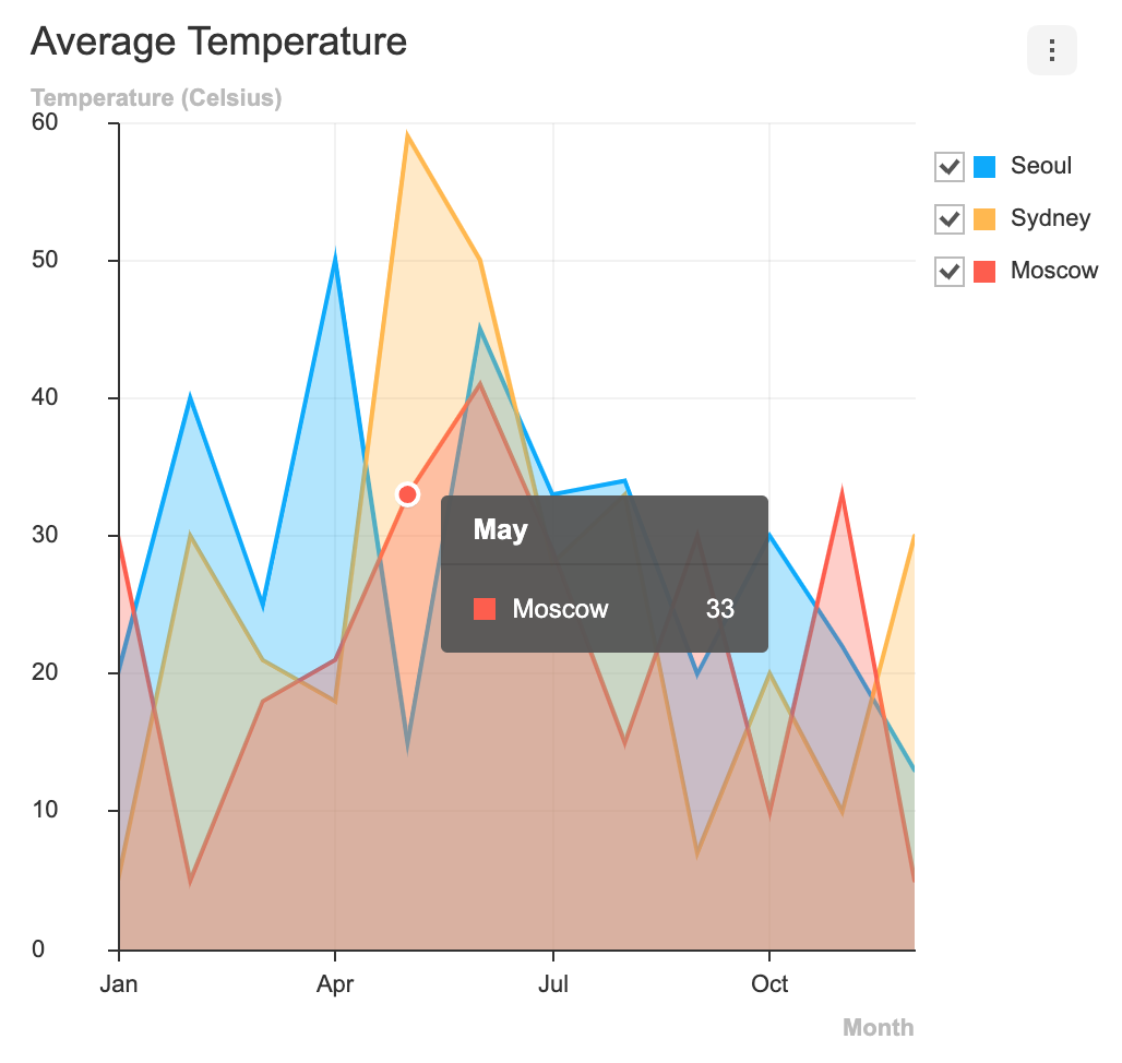
TOAST UI Chart makes your data pop and presents it in a manner that is easy to understand. Furthermore, it provides a wide range of theme options for customizing the charts to be suitable for all of your services. Chart components like the title, axes, legends, tooltips, plots, series, and more can be customized through the options.

image

Variety of powerful features!

Responsive

Add different options and animations according to the charts' sizes by using the responsive option.

responsive

Zoomable

Make the data presented in the Line, Area, and Treemap Charts zoomable with the zoomable option.

zoomable

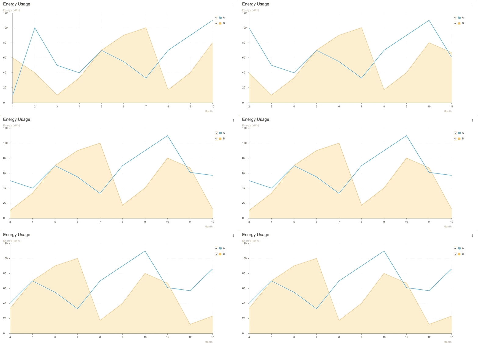
Live Update

View and manage new data as they are added realtime with the addData API and the options.series.shift option.

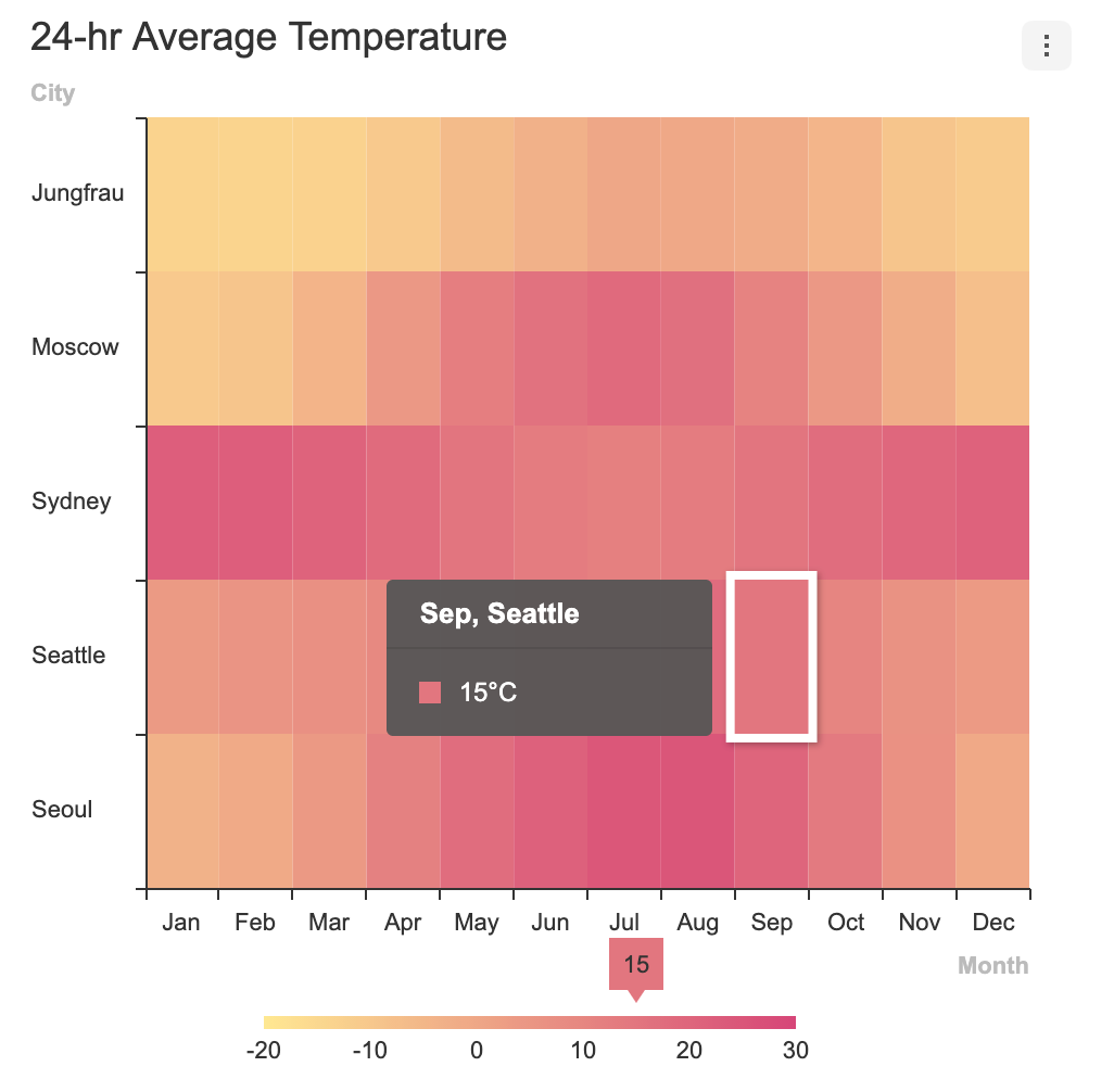
Area Line Heatmap
area live update line heatmap
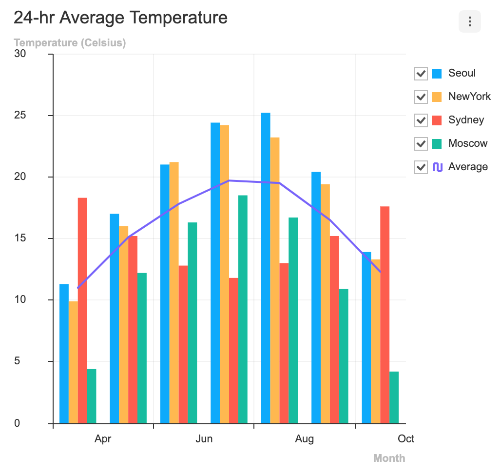
LineArea Column ColumnLine
lineArea column columnline

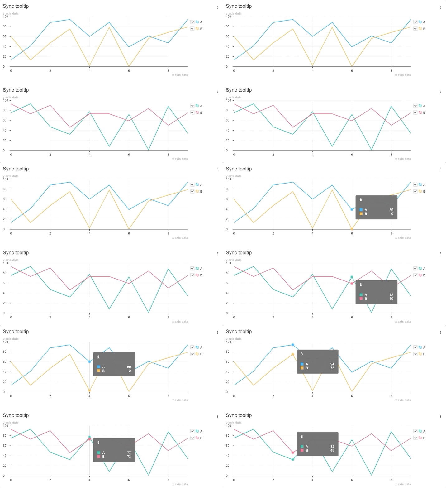
Synchronize Tooltip

Use and synchronize the tooltip features at the moment the cursor hovers over the chart with the showTooltip API and the on custom event.

synctooltip

🎨 Features

Charts

The TOAST UI Chart provides many types of charts to visualize the various forms of data.

Area Line Bar Column
area chart line chart bar chart column chart
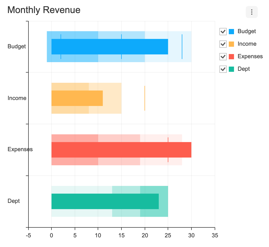
Bullet BoxPlot Treemap Heatmap
bullet chart boxplot chart treemap chart heatmap chart
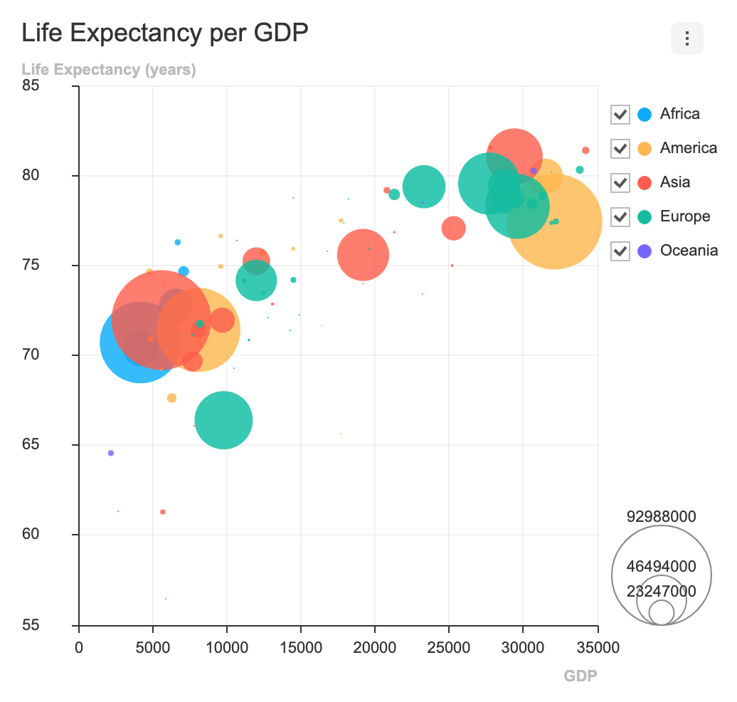
Scatter Bubble Radar Pie
scatter chart bubble chart radar chart pie chart
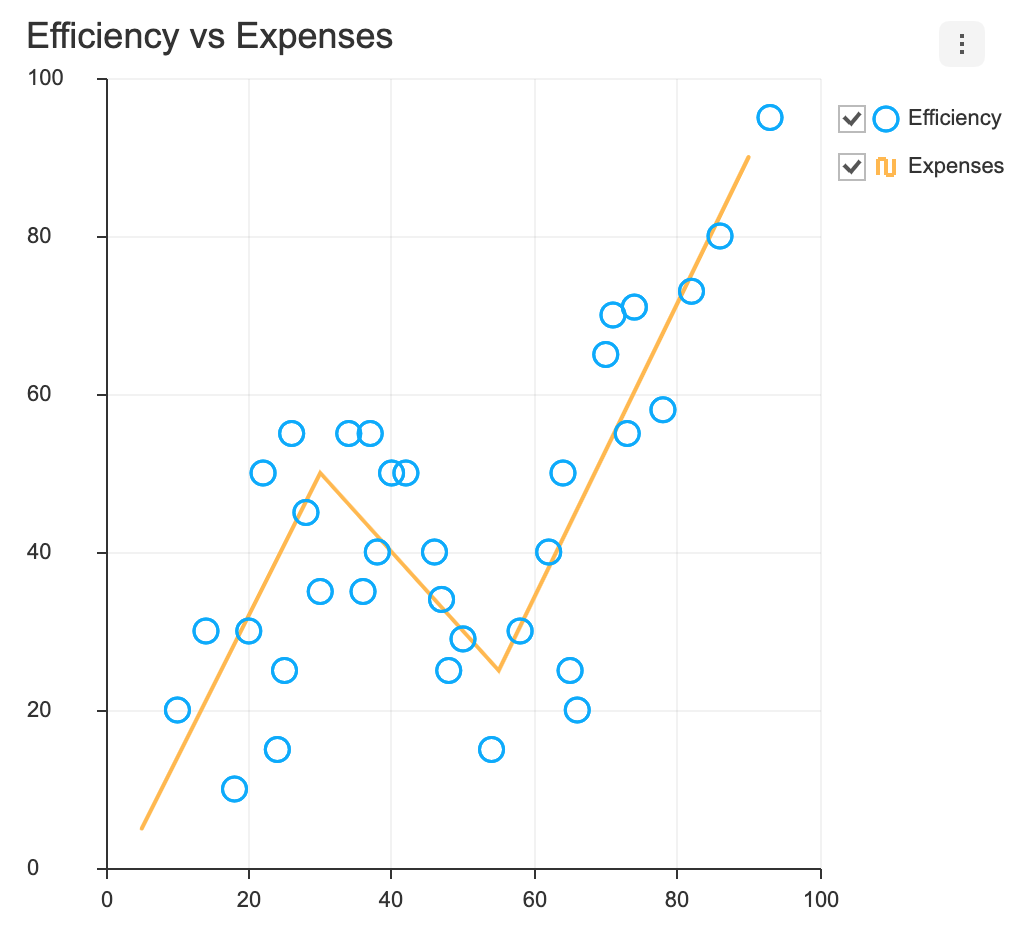
LineArea LineScatter ColumnLine NestedPie
lineArea chart lineScatter chart columnLine chart nestedPie chart
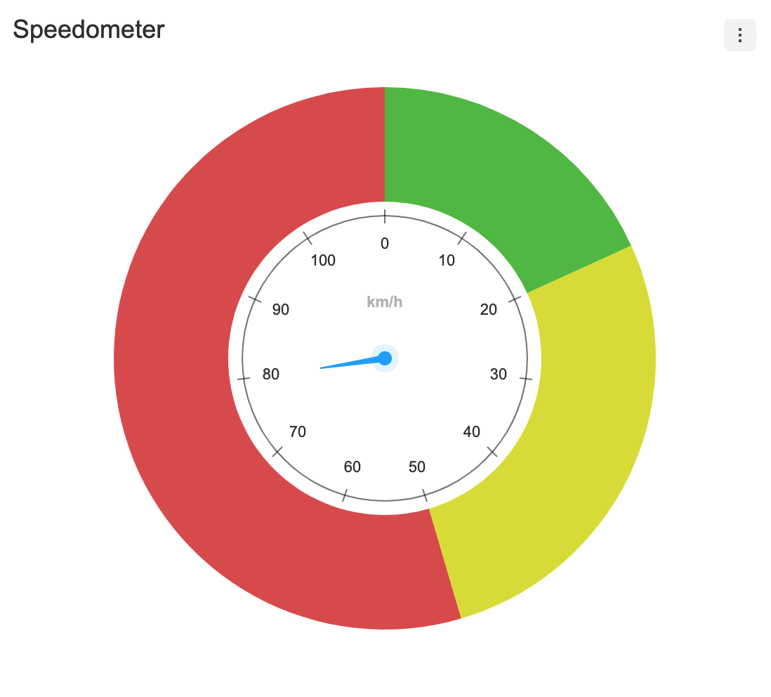
RadialBar Gauge
radialBar chart gauge chart coming soon next

In addition, a variety of powerful features can be found on the demo page below. 👇👇👇

🐾 Examples

Here are more examples and play with TOAST UI Chart!

🔧 Pull Request Steps

TOAST UI products are open source, so you can create a pull request(PR) after you fix issues. Run npm scripts and develop yourself with the following process.

Setup

Fork main branch into your personal repository. Clone it to local computer. Install node modules. Before starting development, you should check to have any errors.

$ git clone https://github.com/{your-personal-repo}/tui.chart.git
$ npm install
$ cd apps/chart
$ npm install
$ npm run test

Develop

Let's start development! You can develop UI through webpack-dev-server or storybook, and you can write tests through Jest. Don't miss adding test cases and then make green rights.

Run webpack-dev-server

$ npm run serve

Run storybook

$ npm run storybook

Run test

$ npm run test

Pull Request

Before uploading your PR, run test one last time to check if there are any errors. If it has no errors, commit and then push it!

For more information on PR's steps, please see links in the Contributing section.

💬 Contributing

🌏 Browser Support

Chrome Chrome IE Internet Explorer Edge Edge Safari Safari Firefox Firefox
Yes 10+ Yes Yes Yes

🍞 TOAST UI Family

🚀 Used By

📜 License

This software is licensed under the MIT © NHN Cloud.

tui.chart's People

Contributors

arjunshibu avatar dependabot[bot] avatar dev-yakuza avatar dotaitch avatar jungeun-cho avatar jwlee1108 avatar shiren avatar

Stargazers

 avatar  avatar  avatar  avatar  avatar  avatar  avatar  avatar  avatar  avatar  avatar  avatar  avatar  avatar  avatar  avatar  avatar  avatar  avatar  avatar  avatar  avatar  avatar  avatar  avatar  avatar  avatar  avatar  avatar  avatar  avatar  avatar  avatar  avatar  avatar  avatar  avatar  avatar  avatar  avatar  avatar  avatar  avatar  avatar  avatar  avatar  avatar  avatar  avatar  avatar  avatar  avatar  avatar  avatar  avatar  avatar  avatar  avatar  avatar  avatar  avatar  avatar  avatar  avatar  avatar  avatar  avatar  avatar  avatar  avatar  avatar  avatar  avatar  avatar  avatar  avatar  avatar  avatar  avatar  avatar  avatar  avatar  avatar  avatar  avatar  avatar  avatar  avatar  avatar  avatar  avatar  avatar  avatar  avatar  avatar  avatar  avatar  avatar  avatar  avatar

Watchers

 avatar  avatar  avatar  avatar  avatar  avatar  avatar  avatar  avatar  avatar  avatar  avatar  avatar  avatar  avatar  avatar  avatar  avatar  avatar  avatar  avatar  avatar  avatar  avatar  avatar  avatar  avatar  avatar  avatar  avatar  avatar  avatar  avatar  avatar  avatar  avatar  avatar  avatar  avatar  avatar  avatar  avatar  avatar  avatar  avatar  avatar  avatar  avatar  avatar  avatar  avatar  avatar  avatar  avatar  avatar  avatar  avatar  avatar  avatar  avatar  avatar  avatar  avatar  avatar  avatar  avatar  avatar  avatar  avatar  avatar  avatar  avatar  avatar  avatar  avatar  avatar  avatar  avatar  avatar  avatar  avatar  avatar  avatar  avatar  avatar  avatar  avatar

tui.chart's Issues

dot에 hover했을 때의 fillColor가 계속 유지됩니다.

안녕하세요
tui.chart 2.9.0 이후 버전으로 업데이트 하였더니 다음과 같은 이슈가 있어 문의드립니다.
업데이트 한 버전은 2.12.1이고 demo페이지에서도 발생하는 것을 보니 최신 릴리즈도 동일한 것 같습니다.

line chart의 theme 설정에서 hover되었을 때 dot 스타일이 변경되도록 하였는데요,
마우스를 off한 상태에서 기존 dot으로 돌아오지 않습니다.

    series: {
        colors: ['#111'],
        dot: {
            fillColor: null,
            fillOpacity: 1,
            radius: 5,
            strokeColor: '#fff',
            strokeOpacity: 1,
            strokeWidth: 2,
            hover: {
                fillColor: '#ffe100',
                fillOpacity: 1,
                radius: 7,
                strokeColor: '#111',
                strokeOpacity: 1,
                strokeWidth: 3
            }
        }
    }
};

dot의 fillColor를 null이 아닌 다른 값으로 바꾸어도 동일합니다. hover하지 않았을 때 다시 원래의 dot이 되었으면 하는데 혹시 테마 적용 방법이 바뀌었는지 이슈인지 모르겠어서 문의드립니다. (관련 document는 바뀌지 않은 듯 합니다 ㅠㅠ)
image

Loading chart data from a file

Hi,
It seems Toast UI chart currently has no option to read data from files such as csv, xml, or json.
As far as I know there's a couple of open source javascript chart libraries which support file loading features through simple forms of methods and parameters.

Here's one of what I've found below:

http://c3js.org/samples/data_url.html

I think this is pretty good idea, especially for those who are not programmers, and even for programmers this works pretty fine as it's simple, easy to understand the code, and reduces some meaningful amount of time.

How do you think about supporting this feature?

Resize fail on null data

안녕하세요.

버그가 있는 것 같아 글을 씁니다.
line 챠트에서 showDot 옵션을 사용하고 있고 categories에 해당하는 값을 null을 주어 표시는 하고 있지 않는 값이 있을 때(처음, 마지막을 null로 주었습니다.) resize 함수를 호출하면 item.endDot이 undefined라 item.endDot.dot에서
Unhandled rejection TypeError: Cannot read property 'dot' of undefined 에러가 발생합니다.

[issue] map chart resize

안녕하세요.
아래의 사이트에서 chart 사용하는 것을 보고 여기까지 오게되었네요
https://analytics.toast.com/analysis/leaveUser?appCode=p0HaZlgr&from=20170618&to=20170718

깔끔하고 제가 원하는 기능이 모두 들어가 있어서 해당 차트를 알게되어 사용을 하려고 하다보니,
다른 chart는 resize가 제대로 적용되는데 map chart의 경우에는 오류가 발생하여 문의를 드리게 되었습니다.

그리고 브라우저 창을 최대화, 최소화 하거나 할 때
chart의 resize 기능이 제대로 동작되지 않습니다. 그래서 변경이 될 때 (resize) 페이지를 새로 고치게 하였는데 좋은 방법은 아닌 것 같아서..

바쁘시겠지만, 해당 부분들에 대해서 피드백 주시면 정말 감사하겠습니다.

Legend pagination `next` button is not showing

Version

v2.14.2

Development Environment

Chrome

Current Behavior

Legend pagination next button(down arrow) is not showing
2018-01-29 6 25 53

var container = document.getElementById('chart-area');
var data = {
    categories: ['Browser'],
    series: [
        {
            name: 'Chrome',
            data: 46.02
        },
        {
            name: 'IE',
            data: 20.47
        },
        {
            name: 'Firefox',
            data: 17.71
        },
        {
            name: 'Safari',
            data: 5.45
        },
        {
            name: 'Opera',
            data: 3.10
        },
        {
            name: 'Etc',
            data: 7.25
        },
        {
            name: 'Chrome',
            data: 46.02
        },
        {
            name: 'IE',
            data: 20.47
        },
        {
            name: 'Firefox',
            data: 17.71
        },
        {
            name: 'Safari',
            data: 5.45
        },
        {
            name: 'Opera',
            data: 3.10
        },
        {
            name: 'Etc',
            data: 7.25
        }
    ]
};
var options = {
    chart: {
        width: 500,
        height: 400,
        title: 'Usage share of web browsers'
    },
    tooltip: {
        suffix: '%'
    }
};

tui.chart.pieChart(container, data, options);

Expected Behavior

Legend pagination next button(down arrow) should be showing
2018-01-29 6 26 34

due date: 2018.2.23

barChar에서 카테고리 데이터 문의드려요

혹시 카테고리나 데이터같은경우 배열 그 자체로 넣을수 있나요?
예를들어
var container = document.getElementById('chart');
var data = {
categories: [title],
series: [{
name: '남자',
data: [data1]
},{
name: '여자',
data: [data2]
}]
};
위와같은경우 title, data1, data2가 배열자체인 상태인데 위와같이 하면 화면이 다 깨지는데 어찌 사용하는게 좋을까요?

Plot bands are not generated

Version

Development Environment

Current Behavior

  1. Plot bands are not generated when data is a date type and numbers in strings are entered in the data values ​​of the plot bands
  2. when adding plot dynamically, it is not create plot band, even though values are number type
var options = {
    chart: {
        width: 900,
        height: 500,
        title: 'Test'
    },
    yAxis: {
        title: '명',
		min: 0
    },
    xAxis: {
        type: "datetime",
		dateFormat: "HH:mm",
		tickInterval: "auto"
    },
	plot: {
		lines: [{
			value: '1519348800000', 
			color: 'red'
		}],
		bands: []
	}
};

Expected Behavior

  1. It should format string to number

Tooltips are not reordered after a series is selected in the legend area

Version

Development Environment

Current Behavior

// Write example code

Expected Behavior

When, a series is selected in the legend area, the serie pops to front.
If a series is 4th series, it would showed on the top of other series.

However, when hover on this poped series, tooltip showed the first series.
This means that, although series order was reordered, tooltip order is not.
Tooltip should be reordered too.

resize() api not working

Version

3.0.1

Development Environment

mac, chrome

Current Behavior

resize() api is not working at line chart

var chart = tui.chart.lineChart(container, data, options);

chart.resize({
    width: 500,
    height: 500
});

Expected Behavior

Legend 위치 변경을 위한 option이 있는지요?

안녕하세요.

우선 이렇게 좋은 오픈소스 활동을 해주시는 데에 있어서 존경과 감사의 말씀을 드립니다.

현재 기본으로 그래프의 오른쪽에 Legend가 표시되도록 되어있는 것 같은데,

이것의 포지션을 그래프 하단이나 위쪽으로 옮길 수 있는 Param이 별도로 제공되어있는 것이 있는지요?

감사합니다.

툴팁의 category값과 Axis에 표시되는 category값을 다르게 표시하고 싶습니다.

안녕하세요?
공유해주신 차트 소스 감사히 사용하고 있습니다.
혹시 툴팁에 표시되는 category값과 xAxis에 표시되는 category의 값을 다르게 하는 것이 가능할까요?

현재 코드에서 툴팁 옵션의 다음 템플릿을 사용하면 아래 이미지와 같은 결과를 얻을 수 있는데요,

툴팁 템플릿 옵션

template: function(category, item) {
	var html = '<section class="layerContents">'
			+ '<time class="date">'+category+'</time>'
			+ '<strong class="count">'+item.value+'회'+'</strong>'
		        + '</section></aside>';
	return html;
}

결과
image

현재 두 값이 똑같지만 툴팁에만 년도가 표시되도록 변경하고 싶어 포맷을 변경해 보았습니다

xAxis 옵션 변경

getDateFormat = function(){
	if(period === 'recentWeek')
		return 'M.dd';
	else(period === 'recentYear')
		return 'M월';
};
...
var options = { 
   xAxis: {
        type: 'datetime',
        dateFormat: getDateFormat()
   }
}

결과
image

위 결과처럼 xAxis의 데이터 포맷을 변경하면 툴팁의 category도 동시에 변경되어 버립니다.

포맷 변경 외에도 beforeShowTooltip 등으로 값을 변경해보려 하였는데, '12월' 등으로 카테고리 값이 먼저 결정되면 추가적인 년도 정보를 툴팁에 표시할 수가 없네요 ㅠ.ㅠ

툴팁 템플릿 변수 중 item 오브젝트에 포맷 변경 전 카테고리 값이 들어가면 가능할 듯도 한데요, 제가 찾지 못한 방법이 있을지 여쭤봅니다.

map chart에서..

map chart 에서 tooltip을 항상 떠있게 할 수 있나요??
아니면 showLabel=true일 때 label을 커스터마이징 할 수 있나요??? tooltip 처럼 html 태그를 사용해서요.

Legend label color is always black

Version

Development Environment

OS: Windows 10 x64
Browser: Firefox & chrome (latest version)

Current Behavior

Legend label color is always black, even when i set another color on the theme.
image

    var DEFAULT_COLOR = '#ffffff';
    var DEFAULT_BACKGROUND = '#000000';
    var DEFAULT_FONTWEIGHT = 'normal';
    var DEFAULT_FONT = 'Roboto';
    var EMPTY = '';
    var DEFAULT_AXIS = {
        tickColor: DEFAULT_COLOR,
        title: {
            fontSize: 12,
            fontFamily: EMPTY,
            color: DEFAULT_COLOR,
            fontWeight: DEFAULT_FONTWEIGHT
        },
        label: {
            fontSize: 12,
            fontFamily: EMPTY,
            color: DEFAULT_COLOR,
            fontWeight: DEFAULT_FONTWEIGHT
        }
    };

    var charttheme = {
        chart: {
            background: {
                color: DEFAULT_BACKGROUND,
                opacity: 0
            },
            fontFamily: DEFAULT_FONT
        },
        title: {
            fontSize: 18,
            fontFamily: EMPTY,
            color: DEFAULT_COLOR,
            fontWeight: DEFAULT_FONTWEIGHT
        },
        yAxis: DEFAULT_AXIS,
        xAxis: DEFAULT_AXIS,
        plot: {
            lineColor: '#dddddd',
            background: '#ffffff',
            label: {
                fontSize: 11,
                fontFamily: DEFAULT_FONT,
                color: '#888'
            }
        },
        series: {
            label: {
                fontSize: 11,
                fontFamily: DEFAULT_FONT,
                color: DEFAULT_COLOR,
                fontWeight: DEFAULT_FONTWEIGHT
            },
            colors: [ '#62923E', '#C90509', '#ac4142', '#d28445', '#f4bf75', '#90a959', '#75b5aa', '#6a9fb5', '#aa759f', '#8f5536'],
            borderColor: EMPTY,
            borderWidth: EMPTY,
            selectionColor: EMPTY,
            startColor: '#F4F4F4',
            endColor: '#345391',
            overColor: '#F0C952',
            dot: {
                fillColor: EMPTY,
                fillOpacity: 1,
                strokeColor: EMPTY,
                strokeOpacity: 1,
                strokeWidth: 2,
                radius: 2,
                hover: {
                    fillColor: EMPTY,
                    fillOpacity: 1,
                    strokeColor: EMPTY,
                    strokeOpacity: 0.8,
                    strokeWidth: 3,
                    radius: 4
                }
            },
            ranges: []
        },
        legend: {          
            label: {
                fontSize: 12,
                fontFamily: DEFAULT_FONT,
                color: "white",
                fontWeight: DEFAULT_FONTWEIGHT
            }
        },
        tooltip: {},
        chartExportMenu: {
            backgroundColor: '#fff',
            borderRadius: 0,
            borderWidth: 1,
            color: '#000'
        }
    };

    tui.chart.registerTheme('charttheme', charttheme);

    //Creation du graphique
    var container = $("#divrepartitiontype").find('.result-graph')[0];
    var data = {
        categories: ["Types d'appels"],
        series: [
            {
                name: "Entrants",
                data: repartitionpartype.repartition[1].count
            },
            {
                name: "Sortants",
                data: repartitionpartype.repartition[2].count
            }
        ]
    }
    var options = {
        chart: {
            width: $(container).width(),
            height: 200
        },
        legend: {
            showCheckbox: false
        },
        series: {
            radiusRange: ['70%', '100%']
        }
    };
    options.theme = 'charttheme';
    tui.chart.pieChart(container, data, options);

Expected Behavior

Color of the legend should change when you set a different label color.

Tutorial page typo

In Create Chart

  • options: ---> options=
  • chart: { ... } ---> chart: { ... },

graph when the smaller data is better

이슈의 개요

보통의 차트에서는 값이 클수록, 데이터가 더 높은 위치에 표현된다.
하지만 랭킹같은 데이터의 표현은 값이 낮을수록 더 높은 등급의 값임으로 더 높은 위치에 표현하고 싶을 수 있다

구현 가이드

  • 차트는 코드는 크게 components, helpers, models, plugins 으로 구성되어 있으며 src/js/ 밑에 각각 디렉토리로 구분되어 있다.
  • helpers는 유틸리티 모음, models은 데이터 가공, plugins는 svg를 실제로 그리기 위한 raphael 라이브러리를 확장하여 구현된 부분이다
  • components는 차트를 구성하고 있는 구성요소들(축(axis), 레전드(legend), 마우스이벤트데텍터(eventdetector), 차트에 배경이 되는 구분선(plot), 차트를 그리는 부분(series), 툴팁(tooltip)) 이다
  • 각각의 component를 차트 사용자가 제어할수 있도록 component별로 옵션을 제공하고 있다
  • 차트의 사용예제나 옵션은 api & example 문서와 wiki문서에서 파악할 수 있다.
  • 이 이슈의 주로 수정해야할 코드는 components의 axis, plot, series 부분이다.

요구 사항

  • line차트에 yAxis.invert 옵션을 추가하여 아래 이미지와 같이 낮은 값이 더 높은 위치에 표현되도록 한다.
var options = {
    yAxis: {
        invert: true
    },
    chart: {
        ...
    },
    xAxis: {
        ...
    },
    ...
};

2018-05-02 6 26 03

선택 요구 사항

  • 유닛 테스트 코드 작성
  • yAxis.invert 옵션을 컬럼차트에도 똑같이 적용.

커밋 메세지 가이드(링크)

개발 환경

  • 프로젝트 내의 ESLint 준수
  • TC 작성 및 통과
npm run test
  • 기능 구현 시 데모용 페이지는 examples 폴더 하위에 생성
  • 크로스브라우징
    • 프로젝트 README.md 에 표시되어 있는 Browser Support 참고

Tooltip does not show current focused series information

Version

v2.16.0

Development Environment

Chrome, OSX

Current Behavior

Tooltip does not show current focused series information.

Reproduction Steps

  1. Select '감자' on legend area
  2. Mouse over on dot point
  3. Bug: it now shows '크리스마스' => It should show '감자'

2018-02-19 11 22 03

var container = document.getElementById('chart-area');
var data = {
    categories: ['20170509', '20170510'],
    series: [
        {
            name: '크리스마스',
            data: [0,0]
        },
        {
            name: '감자',
            data: [0,0]
        }
    ]
};
var options = {
    chart: {
        width: 700,
        height: 400
    },
    yAxis: {
        title: 'Temperature (Celsius)'
    },
    xAxis: {
        title: 'Month',
        type: 'datetime',
        dateFormat: 'MMM'
    },
    series: {
        showDot: true,
        zoomable: true
    },
    tooltip: {
        suffix: '°C'
    },
    legend: {
         align: 'bottom',
        showCheckbox: false
    }
};

var chart = tui.chart.lineChart(container, data, options);

Expected Behavior

Tooltip should show '감자'

Using tow y Axes in a combo chart

안녕하세요.
https://github.com/nhnent/tui.chart/wiki/chart-types-column-line-combo
경로를 참조하여 How to use two yAxis 처리를 하려 하는데

example 사이트(https://nhnent.github.io/tui.chart/latest/tutorial-sample08-01-column-line-combo-chart.html) 에서 yAxis 선언부를 가이드대로 변경했는데 우측 yAxis 가 나타나지 않습니다.

[변경한 부분]
yAxis: [{
title: 'Temperature',
chartType: 'column'
}, {
title: 'Average',
chartType: 'line'
}]

툴팁 표시 오류 문의

그래프를 두개 그릴 경우, 두번째 그래프의 툴팁이 표시되지 않습니다.
정확히는 첫번째 그래프 툴팁이 표시되는 것으로 같습니다.

라인차트를 두개 그리는데 첫번째 그래프엔 데이터가 하나고, 두번째 그래프에 여러개인 경우,
두번째 그래프의 첫 데이터만 툴팁이 위쪽 그래프에 나타납니다.

툴팁을 그래프들이 공유하는 것으로 보입니다.
확인 부탁드리겠습니다^^

offset option for axis title does not work

I'm using the latest 2.9.4.
When I set the axis option like the following, offset does not apply.
xAxis: {
title: {
text: 'X Axis Title',
offsetX: 50,
offsetY: 10
}
},

By seeing the function '_renderTitleArea', I think it's not implemeted.
Is it right?
Please review it :)

tooltip 템플릿 사용시 한글 텍스트에 대해 줄바뀜 현상

안녕하세요
툴팁 표시 관련하여 문의드립니다.
툴팁 옵션에 템플릿 적용시 추가적인 텍스트를 넣으면 한글만 줄바뀜 문제가 발생합니다.

다음 두 이미지와 같이 value값 다음에 숫자, 특수문자(%,! 등...), 영문자는
value값과 함께 한 줄로 처리가 되지만 한글만 줄이 바뀌어서 처리가 됩니다.
image
image

템플릿은 다음과 같은 방식으로 사용하고 있습니다.

tooltip : {
  offsetY: -40,
    offsetX: -5,
      template: function(category, item) {
        var html =  '<time class="date">'+category+'</time>'
              + '<strong class="count">'+item.value+'회'+'</strong>'
        return html;
      }
},

값과 단위를 붙여서 표기를 하고 싶은데, 방법이 없는지요?

Getting Started내 예제에서 문제점 발견했습니다.

안녕하세요.

우선 이렇게 좋은 오픈소스 활동을 해주시는 데에 있어서 존경과 감사의 말씀을 드립니다.

https://github.com/nhnent/tui.chart/wiki/getting-started#create-chart
에 있는 예제에서 조금 이상한 부분을 발견했습니다.
예제의 데이터를 그대로 사용을 하고, barChart를 렌더링을 하면 다음과 같은 경우에

image

Legend1 에 대해서 첫번 째 bar가 렌더링이 되지 않는 것을 볼 수 있습니다.

Data 값을 바꿔봤더니 또 제대로 렌더링이 되더라구요..
image

혹시 예제의 데이터로 했을 때 값이 안 나오는 이유가 있을까요?

The tooltip is covered by the export menu

Version

3.0.1

Development Environment

Chrome V64.0.3282.186 Mac

Current Behavior

The zIndex of export menu is higher than tooltip lead to the tooltip is covered by the export menu.

Expected Behavior

Tooltip will not cover by export menu

yAxis width is wider than the actual label width

Version

v2.14.2

Development Environment

Chrome, OSX

Descriptions

Current

yAxis width is wider than the actual value labels(0.01, 0.02, ..., 0.07) width
2018-01-30 9 35 29

Expected

yAxis width should fit to the actual labels
2018-01-30 9 32 02 |

Steps to reproduce

var container = document.getElementById('chart-area');
var data = {
    categories: ['12/22/2017', '12/23/2017', '12/24/2017'],
    series: [{
        name: 'name',
        data: [0.06, 0.05, 0.05]
    }]
};
var options = {
    chart: {
        format: '1,000',
        height: 350,
        width: 555.4444    
    },
    xAxis: {
        type: 'datetime',
        dateFormat: 'bb일'
    },
    yAxis: {
        min: 0,	
        labelInterval: 2
    },
    series: {
        showDot: false,
        zoomable: false,
        showLabel: false
    },
    legend: {
        visible: false
    }

};
var theme = {
    series: {
        colors: ['#ff7170']
    }
};

// For apply theme
tui.chart.registerTheme('lineTheme', theme);
options.theme = 'lineTheme';
var chart = tui.chart.lineChart(container, data, options);

Bubble Chart : 데이터가 하나만 있을 경우, 값이 중복될 경우

rawData = {
  series: [
    {
      name: 'test',
      data: [
        // {x: 400, y:200, r:1, label:'T*T'},
        // {x: 600, y:400, r:1, label:'T*T'},
        {x: 600, y:300, r:1, label:'T*T'}
      ]
    }
  ]
};

이런식으로 데이터를 하나만 입력할 경우
제대로 렌더링이 되질 않습니다.
차트에 마우스를 올려 툴팁을 보면 x,y 각각의 값이 null로 표시 됩니다.
범위를 잡지 못한 탓인지 xAxis, yAxis도 표기되지 않습니다.
그리고

rawData = {
  series: [
    {
      name: 'test',
      data: [
        // {x: 400, y:200, r:1, label:'T*T'},
        {x: 600, y:400, r:1, label:'T*T'},
        {x: 600, y:300, r:1, label:'T*T'}
      ]
    }
  ]
};

데이터가 2개 이상이라도 x혹은 y값이 같을 때,
위처럼 x값이 동일한경우 x값만 null로 표기 됩니다.(xAxis만 표기 안됨)

이를 해결할 방법이 없을까요?
덧붙여 이처럼 좋은 프로젝트를 오픈소스로 제공해주셔서 정말 감사합니다.

If a series is selected inside legend area, selected series must have priority in mouse events

Version

v2.15.0

Development Environment

Chrome, OSX

Current Behavior

2018-02-05 5 32 15
Series is rendered in order to series index.
priority of 크리스마스, the 0 index is higher than 달력, the 1 index.

As two series has same data 0, we could only show tooltip of 크리스마스.
However, when 달력 is selected inside legend area. It should show tooltip of 달력.
Because selection means 달력 series will only be activated.

var container = document.getElementById('chart-area');
var data = {
       categories: ['2018.01.25'],
    series: [
          {
            name: '크리스마스',
            data: [0]
        },
        {
            name: '달력',
            data: [0]
        }
    ]
};
var options = {
    chart: {
        width: 400,
        height: 300,
        title: '날짜별 검색량'
    },
    series: {
        showDot: true
    }
};
var chart = tui.chart.lineChart(container, data, options);

Expected Behavior

When 달력 is selected inside legend area. It should show tooltip of 달력.

ie8에서 chartExportMenu가 안보입니다

ie8에서 bar차트를 사용 중입니다. ^^
크롬에서는 export 메뉴가 보이는데요(정상동작)
ie8에서는 export 메뉴가 안보입니다

tui-chart.css 코드를 보니~ .tui-chart-chartExportMenu-area 에 z-index:5000; 으로
되어있더군요~ 이문제는 아닌것 같은데요~

ie8은 export 기능을 지원안하는것인가요?

bower로 tui.chart 설치시 오류 메시지

안녕하세요.
클라우드플랫폼개발팀 신진호 입니다.

high chart 라이선스 만료로 tui.chart를 적용하려 합니다.

Wiki 내용대로 bower를 사용해서 tui.chart를 설치시 오류 메시지가 출력됩니다.
가이드 부탁드립니다.

$ bower install tui-chart
bower tui-chart#*           not-cached https://github.com/nhnent/tui.chart.git#*
bower tui-chart#*              resolve https://github.com/nhnent/tui.chart.git#*
bower tui-chart#*             download https://github.com/nhnent/tui.chart/archive/2.5.0.tar.gz
bower tui-chart#*              extract archive.tar.gz
bower tui-chart#*             resolved https://github.com/nhnent/tui.chart.git#2.5.0
bower raphael#v2.1.4b       not-cached https://github.com/nhnent/raphael.git#v2.1.4b
bower raphael#v2.1.4b          resolve https://github.com/nhnent/raphael.git#v2.1.4b
bower tui-code-snippet#1.0.8       not-cached https://github.com/nhnent/tui.code-snippet.git#1.0.8
bower tui-code-snippet#1.0.8          resolve https://github.com/nhnent/tui.code-snippet.git#1.0.8
bower tui-component-effects#~1.1.0 not-cached https://github.com/nhnent/tui.component.effects.git#~1.1.0
bower tui-component-effects#~1.1.0    resolve https://github.com/nhnent/tui.component.effects.git#~1.1.0
bower raphael#v2.1.4b                download https://github.com/nhnent/raphael/archive/v2.1.4b.tar.gz
bower tui-code-snippet#1.0.8         download https://github.com/nhnent/tui.code-snippet/archive/1.0.8.tar.gz
bower tui-component-effects#~1.1.0   download https://github.com/nhnent/tui.component.effects/archive/1.1.1.tar.gz
bower tui-component-effects#~1.1.0    extract archive.tar.gz
bower tui-component-effects#~1.1.0   resolved https://github.com/nhnent/tui.component.effects.git#1.1.1
bower tui-code-snippet#~1.1.0      not-cached https://github.com/nhnent/tui.code-snippet.git#~1.1.0
bower tui-code-snippet#~1.1.0         resolve https://github.com/nhnent/tui.code-snippet.git#~1.1.0
bower tui-code-snippet#~1.1.0        download https://github.com/nhnent/tui.code-snippet/archive/1.1.3.tar.gz
bower raphael#v2.1.4b                 extract archive.tar.gz
bower raphael#v2.1.4b                resolved https://github.com/nhnent/raphael.git#v2.1.4b
bower tui-code-snippet#1.0.8          extract archive.tar.gz
bower tui-code-snippet#1.0.8         resolved https://github.com/nhnent/tui.code-snippet.git#1.0.8
bower tui-code-snippet#~1.1.0         extract archive.tar.gz
bower tui-code-snippet#~1.1.0        resolved https://github.com/nhnent/tui.code-snippet.git#1.1.3
bower                               ECONFLICT Unable to find suitable version for tui-code-snippet

show only integer values on axis

Version

v2.14.2

Development Environment

Chrome, OSX

Current Behavior

Value axis shows decimals.
However count cannot be decimals. I don't need decimal ticks
2018-01-30 10 40 23

Steps to reproduce

var container = document.getElementById('chart-area');
var data = {
    categories: ['12/20/2017', '12/21/2017', '12/22/2017', '12/23/2017', '12/24/2017', '12/25/2017', '12/26/2017'],
    series: [{
        name: 'issues counts',
        data: [1, 0, 0, 1, 0, 1, 0]
    }]
};
var options = {
    chart: {
        height: 350,
        width: 550  
    },
    xAxis: {
        type: 'datetime',
        dateFormat: 'dd일'
    },
    legend: {
        visible: false
    }
};
var chart = tui.chart.columnChart(container, data, options);

Expected Behavior

Value axis shows integer only.
HighChart supports it:
http://jsfiddle.net/gh/get/library/pure/highcharts/highcharts/tree/master/samples/highcharts/yaxis/allowdecimals-false/

custom-event-area is not overlayed on svg chart area

Development Environment

React, Chrome

Current Behavior

First of all, thanks a lot for providing such an awesome library!

I have an issue that the custom-event-area is not put on top of the svg chart area. As shown in the image below, both the export-menu and event-area div's are all placed below the chart.

screen shot 2018-03-07 at 10 26 18 am

I tried the absolute position but with no luck.

<div id="chart-area" style={{position: 'absolute'}} />

Did I miss anything? Below is the full code that I tested.

import React, { Component } from 'react';
import TuiChart from 'tui-chart';

class TestTuiChart extends Component {
  componentDidMount() {
    var container = document.getElementById('chart-area');
    var data = {
        categories: ['01/01/2016', '02/01/2016', '03/01/2016', '04/01/2016', '05/01/2016', '06/01/2016', '07/01/2016', '08/01/2016', '09/01/2016', '10/01/2016', '11/01/2016', '12/01/2016'],
        series: [
            {
                name: 'Seoul',
                data: [-3.5, -1.1, 4.0, 11.3, 17.5, 21.5, 24.9, 25.2, 20.4, 13.9, 6.6, -0.6]
            },
            ......
        ]
    };
    var options = {
        chart: {
            width: 700,
            height: 400,
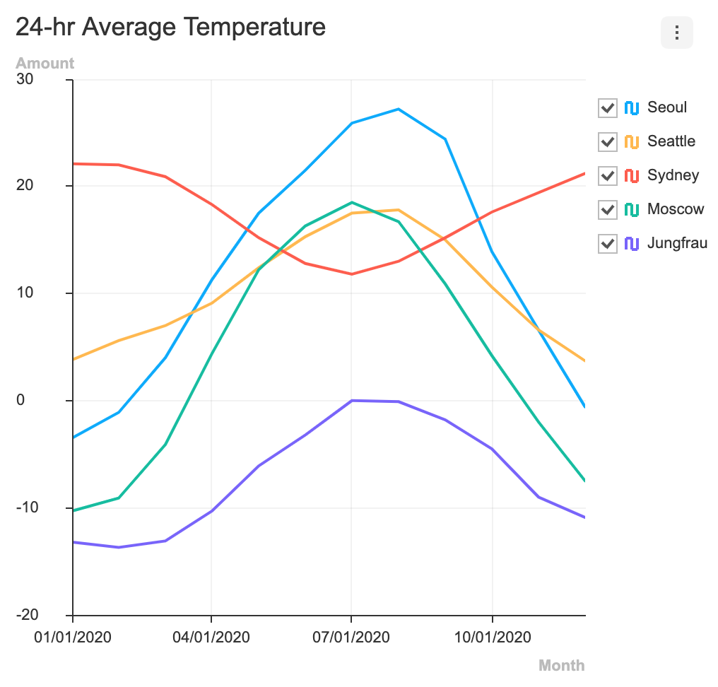
            title: '24-hr Average Temperature'
        },
        ......
    };
    
    TuiChart.lineChart(container, data, options);
  }  

  render() {
    return (
      <div id="chart-area" style={{position: 'absolute'}}>
      </div>
    )
  }
}

export default TestTuiChart;

legend 표시하지 않을 경우 category 오른쪽 텍스트가 잘려 보입니다.

안녕하세요
legend의 옵션을 visible : false로 변경하였을 때,
오른쪽 끝의 카테고리 텍스트가 잘려서 나오게 되는 이슈가 있습니다.
legend를 사용하지 않는 그래프의 카테고리에 대해 약간의 공간이 있으면 좋을 것 같은데,
혹시 다른 해결 가능한 방법이 있을지요?

legend: {
	visible: false,
	showCheckbox: false,
},

image

line chart 몇 가지 문의

안녕하세요.
클라우드플랫폼개발팀 신진호 입니다.

line chart에서 몇 가지 궁금한게 있어서 문의 드립니다.

  1. 가운데 정렬?
    만약 값이 하나 만 있을 경우, 차트 왼쪽 구석에 위치하게 되는데 이 때 가운데 위치하게 할 수 있나요?

  2. series 색 변경
    Defaul 색인 빨강, 주황 외 다른 색으로 변경하고 싶은데, 어떻게 설정해야되는지 궁금합니다.

  3. 왼쪽, 오른쪽 padding?
    값들을 넣으면 양 끝의 값들은 양 끝 쪽에 위치하게 되는데, 이 때 약간 여유 공간을 설정할 수 있나요?

답변 부탁드립니다.

Recommend Projects

  • React photo React

    A declarative, efficient, and flexible JavaScript library for building user interfaces.

  • Vue.js photo Vue.js

    🖖 Vue.js is a progressive, incrementally-adoptable JavaScript framework for building UI on the web.

  • Typescript photo Typescript

    TypeScript is a superset of JavaScript that compiles to clean JavaScript output.

  • TensorFlow photo TensorFlow

    An Open Source Machine Learning Framework for Everyone

  • Django photo Django

    The Web framework for perfectionists with deadlines.

  • D3 photo D3

    Bring data to life with SVG, Canvas and HTML. 📊📈🎉

Recommend Topics

  • javascript

    JavaScript (JS) is a lightweight interpreted programming language with first-class functions.

  • web

    Some thing interesting about web. New door for the world.

  • server

    A server is a program made to process requests and deliver data to clients.

  • Machine learning

    Machine learning is a way of modeling and interpreting data that allows a piece of software to respond intelligently.

  • Game

    Some thing interesting about game, make everyone happy.

Recommend Org

  • Facebook photo Facebook

    We are working to build community through open source technology. NB: members must have two-factor auth.

  • Microsoft photo Microsoft

    Open source projects and samples from Microsoft.

  • Google photo Google

    Google ❤️ Open Source for everyone.

  • D3 photo D3

    Data-Driven Documents codes.