GithubHelp home page GithubHelp logo

plotly / plotly.js Goto Github PK

View Code? Open in Web Editor NEW
16.5K 287.0 1.8K 1.36 GB

Open-source JavaScript charting library behind Plotly and Dash

Home Page: https://plotly.com/javascript/

License: MIT License

JavaScript 99.67% HTML 0.06% CSS 0.01% Shell 0.07% SCSS 0.06% Python 0.12%
data-visualization d3 webgl plotly charting-library charts visualization plotly-dash regl

plotly.js's Introduction

npm version circle ci MIT License

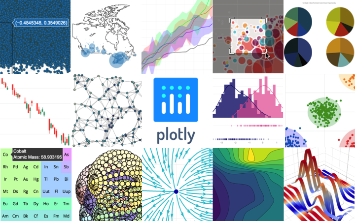
Plotly.js is a standalone Javascript data visualization library, and it also powers the Python and R modules named plotly in those respective ecosystems (referred to as Plotly.py and Plotly.R).

Plotly.js can be used to produce dozens of chart types and visualizations, including statistical charts, 3D graphs, scientific charts, SVG and tile maps, financial charts and more.

Contact us for Plotly.js consulting, dashboard development, application integration, and feature additions.

Table of contents


Load as a node module

Install a ready-to-use distributed bundle

npm i --save plotly.js-dist-min

and use import or require in node.js

// ES6 module
import Plotly from 'plotly.js-dist-min'

// CommonJS
var Plotly = require('plotly.js-dist-min')

You may also consider using plotly.js-dist if you prefer using an unminified package.


Load via script tag

The script HTML element

In the examples below Plotly object is added to the window scope by script. The newPlot method is then used to draw an interactive figure as described by data and layout into the desired div here named gd. As demonstrated in the example above basic knowledge of html and JSON syntax is enough to get started i.e. with/without JavaScript! To learn and build more with plotly.js please visit plotly.js documentation.

<head>
    <script src="https://cdn.plot.ly/plotly-2.30.1.min.js" charset="utf-8"></script>
</head>
<body>
    <div id="gd"></div>

    <script>
        Plotly.newPlot("gd", /* JSON object */ {
            "data": [{ "y": [1, 2, 3] }],
            "layout": { "width": 600, "height": 400}
        })
    </script>
</body>

Alternatively you may consider using native ES6 import in the script tag.

<script type="module">
    import "https://cdn.plot.ly/plotly-2.30.1.min.js"
    Plotly.newPlot("gd", [{ y: [1, 2, 3] }])
</script>

Fastly supports Plotly.js with free CDN service. Read more at https://www.fastly.com/open-source.

Un-minified versions are also available on CDN

While non-minified source files may contain characters outside UTF-8, it is recommended that you specify the charset when loading those bundles.

<script src="https://cdn.plot.ly/plotly-2.30.1.js" charset="utf-8"></script>

Please note that as of v2 the "plotly-latest" outputs (e.g. https://cdn.plot.ly/plotly-latest.min.js) will no longer be updated on the CDN, and will stay at the last v1 patch v1.58.5. Therefore, to use the CDN with plotly.js v2 and higher, you must specify an exact plotly.js version.

MathJax

You could load either version two or version three of MathJax files, for example:

<script src="https://cdnjs.cloudflare.com/ajax/libs/mathjax/2.7.5/MathJax.js?config=TeX-AMS-MML_SVG.js"></script>
<script src="https://cdn.jsdelivr.net/npm/[email protected]/es5/tex-svg.js"></script>

When using MathJax version 3, it is also possible to use chtml output on the other parts of the page in addition to svg output for the plotly graph. Please refer to devtools/test_dashboard/index-mathjax3chtml.html to see an example.

Need to have several WebGL graphs on a page?

You may simply load virtual-webgl script for WebGL 1 (not WebGL 2) before loading other scripts.

<script src="https://unpkg.com/[email protected]/src/virtual-webgl.js"></script>

Bundles

There are two kinds of plotly.js bundles:

  1. Complete and partial official bundles that are distributed to npm and the CDN, described in the dist README.
  2. Custom bundles you can create yourself to optimize the size of bundle depending on your needs. Please visit CUSTOM_BUNDLE for more information.

Alternative ways to load and build plotly.js

If your library needs to bundle or directly load plotly.js/lib/index.js or parts of its modules similar to index-basic in some other way than via an official or a custom bundle, or in case you want to tweak the default build configurations, then please visit BUILDING.md.


Documentation

Official plotly.js documentation is hosted at https://plotly.com/javascript.

These pages are generated by the Plotly graphing-library-docs repo built with Jekyll and publicly hosted on GitHub Pages. For more info about contributing to Plotly documentation, please read through contributing guidelines.


Bugs and feature requests

Have a bug or a feature request? Please open a Github issue keeping in mind the issue guidelines. You may also want to read about how changes get made to Plotly.js


Contributing

Please read through our contributing guidelines. Included are directions for opening issues, using plotly.js in your project and notes on development.


Notable contributors

Plotly.js is at the core of a large and dynamic ecosystem with many contributors who file issues, reproduce bugs, suggest improvements, write code in this repo (and other upstream or downstream ones) and help users in the Plotly community forum. The following people deserve special recognition for their outsized contributions to this ecosystem:

GitHub Twitter Status
Alex C. Johnson @alexcjohnson Active, Maintainer
Mojtaba Samimi @archmoj @solarchvision Active, Maintainer
Antoine Roy-Gobeil @antoinerg Active, Maintainer
Emily Kellison-Linn @emilykl Active, Maintainer
Hannah Ker @hannahker @hannahker11 Active, Maintainer
Étienne Tétreault-Pinard @etpinard @etpinard Hall of Fame
Nicolas Kruchten @nicolaskruchten @nicolaskruchten Hall of Fame
Jon Mease @jonmmease @jonmmease Hall of Fame
Mikola Lysenko @mikolalysenko @MikolaLysenko Hall of Fame
Ricky Reusser @rreusser @rickyreusser Hall of Fame
Dmitry Yv. @dy @DimaYv Hall of Fame
Robert Monfera @monfera @monfera Hall of Fame
Robert Möstl @rmoestl @rmoestl Hall of Fame
Nicolas Riesco @n-riesco Hall of Fame
Miklós Tusz @mdtusz @mdtusz Hall of Fame
Chelsea Douglas @cldougl Hall of Fame
Ben Postlethwaite @bpostlethwaite Hall of Fame
Jack Parmer @jackparmer Hall of Fame
Chris Parmer @chriddyp Hall of Fame
Alex Vados @alexander-daniel Hall of Fame

Copyright and license

Code and documentation copyright 2021 Plotly, Inc.

Code released under the MIT license.

Versioning

This project is maintained under the Semantic Versioning guidelines.

See the Releases section of our GitHub project for changelogs for each release version of plotly.js.


Community

  • Follow @plotlygraphs on Twitter for the latest Plotly news.
  • Implementation help may be found on community.plot.com (tagged plotly-js) or on Stack Overflow (tagged plotly).
  • Developers should use the keyword plotly on packages which modify or add to the functionality of plotly.js when distributing through npm.

plotly.js's People

Contributors

alexander-daniel avatar alexcjohnson avatar andrefarzat avatar antoinerg avatar archmoj avatar bpostlethwaite avatar bronsolo avatar carmeloosh avatar chriddyp avatar coding-with-adam avatar doeg avatar dy avatar emilykl avatar etpinard avatar hannahker avatar jackparmer avatar jonmmease avatar mdtusz avatar mikolalysenko avatar mkcor avatar monfera avatar n-riesco avatar nicholas-esterer avatar nicolaskruchten avatar rmoestl avatar rreusser avatar scjody avatar theengineear avatar troiska avatar waxlamp avatar

Stargazers

 avatar  avatar  avatar  avatar  avatar  avatar  avatar  avatar  avatar  avatar  avatar  avatar  avatar  avatar  avatar  avatar  avatar  avatar  avatar  avatar  avatar  avatar  avatar  avatar  avatar  avatar  avatar  avatar  avatar  avatar  avatar  avatar  avatar  avatar  avatar  avatar  avatar  avatar  avatar  avatar  avatar  avatar  avatar  avatar  avatar  avatar  avatar  avatar  avatar  avatar  avatar  avatar  avatar  avatar  avatar  avatar  avatar  avatar  avatar  avatar  avatar  avatar  avatar  avatar  avatar  avatar  avatar  avatar  avatar  avatar  avatar  avatar  avatar  avatar  avatar  avatar  avatar  avatar  avatar  avatar  avatar  avatar  avatar  avatar  avatar  avatar  avatar  avatar  avatar  avatar  avatar  avatar  avatar  avatar  avatar  avatar  avatar  avatar  avatar  avatar

Watchers

 avatar  avatar  avatar  avatar  avatar  avatar  avatar  avatar  avatar  avatar  avatar  avatar  avatar  avatar  avatar  avatar  avatar  avatar  avatar  avatar  avatar  avatar  avatar  avatar  avatar  avatar  avatar  avatar  avatar  avatar  avatar  avatar  avatar  avatar  avatar  avatar  avatar  avatar  avatar  avatar  avatar  avatar  avatar  avatar  avatar  avatar  avatar  avatar  avatar  avatar  avatar  avatar  avatar  avatar  avatar  avatar  avatar  avatar  avatar  avatar  avatar  avatar  avatar  avatar  avatar  avatar  avatar  avatar  avatar  avatar  avatar  avatar  avatar  avatar  avatar  avatar  avatar  avatar  avatar  avatar  avatar  avatar  avatar  avatar  avatar  avatar  avatar  avatar  avatar  avatar  avatar  avatar  avatar  avatar  avatar  avatar  avatar  avatar  avatar  avatar

plotly.js's Issues

Package broken when installing in JSPM

Not that plotly would necessarily have to support JSPM, but it's also not possible to shim around the issue because there is neither a true source nor a true distribution format in the NPM package.

The package.json points to src/index.js, which relies on build/ploticon and other files in the build folder. Meanwhile, dist/plotly.js – presumably intended for distribution given the name – begins with var Plotly = require('../src/plotly'); which seems wrong.

R library: Big slowdown in Firefox but not in Chrome

Hi, when I view this page: https://beta.rstudioconnect.com/mark/digitalMarketingReportSchedule/
....in Firefox it has big slowdown problems, sometimes asking to stop an unresponsive script, other times its enough that it crashes Firefox. Even if it does load, tooltip response time is sluggish.

The problems only appear when using plot.ly plots, not other htmlwidget libraries like dygraph.

The plots in the page are generated using this R code in an .Rmd document:

gadata %>% plot_ly(x = date, y = sessions, group = medium)


plot_ly(gadata[gadata$date > as.Date(Sys.Date() - 30),], 
        x = date, 
        y = transactionRevenue, group = medium, type = "bar") %>% layout(barmode="stack")

However the same report in Chrome has no issues, loads quickly.

I'm on OSX Yosemite 10.10.2 running Firefox 42.0

Question: streaming example in local?

Hello, I'm interested (since long ago) in doing web-based real time plotting to troubleshoot running systems (robots, actually). From Python.

I've seen your example: https://plot.ly/python/streaming-tutorial/

And it references using an API key and with that, most probably, traffic thru the internet. Is there any way to do this all locally?

Thank you very much for your feedback.

Pie charts don't always seem to fit labels to a constrained space

Maybe it's just me, but I keep ending up with pie chart labels that look like this: http://codepen.io/tlrdstd/pen/QyWybK

image

It happens when I assign a fixed size to the pie chart, either by passing it in the layout hash, or in style attributes on the div. The pie chart always grows to fit the space, regardless of whether there is room to fit the labels. With a 300x300 square in this example, both the title and the text are cut off. If I increase to a 500x500 square, the title fits, but the text is still cut off because the pie chart grows to match.

Converting the square to a rectangle solves the problem, but that doesn't fit my design space.

I haven't dug into this in the code yet...after trying to solve variations on the same problem in other libraries (flot, d3pie, and uvcharts come to mind), I'm just assuming it ain't easy. d3pie does the best job of plotting labels of anything I've seen, though it too forgets to check the edges of the box.

Add powers-of-two 'exponent base' support to axes

Hi,

It seems that the current exponentformat values for showing human-friendly names are either SI or B (which I'm not sure about; is it billion?). However, these both are powers-of-10, so for computer-related values it would make sense to add a powers-of-two model (where 1024 → 1K, etc.)

Histogram does not scale to the range of new data on restyle

If you set up a histogram...

var data1 = [1, 2, 2, 3, 3, 3, 4, 4, 5];
var hist = document.getElementById('hist_div');
Plotly.plot(hist, [{x: data1, type: 'histogram' }]);

... and then update this histogram with wider data followed by a restyle...

var data2 = [10, 20, 20, 30, 30, 30, 40, 40, 50];
Plotly.restyle(hist, {x: [data2]});

... the histogram keeps the old range (in this case 1 to 5) and does not scale to the range of the new data (which is the case when using scatter style plot). Here is a codepen showing this: http://codepen.io/rasmusab/pen/megKOo

I have not found any documentation regarding whether this is the expected behavior. If it is, what would be the best practice for updating a histogram with new data?

zmin and zmax semi-ignored for surfaces (even when zauto=false)

Documentation states:

zauto (boolean)
default: true
Determines the whether or not the color domain is computed with respect to the input data.
zmin (number)
Sets the lower bound of color domain.
zmax (number)
Sets the upper bound of color domain.

However, when used in surfaces, such as displayed in https://plot.ly/~filipinascimento/3/ , zmin and zmax are ignored for the surface color (although, it updates the colorbar). This makes impossible to have two surfaces sharing the same colormap.

Modularise the library

Plotly is a really great library, I think its the best js library out there for scientific graphs in javascript.

I wonder how difficult it is to modularise Plotly - as the current minified cdn version is 1.1MB.

This is quite heavy for someone who, for example, just wants to implement scatter plots.

I think the library would gain a lot of adoption if you could pick and choose which features to include into someonese project.

Running tests on windows

Anyone else having issues running the karma tests? First issue I had was the tasks\util\shortcut_paths.js transform (invalid directory delimiter for windows). That was easy to fix. But even after this npm test produces the error ReferenceError: Can't find variable: require. Looks like karma-browserify is not working as expected.

modebar can't be hidden with multiple traces

It looks like the mode bar can't be hidden in line charts with more than one trace (though it works fine for single trace charts).

Here's a minimal example:

<html>
<body>
  <div id="plotly-div"></div>
<script src="https://cdn.plot.ly/plotly-latest.min.js"></script>
<script>

var trace1 = { x: [0, 1], y: [4, 5], type: "scatter"};
var trace2 = { x: [0, 1], y: [4, 5], type: "scatter"};
//var data = [trace1];  // This works: the mode bar gets removed.
var data = [trace1, trace2];  // This doesn't work: the mode bar remains.
Plotly.plot('plotly-div', data, {}, { displayModeBar: false });

</script>
</body>
</html>

I looked through the code a bit and thought that perhaps this has something to do with this comment.

can not get the locations

I got many warnings saying : location with id Plainfield does not have a matching topojson feature at this resolution.

for input file /static/data/data.csv which has a format as follow:

"Order Date","Department","Category","State","City","Sales","Profit","Region","Customer Segment"
"41057","Office Supplies","Labels","Illinois","Addison","5.9","1.32","Central","Corporate"
"40366","Office Supplies","Pens & Art Supplies","Washington","Anacortes","13.01","4.56","West","Corporate"
"40751","Office Supplies","Paper","Washington","Anacortes","49.92","-47.64","West","Corporate"
"40751","Office Supplies","Scissors, Rulers and Trimmers","Washington","Anacortes","41.64","-30.51","West","Corporate"
"40751","Technology","Telephones and Communication","Washington","Anacortes","1446.67","998.2022999999999","West","Corporate"

demo.html :

<script type="text/javascript" src="https://cdn.plot.ly/plotly-latest.min.js"></script>
<script src="/static/js/excel.js"></script>

and my javascript ( /static/js/excel.js ) is as follows :

Plotly.d3.csv('/static/data/data.csv', function(err, rows){
function unpack(rows, key) {
return rows.map(function(row) { return row[key]; });
}
var cityName = unpack(rows, 'City'),
orderDate = unpack(rows, 'Order Date'),
department = unpack(rows, 'Department'),
category = unpack(rows, 'Category'),
state = unpack(rows, 'State'),
sales = unpack(rows, 'Sales'),
profit = unpack(rows, 'Profit'),
region = unpack(rows, 'Region'),
customer_segment = unpack(rows, 'Customer Segment'),

  color = [,"rgb(255,65,54)","rgb(133,20,75)","rgb(255,133,27)","lightgrey"],
  hoverText = [],
  scale = 50000;

for ( var i = 0 ; i < cityName.length; i++) {
hoverText.push(cityName[i]);
}

console.log(hoverText);

var data = [{
name: 'scattered',
type: 'scattergeo',
locationmode: 'USA-states',
locations: cityName,
text: cityName,
hoverinfo: 'text',
marker: {
// size: citySize,
line: {
color: 'black',
width: 2
},

}
}];

var layout = {
title: 'Data Overview',
showlegend: false,
geo: {
scope: 'usa',
projection: {
type: 'albers usa'
},
showland: true,
landcolor: 'rgb(217, 217, 217)',
subunitwidth: 1,
countrywidth: 1,
subunitcolor: 'rgb(255,255,255)',
countrycolor: 'rgb(255,255,255)'
},
};

Plotly.plot(myDiv, data, layout, {showLink: false});
});

Please help to show the data.

Vertical line following mouse cursor

Is it possible to draw vertical line on charts which follows the mouse or which can be controlled by method calls? The motivation is that if you have multiple time series charts you may want to show the vertical line on all of charts when you move mouse within one any of them.

hover events for labels/legends

I would like to be able to know when the user hovers or clicks on my label or legend items. Specifically, I would like to be able to highlight a given pie slice or bar trace when a particular label or legend item is hovered over. d3pie does this, and an example can be seen here: http://d3pie.org/#generator-start

As a starting point, it would be useful to have this click handler fire an event after it calls Plotly.restyle or Plotly.relayout:

traceToggle.on('click', function() {

A hover handler for the same traces would help a lot as well.

Showing totals for stacked bar charts

I've been trying to show totals on my stacked bar charts. I'd prefer to show them as an integral part of the graph, but I'd settle for hoverinfo if I had to.

This jsfiddle using annotations is the closest I've come: http://jsfiddle.net/u6f0q14n/3/

That works, until I click the legend to hide a given trace:

The annotations (totals) are left hanging in the air, and the graph does not nicely resize to the updated data. As best I can tell, the provided config options do not offer a pre-packaged way to solve this.

explicit bar positioning and width

There are a number of use cases for explicit control over bar widths and positions (horizontal and vertical). I'm thinking about this in the context of waterfall plots, irregular-width bars but also times when the auto width is wrong (eg bar positions 1, 3, 5 and you want width 1, not width 2...), complex groupings (a stack of several traces, grouped with another stack of several other traces, etc).

If we allow explicit position and size, that covers every degree of freedom that exists for drawing bars on a plot. Then later we can peel off pieces with more meaning (like complex groupings that we should be able to describe in terms of grouping and stacking rather than positioning), and provide a simpler syntax for those.

I'm thinking of attributes:

// width of bars, in units of the position axis data
// This would override the whole automatic width machinery,
// including bargap and bargroupgap
width: {
    valType: 'number',
    min: 0,
    arrayOk: true
},
// shift on the position axis, in units of the position axis data
// This would override the automatic positioning machinery
// in the case barmode='group', rather than add to it.
offset: {
    valType: 'number',
    arrayOk: true
}
// shift of the bottom of the bar on the size axis
// This would override the automatic stacking machinery,
// rather than add to it.
base: {
    valType: 'any'
    arrayOk: true
}

Are offset and base clear enough? Any better names? And is width OK even for horizontal bars (in which case it's really the bar height)?

Expose js an api function for saving figures as png/pdf/jpeg/eps/etc with config

I'm sorry if this is already in another issue somewhere. I looked around a bit, but couldn't find it

It would be awesome if the Snapshot functions were exposed at a higher level - perhaps through something that would work like this:

Plotly.save(gd, {format: 'pdf', width: '800', height: '450', dpi: '400'})

which would then trigger the download of the requested file (similar to how the snapshot button triggers a png download right now)

Being able to easily save to to a vector image backend like pdf or eps with specified sizes and dpi would be amazing -- then I could publish my plotly figures in latex based research articles.

Horizontal Legend below the chart

I couldn't find any way to configure legend to be placed under the chart in a single line. It would be nice if Plotly makes it possible to move the legend below the chart.

qgrid - plotly conflict

I'm using plotly offline in a jupyter notebook. I'm coming across an error that i can't seem to debug.

Here is my code:

import qgrid
import Quandl
import plotly
from plotly.offline import download_plotlyjs, init_notebook_mode, iplot

aapl = Quandl.get('yahoo/aapl')
qgrid.nbinstall(overwrite=True)

works ok

qgrid.show_grid(aapl)

init_notebook_mode()

no longer works ok

qgrid.show_grid(aapl)

The error message is
"
Javascript error adding output!
TypeError: Cannot read property 's' of undefined
See your browser Javascript console for more details.
"

Provide TypeScript definitions (aka d.ts file)

The TypeScript transpiler is a useful tool for the development of web applications with a large codebase.

Popular graphics libraries such as Highcharts provides typescript definition files allowing to use their API in a safe way when called from TypeScript code.

It would be awesome if such a definition file was available for plotly.js.
The work consists in creating a TypeScript interface for each object of the public Javascript API.

UMD is broken

The browserify generated UMD files are broken by appendVersion in your bundle task. For CommonJS loading systems Plotly in the last line of plotly.js and plotly.min.js (Plotly.version='1.0.0';) is undefined.

P.S. Great work! Thanks for making this open source.

Disabling zooming and panning

I'm aware that there is staticPlot option for disabling these features but it actually disables all interactive operations including tooltips and legends.

For charts that don't have much data points, these features unnecessary so it would be great if you guys add an option to disable zooming, panning and dragging.

CLI

Add a CLI tool that allow to generate the charts from command line without needing a web browser.

Incorrect behaviour with Plotly.extendTraces when maxPoints > initial

When Plotly.extendTraces is called with a maxPoints value greater than the initial number of points when Plotly.plot is called, the maximum number of points shown does not change, i.e. if we extend a trace containing 3 points so that it will have 4, and set maxPoints to any value greater than 3, only 3 points will be shown on the plot.

Example:

Plotly.plot('plotDiv', [{ x: [1,2,3], y: [5,4,3] }], {})
    .then(function(gd){
        Plotly,extendTraces(gd, { y: [[4]] }, [0], 10)
    });

In this scenario, only 3 points will continue to be displayed, despite setting maxPoints to 10 in Plotly.extendTraces.

Problem with area colors

I'm using Plotly 1.1.0. I have two data series both with

type: 'scatter', fill : 'tonexty'

I don't specify fillcolor and this is what I see.

selection_235

When I swap data (data from Query1 to Query2, data from Query2 to Query1) everyghing looks OK

selection_236

Axis labels for "bucket" or "bin" axes: custom function, esp for bucket range labels

Hello,

Could you please add a feature to support customized formulaic axis labels? I looked around the documentation but didn't find support for this-- if it's there and I missed it, please let me know!

The main use I can think of is for graphs that create or require data "buckets" or "bins" such as histogram or surface graphs. Currently, for these, axis labels only show a single value (e.g. "72"), so the reader cannot tell whether that value is the low end or the middle or the high end of the bucket, or whether an exact match with a bucket boundary would be deemed to be included in the lower or the higher bucket.

As an example, see the 2013 NHL Player Height histogram at http://help.plot.ly/make-a-histogram/. It is not clear from this whether the the bucket labeled "72" means "71-72", "71.5-72.5", or "72-73". Hovering over suggested that it is 71.5-72.5, but it still is not clear whether a value of "71.5" would be included in the bucket labeled "71" or "72".

A generalized, flexible and intuitive approach to solving this problem would be to support a custom function for generating the label value, where the input to the function would be the label value that is currently being used (e.g. "72"). So the function could be:

function NHL_age_label(age) {
  return String(age - .5) + " < x <= " + String(age + .5)
  // not sure if should be (a <= x < b) instead, but you get the idea
}

Randomness in image test outputs

Some run-to-run randomness has been noticed while running the image test routine:

  • gl2d -> something is up in how the canvas is reused from run to run
  • gl3d_bunny-hull -> fails in ~ 1 out of 10 runs

'plotly_click' event only usbale via jQuery ?

You say:

No jQuery. jQuery has been removed from plotly.js for significantly better performance and improved >>browser compatibility.

This is probably true, however it looks like the plotly_click event canonly be used using jQuery
$('idj),on() or $('id').bind().

I can't get it to work using plain obj.addEventHandler('plotly.click',func,...) .

document the structure of trace modules

Motivated by #63 ... we should describe this structure somewhere in the contributor's guide. What's generally supposed to be the role of attributes, supplyDefaults, supplyLayoutDefaults, calc, setPositions, plot, and style (anything else?), how to tell the difference, and when each of them gets called. Without that it's pretty hard for new people to make any meaningful contributions to the drawing code. The non-trace modules (axes, annotations, etc...) may still be too ad-hoc for this kind of doc to be useful, but I think the traces are fairly uniform by now.

Of course if this leads us to the desperately needed refactor & modularization of restyle and relayout I wouldn't complain, but that shouldn't stop us from documenting what we have.

Events and callbacks in Plotly

I am currently using C3 which is now not developing fast. I decided to evaluate Plotly. I see that Plotly is complex library comparing to C3 so it is much heavier. I think C3.js is designed in JS-fashion: emitting events and using callbacks. From what I can see Plotly is designed to be used in JS, Python, Matlab and R so I guess it works differently. Maybe I spent too little time to learn Plotly and I missed a few important things about it. What I would expect from Plotly is to emit events when one hovers a chart or use callbacks to format data which is shown in tooltips. Am I just missing how to use it? I haven't looked into source code of Plotly - only looked at examples and documentation.

Step chart

Any thoughts on implementing a "step mode" for the scatter trace?

I thinks the need to display stepped data is quite frequent (to display error count over time for example). Doing it by programatically adding fake points at the bottom of the step is the only workaround I thought about and it doesn't sound like a great way to do it.

Here is what I mean by step chart:
step chart

(Source: http://www.highcharts.com/stock/demo/step-line)
Sorry about linking them here, but in fact quite a lot of others charting library also support this.

Can't use any bundlers other than browserify

There are a host of issues that have been discussed on other projects with glslify locking down bundling to only browserify.

Shame since it looks like a normal module we can bundle with anything we want 😢

I don't know enough about this issue to propose a fix, but hopefully someone knows enough about this and make swapping out the browserify-specific easy.

iOS + Safari touch events

The touch events on the chart which shows the markers, do not appear on iOS/Safari 9.1.
It is visible under Android Kitkat and later.

question: Is it possible to disable interaction with a plot?

I understand that the interactivity of Plotly is one of the things that make it so powerful, but there are a few situations when a static plot might be preferable. Are there ways to toggle (a) visibility of the modebar and (b) panning/zooming?

Recommend Projects

  • React photo React

    A declarative, efficient, and flexible JavaScript library for building user interfaces.

  • Vue.js photo Vue.js

    🖖 Vue.js is a progressive, incrementally-adoptable JavaScript framework for building UI on the web.

  • Typescript photo Typescript

    TypeScript is a superset of JavaScript that compiles to clean JavaScript output.

  • TensorFlow photo TensorFlow

    An Open Source Machine Learning Framework for Everyone

  • Django photo Django

    The Web framework for perfectionists with deadlines.

  • D3 photo D3

    Bring data to life with SVG, Canvas and HTML. 📊📈🎉

Recommend Topics

  • javascript

    JavaScript (JS) is a lightweight interpreted programming language with first-class functions.

  • web

    Some thing interesting about web. New door for the world.

  • server

    A server is a program made to process requests and deliver data to clients.

  • Machine learning

    Machine learning is a way of modeling and interpreting data that allows a piece of software to respond intelligently.

  • Game

    Some thing interesting about game, make everyone happy.

Recommend Org

  • Facebook photo Facebook

    We are working to build community through open source technology. NB: members must have two-factor auth.

  • Microsoft photo Microsoft

    Open source projects and samples from Microsoft.

  • Google photo Google

    Google ❤️ Open Source for everyone.

  • D3 photo D3

    Data-Driven Documents codes.