
Do you know Bulma, a very nice alternative to Bootstrap as a CSS framework? We are going to create a simple website with Bulma and React!
-
Fork this repo
-
Clone this repo
-
Open the LAB and start:
$ cd lab-bulma-components
$ npm install
$ npm start
-
Upon completion, run the following commands:
git add .
git commit -m "done"
git push origin master
-
Create a Pull Request so that your TAs can check your work.
Clean the App.js component so that it has the following structure:
// src/App.js
import "./App.css";

function App() {
  return <div className="App"></div>;
}
export default App;To get Bulma, install the npm package:
$ npm install bulma
You will have to import Bulma CSS in every component that will use it. You can do it with the following line:
import "bulma/css/bulma.css";To kick-off, create a new folder src/components/ and inside it create two files:
src/components/Navbar.jsandsrc/components/Navbar.css.
This component should display a link to "Home", "Login" and "Signup" like in the following example:

To help you, you can use the code from the Bulma Transparent Navbar.
In the end, import the component and render it in the src/App.js.
Following the previous example, inside the folder src/components/ create two new files:
-
src/components/FormField.jsand -
src/components/FormField.css.
Your task is to create a new component FormField. We want the component to be reusable and allow us to create custom inputs. The component should be customizable through props. You should set the label, type, and placeholder of the input based on the props.
Once ready, we will use the component in the following way:
// JSX version
<FormField label="Name" type="text" placeholder="e.g Alex Smith" />

<FormField label="Email" type="email" placeholder="e.g. [email protected]" />
The above component instances should render the following content in the DOM:
<!-- What should rendered in the DOM -->
<div class="field">
  <label class="label">Name</label>
  <div class="control">
    <input class="input" type="text" placeholder="e.g Alex Smith" />
  </div>
</div>

<div class="field">
  <label class="label">Email</label>
  <div class="control">
    <input class="input" type="email" placeholder="e.g. [email protected]" />
  </div>
</div>
Which should be visually displayed in the following way:

The tag label and the input attributes type and placeholder should be set with the values coming from the props. After you've finished creating the component, import it and render it in App.js.
If you get stuck, feel free to check the hint provided below.
Hint
function FormField(props) {
  return (
    <div className="field">
      <label className="label">{props.label}</label>
      {/* some other code goes here */}
    </div>
  );
}In the src/components/ folder, create a new component SignupForm.js that contains:
-
A
Navbar -
A
<form>with-
A
FormFieldfor name -
A
FormFieldfor email -
A
FormFieldfor password -
A button for submitting the form
-
When you finish creating the SignupForm component, render it in App.js.
Go ahead and create a new component CoolButton.js in the src/components/ folder.
The goal of this iteration is to create a component called CoolButton. The component will render a <button> styled with the Bulma button classes.
When finished, the component will be used like this:
// JSX version
<CoolButton isSuccess >Button 1</CoolButton>

<CoolButton> Button 2 </CoolButton>
The above should render the following content in the DOM:
<!-- What is rendered in the DOM -->
<button class="button is-success">Button 1</button>

<button class="button">Button 2</button>
Which should be visually displayed in the following way:

If the isSuccess prop was passed you need to convert it into a className for the button. You can check Bulma's documentation for the list of button class names: https://bulma.io/documentation/elements/button.
Props without the value like isSuccess, are known as props that default to true. You can check more about it here.
Do you need a hint on how to access the value passed between the component's opening and the closing tag? Take a look at React - props.children.
When finished, update your Navbar component to use the CoolButton component for the "Login" and "Signup" buttons.
Update the CoolButton component so that it can be styled dynamically through props.
You should convert the component's props into Bulma class names and set them as the button's className.
Use the following object of values which maps props names to Bulma class names.
{
// prop name:  bulma class name
  isCentered: 'is-centered',
  isActive: 'is-active',
  isBlack: 'is-black',
  isDanger: 'is-danger',
  isDark: 'is-dark',
  isFocused: 'is-focused',
  isGrouped: 'is-grouped',
  isHovered: 'is-hovered',
  isInfo: 'is-info',
  isInverted: 'is-inverted',
  isLarge: 'is-large',
  isLight: 'is-light',
  isLink: 'is-link',
  isLoading: 'is-loading',
  isMedium: 'is-medium',
  isOutlined: 'is-outlined',
  isPrimary: 'is-primary',
  isRight: 'is-right',
  isRounded: 'is-rounded',
  isSelected: 'is-selected',
  isSmall: 'is-small',
  isStatic: 'is-static',
  isSuccess: 'is-success',
  isText: 'is-text',
  isWarning: 'is-warning',
  isWhite: 'is-white'
}
When finished, the component will be used like this:
// JSX version
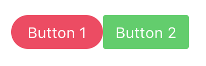
<CoolButton isSmall isDanger isRounded>Button 1</CoolButton>
<CoolButton isSmall isSuccess>Button 2</CoolButton>The above should render the following content in the DOM:
<!-- What is rendered in the DOM -->
<button class="button is-small is-danger is-rounded ">Button 1</button>

<button class="button is-small is-success">Button 2</button>
Which should be visually displayed in the following way:
As a bonus task, create a Message component. You can find the documentation on Bulma's website: https://bulma.io/documentation/components/message/.
The component will be used like this:
// JSX version
<Message isInfo title="Hello World">
  Lorem ipsum dolor sit amet, consectetur adipiscing elit.{" "}
  <strong>Pellentesque risus mi</strong>.
</Message>
Expected result:

Happy coding! ❤️


 React
React
 Typescript
 Django
 Laravel
 Facebook
 Microsoft
 Google
 Alibaba
 D3
D3
 Tencent