GithubHelp home page GithubHelp logo

segmentio / evergreen Goto Github PK

View Code? Open in Web Editor NEW
12.3K 12.3K 823.0 226.58 MB

🌲 Evergreen React UI Framework by Segment

Home Page: https://evergreen.segment.com

License: MIT License

JavaScript 87.98% TypeScript 12.02%
component-library design-systems evergreen react segment ui ui-components

evergreen's Introduction

  • Works out of the box. Evergreen contains a set of polished React components that work out of the box.

  • Flexible & composable. Evergreen components are built on top of a React UI Primitive for endless composability.

  • Enterprise-grade. Evergreen features a UI design language for enterprise-grade web applications.

Documentation & Community

Evergreen v7 Migration guide

Evergreen v7 migration guide

Install and use components

🌲 Evergreen is made up of multiple components and tools which you can import one by one. All you need to do is install the evergreen-ui package:

$ yarn add evergreen-ui
# or
$ npm install --save evergreen-ui

A working version, assuming you are using something like Create React App, might look like this:

import React from 'react'
import ReactDOM from 'react-dom'
import { Button } from 'evergreen-ui'

ReactDOM.render(<Button>I am using 🌲 Evergreen!</Button>, document.getElementById('root'))

Core values of 🌲 Evergreen

  • Evergreen is built on the belief that you can never predict all future requirements, only prepare for it. Instead of creating fixed configurations that work today, Evergreen promotes building systems that anticipate new and changing design requirements.

  • Evergreen is built on the belief that things should work out of the box with smart defaults, but also offer full control when needed. For example, Evergreen uses CSS-in-JS and builds on top of the Box component in ui-box.

  • Evergreen is built on the belief that using Evergreen and contributing to Evergreen should be a pleasant experience. We prioritize documentation and all the tools for a solid developer experience. We advocate respect and inclusivity in our writings and interactions.

FAQ

Theming support?

Evergreen supports a robust theming layer out of the box. You can check out these docs for more information regarding theming in Evergreen.

How does Server Side Rendering (SSR) work?

Evergreen offers easy Server Side Rendering (SSR) and automatic hydration.

Evergreen bundles its own CSS-in-JS solution from ui-box. To make it super easy to do server side rendering and hydration, Evergreen exposes a extractStyles() function.

Contributing to Evergreen

Please see CONTRIBUTING.md for more information on how to contribute!

πŸŽ‰ Contributors

We will add you to the list if you make any meaningful contribution!

  • Jeroen Ransijn
  • Roland Warmerdam
  • Ben McMahon
  • Matt Shwery
  • Colin Lohner
  • Allen Kleiner
  • Chris Chuck
  • Brandon Scott
  • ... many other on the Segment team and open-source contributors

This project is maintained by Segment

Please take a look at the contributing guide to better understand what to work on.

πŸ‘ Respect earns Respect

Please respect our Code of Conduct, in short:

  • Using welcoming and inclusive language
  • Being respectful of differing viewpoints and experiences
  • Gracefully accepting constructive criticism
  • Focusing on what is best for the community
  • Showing empathy towards other community members

License

Evergreen is released under the MIT license. The BlueprintJS icons are licensed under a custom Apache 2.0 license.

Copyright Β© 2021 Segment.io, Inc.

evergreen's People

Contributors

akleiner2 avatar benjaminhoffman avatar brandongregoryscott avatar calthomson avatar chenxzhang avatar chrischuck avatar colinking avatar colinlohner avatar dependabot[bot] avatar dy avatar fforres avatar flaque avatar fouad avatar idealsystemsmcp avatar jeroenransijn avatar kamebkj avatar maraisr avatar mshwery avatar nicksmider avatar notfelineit avatar pasalietis avatar prateekgoel avatar robphoenix avatar rowno avatar salolivares avatar sdoan16 avatar tusbar avatar tusharf5 avatar wangcch avatar zkuzmic avatar

Stargazers

 avatar  avatar  avatar  avatar  avatar  avatar  avatar  avatar  avatar  avatar  avatar  avatar  avatar  avatar  avatar  avatar  avatar  avatar  avatar  avatar  avatar  avatar  avatar  avatar  avatar  avatar  avatar  avatar  avatar  avatar  avatar  avatar  avatar  avatar  avatar  avatar  avatar  avatar  avatar  avatar  avatar  avatar  avatar  avatar  avatar  avatar  avatar  avatar  avatar  avatar  avatar  avatar  avatar  avatar  avatar  avatar  avatar  avatar  avatar  avatar  avatar  avatar  avatar  avatar  avatar  avatar  avatar  avatar  avatar  avatar  avatar  avatar  avatar  avatar  avatar  avatar  avatar  avatar  avatar  avatar  avatar  avatar  avatar  avatar  avatar  avatar  avatar  avatar  avatar  avatar  avatar  avatar  avatar  avatar  avatar  avatar  avatar  avatar  avatar  avatar

Watchers

 avatar  avatar  avatar  avatar  avatar  avatar  avatar  avatar  avatar  avatar  avatar  avatar  avatar  avatar  avatar  avatar  avatar  avatar  avatar  avatar  avatar  avatar  avatar  avatar  avatar  avatar  avatar  avatar  avatar  avatar  avatar  avatar  avatar  avatar  avatar  avatar  avatar  avatar  avatar  avatar  avatar  avatar  avatar  avatar  avatar  avatar  avatar  avatar  avatar  avatar  avatar  avatar  avatar  avatar  avatar  avatar  avatar  avatar  avatar  avatar  avatar  avatar  avatar  avatar  avatar  avatar  avatar  avatar  avatar  avatar  avatar  avatar  avatar  avatar  avatar  avatar  avatar  avatar  avatar  avatar  avatar  avatar  avatar  avatar  avatar  avatar  avatar  avatar  avatar  avatar  avatar  avatar  avatar  avatar  avatar  avatar  avatar  avatar  avatar  avatar

evergreen's Issues

Theming / changing colors?

Evergreen looks great and I'm thinking about using it in an upcoming open-source project.

However the documentation and storybook do not address theming as far as I can tell. Looking at the shared-styles folder it seems that the color references are hardcoded in several places.

Is it possible to override the style choices (e.g. to change the highlight colors) or implement alternative themes (e.g. a dark theme) without forking the project? If not, do you plan to add support for this in the future?

I hope this is the right avenue to ask this question as the README didn't indicate any other support channels for asking questions.

evergreen-portal

evergreen-portal is a package exporting a Popover React component. Portal is a convenience wrapper around React's Portal API. The Portal component transports it's children outside of the current DOM tree and appends it to body. It's used by the Popover component internally.

This package is required by evergreen-popover (#22)

Usage

<Portal>
  <div>Outside of the render tree</div>
</Portal>

Please add props to Storybook

Currently I have to dig thru code in order to find what props an exported component accepts. It would be extremely useful if the Storybook included this information.

Use @reactions/component for storybook and docs examples

I want move over the examples and stories to use https://reactions.github.io/component/ for state and component management. This will allow examples to contain all state and data in the example, instead of referring to outside scope.

Why?

  • Allows all the context to be in the examples. No referring to outside scope.
  • All examples will use one single convention.
  • Easier copy-paste/migration between stories and examples.
  • The https://reactions.github.io/component/ package is documented.

How examples will look

Let's take the SegmentedControl component as an example. On the docs page you will see the following snippet of code with all of the state and data visible.

<Component
  initialState={{
    options: [
      { label: 'Hourly', value: 'hourly' },
      { label: 'Daily', value: 'daily' },
      { label: 'Monthly', value: 'monthly' },
    ],
    value: 'hourly'
  }}
>
  {({ state, setState }) => (
    <SegmentedControl
      width={240}
      options={state.options}
      value={state.value}
      onChange={value => setState({ value })}
    />
  )}
</Component>

What we are doing now in some cases

As a side note, this component is almost the same to using the Manager that is being used in some components. The reason for moving over to https://reactions.github.io/component/ is a single documented way of doing this (instead of reinventing the wheel).

import React from 'react'
import PropTypes from 'prop-types'

export default class Manager extends React.Component {
  static propTypes = {
    children: PropTypes.func,
  }

  constructor(props) {
    super(props)
    this.state = {
      ...props,
    }
  }

  render() {
    return this.props.children({
      setState: (...args) => {
        this.setState(...args)
      },
      state: this.state,
    })
  }
}

evergreen-typography outline

The evergreen-typography is a package exporting React components and text styles. I am not sure yet about some of the API design. Any input is appreciated.

Usage

import {
  Text, // Primitive
  Paragraph,
  Heading,
  Code,
  Pre,
  Label,
  Small,
  Strong
}  from 'evergreen-typography'

Text component primitive

The <Text /> component is the primitive for all other text components.
It should implement a Box from ui-box.

Working example

import React from 'react'
import ReactDOM from 'react-dom'
import { Text } from 'evergreen-typography'

ReactDOM.render(<Text size={400} />, document.getElementById('root'))

The size prop

The Text component has a size prop that uses city blocks naming convention:
100, 200, 300, 400, 500, 600, 700, 800, 900.

The default size is 500 for a Text component.

Text implementation

I am thinking something like the following.

import React from 'react'
import PropTypes from 'prop-types'
import Box from 'ui-box'
import TextStyles from './text-styles'

const Text = ({ size, ...props }) => {
  return <Box {...TextStyles.get(size)} {...props} />
}

Text.defaultProps = {
  is: 'p' // not sure if this should be a `p` or a `span`
}

export default Text

Potential API's

For the most part I don't you should have to configure Text outside of properties already supported by Box. The following come to mind:

<Text textAlign='center' color='white' />

Dedicated API for color options

This begs the question if text styles should be implemented with a color.
It might be nice to have somewhat of a dedicated API for color. Here are some options I am thinking of:

<Text muted />
<Text color='muted' />
<Text color={TextColors.muted} />
<MutedText />

<Text muted /> option

This is the implementation used inside of the React UI Library (current internal Segment UI framework).

  • Short and clean
  • Allows a value to be passed
  • Pain to cancel out
  • Priority conflicts when used with color
<Text muted={null} />

<Text color='muted' /> option

This option might be powerful to use as a standard across components. I have experienced that key/value props end up the most easiest to understand.

  • This API also allows easy composition
  • Still compact API
  • Minimizes naming conflicts
  • Prevents priority conflicts when used with color
const TextColors = {
    dark: '',
    default: '', 
    muted: '',
    extraMuted: '',
}

const Text = ({ color, ...props }) => {
  return <Box {...props} color={TextColors[color] || color} />
}

<Text color={TextColors.muted} /> option

This options is to most powerful but also the most verbose.

  • Most powerful and understandable
  • More verbose
  • More to import

<MutedText /> option

  • Most powerful and understandable
  • Limited composability
  • More to import

Text based components

The following components can be fairly simply implemented on top of Text.

Paragraph, // => increases line height
Heading, // => increased font weight
Code, // => different font
Pre, // => styles added
Label, // => more semantic (I don't think different styling)
Small, // => decreased size
Strong // => sets font weight

Some might not be as useful, but it doesn't break anything either. I have experienced some engineers prefer this instead.

Potentially split up in two packages

It might be beneficial to split up the React components from the actual type styles.
This would potentially mean another package: evergreen-type-styles. This might is useful in the case of using react-sketchapp, or CSS generation tools.

What I have in Sketch so far

The text styles I have in Sketch so far are. Although I don't think we need to be that explicit up front.
I generated this today and don't think we should mirror this API.

Text
Muted Text
White Text
Heading
Muted Heading
White Heading

Text styles we should use

Still unsure if we should base everything from one set of text styles. But in my react-sketchapp generator I am using the following two objects:

heading-styles.js

const fontFamily = 'SF UI Text'

export default {
  h800: {
    fontFamily,
    fontSize: '29px',
    fontWeight: 500,
    lineHeight: '32px',
    letterSpacing: '-0.2px',
    color: '#1f4160',
  },
  h700: {
    fontFamily,
    fontSize: '28px',
    fontWeight: 500,
    lineHeight: '28px',
    letterSpacing: '-0.2px',
    color: '#1f4160',
  },
  h600: {
    fontFamily,
    fontSize: '20px',
    fontWeight: 500,
    lineHeight: '24px',
    letterSpacing: '-0.05px',
    color: '#1f4160',
  },
  h500: {
    fontFamily,
    fontSize: '16px',
    fontWeight: 500,
    lineHeight: '20px',
    letterSpacing: '-0.05px',
    color: '#1f4160',
  },
  h400: {
    fontFamily,
    fontSize: '14px',
    fontWeight: 600,
    lineHeight: '20px',
    letterSpacing: '-0.05px',
    color: '#1f4160',
  },
  h300: {
    fontFamily,
    fontSize: '12px',
    fontWeight: 600,
    lineHeight: '16px',
    letterSpacing: '0',
    color: '#1f4160',
  },
  h200: {
    fontFamily,
    fontSize: '11px',
    fontWeight: 600,
    lineHeight: '16px',
    letterSpacing: '0.3px',
    color: '#1f4160',
    textTransform: 'uppercase',
  },
  h100: {
    fontFamily,
    fontSize: '11px',
    fontWeight: 500,
    lineHeight: '16px',
    letterSpacing: '0.3px',
    color: '#1f4160',
    textTransform: 'uppercase',
  },
}

text-styles.js

const fontFamily = 'SF UI Text'

export default {
  t800: {
    fontFamily,
    fontSize: '29px',
    fontWeight: 400,
    lineHeight: '32px',
    letterSpacing: '-0.2px',
  },
  t700: {
    fontFamily,
    fontSize: '28px',
    fontWeight: 400,
    lineHeight: '28px',
    letterSpacing: '-0.2px',
  },
  t600: {
    fontFamily,
    fontSize: '20px',
    fontWeight: 400,
    lineHeight: '24px',
    letterSpacing: '-0.05px',
  },
  t500: {
    fontFamily,
    fontSize: '16px',
    fontWeight: 400,
    lineHeight: '20px',
    letterSpacing: '-0.05px',
    color: '#1f4160',
  },
  t400: {
    fontFamily,
    fontSize: '14px',
    fontWeight: 400,
    lineHeight: '20px',
    letterSpacing: '-0.05px',
  },
  t300: {
    fontFamily,
    fontSize: '12px',
    fontWeight: 400,
    lineHeight: '16px',
    letterSpacing: '0',
    color: '#1f4160',
  },
  t200: {
    fontFamily,
    fontSize: '11px',
    fontWeight: 400,
    lineHeight: '16px',
    letterSpacing: '0.3px',
    textTransform: 'uppercase',
  },
  t100: {
    fontFamily,
    fontSize: '11px',
    fontWeight: 300,
    lineHeight: '16px',
    letterSpacing: '0.3px',
    textTransform: 'uppercase',
  },
}

SelectMenu outline

A DropdownMenu component that can be triggered by buttons and select like interfaces.

  • Works similar to a Popover component, wrap any button
  • Should allow for multiSelect and maxSelection props
  • Should use virtualization with react-tiny-virtual-list just like in Autocomplete
  • Uses fuzzaldrin-plus by default for filtering
  • Should allow for adding new/custom values Filter or enter value... in search bar, allowCustomValues prop (?)

Remaining questions

  • Should we MenuItem (name tbd) use TableRow or not?
  • Should we use Downshift? we'll get a lot of functionality and accessibility for free

Design Example

dropdown-menu-example

Current implementation

I have already build a working implementation of this thing, but there is still some API tweaks I would like to make β€”Β and some implementation details to consider.

Take a look at the current code and implementation
import React, { PureComponent } from 'react'
import PropTypes from 'prop-types'
import fuzzaldrin from 'fuzzaldrin-plus'
import { Pane } from 'evergreen-layers'
import VirtualList from 'react-tiny-virtual-list'
import { TableRow, TextTableCell, SearchTableHeaderCell } from 'evergreen-table'

const fuzzyFilter = (items, input) => fuzzaldrin.filter(items, input)

const CheckIcon = ({ fill = 'currentColor', ...props }) => (
  <svg width={10} height={7} viewBox="0 0 10 7" {...props}>
    <path
      fill={fill}
      fillRule="evenodd"
      d="M4 4.586L1.707 2.293A1 1 0 1 0 .293 3.707l3 3a.997.997 0 0 0 1.414 0l5-5A1 1 0 1 0 8.293.293L4 4.586z"
    />
  </svg>
)

CheckIcon.propTypes = {
  fill: PropTypes.string,
}

const itemRenderer = ({ key, name, onSelect, isSelected, style, height }) => (
  <TableRow
    key={key}
    isSelectable
    onSelect={onSelect}
    isSelected={isSelected}
    style={style}
    display="flex"
    alignItems="center"
  >
    <Pane
      paddingLeft={11}
      paddingRight={8}
      marginTop={-5}
      opacity={isSelected ? 1 : 0}
    >
      <CheckIcon />
    </Pane>
    <TextTableCell
      height={height - 1}
      textProps={{ color: 'inherit' }}
      paddingLeft={0}
      borderRight={null}
    >
      {name}
    </TextTableCell>
  </TableRow>
)

itemRenderer.propTypes = {
  key: PropTypes.oneOf([PropTypes.string, PropTypes.number]),
  name: PropTypes.string,
  style: PropTypes.any,
  height: PropTypes.number,
  onSelect: PropTypes.func,
  isSelected: PropTypes.bool,
}

const ItemShapePropType = PropTypes.shape({
  name: PropTypes.string,
  value: PropTypes.oneOf([PropTypes.string, PropTypes.number]),
})

export default class SelectableList extends PureComponent {
  static propTypes = {
    items: PropTypes.arrayOf(ItemShapePropType),
    close: PropTypes.func,
    selected: PropTypes.arrayOf(ItemShapePropType),
    onSelect: PropTypes.func,
    itemSize: PropTypes.number,
    listHeight: PropTypes.number,
    renderItem: PropTypes.func,
    placeholder: PropTypes.string,
    itemsFilter: PropTypes.func,
    defaultSearchValue: PropTypes.string,
  }

  static defaultProps = {
    items: [],
    // Including border bottom
    // For some reason passing height to TableRow doesn't work
    itemSize: 33,
    onSelect: () => {},
    selected: [],
    listHeight: 208,
    renderItem: itemRenderer,
    itemsFilter: fuzzyFilter,
    placeholder: 'Filter...',
    defaultSearchValue: '',
  }

  constructor(props, context) {
    super(props, context)

    this.state = {
      searchValue: props.defaultSearchValue,
      selected: props.selected,
    }
  }

  componentDidMount() {
    window.setTimeout(() => {
      this.searchRef.querySelector('input').focus()
    }, 1)
  }

  componentWillReceiveProps(nextProps) {
    if (nextProps.selected !== this.state.selected) {
      this.setState({
        selected: nextProps.selected,
      })
    }
  }

  isSelected = item => {
    const { selected } = this.state

    return !!selected.find(selectedItem => selectedItem.value === item.value)
  }

  search = items => {
    const { itemsFilter } = this.props
    const { searchValue } = this.state
    return searchValue.trim() === ''
      ? items
      : itemsFilter(items.map(item => item.name), searchValue).map(name =>
          items.find(n => n.name === name),
        )
  }

  handleChange = searchValue => {
    this.setState({
      searchValue,
    })
  }

  handleSelect = item => {
    this.props.onSelect(item)
  }

  render() {
    const {
      items: originalItems,
      close,
      onSelect,
      itemSize,
      selected,
      listHeight,
      renderItem,
      itemsFilter,
      placeholder,
      defaultSearchValue,
      ...props
    } = this.props
    const items = this.search(originalItems)

    return (
      <Pane
        height={240}
        width={280}
        display="flex"
        flexDirection="column"
        {...props}
      >
        <TableRow>
          <SearchTableHeaderCell
            onChange={this.handleChange}
            innerRef={ref => (this.searchRef = ref)}
            borderRight={null}
            height={32}
          />
        </TableRow>
        <Pane flex={1}>
          <VirtualList
            height={listHeight}
            width="100%"
            itemSize={itemSize}
            itemCount={items.length}
            overscanCount={3}
            scrollToAlignment="auto"
            renderItem={({ index, style }) => {
              const item = items[index]
              return renderItem({
                key: item.value,
                name: item.name,
                style,
                height: itemSize,
                onSelect: () => this.handleSelect(item),
                isSelected: this.isSelected(item),
              })
            }}
          />
        </Pane>
      </Pane>
    )
  }
}

Usage example

<MenuPopover
  title={title}
  items={items}
  onSelect={this.handleSelect}
  selected={this.state.selected}
>
  <StatelessInlineMenuButton {...statelessProps}>
    {name}
  </StatelessInlineMenuButton>
</MenuPopover>

Items API

In some cases you want the label to be different in the list as in the button. For example if you are dealing with =, you want = (equals) in the menu list. I am suggesting the following API, which is different from what's in the current implementation:

const items = [
  {
    label: '=',
    labelInList: '= (equals)', // optional
    value: 'equals'
  },
  {
    label: '!=',
    labelInList: '!= (not equals)', // optional
    value: 'not_equals'
  }
]
ItemShapePropType
const ItemShapePropType = PropTypes.shape({
  label: PropTypes.string,
  labelInList: PropTypes.string,
  value: PropTypes.oneOf([PropTypes.string, PropTypes.number]),
})

Naming considerations

Some of the options I could think about for naming this thing are:

Option 1 β€”Β Menu

  • evergreen-menu
  • evergreen-menu-popover

Option 2 β€”Β OptionList

  • evergreen-option-list
  • evergreen-option-list-popover

Option 3 β€”Β SelectableList

  • evergreen-selectable-list
  • evergreen-selectable-list-popover

Option 4 β€”Β SelectMenu

  • evergreen-select-menu
  • evergreen-select-menu-popover

I am not sure about naming yet, the term Menu might be better used in a more traditional dropdown menu like this:

screen shot 2017-11-30 at 1 00 16 pm

How is this different from Autocomplete and Combobox?

Combobox is a little bulky in some cases, it does add more affordability, so i think there will still be use cases for it. We'll want to make the look and feel consistent of the actual list of both this component and the Autocomplete.

evergreen-popover outline

evergreen-popover is a package exporting a Popover React component. Popovers display floating content in relation to a target. Popovers appear either at the top or bottom of their target. The preferred and default side is the bottom. Popovers use smart positioning if there is not enough space on the bottom.

Popover contents are rendered in a newly created element appended to document.body using the Portal component (#23). This will use React 16 ReactDOM.createPortal.

When creating a popover, you must specify both:

  • its content, by setting the content prop, and
  • its target, as a single child element or a function

When you pass a function to the content prop you will be able to close the popover inside of the content.

Popovers close on:

  • outside click
  • escape key
  • window resize
  • something in content that calls the close function

Design Example

  • The Card that is rendered is a <Card elevation={3} />.

popover example

Usage

import { Pane } from 'evergreen-layers'
import { Text } from 'evergreen-typography'
import { Button } from 'evergreen-buttons'

const ClosablePopoverContent = ({ close }) => (
  <Pane
    width="240px"
    height="240px"
    display="flex"
    alignItems="center"
    justifyContent="center"
    flexDirection="column"
  >
    <Text>Hello World</Text>
    <Button onClick={close}>Close</Button>
  </Pane>
)

// Using it with a child, will use cloneElement under the hood
const directChildUsage = (
  <Popover
    content={({ close }) => <ClosablePopoverContent close={close} />}
    display="inline-block"
  >
    <Button>Trigger Bottom</Button>
  </Popover>
)

// Using it with a function for complete control
const controlUsage = (
  <Popover
    content={({ close }) => <ClosablePopoverContent close={close} />}
    display="inline-block"
  >
    {({ isOpen, toggle, getRef }) => (
      <Button
        // You can use `isOpen` to set a className or some properties
        className={isOpen ? 'open' : 'close'}
        onClick={toggle}
        // getRef is used to get the ref of the element we need to run
        // getBoundingClientRect() on
        innerRef={ref => getRef(ref)}
      >
        Trigger Bottom
      </Button>
    )}
  </Popover>
)

Prop Types

This is the first pass on the prop types. How we will deal with openProps might change. And maybe we will have a targetOffset prop.

prop type default description
children (element, func).isRequired undefined the target
content (node, func).isRequired undefined content shown in Popover
onOpen func.isRequired () => {} on open callback
onClose func.isRequired () => {} on close callback
side bottom, `top` bottom preferred side to show Popover
useSmartPositioning bool true toggle smart positioning
zIndexContent number 50 z-index property of Popover content
openProps object {} props passed to the target when using cloneElement

V3 Milestone

The goal of V3 is to stabilize and unify the APIs for our main interaction patterns: CornerDialog, SideSheet, Popover and Dialog. Dialog already has the latest API in v2. To avoid many major releases we will roll up these changes in v3.

Potentially we also unify the API between Combobox and SelectMenu.

autoFocus issue with Popover

There is some janky issue with autoFocus and scrolling behavior that misaligns the Popover if it has a input with autoFocus in there:

Example of broken Popover alignment

broken

Without autoFocus it works

without-autofocus

Workaround

Focus the input field inside a setTimeout.

  componentDidMount() {
    window.setTimeout(() => {
      this.searchRef.querySelector('input').focus()
    }, 1)
  }

fix

evergreen-colors outline

The first package that needs to be added is evergreen-colors. I have generated a new color extended color palette, loosely based on Material colors.

How the color system works

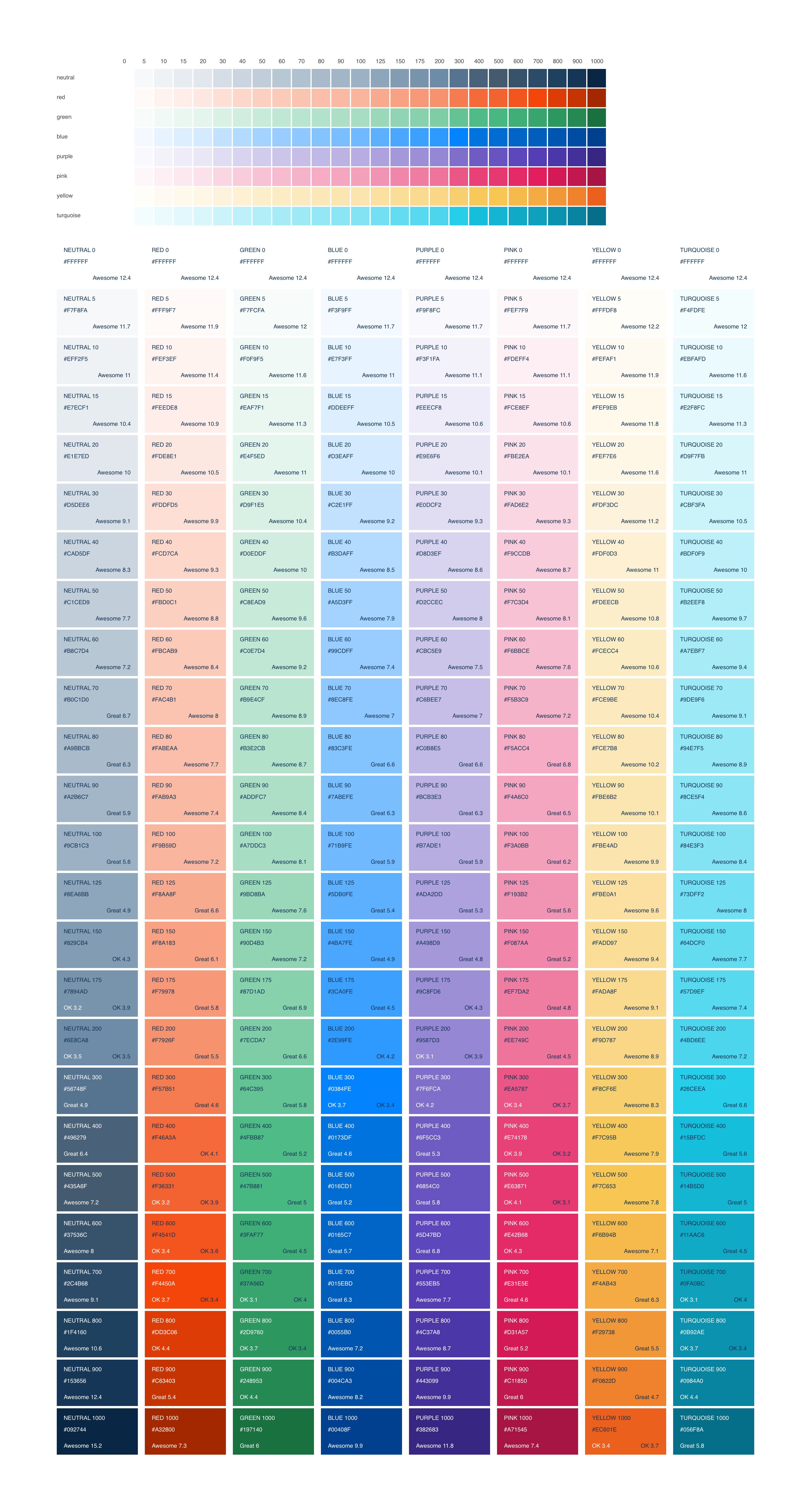
The color system is a set of different colors groups that have each a set of tints and shades.

  • The primary color of each color group is called 500.
  • The darkest shade is called 1000.
  • The lightest color is 5. (0 would be white)

extended color system

Transparent variations for all colors below 500

There is another identical color system that uses transparent colors instead of fully opaque colors.
This is helpful for text colors, borders, box shadows. Only colors below 500 are transparent.

extended color system alpha

Example API

import colors from 'evergreen-colors'

// colors is a object with each color group as a key
colors.neutral
colors.green
colors.red
colors.blue
colors.purple
colors.pink
colors.yellow
colors.turquoise
colors.white

// Each color group has a list of colors as a key
colors.neutral['300A']
colors.neutral['400']
colors.neutral['500'] // primary

colors.purple['500'] // primary

White is an exception

Since there is no darker variation of white (everything over 500).
White only has a 500, and everything below 500 is transparent: 300A, 400A etc.

The export JSON of all the colors

The following JSON is what I think should be the only thing exported from the package.

{
  "neutral": {
    "3A": "rgba(67,90,111,0.025)",
    "5A": "rgba(67,90,111,0.041)",
    "7A": "rgba(67,90,111,0.057)",
    "10A": "rgba(67,90,111,0.079)",
    "15A": "rgba(67,90,111,0.114)",
    "20A": "rgba(67,90,111,0.146)",
    "30A": "rgba(67,90,111,0.204)",
    "40A": "rgba(67,90,111,0.255)",
    "50A": "rgba(67,90,111,0.301)",
    "60A": "rgba(67,90,111,0.342)",
    "70A": "rgba(67,90,111,0.38)",
    "80A": "rgba(67,90,111,0.415)",
    "90A": "rgba(67,90,111,0.447)",
    "100A": "rgba(67,90,111,0.477)",
    "125A": "rgba(67,90,111,0.544)",
    "150A": "rgba(67,90,111,0.602)",
    "175A": "rgba(67,90,111,0.653)",
    "200A": "rgba(67,90,111,0.699)",
    "300A": "rgba(67,90,111,0.845)",
    "400A": "rgba(67,90,111,0.954)",
    "3": "#fafbfc",
    "5": "#f7f8fa",
    "7": "#f3f6f8",
    "10": "#eff2f5",
    "15": "#e7ecf1",
    "20": "#e1e7ed",
    "30": "#d5dee6",
    "40": "#cad5df",
    "50": "#c1ced9",
    "60": "#b8c7d4",
    "70": "#b0c1d0",
    "80": "#a9bbcb",
    "90": "#a2b6c7",
    "100": "#9cb1c3",
    "125": "#8ea6bb",
    "150": "#829cb4",
    "175": "#7894ad",
    "200": "#6e8ca8",
    "300": "#56748f",
    "400": "#496279",
    "500": "#435a6f",
    "600": "#37536c",
    "700": "#2c4b68",
    "800": "#1f4160",
    "900": "#153656",
    "1000": "#092744"
  },
  "red": {
    "3A": "rgba(243,99,49,0.025)",
    "5A": "rgba(243,99,49,0.041)",
    "7A": "rgba(243,99,49,0.057)",
    "10A": "rgba(243,99,49,0.079)",
    "15A": "rgba(243,99,49,0.114)",
    "20A": "rgba(243,99,49,0.146)",
    "30A": "rgba(243,99,49,0.204)",
    "40A": "rgba(243,99,49,0.255)",
    "50A": "rgba(243,99,49,0.301)",
    "60A": "rgba(243,99,49,0.342)",
    "70A": "rgba(243,99,49,0.38)",
    "80A": "rgba(243,99,49,0.415)",
    "90A": "rgba(243,99,49,0.447)",
    "100A": "rgba(243,99,49,0.477)",
    "125A": "rgba(243,99,49,0.544)",
    "150A": "rgba(243,99,49,0.602)",
    "175A": "rgba(243,99,49,0.653)",
    "200A": "rgba(243,99,49,0.699)",
    "300A": "rgba(243,99,49,0.845)",
    "400A": "rgba(243,99,49,0.954)",
    "3": "#fffbfa",
    "5": "#fff9f7",
    "7": "#fef6f3",
    "10": "#fef3ef",
    "15": "#feede8",
    "20": "#fde8e1",
    "30": "#fddfd5",
    "40": "#fcd7ca",
    "50": "#fbd0c1",
    "60": "#fbcab9",
    "70": "#fac4b1",
    "80": "#fabeaa",
    "90": "#fab9a3",
    "100": "#f9b59d",
    "125": "#f8aa8f",
    "150": "#f8a183",
    "175": "#f79978",
    "200": "#f7926f",
    "300": "#f57b51",
    "400": "#f46a3a",
    "500": "#f36331",
    "600": "#f4541d",
    "700": "#f4450a",
    "800": "#dd3c06",
    "900": "#c63403",
    "1000": "#a32800"
  },
  "green": {
    "3A": "rgba(71,184,129,0.025)",
    "5A": "rgba(71,184,129,0.041)",
    "7A": "rgba(71,184,129,0.057)",
    "10A": "rgba(71,184,129,0.079)",
    "15A": "rgba(71,184,129,0.114)",
    "20A": "rgba(71,184,129,0.146)",
    "30A": "rgba(71,184,129,0.204)",
    "40A": "rgba(71,184,129,0.255)",
    "50A": "rgba(71,184,129,0.301)",
    "60A": "rgba(71,184,129,0.342)",
    "70A": "rgba(71,184,129,0.38)",
    "80A": "rgba(71,184,129,0.415)",
    "90A": "rgba(71,184,129,0.447)",
    "100A": "rgba(71,184,129,0.477)",
    "125A": "rgba(71,184,129,0.544)",
    "150A": "rgba(71,184,129,0.602)",
    "175A": "rgba(71,184,129,0.653)",
    "200A": "rgba(71,184,129,0.699)",
    "300A": "rgba(71,184,129,0.845)",
    "400A": "rgba(71,184,129,0.954)",
    "3": "#fafdfc",
    "5": "#f7fcfa",
    "7": "#f5fbf8",
    "10": "#f0f9f5",
    "15": "#eaf7f1",
    "20": "#e4f5ed",
    "30": "#d9f1e5",
    "40": "#d0eddf",
    "50": "#c8ead9",
    "60": "#c0e7d4",
    "70": "#b9e4cf",
    "80": "#b3e2cb",
    "90": "#addfc7",
    "100": "#a7ddc3",
    "125": "#9bd8ba",
    "150": "#90d4b3",
    "175": "#87d1ad",
    "200": "#7ecda7",
    "300": "#64c395",
    "400": "#4fbb87",
    "500": "#47b881",
    "600": "#3faf77",
    "700": "#37a56d",
    "800": "#2d9760",
    "900": "#248953",
    "1000": "#197140"
  },
  "blue": {
    "3A": "rgba(1,108,209,0.025)",
    "5A": "rgba(1,108,209,0.041)",
    "7A": "rgba(1,108,209,0.057)",
    "10A": "rgba(1,108,209,0.079)",
    "15A": "rgba(1,108,209,0.114)",
    "20A": "rgba(1,108,209,0.146)",
    "30A": "rgba(1,108,209,0.204)",
    "40A": "rgba(1,108,209,0.255)",
    "50A": "rgba(1,108,209,0.301)",
    "60A": "rgba(1,108,209,0.342)",
    "70A": "rgba(1,108,209,0.38)",
    "80A": "rgba(1,108,209,0.415)",
    "90A": "rgba(1,108,209,0.447)",
    "100A": "rgba(1,108,209,0.477)",
    "125A": "rgba(1,108,209,0.544)",
    "150A": "rgba(1,108,209,0.602)",
    "175A": "rgba(1,108,209,0.653)",
    "200A": "rgba(1,108,209,0.699)",
    "300A": "rgba(1,108,209,0.845)",
    "400A": "rgba(1,108,209,0.954)",
    "3": "#f8fbff",
    "5": "#f3f9ff",
    "7": "#eef7ff",
    "10": "#e7f3ff",
    "15": "#ddeeff",
    "20": "#d3eaff",
    "30": "#c2e1ff",
    "40": "#b3daff",
    "50": "#a5d3ff",
    "60": "#99cdff",
    "70": "#8ec8fe",
    "80": "#83c3fe",
    "90": "#7abefe",
    "100": "#71b9fe",
    "125": "#5db0fe",
    "150": "#4ba7fe",
    "175": "#3ca0fe",
    "200": "#2e99fe",
    "300": "#0384fe",
    "400": "#0173df",
    "500": "#016cd1",
    "600": "#0165c7",
    "700": "#015ebd",
    "800": "#0055b0",
    "900": "#004ca3",
    "1000": "#00408f"
  },
  "purple": {
    "3A": "rgba(104,84,192,0.025)",
    "5A": "rgba(104,84,192,0.041)",
    "7A": "rgba(104,84,192,0.057)",
    "10A": "rgba(104,84,192,0.079)",
    "15A": "rgba(104,84,192,0.114)",
    "20A": "rgba(104,84,192,0.146)",
    "30A": "rgba(104,84,192,0.204)",
    "40A": "rgba(104,84,192,0.255)",
    "50A": "rgba(104,84,192,0.301)",
    "60A": "rgba(104,84,192,0.342)",
    "70A": "rgba(104,84,192,0.38)",
    "80A": "rgba(104,84,192,0.415)",
    "90A": "rgba(104,84,192,0.447)",
    "100A": "rgba(104,84,192,0.477)",
    "125A": "rgba(104,84,192,0.544)",
    "150A": "rgba(104,84,192,0.602)",
    "175A": "rgba(104,84,192,0.653)",
    "200A": "rgba(104,84,192,0.699)",
    "300A": "rgba(104,84,192,0.845)",
    "400A": "rgba(104,84,192,0.954)",
    "3": "#fbfbfd",
    "5": "#f9f8fc",
    "7": "#f6f5fb",
    "10": "#f3f1fa",
    "15": "#eeecf8",
    "20": "#e9e6f6",
    "30": "#e0dcf2",
    "40": "#d8d3ef",
    "50": "#d2ccec",
    "60": "#cbc5e9",
    "70": "#c6bee7",
    "80": "#c0b8e5",
    "90": "#bcb3e3",
    "100": "#b7ade1",
    "125": "#ada2dd",
    "150": "#a498d9",
    "175": "#9c8fd6",
    "200": "#9587d3",
    "300": "#7f6fca",
    "400": "#6f5cc3",
    "500": "#6854c0",
    "600": "#5d47bd",
    "700": "#553eb5",
    "800": "#4c37a8",
    "900": "#443099",
    "1000": "#382683"
  },
  "pink": {
    "3A": "rgba(230,56,113,0.025)",
    "5A": "rgba(230,56,113,0.041)",
    "7A": "rgba(230,56,113,0.057)",
    "10A": "rgba(230,56,113,0.079)",
    "15A": "rgba(230,56,113,0.114)",
    "20A": "rgba(230,56,113,0.146)",
    "30A": "rgba(230,56,113,0.204)",
    "40A": "rgba(230,56,113,0.255)",
    "50A": "rgba(230,56,113,0.301)",
    "60A": "rgba(230,56,113,0.342)",
    "70A": "rgba(230,56,113,0.38)",
    "80A": "rgba(230,56,113,0.415)",
    "90A": "rgba(230,56,113,0.447)",
    "100A": "rgba(230,56,113,0.477)",
    "125A": "rgba(230,56,113,0.544)",
    "150A": "rgba(230,56,113,0.602)",
    "175A": "rgba(230,56,113,0.653)",
    "200A": "rgba(230,56,113,0.699)",
    "300A": "rgba(230,56,113,0.845)",
    "400A": "rgba(230,56,113,0.954)",
    "3": "#fefafb",
    "5": "#fef7f9",
    "7": "#fef4f7",
    "10": "#fdeff4",
    "15": "#fce8ef",
    "20": "#fbe2ea",
    "30": "#fad6e2",
    "40": "#f9ccdb",
    "50": "#f7c3d4",
    "60": "#f6bbce",
    "70": "#f5b3c9",
    "80": "#f5acc4",
    "90": "#f4a6c0",
    "100": "#f3a0bb",
    "125": "#f193b2",
    "150": "#f087aa",
    "175": "#ef7da2",
    "200": "#ee749c",
    "300": "#ea5787",
    "400": "#e74178",
    "500": "#e63871",
    "600": "#e42b68",
    "700": "#e31e5e",
    "800": "#d31a57",
    "900": "#c11850",
    "1000": "#a71545"
  },
  "yellow": {
    "3A": "rgba(247,198,83,0.025)",
    "5A": "rgba(247,198,83,0.041)",
    "7A": "rgba(247,198,83,0.057)",
    "10A": "rgba(247,198,83,0.079)",
    "15A": "rgba(247,198,83,0.114)",
    "20A": "rgba(247,198,83,0.146)",
    "30A": "rgba(247,198,83,0.204)",
    "40A": "rgba(247,198,83,0.255)",
    "50A": "rgba(247,198,83,0.301)",
    "60A": "rgba(247,198,83,0.342)",
    "70A": "rgba(247,198,83,0.38)",
    "80A": "rgba(247,198,83,0.415)",
    "90A": "rgba(247,198,83,0.447)",
    "100A": "rgba(247,198,83,0.477)",
    "125A": "rgba(247,198,83,0.544)",
    "150A": "rgba(247,198,83,0.602)",
    "175A": "rgba(247,198,83,0.653)",
    "200A": "rgba(247,198,83,0.699)",
    "300A": "rgba(247,198,83,0.845)",
    "400A": "rgba(247,198,83,0.954)",
    "3": "#fffefb",
    "5": "#fffdf8",
    "7": "#fffcf5",
    "10": "#fefaf1",
    "15": "#fef9eb",
    "20": "#fef7e6",
    "30": "#fdf3dc",
    "40": "#fdf0d3",
    "50": "#fdeecb",
    "60": "#fcecc4",
    "70": "#fce9be",
    "80": "#fce7b8",
    "90": "#fbe6b2",
    "100": "#fbe4ad",
    "125": "#fbe0a1",
    "150": "#fadd97",
    "175": "#fada8f",
    "200": "#f9d787",
    "300": "#f8cf6e",
    "400": "#f7c95b",
    "500": "#f7c653",
    "600": "#f6b94b",
    "700": "#f4ab43",
    "800": "#f29738",
    "900": "#f0822d",
    "1000": "#ec601e"
  },
  "turquoise": {
    "3A": "rgba(20,181,208,0.025)",
    "5A": "rgba(20,181,208,0.041)",
    "7A": "rgba(20,181,208,0.057)",
    "10A": "rgba(20,181,208,0.079)",
    "15A": "rgba(20,181,208,0.114)",
    "20A": "rgba(20,181,208,0.146)",
    "30A": "rgba(20,181,208,0.204)",
    "40A": "rgba(20,181,208,0.255)",
    "50A": "rgba(20,181,208,0.301)",
    "60A": "rgba(20,181,208,0.342)",
    "70A": "rgba(20,181,208,0.38)",
    "80A": "rgba(20,181,208,0.415)",
    "90A": "rgba(20,181,208,0.447)",
    "100A": "rgba(20,181,208,0.477)",
    "125A": "rgba(20,181,208,0.544)",
    "150A": "rgba(20,181,208,0.602)",
    "175A": "rgba(20,181,208,0.653)",
    "200A": "rgba(20,181,208,0.699)",
    "300A": "rgba(20,181,208,0.845)",
    "400A": "rgba(20,181,208,0.954)",
    "3": "#f9fefe",
    "5": "#f4fdfe",
    "7": "#f0fcfe",
    "10": "#ebfafd",
    "15": "#e2f8fc",
    "20": "#d9f7fb",
    "30": "#cbf3fa",
    "40": "#bdf0f9",
    "50": "#b2eef8",
    "60": "#a7ebf7",
    "70": "#9de9f6",
    "80": "#94e7f5",
    "90": "#8ce5f4",
    "100": "#84e3f3",
    "125": "#73dff2",
    "150": "#64dcf0",
    "175": "#57d9ef",
    "200": "#4bd6ee",
    "300": "#26ceea",
    "400": "#15bfdc",
    "500": "#14b5d0",
    "600": "#11aac6",
    "700": "#0fa0bc",
    "800": "#0b92ae",
    "900": "#0984a0",
    "1000": "#056f8a"
  },
  "white": {
    "3A": "rgba(255,255,255,0.025)",
    "5A": "rgba(255,255,255,0.041)",
    "7A": "rgba(255,255,255,0.057)",
    "10A": "rgba(255,255,255,0.079)",
    "15A": "rgba(255,255,255,0.114)",
    "20A": "rgba(255,255,255,0.146)",
    "30A": "rgba(255,255,255,0.204)",
    "40A": "rgba(255,255,255,0.255)",
    "50A": "rgba(255,255,255,0.301)",
    "60A": "rgba(255,255,255,0.342)",
    "70A": "rgba(255,255,255,0.38)",
    "80A": "rgba(255,255,255,0.415)",
    "90A": "rgba(255,255,255,0.447)",
    "100A": "rgba(255,255,255,0.477)",
    "125A": "rgba(255,255,255,0.544)",
    "150A": "rgba(255,255,255,0.602)",
    "175A": "rgba(255,255,255,0.653)",
    "200A": "rgba(255,255,255,0.699)",
    "300A": "rgba(255,255,255,0.845)",
    "400A": "rgba(255,255,255,0.954)",
    "500": "#ffffff"
  }
}

evergreen-text-input outline

evergreen-text-input is a package exporting a TextInput React component. I have been thinking of combining some components in a single forms or controls package. But I think it might be cleaner to start with one per package.

Usage

import {
  TextInput
} from 'evergreen-text-input'

<TextInput name='a' value='b' placeholder='Placeholder...' />

Design example

screen shot 2017-09-14 at 9 58 25 am

Key implementation takeaways

  • TextInput implements Text from evergreen-typography (?)
  • is="input" by default
  • Accepts a isInvalid prop

Not sure yet about the following

  • Should implement Text or Box (?)
  • Group all controls or form elements together in a single package (?)
  • Maybe create a evergreen-shared-styles or evergreen-control-styles package

[request] Make demo Storybook available

It would be cool to link to a running demo of the packages we've implemented so far.
I love sharing what we've been building so far, as it gets people excited about our progress and helps recruit contributors.

I'm happy to take a stab at this if you're too busy, @jeroenransijn

Consider creating a "top level" package

I'm currently building a small app using Evergreen and have found it super tedious to have to keep npm installing packages. @stevenmiller888 and I briefly discussed the idea of creating a "top level" package which exports all Evergreen components so this need is removed.

In order to keep our compiled production bundle size reasonable, maybe we also create a Babel plugin to rewrite import { TableCell } from 'evergreen' to import { TableCell } from 'evergreen-table'?

Thoughts? @jeroenransijn

Make Dialog component height auto size

Currently the Dialog component has a static value for height. This requires the developer to manually set the dialog every time they want to use the component. Ideally, the dialog height would be determined by the contents in the dialog

iconSize issue

There is some wonkiness around icon sizing, this should get fixed.

Option rendering issue

This is an issue in evergreen-ui v2.

The problem here is most likely due to box-sizing: border-box.

image

Autocomplete openOnFocus prop

In some cases we want Autocomplete to be triggered as soon as we focus the field. We are going to add a openOnFocus prop to make this happen. We will make it false by default.

Add a Disabled Style for the Link Component

The link component currently has a few styles (green, blue, default). We should also include a style for disabled. This would make it a muted color and would show the 'not-allowed' cursor when hovering

evergreen-buttons outline

evergreen-buttons is a package exporting React components and a ButtonAppearances object. I think this package should export some opinionated button components too: CloseButton, BackButton, IconButton. Maybe more in the future.

Usage

import {
  Button,
  CloseButton,
  BackButton,
  IconButton, 
  ButtonAppearances
}  from 'evergreen-buttons'

<Button>Default (32)</Button>
<Button height={40}>Default 40</Button>
<Button height={36}>Default 36</Button>
<Button height={28}>Default 28</Button>

<Button appearance="green">Green</Button>
<Button appearance="blue">Blue</Button>
<Button appearance="red">Label</Button>

Design Example

screen shot 2017-09-04 at 5 49 08 pm

Key Implementation take aways

  • Button is="button" by default
  • Button implements Text
  • Button, and other controls, are infinitely scaleable on our 4px soft grid
  • Button height determines text size
  • Button uses ui font family
  • Button implements a appearance property that maps to ButtonAppearances
  • ButtonAppearances is an object containing available styles
  • default is the default prop for the appearance property

Button implements Text

A button is build up of text styles and stateful layer styles (default, hover, active, focus). Therefore a button component should implement the Text component. The stateful layer styles will be implemented through the ButtonAppearances object.

Using the css property on ui-box for appearance.

Since there is not a huge value proposition for overwriting the appearance of a button, I am leaning towards using the css property on ui-box to implement the stateful layer styles (but not dimensions).

const ButtonAppearances = {
   default: { ... },
   red: { ... },
   green: { ... },
   blue: { ... },
}

Directly referencing colors

Instead of using a indirection of primary => green and danger => red, I lean towards the simpler green and red. You can make mappings or new components in your application layer to add semantics or abstractions like these.

Button, and other controls, are infinitely scaleable on our 4px soft grid

In a lot of cases, design systems implement a abstraction to express different button sizes. This can be something like small, medium, large. I have mixed feelings about this, because it's a level of indirection that is hard to change in the future. Instead I would like to try a different approach.

Infinitely scalable buttons

One of the premises I am building this design system on, is that you can never anticipate all future requirements, only prepare for it. In a different project I have implemented a button component that is infinitely scalable by simply setting the height property. Your components become less dependent on other use cases throughout your app. It is somewhat harder to change small or medium later on, or put a new size in between.

The benefit of referring to a small or medium button is almost non-existent in my experience, instead designers and engineers would use references as Button 32 and Button 40 in communication and design documentation.

Restricting the height you pass

While it is great to have buttons be available in any size, it becomes annoying for the implementer not to have any height constraints. To solve that, the height property will only accept values on the grid.

4px soft grid height enforcement

The grid scale we are using is a 8px major scale, with a 4px minor scale. I am not sure how this will be enforced, but I think we'll just accept anything you can divide by 4Β β€” and otherwise throw an error / violation.

Using the height to get the text size

Because the height is infinitely scalable (on our soft grid), we need the text size to adjust when the height adjusts. In the past I have done this at one point using a function similar to getTextStyleForControl({ height }). The right final abstraction will require me playing around a little.

Disabled styles

Disabled styles should be implemented on [disabled] for buttons and [data-disabled] for links.

React Router Link and Link component

In some cases you need the styling of a Button with functionality of a ReactRouterLink or Link component. This can be done through setting the is property to this component:

<Button is={Link}>Label</Button>

IconButton

This should be used for a single icon.

BackButton

This should be a Button with a left arrow icon and text.

CloseButton

This should be a Button with a close icon and text.

Add support for icons in Button

With the recent addition of IconMap it's pretty straightforward to add support for icons inside of Button. I am thinking also exporting a BackButton preset.

API outline

<Button iconBefore="arrow" iconBeforeAim="left">Back</Button>
<BackButton>Same as the one above</BackButton>

<Button iconAfter="triangle" iconAfterAim="down">Filter</Button>

Props

  • iconBefore
  • iconBeforeAim
  • iconAfter
  • iconAfterAim

Stuff that is not great and we should address some day

This is a place to write down stuff that doesn't make a ton of sense and should be changes one day.

  • Border colors is using extraMuted as default. But also has name called default
  • <Pane appearance="dark" /> is never used.
  • <Pane appearance="selected" /> is only rarely used.
  • Positioner (maybe) should use Popper.js just like BlueprintJS. It will be more reliable.
  • Our icons should allow for any svg
  • Our icons should not be wrapped in a Box I think. I like how react-icons exports their icon works.
  • We should consider deprecating SubHeading since it's never used.

evergreen-tooltip outline

evergreen-tooltip is a package exporting a Tooltip React component. Tooltips display floating content in relation to a target. Tooltip appear either at the top, bottom, left or right of their target. The preferred and default side is the bottom. Maybe Tooltips use smart positioning if there is not enough space on the preferred side.

Tooltips use a similar implementation to Popovers, maybe there will be a shared package that both of them implement.

When creating a popover, you must specify both:

  • its content, by setting the content prop, and
  • its target, as a single child element or a function

Tooltips implement onMouseLeave and onMouseEnter.

Tooltips should be dark by default and implement something like colors.neutral['900'] with opacity.

Moving over to a single top level package `evergreen` or `evergreen-ui`

Read the complete background on this issue here: #103.

After having tried a Lerna mono-repo, we found that the benefits don't outweigh the downsides. The main issues are:

  • A lot of boilerplate to import components
  • Keeping dependencies in sync is a pain for the consumer
  • Publishing packages gets confusing
  • Harder to setup code splitting

That's why we are in the progress of moving towards a single evergreen-ui package.

I have made PoC codemod to move over current projects that use Evergreen. Which mainly internal projects at Segment.

  • We'll rename the current package folders from evergeen-colors into colors.
  • Test and run a codemod script on the current projects using Evergreen

Remove Max Width on Alert component

I might be missing context on why maxWidth is set to 400px on Alert components. I ran into an issue where I needed to manually override this property to set the width properly. Do we need it set to 400px?

evergreen-badges outline

evergreen-badges is a package exporting a Badge, and Pill React component.

Usage

import {
  Badge,
  Pill
} from 'evergreen-badges'

<Badge appearance="neutral">Neutral badge</Badge>
<Badge appearance="red" isSolid>Solid Red badge</Badge>

<Pill appearance="red">99</Pill>
<Pill appearance="blue" isSolid>2</Pill>

Design example

badges pills

Usage

  • Use Pill for numbers: 1-99
  • Use Badge for status: success, new, etc.

Implementation details

The Badge component should implement the Strong component.
Pill will implement Badge with a rounded border radius, similar to how a Card implements Pane with a additional border radius prop.

Key implementation takeaways

  • Badge implements Strong from evergreen-typography
  • Pill implements Badge
  • Default height is 16px (line-height should be 16px for size=200)
  • Display inline-block
  • isSolid is false by default (defaultProps)
  • Default appearance is neutral (defaultProps)
  • Badge border radius should be 2px
  • Pill border radius should be 999px

Badge appearance

I think it makes sense to implement a isSolid bool prop that determines wether or not the badge or pill looks solid. In other implementations the value passed into the appearance prop maps directly to a object. In this case this is not possible because of the isSolid prop. Here is a approximation of the implementation:

const getBadgeStyle = ({ appearance, isSolid }) => {
  const colorGroup = colors[appearance]
  if (isSolid) {
     return {
        backgroundColor: colorGroup['500'],
        color: 'white',
     }
  }
  return {
     backgroundColor: colorGroup['15A'],
     color: colorGroup['1000']
  }
}

In the design the neutral Badge/Pill uses neutral['500'] instead of neutral['1000']. Let's see how it looks with 1000 first before making an exception.

Add SVG prop to Avatars

Hey I was checking out this repo and I was wondering if it could be possible to have the option of rendering SVG Icons inside avatars or as Icons? This makes possible the availability of any SVG design/code inside a project that is using Evergreen!

Feature Request: Disabled State for Tab component

Tabs currently don't have a disabled property. If we want to make a component disabled, and it contains a tabs component, it is not possible to make the tabs component non-interactive.

I'm currently getting around this by adding the passing in the following CSS, but it would be nice to have a disabled property that automatically applies the css and also prevents click actions to fire

const disabledTabStyle = {
  cursor: 'not-allowed',

  '&:focus': {
    boxShadow: 'none'
  },

  '&[aria-current], &[aria-selected="true"], &:active': {
    backgroundColor: colors.neutral['5A'],
    color: colors.neutral['500']
  }
}

Dialog buttons proposal

I am fixing #121 β€”Β and wanted to add an API for buttons/actions in the Dialog. This will lead to a more consistent interface for Dialogs.

This is currently my take on the API:

  • I am not sure if cancelButton should implicitly be visible when primaryButton is passed
  • I am not sure if primaryButton should accept button props.
static propTypes = {
    /**
     * Composes the Overlay component as the base.
     */
    ...Overlay.propTypes,

    /**
     * Children can be a node or a function accepting { close }.
     */
    children: PropTypes.oneOfType([PropTypes.node, PropTypes.func]),

    /**
     * Props to be passed to the primary button.
     * You should pass `children` and `onClick``
     */
    primaryButton: PropTypes.object,

    /**
     * Label of the cancel button, shown when primaryButton is passed.
     */
    cancelLabel: PropTypes.node,

    /**
     * When
     */
    hideCancelButton: PropTypes.bool,

    /**
     * Title of the Dialog.
     */
    title: PropTypes.node,

    /**
     * Width of the Dialog.
     */
    width: PropTypes.oneOfType([PropTypes.string, PropTypes.number]),

    /**
     * Show the close icon.
     */
    hasCloseIcon: PropTypes.bool,

    /**
     * Props that are passed to the Dialog container.
     */
    containerProps: PropTypes.object,
  }

  static defaultProps = {
    width: 567,
    hasCloseIcon: true,
    cancelLabel: 'Cancel',
  }

Stories

import { storiesOf } from '@storybook/react' // eslint-disable-line import/no-extraneous-dependencies
import React, { PureComponent } from 'react'
import PropTypes from 'prop-types'
import Box from 'ui-box'
import { Paragraph } from 'evergreen-typography'
import { Button } from 'evergreen-buttons'
import { Dialog } from '../src/'

class DialogManager extends PureComponent {
  static propTypes = {
    children: PropTypes.func,
  }

  state = {
    isShown: false,
  }

  render() {
    return this.props.children({
      isShown: this.state.isShown,
      show: () =>
        this.setState({
          isShown: true,
        }),
      hide: () =>
        this.setState({
          isShown: false,
        }),
    })
  }
}

storiesOf('dialog', module).add('Dialog', () => (
  <Box padding={40}>
    {(() => {
      document.body.style.margin = '0'
      document.body.style.height = '100vh'
    })()}
    <DialogManager>
      {({ isShown, show, hide }) => (
        <Box marginBottom={16}>
          <Dialog
            isShown={isShown}
            title="Dialog title"
            onHide={hide}
            primaryButton={{
              onClick: close => {
                console.log('click')
                close()
              },
              children: 'Primary Action',
            }}
          >
            <Paragraph>Dialog content</Paragraph>
          </Dialog>
          <Button onClick={show}>Show Dialog With Primary Button</Button>
        </Box>
      )}
    </DialogManager>
    <DialogManager>
      {({ isShown, show, hide }) => (
        <Box marginBottom={16}>
          <Dialog
            isShown={isShown}
            title="Dialog with primary button only"
            onHide={hide}
            primaryButton={{
              children: 'Got It',
            }}
            hideCancelButton
          >
            <Paragraph>
              This is useful for product updates and onboarding content.
            </Paragraph>
          </Dialog>
          <Button onClick={show}>Show Dialog With Primary Button Only</Button>
        </Box>
      )}
    </DialogManager>
    <DialogManager>
      {({ isShown, show, hide }) => (
        <Box marginBottom={16}>
          <Dialog
            isShown={isShown}
            title="Dialog without buttons"
            onHide={hide}
          >
            <Box>
              <Paragraph>Manage your own buttons and interactions.</Paragraph>
            </Box>
          </Dialog>
          <Button onClick={show}>Show Dialog Without Buttons</Button>
        </Box>
      )}
    </DialogManager>
    <DialogManager>
      {({ isShown, show, hide }) => (
        <Box marginBottom={16}>
          <Dialog
            isShown={isShown}
            title="Dialog without buttons"
            onHide={hide}
          >
            {({ close }) => (
              <Box>
                <Paragraph>Manage your own buttons and interactions.</Paragraph>
                <Button marginTop={16} onClick={close}>
                  Self Managed Close
                </Button>
              </Box>
            )}
          </Dialog>
          <Button onClick={show}>Show Dialog With Self Managed Close</Button>
        </Box>
      )}
    </DialogManager>
  </Box>
))

Story Examples

screen shot 2018-02-05 at 12 03 30 pm

screen shot 2018-02-05 at 12 03 39 pm

screen shot 2018-02-05 at 12 03 44 pm

screen shot 2018-02-05 at 12 03 48 pm

Future package and component ideas

Future package and component ideas

This issue is meant as a way to collect some thoughts around future packages now we are reaching coverage for most simpler atoms.

evergreen-table-advanced β€”Β high priority

Configuration based table component with virtualization, sorting, filtering and pagination.

evergreen-async-paginator β€”Β low priority

Easy way to setup up virtualized lists with async loading. Might be a part of advanced tables.

evergreen-form-manager β€” medium priority

Form library with similar APIs to Downshift. Should bring easier state management and validation to forms in React/Evergreen. Might benefit from a form builder.

evergreen-toast-manager β€” low priority

A manager for toast and messages, similar to something like react-toastr. Not sure about the API yet.

Components

ButtonGroup

AvatarStack

DropdownMenu

Popover + Menu

Menu

A list of menu items

Remove borderRight from TableCell by default. (make it opt-in)

Currently our TableCell and TableHeaderCell components have a borderRight by default. In most cases we are moving away from having the borders and it would be better if it's an opt-in feature instead of default behavior.

Versioning

This could potentially be a minor update, but might be better to be rolled up in a major update.

Current

image

Proposal

image

Create SSR example for GatsbyJS

I am using Gatsby for some of my prototypes and want to make SSR work. I will add an example as soon as I have done this.

evergreen-layers outline

The evergreen-layers is a package exporting React components and layer/elevation styles.
Not entirely sure about some of the API specifics, but have a pretty good idea.

Usage

import {
  Pane,
  Card,
  ElevationStyles,
  BorderColors,
  LayerAppearances
}  from 'evergreen-layers'

<Card elevation={0} />

Design example

screen shot 2017-08-30 at 8 51 11 pm

<Pane /> component

Pane will simply implement ui-box with some opinionated properties. It is used pretty much as a div or Box element and acts as a abstraction between Box.

<Pane appearance="dark" elevation={2} />

The styles will be implemented on a LayerAppearances object.

const LayerAppearances = {
   dark: { backgroundColor: colors.neutral['800'] }
   selected: {
       backgroundColor: colors.blue['10A'],
       boxShadow: `inset 0 0 0 1px ${colors.blue['30A']}`,
       borderColor: 'selected'
   }
   // are there some obvious colors I am forgetting?
}

Selected appearance

In some cases you want to make the Card interactive, therefore having a selected appearance is often a nice to have.

screen shot 2017-08-30 at 9 39 36 pm

One way of dealing with the appearance to avoid elevation conflicts is to have the appearance applied after the elevation box shadow, this would cancel out that box shadow.

<Card /> component

The Card component directly implements the Pane component. The only difference is that it comes with opinionated border radius. Generally engineers and designers like to refer to these things as Cards.

The standard border radius will be 5px. Maybe will make this configurable in the future.

<Card elevation={2} />

Elevation property

The elevation property determines what kind of box shadow will be set.

<Pane elevation={0} />
<Pane elevation={1} />
<Pane elevation={2} />
<Pane elevation={3} />
<Pane elevation={4} />

I don't think there should be a default for the elevation if you don't need a box shadow.

hoverElevation, and activeElevation property

To easily allow for interactive cards, having a hoverElevation and activeElevation is a nice addition. This will have to use the Box css .

Elevation box shadows implementation

The box shadows themselves will be implemented on a ElevationStyles array.
The box shadow is following a technique where you use 2 box shadows, one of which is implemented with a negative spread to avoid blurry sides. Which is sadly not supported by Sketch

The color used right now is for the box shadow acting as a border is colors.neutral['80A']. However this has proved somewhat light in some circumstances. This might be bumped up slightly. Or instead of using a blur we'll use a spread.

import colors from 'evergreen-colors'

const borderShadowColor = colors.neutral['80A']
const blurryShadowColor = colors.neutral['50A']

const ElevationStyles = [
  `0 0 1px ${borderShadowColor}`,
  `0 0 1px ${borderShadowColor}, 0 2px 4px -2px ${blurryShadowColor}`,
  `0 0 1px ${borderShadowColor}, 0 3px 6px -2px ${blurryShadowColor}`,
  `0 0 1px ${borderShadowColor}, 0 8px 10px -4px ${blurryShadowColor}`,
  `0 0 1px ${borderShadowColor}, 0 16px 24px -8px ${blurryShadowColor}`
]

export default ElevationStyles

Border property

In the react-ui-library (Segment's current internal UI library) there is a shorthand for setting borders on any Box, simply by doing something like the following:

<Pane borderBottom borderTop borderLeft borderRight /> 

I actually have really enjoyed using this API in the past, and I don't see a clear alternative for this.

I am thinking this should still use a actual border. I am not sure how this would work when using elevation. Maybe add use a box shadow at that point?

I think the border color should be using a neutral color with a alpha channel.

BorderColors

One border color might not be enough for all use cases. In the past this was somewhat annoying.
Instead I think we can do something like:

const BorderColors = {
   default: '...',
   muted: '...',
   extraMuted: '...'
}

Usage

You will still be able to pass in any color.

<Pane borderBottom>Same as default</Pane>
<Pane borderBottom='default' /> 
<Pane borderRight='muted' /> 
<Pane borderRight='extraMuted' /> 
<Pane borderRight='red' /> 

Update README.md

README.md needs some love, and some of the other docs in .github are outdated at this point.

Make it easier to add underlines to links by default

The currently existing link appearances only support underlines on hover. It should be nice to either have an appearance that underlines by default or has a component property called underline that would underline the component

Recommend Projects

  • React photo React

    A declarative, efficient, and flexible JavaScript library for building user interfaces.

  • Vue.js photo Vue.js

    πŸ–– Vue.js is a progressive, incrementally-adoptable JavaScript framework for building UI on the web.

  • Typescript photo Typescript

    TypeScript is a superset of JavaScript that compiles to clean JavaScript output.

  • TensorFlow photo TensorFlow

    An Open Source Machine Learning Framework for Everyone

  • Django photo Django

    The Web framework for perfectionists with deadlines.

  • D3 photo D3

    Bring data to life with SVG, Canvas and HTML. πŸ“ŠπŸ“ˆπŸŽ‰

Recommend Topics

  • javascript

    JavaScript (JS) is a lightweight interpreted programming language with first-class functions.

  • web

    Some thing interesting about web. New door for the world.

  • server

    A server is a program made to process requests and deliver data to clients.

  • Machine learning

    Machine learning is a way of modeling and interpreting data that allows a piece of software to respond intelligently.

  • Game

    Some thing interesting about game, make everyone happy.

Recommend Org

  • Facebook photo Facebook

    We are working to build community through open source technology. NB: members must have two-factor auth.

  • Microsoft photo Microsoft

    Open source projects and samples from Microsoft.

  • Google photo Google

    Google ❀️ Open Source for everyone.

  • D3 photo D3

    Data-Driven Documents codes.