
WxP UI 是一款提供高交互小程序插件的合集, 致力于简洁和高可用性的插件实现.
使用前请认真阅读文档和示例项目
该小程序所有组件都是基于微信小程序原生api编写的, 旨在提供最简明扼要的实现思路, 所以如果用了第三方框架会增加学习成本. 当然这也造成所有组件只有微信端实现的问题, 不过聪明的你看了这些实现后肯定可以举一反三, 实现其他端的展现.

+微信 singletouch233 进群交流, 加的时候请备注: WxP UI. 您的 star 是我前进的动力~~.
本项目默认包含.vscode 配置文件, 安装完插件即可使用
- Preferences -> Plugins -> 搜索
Wechat mini program support插件 - Preferences -> Languages & Frameworks -> JavaScript -> Libraries -> 启用wechat-mini-program-api
使用npm全局安装sass工具
npm install sass -g
Preferences -> Tools -> File Watchers -> + scss 文件 ->
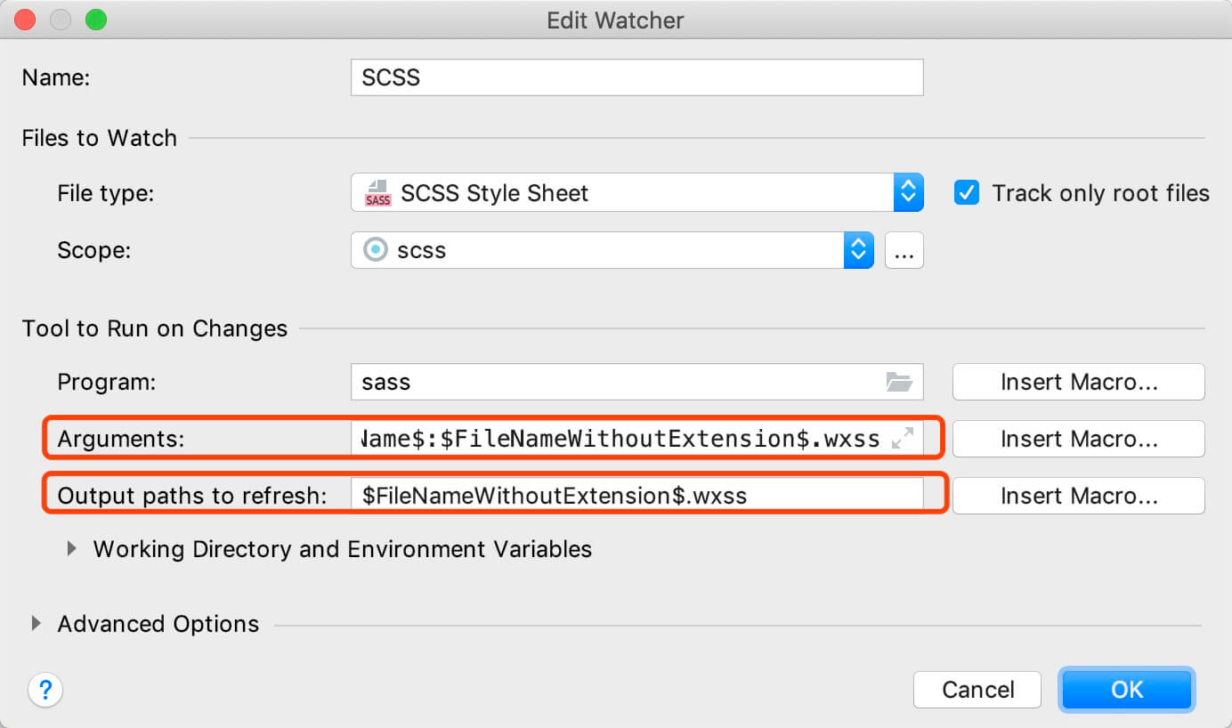
将上图参数替换
Arguments参数替换为--update --no-source-map $FileName$:$FileNameWithoutExtension$.wxssOutput paths to refresh参数替换为$FileNameWithoutExtension$.wxss
接着配置 Scope 即 File Watcher 在项目中作用域, 我们点击最外层文件夹然后选择 Include Recursively 即递归整个项目文件
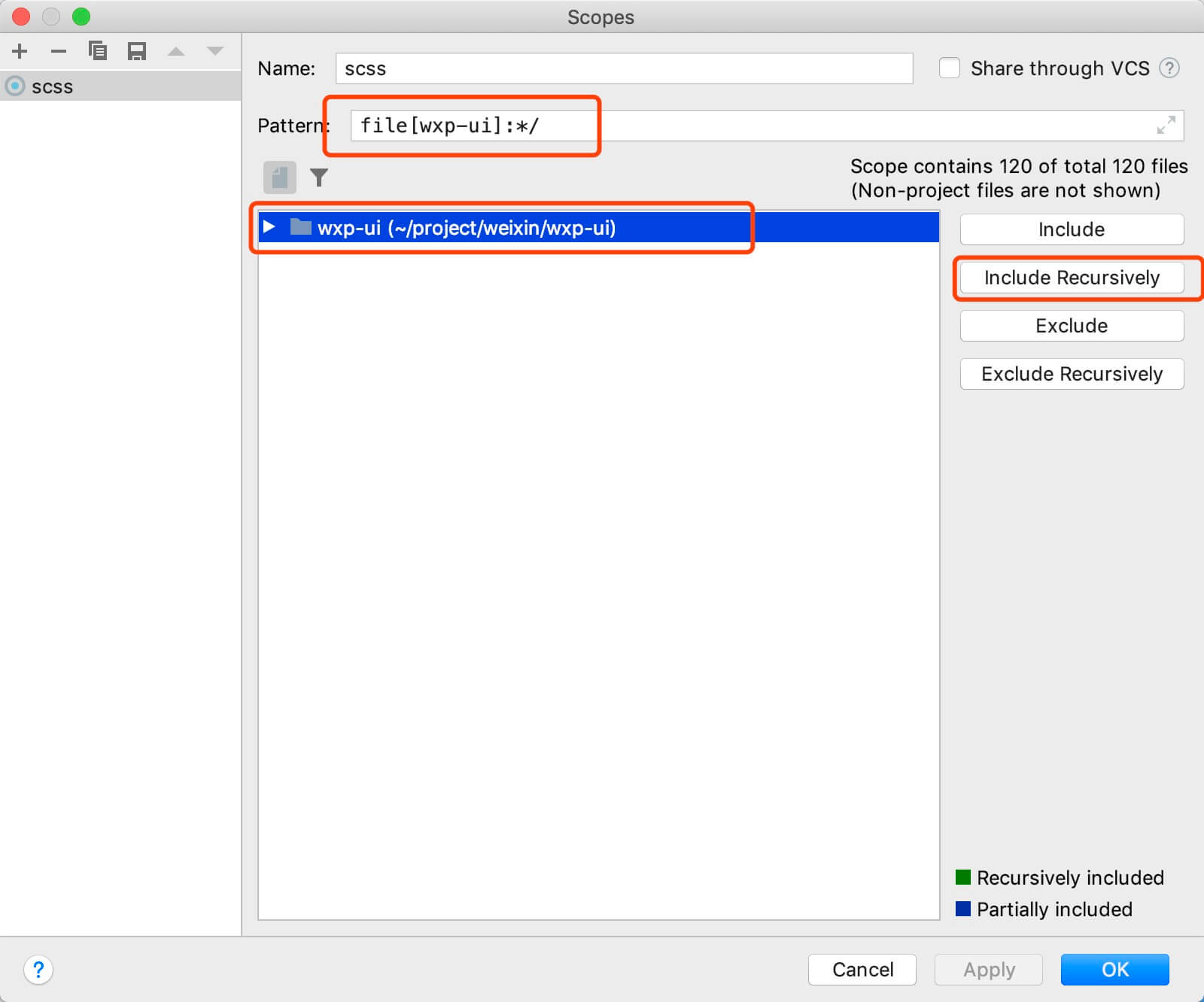
完成之后 Apply 即可
- swipe-list组件
- scroll组件
- tab组件
- drag组件
- x-drag组件
- date-picker组件
- side-slip组件(基于movable-view实现)
- index-list组件
git clone https://github.com/singletouch/wx-plugin.git
将需要使用的组件代码拷至自己的小程序项目中,按照小程序官方引入组件方式引入即可
本项目自身就是一个完整的小程序项目,也可以直接使用本项目作为小程序开发目录
| 参数 | 说明 | 类型 | 可选值 | 默认值 |
|---|---|---|---|---|
| requesting | 列表数据是否处于加载中 | Boolean | -- | false |
| end | 列表数据加载完成 | Boolean | -- | false |
| emptyShow | 控制空状态显示 | Boolean | -- | false |
| listCount | 当前列表长度 | Number | -- | 0 |
| emptyUrl | 空列表的展示图片 | String | * | /assets/image/empty/empty.png |
| emptyText | 空列表的文字提示 | String | * | 未找到数据 |
| refreshSize | 下拉刷新的高度 | Number | -- | 90 |
| topSize | 顶部高度 | Number | -- | 0 |
| bottomSize | 底部高度 | Number | -- | 0 |
| color | 颜色 | String | -- | "" |
| enableBackToTop | 双击顶部状态栏回到顶部 | Boolean | -- | false |
| 事件名称 | 说明 | 回调参数 |
|---|---|---|
| refresh | 下拉刷新 | -- |
| more | 上拉加载 | -- |
| name | 说明 |
|---|---|
| -- | 列表组件主体 |
| 参数 | 说明 | 类型 | 可选值 | 默认值 |
|---|---|---|---|---|
| tabData | 数据源 | Array | -- | [] |
| tabCur | 当前聚焦项索引 | Number | -- | 0 |
| scroll | 是否可以超出滚动 | Boolean | -- | false |
| size | tab高度 | Number | -- | 90 |
| color | 颜色 | String | -- | "" |
| 事件名称 | 说明 | 回调参数 |
|---|---|---|
| change | tab切换事件 | 当前选中tab的index |
| 方法名 | 说明 | 回调参数 |
|---|---|---|
| scrollByIndex | 让tab组件根据传入的index进行滚动 | 需要切换tab项的index |
后续更新
| 方法名 | 说明 | 回调参数 |
|---|---|---|
| delete | 点击删除按钮触发的事件 | -- |
| 参数 | 说明 | 类型 | 可选值 | 默认值 |
|---|---|---|---|---|
| listData | 数据源 | Array | -- | [] |
| topSize | 顶部固定区域高度 | Number | -- | 0(rpx) |
| bottomSize | 底部固定区域高度 | Number | -- | 0(rpx) |
| color | 颜色 | String | -- | "" |
| emptyUrl | 空列表的展示图片 | String | * | /assets/image/empty/empty.png |
| emptyText | 空列表的文字提示 | String | * | 未找到数据 |
| emptyShow | 控制空状态显示 | Boolean | -- | false |
| 参数 | 说明 | 类型 | 可选值 | 默认值 |
|---|---|---|---|---|
| key | 索引值 | String | -- | -- |
| data | 索引值对应数据 | Array | ... | ... |
数据结构演示, 如需更多数据结构和渲染样式, 需自行修改渲染和初始化部分代码.
[
    {
        key: "A",
        data: [
            {
                name: "城市1",
                code: "0001",
                short: "city1"
            },
            {
                name: "城市2",
                code: "0002",
                short: "city2"
            },
            ...
        ]
    },
    {
        key: "B",
        data: [
            {
                name: "城市1",
                code: "0001",
                short: "city1"
            },
            {
                name: "城市2",
                code: "0002",
                short: "city2"
            },
            ...
        ]
    },
    {
        key: "C",
        data: [
            {
                name: "城市1",
                code: "0001",
                short: "city1"
            },
            {
                name: "城市2",
                code: "0002",
                short: "city2"
            },
            ...
        ]
    }
    ...
]
| 事件名称 | 说明 | 回调参数 |
|---|---|---|
| click | 点击item | 当前item的数据信息 |
tip: 最新版本去除 dataChange 方法, 改为直接使用 this.drag.init(), listData, columns, topSize, bottomSize 等参数变化时候需要手动初始化
| 参数 | 说明 | 类型 | 可选值 | 默认值 |
|---|---|---|---|---|
| extraNodes | 额外节点 | Array | -- | [] |
| listData | 数据源 | Array | -- | [] |
| columns | 列数 | Number | -- | 1 |
| topSize | 顶部固定区域高度 | Number | -- | 0(rpx) |
| bottomSize | 底部固定区域高度 | Number | -- | 0(rpx) |
| itemHeight | 每个 item 高度(用于计算 item-wrap 高度) | Number | -- | 0(rpx) |
| scrollTop | 页面滚动高度(用于页面滚动时候正确计算) | Number | -- | 0(rpx) |
| 事件名称 | 说明 | 回调参数 |
|---|---|---|
| change | 排序监听事件 | 排序后数据 |
| sortend | 排序结束事件 | 排序后数据 |
| click | 点击item监听 | item数据和排序key值 |
| 参数 | 说明 | 类型 | 可选值 | 默认值 |
|---|---|---|---|---|
| dragId | 每个数据项唯一标识(必填, 提升渲染性能) | String/Int | -- | -- |
| fixed | 是否固定该项 | Boolean | -- | -- |
| ... | ... | ... | ... | ... |
| 参数 | 说明 | 类型 | 可选值 | 默认值 |
|---|---|---|---|---|
| type | 额外节点类型 | String/Int | before/after/destBefore/destAfter | -- |
| dragId | 每个数据项唯一标识(必填, 提升渲染性能) | String/Int | -- | -- |
| destKey | 要插入的位置 | Number | -- | -- |
| fixed | 额外节点是否固定 | Boolean | -- | -- |
| slot | 额外节点展示的所使用的 slot 名称 | String | -- | -- |
如果有什么好的建议欢迎提issues
MIT
 React
React
 Typescript
 Django
 Laravel
 Facebook
 Microsoft
 Google
 Alibaba
 D3
D3
 Tencent