


Bang is now know as GOOD
Holen Sie es hier, or on NPM @bang.html
- Demos
- Introducing: self-closing tags for Web Components
- Regular tags
- Templates, and with async values
- Minimal DOM diffing with minimal granular updates
- Lazy loading
- More Goodies
- More info on templating
- The big picture: defining custom element bang components: markup, script and style
- Get started in 5 simple steps
- Slots and variables
- The
state=attribute, nested objects and template replacement slots - Async templating
- More information
- Q&A
- HTML but with a BANG!
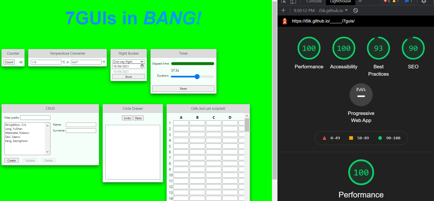
The page in the Lighthouse shot above has over 10,000 DOM nodes, yet Lighthouse manages to love it, anyway. How is this possible? Mostly through the use of the lazy and super lazy attributes, particularly on the large 'Cells' spreadsheet component.
EXPLORE BANG! FOR KNOWLEDGE
This is BANG!, making a component:
components/sg-counter/markup.html
<sg-frame state=${_self}>
  <button id=counter onclick=Increment>Count</button>
  <label for=counter>${count}</label>
</sg-frame>components/sg-counter/script.js:
class Counter extends Base {
  Increment() {
    const {state} = this;
    state.count++;
    this.state = state;
  }
}components/sg-counter/style.css:
label {
  min-width: 4.5ch;
  display: inline-block;
  text-align: right;
}
This is BANG!, using a component:
index.html:
<link rel=stylesheet href=components/style.css>
<script src=//unpkg.com/bang.html></script>
<script>
  use('sg-frame');
  use('sg-counter');
</script>
<!sg-counter lazy state=ctr />
You need to fill out the sg-frame component. But that is all.
This is BANG!
For more, the best way is just read the code for the 7GUIs implementation. But you could also read the intro below. And finally here's a quick overview of features:
- Minimal DOM diffs (lists, keyed components, attribute names, attribute values, text values) with no absolutely VDOM overhead, instead we use granular DOM-based updator functions.
- JavaScript templating syntax. Forget a DSL, or "pseudo-code" with its own quirks and weird edge-cases, just use JavaScript to
${template}in all the${values.map(v => F`<!my-item state=${v}>`)}you need. - Custom Elements. Simply put
use('my-item');in your JavaScript, and fill out any of themarkup.html,style.css, andscript.jsfiles in the./components/my-item/directory, that yourmy-itemcomponent needs. - Keyed components, with optional keys. Just supply a key to create an instance component that can have many different instantiations in the DOM, or no key to get a singleton component. Both of these are pinned to their DOM location and will automatically be updated when you update relevant state.
- Re-rendering only the changes when you
setState. You can also use thethis.state =convenience setter within a component that uses string key as the value of itsstate=attribute. - Simple, low learning curve. Uses the HTML, JavaScript and CSS you already know, just provides some enhancements. No DSLs or transpilers required.
lazyandsuper lazyloading options, initiated by those attributes on your component. Lazy components do not delay the load of any ancestor components, and super lazy components only begin loading after the rest of the page has finished loading first.- Async value resolution in templates. You can plop async values right into your templates, even lists of async values, arbitrarily nested, and BANG! will resolve them all.
- Lighthouse and performance friendly:

🌱 BANG! A zero-dependency, no build-step, no transpilation, JSX-free, good old fashioned HTML and JavaScript Custom Element library for the new age. 


BANG! makes your UI work easy, and your syntax beautiful, by pairing Web Components with smooth template syntax, minimal DOM updates (and without VDOM), lazy loading, async values and empty elements (a.k.a void elements / self-closing tags).
Void tags have finally come to custom-elements—with a BANG!
BANG! is your library of choice for self-closing tags with Web Components:
<!app-header />
<div>
  <!app-content />
</div>
These self-closing tags are known as bang-tags (web components with a bang!)
They're actually just valid HTML comments that BANG! converts into valid Web Components.
Like HTML void tags, when you use bang-tags you can omit the self-closing slash />. So, <!custom-el2> is also a valid void self-closing bang-tag.
BANG! also makes it easy to define and use regular custom elements.
Normally using web components you need to use the <slot></slot> tag to pull in values. In BANG! you can still use slots (they work just fine), but for simple values this can be too much HTML, and excessive typing when all you really want to say is, ${myValue}. Now you can:
<h1>${firstName} ${lastName}</h1>Minimal diffing is all the rage these days. It ensures that you don't do more work than you need to do to reflect the changes in your state into the DOM. Other frameworks use concepts like VDOM, which has a large overhead, as well as a large amount of code. BANG! uses the high-tech granular, linear-time updating technology from vanillaview, but builds on it and adds improvements to make the updates even more minimal in the case of lists (only items inserted or delete are the ones that change). In all other cases, only the text, attribute names or values, that contain templated state values that have changed, are the things that change.
It really is optimally minimal.
Just add a lazy attribute to your component to make its parent components not depend on it being loaded, in order for them to load. The component will load when its ready, a lazy component will not hold up it's ancestor components.
<!hot-button lazy state=buy onclick=Purchase />Apart from self-closing tags, minimal granular updates BANG! has numerous other special features that make it super productive for building interfaces. Read on to discover how BANG! makes UI work more productive.
You can jump in right away and get it on the npm: npmjs.com/@bang.html
The problem of custom void tags in HTML has been solved. Hoo-ray!
.png)
In fact, any JavaScript expression works fine, even async/await expressions and Promises:
/components/item-list/markup.html:
<ul>${
  items.map(async item => F`
  <li>
    <span class=name>${item.name}</span>
    <img src=${img.imgSrc}</span>
    <span class=price>${await item.getLatestPrice()}</span>
    <!item-details state=${item.details} />
  </li>
 `)}</ul>
BANG! automatically handles and awaits Promises to resolve, so the await item.getLatestPrice(), will fetch the most up to date price from the server and print that value into the template, with BANG! handling all the details. You can even leave out the await keyword, because BANG! will know it's value a Promise and treat it the same way.
Variables (like items, and firstName and lastName) in the above examples are in scope for BANG! when they are properties of the state object you pass to the component the markup appears in.
So, in the example above, you'd be able to access the items variable if you saved state for your item-list component, like so:
  setState('Items', {
    items: myItemList
  });
Then passed it to item-list components using state=:
<item-list state=Items></item-list>Also note: that in the example above the item-details component is passed state as an object to its state= attribute. This is fine too, but the object passing syntax is only available inside a component's markup.html file.
Inside a template slot if you want to include markup you need to wrap it in a F template tag function, like: ${F`<my-markup></my-markup>`}
You'll notice in the above <item-list> example, we printed <li> elements within a .map iterator function using a special template tag function, F. This function is necessary if you want your markup to get all the benefits of BANG!. In fact, all markup in your markup.html files is implicitly wrapped in F by BANG!, so if you create new markup inside 'template backticks`, you need to wrap that template string in an F tag. F is just a standard template tag function that is always in scope for your markup.html files.
// somewhere deep in your markup:

<my-el state=myState>
  <marquee>My Humps</marquee>
</my-el>

// elsewhere, in /my-el/markup.html
// you define the Shadow DOM content:

<dialog class=modal ${isOpen ? 'open' : ''}>
  <nav class=titlebar>${message.title}</nav>
  <section class=sparkles>
    <details>
      <summary>
        ${message.summary}
        <span class=button>More</span>
      </summary>
      <slot></slot>
    </details>
    <button class=close onclick=close>OK</button>
  </section>
</aside>

// eslewhere still, you seek out control with scripting
// in /my-el/script.js

class MyModal extends Base {
  open(message) {
    const state = getState('modalState');
    state.open = true;
    state.message = message;
    setState('modalState', state);
  }

  close(clickEvent) {
    const state = getState('modalState');
    state.open = false;
    setState('modalState', state);
  }
}

// meanwhile, across town in your /my-el/style.css you set the tone

dialog.modal {
  border: medium dashed var(--sparkle);
}

span.button {
  appearance: button;
  /* ... flesh it out ... */
}
All these files are optional. You don't need to provide a markup.html, script.js or style.css file in your component directory, but if you do, they will be utilized.
Also if you define a top-level style.css file in your /components base directory, it will be automatically imported into all component's style files.
For this mini-tutorial we'll be building a simple greeter component:
<!warm-greeter />Follow along with the below steps to learn how to create your very own greeter component. Or just jump straight to a work demo if you prefer to have something to play with.
First, to get you setup for the tutorial, install the BANG! package from NPM:
$ npm i --save bang.htmlAnd since we'll also be using serve to run a static development server, install that, too, using:
$ npm i --save-dev serveNow, onto the tutorial!
my-project/
├── README.md
├── package.json
└── public/
    ├── index.html
    └── components/
        ├── config.js (optional)
        ├── warm-greeter/
        │   ├── markup.html (optional)
        │   ├── style.css (optional)
        │   └── script.js (optional)
        └── greet-count/
            ├── markup.html (optional)
            ├── style.css (optional)
            └── script.js (optional)
...
Note that each component lives in sub-folder under the components directory. Serve the components directory from your site root at /components.
Each component is defined by 3 files, all optional:
- markup.html: the shadow DOM content
- style.css: the scoped styles applied. Note that standard Web Components CSS pseudo-classes work here.
- script.js: the class extension extending the default base class. You'll learn about the default base class of the component in a second.
Copy the below into your public/index.html file:
<!DOCTYPE html>
<script type=application/javascript src=https://unpkg.com/bang.html></script>
<link rel=stylesheet href=https://unpkg.com/bang.html/src/style.css>
<script>
  use('warm-greeter');
</script>
<!warm-greeter>
Start your development server:
$ npx serve -p 8080 public/Now visit your server in a web browser. You should just see a blank page. Open DevTools and see that:
<!warm-greeter />has become:
<warm-greeter></warm-greeter>A valid Web Component, that you defined using a void self-closing tag.
Now let's flesh out your component and show some markup and styles by adding some content to the component directory.
First we're going to add some templated markup to the markup.html files of the two components we'll use.
Go ahead and paste the following HTML into public/components/warm-greeter/markup.html:
<h1>Hello ${name}</h1>
<p>We are very pleased to meet you <greet-count state=${greetCounts}>happy</greet-count> times</p>
<button onclick=Regreet>Regreet!</button>
And also add the following markup to public/components/greet-count/markup.html:
<span class=count>${value}</span>
<slot></slot>
You'll notice that the markup contains the sequences ${...} above. These sequences are template replacement slots which are how you display your components variables and state.
These are different to Web Components slot elements which you can also see we use. The differences are that web component slot elements pull in content you put between the start and end tags of your component, but template replacement slots pull in variables and state from the component itself.
You'll learn more about component variables and state in the next step of this tutorial.
Go back to your public/index.html file and change the code in the <script> tag and the greeter as follows.
Update the <script> tag content to this:
  use('warm-greeter');
  use('greet-count');
  setState('MyState', {
    name: 'Uncle Bob',
    greetCounts: {
      value: 1
    }
  });
And change this:
<!warm-greeter />To this:
<!warm-greeter state=MyState />Now reload the development page in your browser and you should be able to see your greeter taking shape, display a greeting to Uncle Bob, a count and a button.
If you open up the DevTools Elements tag and inspect the warm-greeter tag you probably noticed that it has a Shadow Root that is now hosting some content.
In this step, you'll add an event handler to the warm-greeter component so it will do something when the button is clicked.
To do that, you'll be extending the default base class for the warm-greeter component, by adding some methods to its script file.
So, go ahead, and open up 'public/components/warm-greeter/script.js' and add the following content:
class Component extends Base {
  Regreet(clickEvent) {
    const newState = cloneState('MyState');
    newState.greetCounts.value += 1;
    setState('MyState', newState);
  }
}
Make sure you save that file, then reload the development page in your web browser.
This time, when you click the button, you'll see something happen.
A new message will appear, telling you that: "We are very pleased to meet you 2 happy times."
That's the end of this mini-tutorial, so, Congratulations! You've done really well, and you're ready to start writing components on your own and learning more.
If you read on you'll discover more about some details you saw in the tutorial.
You'll notice in the examples above that we used both <slot></slot> elements and variables. In BANG! slot elements function just like they do in regular Web Components, so if you know how to use them there, you know how to use them in BANG. If you don't, you can read up on information about slot elements here.
You also saw that we used a new syntax for templating called template replacement slots. This is not part of web standard, and is in fact a convenient syntax for display variables and state in your components. It's quite different to <slot></slot> elements, so read on to find out more.
In order to have your component display variables form an object, you need to do 3 things:
- Assign that state object a string key, it's state key, and save it in the object store using
setState(<key: string>, <value: object>); - Pass that state key to the component by setting its
stateattribute; and - Reference properties from that state object using template replacement slot syntax
Let's run through an example to tease out the details of these 3 steps:
In a script you would write:
setState('MyState', {
  deviceFormat: 'mobile',
  screen: {
    width: 420
  }
});
You can now access the state object using the key MyStae.
In a markup file for a component (or in the top-level HTML file for your app you would write):
<!test-el state=MyState />In a markup file for your component, you could then write:
<div class="big-banner ${deviceFormat}">
  <img src=wide-cat.png width=${screen.width*0.75}px
</div>You probably noticed above that you didn't need to refer to the parent object when using the template replacement slot syntax. This is because you can simply use the property name inside the markup of the component you pass the state to. If you need to access the outer state object, you can do that via the special _self property.
Also what if you want pass nested objects in your state object to be the state= properties of a sub-component?
For example, in the tutorial we created a warm-greeter component that incorporated a sub-component, greet-count like so:
<h1>Hello ${name}</h1>
<p>
  We are very pleased to meet you
  <greet-count state=${greetCounts}>happy</greet-count> times
</p>
<button onclick=Regreet>Regreet!</button>
You might have noticed that the state= property of the greet-count component is not passed by string key, but instead passed a nested object using our standard template replacement slot syntax. Despite this, greet-count behaves as if it had been passed a state-key.
So what's going on?
This is the expected behavior. You can pass state directly to your sub-components using template replacement slots in any component markup file but not in a top-level HTML file (because template replacement slots are not processed there, only in component markup).
This means that in the above example, greet-count behaves the same as if you explicitly saved that nested object to the state store using a string state-key then passed that key to your component using the state= property.
Instead of having to write that extra step, BANG! detects the nested object and saves it to the store for you, and passes to new components as they are created to load the state, without you having to worry about the details.
BANG! can also accept state properties that are functions, async functions and Promises. In these cases, here's what happens:
- Promise: BANG! awaits the Promise to resolve, then templates in the value returned by the resolved Promise.
- Async Function: BANG! executes the async function and awaits the result, then templates in the value.
- Function: BANG! executes the function and templates in the result.
BANG! is new, and it might take you some time to learn.
These documents, and BANG! itself are a work in progress.
Plans may change, but right now, some aims for the future are:
- re-render function in the base class
- improve documentation
- add minimal DOM diffing using vanillaview granular DOM updator function technology
- add state-queries with automatic data binding, to fully decouple state objects from components, and decouple components from each other, and enables dependent components to be automatically re-rendered when data they use in the store changes.
When the HTML parser encounters a self-closing slash in a non-void element, it acts as if the slash isn't there, in effect opening the tag, and wrapping any subsequent content up to the next valid closing tag for that element, inside that open tag. This is not what you intend when you try to use a self-closing tag.
Similarly, when the HTML parser encounters a single <custom-tag> it opens it, and so subsequent tags will be placed inside that open tag.
Easy! Just implement a handler in your component class (the class that extends from Base and is located in component's script.js file), and use that handlers method name as the value of an onevent= attribute. For example:
/components/cta-button/script.js:
class Component extends Base {
  BuyNow(clickEvent) {
    this.paymentService.createCharge(this.from.getCardDetails()).then(status => this.Report(status));
  }
}/components/cta-button/markup.html:
<button onclick=BuyNow>Buy. Like RIGHT NOW</button>Notice how we pass the string BuyNow, which is the name of our event handler function BuyNow() in our component class, to the <button> element using the onclick= event handler? This syntax ensures the BuyNow() function binds to that button, and listens for its click event.
Right now, you can't do this:
<button click=${myHandlerFunc}>Do Stuff</button>This old, vanillaview style syntax, by passing in a function, to a an attribute is not currently supported. This is because, right now, BANG! interprets any function value given it as a function to execute, not as an event handler to bind to an element. So if you pass it a function, it will execute that function and pass in the state object in scope in that component, func(state) and print the value returned by that call into the slot where the function was, in the markup.
If you don't call use with the name of the component (the name of its directory) then your component will not be a custom element, and will just be a regular HTML tag.
Don't forget to always use all components, even nested components in your script.
BANG! is design to be pretty intuitive and smooth with the syntax, so most things work as you expect. But there are still some things that may catch you out if you forget.
So:
- don't omit the bang (!) because that's how we signal it's not a normal tag; and
- don't start any comment with a double-barrelled word, because that's how we signal it's a self-closing tag, not a comment.
Also, regarding extending classes it doesn't matter what you call your component class (you can call it Component or anything you like) but you do need to extend it from the Base class and use the exact name Base like so:
class MyComponent extends Base {
 /* ... */
}You need to include a <body> tag in your top-level HTML document, or another displayable tag, and put your self-closing tags after that displayable tag, otherwise they will end up <head> tag of the document, and not be displayed.
You can configure the following properties:
{
  htmlFile: 'markup.html',
  scriptFile: 'script.js',
  styleFile: 'style.css',
  bangKey: '_bang_key',
  componentsPath: './components',
  allowUnset: false,
  unsetPlaceholder: '',
  EVENTS: `error load click pointerdown pointerup pointermove mousedown mouseup
    mousemove touchstart touchend touchmove touchcancel dblclick dragstart dragend
    dragmove drag mouseover mouseout focus blur focusin focusout scroll
  `.split(/\s+/g).filter(s => s.length)
}
To override the above defaults, pass in a new config object, like so:
bangFig({
  markupFile: 'html.html`,
  componentsPath: `coco`
});You can set a specific state key for a nested object to override the autogenerated key by setting the CONFIG.bangKey property name (by default _bang_key) on the nested object. For example:
setState(`S1`, {
  nester: {
    _bang_key: `happy1`,
    prop1: 'okay ;p ;) xx`
  }
});
Then later:
const nestedState = cloneState(`happy1`);Or
<some-guy state=happy1></some-guy>Contributions are very welcome. No CLA needed. No license restrictions. Just get-in, muck-in and get involved! :P ;) xx
If you want to, of course. :P ;) xx
These are just ideas, and I might not do them. :)
- Convenience getters for named state (in other words, you can call
this.state.modalStaterather than writingconst state = getState('modalState') - Passing instance property arguments or state scope through the custom element tag. Need to consider the syntax for this whether the values go to the constructor, or to the state or both.


 React
React
 Typescript
 Django
 Laravel
 Facebook
 Microsoft
 Google
 Alibaba
 D3
D3
 Tencent