NEW! I'm creating the official PocketGrid website!
It's a work in progress but you can preview it here: http://arnaudleray.github.io/pocketgrid/
And of course, it's responsive using the PocketGrid itself!
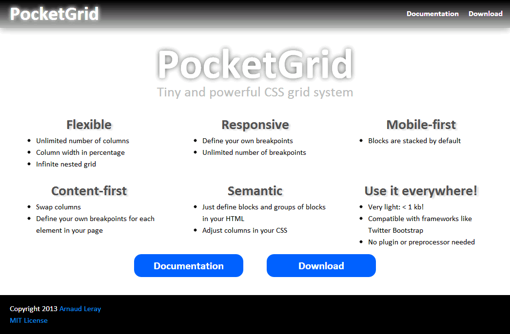
PocketGrid is the smallest responsive grid system having so many features:
- Lightweight: about 0.5kB!
- Pure CSS-only (no CSS preprocessor needed)
- Fluid (by default, but you can set a fixed width or max-width if you want)
- Responsive
- Unlimited number of breakpoints (you can define your own Media Queries)
- Mobile-first compatible (block width is 100% by default)
- Content-first compatible (you can swap columns and you can define your own breakpoints for each element in your page to finely tune and optimize your content readability: not only 'tablet' or 'smartphone' breakpoints)
- Semantic (as much as a pure CSS grid could be ;) )
- Very simple (just have to define blocks and groups of blocks)
- Unlimited number of columns (no 12 or 16 columns restrictions: blocks just require a width in percentage)
- Infinite nested grids
- Manage consistent gutters (gutters can be defined in pixels or ems, which is better than percentage-based solutions because it allows consistent gutters even in nested grids)
- Automatic rows (when a row is full, the next blocks go to a new row without doing anything)
- No dependencies
- Compatible with CSS frameworks such as Twitter Bootstrap or Zurb Foundation (you can use the Bootstrap or Foundation components such as buttons, tabs, etc. and use the Pocket grid for other layout)
- IE6 compatible with some polyfills (for border box-sizing and media queries compatibility)
Note : soon, a PocketGrid Plus version will be added to provide many useful features such as centering, push/pull, offsets, swaping, gutter improvements...
Keep an eye on this project! ;)
- PocketGrid is really lightweight, so you can use it in all your projects at no cost (Twitter Bootstrap is about 200x bigger, even minified!)
Note: you can use both! Bootstrap for styling, tabs or special components AND PocketGrid for layout for example. - Twitter Bootstrap's grid has only 1 breakpoint (like most grid systems), with PocketGrid you can define infinite breakpoints!
- PocketGrid is one of the very few semantic grids (especially pure CSS grids!): you don't have "span4" or "small-6 large-2 columns" classes in your HTML: column size should be defined in the stylesheet!
- Percentage sizing is more natural and more precise than using a number of columns (how can you make 5 columns in a 12 or 16-columns system? It's impossible! With PocketGrid, just put "width:20%", easy!)
- PocketGrid does not require a CSS preprocessor (but you can use one if you want).
- PocketGrid is compatible with most other CSS frameworks (because it does not use 'grid', 'row' or 'col' classes which are used by too many grid systems).
You just have to include the pocketgrid.css file in the <head> tag
and don't forget the viewport meta tag!
Here is the minimal markup you need to put in your pages:
<!doctype html>
<html>
  <head>
    <meta name="viewport" content="width=device-width, initial-scale=1.0">
    <link rel="stylesheet" href="pocketgrid.css" />
  </head>
  <body>
    <!-- YOUR CONTENT HERE -->
  </body>
</html>
Then, you just have to add block classes to elements you want to put in the grid, and block-group classes for block containers.
The /examples directory contains some examples (more to come):
- A very simple 2-columns layout example
- A basic layout example
- A simple responsive layout
- A complex responsive layout
- Nested grids
- Responsive nested grids
- Responsive gutters (why not!)
- Portrait / landscape
- Block-group on body
- HTML5 tags
- Content-first
- Source ordering / push pull / Swap columns
- Offsets
- Max-width
- Fixed-width
Here is a quick nested grid example:
Preview

HTML file
    <div class="block-group">
        <div class="block header">Header</div>
        <div class="block sidebar">Sidebar</div>
        <div class="block-group content"><!-- nested grid -->
            <div class="block nheader">Nested header</div>
            <div class="block item">1</div>
            <div class="block item">2</div>
            <div class="block item">3</div>
            <div class="block item">4</div>
            <div class="block item">5</div>
        </div>
        <div class="block footer">Footer</div>
    </div>
CSS file
    /* Blocks have a default size of 100%,
       so elements with a 100% size do not need to be redefined in the CSS. */
    .sidebar { width: 25%; }
    .content { width: 75%; }
.item { width: 20%; } /* 20% => items on 5 columns */To make a responsive version of the nested grid example, we only have to change the CSS file like that:
CSS file
/* Smartphone version:
   Nothing to write: blocks are 100% width by default, so all blocks will be put below each other. */

/* Tablet version:
   sidebar and content are side by side, with respectively 25% and 75% of the grid width,
   and there are 2 items per "row". */
@media (min-width: 768px) and (max-width: 959px) {
    .sidebar { width: 25%; }
    .content { width: 75%; }
    .item { width: 50%; } /* 50% => items on 2 columns */
}
/* Desktop version:
   sidebar and content are side by side, with respectively 20% and 80% of the grid width,
   and there are 5 items per "row". */
@media (min-width: 960px) {
    .sidebar { width: 20%; }
    .content { width: 80%; }
    .item { width: 20%; } /* 20% => items on 5 columns */
}-
Want to change the 'block' and 'block-group' class names? (you may prefer 'grid' or 'row' and 'col'...)
PocketGrid is so tiny that it's trivial to customize: in your favorite file editor, first make a 'replace all' for the 'block-group' name (with 'grid' or 'row' for example), and then a 'replace all' for the 'block' name (with 'col' for example).
Do it in that order (because there is 'block' in 'block-group'...)
Note: Twitter Bootstrap already defines classes like 'container' or 'row', so if you want to use PocketGrid with Twitter Bootstrap, avoid using the same class names ;) -
Don't want to use an extra
<div>for block groups?
Well you can put theblock-groupclass directly on the<body>tag!
  <body class="block-group">
      <div class="header block">Header</div>
      <div class="nav block">Nav</div>
      <div class="main block">Main</div>
      <div class="links block">Links</div>
      <div class="footer block">Footer</div>
</body>- Don't like
<div>tags?
You can use any tag you want! You could use the new HTML5 tags for example:
  <body class="block-group">
      <header class="header block">Header</header>
      <nav class="nav block">Nav</nav>
      <section class="main block">Main</section>
      <aside class="links block">Links</aside>
      <footer class="footer block">Footer</footer>
</body>By default, the Pocket Grid is compatible with IE8+, Firefox, Google Chrome, Safari, Opera, and mobile browsers (iPhone, iPad, Android...)
For IE6+ compatibility, you can use these 2 polyfills:
- Media Queries: https://github.com/scottjehl/Respond
- Box-sizing: https://github.com/Schepp/box-sizing-polyfill
Arnaud Leray
Copyright 2013 Arnaud Leray.
Licensed under the MIT License:
http://opensource.org/licenses/MIT
Basically, you can do whatever you want as long as you include the original copyright.


 React
React
 Typescript
 Django
 Laravel
 Facebook
 Microsoft
 Google
 Alibaba
 D3
D3
 Tencent