

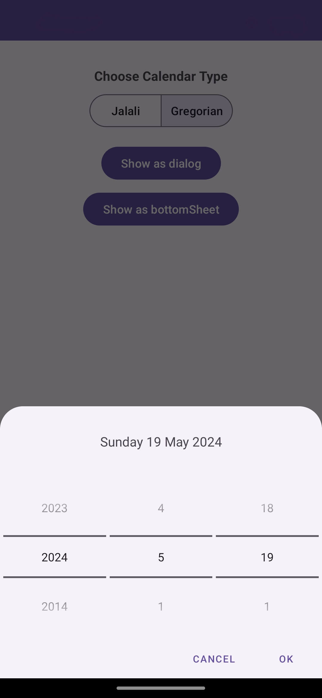
A customizable date picker dialog for Android that supports both Gregorian and Jalali calendars. Users can easily select dates using either a dialog or a bottom sheet. The library is designed to be simple to use and integrate into your existing projects.
| Gregorian | Jalali |
|---|---|
 |
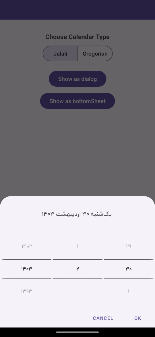 |
- Dual Calendar Support: Pick dates using either the Gregorian or Jalali calendar.
- Dialog & Bottom Sheet: Choose between a traditional dialog or a modern bottom sheet for date selection.
You use it in your project like below.
 DatePickerDialog.Builder(this) // context
    .setCalendarType(calendarType)
    .setMaxYear(DatePickerDialog.THIS_YEAR)
    .setMaxMonth(DatePickerDialog.THIS_MONTH)
    .setMaxDay(DatePickerDialog.THIS_DAY)
    .setPositiveButtonString(R.string.ok)
    .setNegativeButtonString(R.string.cancel)
    .setCancelable(false)
    .setShowInBottomSheet(true)
    .setListener(object : DatePickerListener {
        override fun onDateSelected(datePicker: IDatePicker) {
            Log.d(TAG, "onDateSelected: " + datePicker.getTimeStamp())
            Log.d(TAG, "onDateSelected: " + datePicker.getGregorianDate())
            Log.d(TAG, "onDateSelected: " + datePicker.getJalaliLongDate())
            Log.d(TAG, "onDateSelected: " + datePicker.getJalaliMonthName())

            Toast.makeText(this@MainActivity, "${datePicker.getJalaliYear()}/${datePicker.getJalaliMonth()}/${datePicker.getJalaliDay()} ", Toast.LENGTH_SHORT).show()
        }

        override fun onDismiss() {
            Toast.makeText(this@MainActivity, "dismissed", Toast.LENGTH_SHORT).show()
        }

    })
.build().show()| Name | Description |
|---|---|
| setMaxYear(int) | set maximum year can be selected |
| setMaxMonth(int) | set maximum month can be selected |
| setMaxDay(int) | set maximum day can be selected in the last month |
| setMinYear(int) | set minimum year can be selected |
| setCalendarType(CalendarType) | set calendar type(Gregorian or Jalali) |
| setPositiveButtonString(@StringRes int) | set positive button text from strings.xml |
| setNegativeButtonString(@StringRes int) | set negative button text from strings.xml |
| setCancelable(boolean) | set dialog cancelable or not |
| setShowInBottomSheet(bool) | switch between dialog and bottomsheet |
| setListener(Listener) | set dialog callback listener |
The pickers will be themed automatically based on the current theme where they are created.
you can theme the pickers by overwriting the color resources mdtp_accent_color and mdtp_accent_color_dark in your project.
<color name="mdtp_accent_color">#009688</color>
<color name="mdtp_accent_color_dark">#00796b</color>This library is completely based on Persian Date Picker Dialog.


 React
React
 Typescript
 Django
 Laravel
 Facebook
 Microsoft
 Google
 Alibaba
 D3
D3
 Tencent