|
This project was originally thought to be an experiment and currently is unmaintained (and buggy) Use it at your own risk Also, consider using more modern, WAI-ARIA compliant approach like downshift |

Set of enhancements for input control
The intention of creating this library was to bring input component out of the dropdown/autocomplete/whatever code, so it could be easily replaced with your custom component, and also to split independent functionality into different components, which could be combined with each other (still not quite sure it was worth it, though).
There are currently five components:
<Combobox /> is a combination of Dropdown, Autosize and/or Autocomplete components.
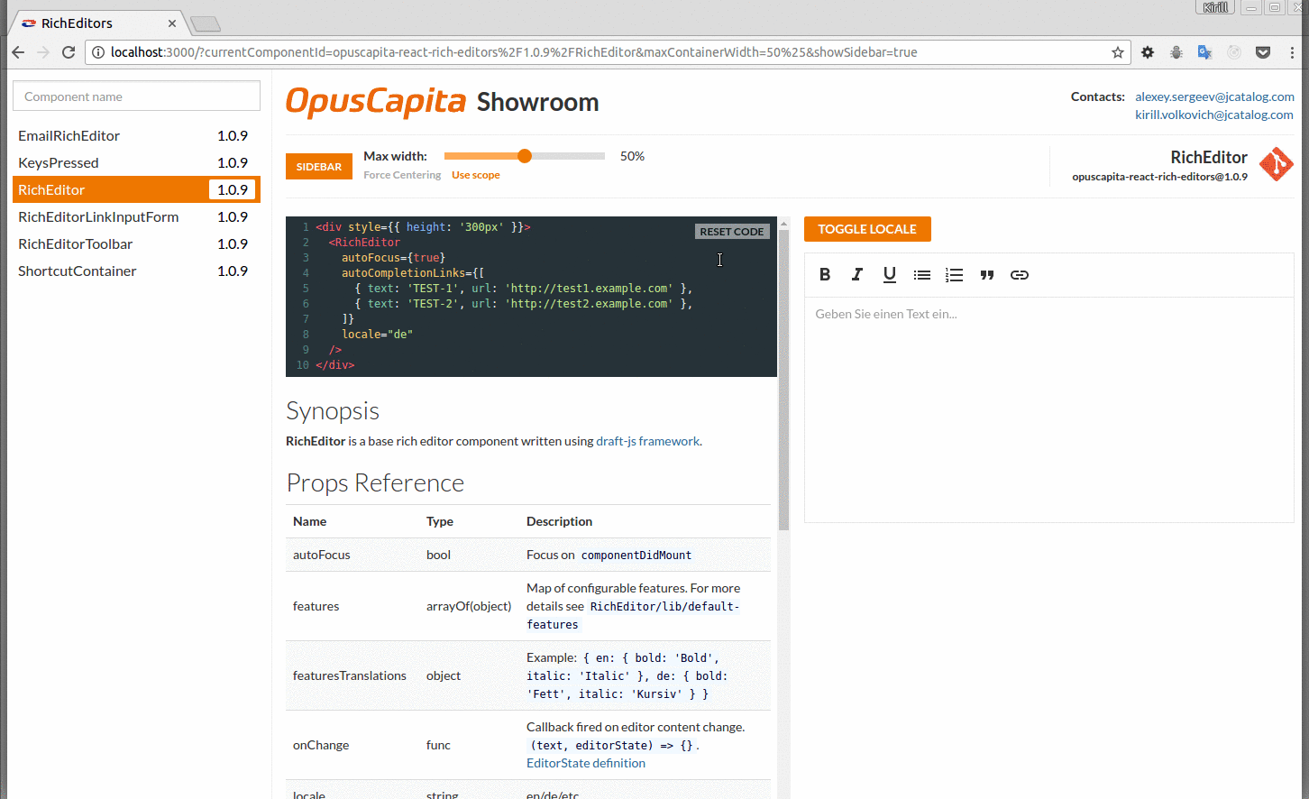
http://alexkuz.github.io/react-input-enhancements/
- Each component is responsible for a corresponding behaviour (
<Autosize>resizes<input>according to it's content length,<Dropdown>adds popup with options, and so on). - All components accept
functionas a child, providing props as a first argument, which you should pass to yourinputcomponent. If there is nothing else exceptinput, it could be passed as a child directly (for simplicity). - If you need to have combined behaviour in your component, let's say
<Autosize>with<Autocomplete>just pass<Autocomplete>as a child to<Autosize>(see<Combobox>source code for reference)
All components needs an access to <input> DOM element. To provide it, use getInputComponent prop:
let input;

getInput() {
  return input;
}

<Autocomplete
  options={options}
  getInputComponent={getInput}
>
  {props =>
    <input
      ref={c => input = c}
      {...props}
    />
  }
</Autocomplete>
Or, if you don't want to store the node in your component:
<Autocomplete
  options={options}
>
  {(props, otherProps, registerInput) =>
    <input
      ref={c => registerInput(c)}
      {...props}
    />
  }
</Autocomplete>
The first option also allows you to use shorter form with implicit parameters passing:
let input;

getInput() {
  return input;
}

<Autocomplete
  options={options}
  getInputComponent={getInput}
>
  <input
    ref={c => input = c}
  />
</Autocomplete>
However, this is not preferable as there is too much magic happening.
If <input> element wasn't provided, component tries to find node automatically, however this behaviour is deprecated and will be removed in future versions.
Autosize resizes component to fit it's content.
<Autosize defaultValue={value}
          minWidth={100}>
  {(inputProps, { width, registerInput }) =>
    <input type='text' {...inputProps} ref={c => registerInput(c)} />
  }
</Autosize>valuestring - Input value (for a controlled component)defaultValuestring - Initial value (for a uncontrolled component)getInputElementfunction() - Optional callback that provides<input>DOM elementregisterInputfunction - Registers<input>DOM elementdefaultWidthnumber - Minimum input width
Autocomplete prompts a value based on provided options (see also react-autocomplete for the same behaviour)
<Autocomplete defaultValue={value}
              options={options}>
  {(inputProps, { matchingText, value, registerInput }) =>
    <input type='text' {...inputProps} ref={c => registerInput(c)} />
  }
</Autocomplete>valuestring - Input value (for a controlled component)defaultValuestring - Initial value (for a uncontrolled component)getInputElementfunction - Optional callback that provides<input>DOM elementregisterInputfunction - Registers<input>DOM elementoptionsarray - Array of options that are used to predict a value
options is an array of strings or objects with a text or value string properties.
Dropdown shows a dropdown with a (optionally filtered) list of suitable options.
<Dropdown defaultValue={value}
          options={options}>
  {(inputProps, { textValue }) =>
    <input type='text' {...inputProps} />
  }
</Dropdown>valuestring - Input value (for a controlled component)defaultValuestring - Initial value (for a uncontrolled component)optionsarray - Array of shown optionsonRenderOptionfunction(className, style, option) - Renders option in listonRenderCaretfunction(className, style, isActive, children) - Renders a caretonRenderListfunction(className, style, isActive, listShown, children, header) - Renders list of optionsonRenderListHeaderfunction(allCount, shownCount, staticCount) - Renders list headerdropdownPropsobject - Custom props passed to dropdown root elementoptionFiltersarray - List of option filtersgetInputElementfunction - Optional callback that provides<input>DOM elementregisterInputfunction - Registers<input>DOM element
options is an array of strings or objects with a shape:
value- "real" value of on optiontext- text used as input value when option is selectedlabel- text or component rendered in liststatic- option is never filtered out or sorteddisabled- option is not selectable
null option is rendered as a separator
optionFilters is an array of filters for options (for convenience). By default, these filters are used:
filters.filterByMatchingTextWithThreshold(20)- filters options by matching value, if options length is more than 20filters.sortByMatchingText- sorting by matching valuefilters.limitBy(100)- cuts options longer than 100filters.notFoundMessage('No matches found')- shows option with 'No matches found' label if all options are filtered outfilters.filterRedudantSeparators- removes redudant separators (duplicated or at the begin/end of the list)
Mask formats input value.
<Mask defaultValue={value}
      pattern='0000-0000-0000-0000'>
  {(inputProps, { value }) =>
    <input type='text' {...inputProps} />
  }
</Mask>valuestring - Input value (for a controlled component)defaultValuestring - Initial value (for a uncontrolled component)getInputElementfunction - Optional callback that provides<input>DOM elementregisterInputfunction - Registers<input>DOM elementpatternstring - String formatting pattern. Only '0' (digit) or 'a' (letter) pattern chars are currently supported.emptyCharstring - Character used as an empty symbol (' 'by default)placeholderstring - If set, it is shown whenunmaskedValueis emptyonUnmaskedValueChangefunction(text) - Fires when value is changed, providing unmasked valueonValuePreUpdatefunction - Optional callback to update value before it is parsed byMask
DatePicker uses Mask to format date and shows calendar (react-date-picker by default) in popup.
<DatePicker defaultValue={moment(value).format('ddd DD/MM/YYYY')}
            placeholder={moment().format('ddd DD/MM/YYYY')}
            pattern='ddd DD/MM/YYYY'
            locale='en'>
  {(inputProps, { value }) =>
    <input type='text' {...inputProps} />
  }
</DatePicker>valuestring - Input value (for a controlled component)defaultValuestring - Initial value (for a uncontrolled component)patternstring - Date formatting pattern. For now, only these tokens are supported:DD- day of monthMM- monthYYYY- yearddd- day of week (not editable)
placeholderstring - If set, it is shown whenunmaskedValueis emptylocalestring - Date localetodayButtonTextstring - Text for 'Go to Today' button labelonRenderCalendarfunction({ styling, style, date, isActive, popupShown, onSelect, locale, todayButtonText }) - Returns calendar component shown in popup (react-day-picker-themeable by default)onChangefunction(date) - Fires when date is selected, providing moment.js objectgetInputElementfunction - Optional callback that provides<input>DOM elementregisterInputfunction - Registers<input>DOM elementonValuePreUpdatefunction - Optional callback to update value before it is parsed byDatePicker. In this example, it parses inserted timestamp:
onValuePreUpdate={v => parseInt(v, 10) > 1e8 ?
  moment(parseInt(v, 10)).format('ddd DD/MM/YYYY') : v
}
Combobox combines Dropdown, Autosize and/or Autocomplete components.
<Combobox defaultValue={value}
          options={options}
          autosize
          autocomplete>
  {(inputProps, { matchingText, width }) =>
    <input type='text' {...inputProps} />
  }
</Combobox>
Autosize and Autocomlete are enabled with corresponding bool props, other properties are proxied to Dropdown component.
See demo for code examples.
- react-autocomplete - Dropdown with autocompletion by Ryan Florence (that led me to create this library)
- react-maskedinput - More advanced masked input by Jonny Buchanan
- react-autosuggest - Beautifully crafted input with dropdown suggestions


 React
React
 Typescript
 Django
 Laravel
 Facebook
 Microsoft
 Google
 Alibaba
 D3
D3
 Tencent