GithubHelp home page GithubHelp logo

aloco / simplebutton Goto Github PK

View Code? Open in Web Editor NEW
175.0 14.0 51.0 2.09 MB

Simple UIButton subclass with additional state change animations (e.g. backgroundColor) and missing features

License: MIT License

Swift 97.20% Objective-C 1.08% Ruby 1.72%
swift uibutton-subclass animation simplebutton ios

simplebutton's Introduction

SimpleButton

Carthage compatible Build Status Swift 5

UIButton subclass with animated, state-aware attributes. Easy to subclass and configure! Full API docs

Sample

Usage

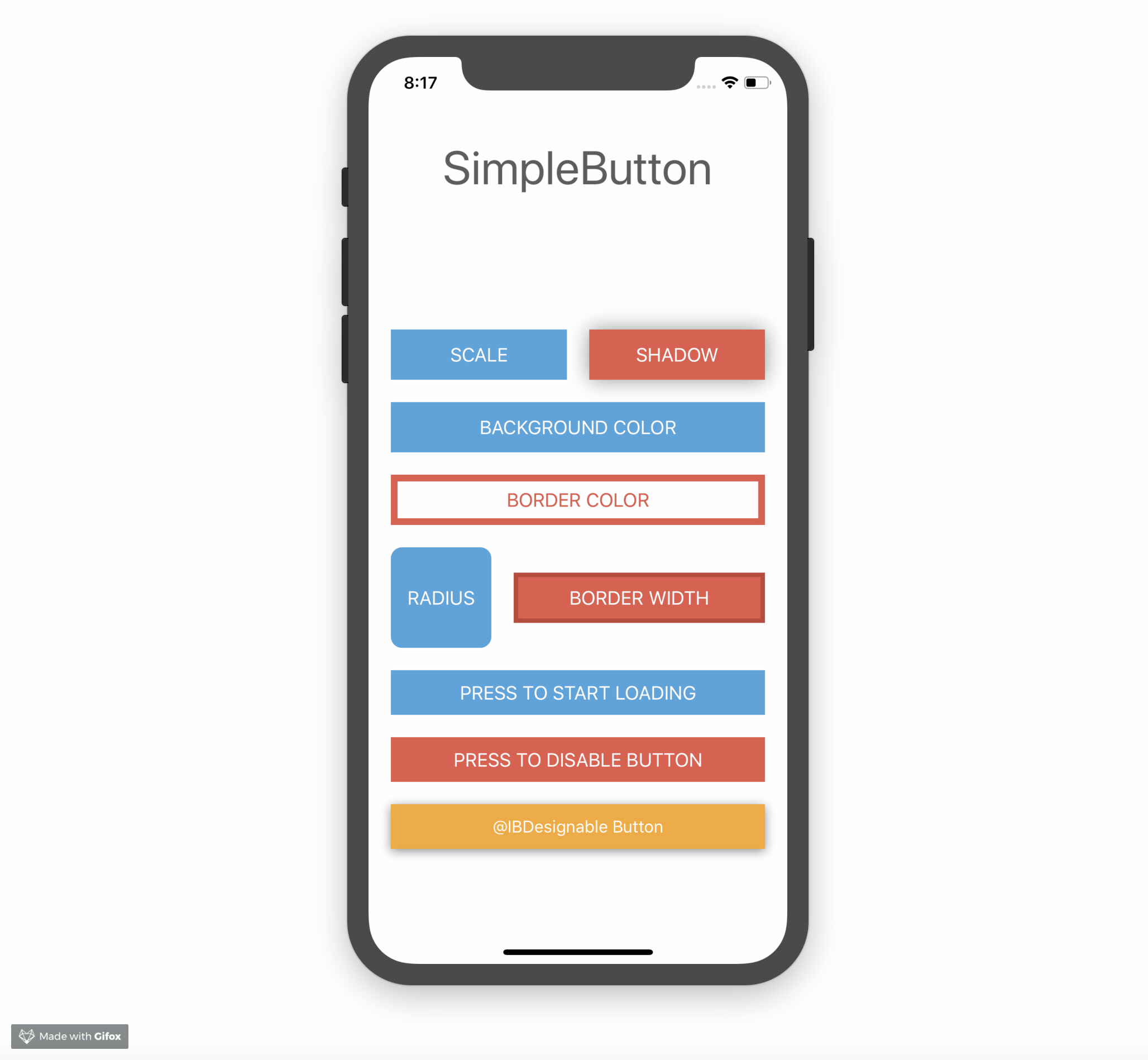
Just create your own SimpleButton subclass and configure your button attributes by overriding configureButtonStyles.

class PrimaryButton: SimpleButton {
	override func configureButtonStyles() {
		super.configureButtonStyles()
    	setBorderWidth(4.0, for: .normal)
		setBackgroundColor(UIColor(red: 52/255, green: 73/255, blue: 94/255, alpha: 1.0), for: .normal)
		setBackgroundColor(UIColor(red: 44/255, green: 62/255, blue: 80/255, alpha: 1.0), for: .highlighted)
		setBorderColor(UIColor(red: 44/255, green: 62/255, blue: 80/255, alpha: 1.0), for: .normal)
		setScale(0.98, for: .highlighted)
		setTitleColor(UIColor.whiteColor(), for: .normal)
	}
}

For usage in Interfacebuilder, just use your SimpleButton subclass as custom class for any UIButton element. All defined styles gets applied automatically.

You can also configure your button without a subclass directly inline.

let awesomeButton = SimpleButton(type: .custom)
awesomeButton.setBorderWidth(2.0, for: .normal)
awesomeButton.setBorderColor(UIColor.redColor(), for: .highlighted)
view.addSubview(awesomeButton)

Note that you should use UIButtonType.custom to avoid undesired effects.

Please checkout the example project for a detailed usage demo.

@IBDesignable

Have a look on DesignableButton subclass within the Example Project for @IBDesignable usage.

Animation

Each state change of SimpleButton animates by default. Sometimes you need to define which state transition should animate and which should happen immediately. Therefore you can control that behaviour with the animated and animationDuration parameters.

setBorderWidth(4.0, for: .normal, animated: true, animationDuration: 0.2)
setBorderWidth(8.0, for: .highlighted, animated: false)

This means, every state change to .normal animates the borderWidth to 4.0. Every state change to .highlighted changes instantly the borderWidth to 8.0 without animation.

Loading state

SimpleButton has a custom loading state. You can toggle this state by setting simpleButton.isLoading. The button shows an UIActivityIndicator instead of the title when adding the loading state.

simpleButton.setCornerRadius(20, for: SimpleButtonControlState.loading)
simpleButton.isLoading = true

If you don´t like the default loading indicator, you can set your own UIView by doing

simpleButton.loadingView = CustomAwesomeLoadingView()

Please note, when using a custom loading view don´t forget to handle the position and initial add to subview by yourself to fit your needs.

Configurable attributes

Take a look at the Setter for state attributes section of the API Docs

Installation

Note that SimpleButton is written in swift 5 and may not be compatible with previous versions of swift.

Swift Package Manager (Recommended)

Add the following dependency to your Package.swift file:

.package(url: "https://github.com/allaboutapps/SimpleButton.git", from: "5.0.0")

Carthage

Add the following line to your Cartfile.

github "allaboutapps/SimpleButton" ~> 5.0

Then run carthage update.

Manually

Just drag and drop the SimpleButton.swift file into your project.

Contributing

  • Create something awesome, make the code better, add some functionality, whatever (this is the hardest part).
  • Fork it
  • Create new branch to make your changes
  • Commit all your changes to your branch
  • Submit a pull request

simplebutton's People

Contributors

aloco avatar aschuch avatar igor-palaguta avatar mbuchetics avatar mswagner avatar swieland avatar vuln3r avatar zettlunic avatar

Stargazers

 avatar  avatar  avatar  avatar  avatar  avatar  avatar  avatar  avatar  avatar  avatar  avatar  avatar  avatar  avatar  avatar  avatar  avatar  avatar  avatar  avatar  avatar  avatar  avatar  avatar  avatar  avatar  avatar  avatar  avatar  avatar  avatar  avatar  avatar  avatar  avatar  avatar  avatar  avatar  avatar  avatar  avatar  avatar  avatar  avatar  avatar  avatar  avatar  avatar  avatar  avatar  avatar  avatar  avatar  avatar  avatar  avatar  avatar  avatar  avatar  avatar  avatar  avatar  avatar  avatar  avatar  avatar  avatar  avatar  avatar  avatar  avatar  avatar  avatar  avatar  avatar  avatar  avatar  avatar  avatar  avatar  avatar  avatar  avatar  avatar  avatar  avatar  avatar  avatar  avatar  avatar  avatar  avatar  avatar  avatar  avatar  avatar  avatar  avatar  avatar

Watchers

 avatar  avatar  avatar  avatar  avatar  avatar  avatar  avatar  avatar  avatar  avatar  avatar  avatar  avatar

simplebutton's Issues

2.1 requires 8.1

Is there any reason you require 8.1 not 8.0, on 8.0 it works fine

SimpleButton doesn't call `configureButtonStyles` when used in InterfaceBuilder

The button doesn't appear as expected when subclassed and used with @IBInspectable variables to set up the values for configureButtonStyles like here:

import UIKit
import SimpleButton

@IBDesignable

class DesignableButton: SimpleButton {

        /// Background color for normal state.
    @IBInspectable var backgroundColorNormal: UIColor?
    @IBInspectable var backgroundColorHighlight: UIColor?
    @IBInspectable var titleColorNormal: UIColor?
    @IBInspectable var titleColorHighlighted: UIColor?

    @IBInspectable var shadow: Bool = false
    @IBInspectable var shadowColor: UIColor?
    @IBInspectable var shadowOffset: CGSize = CGSizeZero
    @IBInspectable var shadowRadius: CGFloat = 0
    @IBInspectable var shadowOpacity: Float = 0

    override func configureButtonStyles() {
        super.configureButtonStyles()

        if let backgroundColorNormal = backgroundColorNormal {
            setBackgroundColor(backgroundColorNormal, forState: .Normal)
        }
        if let backgroundColorHighlight = backgroundColorHighlight {
            setBackgroundColor(backgroundColorHighlight, forState: .Highlighted)
        }
        if let titleColorNormal = titleColorNormal {
            setTitleColor(titleColorNormal, forState: .Normal)
        }
        if let titleColorHighlighted = titleColorHighlighted {
            setTitleColor(titleColorHighlighted, forState: .Highlighted)
        }

        if shadow {
            if let shadowColor = shadowColor {
                setShadowColor(shadowColor)
            }
            setShadowOffset(shadowOffset)
            setShadowRadius(shadowRadius)
            setShadowOpacity(shadowOpacity)
        }
    }


}

"Vary For Trait"-aware?

At present, the control completely blows VaryForTrait away. I think it is moderately easy to enable, but will have to review the Apple vids to confirm. This makes the corner radius attribute useless for a properly proportioned multi-device app.

If time permits, i will see if I can make it aware, then post back here, else (due to time constraints) will just tweak my deliverable to miss the mark as minimally as i can.

Release 3.0

Following semantic versioning I think we can safely release version 3.0 for Swift 2.3.

Release 2.1

Please release a new version with the latest changes.

Button doesn't use .Normal attributes in .Disabled state when they're not explicitly set

You can reproduce this by adding the following line to the sample project:

        let awesomeButton = SimpleButton.buttonWithType(.Custom) as! SimpleButton
        awesomeButton.enabled = false //add this

If you run the project with that line in place, you will see that the awesomButton is not visible. Its attributes are set properly, but it hasn't been updated visually.

The problem is caused by the following check:

    if state == self.state

When you call e.g. setBackgroundColor, and button's state is .Disabled, but the attributes are set for .Normal. Thus, the method changeBackgroundColorForStateChange is not called and the button's appearance is not updated.

I wasn't sure if the above check is needed for performance reasons or if you can just get rid it.

Selected state shows an extra background box

I'm trying to enable a toggle feature through the selected property and using UIControlState.Selected for state. I get an extra blue layer in the background that I haven't been able to get rid off efficiently. Any tips?

screen shot 2016-06-29 at 3 43 26 pm

Recommend Projects

  • React photo React

    A declarative, efficient, and flexible JavaScript library for building user interfaces.

  • Vue.js photo Vue.js

    🖖 Vue.js is a progressive, incrementally-adoptable JavaScript framework for building UI on the web.

  • Typescript photo Typescript

    TypeScript is a superset of JavaScript that compiles to clean JavaScript output.

  • TensorFlow photo TensorFlow

    An Open Source Machine Learning Framework for Everyone

  • Django photo Django

    The Web framework for perfectionists with deadlines.

  • D3 photo D3

    Bring data to life with SVG, Canvas and HTML. 📊📈🎉

Recommend Topics

  • javascript

    JavaScript (JS) is a lightweight interpreted programming language with first-class functions.

  • web

    Some thing interesting about web. New door for the world.

  • server

    A server is a program made to process requests and deliver data to clients.

  • Machine learning

    Machine learning is a way of modeling and interpreting data that allows a piece of software to respond intelligently.

  • Game

    Some thing interesting about game, make everyone happy.

Recommend Org

  • Facebook photo Facebook

    We are working to build community through open source technology. NB: members must have two-factor auth.

  • Microsoft photo Microsoft

    Open source projects and samples from Microsoft.

  • Google photo Google

    Google ❤️ Open Source for everyone.

  • D3 photo D3

    Data-Driven Documents codes.