


Introduction
Popup Dialog is a simple, customizable popup dialog written in Swift.
Installation
PopupDialog is available through CocoaPods. To install it, simply add the following line to your Podfile:
pod 'PopupDialog', '~> 0.2'If you are looking for a Swift 3 version of PopupDialog, specify the following branch in your podfile:
pod 'PopupDialog', :git => 'https://github.com/Orderella/PopupDialog.git', :branch => 'Swift3'
Example
You can find this and more example projects in the repo. To run it, clone the repo, and run pod install from the Example directory first.
// Prepare the popup assets
let title = "THIS IS THE DIALOG TITLE"
let message = "This is the message section of the popup dialog default view"
let image = UIImage(named: "pexels-photo-103290")

// Create the dialog
let popup = PopupDialog(title: title, message: message, image: image)

// Create buttons
let buttonOne = CancelButton(title: "CANCEL") {
    print("You canceled the car dialog.")
}

let buttonTwo = DefaultButton(title: "ADMIRE CAR") {
    print("What a beauty!")
}

let buttonThree = DefaultButton(title: "BUY CAR") {
    print("Ah, maybe next time :)")
}

// Add buttons to dialog
// Alternatively, you can use popup.addButton(buttonOne)
// to add a single button
popup.addButtons([buttonOne, buttonTwo, buttonThree])

// Present dialog
self.presentViewController(popup, animated: true, completion: nil)
Usage
PopupDialog is a subclass of UIViewController and as such can be added to your view controller modally. You can initialize it either with the handy default view or a custom view controller.
Default Dialog
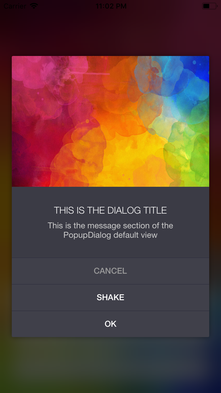
public init(title: String?,
            message: String?,
            image: UIImage? = nil,
            transitionStyle: PopupDialogTransitionStyle = .BounceUp,
            buttonAlignment: UILayoutConstraintAxis = .Vertical)
The default dialog initializer is a convenient way of creating a popup with image, title and message (see image one and two).
Bascially, all parameters are optional, although this makes no sense at all. You want to at least add a message and a single button, otherwise the dialog can't be dismissed. I am planning on implementing dismiss by background tap or swipe in the future.
If you provide an image it will be pinned to the top/left/right of the dialog. The ratio of the image will be used to set the height of the image view, so no distortion will occur.
Custom View Controller
public init(viewController: T
            transitionStyle: PopupDialogTransitionStyle = .BounceUp,
            buttonAlignment: UILayoutConstraintAxis = .Vertical)
You can pass your own view controller to PopupDialog (see image three). It is accessible via the viewController property of PopupDialog. Make sure the custom view defines all constraints needed, so you don't run into any autolayout issues.
Buttons are added below the controllers view, however, these buttons are optional. If you decide to not add any buttons, you have to take care of dismissing the dialog manually. Being a subclass of view controller, this can be easily done via dismissViewControllerAnimated(flag: Bool, completion: (() -> Void)?).
Transition Animations
You can set a transition animation style with .BounceUp being the default. The following transition styles are available
public enum PopupDialogTransitionStyle: Int {
    case BounceUp
    case BounceDown
    case ZoomIn
    case FadeIn
}
Button alignment
Buttons can be distributed either .Horizontal or .Vertical, with the latter being the default. Please note distributing buttons horizontally might not be a good idea if you have more than two buttons.
public enum UILayoutConstraintAxis : Int {
    case Horizontal
    case Vertical
}
Default Dialog Properties
If you are using thee default dialog, you can change selected properties at runtime:
// Create the dialog
let popup = PopupDialog(title: title, message: message, image: image)

// Present dialog
self.presentViewController(popup, animated: true, completion: nil)

// Get the default view controller and cast it
// Admittedly, this is a bit unfortunate :(
// I will look into a better way of doing this soon
let vc = popup.viewController as! PopupDialogDefaultViewController

// Set dialog properties
vc.image = UIImage(...)
vc.titleText = "..."
vc.messageText = "..."
vc.buttonAlignment = .Horizontal
vc.transitionStyle = .BounceUp
Styling PopupDialog
Appearance is the preferred way of customizing the style of PopupDialog. The idea of PopupDialog is to define a theme in a single place, without having to provide style settings with every single instantiation. This way, creating a PopupDialog requires only minimal code to be written and no "wrappers".
This makes even more sense, as popup dialogs and alerts are supposed to look consistent throughout the app, that is, maintain a single style.
Dialog Default View Appearance Settings
If you are using the default popup view, the following appearance settings are available:
var dialogAppearance = PopupDialogDefaultView.appearance()

dialogAppearance.backgroundColor      = UIColor.whiteColor()
dialogAppearance.titleFont            = UIFont.boldSystemFontOfSize(14)
dialogAppearance.titleColor           = UIColor(white: 0.4, alpha: 1)
dialogAppearance.titleTextAlignment   = .Center
dialogAppearance.messageFont          = UIFont.systemFontOfSize(14)
dialogAppearance.messageColor         = UIColor(white: 0.6, alpha: 1)
dialogAppearance.messageTextAlignment = .Center
dialogAppearance.cornerRadius         = 4
dialogAppearance.shadowEnabled        = true
dialogAppearance.shadowColor          = UIColor.blackColor()
Overlay View Appearance Settings
This refers to the view that is used as an overlay above the underlying view controller but below the popup dialog view. If that makes sense ;)
let overlayAppearance = PopupDialogOverlayView.appearance()

overlayAppearance.color       = UIColor.blackColor()
overlayAppearance.blurRadius  = 20
overlayAppearance.blurEnabled = true
overlayAppearance.opacity     = 0.7
Button Appearance Settings
The standard button classes available are DefaultButton, CancelButton and DestructiveButton. All buttons feature the same appearance settings and can be styled seperately.
var buttonAppearance = DefaultButton.appearance()

// Default button
buttonAppearance.titleFont      = UIFont.systemFontOfSize(14)
buttonAppearance.titleColor     = UIColor(red: 0.25, green: 0.53, blue: 0.91, alpha: 1)
buttonAppearance.buttonColor    = UIColor.clearColor()
buttonAppearance.separatorColor = UIColor(white: 0.9, alpha: 1)

// Below, only the differences are highlighted

// Cancel button
CancelButton.appearance().titleColor = UIColor.lightGrayColor()

// Destructive button
DestructiveButton.appearance().titleColor = UIColor.redColor()
Moreover, you can create a custom button by subclassing PopupDialogButton. The following example creates a solid blue button, featuring a bold white title font. Separators are invisble.
public final class SolidBlueButton: PopupDialogButton {

    override public func setupView() {
        defaultFont           = UIFont.boldSystemFontOfSize(16)
        defaultTitleColor     = UIColor.whiteColor()
        defaultButtonColor    = UIColor.blueColor()
        defaultSeparatorColor = UIColor.clearColor()
        super.setupView()
    }
}
These buttons can be customized with the appearance settings given above as well.
Dark mode example
The following is an example of a Dark Mode theme. You can find this in the Example project AppDelegate, just uncomment it to apply the custom appearance.
// Customize dialog appearance
let pv = PopupDialogDefaultView.appearance()
pv.backgroundColor      = UIColor(red:0.23, green:0.23, blue:0.27, alpha:1.00)
pv.titleFont            = UIFont(name: "HelveticaNeue-Light", size: 16)!
pv.titleColor           = UIColor.whiteColor()
pv.messageFont          = UIFont(name: "HelveticaNeue", size: 14)!
pv.messageColor         = UIColor(white: 0.8, alpha: 1)
pv.cornerRadius         = 2

// Customize default button appearance
let db = DefaultButton.appearance()
db.titleFont      = UIFont(name: "HelveticaNeue-Medium", size: 14)!
db.titleColor     = UIColor.whiteColor()
db.buttonColor    = UIColor(red:0.25, green:0.25, blue:0.29, alpha:1.00)
db.separatorColor = UIColor(red:0.20, green:0.20, blue:0.25, alpha:1.00)

// Customize cancel button appearance
let cb = CancelButton.appearance()
cb.titleFont      = UIFont(name: "HelveticaNeue-Medium", size: 14)!
cb.titleColor     = UIColor(white: 0.6, alpha: 1)
cb.buttonColor    = UIColor(red:0.25, green:0.25, blue:0.29, alpha:1.00)
cb.separatorColor = UIColor(red:0.20, green:0.20, blue:0.25, alpha:1.00)

I can see that there is room for more customization options. I might add more of them over time.
Screen sizes and rotation
Rotation and all screen sizes are supported. However, the dialog will never exceed a width of 340 points. This way, the dialog won't be too big on devices like iPads. However, landscape mode will not work well if the height of the dialog exceeds the width of the screen.
Testing
PopupDialog exposes a nice and handy method that lets you trigger a button tap programmatically:
public func tapButtonWithIndex(index: Int)Other than that, PopupDialog unit tests are included in the root folder.
Requirements
As this dialog is based on UIStackViews, a minimum Version of iOS 9.0 is required. This dialog was written with Swift 2.2, 3.X compatability will be published on a seperate branch soon.
Changelog
- 0.2.0 You can now pass custom view controllers to the dialog. This introduces breaking changes.
- 0.1.6 Defer button action until animation completes
- 0.1.5 Exposed dialog properties
(titleText, messageText, image, buttonAlignment, transitionStyle) - 0.1.4 Pick transition animation style
- 0.1.3 Big screen support
Exposed basic shadow appearance - 0.1.2 Exposed blur and overlay appearance
- 0.1.1 Added themeing example
- 0.1.0 Intitial version
Author
Martin Wildfeuer, [email protected]
for Orderella Ltd., orderella.co.uk
You might also follow me on Twitter, @theMWFire
Images in the sample project
The sample project features two images from Markus Spiske raumrot.com:
Vintage Car One | Vintage Car Two
Thanks a lot for providing these :)
License
PopupDialog is available under the MIT license. See the LICENSE file for more info.

 React
React
 Typescript
 Django
 Laravel
 Facebook
 Microsoft
 Google
 Alibaba
 D3
D3
 Tencent