Cosmos is a legacy project, that has now been deprecated. Consider using Quantum Design System as an alternative.
Thank you.


A Design System For Auth0 Products.
“A set of shared and integrated principles and patterns that define the overall design of a product.” — Karri Saarinen @ Airbnb
The aim of Cosmos is to help Auth0 designers and developers deliver work faster and better. It provides teams with a common language and encourages adherence to design guidelines with compliant components right out of the box.
We are currently building our roadmap and initial components inventory to estimate the v1 release date. We are in active development and testing with selected teams, so the components API may change frequently. However, you can play with the alpha version today! Your feedback will help us shape Cosmos.
See the documentation at https://auth0-cosmos.now.sh/
- Getting started
- How to use Cosmos
- Components Overview
- Playground
- Sandbox - Storybook
- Contribution Guide
Ensure you have Yarn installed.
To add Cosmos to your React application, run:
$ yarn add @auth0/cosmos
If you prefer npm, run this command instead:
$ npm install --save @auth0/cosmos
That's all you need to do: no config changes required!
- Cosmos provides a CssBaseline component to setup some of the base styles required (fonts, etc). It also fixes some inconsistencies across browsers and devices while providing slightly more opinionated resets to common HTML elements. Import and render the
CssBaselinecomponent once at the top of your application.
import { CssBaseline } from '@auth0/cosmos';

const App = () => {
  return (
    <>
      <CssBaseline />
      {/* The rest of your application */}
    </>
  )
};- Include and render them alongside your React components:
import { Button } from '@auth0/cosmos'
const Actions = () => (
<div>
<h1>Hello Word!</h1>
<Button size="default" appearance="cta" onClick>
Cosmos Documentation
</Button>
</div>
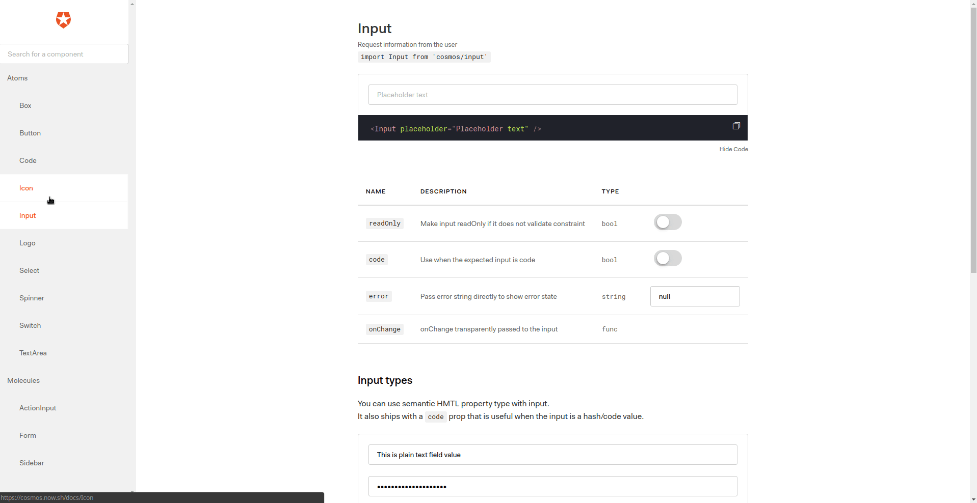
)To learn more about the components and the props they offer, check the Cosmos documentation. Pick a component from the sidebar to find examples and configuration options.
There's a lot to write here, we maintain it in our docs: Contribution guidelines
Issues or feature requests can be created on our GitHub page or on Slack (internal). You can use the playground to test and share code, report bugs and ask for feedback.
Thanks to Chromatic for providing the visual testing platform that helps us review UI changes and catch visual regressions.
Thanks to BrowserStack for providing the infrastructure that allows us to test in real browsers.
Thanks to Circle CI for providing the infrastructure for our Continuous Integration needs.


![dependabot[bot] avatar](https://avatars.githubusercontent.com/in/29110?v=4 "dependabot[bot]")


 React
React
 Typescript
 Django
 Laravel
 Facebook
 Microsoft
 Google
 Alibaba
 D3
D3
 Tencent