GithubHelp home page GithubHelp logo

bdlukaa / rounded_background_text Goto Github PK

View Code? Open in Web Editor NEW
54.0 2.0 12.0 6.03 MB

Text and TextField highlighted with rounded corners

Home Page: https://bdlukaa.github.io/rounded_background_text/

License: BSD 3-Clause "New" or "Revised" License

Dart 69.01% CMake 10.61% C++ 17.67% C 0.77% HTML 1.94%
flutter text highlighted-text

rounded_background_text's Introduction

rounded_background_text

Highlight text with rounded corners

Content

Features

  • ✅ Highlight Text
  • ✅ Highlight Text Field
  • ✅ Highlight Text Span

Getting started

Import the package:

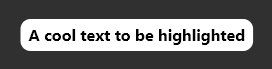
import 'package:rounded_background_text/rounded_background_text.dart';

Usage

Highlight a simple text:

RoundedBackgroundText(
  'A cool text to be highlighted',
  style: const TextStyle(fontWeight: FontWeight.bold),
  backgroundColor: Colors.white,
),

Simple Text

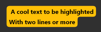
Multiline text is also supported

RoundedBackgroundText(
  'A cool text to be highlighted\nWith two lines or more',
  style: const TextStyle(fontWeight: FontWeight.bold),
  backgroundColor: Colors.amber,
),

Two Lines Text

Highlight a text field:

You must use a TextEditingController

RoundedBackgroundTextField(
  backgroundColor: Colors.blue,
  style: const TextStyle(fontWeight: FontWeight.bold),
  textAlign: TextAlign.center,
),

The text will be highlighted as the user types

TextField Preview

The text highlight will follow the text field scroll position.

Highlight a text span:

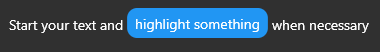
Highlight a small part of a text

RichText(
  text: TextSpan(
    text: 'Start your text and ',
    children: [
      RoundedBackgroundTextSpan(
        text: 'highlight something',
        backgroundColor: Colors.blue,
      ),
      const TextSpan(text: ' when necessary'),
    ],
  ),
),

TextSpan Highlight Preview

You may like to know:

Change the corner radius

You can change the radius of the corners by setting innerRadius and outerRadius:

RoundedBackgroundText(
  'A cool text to be highlighted',
  style: const TextStyle(fontWeight: FontWeight.bold),
  backgroundColor: Colors.white,
  innerRadius: 15.0,
  outerRadius: 10.0,
),

The max allowed value is 20.0. The min is 0.0

Deep dive

This section explains, with details, how the background painting works.

RoundedBackgroundText doesn't use a Text widget under the hood. Instead, it uses a custom text painter to paint the text above the background. As soon as the RoundedBackgroundText widget is initialized, the line metrics for the text is calculated (See computeLineMetrics), and is recalculated when the text changes or when the parent width changes. This is done at built time, resulting in a smooth experience for the user.

To paint the background, the line metrics generated before is used. Each line has 4 properties:

  • x - where the line starts horizontally within the size
  • y - where the line starts vertically within the size
  • width - the horizontal size of the line
  • height - the vertical size of the line

With these values, we can generate the background for each line. The background is generated around the whole text: from top-left to bottom-left to bottom-right to top-right to top-left. This makes it easy to calculate when there is a corner, either outer or inner.

The inner and outer radius are dynamically calculated based on the line height, provided by the line metrics, and the given innerRadius and outerRadius, respectively. By default, innerRadius is 10.0 and outerRadius is 10.0. For safety, in order to keep the roundnesses correct, these values must be in the bounds of 0.0 (min) and 20.0 max, otherwise the painting would be out the line.

Contribution

Feel free to file an issue if you find a problem or make pull requests.

All contributions are welcome!

rounded_background_text's People

Contributors

bdlukaa avatar

Stargazers

 avatar  avatar  avatar  avatar  avatar  avatar  avatar  avatar  avatar  avatar  avatar  avatar  avatar  avatar  avatar  avatar  avatar  avatar  avatar  avatar  avatar  avatar  avatar  avatar  avatar  avatar  avatar  avatar  avatar  avatar  avatar  avatar  avatar  avatar  avatar  avatar  avatar  avatar  avatar  avatar  avatar  avatar  avatar  avatar  avatar  avatar  avatar  avatar  avatar  avatar  avatar  avatar  avatar  avatar

Watchers

 avatar  avatar

rounded_background_text's Issues

crashes with just_the_tooltip

I didn't look into this closely, but it didn't work.

The following assertion was thrown building
js_primitives.dart:30 _OverlayEntryWidget-[LabeledGlobalKey<_OverlayEntryWidgetState>#1c2cf](dirty, state:
js_primitives.dart:30 _OverlayEntryWidgetState#d6b7f):
js_primitives.dart:30 The _RenderLayoutBuilder class does not support dry layout.
js_primitives.dart:30 Calculating the dry layout would require running the layout callback speculatively, which might
js_primitives.dart:30 mutate the live render object tree.

[bug] Rendering issue with non-latin characters on Flutter Web

Describe the bug
When using the highlight widget with a non-latin text, the highlight is misplaced. When the non-latin text is mixed with the Latin text, the highlight goes crazy to different points.

Screenshots
image
image
image

Additional context
This happens with Hebrew, Korean, Japanese, Chinese, Thai, Arabic. With the Cyrillic alphabet, it works as fine as the Latin alphabet.

This only happens with the canvas-kit renderer. The html renderer works fine.

[bug] Selectable Text Renders at Incorrect Position

Describe the bug
It looks like there is a difference in the line spacing and letter spacing between the regular text and the selectable text.

To Reproduce
Steps to reproduce the behavior:

  1. Open the demo website https://bdlukaa.github.io/rounded_background_text
  2. Select the Selectable Text option.

Expected behavior
Both text elements should render at the same position with consistent line height and letter spacing.

Screenshots
293644301-22b9fc75-a925-4ec5-948c-1dfaa9a5d2b1

Additional context
We've previously mentioned this issue in another thread and provided a workaround by using RoundedBackgroundTextField with readOnly: true.

How to calculate it's width or height with a LayoutBuilder?

Is your feature request related to a problem? Please describe.
I am trying to place this widget in a positioned widget.And i want to set the 'left:' parameter to screenWidth - RoundedBackgroundText.width
Describe the solution you'd like
I there is a size parameter available then it would be easy for me to position this widget where i wanted.

Additional context
Is there any other way to accomplish my requirement with current version?

[bug] Sometimes the inner corner doesn't align with the next outer corner

Describe the bug
Sometimes the inner corner doesn't align with the next outer corner

To Reproduce
Use a textfield with two lines, one sighly smaller or bigger than the other

Expected behavior
A clear and concise description of what you expected to happen.

Screenshots
Showcase of the bug

Additional context
N/A

Hint doesn't work

Describe the bug
The hint parameter is not built.

To Reproduce
Steps to reproduce the behavior:

  1. Create Widget RoundedBackgroundTextField
  2. add hint: "text"
  3. See error

Expected behavior
A lighter-colored placeholder hint that appears on the first line of the text field when the text entry is empty.

[bug] Flutter 3.0 padding text down

Hi friends,

Thanks for your great package I got an issue after upgrading to flutter 3.0, the text floating down from the background :( can you please help me fix this issue? Thanks in advance!

My widget:
Positioned( left: 15, top: 10, child: Container( alignment: Alignment.center, //decoration: , width: 150, height: 40, color: Colors.transparent, child: RoundedBackgroundText( 'TEXT ' , style: const TextStyle( fontSize: 16, fontWeight: FontWeight.w900), backgroundColor: Colors.orangeAccent .withOpacity(0.9), textAlign: TextAlign.center, maxLines: 1, innerRadius: 1.0, outerRadius: 6.0, // textHeightBehavior: // const TextHeightBehavior( // applyHeightToFirstAscent: false, // applyHeightToLastDescent: false, // leadingDistribution: // TextLeadingDistribution // .even, // ), ),

Screenshot 2022-05-13 145414

Disable auto-resize of text

Is your feature request related to a problem? Please describe.
I have an application that does not need the option to resize the font size when typing. I have an extra option for the user to do this.

Describe the solution you'd like
I would love to have a parameter, where I simply can disable this feature. Like autoResize: false. In the best case, it simply prohibits adding more in the text field, when the max limit is reached.

Describe alternatives you've considered
Alternatively, I could also imagine something like in the Text widget, where there is a parameter for overflow (overflow: TextOverflow.fade).

Additional context
This is a fundamental problem, that needs to be solved. The usage of this plugin is otherwise critical or not possible.

Placing the widget

Describe the bug
I am kind of puzzled how the new version was able to get released. I see no option to handle this widget as before.
And I also seem to use a specific size as a parent, which is a kind of contra-production if the goal is to have a dynamic size text field?!

To Reproduce
Run the code below and try to center the widget.
(Keeps being stuck at the top-left corner)

  @override
  Widget build(BuildContext context) {
    // TODO: implement build
    return Center(
      child: RoundedBackgroundTextField(
        autofocus: true,
        keyboardType: TextInputType.multiline,
        enableInteractiveSelection: true,
        controller: controller,
      ),
    );
  }

Expected behavior
Being able to move and handle the widget like the normal Text() widget or any other normal widget.

I am now using version 0.1.3 because every newer one is not functional at all. Please fix

Scrollable text field

Is your feature request related to a problem? Please describe.
Scaling the text down doesn't work properly!

Describe the solution you'd like
Scrollable text field

Describe alternatives you've considered
N/A

Additional context
N/A

Unable to tap text field to call keyboard if the text field is empty

Hello, I'm using your package and I find it really helpful but I'm facing a small issue where if I dismiss the keyboard without adding any text to rounded background text field, I'm unable to tap the text field nor cursor to call back the keyboard unless it contains text.
Simply put it as if the text field is empty on tap is unable to call keyboard unless the text field contains any form of text

[enhancement] Better hit detection

Is your feature request related to a problem? Please describe.
The hit area of the widget is currently suboptimal. The problem occurs when there is text with multiple blank lines in between. In this situation, the widget will continue to respond to hit events even if the user taps in those blank spaces. In the image below, you can see the region that is mistakenly identified as a hit target colored green. In my opinion, the widget should only detect a hit event when the user taps on the text with the background, which is below colored in amber.
Screenshot 2024-01-04 122145

Describe the solution you'd like
We should override the hitTest method of the CustomPainter inside the RoundedBackgroundTextPainter class. Below is a simple example of how to do this.

@override
  bool? hitTest(Offset position) {
    // Retrieve the line information
    final lineInfos = computeLines(text);

    // Check each line
    for (final lineInfo in lineInfos) {
      for (final info in lineInfo) {
        // Construct the rounded rectangle for this line
        final rRect = RRect.fromLTRBR(
          info.x,
          info.y,
          info.fullWidth,
          info.fullHeight,
          Radius.circular(info.outerRadius(outerRadius)),
        );

        // Check if the position is within this rectangle
        if (rRect.contains(position)) {
          onHitTestResult(true); // Call method with the result for external handling
          return true;
        }
      }
    }

    // If the position was not within any line's bounding box
    onHitTestResult(false); // Call method with the result for external handling
    return false;
  }

This example is simple and will not perfectly detect any inner rounding. It will also not detect the surrounding padding.
Maybe you have a better solution, but I think for most cases this simple hit detection will be enough. For me it will also be useful if it always calls a method like onHitTestResult which returns if the hitTest is true or false. This is helpful for applications that have more complex logic with many layers. So in the end the widget will look like this then.

RoundedBackgroundText(
  'Text',
  onHitTestResult: (hit) {
   /// Handle hit
  },
  backgroundColor: Colors.amber,
),

[bug] Vertical Alignment Issue

Describe the bug
The bug I've encountered is that the text within the painted content is not vertically aligned to the center.

To Reproduce
Create a widget with a large font size like below. Then use the Flutter Widget Inspector and tap on the text. This way you can see it clearly.

@override
Widget build(BuildContext context) {
   return Scaffold(
      backgroundColor: Colors.blueGrey.shade500,
      body: Center(
        child: RoundedBackgroundText(
          'Hello World',
          backgroundColor: Colors.white,
          style: const TextStyle(fontSize: 48),
        ),
      ),
    );
}

Expected behavior
I expected the text inside the painted content to be vertically aligned at the center.

Screenshots
Screenshot_20231229_140736

Additional context
I think a potential improvement is to update the y-position for the first line. However, I'm not sure if this is the optimal approach.

double get y {
    final y = metrics.baseline - metrics.ascent;
    if (isFirst) {
      // Replace => return y;
      return (height - metrics.height -_lastLinePadding.bottom)/2;
    } else if (isLast) {
      return y + (_lastLinePadding.top / 2);
    } else {
      return y - _innerLinePadding.top;
    }
  }

[bug] Textfield align with background is wrong

Describe the bug
When we use RoundedBackgroundTextField the background doesn't align correctly with the input text if we align left or right.

To Reproduce
Just use the example code with the same configurations like in the image below.

Screenshots
Screenshot_20230815_112832

Space doesn't get background

Describe the bug
When typing a space (" ") a background doesn't get added. When breaking the line twice and then typing again, you can create ONE single text element with TWO different backgrounds. This isn't very confusing for the user when he suddenly drags two elements while expecting to drag only one.

To Reproduce
Steps to reproduce the behavior:

  1. Create a RoundedBackgroundTextField (make sure to set keyboardType: TextInputType.multiline,)
  2. Type "First line\n\nThird line"
  3. See empty row

Expected behavior
Generally having the space character (" ") rendered.

Screenshots
WhatsApp Image 2022-07-24 at 10 23 57 PM

Text is outside its background

Describe the bug
When using Thai characters, sometimes the text appears partly outside its background.
Tested both on Android and web

Is there any workaround?

To Reproduce
Steps to reproduce the behavior:

  1. Add text
    RoundedBackgroundText('ที่', style: TextStyle(fontFamily: 'Sarabun', fontSize: 26), backgroundColor: Colors.amber)
  2. Add font (fonts folder is attached)
    pubspec..yaml:
    ` fonts:
    • family: Sarabun
      fonts:
      • asset: fonts/Sarabun-Regular.ttf`

Expected behavior
Text should appear inside its background

Screenshots
image

Additional context
Fonts folder:
https://www.arnirichard.dk/fonts.zip

Doctor summary (to see all details, run flutter doctor -v):
[√] Flutter (Channel master, 3.1.0-0.0.pre.2268, on Microsoft Windows [Version 10.0.22000.856], locale en-GB)
[√] Android toolchain - develop for Android devices (Android SDK version 33.0.0)
[√] Chrome - develop for the web
[√] Visual Studio - develop for Windows (Visual Studio Community 2022 17.2.6)
[√] Android Studio (version 2021.2)
[√] Connected device (4 available)
[√] HTTP Host Availability

• No issues found!

Recommend Projects

  • React photo React

    A declarative, efficient, and flexible JavaScript library for building user interfaces.

  • Vue.js photo Vue.js

    🖖 Vue.js is a progressive, incrementally-adoptable JavaScript framework for building UI on the web.

  • Typescript photo Typescript

    TypeScript is a superset of JavaScript that compiles to clean JavaScript output.

  • TensorFlow photo TensorFlow

    An Open Source Machine Learning Framework for Everyone

  • Django photo Django

    The Web framework for perfectionists with deadlines.

  • D3 photo D3

    Bring data to life with SVG, Canvas and HTML. 📊📈🎉

Recommend Topics

  • javascript

    JavaScript (JS) is a lightweight interpreted programming language with first-class functions.

  • web

    Some thing interesting about web. New door for the world.

  • server

    A server is a program made to process requests and deliver data to clients.

  • Machine learning

    Machine learning is a way of modeling and interpreting data that allows a piece of software to respond intelligently.

  • Game

    Some thing interesting about game, make everyone happy.

Recommend Org

  • Facebook photo Facebook

    We are working to build community through open source technology. NB: members must have two-factor auth.

  • Microsoft photo Microsoft

    Open source projects and samples from Microsoft.

  • Google photo Google

    Google ❤️ Open Source for everyone.

  • D3 photo D3

    Data-Driven Documents codes.