Issue tickets have been created so that you can track your progress. As you complete a ticket, close it out.
- Each person should create a github assignment repo named
ASSIGNMENT-product-cards - Each person should create a local folder in this location:
~/workspace/foundations/exercises/product-cards. - You should be using flexbox.
- Decide as a team how many branches you will need and what will happen on each branch (remember one feature per branch).
- While in
~/workspace/foundations/exercises, make a directory calledproduct-cards - Create a github repository called
product-cardsand push up a README.md file - Create a setup branch and push up the usual stuff
Your task is to build a grid of cards for a company's products. Here are the requirements for the basic structure of the cards.
- Each card should be a
div. - Cards should be 3 per row.
- Each product should contain a
headerelement that, itself, contains anh2element where the product's title will be written. - Each product should have three block level html elements.
- The first section should contain three child block elements.
- The first element contains the product image.
- The second element contains the product description.
- The third element contains the product availability (e.g. "Available" or "Not Available")
- The second section contains product specifications.
- This section should have a header containing the word "Specifications"
- This section should contain two block elements
- The first block element specifies the size.
- The second block element specifies the weight.
- This section should contain a footer.
- The footer contains text stating when the product specifications become invalid.
- The third section contains the product pricing.
- This section should contain a header.
- This section should contain three block elements.
- Each block element contains information about the price for different quantities.
- The entire card has a box shadow.
- The card title has a solid 1px border that is
lightblue. - The title and product image are centered.
- Notice that the text for the description in the image is justified.
- The text for the product specification details and pricing details is bold.
- The availability element extends the full width of the card, with a dark grey background and yellow text.
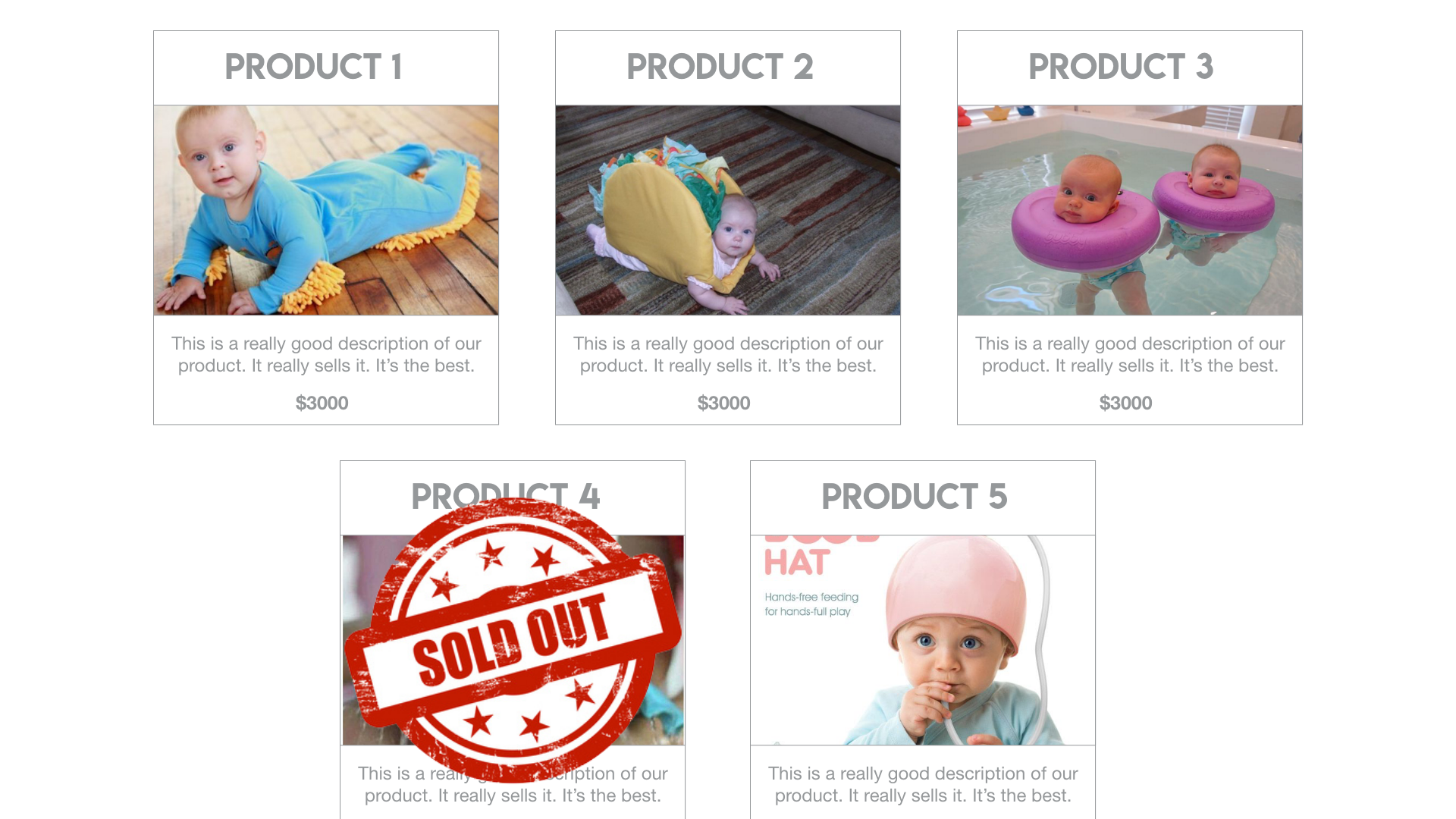
Here's an image that shows how the cards should appear.

- Design your application and use some colors that aren't weird or boring.
- Use a tool called Material Palette and pick 2 colors and you will get a resulting palette. You can click to download and then select "CSS" and you will get a file that looks like this:
/* Palette generated by Material Palette - materialpalette.com/brown/teal */

.dark-primary-color    { background: #5D4037; }
.default-primary-color { background: #795548; }
.light-primary-color   { background: #D7CCC8; }
.text-primary-color    { color: #FFFFFF; }
.accent-color          { background: #009688; }
.primary-text-color    { color: #212121; }
.secondary-text-color  { color: #757575; }
.divider-color         { border-color: #BDBDBD; }
- Modify your CSS and/or HTML classes to incorporate this new color palette.
- Pick font(s) from Google Font and include them in your project. You can use them wherever you want, but uh, don't make it too ugly.
- For items that are no longer available, place this image over top of the product card. Note this is complex positioning, it is going to challenge you.. What I mean by "over the product card" is
- Use CSS to conditionally apply styles depending on the width of the screen! (or the size of the browser window) You can do this using a fancy thing called media queries. You can find a good example of how to do that here.

 React
React
 Typescript
 Django
 Laravel
 Facebook
 Microsoft
 Google
 Alibaba
 D3
D3
 Tencent