benpickles / peity Goto Github PK
View Code? Open in Web Editor NEWProgressive <svg> pie, donut, bar and line charts
Home Page: http://benpickles.github.io/peity
License: MIT License
Progressive <svg> pie, donut, bar and line charts
Home Page: http://benpickles.github.io/peity
License: MIT License


It would be nice if we could have tooltips showing values for the various charts.
Any react port?
In the Events section of the page http://benpickles.github.com/peity/ presumably there should be 3 pie charts next to their corresponding bullet points and elements... but I'm seeing only a barely visible (very pale orange/pink) pie chart that's a full circle with no segments, followed by the element, and the following two elements (in successive bullet points) have no pie chart at all.
But everything else on the page works fine and looks great!
This is in FF 3.6.3, I'm at work and don't have access to anything else to test in right now.
I started using Peity, and when i hover over a div, I am making the Peity sparklines go from b&w to full color. I am doing this by
$(".sparkline").peity("line",{
colour: function() {return this.getAttribute("fillColor")},
strokeColour: function() {return this.getAttribute("strokeColor")},
strokeWidth: function() {return this.getAttribute("strokeWidth")},
max: function() {return this.getAttribute("sparklineMax")},
width: function() {return this.getAttribute("sparklineWidth")},
});
However with only 10 sparklines, this takes a good solid second to render. Any way to speed this up?
everywhere that has svgElement('shape',{attributes object})
in the attributes object, add a line
"data-value":value
this enables code like
$("svg rect").hover(function(){console.log($(this).attr("data-value"));},function(){});
and obviously more clever uses of the value that gave rise to the representation
Is it possible to do Multiple Line Chart?
thanks
Is this in the roadmap at all?
Huge fan of Peity but I'm wanting to drop jQuery. Would love to see it ported over to vanilla JS. I can give it a go if you have no plans for it?
Any chance you could add tooltips (by default) to some types of peity chart (e.g. pie) or even all of them, so that the real underlying value (e.g. 17/23) can be viewed as well as the visual rendering?
Hi there Ben
I have installed your awesome Peity Charts.
I have encountered an issue where i have added two updating line charts to the same web page. Since adding the second updating line chart to the same page, i have lost the functionality on the first one. It renders graphically but has stopped animating.
Following guidance on your documentation, i have added the following code to my web page:
Updating Chart One HTML:
<span class="updating-chart">5,3,9,6,5,9,7,3,5,9,6,5,9,7,3,5,2</span>Updating Chart One JavaScript:
var updatingChart = $(".updating-chart").peity("line", { width: 64 })

setInterval(function() {
  var random = Math.round(Math.random() * 10)
  var values = updatingChart.text().split(",")
  values.shift()
  values.push(random)

  updatingChart
    .text(values.join(","))
    .change()
}, 1000)
Updating Chart Two HTML:
<span class="updating-chart-two">5,3,9,6,5,9,7,3,5,9,6,5,9,7,3,5,2</span>Updating Chart Two JavaScript:
var updatingChart = $(".updating-chart-two").peity("line", { width: 64 })

setInterval(function() {
  var random = Math.round(Math.random() * 10)
  var values = updatingChart.text().split(",")
  values.shift()
  values.push(random)

  updatingChart
    .text(values.join(","))
    .change()
}, 1000)
The reason for me running two updating line charts is because i would like to style the two updating line charts differently.
I am not that experienced with JavaScript, so i am hoping you would be kind enough to help resolve my issue.
Thanks ever so much, and thanks for such a great data chart solution. Its really appreciated.
Regards
For the bar charts, is there a way to assign some small bar height to values of "0"?
I prefer the way Github does it with their 52-week participation graphs and not just to have empty space.
When creating a line chart with all zeros, the following error is seen:
Error: Invalid value for <polygon> attribute points="0 NaN 0 NaN 1 NaN 2 NaN 3 NaN 4 NaN 5 NaN 6 NaN 7 NaN 8 NaN 9 NaN 10 NaN 11 NaN 12 NaN 13 NaN 14 NaN 15 NaN 16 NaN 17 NaN 18 NaN 19 NaN 20 NaN 21 NaN 22 NaN 23 NaN 24 NaN 25 NaN 26 NaN 27 NaN 28 NaN 29 NaN 30 NaN 31 NaN 32 NaN 33 NaN 34 NaN 35 NaN 36 NaN 37 NaN 38 NaN 39 NaN 40 NaN 41 NaN 42 NaN 43 NaN 44 NaN 45 NaN 46 NaN 47 NaN 48 NaN 49 NaN 50 NaN 51 NaN 52 NaN 53 NaN 54 NaN 55 NaN 56 NaN 57 NaN 58 NaN 59 NaN 60 NaN 60 NaN"
The yQuotient in line 224 is being calculated as Infinity because you're dividing by zero. I solved it by:
yQuotient = Math.min(0, height / (max - min))
but I don't know if this accounts for negative minimum values. In my case I'll never have negative values so it doesn't affect me, but I'm looking for your guidance on a proper solution.
All changes are currently logged in https://github.com/benpickles/peity/blob/master/History.md, it would be nice to make them more visible and present on the website.
Would it be possible to make a new chart type, based on this image:
I think it's called a bullet chart. Though really, what I'm doing is a progress chart.
I'd normally do a DIV with a % width but I feel an SVG is better suited for this task, especially on smaller screens. I think this chart type would suit Peity.
The URL at the bottom of the page in your gh-pages branch points to the old LICENSE file before you renamed it to MIT-LICENSE on master. A four character change isn't really worth forking and raising a pull request :)
Considering you've just been featured on Hacker News, it might be worth fixing. http://news.ycombinator.com/item?id=4143627
is there a way to see what the value is for each bar in a bar chart?
thanks,
tim
We are using simple pie charts to display a series of data points. If we pass invalid data to the library, Chrome complains about invalid SVG.
Example:
<span class="pie hidden" data-diameter="96">0,0,0,0</span>
Chrome complains with:
Error: Invalid value for <path> attribute d="M 48 48 L 48 0 A 48 48 0 0 1 NaN NaN Z"
Obviously it's impossible to create a pie chart with all zeroes, but I would have thought that the library should capture this error and avoid putting invalid SVG into the DOM.
I tried to position absolute multiples line charts with rgba colors but it seems that they have a white background and can't be transparent. Is there a way to plot multiple lines?
Hi,
I'm using your api to display some charts. Their values could be reloaded in Ajax, there is only a problem with the change function, I can't update the colors of the chart. Is there a way to do that? I can easily assign color dynamically at the chart generation but the update function doesn't seems to use the same information.
Thanks for your help
This may not be a real issue, but since it took me some time to troubleshoot I thought I'd post a note about it here in case someone else runs into the same problem. I was attempting to update the value of a pie chart by changing the span value and calling .change() but nothing would appear -- the SVG element was still there in the source but the pie chart was not actually created. But I now realize this was because I was updating the pie chart before re-showing the parent div. When I switched the order of those it fixed the problem.
Hi,
I have included the peity library, and inside a div I added this line
5,3,9,6,5,9,7,3,5,2.
And I added this line to my script file.
$(".bar").peity("bar")
However, the bar chart is displayed as a line as shown in the following image.


Can you guide me to solve this problem, please? I tried to increase the width and the height of class bar , but it did not work.
Thank you in advance.
Hi,
I'd like to know if it's possible to render the pie charts in different color combinations based on the values by using if conditions in the fill function. Like when the value is <span class="pie">150/200</span>, the pie chart will be in orange and blue. If it's is 250/300, the colors will be green and blue. Here's a fiddle example to show what I'm trying to do.
Maybe this is already possible, and I'm just struggling to figure it out. But it would be great if the donut charts could be set to be 100% width and height of the container element.
That's basically it.
Given the string "1,2,3,-4,-3,-2,-1", the -4 won't plot correctly.
You can even see this in the demo page if you look carefully.
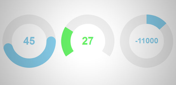
In the image below you can see the middle shape doesn't create a full circle I'd want to add a clipping mask in the svg? would this be possible?
Note: I Know they're alternatives but SVG is my preferred option rather than canvas
I'm really sorry for even filing this bug. This library is an awesome idea, btw.
would it be nice if there is an peity registered in bower or component pakage?
Cannot run test suit, phantomjs cannot find file
❯ make test
rm -f test/comparisons/*
rm -f test/images/*
./node_modules/.bin/mocha -R spec -t 30000  ./test/index.js
child_process: customFds option is deprecated, use stdio instead.


  Peity
    1) bar1
    ....

  0 passing (320ms)
  51 failing

  1) Peity bar1:
     Uncaught Error: Command failed: /Users/bwin/Documents/Dev/github/peity/test/bin/screenshot http://localhost:50354/bar1 /Users/bwin/Documents/Dev/github/peity/test/images/bar1.png 32 16
env: phantomjs: No such file or directory

      at ChildProcess.exithandler (child_process.js:751:12)
      at ChildProcess.emit (events.js:110:17)
      at maybeClose (child_process.js:1015:16)
      at Socket.<anonymous> (child_process.js:1183:11)
      at Socket.emit (events.js:107:17)
      at Pipe.close (net.js:485:12)
lets say with the following two elements, <span>1, 2, 3, 4, 5</span> and <span>null, null, 3, 4, 5</span> is there a way to run peity on both, and have the second graph only plot the 3, 4, 5, but leave space for the two null values? The net effect would be if you layered the second over the first, they lines would be identical, however the second graph would just not have any plot points.
Use Case: showing a trend of last 4 weeks of data for several items, but some items may only have 3 or 2 weeks of data, so instead of having the graph look skewed since it's stretching a smaller data set to teh same width, it would keep the same width, but just not plot the missing points.
Doable?
Is it possible to nest pie or doughnut charts (i.e. have one inside another one)? Could it become possible?
Is it possible to animate these charts similar to what chart.js does?
Will be good to have option for spacing between bars in bar charts.
Firstly, great plugin. It's super easy to use and you should be commended on your work :)
I have written a 'timeline' style slider which onchange fires a 'drawPie' function containing the following peity code:
function drawPie() {
$('#pieData .pie').peity("pie", {
radius: function () {
return this.getAttribute("data-radius")
},
colours: function () {
return [squads.away.color, squads.home.color]
}
});
}
The issue I am having is that each call to drawPie creates a new span tag within #pieData. Peity continues to work (hazzah!), but creates multiples of the span tags without limit (boo!). I'm not sure if this is by design or my implementation.
For clarity, this is the 'change' function of the slider which fires drawPie:
....
change: function (e, ui) {
//alert('changed '+ $('#matchtimeline option').eq(ui.values[0]).text() );
//fire changes to charts...
//change the span first
var homepossession = Math.floor(Math.random()*100);
var awaypossession = 100 - homepossession;
$('#pieData .pie').text(homepossession + "/" + awaypossession);
drawPie();
}
....
Help is appreciated.
Hi,
I'm trying to set different colors for each bar on my bar chart.
I use Peity to show small graph with 2 bars on for a periode n and the other for perdiode n-1 so i need to have 2 differents colors for each of my bars.
I haven't find a way to do so.
Thanks.
Please correct me if I'm wrong but it appears that v0.6.0 vs. v1.1.2 renders the element as a child vs. a sibling, respectively, of the element containing the chart values.
Being a previous sibling makes it much harder/impossible to style the canvas with CSS: http://stackoverflow.com/questions/1817792/css-previous-sibling-selector
v.0.6.0: http://imgur.com/H2rwfs9
v.1.1.2: http://imgur.com/joUXesR
The see license for details links to a nonexistent MIT License:
https://github.com/benpickles/peity/blob/master/MIT-LICENSE
Not a very urgent bug, but a 404 is a 404 :)
There is an existing NUGET package that is two major versions out of date. Can I request that the NUGET package is maintained in line with the github release.
Thanks. Andy.
Sometimes the $svg.width() and $svg.width() calls return 0, even though we explicitly set width and height of the element before creating it. I cannot figure out whether this is a bug in jquery or mobile safari (iOS 7.1). In any case, I cannot reproduce it outside of my current project. The fix is simple and probably safe though, so I thought I'd upstream it:
diff --git a/RowingInMotion.Analytics/app/lib/peity/jquery.peity.js b/RowingInMotion.Analytics/app/lib/peity/jquery.peity.js
--- a/RowingInMotion.Analytics/app/lib/peity/jquery.peity.js
+++ b/RowingInMotion.Analytics/app/lib/peity/jquery.peity.js
@@ -135,16 +135,13 @@
               values = [0, 1]
           }

-          var diameter = opts.radius * 2
+          var diameter = opts.radius * 2,
+              width = opts.width || diameter,
+              height = opts.height || diameter

-          var $svg = this.prepare(
-            opts.width || diameter,
-            opts.height || diameter
-          )
+          var $svg = this.prepare(width, height)

-          var width = $svg.width()
-            , height = $svg.height()
-            , cx = width / 2
+          var cx = width / 2
             , cy = height / 2

           var radius = Math.min(cx, cy)
I have perhaps a slightly unusual use case. I have dynamically created data where some options will be 0. My assumption has been that using nth-child in CSS to cycle through elements to change the fill would result in the same colours for both bar and pie graphs to allow the use of a visual key.
However, I have noticed that any 0 values are not generated in the pie version, so the colours do not match.
As a workaround I am pushing in a figure of 0.0001 instead, but wanted to flag this up in case you felt this was not desired behaviour.
Hi, thanks for great plugin!
It is pretty fine solution, but i couldn't optimize it for IE7 + IE8 - I am using this :
http://code.google.com/p/explorercanvas/wiki/Instructions
I follow the second reccomendation on their github wiki, bud doesnt work if i apply it.
I am giving the fix code into private function of plugin - createCanvas()
Rest of code and initialization is same as on your pages
I would be very grateful for any advice..
Thank you very much
I have the latest Chrome for Linux (22.0.1229.79), running under Ubuntu. The pie charts work fine in Safari and Firefox, but under Chrome 5/5 on 0/5 show no graphic, even on the demo page at http://benpickles.github.com/peity/
I played a bit around with the line-charts to be able to show incoming- and outgoing traffic in one chart. This could easily be done by visualizing the 2nd data list in a 2nd line-chart and multiplying it by -1.

Unfortunately, the scalings of the line-charts are independent from each other - as you can see in the little picture. Does anyone see a way to get around this issue?
Given all zero data, e.g. <span class="bar">0,0,0,0,0</span>, the browser has an error in the JS Console:
Error: Invalid value for attribute y="NaN" jquery.peity.js:12
And the bar chart base-line will show at the top of the span rather than the bottom.
Use case: <span class="peity">5,5,5,5</span>
when peity turns this into a line chart, the result is a line across the vertical top of the resulting box.
highlighted box is the svg, line goes across top
How hard would it be to modify the source js to have the line go across the vertical middle of the resulting box instead of along the top. I realize this is dependent on the min/max automatically taken from the source values, but when there's the same values, the resulting line is at vertical top instead of vertical middle.
I have a backup plan of going over the data myself vs js before applying peity and manually setting min/max values at -/+1 of the source data, which would achieve the same effect, but if there's a simpler way of modifying the source directly, I'd rather do that as it'd be all encomposing.
Would it be possible to add a 'title' to the svg element which shows the text when moving the mouse over that element?
With a donut widget, can we add legends automatically ?
Thanks a lot !
Hi I use your wonderful work with maps based on leaflet the render is like this

My problem is I want to let the user to display or not those icons so he must click on a checkbox to see data on the map.
The problem is that the jquery code can't work in this case because the page is already loaded. Do you have an idea for this problem ?

Thanks
I'm trying to have the line chart span 100% of it's parent and when I pass '100%' in the width parameter of the line type, the plugin doesn't draw anything.
Thanks.
There isn't any way to add more than 2 values on pie charts
A declarative, efficient, and flexible JavaScript library for building user interfaces.
🖖 Vue.js is a progressive, incrementally-adoptable JavaScript framework for building UI on the web.
TypeScript is a superset of JavaScript that compiles to clean JavaScript output.
An Open Source Machine Learning Framework for Everyone
The Web framework for perfectionists with deadlines.
A PHP framework for web artisans
Bring data to life with SVG, Canvas and HTML. 📊📈🎉
JavaScript (JS) is a lightweight interpreted programming language with first-class functions.
Some thing interesting about web. New door for the world.
A server is a program made to process requests and deliver data to clients.
Machine learning is a way of modeling and interpreting data that allows a piece of software to respond intelligently.
Some thing interesting about visualization, use data art
Some thing interesting about game, make everyone happy.
We are working to build community through open source technology. NB: members must have two-factor auth.
Open source projects and samples from Microsoft.
Google ❤️ Open Source for everyone.
Alibaba Open Source for everyone
Data-Driven Documents codes.
China tencent open source team.


