GithubHelp home page GithubHelp logo

canonical / design-vanilla-framework Goto Github PK

View Code? Open in Web Editor NEW
62.0 26.0 10.0 45.16 MB

Design components for Vanilla Framework.

Home Page: https://vanillaframework.io

License: GNU General Public License v3.0

vanilla-framework design web-and-design

design-vanilla-framework's Introduction

design-vanilla-framework

This is the design repository for design components for Vanilla Framework, we use Issues to create and track UI and UX features.

If you have any questions please contact:

Component proposal process

This is our flow diagram which explains the process when proposing a new, or amending and existing components in Vanilla.

design-vanilla-framework's People

Contributors

anthonydillon avatar lyubomir-popov avatar spencerbygraves avatar yaili avatar

Stargazers

 avatar  avatar  avatar  avatar  avatar  avatar  avatar  avatar  avatar  avatar  avatar  avatar  avatar  avatar  avatar  avatar  avatar  avatar  avatar  avatar  avatar  avatar  avatar  avatar  avatar  avatar  avatar  avatar  avatar  avatar  avatar  avatar  avatar  avatar  avatar  avatar  avatar  avatar  avatar  avatar  avatar  avatar  avatar  avatar  avatar  avatar  avatar  avatar  avatar  avatar  avatar  avatar  avatar  avatar  avatar  avatar  avatar  avatar  avatar  avatar  avatar  avatar

Watchers

 avatar  avatar  avatar  avatar  avatar  avatar  avatar  avatar  avatar  avatar  avatar  avatar  avatar  avatar  avatar  avatar  avatar  avatar  avatar  avatar  avatar  avatar  avatar  avatar  avatar  avatar  avatar  avatar

design-vanilla-framework's Issues

Align ubuntu.com new testimonials pattern and Vanilla's pull quote pattern

From @yaili on June 27, 2017 8:51

2. Pattern proposal/amendment

Is this a proposal or an amendment?

  • Amendment to pull quote pattern

Context

  • Vanilla has a pull quote pattern, but the small screen version is too large
  • ubuntu.com has a new testimonials pattern (in usage here), which is not using the Vanilla pull quote
  • We should merge both:
    • Vanilla could perhaps use the quotation position of testimonials
    • Font sizes should be the Vanilla ones (for both text and quotation mark)
    • Spacing of elements should use Vanilla spacing variables

Copied from original issue: canonical/vanilla-framework#1133

Update notification design spec with dismiss icon

Current notification pattern only has a text link as an action.

In build.snapcraft.io we already have text link to survey in notification text which could be easily confused with another inline 'Dismiss' link, so we introduced a dismiss icon to notification:

screen shot 2017-07-21 at 15 42 37

This could probably we worth including in Vanilla pattern as an option.

Design and spec Subheading component

[Split off from #47]

Several Vanilla sites use subheadings/deks below headings. They use a variety of markup to achieve this, which suggests that there should be a pattern.

  • Ubuntu Developer: “<h2>What will you do with Ubuntu?</h2>
  • Ubuntu Cloud: “<h3 class="p-heading--five">The bare metal physical cloud</h3>
  • Ubuntu Cloud training: “<h3>Online training by Hastexo</h3>
  • Ubuntu Server: “<p class="p-heading--three">Agile, secure, deploy-anywhere technology for fast-moving companies</p>
  • Ubuntu Desktop for enterprise: “<p class="p-heading--four">Stay up-to-date with regular updates and upgrades</p>
  • Juju: “<p class="intro">Operate big software <br>at scale on any cloud</p>” (after a main heading that is present but hidden)

Subheadings are unfortunately one of the details where WhatWG HTML (which browser vendors pay attention to) differs from W3C HTML (which many authors still pay attention to). WhatWG recommends using the next-level heading inside an hgroup element:

<hgroup>
 <h1>Dr. Strangelove</h1>
 <h2>Or: How I Learned to Stop Worrying and Love the Bomb</h2>
</hgroup>

W3C instead recommends a p or span inside a header element:

<header>
   <p>Magazine of the Decade</p>
   <h1>THE MONTH</h1>
   <p>The Best of UK and Foreign Media</p>
</header>

The difference is apparently theoretical, since browsers currently don’t generate outlines either way. But for the same reason, nothing goes wrong when you use either; and it would seem to be easy to write CSS selectors that catch both.

Colors out of date

vanilla-design/Color/color.png

Missing:

  • Blue for focus (and uncommitted)
  • Blue for components
  • Text colour #111

Define behaviour of search pattern

Notes from Vanilla brochure theme workshop:

  • Agreed name: search (p-search)
  • Needs design work:
    • Define behaviour, search icon and x icon placement, placeholder text and colour
    • Do we need to integrate auto-complete/live results?
    • Consider large variation (e.g. when used in the content area of a page of search results)
    • Consider how it works on different background colours (light, dark, …)

Missing: pagination navigation pattern

Whilst working on build.snapcraft.io I've needed a pattern to navigate between lists of GitHub repos. There isn't, as far as I can see, a pattern for this.

I'm going to work on one, based on the breadcrumb styling and see how I get on.

By-line pattern

When considering patterns for the blog theme, we noticed that a few different blog platforms make use of a tagline under the title - e.g. for displaying author name / published date. For example, from insights.ubuntu.com:

subheading-insights
subheading-insights-2

If we were to support this pattern in our blogs, it should certainly be its own pattern, distinct from any of the existing headings, as it's not a heading, and should be deliberately designed.

From the HTML5 spec:

h1–h6 elements must not be used to markup subheadings, subtitles, alternative titles and taglines unless intended to be the heading for a new section or subsection.

Might this pattern also be useful for the existing classes of websites supported by vanilla? Sub-headings like this would, I would imagine, only ever apply to the page title, not any other headings. Do we have websites that have article-type pages where you might want to include a tagline under the title? Or do all our existing pages have more explicit patterns for titles?

If this will only be useful for the blog sites then this decision should probably wait until we decide if it's something we need for the blog theme.

Once we have decided if this pattern should be included in the framework, from a design perspective, there will then be a bunch of development considerations for which I have ideas, but we should wait until that decision is made and then discuss those over on the vanilla-framework repository.

“font-smoothing” choices are undocumented/misguided

Vanilla’s scss/_base_typography.scss contains changes to the browser’s default font smoothing:

  * {
    // sass-lint:disable no-vendor-prefixes
    // These vendor prefixes are unique and cannot be added by autoprefixer
    -moz-osx-font-smoothing: grayscale;
    -webkit-font-smoothing: antialiased;
    // sass-lint:enable no-vendor-prefixes
    font-smoothing: subpixel-antialiased;
  }

Unfortunately, there seems to be no documentation anywhere of why this choice was made: it isn’t mentioned on the “Font” page, it isn’t explained in the code itself, and even git blame is no help (“Fix up styling structure for v1-dev”).

From what I can find on the Web, people who recommend changing the browser’s default smoothing seem to fall into three categories:

  • Those who subjectively prefer one style or another, apparently because they use an OS that defaults to that style (such as iOS using grey-scale smoothing).
  • Those who have made mockups in Photoshop, and who are then upset when browsers render a particular font slightly thinner or thicker than Photoshop does.
  • Those who are just copying and pasting code from people in one of those other categories, without understanding why. (Some of these people seem to be under the impression that if they don’t customize font smoothing, browsers won’t smooth their text at all!)

I propose that this rule in Vanilla is misguided and inconsistent, and should be removed.

It’s misguided because:

  • Its only noticeable effect, when it has any, is to render text in a way that the reader is not used to.
  • Vanilla by default uses the Ubuntu font, which has relatively thick strokes and is therefore resilient to small variations in thickness. So the issue of browsers rendering it slightly thicker/thinner than in Photoshop mockups barely matters. (If someone else uses Vanilla with a different font, for which they really think the particular variety of smoothing is important, they can change the smoothing when they change the font.)

And it’s inconsistent in two other ways:

  • The font-smoothing CSS property does not exist, has never existed, and is not currently proposed for existence. But if it did exist, this rule would be contradicting itself: -moz-osx-font-smoothing: grayscale and -webkit-font-smoothing: antialiased (when they do anything at all) switch from subpixel to grey-scale smoothing, but font-smoothing: subpixel-antialiased would (if it did anything at all) switch from grey-scale to subpixel smoothing!
  • If the Ubuntu font is not available, Vanilla attempts to use your OS’s default font as a fallback: $font-base-family:-apple-system, BlinkMacSystemFont, "Segoe UI", "Roboto", "Oxygen", "Cantarell"… (The default fonts of, respectively, macOS, macOS, Windows, Android, KDE systems, and non-Ubuntu Gnome systems.) But it doesn’t make sense to ask the browser to use the OS’s default font, presumably for familiarity, and then to ask that it be rendered inconsistently from how the OS does it.

Alternatively, if there are good reasons to change the font smoothing that outweigh the inconsistency, those reasons are obscure enough that they should be documented in the code and/or the Web site.

Copy icon looks like a link icon

From @matthewpaulthomas on May 15, 2017 15:10

Pattern amendment

The “Code snippet” pattern uses a Copy icon that consists of a stylized chain with three links:

vanilla - copy icon

This is confusing, because Copy icons seldom look like a chain, whereas that motif is commonly used for inserting hyperlinks.

insert link icons

It is much more common for a “Copy” icon to show two overlapping boxes or pages, or sometimes a clipboard.

Since we are likely to use two overlapping boxes to convey “opens in a new window/tab”, I suggest that our Copy icon use a stylized clipboard.

Copied from original issue: canonical/vanilla-framework#1073

Update design of code numbered

Designs for vanilla-framework issue 856

The purpose of adding some kind of visual division between line numbers and actual code is to make it more clear these are two different things, similar to what some code editors do.

There are 5 options here:

v1: Current code block version
1-code block proposal current

v2: More space between line numbers and code
2-code block proposal nothing

v3: Vertical divider between line numbers and code, with white background
3-code block proposal divider

v4: Background (cdcdcd) behind numbers (666666) - this was the initial suggestion, it's not accessible - could be accessible if the numbers are the same colour as text (111111)
4-code block proposal background

v5: Background (cdcdcd) behind numbers (ffffff) - same comments as 4
5-code block proposal background reverse

Update design specs

  • Breadcrumbs
  • Code
  • Code numbered?
  • Code snippet
  • Footer
  • Forms
  • Lists
  • List stepped
  • Links
  • Matrix
  • Navigation
  • Notifications
  • Table
  • Tabs

Proposed breadcrumb guidelines

Sometimes it’s appropriate to represent the current page inside its own breadcrumbs. Other times, doing that would needlessly repeat a heading just below.

At the design patterns meeting on Thursday, I volunteered to write proposed guidelines for the Vanilla docs Breadcrumbs page on when+how to use one model vs. another.

Here they are:

Breadcrumbs

You can use the breadcrumbs pattern to show the hierarchy from the front page of a site to the current page. Even if there are multiple ways to navigate to the current page, a canonical hierarchy can help users understand the context, or help them navigate to more general information.

You don’t have to add breadcrumb separators manually, because Vanilla adds them using CSS.

Sometimes breadcrumbs are immediately followed by a heading representing the current page:

Front page > Second level > Third level >

Fourth level

<ul class="p-breadcrumbs">
  <li class="p-breadcrumbs__item"><a class="p-breadcrumbs__link" href="#">Front page</a></li>
  <li class="p-breadcrumbs__item"><a class="p-breadcrumbs__link" href="#">Second level</a></li>
  <li class="p-breadcrumbs__item"><a class="p-breadcrumbs__link" href="#">Third level</a></li>
</ul>
<h1>Fourth level</h1>

If your page layout doesn’t allow this, you may choose to represent the current page at the end of the breadcrumbs, as well as (or instead of) a main heading.

Front page > Second level > Third level > Fourth level

<ul class="p-breadcrumbs">
  <li class="p-breadcrumbs__item"><a class="p-breadcrumbs__link" href="#">Front page</a></li>
  <li class="p-breadcrumbs__item"><a class="p-breadcrumbs__link" href="#">Second level</a></li>
  <li class="p-breadcrumbs__item"><a class="p-breadcrumbs__link" href="#">Third level</a></li>
  <li class="p-breadcrumbs__item">Fourth level</li>
</ul>

If you do choose to represent the current page as the final breadcrumb, then:

  • Do not make it a link. That would mean the page was linking to itself, and it would be followed by a misleading separator.
  • Make sure the text is short enough to fit in the space you’ve allocated to breadcrumbs. This might involve using text that is different from the main heading.

If it’s appropriate to link to external guidelines for more detail, the Nielsen Norman breadcrumb guidelines are old but good.

The sample code assumes that the Vanilla CSS can select whether or not to add a separator after an item based solely on whether the item contains a link, rather than the current approach of whether the item is not the last one in the list. This would be simplest for authors. It would also help them avoid errors like self-links and missing links (such as our own vanilla-docs-theme#37), because those errors would look more obviously wrong during testing. However, I understand that it can’t be achieved with current CSS alone. If Vanilla can’t achieve it using some other mechanism, such as document.querySelector('li.p-breadcrumbs__item:has(> :link)'), then there would need to be a separate class for the <li> that represents the current page.

Button with spinner

In https://build.snapcraft.io we use spinner in the buttons that trigger some background action (calling web API and waiting for response):

screen shot 2017-07-21 at 13 18 01

screen shot 2017-07-21 at 13 19 48

Not to make the button change its size when spinner is displayed we are hiding button text and showing spinner in the centre of the button.
For more context see @matthewpaulthomas comment in "Create demo of spinner animation #13".

Currently Vanilla buttons don't provide any built-in means to show ongoing action (other then just disabling the button), and as screenshot in #13 suggests showing spinner in the button may be an option to consider to be part of the framework.

Links inside lists

For docs-vanilla-theme I've been updating the links to the new style. I copied what @anthonydillon had done for cloud-vanilla-theme, as I believe this reflects the latest thinking for links.

  ul,
  ... {
    a,
    ... {
      color: $cool-grey;
      font-weight: normal;
      ...
    }
  }

  a,
  p a,
  ... {
    color: $link-color;
    font-weight: 300;
    ...
  }

This intended to achieve the following:

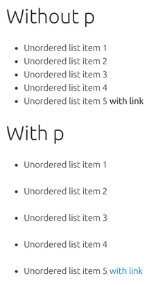
  • Normal links (inside text blocks) are blue and 300 weight
  • Links directly inside list items are black and 400 weight
  • Links inside list items inside paragraph items (<li><p><a>) are blue and 300 weight again

Clearly the idea is that if you're placing links directly inside list items, you want them to stand out:

<ul>
    <li><a>Standout link</a></li>
</ul>

If you want to place plain text in your lists, you have to add a wrapping paragraph element:

<ul>
    <li><p>Some text with <a>a link</a></p></li>
</ul>

However, this doesn't work with the latest version of vanilla because the latter format adds significant unintended spacing:

with vanilla 1.0.1

My suggestion

I would like to suggest we can avoid this sort of issue by keeping our base styles as simple as possible.

For me that would mean that the default link would simply inherit the font-weight of the context, and we should override it as rarely as possible:

a {
  color: $link-color;
  font-weight: inherit;

  &:hover {
    text-decoration: underline;
  }
}

I would say this should even extend to navigation, in that rather than setting a separate style for nav a, we should set specific styles for each type of navigation, e.g. for p-navigation__link etc. As I don't think we can effectively predict all the places in which people might want to use a nav and what they might want the styling to look like.

Then if we want to be able to create a list of links that stand out more, that should be an extra pattern, e.g. .p-standout-list or something:

.p-standout-list__link {
  color: $color-dark;
  font-weight: 400;
}

Inconsistent navigation header height between Vanilla-using sites

From @matthewpaulthomas on May 25, 2017 11:1

The “Navigation” page shows a navigation header that is 48px high:
html {font-size: 16 px} × (.p-navigation__link > a {font-size: .875rem} +
.p-navigation .p-navigation__links .p-navigation__link {padding: .75rem 1.25rem;})
= 16px × (0.875 + 0.75 top + 0.75 bottom) = 48px.

Some sites using Vanilla are consistent with this:
48px www.ubuntu.com
48px www.canonical.com
48px maas.io

Unfortunately, others are not:
50px build.snapcraft.io (#800)
51px snapcraft.io, including snapcraft.io/docs
53px docs.ubuntu.com
53px jujucharms.com

The jujucharms.com example is apparently from the past couple of weeks, and build.snapcraft.io from only 3~4 months ago, which suggests that this is not just a matter of some sites using out-of-date Vanilla versions.

So, it may be worthwhile investigating how they became inconsistent, and how this can be avoided in future.

Copied from original issue: canonical/vanilla-framework#1083

Radio menus <select> are slightly different height from text fields and buttons

In Vanilla by default, text fields and buttons are the same height, but radio menus <select> are taller. This makes them look wonky alongside each other. They should default to the same height.

The default heights:

  • Text field: height = line-height + padding + border = (browser default font size 16px × body1.5) + (2 × 8px) + (2 × 1px) = 42px
  • Button: height = line-height + padding + border = 16px + (2 × 12px) + (2 × 1px) = 42px
  • Radio menu: height = max(min-height, intrinsic height) = max(48px, (line-height + padding + border)) = max(48px, (19px + (2 × 8px) + (2 × 1px)) = max(48px, 37px) = 48px

Vanilla defaults to specifying that “Labels and most input types are 100% width of the <form> parent element”. So though they retain the browser’s display: inline, they are on a line by themselves.

But regardless of whether that is a good default, in real-world forms it is common for radio menus to be alongside text fields and/or buttons. For example:

If these controls were alongside each other but slightly different heights, they would look wonky. And if their heights were customized just for these situations, they would be inconsistent with other radio menus on the same page.

Therefore, radio menus should default to having the same height as text fields and buttons.

Bigger button style

On https://build.snapcraft.io landing page we use bigger call to action buttons:

screen shot 2017-07-21 at 12 56 55

Currently we need to add custom style to it, but possibly it would be good to include as a standard Vanilla style to be used on other sites as well.

It should work with all available button styles (positive, negative, base, etc), so it could be implemented as is-bigger state class (similar to existing is-inline).

Inconsistent navigation header height between Vanilla-using sites

From @matthewpaulthomas on May 25, 2017 11:1

The “Navigation” page shows a navigation header that is 48px high:
html {font-size: 16 px} × (.p-navigation__link > a {font-size: .875rem} +
.p-navigation .p-navigation__links .p-navigation__link {padding: .75rem 1.25rem;})
= 16px × (0.875 + 0.75 top + 0.75 bottom) = 48px.

Some sites using Vanilla are consistent with this:
48px www.ubuntu.com
48px www.canonical.com
48px maas.io

Unfortunately, others are not:
50px build.snapcraft.io (#800)
51px snapcraft.io, including snapcraft.io/docs
53px docs.ubuntu.com
53px jujucharms.com

The jujucharms.com example is apparently from the past couple of weeks, and build.snapcraft.io from only 3~4 months ago, which suggests that this is not just a matter of some sites using out-of-date Vanilla versions.

So, it may be worthwhile investigating how they became inconsistent, and how this can be avoided in future.

Copied from original issue: canonical/vanilla-framework#1083

Recommend Projects

  • React photo React

    A declarative, efficient, and flexible JavaScript library for building user interfaces.

  • Vue.js photo Vue.js

    🖖 Vue.js is a progressive, incrementally-adoptable JavaScript framework for building UI on the web.

  • Typescript photo Typescript

    TypeScript is a superset of JavaScript that compiles to clean JavaScript output.

  • TensorFlow photo TensorFlow

    An Open Source Machine Learning Framework for Everyone

  • Django photo Django

    The Web framework for perfectionists with deadlines.

  • D3 photo D3

    Bring data to life with SVG, Canvas and HTML. 📊📈🎉

Recommend Topics

  • javascript

    JavaScript (JS) is a lightweight interpreted programming language with first-class functions.

  • web

    Some thing interesting about web. New door for the world.

  • server

    A server is a program made to process requests and deliver data to clients.

  • Machine learning

    Machine learning is a way of modeling and interpreting data that allows a piece of software to respond intelligently.

  • Game

    Some thing interesting about game, make everyone happy.

Recommend Org

  • Facebook photo Facebook

    We are working to build community through open source technology. NB: members must have two-factor auth.

  • Microsoft photo Microsoft

    Open source projects and samples from Microsoft.

  • Google photo Google

    Google ❤️ Open Source for everyone.

  • D3 photo D3

    Data-Driven Documents codes.