catharsisfonts / cormorant Goto Github PK
View Code? Open in Web Editor NEWCormorant open-source display font family
License: SIL Open Font License 1.1
Cormorant open-source display font family
License: SIL Open Font License 1.1


Cormorant and Ysabeau are so beautiful, I hope they can be used in this Taiwanese language. To-siā (Thank you).
About the POJ: https://en.wikipedia.org/wiki/Pe%CC%8Dh-%C5%8De-j%C4%AB
POJ marks: https://tauhu.tw/gua-ji-pio/
E.g
https://github.com/justfont/open-huninn-font
https://github.com/ButTaiwan/genyo-font
https://github.com/aiongg/POJFonts
Hey,
I should have the mastering finished off tomorrow. I'd appreciate it if you could hold off doing any more modifications.
Since we're dealing with a shit tonne of ttfs, it make merge conflicts a huge possibility.
cc @davelab6
The kerning is wrong, and the rings and umlauts are off center.

This isn't a bug report, but a question about design. But in creating the question, i'm lost why the glyph in question goes missing when I insert a soft return. So the glyph missing part is possibly a bug report, or possibly it's libreoffice or possibly i need to work on my stylesheet more.
The arrows in Cormorant are matched except the left pointing black arrow U25C0, which is thinner. This results in this unbalanced look.
I'm not suggesting the glyphs need to balance, or that the usage of the arrows in the image is appropriate for the glyphs, just wondering why that one glyph isn't like the others.
And then it got weird. I hit soft return in image 2 so that the arrows would show on the same row, and the left pointing black arrow goes missing. This is in LibreOffice 6.0.5 on a mac. The file that created it is here:
However, that's an initial test at setting up a style sheet, it's ugly and I know it, and it's an .fodt file which only opens in LibreOffice. LibreOffice has opentype enabled. I'm still not sure it's a bug, but I don't see how anything I did in a stylesheet could make the glyph go missing. It's got the following opentype features set:
Cormorant:liga=1&dlig=0&clig=0&hlig=0&onum=0&lnum=1&tnum=0&pnum=1&jalt=1&kern=1&
0=disabled, 1=enabled. jalt is in the stylesheet, but I haven't touched the font yet. It is still the one I just downloaded this week, so it shouldn't be doing anything on that call. Or am I misunderstanding opentype?
Please update the behance text to match the README :)
It would be great to have an Asterism glyph as well, unicode U+2042.
Hi,
I really like your font and I want to use it for regular text and documents. The only problem I face is that the regular font seems to be lighter than other fonts. Is that intended? I currently use medium for text but then that is not very convenient.
I am sorry, i am not a font designer so I may not be using the technical terms but you can call me a font geek.
Thanks a lot and continue the great work! I am recommending the font to all my friends and colleagues. I love the italtics esp.
cheers
Sunny
The design of Greek text (notably, Grecs du roi) can be found at some materials printed in the same age as the birth of Garamond type, for example, Editio Regia.
why not splitting it into submodules if you want to store everything on github?
i honestly just wanted the webfont without going over to google fonts, but here i am waiting 10 mins in order to git clone a repo amounting to more than 1 GB.
thanks for the work,
af
Can you please add the letter ṋ?
Name: Latin Small Letter N with Circumflex Below
Code: U+1E4B
I was trying to get c_t (0x100ee) to substitute for "et" as a ligature and have thus far been stymied.
I see it is the first entry in the "dlig" table, but I can't get it or any other discretionary ligatures to render in either Chrome nor FF, Win nor Ubuntu testing as:
https://developer.mozilla.org/en-US/docs/Learn/CSS/Styling_text/Fundamentals
HTML Input:
<link href="https://fonts.googleapis.com/css2?family=Cormorant+Garamond:ital,wght@0,500;1,500&display=swap" rel="stylesheet">
<p class="ligs">dlig: ct ffu fu Qy liga: fb ff ffb</p>
CSS Input
.ligs {
 font-size: 50px;
font-family: 'Cormorant Garamond', serif;
  font-variant-ligatures: discretionary-ligatures;
}
output:

I'd expect:

I had thought to simply call it by HTML or Unicode, but the standard values cited U+1F670/🙰 aren't assigned in the font file.
Any hints?
Thanks!
From https://www.behance.net/gallery/28579883/Cormorant-an-open-source-display-font-family
The cormorant photograph used in the title bar was taken by JJ Harrison and shared under a Creative Commons license on Wikipedia. The goldfinch and kingfisher photographs are my own.
I suggest including these images in the repo; you can inline them in the readme, and have the page's site on the gh-pages branch
The cormorant glyph below is part of the Cormorant typeface; it is encoded as the Han Chinese glyph 鵁 («the fishing cormorant», Unicode U+9D41).
I don't think this is a good idea, U+9D41 should be 鵁 and the cormorant glyph should either have a PUA encoding or a GSUB feature so that writing cormorantlogo makes it appear (or both)
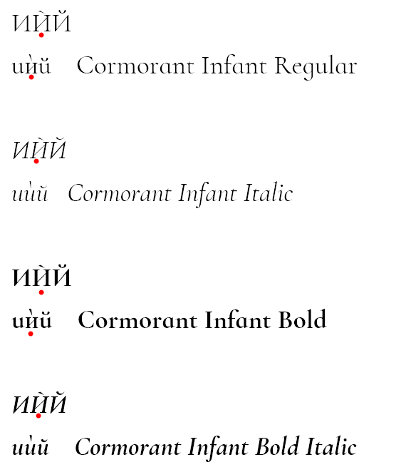
In some variants of C.I. the letter "Ѝ" appears like it is from different font. Actually it has to look alike the regular letter "И" but stressed. I'm applying screenshot and source to Wikipedia for reference https://en.wikipedia.org/wiki/I_with_grave_(Cyrillic).
Lower letter ѝ in Italic and BoldItalic are fine, the others not (red dots).
_I am using your Cormorant Infant and Barlow Semi Condensed fonts in a print book that I am publishing. I am very happy with both fonts, with one exception. The ligatures fi and fl often cause problems: an extra space later in the word or two letters overlapping. Sometimes the word looks perfectly good but the spelling checker flags it because it is broken in the middle.
Is there any solution to these problems as far as you know? I am using the fonts in Adobe InDesign software. I have tried turning off ligatures in InDesign.
Here are some samples:


but this doesn't help._
Hello,
I'm using your fonts Cormorant. I'm working on Mac system, using Pages application. I am a basic user mac, not a specialist in software.
Cormorant standard ligatures are actives (fi, ff, fl, etc.) but I cannot use discretionary ligatures (st, rt, sp, etc.).
What can I do to use these discretionary ligatures? I downloaded the "Cormorant_Install" ZIP and I installed the TrueType font files (.ttf).
Did I do a mistake? Is there a special operation to do to update the fonts?
Thanks by advance for your help.
Regards
Being less Display
Thanks for the awesome attainment.
Can't get past this issue, w/o and w/ Cormorant SC installed.
This is XeTeX, Version 3.14159265-2.6-0.99998 (TeX Live 2017) (preloaded format=xelatex) restricted \write18 enabled.
entering extended mode
LaTeX2e <2017-04-15>
LaTeX Font Warning: Font shape TU/Cormorant(0)/m/sc' undefined (Font) using TU/Cormorant(0)/m/n' instead on input line 177.
LaTeX Font Warning: Some font shapes were not available, defaults substituted.
Hi Christian,
Is there any way to add the phonetic characters of IPA?
Since they are mostly based on latin characters which are turned around or flipped etc., maybe it's not too hard to include them? ʔǝŋɲɾʧɨɔɛʃʤɸɣβɡɑɐɒʙðɕʑɻɚ I know every linguist would be eternally grateful :)
On the other hand, from your experience, what do you think would be the best fallback font for characters that aren't available in Cormorant? Aside from IPA I'm also thinking about Greek (I saw the other threads), every once in a while it happens that a Greek word shows up in my text, and it'd be great to know which alternatives might be best to use so that it doesn't disturb the eye (I tried with [standard] Garamond but it's a little too heavy for my taste).
Other than that I can only say your font is the prettiest serif out there. Thanks for such an awesome job!
Jan
CormorantGaramond-Regular has onum, tnum and lnum but not pnum. Similarly for the Medium and Bold, but the Italic has it. I haven't looked at the rest of them.
First of all congratulations for crafting this beautiful type!
I see you have been quickly adding Cyrillic recently so I hope you will be also adding Greek soon?
_I am using your Cormorant Infant and Barlow Semi Condensed fonts in a print book that I am publishing. I am very happy with both fonts, with one exception. The ligatures fi and fl often cause problems: an extra space later in the word or two letters overlapping. Sometimes the word looks perfectly good but the spelling checker flags it because it is broken in the middle.
Is there any solution to these problems as far as you know? I am using the fonts in Adobe InDesign software. I have tried turning off ligatures in InDesign, but this doesn't help.
Here are some samples:
_
As you can see from the screen-shot, the latest build have some over abundance of diacritics ;) (tested with OpenType variant). The build from September 10 had no problems.

The Cormorant Install 2.0 Zip file seems to only have TrueType (.ttf) files, and not the OpenType files. From reading the Cormorant Behance page it seems like more features are available via the OpenType files.
What is the recommended font size, in points, for the Light weight?
By trial and error I can see that ss02 gives Cormorant Garamond variant while ss03 gives Cormorant Infant, but the font declare several other OT tables. For example I cannot see what the character variants 1, 2, 5, 6 and 7 actually do, they do not seem to change any of the characters on the Latin alphabet. It would be nice to have a small sample document showing the use of each OT table on this font, specially the not-so-obvious ones like the stylistic sets and character variants.
BTW, Thank for your hard work! I'm a happy user of your fonts.
I just noticed that the HYPHEN BULLET codepoint is missing from the font. Could that one be added?
The metadata names of the fonts aren’t set consistently. Some follows Cormorant Style Weight, some CormorantStyle-Weight (not taking italics into account). This is especially troublesome when it happens inside the same style, as with CormorantUpright-Regular vs Cormorant Upright Bold, or Cormorant-Light vs Cormorant Bold.
It seems as if two Pāli characters are missing: U+1E40 (Ṁ) and U+1E41 (ṁ). Would be great if they were added!
Hi Christian,
Congratulations with your release.
Your detailed attention to Cyrillic localised features (BGR, SRB) across the family is touching.
May I point out some confusion in the Bulgarian Cyrillic:
Green — correct
Red — incorrect / unconventional
Yellow — the spacing too tight
1.uni0422 should be 'T', uni0422.loclBGR should be 'm'


Best,
Alexei
Can you add these space and space-like nonwhitespace glyphs?
| Uni | Description | Note |
|---|---|---|
| 0008 | Backspace | (same as ZWSP) |
| 034F | Combining Joiner | (same as ZWSP) |
| 00AD | Soft hyphen | (same as a ZWSP) |
| 2010 | Hyphen | (same as a hyphen-minus) |
| 2011 | No-break hyphen | (same as a hyphen-minus) |
| 2027 | Hyphen point | (mid height dot) |
| 2043 | Hyphen bullet | (mid height dash about the same as a narrow space) |
| 2000 | En Quad | |
| 2001 | Em Quad | |
| 200D | Zero width joiner | |
| 2060 | Word joiner | |
| 2063 | Invisible separator | |
| 2028 | Line separator | |
| 2029 | Paragraph separator | |
| 3000 | Ideographic Space | (space that spans the same in X as the vertical leading, likely a little larger than em space.) |
| FEFF | Zero width no-break space | |
| FFF9 | Interlinear anchor | |
| FFFA | Interlinear separator | |
| FFFB | Interlinear terminator |
In all cases, these glyphs provide special functions as described in the Unicode standard in apps if they are present in the font, and supported in the app. For example, the various hyphen characters are detected and possibly show up as alternatives in a layout engine.
I'm working through what it takes to make LibreOffice produce real text.
And one of the big gaps between LO and Indesign is the lack of proper justified text mode with allowances for punctuation.
So, I'm studying implementing some negative tracking/kerning on punctuation. By this, I originally meant including a NWJ character in front of leading quotes and automatically detecting them in a script and kerning them back. This won't work at the end of text rows, but it will work for leading text.
Except that's exactly what the font does in the kern table. In order to 'track or kern before the starting margin, the kern needs to be on a non whitespace character. Which brings me to the list above, and that there are other whitespace functions that the font isn't aware of but apps have enabled, but deal poorly with missing glyphs.
Hello Christian,
The Google fonts team would love to see a variable fonts version of ‘Cormorant'. They have commissioned us @TypeNetwork to work on upgrading a number of font projects to be variable fonts with a single weight axis.
In order to achieve the highest quality and most efficient long term results we will be converting the source data from Glyphs to UFO. The new source data will be generated in the RoboFont environment using fontmake and ttfautohint. There has been progress on tools to make an easy path to move between the Glyphs and Robofont environment.
During the process we will be looking to improve any errors while preserving how the font appears and renders on different platforms.
We have started by making a fork off of this git repository. The upgrade will be completed for you in the near future. When the proposed final font is approved by Google will you accept a pull request?
To confirm, are the .glyphs source files on this git repository the most current data?
CormorantRoman.glyphs
CormorantItalic.glyphs
CormorantUpright.glyphs
We hope this answers some of your questions about the process. Please let us know if you have any additional comments.
Best Regards,
Jill Pichotta
Vice President
Type Network
[email protected]
OS: Windows 10, x64
Software: MS Word 2016
I tried only Cormorant Infant as it's supports Bulgarian glifs.
The issue: There is too much white space after certain capital letters when one use Cyrillic. Thhis makes the letter appear like a standalone but not a part of the word itself. Namely the letters are: М, Р, Т and X in Cyrillic. This large kerning appears only in regular weight, in itallic, bold & bolditallic they are OK.
Applying a screenshot from my Word. Underlining is mine in order to be easier to see, if one is not familiar with Cyrillic.

I'd be thankful if you could address my requests:
I also noticed that the OpenType files and UFO files are lacking behind the Glyphs files. Is that intentional? (I think you use Glyphs, but it'd be nice to have UFO files up to date with so that I could open them in FontForge)
Thanks for the great work!
The oldstyle figures in Cormorant Infant appear to be taller than the lining, and ss02 seems to provide a small-caps style letter I ('eye') for the numeral one with what look like the taller 0, [2-9].
Could the Cormorant Garamond font be enriched with a smile character (code: $263A)? I created a smile character based on capital letter O – see enclosed file. In my opinion, it looks very nice. You can use it.
Ridero.eu uses Cormorant Garamond font and I need this character very much :).
Starting from Cormorant regular,
FontForge complains about glyph names when I build .otf fonts:

But I don't see a ss13 to verify against. I suspect these are now in a character variant, but where? Font forge is pretty good about renaming glyphs, but these are invalid, so I want to check they did rename everywhere, because font forge doesn't deal well with names in feature tables that don't have glyphs.
If the unlikely "actually not in a table" are true.. is this development, or dinosaur?
к is too close to з, а too close to л and л too far from и
U+220F N-ARY PRODUCT and U+2211 N-ARY SUMMATION should descend below the baseline, which is the convention for n-ary operators. The current glyphs would be appropriate for U+03A0 GREEK CAPITAL LETTER PI and U+03A3 GREEK CAPITAL LETTER SIGMA instead. Here they are, with ⟨R⟩ for comparison:

When placed over the ŋ character, the combining diacritic overdot is not centered (see last character in each series below). The screenshot is from LibreOffice.

I've noticed a few other instances of this, for example placing a combining diactric acute vs. grave accent over a consonant (such as m). The grave accent is centred, but the acute is not.

The Cormorant_Install_v2.1.zip file on the "release" folder only includes the ttf fonts: in order to obtain the otf fonts it is necessary to download the full source package. Maybe the "install" package could provide otf too?
BTW, thanks for these amazing fonts!!!!
Hi,
Thank you for publishing a rich and complex font family. It’s both awesome and intimidating.
Am I right, when reading
It comprises a total of 45 font files spanning 9 different styles Roman, Italic, Infant, Infant Italic, Garamond, Garamond Italic, Upright Cursive, Small Caps, Unicase
that Small Caps and Unicase are available as standard opentype features in the main font files, and provided as separate font files as a convenience?
https://docs.microsoft.com/en-us/typography/opentype/spec/features_ae
(of course Infant, Garamond and Upright may also been provided in the main files as stylistic alternates, but since those are, as far as I understand, non standard features, most apps won’t use or make them discoverable by default)
If I am wrong please correct me. I am often wrong.
The MUFI group published a recommendation for the selection of characters from the Unicode Standard and for characters to be allocated to the Private Use Area (PUA), they are suitable to be implemented in Cormorant fonts. See:
https://folk.uib.no/hnooh/mufi/specs/index.html
Alternatively, you can add more OT features to achieve similar implementations.
There's 1 new commit since the last release :) v2.5...master
I am not sure this is common, but in German compound nouns with a triple "fff" can happen: Auspufffeuer, Schifffahrt (see attached image). There's no ligature for that one, right? Are there plans to add it, or does it not make sense because it helps separating the two nouns?

The font(s) and the different styles are great, but sometimes a monospace font is required. It might be a little bit too much to ask for a monospace style, but can you recommend a (SIL licensed) monospace font which goes well together with Cormorant? I'm asking because your knowledge as a font designer might be better than just guessing around.
Is the only difference between Cormorant and Cormorant Garamond that the latter has a tiny bit more condensed Cyrillic? I've installed both and printed out some specimens, and that's the only difference I've noticed.
A declarative, efficient, and flexible JavaScript library for building user interfaces.
🖖 Vue.js is a progressive, incrementally-adoptable JavaScript framework for building UI on the web.
TypeScript is a superset of JavaScript that compiles to clean JavaScript output.
An Open Source Machine Learning Framework for Everyone
The Web framework for perfectionists with deadlines.
A PHP framework for web artisans
Bring data to life with SVG, Canvas and HTML. 📊📈🎉
JavaScript (JS) is a lightweight interpreted programming language with first-class functions.
Some thing interesting about web. New door for the world.
A server is a program made to process requests and deliver data to clients.
Machine learning is a way of modeling and interpreting data that allows a piece of software to respond intelligently.
Some thing interesting about visualization, use data art
Some thing interesting about game, make everyone happy.
We are working to build community through open source technology. NB: members must have two-factor auth.
Open source projects and samples from Microsoft.
Google ❤️ Open Source for everyone.
Alibaba Open Source for everyone
Data-Driven Documents codes.
China tencent open source team.

