GithubHelp home page GithubHelp logo

codingbyjerez / react-native-alert-notification Goto Github PK

View Code? Open in Web Editor NEW
78.0 2.0 21.0 4.7 MB

Toast notification and dialog box notification for react native

License: MIT License

JavaScript 3.15% Java 23.35% TypeScript 48.07% Objective-C 3.57% Ruby 1.90% Starlark 0.88% Makefile 2.25% C++ 10.28% Objective-C++ 6.55%

react-native-alert-notification's Introduction

react-native-alert-notification

Example Dialog Box

Theme Light Theme Dark
Dialogs light Dialogs Dark

Example Toast Notification

Theme Light Theme Dark
toasts light toasts Dark

Installation

- Installing:

yarn add react-native-alert-notification

- Installing dependencies:

  • For Native project:
yarn add react-native-safe-area-context

pod install
  • For Expo project:
expo install react-native-safe-area-context

Usage

import { ALERT_TYPE, Dialog, AlertNotificationRoot, Toast } from 'react-native-alert-notification';

<AlertNotificationRoot>
  <View>
    // dialog box
    <Button
      title={'dialog box'}
      onPress={() =>
        Dialog.show({
          type: ALERT_TYPE.SUCCESS,
          title: 'Success',
          textBody: 'Congrats! this is dialog box success',
          button: 'close',
        })
      }
    />
    // toast notification
    <Button
      title={'toast notification'}
      onPress={() =>
        Toast.show({
          type: ALERT_TYPE.SUCCESS,
          title: 'Success',
          textBody: 'Congrats! this is toast notification success',
        })
      }
    />
  </View>
</AlertNotificationRoot>;

Documentation:

Root Component

A React node that will be most likely wrapping your whole app.

Name Description Require Default Type
theme select theme light dark (by default is auto) auto 'light','dark'
colors custom colors [IColors, IColors]
dialogConfig config dialog box global {closeOnOverlayTap:bool, autoClose:bool / number}
toastConfig config toast global {autoClose:bool / number, titleStyle?: StyleProp , textBodyStyle?: StyleProp}
type IProps = {
  dialogConfig?: Pick<IConfigDialog, 'closeOnOverlayTap' | 'autoClose'>;
  toastConfig?: Pick<IConfigToast, 'autoClose' | 'titleStyle' | 'textBodyStyle'>;
  theme?: 'light' | 'dark';
  colors?: [IColors, IColors] /** ['light_colors' , 'dark_colors'] */;
};
type IColors = {
  label: string;
  card: string;
  overlay: string;
  success: string;
  danger: string;
  warning: string;
};

Dialog Box Component

Name Description Require Default Type
title The title text String
type Defines the type ("Success", "Warning" or "Error") true "SUCCESS", "DANGER", "WARNING"
textBody The text body String
button name button (for hide button: undefined) String
autoClose Defines time auto close dialog box in ms face bool / number
closeOnOverlayTap allow close if click in overlay true bool
onPressButton (if not declared and isset button action is close) String () => void
onShow action after end animation open () => void
onHide action after end animation close () => void
type IConfig = {
  type: ALERT_TYPE;
  title?: string;
  textBody?: string;
  button?: string;
  autoClose?: number | boolean;
  closeOnOverlayTap?: boolean;
  onPressButton?: () => void;
  onShow?: () => void;
  onHide?: () => void;
};

Toast Notification Component

Name Description Require Default Type
title The title text String
type Defines the type ("Success", "Warning" or "Error") "SUCCESS", "DANGER", "WARNING"
textBody The text body String
autoClose Defines time auto close dialog box in ms 5000 bool / number
onPress action click in card bool
onShow event after end animation open () => void
onHide event after end animation close () => void
type IConfig = {
  type?: ALERT_TYPE;
  title?: string;
  textBody?: string;
  autoClose?: number | boolean;
  titleStyle?: StyleProp<TextStyle>;
  textBodyStyle?: StyleProp<TextStyle>;
  onPress?: () => void;
  onShow?: () => void;
  onHide?: () => void;
};

For Close popup

// For Dialog Box
Dialog.hide();

// For Toast Notification
Toast.hide();

Author

Rodolphe Jerez | https://codingbyjerez.com

See the contributing guide to learn how to contribute to the repository and the development workflow.

License

MIT

react-native-alert-notification's People

Contributors

codingbyjerez avatar edgarturrin avatar fessor10 avatar mahipalsingh-syt avatar salembaira avatar

Stargazers

 avatar  avatar  avatar  avatar  avatar  avatar  avatar  avatar  avatar  avatar  avatar  avatar  avatar  avatar  avatar  avatar  avatar  avatar  avatar  avatar  avatar  avatar  avatar  avatar  avatar  avatar  avatar  avatar  avatar  avatar  avatar  avatar  avatar  avatar  avatar  avatar  avatar  avatar  avatar  avatar  avatar  avatar  avatar  avatar  avatar  avatar  avatar  avatar  avatar  avatar  avatar  avatar  avatar  avatar  avatar  avatar  avatar  avatar  avatar  avatar  avatar  avatar  avatar  avatar  avatar  avatar  avatar  avatar  avatar  avatar  avatar  avatar  avatar  avatar  avatar  avatar  avatar  avatar

Watchers

 avatar  avatar

react-native-alert-notification's Issues

Is not working at all

import { ALERT_TYPE, Toast } from 'react-native-alert-notification';

export default function Login(props: ILoginView) {
  const onClickLoginBtn = () => {
      Toast.show({
        type: ALERT_TYPE.SUCCESS,
        title: 'Success',
        textBody: 'Congrats! this is toast notification success',
      })
    };
  
  return (
     <TouchableOpacity style={styles.loginBtn} onPress={onClickLoginBtn}>
        <Text style={styles.loginText}>{`Login`}</Text>
      </TouchableOpacity>
  );
}
Screen.Recording.2021-12-15.at.8.48.54.PM.mov

React Native Info

System:
    OS: macOS 11.3.1
    CPU: (8) x64 Apple M1
    Memory: 532.04 MB / 16.00 GB
    Shell: 5.8 - /bin/zsh
  Binaries:
    Node: 14.15.0 - ~/.nvm/versions/node/v14.15.0/bin/node
    Yarn: 1.22.17 - ~/.nvm/versions/node/v14.15.0/bin/yarn
    npm: 6.14.8 - ~/.nvm/versions/node/v14.15.0/bin/npm
    Watchman: 4.9.0 - /usr/local/bin/watchman
  Managers:
    CocoaPods: 1.11.2 - /usr/local/bin/pod
  SDKs:
    iOS SDK:
      Platforms: DriverKit 21.0.1, iOS 15.0, macOS 12.0, tvOS 15.0, watchOS 8.0
    Android SDK: Not Found
  IDEs:
    Android Studio: 4.1 AI-201.8743.12.41.7042882
    Xcode: 13.1/13A1030d - /usr/bin/xcodebuild
  Languages:
    Java: Not Found
  npmPackages:
    @react-native-community/cli: Not Found
    react: 17.0.1 => 17.0.1 
    react-native: 0.64.3 => 0.64.3 
    react-native-macos: Not Found
  npmGlobalPackages:
    *react-native*: Not Found

How to modify the container style of the toast?

I'm curious to know if it's feasible to incorporate a shadow effect into the toast container. If you don't mind, I would be interested in joining the contributors to assist with implementing this feature, especially if you are unavailable to make the necessary modifications yourself.

two buttons support

if we can use it as a confirmation message, two buttons would be nice so we can ask for for user action regarding the confirmation,

Regards

[Dialog] how to set textBody's style

I would like to set the textbody characters to be left justified, how can I do that?

<TouchableOpacity
style={{
flex: 1,
flexDirection: 'row',
justifyContent: 'space-between',
alignItems: 'center'
}}
onPress={() =>Dialog.show({
type: ALERT_TYPE.WARNING,
title: title,
textBody: messageValue,
button: '了解',
closeOnOverlayTap: true,
})}>
<Image source={helpIcon} style={{width: 15, height: 15}}/>

How modify textBody style

hi,
Dialog.show({
type: ALERT_TYPE.WARNING,
title: 'Avertissement',
textBody: 'Veuillez entrer votre matricule.',
button: 'Fermer',
closeOnOverlayTap:false,
textBodyStyle:{
fontSize:50
}
});

don't work

Root Component showing error

Root Component Showing Error

Type '{ children: Element; }' has no properties in common with type 'IntrinsicAttributes & IProps'

Custom Image

Can we change success or error image? or can we use iocn instead image?

Call with onPress

Hello,
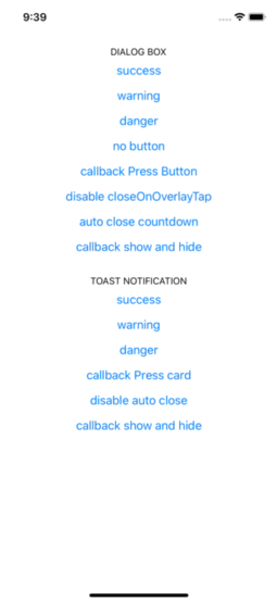
I will first thank the author for the package. I am trying to use the package in a project and i will to like to call the Dialog as i to for a normal alert without an Onpress, just rendering it. is that posttible and exmaple of what am saying

const errorHandler = (error: Error, isFatal: boolean) => {
  <Root>
    {Dialog.show({
      type: ALERT_TYPE.DANGER,
      title: error.name,
      textBody: error?.response?.data?.message
        ? I18n.translate(error.response.data.message)
        : I18n.translate('UNKNOWN_ERROR'),
      button: 'close',
    })}
  </Root>;
};

Pass custom Icon

Any chance we can pass a component to overwrite the icon/image?

How to change the font family of the title, text and button?

I am adding the alert to my app using

Dialog.show({
type: ALERT_TYPE.SUCCESS,
title: 'Success',
textBody: 'Congrats! this is dialog box success',
button: 'close',
});

I want to use google font "solway". How do I change the font family of all the text rendered inside the alert dialog? Is there any way to pass the text element directly to the show method as a prop?

Recommend Projects

  • React photo React

    A declarative, efficient, and flexible JavaScript library for building user interfaces.

  • Vue.js photo Vue.js

    πŸ–– Vue.js is a progressive, incrementally-adoptable JavaScript framework for building UI on the web.

  • Typescript photo Typescript

    TypeScript is a superset of JavaScript that compiles to clean JavaScript output.

  • TensorFlow photo TensorFlow

    An Open Source Machine Learning Framework for Everyone

  • Django photo Django

    The Web framework for perfectionists with deadlines.

  • D3 photo D3

    Bring data to life with SVG, Canvas and HTML. πŸ“ŠπŸ“ˆπŸŽ‰

Recommend Topics

  • javascript

    JavaScript (JS) is a lightweight interpreted programming language with first-class functions.

  • web

    Some thing interesting about web. New door for the world.

  • server

    A server is a program made to process requests and deliver data to clients.

  • Machine learning

    Machine learning is a way of modeling and interpreting data that allows a piece of software to respond intelligently.

  • Game

    Some thing interesting about game, make everyone happy.

Recommend Org

  • Facebook photo Facebook

    We are working to build community through open source technology. NB: members must have two-factor auth.

  • Microsoft photo Microsoft

    Open source projects and samples from Microsoft.

  • Google photo Google

    Google ❀️ Open Source for everyone.

  • D3 photo D3

    Data-Driven Documents codes.