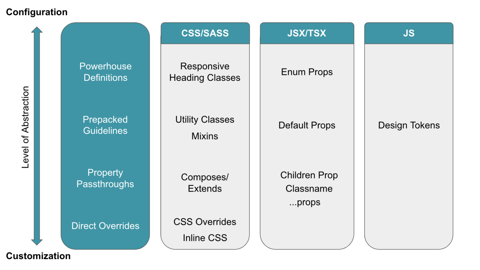
Key terms:
- Declare a
grid container, with grid items (direct descendants) inside. If it's not a direct descendant, it's not a grid item.
grid line - the dividing line that makes up the grid's structure. Can be vert (column grid lines) or horiz (row grid lines).grid track - The columns/rows of the grid. (Space between adjacent grid lines)grid cell - Like a cell in a table/spreadsheet. A single "unit" of the grid.grid area - Total space surrounded by four grid lines. Can be comprised of any number of grid cells.
grid
Declare a grid container:
display: grid | inline-grid
grid - block-level grid
inline-grid - inline-level grid
columns and rows
Define columns and rows via space-separated track sizes
.container {
  grid-template-columns: 40px 50px auto 50px 40px;
  grid-template-rows: 25% 100px auto;
}
Code above generates this. Note that line numbers are assigned automatically.
Can use line numbers to change order, or preferably, use shorthand syntax, or even shorter with grid-area
Can optionally name lines:
.container {
  grid-template-columns: [first] 40px [line2] 50px [line3] auto [col4-start] 50px [five] 40px [end];
  grid-template-rows: [row1-start] 25% [row1-end] 100px [third-line] auto [last-line];
}
Can even give a line multiple names:
.container {
  grid-template-rows: [row1-start] 25% [row1-end row2-start] 25% [row2-end];
}
Can repeat to save typing:
.container {
  grid-template-columns: repeat(3, 20px [col-start]);
}
Above is equivalent to:
.container {
  grid-template-columns: 20px [col-start] 20px [col-start] 20px [col-start];
}
If multiple lines have the same name, you can slap a count on the end. This references the 2nd col-start line
.item {
  grid-column-start: col-start 2;
}
Use fr to set size as a fraction of the grid container's free space:
.container {
  grid-template-columns: 1fr 1fr 1fr;
}
This is calculated after any non-flexible items. For example, the free space here is the total space minus 50px:
.container {
grid-template-columns: 1fr 50px 1fr 1fr;
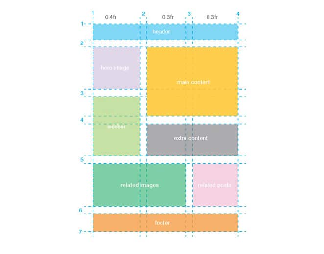
}grid-template-areas
Defines a grid template. How? It references grid-area's by name. 3 potential values:
<grid-area-name> - The targeted grid-area- A period - signifies an empty cell.
none - no grid areas defined.
Note grid-template-areas below: The syntax visualizes the grid's structure! 👍
.item-a {
  grid-area: header;
}
.item-b {
  grid-area: main;
}
.item-c {
  grid-area: sidebar;
}
.item-d {
  grid-area: footer;
}

.container {
  display: grid;
  grid-template-columns: 50px 50px 50px 50px;
  grid-template-rows: auto;
  grid-template-areas:
    "header header header header"
    "main main . sidebar"
    "footer footer footer footer";
}
Above produces this.
Each row in the declaration needs to have the same number of cells. This syntax names areas. The associated lines are automatically named. So if your grid area is called header, the area's starting row line will be header-start, and the last row line will be called header-end. So some lines might have multiple names such as main-start, header-start, etc.
grid-template
Shorthand for grid-template-rows, grid-template-columns, and grid-template-areas in one declaration.
Values:
- none - sets all 3 to their initial values
<grid-template-rows/grid-template-columns> - sets grid-template-columns and grid-template-rows to the specified values, respectively. Sets grid-template-areas to none.
So this:
.container {
  grid-template:
    [row1-start] "header header header" 25px [row1-end]
    [row2-start] "footer footer footer" 25px [row2-end]
    / auto 50px auto;
}
is equivalent to:
.container {
  grid-template-rows: [row1-start] 25px [row1-end row2-start] 25px [row2-end];
  grid-template-columns: auto 50px auto;
  grid-template-areas:
    "header header header"
    "footer footer footer";
}Note: You typically want to use grid instead. Why? Because grid-template doesn't reset the implicit grid properties (grid-auto-columns, grid-auto-rows, and grid-auto-flow`), which you probably want to do.
grid-column-gap
grid-row-gap
Set gap between cells (okay, technically sets the grid line size).
.container {
  grid-template-columns: 100px 50px 100px;
  grid-template-rows: 80px auto 80px;
  grid-column-gap: 10px;
  grid-row-gap: 15px;
}
Result
Note: Gutters aren't added on the outer edges. Only between columns/rows. Also, the grid- prefix will be removed and grid-column-gap and grid-row-gap renamed to column-gap and row-gap. The unprefixed properties are already supported in Chrome 68+, Safari 11.2 Release 50+ and Opera 54+.
grid-gap
Shorthand for grid-row-gap and grid-column-gap
.container {
  grid-template-columns: 100px 50px 100px;
  grid-template-rows: 80px auto 80px;
  grid-gap: 15px 10px;
}
If no grid-row-gap is specified, it's set to the same value as grid-column-gap
Note: The grid- prefix will be removed and grid-gap renamed to gap. The unprefixed property is already supported in Chrome 68+, Safari 11.2 Release 50+ and Opera 54+.
justify-items
Aligns grid items horizontally. (align-items does the opposite, it aligns vertically)
Values:
Can be set on individual grid items via justify-self.
align-items
Aligns grid items vertically. See justify-items above for horiz. Same values as justify-items.
Can be set on individual items via align-self.
place items
Shorthand. Sets align-items and justify-items. First val is align, second is justify. Not supported in Edge yet.
justify-content
Aligns entire grid horizontally inside container. So, only applicable when grid doesn't fill entire container).
Values:
- start
- end
- center
- stretch
- space-around
- space-between
- space-evenly
align-content
Same as justify-content above, but vertically aligns.
place-content
Sets both align-content and justify-content, align listed first, justify 2nd. Not in Edge yet.
grid-auto-rows
grid-auto-columns
Sets the size of any auto-generated grid tracks (aka implicit grid tracks). These are created when there are more grid items than cells in the grid.
Example:
You create a container with a 2x2 grid:
.container {
  grid-template-columns: 60px 60px;
  grid-template-rows: 90px 90px;
}
But then you position items like this:
.item-a {
  grid-column: 1 / 2;
  grid-row: 2 / 3;
}
.item-b {
  grid-column: 5 / 6;
  grid-row: 2 / 3;
}
This tells item-b to start on column line 5 and end on 6. But we never defined that column, so it results in this! So implicit tracks are created. This setting specifies the width of those auto-generated columns:
.container {
  grid-auto-columns: 60px;
}
New result
grid-auto-flow
If you have grid items that you don't explicitly place on the grid, this controls how they're automatically placed.
Values:
row - fill each row in turn, add new rows as needed
column - fill each column in turn, add new columns as needed
dense - fill in holes earlier in the grid if smaller items come up later
.container {
  grid-auto-flow: row | column | row dense | column dense;
}
Note: Dense changes the visual order, which might cause them to display out of order. Consider the a11y risks of this.
Example:
Step 1: Declare some html for 5 columns
<section class="container">
  <div class="item-a">item-a</div>
  <div class="item-b">item-b</div>
  <div class="item-c">item-c</div>
  <div class="item-d">item-d</div>
  <div class="item-e">item-e</div>
</section>
Then, declare a grid with 5 columns, 2 rows:
.container {
  display: grid;
  grid-template-columns: 60px 60px 60px 60px 60px;
  grid-template-rows: 30px 30px;
  grid-auto-flow: row;
}
Then, when placing them on the grid, only specify spots for 2:
.item-a {
  grid-column: 1;
  grid-row: 1 / 3;
}
.item-e {
  grid-column: 5;
  grid-row: 1 / 3;
}
Because grid-auto-flow is set to row above, the grid looks like this.
If we switch grid-auto-flow to column, then item-b, c, and d will flow down columns instead.
grid
Shorthand for grid-template-rows, grid-template-columns, grid-template-areas, grid-auto-rows, grid-auto-columns, grid-auto-flow.
These 2 are equivalent:
.container {
    grid-template-rows: 100px 300px;
    grid-template-columns: 3fr 1fr;
}.container {
grid: 100px 300px / 3fr 1fr;
}These 2 are equivalent:
.container {
    grid-auto-flow: row;
    grid-template-columns: 200px 1fr;
}.container {
grid: auto-flow / 200px 1fr;
}These 2 are equivalent:
.container {
    grid-template-rows: 100px 300px;
    grid-auto-flow: column;
    grid-auto-columns: 200px;
}.container {
grid: 100px 300px / auto-flow 200px;
}Finally, a more complex example that sets grid-template-areas, grid-template-rows, and grid-template columns - all other properties are set to their initial values. So this specifies line names and track sizes inline with their grid areas.
These are equivalent:
.container {
    grid-template-areas:
      "header header header"
      "footer footer footer";
    grid-template-rows: [row1-start] 1fr [row1-end row2-start] 25px [row2-end];
    grid-template-columns: auto 50px auto;
}.container {
grid: [row1-start] "header header header" 1fr [row1-end]
[row2-start] "footer footer footer" 25px [row2-end]
/ auto 50px auto;
}Grid Item properties (the children)
Note: float, display: inline-block, display: table-cell, vertical-align and column-* properties have no effect on a grid item.
grid-column-start
grid-column-end
grid-row-start
grid-row-end
Determines the grid item's location in the grid. Refers to specific grid lines. *-start is where it begins. *-end is where the item ends.
Values:
<line> - Can be a number (to refer to a numbered grid line) or name (to refer to a named grid line)- span - number of grid tracks to span across, or name of line where it should stop
- auto - auto-placement. Default span of one.
.item {
  grid-column-start: <number> | <name> | span <number> | span <name> | auto;
  grid-column-end: <number> | <name> | span <number> | span <name> | auto;
  grid-row-start: <number> | <name> | span <number> | span <name> | auto;
  grid-row-end: <number> | <name> | span <number> | span <name> | auto;
}.item-a {
grid-column-start: 2;
grid-column-end: five;
grid-row-start: row1-start;
grid-row-end: 3;
}Result
If no grid-column-end/grid-row-end is declared, the item will span 1 track by default.
Items can overlap each other. You can use z-index to control their stacking order.
grid-column
grid-row
Shorthand for grid-column-start + grid-column-end and grid-row-start + grid-row-end respectively.
This sets row to start at line 3, and ends at line 4. And sets the column to start at line 3 and end 2 lines later (line 5). Result.
.item-c {
  grid-column: 3 / span 2;
  grid-row: third-line / 4;
}
Note: If no end value is declared, the item will span one item by default.
grid-area
Gives item a name so it can be referenced by grid-template-areas.
This assigns the name:
.item-d {
  grid-area: header;
}
Can also be used as shorthand for grid-row-start + grid-column-start + grid-row-end + grid-column-end:
.item-d {
  grid-area: 1 / col4-start / last-line / 6;
}
Result
justify-self
Horiz align (along row) a single item inside a cell
Values:
start
end
center
stretch
align-self
Like justify-self, but for vert align (column).
place-self
Shorthand for setting both align-self and justify-self, in that order. So vert, then horiz.
.item-a {
  place-self: center stretch;
}
Special funcs and keywords
When sizing rows/columns, you can use all the usual lengths like px, %. But also have keywords like min-content, max-content and fractional units.
minmax can set boundaries for otherwise flexible units. For example to set a column to be 1fr, but shrink no further than 200px: grid-template-columns: 1fr minmax(200px, 1fr);repeat() - saves typing. Example: Make 10 columns: grid-template-columns: repeat(10, 1fr);
Combining all of these things can be extremely powerful, like grid-template-columns: repeat(auto-fill, minmax(200px, 1fr));
Codepen of above
Examples
Simple example
Named grid areas
[Excellent simple responsive grid with media query example]
(https://gridbyexample.com/examples/example13/)
Source order doesn't effect grid - can weave ads from bottom into content
Repeat example
Layering
Auto placement
Auto flow columns instead of rows
Mix auto placement with placed item
Full site example - Compare to Flexbox version.
Complex grid layout example
Grid resources
Josh Comeau's interactive guide
CSS Grid Generator
Box alignment cheatsheet - Compares Flexbox and Grid alignment
Grid by example
Grid Critters learning game


 React
React
 Typescript
 Django
 Laravel
 Facebook
 Microsoft
 Google
 Alibaba
 D3
D3
 Tencent