GithubHelp home page GithubHelp logo

ct-material-kit-pro-react's Introduction

version GitHub issues open GitHub issues closed

Image

Material Kit 2 PRO React is our newest premium MUI Design System based on React. Its amazing design is inspired by Material Design and contains all the components you need for your development. If you’re a developer looking to create good-looking websites, rich with features, and highly customisable, here is your match.

Fully Coded Elements Material Kit 2 PRO React is built with over 100 frontend individual elements, like buttons, inputs, navbars, alerts or cards, giving you the freedom of choosing and combining. All components can take variations in color, which you can easily modify using MUI styled() API and sx prop. You will save a lot of time going from prototyping to full-functional code because all elements are implemented.

This Premium MUI & React template is coming with pre-built design blocks, so the development process is seamless, switching from our pages to the real website is very easy to be done. View all components here. (https://www.creative-tim.com/learning-lab/react/alerts/material-kit/)

Documentation built by Developers Each element is well presented in very complex documentation. You can read more about the documentation here (https://www.creative-tim.com/learning-lab/react/overview/material-kit/).

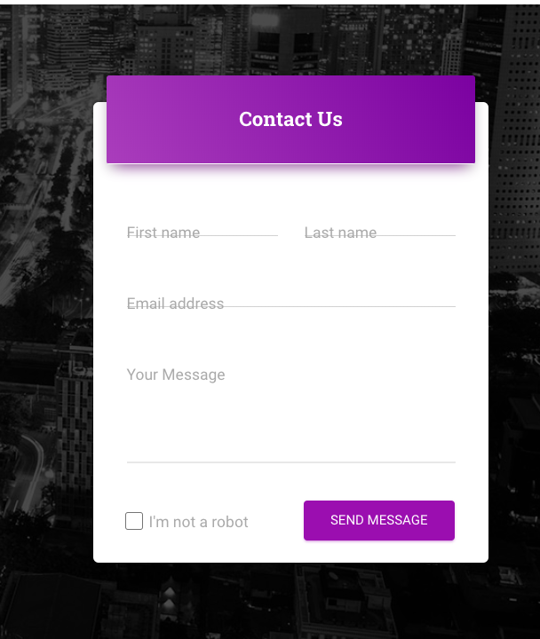
Example Pages If you want to get inspiration or just show something directly to your clients, you can jump-start your development with our pre-built example pages. You will be able to quickly set up the basic structure for your web project.

View example pages here. (https://demos.creative-tim.com/material-kit-pro-react/#/pages/landing-pages/coworking)

HELPFUL LINKS

Special thanks

During the development of this dashboard, we have used many existing resources from awesome developers. We want to thank them for providing their tools open source:

  • MUI - The React UI library for faster and easier web development.
  • React Flatpickr - Useful library used to select date.
  • React Copy to Clipboard - Useful library used for copying data to the clipboard.
  • React Countup - A lightweight React component that can be used to quickly create animations that display numerical data in a more interesting way.
  • React Syntax Highlighter - Syntax highlighting component for react with prismjs or highlightjs ast using inline styles.
  • Rellax - Rellax is a buttery smooth, super lightweight, vanilla javascript parallax library.
  • SwiperJS - Swiper is the most modern free mobile touch slider with hardware accelerated transitions and amazing native behavior.
  • TypedJS - A JavaScript Typing Animation Library.
  • ChromaJS - A small-ish zero-dependency JavaScript library for all kinds of color conversions and color scales.
  • UUID - JavaScript library for generating random id numbers.
  • Nepcha Analytics for the analytics tool. Nepcha is already integrated with Material Kit 2 PRO React. You can use it to gain insights into your sources of traffic.

Let us know your thoughts below. And good luck with development!

Table of Contents

Versions

React

| Material Kit 2 PRO React

Demo

View More.

Quick start

Quick start options:

Terminal Commands

  1. Download and Install NodeJs LTS version from NodeJs Official Page.
  2. Navigate to the root ./ directory of the product and run yarn install or npm install to install our local dependencies.

Documentation

The documentation for the Material Kit is hosted at our website.

What's included

Within the download you'll find the following directories and files:

material-kit-2-pro-react
    ├── public
    │   ├── apple-icon.png
    │   ├── favicon.png
    │   ├── index.html
    │   ├── manifest.json
    │   └── robots.txt
    ├── src
    │   ├── assets
    │   │   ├── images
    │   │   ├── theme
    │   │   │   ├── base
    │   │   │   ├── components
    │   │   │   ├── functions
    │   │   └── └── index.js
    │   ├── components
    │   │   ├── MKAlert
    │   │   ├── MKAvatar
    │   │   ├── MKBadge
    │   │   ├── MKBox
    │   │   ├── MKButton
    │   │   ├── MKDatePicker
    │   │   ├── MKInput
    │   │   ├── MKPagination
    │   │   ├── MKProgress
    │   │   ├── MKSnackbar
    │   │   ├── MKSocialButton
    │   │   └── MKTypography
    │   ├── examples
    │   │   ├── Breadcrumbs
    │   │   ├── Cards
    │   │   ├── Footer
    │   │   ├── Navbars
    │   │   └── Tables
    │   ├── layouts
    │   │   ├── authentication
    │   │   │    ├── reset-password
    │   │   │    ├── sign-in
    │   │   │    └── sign-up
    │   │   ├── pages
    │   │   │    ├── apps
    │   │   │    ├── blogs
    │   │   │    ├── company
    │   │   │    ├── extra
    │   │   │    ├── landing-pages
    │   │   │    ├── presentation
    │   │   │    └── support
    │   │   ├── sections
    │   │   │    ├── attention-catchers
    │   │   │    ├── components
    │   │   │    ├── elements
    │   │   │    ├── input-areas
    │   │   │    ├── input-navigation
    │   │   └──  └── page-sections
    │   ├── pages
    │   │   ├── Apps
    │   │   ├── Authentication
    │   │   ├── Blogs
    │   │   ├── Company
    │   │   ├── Extra
    │   │   ├── LandingPages
    │   │   ├── Presentation
    │   │   └── Support
    │   ├── App.js
    │   ├── index.js
    │   ├── footer.routes.js
    │   └── routes.js
    ├── .eslintrc.json
    ├── .prettierrc.json
    ├── CHANGELOG.md
    ├── ISSUE_TEMPLATE.md
    ├── jsconfig.json
    ├── package.json
    └── README.md

Browser Support

At present, we officially aim to support the last two versions of the following browsers:

Resources

Reporting Issues

We use GitHub Issues as the official bug tracker for the Material Kit 2 PRO React. Here are some advices for our users that want to report an issue:

  1. Make sure that you are using the latest version of the Material Kit 2 PRO React. Check the CHANGELOG from your dashboard on our website.
  2. Providing us reproducible steps for the issue will shorten the time it takes for it to be fixed.
  3. Some issues may be browser specific, so specifying in what browser you encountered the issue might help.

Technical Support or Questions

If you have questions or need help integrating the product please contact us instead of opening an issue.

Licensing

Useful Links

Social Media

Twitter: https://twitter.com/CreativeTim

Facebook: https://www.facebook.com/CreativeTim

Dribbble: https://dribbble.com/creativetim

Google+: https://plus.google.com/+CreativetimPage

Instagram: https://instagram.com/creativetimofficial

ct-material-kit-pro-react's People

Contributors

einazare avatar marqbeniamin avatar sajadevo avatar

Stargazers

 avatar  avatar  avatar  avatar  avatar  avatar  avatar  avatar  avatar  avatar  avatar  avatar  avatar  avatar  avatar  avatar  avatar  avatar  avatar  avatar  avatar  avatar  avatar  avatar  avatar  avatar  avatar  avatar  avatar  avatar  avatar  avatar  avatar  avatar  avatar  avatar  avatar  avatar  avatar

Watchers

 avatar  avatar  avatar  avatar  avatar  avatar  avatar  avatar  avatar  avatar  avatar  avatar  avatar  avatar

ct-material-kit-pro-react's Issues

Module not found: Can't resolve '@babel/runtime/helpers/builtin/assertThisInitialized'

Just purchased the pro version and tried to start by following these steps. But encountered below error.

Nothing did anything extra. I just followed the steps.

`Failed to compile.

./node_modules/@material-ui/core/ButtonBase/TouchRipple.js
Module not found: Can't resolve '@babel/runtime/helpers/builtin/assertThisInitialized' in '/Users/sagarkamble/hobby_projects/rento/material-kit-pro-react-v1.0.0/node_modules/@material-ui/core/ButtonBase'`

Version: material-kit-pro-react - 1.0.0

Typo in Header docs: Mayterial-UI's

See header

Should be this:

This is the top navigation of our demo app.

It was made using Material-UI's AppBat, but with some custom styling.

You will find this component in src/components/Header/Header.jsx. In this component, there is just the structure of the navbar. The links can be found in src/components/Header/HeaderLinks.jsx. We've done this because on responsive we create a Sidebar / Drawer with all these links, and we wanted to only write them once.

You can choose between 9 colors by using the color property.

If this property is not set, then the Appbar will be white.```

Keep Getting Error Uncaught TypeError: Cannot read property 'list' of undefined

Prerequisites

Please answer the following questions for yourself before submitting an issue.

  • I am running the latest version
  • I checked the documentation and found no answer
  • I checked to make sure that this issue has not already been filed
  • I'm reporting the issue to the correct repository (for multi-repository projects)

Expected Behavior

No More getting error Uncaught TypeError: Cannot read property 'list' of undefined ,

Current Behavior

Keep Getting error Uncaught TypeError: Cannot read property 'list' of undefined in Chrome DevTools

Failure Information (for bugs)

Uncaught TypeError: Cannot read property 'list' of undefined
at App.render (App.jsx:40)
at finishClassComponent (modules.js?hash=09de7f7f1fd51101225b5b3ebace03ec833f2b32:19056)
at updateClassComponent (modules.js?hash=09de7f7f1fd51101225b5b3ebace03ec833f2b32:19011)
at beginWork (modules.js?hash=09de7f7f1fd51101225b5b3ebace03ec833f2b32:19959)
at performUnitOfWork (modules.js?hash=09de7f7f1fd51101225b5b3ebace03ec833f2b32:23627)
at workLoop (modules.js?hash=09de7f7f1fd51101225b5b3ebace03ec833f2b32:23667)
at HTMLUnknownElement.callCallback (modules.js?hash=09de7f7f1fd51101225b5b3ebace03ec833f2b32:4464)
at Object.invokeGuardedCallbackDev (modules.js?hash=09de7f7f1fd51101225b5b3ebace03ec833f2b32:4514)
at invokeGuardedCallback (modules.js?hash=09de7f7f1fd51101225b5b3ebace03ec833f2b32:4571)
at replayUnitOfWork (modules.js?hash=09de7f7f1fd51101225b5b3ebace03ec833f2b32:22893)

Steps to Reproduce

Here is the step :

  1. I code like this, in App.jsx :
import React, { Component } from 'react';
import ReactDOM from 'react-dom';
import { Meteor } from 'meteor/meteor';
import { Router, Route, Switch} from 'react-router';
import createBrowserHistory from 'history/createBrowserHistory';

// @material-ui/core components
import withStyles from "@material-ui/core/styles/withStyles";
import List from "@material-ui/core/List";
import ListItem from "@material-ui/core/ListItem";
// @material-ui/icons
import Search from "@material-ui/icons/Search";
import Email from "@material-ui/icons/Email";
import Face from "@material-ui/icons/Face";
import Settings from "@material-ui/icons/Settings";
import AccountCircle from "@material-ui/icons/AccountCircle";
import Explore from "@material-ui/icons/Explore";
// core components
import GridContainer from "/components/Grid/GridContainer.jsx";
import GridItem from "/components/Grid/GridItem.jsx";
import Header from "/components/Header/Header.jsx";
import CustomInput from "/components/CustomInput/CustomInput.jsx";
import CustomDropdown from "/components/CustomDropdown/CustomDropdown.jsx";
import Button from "/components/CustomButtons/Button.jsx";

import navbarsStyle from "/assets/jss/material-kit-pro-react/views/componentsSections/navbarsStyle.jsx";

class App extends Component {
  render() {

    const { classes } = this.props;
    const browserHistory = createBrowserHistory();

    return (
      <Router history={browserHistory}>
        <Header
          brand="Transparent"
          color="transparent"
          links={
            <List className={classes.list + " " + classes.mlAuto}>
              <ListItem className={classes.listItem}>
                <Button
                  color="transparent"
                  className={
                    classes.navLink + " " + classes.socialIconsButton
                  }
                >
                  <i
                    className={
                      classes.socialIcons +
                      " " +
                      classes.marginRight5 +
                      " fab fa-twitter"
                    }
                  />{" "}
                  Twitter
                </Button>
              </ListItem>
              <ListItem className={classes.listItem}>
                <Button
                  color="transparent"
                  className={
                    classes.navLink + " " + classes.socialIconsButton
                  }
                >
                  <i
                    className={
                      classes.socialIcons +
                      " " +
                      classes.marginRight5 +
                      " fab fa-facebook"
                    }
                  />{" "}
                  Facebook
                </Button>
              </ListItem>
              <ListItem className={classes.listItem}>
                <Button
                  color="transparent"
                  className={
                    classes.navLink + " " + classes.socialIconsButton
                  }
                >
                  <i
                    className={
                      classes.socialIcons +
                      " " +
                      classes.marginRight5 +
                      " fab fa-instagram"
                    }
                  />{" "}
                  Instagram
                </Button>
              </ListItem>
            </List>
          }
        />
      </Router>
    );
  }
}

export default App;

I confuse about the {classes.list} is defined?
can you guide me how you define it? or how to fix my issue?

Context

  • Device: darwin
  • Operating System: macOS X
  • Browser and Version: Chrome 73

[Bug] Styles example overrides link is broken(https://material-ui.com/customization/overrides/#overriding-with-class-names?ref=creativetim)

Version

Latest 1.7.0

Reproduction link

https://material-ui.com/customization/overrides/#overriding-with-class-names?ref=creativetim

Operating System

Mac OS X

Device

desktop

Browser & Version

Chrome

Steps to reproduce

Unable to open examples (https://material-ui.com/customization/overrides/#overriding-with-class-names?ref=creativetim) link from the documentation : https://demos.creative-tim.com/material-kit-pro-react/#/documentation/styles

What is expected?

Being able to see and how components could be styled through an example

What is actually happening?

Page Not Found


Solution

Additional comments

[Enhancement]May be a better practice for Snackbarcontent

import React from "react";
// nodejs library to set properties for components
import PropTypes from "prop-types";
// @material-ui/core components
import withStyles from "@material-ui/core/styles/withStyles";
import Snack from "@material-ui/core/SnackbarContent";
import IconButton from "@material-ui/core/IconButton";
import Icon from "@material-ui/core/Icon";
// @material-ui/icons
import Close from "@material-ui/icons/Close";
// core components
import snackbarContentStyle from "assets/jss/material-kit-pro-react/components/snackbarContentStyle.jsx";

class SnackbarContent extends React.Component {
constructor(props) {
super(props);
this.closeAlert = this.closeAlert.bind(this);
}

closeAlert() {
this.props.closeAlert(false);
}

render() {
const { classes, message, color, close, icon, open } = this.props;
let action = [];
if (close !== undefined) {
action = [


];
}
let snackIcon = null;
switch (typeof icon) {
case "function":
snackIcon = <props.icon className={classes.icon} />;
break;
case "string":
snackIcon = {icon};
break;
default:
snackIcon = null;
break;
}
let alert = null;
if (open) {
alert=(
<Snack
message={


{snackIcon}
{message}
{close !== undefined ? action : null}

}
classes={{
root: classes.root + " " + classes[color],
message: classes.message + " " + classes.container
}}
/>
);
} else {
alert = null ;
}
return alert;
}
}

SnackbarContent.propTypes = {
classes: PropTypes.object.isRequired,
message: PropTypes.node.isRequired,
color: PropTypes.oneOf(["info", "success", "warning", "danger", "primary"]),
close: PropTypes.bool,
icon: PropTypes.oneOfType([PropTypes.func, PropTypes.string])
};

export default withStyles(snackbarContentStyle)(SnackbarContent);

Feature request - add loading spinner component

Prerequisites

Please answer the following questions for yourself before submitting an issue.

  • I am running the latest version
  • I checked the documentation and found no answer
  • I checked to make sure that this issue has not already been filed
  • I'm reporting the issue to the correct repository (for multi-repository projects)

Feature request

It would be nice to have a loading spinner component, delivering a nice looking spinner rendered in the center of the viewport.

The use case is when fetching a resource (e.g. blog page content, or whatever) from an API, in the 1-2s roundtrip time I want to render a blank page with a spinner to show the user that something will happen soon.

This is a minor component, not too hard to build oneself, but it'd make a convenient addition to the kit.

EDIT: BONUS: I developed this component to help render a loading spinner in center page with the material grid container, when waiting for page data

Module not found, tried changing npm start still no luck.

Hi. I'm using MacOS and tried to install the Pro kit.

./node_modules/@material-ui/core/ButtonBase/TouchRipple.js
Module not found: Can't resolve '@babel/runtime/helpers/builtin/assertThisInitialized' in '/Users/arsham/Desktop/Material-UI/node_modules/@material-ui/core/ButtonBase'

Am I doing anything wrong or?

Error when ejecting

Hi. I am a noob, so this is likely user error. This seems like an awesome template 🙌 I was hoping to add an Express server and some API endpoints. If I can do that without ejecting, I'll give it a try (and appreciate any pointers), but maybe good to record this issue.

Prerequisites

  • I am running the latest version
  • I checked the documentation and found no answer
  • I checked to make sure that this issue has not already been filed
  • I'm reporting the issue to the correct repository (for multi-repository projects)

Expected Behavior

>npm run eject
>npm start
Compiled successfully!

You can now view material-kit-pro-react in the browser.

  Local:            http://localhost:3000/
  On Your Network:  http://xxx.xxx.x.xx:3000/

Note that the development build is not optimized.
To create a production build, use npm build.

Current Behavior

>npm run eject
>npm start
Failed to compile.

./src/components/Typography/Muted.jsx
  Line 10:  'children' is missing in props validation  react/prop-types

Search for the keywords to learn more about each error.

Failure Information (for bugs)

Steps to Reproduce

  1. Download, unzip and navigate to package folder
  2. npm install
  3. npm run eject
  4. npm start

Context

  • Device: Dell XPS 15
  • Operating System: Windows 10
  • Browser and Version: Chrome Version 69.0.3497.100 (Official Build) (64-bit)

Failure Logs

Failed to compile.

./src/components/Typography/Muted.jsx
Line 10: 'children' is missing in props validation react/prop-types

Search for the keywords to learn more about each error.

Parallax lag....

Parallax seems to be laggy on mobile devices. Is there a way to fix this?

Paragraph tag in InfoArea description

!!! IF YOU DO NOT USE THIS ISSUES TEAMPLATE, YOUR ISSUE IS LIABLE TO BEING IGNORED BY US

Prerequisites

Please answer the following questions for yourself before submitting an issue.

Expected Behavior

Is it possible to use a paragraph or br tag in the description field on an InfoArea element?

Current Behavior

Long paragraphs seem to be the only option

Failure Information (for bugs)

Steps to Reproduce

Context

Failure Logs

Please include any relevant log snippets or files here.

Simple Typo

This may be the wrong place but I wanted to inform the maintainers of a typo on this page.

(Below the file hierarchy snippet)

you go to any of our components you will see that somewhere at the beginning of the file we import withStylesfrom material-ui, then we import from src/assets/jss/material-kit-pro-react/components the correspondig style for that component and at the end of the file, we export that component's class/function with the withStylesfunction so that the imported style overrides the material-ui style.

corresponding is misspelled.

That is all, thanks for the stellar template.

-pynchon

Use it on GatsbyJS?

Prerequisites

Please answer the following questions for yourself before submitting an issue.

  • I am running the latest version
  • I checked the documentation and found no answer
  • I checked to make sure that this issue has not already been filed
  • I'm reporting the issue to the correct repository (for multi-repository projects)

Hi, can I use the components and sections in my Gatsby website? I tried to add it but it seems that directly copying dependencies from package.json doesn’t not work. Since I’m really new to React and can’t find anywhere from the doc how to do that, could you provide a short tutorial on it? Thank you so much.

Wiring <Field> from Redux-Form to <CustomInput> from material-ui

!!! IF YOU DO NOT USE THIS ISSUES TEAMPLATE, YOUR ISSUE IS LIABLE TO BEING IGNORED BY US

Prerequisites

Please answer the following questions for yourself before submitting an issue.

  • I am running the latest version
  • I checked the documentation and found no answer
  • I checked to make sure that this issue has not already been filed
  • I'm reporting the issue to the correct repository (for multi-repository projects)

Expected Behavior

Expected to be able to pass into component attribute on

Current Behavior

The value of the CustomInput isn't matching up with the Field value in ReduxForm

Failure Information (for bugs)

Input props is showing on console but unable to connect it to CustomInput component

Steps to Reproduce

Please provide detailed steps for reproducing the issue.

import { Field, reduxForm } from "redux-form";

<Field
     name="additional_info"
     component={CustomInput}
     labelText="Additional Info"
     id="additional_info"
     formControlProps={{
          fullWidth: true
     }}
     inputProps={{
          multiline: true,
          rows: 5
     }}
/>

Console -
screen shot 2019-01-12 at 1 02 44 pm

CustomInput.jsx

import Input from "@material-ui/core/Input";

const {
      classes,
      formControlProps,
      labelText,
      id,
      labelProps,
      inputProps,
      error,
      white,
      inputRootCustomClasses,
      success,
      input <------????????
    } = props;

<Input
     classes={{
          input: inputClasses,
          root: marginTop,
          disabled: classes.disabled,
         underline: underlineClasses
     }}
     id={id}
     {...inputProps}
     {...input} <----?????
        />

Context

Please provide any relevant information about your setup. This is important in case the issue is not reproducible except for under certain conditions.

  • Device:
  • Operating System:
  • Browser and Version:

Failure Logs

Please include any relevant log snippets or files here.

Missing Button and slighlty different different font when integrating with Next js

!!! IF YOU DO NOT USE THIS ISSUES TEAMPLATE, YOUR ISSUE IS LIABLE TO BEING IGNORED BY US

Prerequisites

Please answer the following questions for yourself before submitting an issue.

  • I am running the latest version
  • I checked the documentation and found no answer
  • I checked to make sure that this issue has not already been filed
  • I'm reporting the issue to the correct repository (for multi-repository projects)

Expected Behavior

should be look exactly the same like demo

Current Behavior

Missing Button and slighlty different different font

Failure Information (for bugs)

Please help provide information about the failure if this is a bug. If it is not a bug, please remove the rest of this template.

Steps to Reproduce

Please provide detailed steps for reproducing the issue.

  1. Integrate it into Next js following this post
    creativetimofficial/ct-material-dashboard-pro-react#72

Context

Please provide any relevant information about your setup. This is important in case the issue is not reproducible except for under certain conditions.

  • Device: PC
  • Operating System: Win 10
  • Browser and Version: Chrome 70

Failure Logs

Please include any relevant log snippets or files here.

Search icon in app bar doesn't line up.

!!! IF YOU DO NOT USE THIS ISSUES TEAMPLATE, YOUR ISSUE IS LIABLE TO BEING IGNORED BY US

Prerequisites

Please answer the following questions for yourself before submitting an issue.

  • I am running the latest version
  • I checked the documentation and found no answer
  • I checked to make sure that this issue has not already been filed
  • I'm reporting the issue to the correct repository (for multi-repository projects)

Expected Behavior

Please describe the behavior you are expecting

Current Behavior

What is the current behavior?

Failure Information (for bugs)

Please help provide information about the failure if this is a bug. If it is not a bug, please remove the rest of this template.

Steps to Reproduce

Please provide detailed steps for reproducing the issue.

  1. step 1
  2. step 2
  3. you get it...

Context

Please provide any relevant information about your setup. This is important in case the issue is not reproducible except for under certain conditions.

  • Device:
  • Operating System:
  • Browser and Version:

Failure Logs

Please include any relevant log snippets or files here.

[Feature Request] Use relative paths for all imports

What is your enhancement?

In my project, I've put all the Material Kit Pro React components and assets under their own directory, /src/muipro/components and /src/muipro/assets ... however this breaks all the links in Material UI to style sheets and component imports. They aren't too hard to global-search-and-replace, but then when there's an update I have to do it again. Thanks!

CustomDropdown Usage?

Trying to use the CustomDropdown with links or any sort of data other than plaintext, however, nothing seems to layout well, due to everything being wrapped in a MenuItem. What's the point of this component if you can't tie into the onclick logic?

In the example below the link doesn't fill the entire menu item, there you have to click on the exact text.

<CustomDropdown
                caret={false}
                dropdownHeader="User Actions"
                buttonText={
                  <Avatar
                    alt="Adelle Charles"
                    src={avatarImg}
                  />
                }
                buttonProps={{
                  color: "transparent",
                  style: {padding: 5},
                }}
                dropdownList={[
                  "Sign Out",
                  <Link to="/test" className={classes.dropDownLink}>Sign Out</Link>
                ]}
              />

[Bug] Select menu Items larger that maxHeight menu box are not displayed on iphone and ipad devices

Version

1.8.0

Reproduction link

Operating System

ios

Device

iphone and ipad

Browser & Version

chrome and safari

Steps to reproduce

  • Open multiple select (9 cities are provisioned as menu items)
    ['Madrid', 'Rome', 'Lisbon', 'Paris', 'London', 'Amsterdam', 'Berlin', 'Helsinki', 'Oslo']

  • The 5 cities that fit into the maxHeight menu box are displayed
    ['Madrid', 'Rome', 'Lisbon', 'Paris', 'London']

  • Try to scroll to see the remaining 4 cites

  • The remaining 4 cities are not displayed on iphone and ipad until you tap the items
    (it works as expected on desktop and android mobile devices)

What is expected?

all menu items can be scrolled and selected normally as in desktop and android

What is actually happening?

I dont know but looks to be a function of iphone and ipad so ios


Solution

Additional comments

NavPill Animation

!!! IF YOU DO NOT USE THIS ISSUES TEAMPLATE, YOUR ISSUE IS LIABLE TO BEING IGNORED BY US

Prerequisites

Please answer the following questions for yourself before submitting an issue.

  • I am running the latest version
  • I checked the documentation and found no answer
  • I checked to make sure that this issue has not already been filed
  • I'm reporting the issue to the correct repository (for multi-repository projects)

Expected Behavior

When using navpills, there should be an option to re-render content without showing an animation on selecting tabs - like the angular version of Material Kit Pro

Current Behavior

Animation occurs

Failure Information (for bugs)

none

Steps to Reproduce

use navpills and navigate between tabs

Context

Please provide any relevant information about your setup. This is important in case the issue is not reproducible except for under certain conditions.

  • Device:
  • Operating System:
  • Browser and Version:

Failure Logs

Please include any relevant log snippets or files here.

Best Way to Integrate this with my Meteor App

Prerequisites

Please answer the following questions for yourself before submitting an issue.

  • I am running the latest version
  • I checked the documentation and found no answer
  • I checked to make sure that this issue has not already been filed
  • I'm reporting the issue to the correct repository (for multi-repository projects)

Expected Behavior

I want to use this template to integrate it with my meteor app,

Current Behavior

I don't know the best way to integrate it with my meteor app

Failure Information (for bugs)

I just want to ask about detailed tutorial to integrate it with my meteor app

Context

I'm using Latest Meteor Version 1.8.x

  • Device: darwin
  • Operating System: macOS
  • Browser and Version: Google Chrome 73

[Bug] Small typo in cardBodyStyle.jsx Line 39

Version

1.7.0

Reproduction link

hupe1980/gatsby-plugin-material-ui#31

Steps to reproduce

Please note that you have a small typo on line 39 of cardbodystyle.jsx ... the 'h1, h2, h3' subselector is missing the '&'.

For some reason this didn't show up during development. I'm using Gatsby and it only showed up when I'm using the gatsby-plugin-material-ui plugin, and then do a production build. It complained of an invalid word in CSS, and through process of elimination, I figured out the error was on this line of code...

  cardBodyColor: {
    borderRadius: '6px',
    '&': {
      'h1, h2, h3': { // <- Line 39 should be '& h1, h2, 3'
        '& small': {
          color: 'rgba(' + hexToRgb(whiteColor) + ', 0.8)'
        }
      }
    }
  }

What is expected?

The subselector should start with '&'

What is actually happening?

There's no '&'


Solution

Add an ampersand to line 39

cardBodyColor: {
    borderRadius: '6px',
    '&': {
      '& h1, h2, h3': { // <- fixed
        '& small': {
          color: 'rgba(' + hexToRgb(whiteColor) + ', 0.8)'
        }
      }
    }
  }

Additional comments

If this fix is incorrect, please let me know!

[enhancement] Auto close dropdown submenus

Prerequisites

Please answer the following questions for yourself before submitting an issue.

  • I am running the latest version
  • I checked the documentation and found no answer
  • I checked to make sure that this issue has not already been filed
  • I'm reporting the issue to the correct repository (for multi-repository projects)

Expected Behavior

When using a multilevel dropdown, submenus could be closed when you close the dropdown

Current Behavior

When you close a dropdown that has a submenu open and open the menu again, that submenu still open... I think that it should close all levels or at least give the option to do so with some prop

Failure Information (for bugs)

NA

Steps to Reproduce

NA

Context

NA

  • Device: PC
  • Operating System: Windows 10 Home
  • Browser and Version: Mozilla Firefox 63.0.1

Failure Logs

NA

Missing upgrading tutorial in documentation

Prerequisites

  • I am running the latest version
  • I checked the documentation and found no answer
  • I checked to make sure that this issue has not already been filed
  • I'm reporting the issue to the correct repository (for multi-repository projects)

Expected Behavior

The documentation should contain an upgrade guide of application to the latest version of the Material Kit Pro React

Current Behavior

The documentation is missing.

Failure Information (for bugs)

Not applicable.

Steps to Reproduce

Let's try to have working application and want to upgrade it :)

Context

Not applicable.

Failure Logs

Not applicable

Convert a file to Base64 using ImageUpload

Expected Behavior

Hello, I wanted to use the ImageUpload (link to the docs) component to upload files like pictures or PDF.
I would like to convert these file into Base64 to send them to my api. That's for I have two questions:

  1. How can I call properly handleSubmit()
  2. How can I convert my file into Base64 string ?

Current Behavior

When I click on the "upload button" and select a file I can console.log the this.state.file in the render function of the component file src/components/CustomUpload/ImageUpload.jsx.

That is the result in my browser logs:
Capture d’écran 2019-04-29 à 15 40 51

In the component file inside the handleSubmit(), they tell us (line 35)

  // this.state.file is the file/image uploaded
  // in this function you can save the image (this.state.file) on form submit
  // you have to call it yourself

I tried to call handleSubmit() in the handleClick() (line 40) function but it doesn't work fine because handleSubmit() do not wait the selected file in the file browser.

  • Device: Macbook Pro 2018 (touch bar)
  • Operating System: macOS Mojave Version 10.14.4
  • Browser and Version: Chrome Version 73.0.3683.103 (Build officiel) (64 bits)

Integrating with react-redux-firebase generator

Prerequisites

Expected Behavior

I am trying to integrate this front end with https://github.com/prescottprue/generator-react-firebase which provides a ready to go back end using a basic material ui theme.

It's tricky. I'm not sure why the dependencies specified in this code dont mesh with those in the backend setup - but I can't get the code to start.

Current Behavior

Since adding the dependencies in this setup, the code now won't start (no other changes at all) and scss that was in the backend file is throwing an error that says: LoadingSpinner.js:4 Uncaught Error: Cannot find module "./LoadingSpinner.scss"

This and all the other scss files previously loaded just fine.

Do you have any experience integrating your front end with this backend?

Please help provide information about the failure if this is a bug. If it is not a bug, please remove the rest of this template.

Steps to Reproduce

Run the generator for the back end (using materialui), then try to integrate this front end.

Context

MAC os mojave

Failure Logs

LoadingSpinner.js:4 Uncaught Error: Cannot find module "./LoadingSpinner.scss"
at webpackMissingModule (LoadingSpinner.js:4)
at Object../src/components/LoadingSpinner/LoadingSpinner.js (LoadingSpinner.js:4)
at webpack_require (bootstrap 7d666f630f65eb690b4e:712)
at fn (bootstrap 7d666f630f65eb690b4e:117)
at Object../src/components/LoadingSpinner/index.js (index.js:1)
at webpack_require (bootstrap 7d666f630f65eb690b4e:712)
at fn (bootstrap 7d666f630f65eb690b4e:117)
at Object../src/utils/components.js (components.js:7)
at webpack_require (bootstrap 7d666f630f65eb690b4e:712)
at fn (bootstrap 7d666f630f65eb690b4e:117)

Thank you

Rotating Cards are not responsive

!!! IF YOU DO NOT USE THIS ISSUES TEAMPLATE, YOUR ISSUE IS LIABLE TO BEING IGNORED BY US

Prerequisites

Please answer the following questions for yourself before submitting an issue.

  • I am running the latest version
  • I checked the documentation and found no answer
  • I checked to make sure that this issue has not already been filed
  • I'm reporting the issue to the correct repository (for multi-repository projects)

Expected Behavior

Rotating Cards should not cover each other, not even partially, on hover (on rotate) or when in normal state.

Current Behavior

Depending on the window size, adjacent cards cover each other partially on some window sizes, and only on rotate on other window sizes. On large screen or mobile phone they work as expected (one card in a row on mobile)

Failure Information (for bugs)

Please help provide information about the failure if this is a bug. If it is not a bug, please remove the rest of this template.

Steps to Reproduce

Please provide detailed steps for reproducing the issue.

  1. Reduce and enlarge screen size.

Context

Please provide any relevant information about your setup. This is important in case the issue is not reproducible except for under certain conditions.

  • Device: Dell Inspiron 15 3000
  • Operating System: Windows 10
  • Browser and Version: Google Chrome 73

Failure Logs

Please include any relevant log snippets or files here.

typescript support

What is your enhancement?

Hello,

I am interested in your react themes based on material-ui component framework. As I strictly have to use Typescript I would like to know if you are planning to support this in the upcoming releases.

Thanks
Dominic

Footer CSS bug in mobile display

  • I am running the latest version
  • I checked the documentation and found no answer
  • I checked to make sure that this issue has not already been filed
  • I'm reporting the issue to the correct repository (for multi-repository projects)

In the demo of login page, the footer doesn't show correctly from mobile view.

wechatimg31

Unable to find latest version in website to download

Prerequisites

Please answer the following questions for yourself before submitting an issue.

  • I am running the latest version
  • [x ] I checked the documentation and found no answer
  • I checked to make sure that this issue has not already been filed
  • I'm reporting the issue to the correct repository (for multi-repository projects)

Expected Behavior

I just bought the Material Kit PRO React HTML + PSD Archive and when I go to the downloads page it only shows the download link for v1.1.0. I see the latest version is v1.3.0, how can I find the download link for the latest version so that I can use it and get started. Currently I am blocked so help is appreciated.

Current Behavior

image

placeholder text is a bit off

!!! IF YOU DO NOT USE THIS ISSUES TEAMPLATE, YOUR ISSUE IS LIABLE TO BEING IGNORED BY US

Prerequisites

Please answer the following questions for yourself before submitting an issue.

  • [ x] I am running the latest version
  • I checked the documentation and found no answer
  • [ x] I checked to make sure that this issue has not already been filed
  • [ x] I'm reporting the issue to the correct repository (for multi-repository projects)

Expected Behavior

Please describe the behavior you are expecting
placeholder text in text input is a bit off.

Current Behavior

screenshot 2019-02-19 at 01 32 33

What is the current behavior?

Failure Information (for bugs)

Please help provide information about the failure if this is a bug. If it is not a bug, please remove the rest of this template.

Steps to Reproduce

Please provide detailed steps for reproducing the issue.

  1. Open any form (I just demonstrate in Contact Us form)

Context

Please provide any relevant information about your setup. This is important in case the issue is not reproducible except for under certain conditions.

  • Device: iMac
  • Operating System: Mac OS
  • Browser and Version: Chrome latest version

Failure Logs

Please include any relevant log snippets or files here.

Slider Plugin Does Not Work Vertically

When the Slider is changed to vertical, it does not work. It just shows up as a square box.

https://demos.creative-tim.com/material-kit-pro-react/?_ga=2.27182397.1622210057.1533927310-835262904.1533774280#/documentation/nouislider

`


<Nouislider
orientation={"vertical"}
start={[0, 100]}
connect={[false, true, false]}
step={1}
range={{ min: 0, max: 100 }}
/>

`

Also, wrapp is spelled wrap and should be updated on that page.
If you want to add color to your slider you need to wrapp the

Search icon in app bar doesn't line up.

!!! IF YOU DO NOT USE THIS ISSUES TEAMPLATE, YOUR ISSUE IS LIABLE TO BEING IGNORED BY US

Prerequisites

Please answer the following questions for yourself before submitting an issue.

  • I am running the latest version
  • I checked the documentation and found no answer
  • I checked to make sure that this issue has not already been filed
  • I'm reporting the issue to the correct repository (for multi-repository projects)

Expected Behavior

Please describe the behavior you are expecting

Current Behavior

What is the current behavior?

Failure Information (for bugs)

Please help provide information about the failure if this is a bug. If it is not a bug, please remove the rest of this template.

Steps to Reproduce

Please provide detailed steps for reproducing the issue.

  1. step 1
  2. step 2
  3. you get it...

Context

Please provide any relevant information about your setup. This is important in case the issue is not reproducible except for under certain conditions.

  • Device:
  • Operating System:
  • Browser and Version:

Failure Logs

Please include any relevant log snippets or files here.

Feature Request: Bootstrap Sidebar Collapse

!!! IF YOU DO NOT USE THIS ISSUES TEAMPLATE, YOUR ISSUE IS LIABLE TO BEING IGNORED BY US

Prerequisites

Please answer the following questions for yourself before submitting an issue.

  • I am running the latest version
  • I checked the documentation and found no answer
  • I checked to make sure that this issue has not already been filed
  • I'm reporting the issue to the correct repository (for multi-repository projects)

Expected Behavior

Hoping that there is an easy way to mod the AppBar so that we can use the default bootstrap sidebar collapse.

Current Behavior

Sidebar slides out from the right

Failure Information (for bugs)

none

Context

I understand the AppBar component is probably coded to work for react-native but the option to use the bootstrap default collapse would be appreciated!

Failure Logs

Please include any relevant log snippets or files here.

Vulnerabilities found in package

Prerequisites

Please answer the following questions for yourself before submitting an issue.

  • I am running the latest version
  • I checked the documentation and found no answer
  • I checked to make sure that this issue has not already been filed
  • I'm reporting the issue to the correct repository (for multi-repository projects)

Expected Behavior

Clean installation with no vulnerabilities.

Current Behavior

Install has 68 vulnerabilities

Steps to Reproduce

  1. Download package
  2. unpack package to a directory
  3. cd <packageDir>
  4. npm i

Context

Please provide any relevant information about your setup. This is important in case the issue is not reproducible except for under certain conditions.

  • Device: Razer Blade Advanced 15" (2018
  • Operating System: Windows 10 (Insider Build)
  • Browser and Version: Not Applicable

Failure Logs

added 2302 packages from 902 contributors and audited 37218 packages in 67.915s
found 68 vulnerabilities (63 low, 5 high)
  run `npm audit fix` to fix them, or `npm audit` for details

There is no possibility of starting from an empty project

Prerequisites

  • I am running the latest version
  • I checked the documentation and found no answer
  • I checked to make sure that this issue has not already been filed
  • I'm reporting the issue to the correct repository (for multi-repository projects)

Expected Behavior

There should be possibility to start new application from scratch (empty project).

Current Behavior

Now, the only way is to modify existing examples (great job, I admit), but it even dynamic routes must be modified.

Failure Information (for bugs)

Not applicable.

Steps to Reproduce

Try start new project from scratch and build web app using empty components.

Context

Not applicable.

Failure Logs

Not applicable.

[1.2.0] missing "components/CustomButtons/IconButton.jsx"

Missing file

In the docs for header the "Navbar with notifications" references IconButton and imports the expected files: import IconButton from "components/CustomButtons/IconButton.jsx";. Unfortunetly, the CustomButtons/IconButton.jsx component is not included with the package, I only see "components/CustomButtons/Button.jsx".

Using Material-UI's Icon Button does not work either. :(

The sample code

From demos.creative-tim.com/material-kit-pro-react/#/documentation/header

import React from "react";

// @material-ui/core components
import withStyles from "@material-ui/core/styles/withStyles";
import List from "@material-ui/core/List";
import ListItem from "@material-ui/core/ListItem";
// @material-ui/icons
import Search from "@material-ui/icons/Search";
import Email from "@material-ui/icons/Email";
import Face from "@material-ui/icons/Face";
import Settings from "@material-ui/icons/Settings";
import AccountCircle from "@material-ui/icons/AccountCircle";
import Explore from "@material-ui/icons/Explore";
// core components
import GridContainer from "components/Grid/GridContainer.jsx";
import GridItem from "components/Grid/GridItem.jsx";
import Header from "components/Header/Header.jsx";
import CustomInput from "components/CustomInput/CustomInput.jsx";
import IconButton from "components/CustomButtons/IconButton.jsx";
import CustomDropdown from "components/CustomDropdown/CustomDropdown.jsx";
import Button from "components/CustomButtons/Button.jsx";

import navbarsStyle from "assets/jss/material-kit-pro-react/views/componentsSections/navbarsStyle.jsx";

import image from "assets/img/bg.jpg";
import profileImage from "assets/img/faces/avatar.jpg";

// ...

<Header
            brand="Navbar with notifications"
            color="dark"
            links={
              <List className={classes.list + " " + classes.mlAuto}>
                <ListItem className={classes.listItem}>
                  <Button
                    href="#pablo"
                    className={classes.navLink}
                    onClick={e => e.preventDefault()}
                    color="transparent"
                  >
                    Discover
                  </Button>
                </ListItem>
                <ListItem className={classes.listItem}>
                  <Button
                    href="#pablo"
                    className={classes.navLink}
                    onClick={e => e.preventDefault()}
                    color="transparent"
                  >
                    Wishlist
                  </Button>
                </ListItem>
                <ListItem className={classes.listItem}>
                  <IconButton
                    href="#pablo"
                    className={classes.notificationNavLink}
                    onClick={e => e.preventDefault()}
                    color="rose"
                  >
                    <Email />
                  </IconButton>
                </ListItem>
                <ListItem className={classes.listItem}>
                  <CustomDropdown
                    left
                    caret={false}
                    hoverColor="black"
                    dropdownHeader="Dropdown Header"
                    buttonText={
                      <img
                        src={profileImage}
                        className={classes.img}
                        alt="profile"
                      />
                    }
                    buttonProps={{
                      className:
                        classes.navLink + " " + classes.imageDropdownButton,
                      color: "transparent"
                    }}
                    dropdownList={[
                      "Me",
                      "Settings and other stuff",
                      "Sign out"
                    ]}
                  />
                </ListItem>
              </List>
            }
          />

Difference in component files between dashboard and kit

I find that the component files in the two respective source trees for material-dashboard-pro-react-v1.3.0 and material-kit-pro-react-v1.1.0 are slightly different, even though they have the same file names. Is this because the versions are different? Which one should I use? Are there compatibility issues going either way? We would like to merge components and views from both into a project with a common component / views library.

Toolbar not able to be set to 'dense'

Not able to set the toolbar to be in dense mode. per the MUI documentation <Toolbar variant='dense' /> should result in a appbar with a smaller height.

How can i reduce the height of the standard appbar?

Pagination Component

!!! IF YOU DO NOT USE THIS ISSUES TEAMPLATE, YOUR ISSUE IS LIABLE TO BEING IGNORED BY US

Prerequisites

Please answer the following questions for yourself before submitting an issue.

  • [v1.2.0 ] I am running the latest version
  • [ Yes] I checked the documentation and found no answer
  • [Yes ] I checked to make sure that this issue has not already been filed

Expected Behavior

I am trying to import pagination component in order to implement pagination in one of my web pages. I am using material Pro Kit React 1.2.0 version.

Current Behavior

Hi I have imported pagination component into my application in order to build pagination into one of my web pages. But some how it shows me an error in pagination.jsx. When I imported other components like Buttons and headers it worked. Does pagination component works in material pro kit react v1.2.0

[Bug] unable to compile components with webpack

Version

1.7.0

Reproduction link

http://dev-issue.com

Operating System

MacOs

Device

Mac

Browser & Version

Chrome (latest)

Steps to reproduce

webpack 4.35.2, material-ui: 0.20.2

  1. imported components into an existing react app
  2. in the index.js created a route taken from the sample to point to AboutUsPage
  3. It fails to render because withStyles returns an object not an expected class

What is expected?

no errors

What is actually happening?

}
checkPropTypes.js?a15c:20 Warning: Failed prop type: Invalid prop component of type object supplied to Route, expected function.
in Route
printWarning @ checkPropTypes.js?a15c:20
checkPropTypes @ checkPropTypes.js?a15c:82
validatePropTypes @ react.development.js?72d0:1666
createElementWithValidation @ react.development.js?72d0:1755
(anonymous) @ index.js?75f5:26
./client/app/index.js @ app.js:2770
webpack_require @ app.js:724
fn @ app.js:101
0 @ app.js:11823
webpack_require @ app.js:724
(anonymous) @ app.js:791
(anonymous) @ app.js:794
tiny-invariant.esm.js?f51f:11 Uncaught Error: Invariant failed: You should not use outside a
at invariant (tiny-invariant.esm.js?f51f:11)
at eval (react-router-dom.js?e792:154)
at updateContextConsumer (react-dom.development.js?61bb:15484)
at beginWork (react-dom.development.js?61bb:15672)
at performUnitOfWork (react-dom.development.js?61bb:19312)
at workLoop (react-dom.development.js?61bb:19352)
at HTMLUnknownElement.callCallback (react-dom.development.js?61bb:149)
at Object.invokeGuardedCallbackDev (react-dom.development.js?61bb:199)
at invokeGuardedCallback (react-dom.development.js?61bb:256)
at replayUnitOfWork (react-dom.development.js?61bb:18578)
invariant @ tiny-invariant.esm.js?f51f:11
(anonymous) @ react-router-dom.js?e792:154
updateContextConsumer @ react-dom.development.js?61bb:15484
beginWork @ react-dom.development.js?61bb:15672
performUnitOfWork @ react-dom.development.js?61bb:19312
workLoop @ react-dom.development.js?61bb:19352
callCallback @ react-dom.development.js?61bb:149
invokeGuardedCallbackDev @ react-dom.development.js?61bb:199
invokeGuardedCallback @ react-dom.development.js?61bb:256
replayUnitOfWork @ react-dom.development.js?61bb:18578
renderRoot @ react-dom.development.js?61bb:19468
performWorkOnRoot @ react-dom.development.js?61bb:20342
performWork @ react-dom.development.js?61bb:20254
performSyncWork @ react-dom.development.js?61bb:20228
requestWork @ react-dom.development.js?61bb:20097
scheduleWork @ react-dom.development.js?61bb:19911
scheduleRootUpdate @ react-dom.development.js?61bb:20572
updateContainerAtExpirationTime @ react-dom.development.js?61bb:20600
updateContainer @ react-dom.development.js?61bb:20657
ReactRoot.render @ react-dom.development.js?61bb:20953
(anonymous) @ react-dom.development.js?61bb:21090
unbatchedUpdates @ react-dom.development.js?61bb:20459
legacyRenderSubtreeIntoContainer @ react-dom.development.js?61bb:21086
render @ react-dom.development.js?61bb:21155
(anonymous) @ index.js?75f5:22
./client/app/index.js @ app.js:2770
webpack_require @ app.js:724
fn @ app.js:101
0 @ app.js:11823
webpack_require @ app.js:724
(anonymous) @ app.js:791
(anonymous) @ app.js:794
Show 2 more frames
react-dom.development.js?61bb:17117 The above error occurred in the <Context.Consumer> component:
in Link (created by Header)
in span (created by ForwardRef(Button))
in button (created by ForwardRef(ButtonBase))
in ForwardRef(ButtonBase) (created by WithStyles(ForwardRef(ButtonBase)))
in WithStyles(ForwardRef(ButtonBase)) (created by ForwardRef(Button))
in ForwardRef(Button) (created by WithStyles(ForwardRef(Button)))
in WithStyles(ForwardRef(Button)) (created by Header)
in div (created by ForwardRef(Toolbar))
in ForwardRef(Toolbar) (created by WithStyles(ForwardRef(Toolbar)))
in WithStyles(ForwardRef(Toolbar)) (created by Header)
in header (created by ForwardRef(Paper))
in ForwardRef(Paper) (created by WithStyles(ForwardRef(Paper)))
in WithStyles(ForwardRef(Paper)) (created by ForwardRef(AppBar))
in ForwardRef(AppBar) (created by WithStyles(ForwardRef(AppBar)))
in WithStyles(ForwardRef(AppBar)) (created by Header)
in Header (created by WithStyles(Header))
in WithStyles(Header) (created by AboutUsPage)
in div (created by AboutUsPage)
in AboutUsPage (created by WithStyles(AboutUsPage))
in WithStyles(AboutUsPage) (created by Route)
in Route
in Switch
in Router

Consider adding an error boundary to your tree to customize error handling behavior.
Visit https://fb.me/react-error-boundaries to learn more about error boundaries.


Solution

Additional comments

Module not found

Hi
When I tried to run my project got this below error

Module not found: Can't resolve 'C:\Users\team3\Desktop\mop\DBP_MOP_PROJECT\public\frontend\node_modules\@babel\runtime/helpers/esm/asyncToGenerator' in 'C:\Users\team3\Desktop\mop\DBP_MOP_PROJECT\public\frontend\src\componentes\DBP_MOP\Molding'
I tried to install again using the below commands but same error is shown
npm add @babel/runtime
npm install --save-dev babel-cli

And I tried to downgrade the version also using the following command
npm install --save-exact @babel/[email protected]

My package.json file

{
  "name": "frontend",
  "version": "0.1.0",
  "private": true,
  "dependencies": {
    "@amcharts/amcharts4": "^4.0.14",
    "@amcharts/amcharts4-geodata": "^4.0.26",
    "@babel/runtime": "^7.0.0-beta.55",
    "@devexpress/dx-react-core": "^1.10.1",
    "@devexpress/dx-react-grid": "^1.10.1",
    "@devexpress/dx-react-grid-bootstrap4": "^1.10.1",
    "@devexpress/dx-react-grid-material-ui": "^1.10.1",
    "@material-ui/core": "^3.9.0",
    "@material-ui/icons": "^3.0.2",
    "antd": "^3.11.2",
    "axios": "^0.18.0",
    "bootstrap": "^4.1.3",
    "browserslist": "^4.6.2",
    "caniuse-lite": "^1.0.30000974",
    "classnames": "^2.2.6",
    "datatables.net": "^1.10.19",
    "jquery": "^3.3.1",
    "react": "^16.6.3",
    "react-dom": "^16.6.3",
    "react-full-screen": "^0.2.3",
    "react-highlight-words": "^0.16.0",
    "react-image-dropzone": "^1.11.0",
    "react-live-clock": "^3.0.0",
    "react-loader-spinner": "^2.3.0",
    "react-router-dom": "^4.3.1",
    "react-scripts": "2.1.1",
    "react-table": "^6.8.6",
    "reactstrap": "^6.5.0",
    "socket.io-client": "^2.2.0"
  },
  "scripts": {
    "start": "react-scripts start",
    "build": "react-scripts build",
    "test": "react-scripts test",
    "eject": "react-scripts eject"
  },
  "eslintConfig": {
    "extends": "react-app"
  },
  "browserslist": [
    ">0.2%",
    "not dead",
    "not ie <= 11",
    "not op_mini all"
  ],
  "devDependencies": {
    "babel-cli": "^6.26.0"
  }
}
```
`

React-Popper error

Prerequisites

Please answer the following questions for yourself before submitting an issue.

  • [ x] I am running the latest version
  • [x ] I checked the documentation and found no answer
  • [x ] I checked to make sure that this issue has not already been filed
  • [ x] I'm reporting the issue to the correct repository (for multi-repository projects)

Expected Behavior

Please describe the behavior you are expecting

Current Behavior

./src/components/CustomDropdown/CustomDropdown.jsx
185:10-16 'react-popper' does not contain an export named 'Target'.

What is the current behavior?

Failure Information (for bugs)

Please help provide information about the failure if this is a bug. If it is not a bug, please remove the rest of this template.

Steps to Reproduce

Please provide detailed steps for reproducing the issue.

  1. step 1
  2. step 2
  3. you get it...

Context

Please provide any relevant information about your setup. This is important in case the issue is not reproducible except for under certain conditions.

  • Device:MacBook Pro
  • Operating System: OS X 10.14
  • Browser and Version: Chrome Version 68.0.3440.106 (Official Build) (64-bit)

Failure Logs

Please include any relevant log snippets or files here.

Use with Nextjs

!!! IF YOU DO NOT USE THIS ISSUES TEAMPLATE, YOUR ISSUE IS LIABLE TO BEING IGNORED BY US

Prerequisites

Please answer the following questions for yourself before submitting an issue.

  • I am running the latest version
  • I checked the documentation and found no answer
  • I checked to make sure that this issue has not already been filed
  • I'm reporting the issue to the correct repository (for multi-repository projects)

Expected Behavior

Trying to get the components working in a nextjs SSR project.

Current Behavior

The first page to render displays the styles perfectly- then any other page the styles are wonky and completely bizarre looking.

Failure Information (for bugs)

_document.js
document
_app.js
app

Recommend Projects

  • React photo React

    A declarative, efficient, and flexible JavaScript library for building user interfaces.

  • Vue.js photo Vue.js

    🖖 Vue.js is a progressive, incrementally-adoptable JavaScript framework for building UI on the web.

  • Typescript photo Typescript

    TypeScript is a superset of JavaScript that compiles to clean JavaScript output.

  • TensorFlow photo TensorFlow

    An Open Source Machine Learning Framework for Everyone

  • Django photo Django

    The Web framework for perfectionists with deadlines.

  • D3 photo D3

    Bring data to life with SVG, Canvas and HTML. 📊📈🎉

Recommend Topics

  • javascript

    JavaScript (JS) is a lightweight interpreted programming language with first-class functions.

  • web

    Some thing interesting about web. New door for the world.

  • server

    A server is a program made to process requests and deliver data to clients.

  • Machine learning

    Machine learning is a way of modeling and interpreting data that allows a piece of software to respond intelligently.

  • Game

    Some thing interesting about game, make everyone happy.

Recommend Org

  • Facebook photo Facebook

    We are working to build community through open source technology. NB: members must have two-factor auth.

  • Microsoft photo Microsoft

    Open source projects and samples from Microsoft.

  • Google photo Google

    Google ❤️ Open Source for everyone.

  • D3 photo D3

    Data-Driven Documents codes.