GithubHelp home page GithubHelp logo

ctrlcctrlv / kjv1611 Goto Github PK

View Code? Open in Web Editor NEW
92.0 9.0 6.0 234.26 MB

A complete digital OpenType font restoration of the typeface found in the 1611 King James Bible

License: SIL Open Font License 1.1

Python 31.40% Shell 9.73% TeX 57.96% Makefile 0.91%

kjv1611's Introduction

King James Verſion 1611 Font: Digital Reſtoration

Click to download font

Sample 2 Info

Cool links to more information about the King James Bible

How did I make this?

I used a microscope and a reproduction King James Bible skillfully crafted by GreatSite.com. After that it was just a matter of tracing in Adobe Illustrator and importing to FontForge. You can see the raw image output of my microscope and all my Illustrator traces in the "KJV glyphs" directory.

How can I use the OpenType features?

Many programs support the OpenType features this font provides.

  • XeTeX supports all of them, you can see a good example of how to use XeLaTeX with this font in info/info.tex
  • Adobe software supports most of the features
  • You can enable features in LibreOffice by name by setting the font to e.g. KJV1611:hist where hist is the feature you want to enable, in this case Historical Forms.
  • Inkscape supports the kerning and contextual alternates.

The below text is for screen readers and search engines

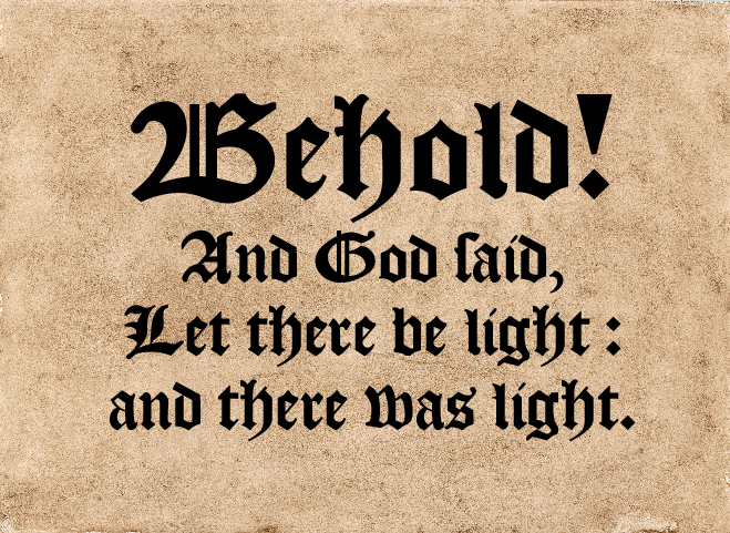
This font is a libre digital recreation of the font found in one of the moſt famous books in the Engliſh language, the 1611 King James Verſion of the Holy Bible. It is licenſed under the S.J.L Open Font Licenſe.

This font can be used to typeset both in the medieual spelling style, or in the modern style. The alphabet is not static ; some glyphs that we use today did not exist in the 17th century. For example, capital “V”, capital “I”, and the “@” sign. Based on other blackletter fonts made by contemporaries of the scribes, and other modern recreations of other blackletter fonts, I made up glyphs for these modern symbols/letters.

The King James Bible was typeset by publishing houses contracted by Robert Barker, who at the time was the King’s Publisher. Barker had a monopoly on the printing of the King James Bible, as well as the Geneva Bible and Bishop’s Bible. There seems to be a bit of a mystery around who actually drew the font : it looks very similar to a font called alternately “Pica Textura” or “Texte Flamand”, sold by the publishing house of one Mr. Hendrik van der Keere. However, he died in 1580 : some letters, such as “A” and “Y” are notably different than how he would haue written them. Another possibility is that the font was made by Wolfgang Hopyl. A third possibility still is that the font was made by Barker or an associate of his in imitation of the styles of those two men, as works printed by them were popular in England at the time.

Whatever the truth, the font is beautiful, and I hope to have prouided a faithful restoration.

OpenType Features :

  1. Ligatures
  2. Discretionary Substitution
  3. Alternate Characters
  4. Special Kerning: f and long s (ſ)
  5. Extended Character Set

I recommend pairing this font with E.B. Garamond.

kjv1611's People

Contributors

ctrlcctrlv avatar

Stargazers

 avatar  avatar  avatar  avatar  avatar  avatar  avatar  avatar  avatar  avatar  avatar  avatar  avatar  avatar  avatar  avatar  avatar  avatar  avatar  avatar  avatar  avatar  avatar  avatar  avatar  avatar  avatar  avatar  avatar  avatar  avatar  avatar  avatar  avatar  avatar  avatar  avatar  avatar  avatar  avatar  avatar  avatar  avatar  avatar  avatar  avatar  avatar  avatar  avatar  avatar  avatar  avatar  avatar  avatar  avatar  avatar  avatar  avatar  avatar  avatar  avatar  avatar  avatar  avatar  avatar  avatar  avatar  avatar  avatar  avatar  avatar  avatar  avatar  avatar  avatar  avatar  avatar  avatar  avatar  avatar  avatar  avatar  avatar  avatar  avatar  avatar  avatar  avatar  avatar  avatar  avatar  avatar

Watchers

 avatar  avatar  avatar  avatar  avatar  avatar  avatar  avatar  avatar

kjv1611's Issues

No stylistic sets

The hist feature is not available in moſt typeſetting foſtware ; thus, my ſuggeſtion is to include the features encoded there in ſeparate ſtyliſtick ſets ſo that they may be uſed in all programs that ſupport it.

Punctuation spaces

A thin space (U+2009) and narrow no-break space (U+202F). To be manually inserted before colons, commas & question marks, as in the original Bible.

Glyphs Incorrect

In the Readme, it is stated: "The alphabet is not static ; some glyphs that we use today did not exist in the 17th century. For example, capital “V”, capital “I”, and the “@” sign."

In the 1611 KJV text, every leading or capital "u" is a "v", while every capital "j" is in reality a capital "i". This may be verified by comparing the 1611, available here: https://archive.org/details/1611theauthorizedkingjamesbible_202001, against the Oxford Roman typeface reprint, available here: https://archive.org/details/av1611oxford1833part2/AV1611oxford1833part1/page/n181/mode/2up

Also one may examine the spellings within the preface to the 1611 itself in Roman typeface, where "unto" is spelt "vnto," "JESUS" is spelt "IESVS," "give" is spelt "giue," and so on. The text given in blackletter typeface follows these spellings as well.

Small caps

A full set of OpenType small caps, to complement the LORD ligature.

d

The left-facing tip of the ascender on the lowercase "d" should be slightly rounded, rather than perfectly square. (Cf. your scan, or nearly any verse.)

Vertical bars

One more thing (which I mentioned by email, but forgot to post here):
The footnote consisting of two vertical bars could stand to have more of a gap. (Less kerning, I guess, since it’s one character repeated twice.) The gap is roughly equal to that of the double-hyphen used for wrapped words. Two clean examples in your facsimile occur in 1 Mac. 14:28 & 14:34 (same page).
It should also be longer. A good early example of this is Gen. 3:7, “themſelues || apꝛons”: notice how it aligns with the top of the “ſ” and bottom of the “p” — from the ascender to the descender — so it’s a full-length glyph.

Numbers

  1. Reduce the size of all numbers by approx. one point, till the x-height matches that of the letters, and the character weight is the same.
  2. Some numbers could do with slight remastering. In particular:
  • The "1" should be more symmetrical. (Not left to right, but top to bottom.) The top-right stroke is heavy; it gives this glyph a lopsided, unfinished look.
  • The "2" has too square a taper on the bottom, and too blob-like a hook on top. It could be sharper. (A new source image may be needed; that scan doesn't look exemplary to me.)
  • The "0" is thicker on the right than the left. In the Bible, it's a uniform circle.

Where's the "ye" ligature?

Hello, I've downloaded your font and I like it, but there doesn't seem to be a "ye" ligature in the font.

As you no doubt are aware, the "ye" ligature stands for the word "the", the "y" being a substitute for the symbol "thorn", which did not exist in the typefaces the English imported from mainland Europe.

Are you planning to add the "ye" ligature in the future? If so, will it be a contextual ligature for use with OpenType capabilities?

Let us know as soon as possible.

j

  1. The dot should match the incline of the dot on the "i" glyph. (Cf. Jer. 26:21, Vrijah.)
  2. The descender should be slightly longer, and pointy rather than blunt. (Cf. ibid.)

Asterisk

The asterisk has two issues:

  1. Its tips are square / blunt, but should be round / tapered.
  2. It is perfectly straight, whereas it should tilt left by ~10 degrees.

Only one dagger exists in the font, but the 1611 KJV contained many different typographical daggers

The cross symbol has a couple issues:

  1. It is too bold. The actual cross used in the Bible is much thinner.
  2. It needs to be superscript. Its top should align with the ascender of the lowercase "h," and its base should align with the beginning of the serif on that same character's left stem. (Cf. Gen. 8:7.)
    We might also consider adding a second cross character (U+271D rather than U+2020). This one should be approx. half the height. (Cf. Gen. 13:8.)

Old style

I was wondering how to I switch to the long style S, in particular the medieval style? Thank you for your help!

No `mark` or `mkmk`

I made an error during the construction of this font which is now coming back to haunt me in some ways.

I used FontForge's automatic generation of letters with diacritics instead of generating them myself the right way via adding anchors and classes and using the OpenType mark feature. Part of why I did this was I was affected by fontforge/fontforge#3324—but I didn't know it and thought I was doing something wrong.

The effects of this are subtle. For one thing, combining diactritics don't work right in this font. This becomes glaringly obvious w/r/t #21, #25 etc., as I have added ligatures and extra glyphs encoded in the PUA instead of just allowing the renderer to render it correctly.

I will eventually have to scrap all my diactric letters and do them over again the right away. This issue will track my progress (if any 😉 ) with that.

Exclamation mark

The triangular exclamation mark has surely been invented for this font. But there is an actual exclamation mark in the Bible (cf. Num. 24:23). It has a straight shaft.

Paragraph symbol

The ¶ glyph could stand to be thinner, and more symmetrical. In most examples I've found, the inside line and top & bottom curves are all one thickness, which in turn matches the weight of the parentheses, and possibly the inner strokes of some capital letters. (I haven't used a microscope, but this is my considered impression, based on comparing many different pages.)
Whereas, at the moment, yours is slightly bottom-heavy, and on the thick side — suggesting ink bleed in your sample.
If you simply matched the top & bottom to the center stroke (no taper toward the tips), this may suffice. It's possible even the center could be just a hair thinner, but I leave that to your judgment.
I think this may be the last less-than-perfect thing I can find in your faithful reproduction of this beautiful typeface. I thank you heartily & soulfully for your attention to detail, and modesty when confronted with criticism. (You have already done a better job than I could ever have, myself, so I feel guilty bringing any of these perceived flaws to your attention.) Thank you for sharing this labor of love with the world. God bless you!

Capital letters

A few of the capital letters need minor tweaks. In particular:

• Your “A” has a perfectly straight crossbar, whereas the original is at a slight angle. (Cf. emailed pictures.)
• Your “B” is too wide. (Cf. ibid.)
• And your “N” is too tall. Not above the x height, but below it: its right foot should anchor on the baseline. (Type e.g. “Ne,” and the part facing the “e” should be in line with it.)

In the near future, I will attempt to reproduce a few more passages, which I will then paste side-by-side (or top-to-bottom) with a cropped scan of the original, and send you a screenshot as before. The goal being to doublecheck the other capitals, too (and perhaps various other details). I will try to do this with multiple passages that feature the same characters, and in this way also doublecheck the source. (Since we know it varies slightly from letterpress to letterpress.)

Of course, now that you possess the same scans, you have the ability to do this as well. Though perhaps less free time. ;) But minor tweaks are easier to deal with than major overhauls or additions, and I hope that’s all that remains by the time you get to this issue. :)

`hist` table: useful for automatic replacement of `r` by `r.rotunda`, `s` by `long_s`, etc?

I was sent a feature request in e-mail by a Mr. Kessler, the automatic replacement using OpenType alternates of r by r.rotunda and s by long_s, and certainly all of the ligatures would also apply. s h to long_s h to long_s_h where appropriate.

One difficulty is that both of these switches are not universally applied, but rather applied only in certain circumstances.

I think this might be doable inside the hist feature tag, but am not sure. Further research needed.

Hyphens

  1. (I discovered the word-wrap hyphen is present & sufficient.)
  2. Regular hyphens are a bit thick, and bent to either side. They should be thinner & straighter, or even vaguely dot-like. (Cf. most instances of the name Nebuchad-rezzar.)

Non-gothic typeface in KJV

What about the non-gothic, 'roman' type in the King James Version? Do you know anything about which typeface was used in the 1611 edition? E.g.:
such as

(a number of interesting ligatures there too..)

Lowercase S styles

Hello, and thank you for this wonderful font!

I don't know if I'm doing something wrong, but the lowercase letter "s" always appears as the "s"-shaped ligature modern readers are familiar with, rather than as an "f" missing the crossbar.

I have tried this in both Word and LibreOffice. I've tried it in the beginning, middle, and end of words. I've tried it as a double letter. I'm running Windows 10.

too much space between "ssw"

the combination of "ssw" results in too much space between all the letters. I can't imagine it's very common - but it is used in the 1662 Book of Common Prayer, prayer "In time of War and Tumults": "abate their pride, asswage their malice, and confound their devices..."
I've attached two screenshots:
asswage1
asswage2

Some ſuggeſtions.

Seeing as this is one of the only complete founts of Blackletter in the Engliſh ſtyle, although to my knowledge many of theſe ſuggeſtions may not be preſent in the original printing of the Bible, I feel it may be beneficial to include them for the ſake of completeneſs and to the end of aſſiſting anyone intereſted in reproducing period works in this ſtyle.
 I have read the iſſue regarding the “ ye ” ligature (#2), and while I know not how it was implemented, I do have a ſuggeſtion to impove its functionality, and allow it to be uſed eaſily without ſpecial typeſetting ſoftware ; my ſolution is, thus :—Create a ſet of ſuperſcript letters that are kerned over the preceeding letter, or uſe the combining letters in Unicode (ſuch as U+0364). Doing it this way would not only allow the “ ye ” to be eaſily typeſet, but would alſo allow other abbreviations, ſuch as “ wch,” “ wt,” “ yr ” (which, with, your). Some other common abbreviations I’ve ſeen in ſome works are ỹ as in “ metỹg ” (metyng ; i. e., meeting), and ꝭ (U+A76D LATIN SMALL LETTER IS) as can be ſeen in the words “ ſpouſellꝭ ” and “ kingꝭ ” on this page. I have alſo ſeen p̱ for “ per,” as ſeen in “ goodly p̱ſones ” on the antepenultimate line here.
 Another ſuggeſtion I have is to include an alternate form of w, which is very popular in many Engliſh faces, that more cloſely reſembles v ; it can be ſeen on this page.
 Finally, a few common ligatures ſeem to be miſſing ; namely, ct, ffi, ffl, ſb, ſk, ſl, ſſl. The leſs common in Engliſh, but ſtill uſeful to include are : ch, ck, fj, fij, ft, ſj, ſö, tt, and tz.

Recommend Projects

  • React photo React

    A declarative, efficient, and flexible JavaScript library for building user interfaces.

  • Vue.js photo Vue.js

    🖖 Vue.js is a progressive, incrementally-adoptable JavaScript framework for building UI on the web.

  • Typescript photo Typescript

    TypeScript is a superset of JavaScript that compiles to clean JavaScript output.

  • TensorFlow photo TensorFlow

    An Open Source Machine Learning Framework for Everyone

  • Django photo Django

    The Web framework for perfectionists with deadlines.

  • D3 photo D3

    Bring data to life with SVG, Canvas and HTML. 📊📈🎉

Recommend Topics

  • javascript

    JavaScript (JS) is a lightweight interpreted programming language with first-class functions.

  • web

    Some thing interesting about web. New door for the world.

  • server

    A server is a program made to process requests and deliver data to clients.

  • Machine learning

    Machine learning is a way of modeling and interpreting data that allows a piece of software to respond intelligently.

  • Game

    Some thing interesting about game, make everyone happy.

Recommend Org

  • Facebook photo Facebook

    We are working to build community through open source technology. NB: members must have two-factor auth.

  • Microsoft photo Microsoft

    Open source projects and samples from Microsoft.

  • Google photo Google

    Google ❤️ Open Source for everyone.

  • D3 photo D3

    Data-Driven Documents codes.