https://neuroimaging-core-docs.readthedocs.io/en/latest/pages/choropleths.html
This tool is compatible with the Iodide scientific computation notebook environment, and a live version of it is accessible here: Neuro-Choropleth Notebook
Live tool accessible at
Home Page: https://devinbayly.github.io/neuro-choro
https://neuroimaging-core-docs.readthedocs.io/en/latest/pages/choropleths.html
This tool is compatible with the Iodide scientific computation notebook environment, and a live version of it is accessible here: Neuro-Choropleth Notebook


This is a feature request to handle csvs that have multiple references to a region. One example is in the case where there are multiple runs of the data. If this is true, then there would be a column named run and filterable elements within that column to switch between what value is shown at a time.
Mostly this question relates to what the default aggregate behavior should be when it comes to displaying a column like mean when multiple values exist for one region.
I don't have a picture, but I believe I saw this briefly, so keep your eyes open.
It might be useful to explicitly say which atlas is being displayed.
If there are multiple atlases, then it might be nice to have a toggle or dropdown that allows you to select the atlas to fetch.
I could also imagine that there would simply be separate notebooks for each atlas choice, but if it is relatively easy to allow users to pick which JSON file to fetch and display the current selection's name (e.g., HO-CB), that would be really nice.

Your code says: ...neuro-choro/HCP/src...
but the atlas you have displayed is the HO-CB atlas, so I'm thinking the totalfix.json is not associated with the correct path. (Note: I am glad the HO-CB atlas is the default)
Actually, it might look nice to put the radio buttons on the left of the text, and then add a little spacing between the button and the text.
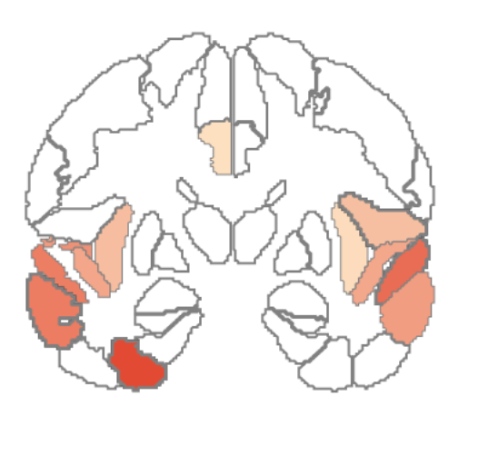
Choropleths are simple maps that display regional changes as color (e.g., a US map showing states that lean Democrat vs Republican). Here is an example of a brain choropleth.
(Umm, but there is no picture of a choropleth here)
There is more in this readme that does not make sense in this context.
It might make sense to refer people to my read the docs page: https://neuroimaging-core-docs.readthedocs.io/en/latest/pages/choropleths.html
We probably should not refer "Devin Bayly's work" as a work in progress etc.
You might read it over carefully and decide what works.
I see this statement on the report view...but I have no idea what it means. That is, are you telling us we could create plots with plotly (but with no indication of how to proceed)?
Or are you giving credit to plotly for the choropleths? (This seems unlikely).
Maybe this statement should go away, or maybe you should point to more comprehensive documentation (your code documentation, documentation on adding plotly plots etc.)
Else, I'm really missing something.
There should be a pane present with a greyed out brain at the beginning of using the tool no matter what.
What should be the representation of color in the gradient if both negative and positiev values are in the range of the color column?
Clicking on the brain view of a different pane accidentally resets the radio button for other panes. Likely due to the way a section of radio buttons work, where only one can be active.
I see that there is only one set of buttons (add pane, export, import) until I run the notebook. Then there are two sets of buttons.
this session has the problem with various regions.
neuro_choropleth_session_2019_11_17_14_56.zip
The buttons (add pane etc.) should be left-aligned with the text. The panel should also be left-aligned with the text.
Obviously a totally minor issue, but it'd look even nicer, I think.
Title says it all.
I have a very big screen, so I can see the brain and several region panels at the same time.
I'm wondering if we could save some vertical space though to improve what can be seen without scrolling:
I think there are several places where you could layout components horizontally:
I saw this behavior in Chrome (no color displays on brain map), where I was not able to display the color even though it existed at that slice for that dataset and did display in Firefox.
This is likely due to a problem with the region coordinates and canvas coordinates conversion. A single calculation should be made over the entire geojson stack first and then the min and max values of that should be set to the largest our canvas content can be.
I processed some data with very large values in the regions. In this case, the slider is too short to accomodate the big numbers.


If I load LearnRuns.csv and click a region to see the region value for run1 (for example), the "selected region panel" is displayed.
If I switch the alt column to run2 and click the same region, the selected region panel disappears. Although it is the same region, it is a different value.
Is it possible to switch the disappearance of the selected region panel to occur only if it is not an exact match?
Although I can see at a glance that the range has changed in the color bar, the images all LOOK exactly the same.
This, I suppose, is because you have cleverly set the range of values to be perfect for each dataset.
What I want (I think) is greater flexibility to set the range of values in the choropleth viewer.
If I could set multiple panes to be the same (e.g., 0 to 8.6), then it would make visual comparisons easier.
A dropdown selector should appear next to the region color column slider. It does not always appear and especially likely to be missing on the first pane.
The present state of the tool allows for new CSV data to be uploaded, but this causes some elements to be removed and then replaced. The issue is that the position after this operation is not constant. Likely need to have a holder element which doesn't go away that is placed at initialization, and then removal and replacement will not shift position.
If you drag the MIN ball on top of the MAX ball, you are in real trouble, you can't tell the difference between them to pull them apart
Slice selector is underlined and to the left of its slider (it needs some space between it and the text)
Fill Color Filter has a completely different look: No underlining for the text, the slider color and size is different, and the slider is under the text.
These should be more consistent with each other. I'd say the Fill Color Slider is the odd man out, and it should resemble the Slice selector.
The csv that was used during a session should get stored with a session json file, and used upon import.
Have a legend next to the canvas with the color gradient and numerical values associated.
The current state of the program has a clunky range slider for the fill filter option, and there's actually an html 5 element that could handle this better.
It appears that the values get correctlty passed to the canvas draw, but not the sliders.

Given that comparison is the primary goal, it'd be nice to display 2 panes side by side.
Note that precise range setting would be easier if it was
possible to edit the numbers on the Fill Color Filter directly.
This is not crucial...don't do it if it requires significant work.
There should be a way to delete an entire pane from the page and the application list.
I think my old eyes need a larger range of color values.
Could we go all the way to bright red?
OR, FSLeyes has a hot colorbar which does red-orange-yellow. That is pretty good for seeing distinctions at a glance. There may be other solutions??
Shift the colors used for the fill to one of the sequential colorblind safe ones listed here http://colorbrewer2.org/#type=sequential&scheme=BuGn&n=3
I don't understand the behavior of the slider: it starts off blues, I move it around and it switches to reds but seems to have set its own min and max?
The legend also shows a different range than the slider sometimes.
Just a bit weird
You suggested adding the name of the loaded CSV to the annotation box. That seems more important than ever since we can load multiple csvs.
I'm wondering if it might be even nicer to display the name of the CSV at the top of the pane next to the load CSV button (since they are related).
The radio button selection should probably remain visible on every pane
Slice labeled incorrectly:

What I did:
I loaded the same CSV (same as LearnRuns...relabeled as NAD2_Learn_IC2) 4 times, intending to display the 4 runs side by side. All are axial view on slice -6mm.
The Problem: Run2 is different...it should match the others but doesn't.
Additional information: Scrolling from top to bottom, it looks like run2 is the only one that was correct...the others match that slice if I scroll them to the bottom and back up to slice -6.
In fact, the others were displaying slice 6mm instead of slice -6mm.
A declarative, efficient, and flexible JavaScript library for building user interfaces.
🖖 Vue.js is a progressive, incrementally-adoptable JavaScript framework for building UI on the web.
TypeScript is a superset of JavaScript that compiles to clean JavaScript output.
An Open Source Machine Learning Framework for Everyone
The Web framework for perfectionists with deadlines.
A PHP framework for web artisans
Bring data to life with SVG, Canvas and HTML. 📊📈🎉
JavaScript (JS) is a lightweight interpreted programming language with first-class functions.
Some thing interesting about web. New door for the world.
A server is a program made to process requests and deliver data to clients.
Machine learning is a way of modeling and interpreting data that allows a piece of software to respond intelligently.
Some thing interesting about visualization, use data art
Some thing interesting about game, make everyone happy.
We are working to build community through open source technology. NB: members must have two-factor auth.
Open source projects and samples from Microsoft.
Google ❤️ Open Source for everyone.
Alibaba Open Source for everyone
Data-Driven Documents codes.
China tencent open source team.