You can also find all 100 answers here 👉 Devinterview.io - CSS
Cascading Style Sheets (CSS) is primarily designed to separate web page content from its visual presentation. This allows for a consistent and adaptable design across multiple web pages.
- Selectors: Elements to which the style rules apply.
- Properties: Visual features, such as font-size, color, and background.
- Values: Specific settings for properties, like 'red' for the color property.
Here is the HTML code:
<!DOCTYPE html>
<html lang="en">
<head>
<meta charset="UTF-8">
<meta name="viewport" content="width=device-width, initial-scale=1.0">
<title>CSS Example</title>
<link rel="stylesheet" href="styles.css">
</head>
<body>
<header>
<h1>Welcome to Our Site</h1>
<nav>
<ul>
<li><a href="#">Home</a></li>
<li><a href="#">About</a></li>
<li><a href="#">Contact</a></li>
</ul>
</nav>
</header>
<section>
<h2>Latest News</h2>
<article>
<h3>Breaking News: Big Event Tomorrow</h3>
<p>Join us for our biggest event of the year!</p>
</article>
</section>
<footer>
© 2022 YourSite
</footer>
</body>
</html>And, here is the accompanying CSS in styles.css:
/* Targeting all text on the page */
body {
  font-family: Arial, sans-serif;
  color: #333;
  background-color: #f4f4f4;
}

/* Targeting the header elements */
header {
  background-color: #1e90ff;
  padding: 1em 0;
  text-align: center;
}

/* Targeting the nav elements */
nav ul {
  list-style-type: none;
  padding: 0;
}

/* Targeting the nav links */
nav a {
  text-decoration: none;
  color: #fff;
  margin: 0 10px;
}

/* Targeting the main section */
section {
  padding: 20px;
}

/* Targeting the footer element */
footer {
  text-align: center;
  margin-top: 50px;
  padding: 10px;
  background-color: #1e90ff;
  color: #fff;
}There are four primary methods to incorporate CSS in an HTML document, each presenting unique advantages and use cases.
- Inline Style: Directly insert CSS rules within HTML tags.
- Embedded Style: Encompass CSS within the HTML document's
<head>section. - External Style Sheet: Create a standalone
.cssfile to be referenced in the HTML. - Imported Style Sheet: Employ
@importwithin a<style>tag or a CSS file to bring in other CSS files.
- Specificity: The degree of influence a selector has over others.
- Reuse: The potential to apply the same CSS rules across multiple elements.
- Maintainability: The ease with which one can update and manage the CSS.
- Ideally, Choose a Single Method: Mixing techniques can complicate maintenance and understanding.
- Inline Styles for Quick Changes: Useful when rapid style modifications are necessary.
Here is the HTML code:
<!DOCTYPE html>
<html lang="en">
<head>
    <meta charset="UTF-8">
    <meta name="viewport" content="width=device-width, initial-scale=1.0">
    <link rel="stylesheet" href="mystyle.css">
    <title>Document</title>
</head>
    <style>
        h1, h2, p {
            color: green;
        }

        div {
            border: 1px solid black;
        }
    </style>
<body>
    <h1>My Header</h1>
    <p>Hello, World!</p>
</body>
</html>Class and ID selectors in CSS serve distinct roles and have limitations in their applicability.
-
Class Selector (`.classname{...}`): Matches multiple elements that share the same class attribute. These elements can belong to various HTML tags (e.g.,
<div>,<p>). -
ID Selector (
#idName{...}): Identifies a single unique element based on its unique ID attribute. While it's still possible to style multiple elements with the same ID, best practices mandate unique IDs for effective CSS usage.
-
Class Selector: Generally faster to compute than ID selectors in modern browsers, particularly when applied to a large number of elements.
-
ID Selector: Formerly superior in terms of speed, contemporary browsers mitigate this difference.
-
Class Selector: Ideal for styling groups of elements based on shared attributes or type.
-
ID Selector: Typically reserved for unique elements that require highly specific styling or JavaScript manipulation. While it's valid to use an ID for styling, as stated in the HTML5 specification, it's generally more maintainable to reserve the use of IDs for uniquely identifiable elements and use classes for styling.
Here is the HTML code:
<html>
  <head>
    <link rel="stylesheet" type="text/css" href="styles.css" />
  </head>
  <body>
    <div class="content">Content 1</div>
    <div class="content">Content 2</div>
    <div class="content" id="uniqueContent">Special Content</div>
  </body>
</html>
Here is the CSS code:
/* Styles applied using class selectors */
.content { color: blue; }

/* Styles applied using ID selector */
#uniqueContent { color: red; }Pseudo-classes are special keywords in CSS that allow you to apply styles to elements based not only on their state or position in the document tree but also on user interaction.
-
Dynamic Pseudo-classes: These appear as the user interacts with an element. For instance,
:hoveris activated when the user hovers the cursor over an element. -
User-action Pseudo-classes: These capture actions taken by the user, such as
:checkedfor input elements that are selected. -
Relationship Pseudo-classes: These pertain to the document tree's hierarchical structure, like
:first-childfor an element that's the first child within its parent. -
Language Pseudo-Classes: These cater to elements displayed in specific languages, for example
:dir(). -
Input Control Pseudo-Classes: Designed specifically for interactive elements, these pseudo-classes style form controls like buttons, inputs, and text areas. Some examples are
:default,:valid,:invalid, and:optional. -
Enabled and Disabled Pseudo-classes: These are self-explanatory; they alter the style of elements based on whether they're enabled or disabled. Examples include
:enabledand:disabled.
A CSS reset is a set of styles intended to reduce browser inconsistencies in elements such as margins, paddings, and various typical style defaults.
- Consistent Starting Point: Eliminates default styling differences across browsers, making the design process more predictable.
- Consistent Box Model: Ensures uniform calculations of element sizing (e.g., widths and heights) to prevent unexpected layout shifts.
- Want Only Custom Styles: It's especially useful if you intend to start from a blank slate and apply your own bespoke styles.
For HTML:
<!DOCTYPE html>
<html lang="en">
<head>
  <meta charset="UTF-8">
  <meta name="viewport" content="width=device-width, initial-scale=1.0">
  <link href="styles.css" rel="stylesheet">
  <title>Document</title>
</head>
<body>
  <h1>Hello, CSS Reset!</h1>
</body>
</html>
And for CSS, here is a simple normalize.css-based reset:
/* reset.css */
/*! normalize.css v8.0.1 | MIT License | github.com/necolas/normalize.css */
h1 {
    font-size: 2em;
    margin: 0.67em 0;
}While programming in CSS, you can leverage attribute selectors to define rules based on the presence or value of specific HTML attributes.
Using attribute selectors has multiple advantages, such as:
- Versatility: They cater to a wide range of scenarios.
- Simplicity: They are easy to use.
- Consistency: They're a part of a standard set of CSS selectors.
You can utilize attribute selectors in three distinct ways:
- Exact Match:
[]selects an exact attribute value. - Value Starts With:
[^]targets attributes with specified starting values. - Case Insensitive: Selectors are usually case-sensitive, but by using
i, you can make them case-insensitive.
Here is the CSS code snippet:
/* Exact Match */
[class="important"] {
  color: red;
}

/* Value Starts With */
[href^="https"] {
  color: green;
}

/* Case Insensitive */
[alt="home" i] {
  background: url('home-icon.png');
}
In the example above,
[class="important"]selects all elements with the exactclassattribute set to "important".[href^="https"]will style all anchor links with anhrefattribute that starts with "https".[alt="home" i]targets thealtattribute with a value of "home" in a case-insensitive manner.
Pseudo-elements are virtual elements that give developers the power to style parts of an HTML document that don't correspond to actual HTML elements. Essentially, they let you apply styles to specific parts of an element without the need for extra HTML markup.
Commonly used pseudo-elements include ::before and ::after which let developers insert content before or after an element, respectively.
- Automatic Insertion: These pseudo-elements can add content continuously without requiring manual code changes.
- Dynamic Content: With generated content and styles, pseudo-elements can adapt based on the specific conditions.
- Custom Styling: Pseudo-elements enable developers to style parts of an element differently than the rest.
-
- Link: Indicating content that opens an external website.
- Implementation: Visual or textual cues like arrows or "External Link" next to anchor elements.
-
- Link: Styling a single letter or number within a text block.
- Implementation: Especially useful in design, for instance, highlighting the first letter of a paragraph with a larger font size.
-
- Link: Apply background images or colors specific to certain parts of an element for various screen sizes.
- Implementation: Use media queries within the pseudo-element for specific screen sizes.
-
- Link: Add decorative elements preceding and following code blocks and blockquote elements.
- Implementation: Help highlight code samples or visually delineate long blockquote sections.
-
- Link: Rework default styling for radio buttons and checkboxes for a more customized look.
- Implementation: Use ::before or ::after with content property to replace default appearance.
-
- Link: Overcome challenges in parent containers not respecting the height of floated child elements and collapsing.
- Implementation: Create an element with ::after pseudo-element where the content clears the floats.
-
- Link: Sometimes, especially with prior versions of Internet Explorer, using pseudo-elements proves crucial for achieving desired stylings.
- Implementation: Useful for applying specifically crafted styles that wouldn't work properly on older browsers without this technique.
The child combinator (>) and the descendant combinator (~) both serve to target HTML elements with CSS. However, they operate in different ways.
- Child Combinator >: Selects an HTML element that is a direct child of another element.
- Descendant Combinator ~: Matches an HTML element that is a descendant (direct or indirect child) of another specified element.
Here is the CSS:
/* target direct children of the parent element */
nav > ul > li {
  color: red;
}

/* target any descendant list items under nav */
nav li {
  color: blue;
}
Here is the HTML:
<nav>
  <ul>
    <li>Direct Child</li> <!-- This is red -->
    <li>
      Nested Child <!-- This is blue -->
      <ul>
        <li>Nested List Item</li> <!-- This is blue -->
      </ul>
    </li>
  </ul>
</nav>-
Specificity of Selection: Implement the child combinator
$>$ when you want to target a specific, direct child of an element. - Minimize Global Targeting: Utilize the descendant combinator cautiously as it has the potential for global targeting. It's often a good habit to opt for more specific selectors.
- Balance Styling and Performance: As a rule of thumb, more specific selectors could improve rendering speed. Use combinators with a balanced approach keeping in mind both specificity and performance needs.
To select all direct children of a specific type in CSS, you can use the > child selector combined with the desired element to build the selector.
For example, to select all the direct children that are <li> elements within an <ul> element, you would use the following CSS:
ul > li {
  /* Styles here */
}The Universal Selector (the asterisk, *) is a powerful tool that enables you to target every element within a specified container. While it's a straightforward selector, its implications can be broad.
-
When to Use: You might want to normalize or reset specific CSS properties (resetting padding, margin, etc.) across all elements within a container or the entire document. The Universal Selector effectively achieves this.
-
Best Practices: Overuse of the Universal Selector can lead to performance issues and unexpected style side effects. Keep its use concise and well-defined.
The Sibling Combinator (+) in CSS targets elements that are immediately preceded by a specified element. Unlike child (>) or descendant (whitespace) selectors, the sibling combinator allows direct sibling targeting.
-
When to Use: For DOM structures where direct sibling relationships are key, such as tabbed content or multi-step forms.
-
Best Practices: While direct sibling targeting is useful, ensure it's the most efficient method for your objective. Overreliance can lead to inflexible CSS and HTML structures.
Here is the CSS:
/* Remove margins, paddings on all elements within the container */
.containers > * {
    margin: 0;
    padding: 0;
}
The HTML:
<div class="container">
    <p>Paragraph 1</p>
    <ul>
        <li>Item 1</li>
        <li>Item 2</li>
    </ul>
</div>Here is the CSS:
/* Style the direct sibling anchor tag when a list item is hovered */
ul li:hover + a {
    color: red;
}
The HTML:
<ul>
    <li>Item 1</li>
    <li>Item 2</li>
    <li><a href="#">Link</a></li>
</ul>Let us take a real-world example.
In this scenario, you have a parent container and you want to remove the default margins and paddings from all its child elements.
The Universal Selector can accomplish this:
Here is the CSS:
.container > * {
    margin: 0;
    padding: 0;
}
The HTML:
<div class="container">
    <p>Paragraph 1</p>
    <p>Paragraph 2</p>
</div>The Box Model is the foundational concept in CSS that describes the structure of an HTML element. It encompasses four key components: content, padding, border, and margin.
- Content: The actual element content, such as text, images, or other visual or interactive elements.
- Padding: Clears an area around the element's content, inside the border. The padding is transparent and doesn't have a background color or border.
- Border: A solid line that defines the boundary of the padding area.
- Margin: Clears an area around the element's border, outside any defined background or border.
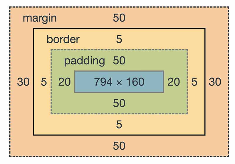
- Height & Width: Element dimensions are determined by the sum of content width/height, and any padding, border, or margin added to it.
- Border: Specifies the size, style, and color of the border surrounding the content and padding.
- Margin: Defines the clearance between adjacent elements.
Here is the HTML code:
<div id="boxModelExample">This is an example of text within the Box Model.</div>Here is the CSS code:
#boxModelExample {
    border: 5px solid red;
    padding: 20px;
    margin: 20px;
}When the surrounding container has a defined width, horizontal margins set to "auto" equally distribute the remaining horizontal space on both sides of the element, centering it within the container.
#autoMarginExample {
    width: 50%;
    margin-left: auto;
    margin-right: auto;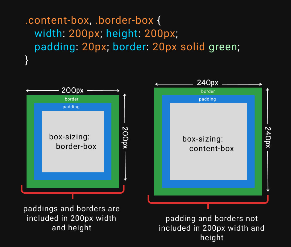
}By default, the width of an element does not include padding or border. CSS can alter this behavior using the box-sizing property:
- Content-Box (default): The element's specified width and height are calculated excluding padding and border. When you change the width or height of an element using CSS, this is the model being used.
- Border-Box: The width and height comprise the content, padding, and border, avoiding the expansion of the box when adding padding or border to an element.
This distinction aids in layout control and ensures uniformity.
#borderBoxExample {
box-sizing: border-box;
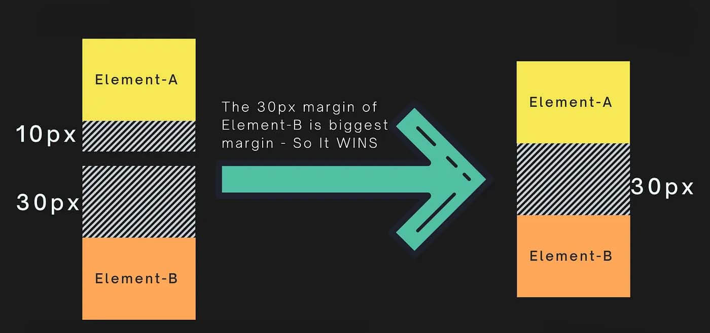
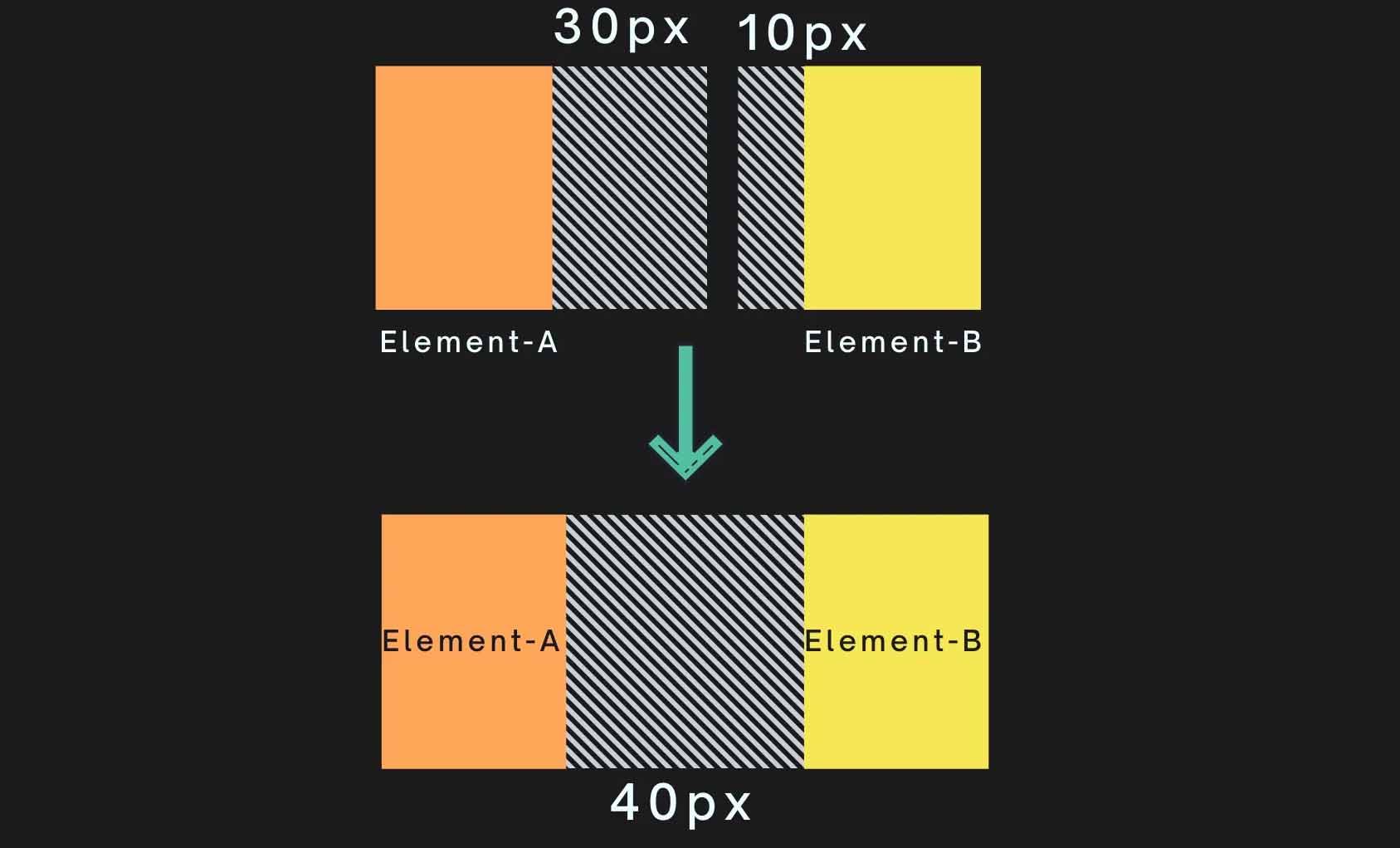
}Margin collapsing can occur when there are adjacent vertical margins between elements. In such cases, the larger of the two margins becomes the "collapsed margin."
-
Adjacent Sibling Collapsing: When two blocks or inline-block elements are hierarchically adjacent, such as being direct children of a common container, their top and bottom margins might collapse. For instance, in the code:
<div>
    <p>This is paragraph 1</p>
    <p>This is paragraph 2</p>
</div>
-
Parent-Child Collapsing: If there are no intervening content or padding or border between the parent and the first/last child inside it, the parent's margins might collapse with the child's corresponding margin.
- Vertical margin collapse:
- Horizontal margin collapse does not occur:
- Padding or Borders: Introduce padding or borders to disrupt the margin collapsing behavior when required.
- Inline-Block or Floats: Transform adjacent elements into
inline-blockor usefloatproperty. - Clearfix: Employ a clearing technique for floated elements, which separates subsequent elements in the flow, ultimately preventing margin collapse.
- Marginal vs. Calculated Total:
- If margins are set, every other margin is respected.
- If margins are calculated to be a non-zero value, margins can be collapsed.
- Margins from both the top and the bottom end of the elements are considered.
- Non-Root Elements: The root
<html>element's margins don't collapse. - Non-Adjacent Items: A margin doesn't collapse through wrapping or inline elements.
While margin collapsing can simplify layout management under specific conditions, it's essential to understand its behavior to ensure predictable and consistent designs.
The box-sizing property has three possible values:
-
Content-Box: Box dimensions are calculated by adding the
widthandheightto the content only. This is the default behavior. Mathematically, this is represented as: $$ \text{Content Width/Height} = \text{Specified Width/Height} $$ -
Border-Box: The
widthandheightof the box are calculated by including both the content and padding within the specified values. Essentially, the browser will adjust the content width and height measurements to include the padding and border thickness. Mathematically, this is represented as: $$ \text{Content Width/Height} = \text{Specified Width/Height} - \text{Padding} - \text{Border} $$ -
Initial: This value sets the
box-sizingproperty to its default value, which is typicallycontent-box.
To center a block-level element using CSS, there are several methods, which handle either horizontal or vertical alignment.
There are three common options to horizontally center a block:
- Auto margins: by setting both left and right margins to
auto. - Flexbox: placing the block in a flex container and setting
justify-content: center. - Grid: applying the
place-itemsproperty on the container set to grid layout.
.container {
  width: 50%;
  margin: 0 auto; /* Center horizontally */
}.container {
display: flex;
justify-content: center; /* Horizontally center child elements */
}To vertically center a block, modern techniques such as Flexbox and Grid layout can be used.
.container {
  display: flex;
  align-items: center; /* Vertically center child elements */
}.container {
display: grid;
align-items: center; /* Vertically center child elements */
}Block elements, by default, stack vertically, while inline elements sit next to each other on the same line.
Inline-block elements combine characteristics of both, stacking vertically and allowing for adjustments in height, margin, and padding.
Here is the HTML:
<div class="block">Block</div>
<span class="inline">Inline</span>
<span class="inline-block">Inline-Block</span>
Here is the CSS:
div, span {
  display: block;
  margin-bottom: 10px;
}

.inline-block {
  display: inline-block;
  background: lightblue;
  padding: 10px;
}
In div and span due to default display type (block): text is separated by
a gap.
In span.inline-block: with display: inline-block, text shares a line but is visually separated by its background.
Explore all 100 answers here 👉 Devinterview.io - CSS


 React
React
 Typescript
 Django
 Laravel
 Facebook
 Microsoft
 Google
 Alibaba
 D3
D3
 Tencent