
You just realized that since the beginning of the bootcamp, your diet is not healthy and it may have an impact on your health (and productivity), now and in the long term.
To take care of the food you eat, you decided to create a nutrition app that will track everything you eat!

-
Fork this repo
-
Clone this repo
-
Open the LAB and start:
$ cd lab-react-ironnutrition
$ npm install
$ npm start
-
Upon completion, run the following commands:
git add .
git commit -m "done"
git push origin master
-
Create a Pull Request so that your TAs can check your work.
Clean the App.js component so that it has the following structure:
// src/App.js
import "./App.css";

function App() {
  return <div className="App"></div>;
}
export default App;We will use Ant Design component library for the design. :)
$ npm install antdTo make the Ant Design styles available in the entire app, import Ant Design stylesheet in index.js:
// src/index.js
import "antd/dist/antd.css";During the LAB we will be using a set of simple Ant Design components that provide basic styling.
Before using any Ant Design component you will first have to import it from the antd package. You must import a component in each file where you intend to use it. Example:
// EXAMPLE
// To start using the pre-made Ant Design components we must first import them:
import { Card, Row, Col, Divider, Input, Button } from "antd";

function Example() {
  // After importing the components we can render them directly:
  return (
    <div>

      <Row>
        <Col>
          <Divider>Fancy Input</Divider>
          <Input value={""} onChange={() => {}} />
        </Col>

        <Col>
          <Card title={"Fancy Card"}>
            <Button onClick={() => {}}>Fancy Button</Button>
          </Card>
        </Col>
      </Row>

    </div>
  );
}For now, we will be working in the App.js. In the later steps, you can refactor the app and split it into multiple components. Import the array of foods from the foods.json file to App.js.
import foods from "./foods.json";If you struggle with the design, you can find static examples of what is expected inside the style-guide/ folder.
So let's start!
Now that you have the foods.json imported in App.js it is time to save it in a state variable. Once you have done that, map over the state variable and render a simple list (without styles) that displays food names. You can use the following snippet for the list items:
{
  /* Simple list Item */
}
<div>
  <p> FOOD_NAME_HERE </p>
  <img src="FOOD_IMAGE_HERE" width={0} />
</div>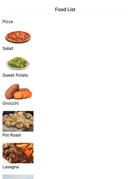
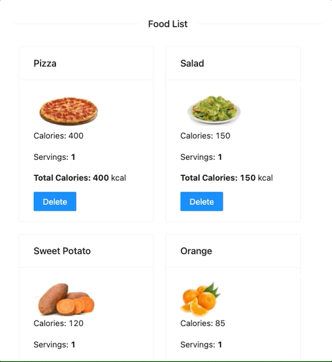
Create a new component named FoodBox that takes the food object as a prop. It should display the card with all the information about the food coming from the food prop. The component should render the following content:
{
  /* FoodBox component */
}
<Col>
  <Card
    title={"FOOD_NAME_HERE"}
    style={{ width: 230, height: 300, margin: 10 }}
  >
    <img src={"FOOD_IMAGE_HERE"} height={60} />
    <p>Calories: FOOD_CALORIES_HERE</p>
    <p>Servings: FOOD_SERVINGS_HERE</p>
    <p>
      <b>Total Calories: FOOD_CALORIES * FOOD_SERVINGS </b> kcal
    </p>
    <Button type="primary"> Delete </Button>
  </Card>
</Col>
Remember to import the Ant Design components Card, Col, Divider and Button before using them:
import { Card, Col, Divider, Button } from "antd";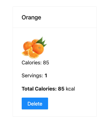
After creating the FoodBox component, use it in the App.js to render the food list. Instead of mapping over the foods array and renderign only the food names, render the <FoodBox /> component. When rendering FoodBox remember to pass the food object as a prop.
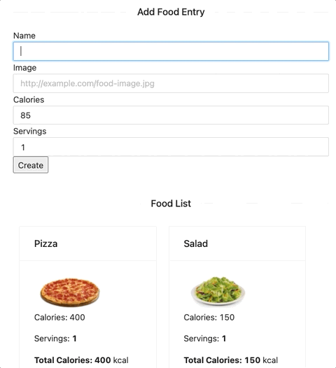
Once you are done rendering the FoodBox in the list, your app should display the following content:
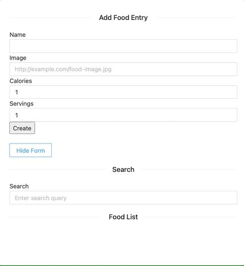
Create a new controlled component named AddFoodForm, used to add new foods. The component should contain a form with four input elements for name , image , calories and servings.
The component should render use the AntDesign component Input instead of the the input tag. The AntDesign Input component uses the same syntax as the regular input tag. Example:
// HTML <input /> tag
<input value={} type="text" onChange={} />
// Ant Design <Input /> component
<Input value={} type="text" onChange={} />The component should be rendered in the App.js.
When the user clicks submit, the food should be added to the list.
Hint: To add new food to the food array in App.js you will need to pass a function through the props.
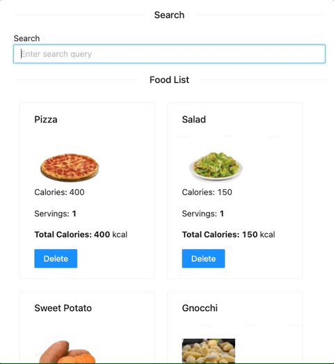
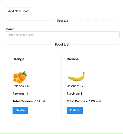
Create a Search component to perform a search and filter the list of food items displayed.
Your FoodBox component has a delete button. Implement the delete functionality so that when a user clicks on the button, the item gets removed from the food list.
Hint: To update the food array from App.js you will need to pass a function through the props.
If you are not sure how to create responsive columns with Ant Design, you can check the example provided in the Ant Design documentation.
There are quite a few components displaying in the app. Implement a hide/show button that when clicked, hides/shows the AddFoodForm. When the form is showing the button should display the message Hide Form` and when the form is hidden it shoud display Add New Food.
Display a Feedback message to the user when the food array is empty. For example, once all of the items are deleted from the list the user should see the a message that looks like this:


 React
React
 Typescript
 Django
 Laravel
 Facebook
 Microsoft
 Google
 Alibaba
 D3
D3
 Tencent