GithubHelp home page GithubHelp logo

ekeric13 / react-ratings-declarative Goto Github PK

View Code? Open in Web Editor NEW
44.0 1.0 10.0 666 KB

A customizable rating component for selecting x widgets or visualizing x widgets

Home Page: https://codepen.io/ekeric13/project/full/DkJYpA/

License: BSD 3-Clause "New" or "Revised" License

Makefile 0.13% JavaScript 95.84% HTML 2.23% CSS 1.80%
rating star-rating react react-component component svg svg-icons icons rater input

react-ratings-declarative's Introduction

React Ratings Declarative

A customizable rating component for selecting x widgets or visualizing x widgets. SVG stars that show aggregate star ratings to the hundreths decimal point.

npm install --save react-ratings-declarative

Demo

Demo Example Image

Usage

import Ratings from 'react-ratings-declarative';

class Foo extends Component {
    changeRating( newRating ) {
      this.setState({
        rating: newRating
      });
    }

    render() {
      return (
          <Ratings
            rating={this.state.rating}
            widgetRatedColors="blue"
            changeRating={this.changeRating}
          >
            <Ratings.Widget />
            <Ratings.Widget />
            <Ratings.Widget
              widgetDimension="60px"
              svgIconViewBox="0 0 5 5"
              svgIconPath="M2 1 h1 v1 h1 v1 h-1 v1 h-1 v-1 h-1 v-1 h1 z"
            />
            <Ratings.Widget widgetHoverColor="black" />
            <Ratings.Widget />
          </Ratings>
      );
    }
}


class Bar extends Component {
  render() {
    return (
      <Ratings
        rating={3.403}
        widgetDimensions="40px"
        widgetSpacings="15px"
      >
        <Ratings.Widget widgetRatedColor="green" />
        <Ratings.Widget widgetSpacing="30px" widgetDimension="15px" />
        <Ratings.Widget widgetRatedColor="black" />
        <Ratings.Widget widgetRatedColor="rebeccapurple" />
        <Ratings.Widget />
      </Ratings>
    );
  }
}

API

Ratings

Prop Type Default Description Example
rating number 0 The user's rating. Number of widgets to highlight. 3
typeOfWidget string 'Star' The type of widget used as a rating meter Point
changeRating function ()=>{} Callback that will be passed the new rating a user selects const setNewRating = (rating) => this.props.dispatch( fooActions.setRating(rating) )
gradientPathName string '' gradientPathname needed if app's path is not at the root /app/
ignoreInlineStyles boolean false ignore all the inline styles and write your own css using the provided classes true
svgIconPaths string 'm25,1 6,17h18l-14,11 5,17-15-10-15,10 5-17-14-11h18z' Set a path that describes the svg shape for all the children 'm25,1 6,17h18l-14,11 5,17-15-10-15,10 5-17-14-11h18z'
svgIconViewBoxes string '0 0 51 48' Set the view box for a custom svg path you might have for all the children '0 0 51 48'
svgs node none Use a custom svg or react element for all the children <svg><circle /></svg>
widgetRatedColors string 'rgb(109, 122, 130)' Color of widgets that the user has rated, applied to all the children black
widgetEmptyColors string 'rgb(203, 211, 227)' Color of widgets that the use hasn't rated, applied to all the children grey
widgetHoverColors string 'rgb(230, 67, 47)' Color of widget when hovering over it in selection mode, applied to all the children yellow
widgetDimensions string '50px' The width and height of the star, applied to all the children 15px
widgetSpacings string '7px' The spacing between the widgets, applied to all the children 0

Widget

Prop Type Default Description Example
svgIconPath string 'm25,1 6,17h18l-14,11 5,17-15-10-15,10 5-17-14-11h18z' Set a path that describes the svg shape 'm25,1 6,17h18l-14,11 5,17-15-10-15,10 5-17-14-11h18z'
svgIconViewBox string '0 0 51 48' Set the view box for a custom svg path you might have '0 0 51 48'
svg node none Use a custom svg or react element <svg><circle /></svg>
widgetRatedColor string 'rgb(109, 122, 130)' Color of widgets that the user has rated black
widgetEmptyColor string 'rgb(203, 211, 227)' Color of widgets that the use hasn't rated grey
widgetHoverColor string 'rgb(230, 67, 47)' Color of star when hovering over it in selection mode yellow
widgetDimension string '50px' The width and height of the widget 15px
widgetSpacing string '7px' The spacing between the widgets 0

Browser Support

Supports Chrome, safari, firefox, edge, and ie 9+. The widget is SVG, so this library fails for any browser that doesn't support svg.

Potential Gradient Path Name Issue

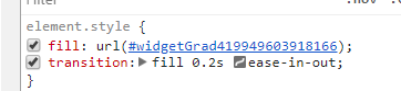
I use the css property fill: 'url(#starGrad<randomNum>)'; to fill in just a percentage of a star. It has some weird bugs depending on the pathname of the app. Normally SPA's have window.location.pathname === '/', but if you append window.location.origin with the pathname of say app, so that window.location.pathname === '/app/', then you need a gradientPathName of '/app/'.

Here is a stackoverflow post that I found that was related to this issue: http://stackoverflow.com/questions/36774188/svg-internal-url-links-and-iframes-on-wirecloud

Contribute

If you want to contribute: Make changes in the src folder. And then run make build. The make build command compiles react and es6 stuff using babel from src/ into build/.

react-ratings-declarative's People

Contributors

ekeric13 avatar

Stargazers

 avatar  avatar  avatar  avatar  avatar  avatar  avatar  avatar  avatar  avatar  avatar  avatar  avatar  avatar  avatar  avatar  avatar  avatar  avatar  avatar  avatar  avatar  avatar  avatar  avatar  avatar  avatar  avatar  avatar  avatar  avatar  avatar  avatar  avatar  avatar  avatar  avatar  avatar  avatar  avatar  avatar  avatar  avatar  avatar  avatar

Watchers

 avatar

react-ratings-declarative's Issues

Uncaught Error: Cannot find module 'ie-number-polyfill'

I just tried the rating component and it gives the following error:
Uncaught Error: Cannot find module 'ie-number-polyfill'

The problem is in the following file build/index.js
line 17 require('ie-number-polyfill');
To fix the problem change it to require('./ie-number-polyfill'); because else it thinks it's a module.

Allow extra props for the Widget

Hi, first of all thank you for this flexible library, it worked nicely for my needs and it is well documented.

I found that I need to be able to pass extra props to Ratings.Widget to make it locatable by our browser automated testing (an "id" at least), and also to provide accessibility attributes.

I opened a PR (#6 ) to allow this and I would be grateful if you could check it.

Thanks!

Stars change at different times on hover

Excellent work on this library. It really shows a lot of polish.

A quick example:

<Ratings changeRating={()={}} rating={2.9}>
    <Ratings.Widget />
    ...5x
</Ratings>

(I only add changeRating so that ratings would be selectable.) In this case, moving your mouse over, for instance, the first star over and over causes the third star to appear to wink. Let me know if you would like a video or more information.

Ability to hover and set to half star ratings

I only see the ability to set new star ratings in full stars, it would be really nice to easily set to half or quarter star ratings through hovering and clicking on the location of the star. This is pretty standard with most star rating systems.

starSpacings and starSpacing doesn't work

On the Ratings component starSpacings and on the Widget starSpacing doesn't work but when I looked in the React Dev Tools I found the following widgetSpacings and widgetSpacing when I changed those values it does work. Even when I put them on the component it works. Like this:

<Ratings
  ...
  widgetSpacings="1px"
>

<Ratings.Widget widgetSpacing="1px" />

Long story short changing the API docs from starSpacings and starSpacing to widgetSpacings and widgetSpacing

stars randlomly dissapearing after onHover changes

Hello,
image

this is how I use it:

<Ratings
                                            rating={3.5}
                                            widgetRatedColors="#F7D620"
                                            widgetEmptyColors="#ccc"
                                            widgetDimensions="16px"
                                            widgetSpacings="3px"
                                            changeRating={this.changeRating}
                                            typeOfWidget='Star'
                                        >
                                            <Ratings.Widget  widgetHoverColor="#F7D620"/>
                                            <Ratings.Widget  widgetHoverColor="#F7D620"/>
                                            <Ratings.Widget widgetHoverColor="#F7D620"/>
                                            <Ratings.Widget widgetHoverColor="#F7D620" />
                                            <Ratings.Widget widgetHoverColor="#F7D620"/>
                                        </Ratings>

It gets this inline style and just disappearing. Am I missing something? Thanks

Using percentage values for widgetDimensions or widgetDimensions makes widgets display vertically

In the docs, all the examples use pixels for widgetDimensions and widgetDimension. I am using this library, and liking it alot, but now I need to set the size of the stars according to the width of their container. I tried doing something like this:
<Ratings rating={this.state.rating} widgetDimensions='20%'>
[<Ratings.Widget here]
.

This causes the widgets to line up (not quite) vertically as opposed to horizontally. I believe this is not intended functionality.

Attached is a screenshot of the issue.
image

Recommend Projects

  • React photo React

    A declarative, efficient, and flexible JavaScript library for building user interfaces.

  • Vue.js photo Vue.js

    ๐Ÿ–– Vue.js is a progressive, incrementally-adoptable JavaScript framework for building UI on the web.

  • Typescript photo Typescript

    TypeScript is a superset of JavaScript that compiles to clean JavaScript output.

  • TensorFlow photo TensorFlow

    An Open Source Machine Learning Framework for Everyone

  • Django photo Django

    The Web framework for perfectionists with deadlines.

  • D3 photo D3

    Bring data to life with SVG, Canvas and HTML. ๐Ÿ“Š๐Ÿ“ˆ๐ŸŽ‰

Recommend Topics

  • javascript

    JavaScript (JS) is a lightweight interpreted programming language with first-class functions.

  • web

    Some thing interesting about web. New door for the world.

  • server

    A server is a program made to process requests and deliver data to clients.

  • Machine learning

    Machine learning is a way of modeling and interpreting data that allows a piece of software to respond intelligently.

  • Game

    Some thing interesting about game, make everyone happy.

Recommend Org

  • Facebook photo Facebook

    We are working to build community through open source technology. NB: members must have two-factor auth.

  • Microsoft photo Microsoft

    Open source projects and samples from Microsoft.

  • Google photo Google

    Google โค๏ธ Open Source for everyone.

  • D3 photo D3

    Data-Driven Documents codes.