GithubHelp home page GithubHelp logo

eliav2 / react-xarrows Goto Github PK

View Code? Open in Web Editor NEW
561.0 3.0 73.0 5.94 MB

Draw arrows (or lines) between components in React!

Home Page: https://codesandbox.io/embed/github/Eliav2/react-xarrows/tree/master/examples?fontsize=14&hidenavigation=1&theme=dark

License: MIT License

TypeScript 91.36% JavaScript 8.64%

react-xarrows's Introduction

react-xarrows

⚠️Warning⚠️

I'm no longer maintaining this project, as evident from the commit history. It Started 5 years ago due to a lack of good React libraries for SVG arrows/lines, but better alternatives exist today, like react-flow (unrelated to me). react-xarrows v3 is 75% ready in my stash, but I won't work on it for now due to other projects.

Thanks for the journey, happy development!

introduction

Draw arrows between components in React!

npm version downloads issues licence

Main features

  • Connect arrows/lines between components just by passing an id or ref!
  • Super simple API yet fully customizable usage!
  • Smart and Intuitive look and behavior!
  • Smart React lifecycle, and cached parsed props for efficiency!

liked my work? star this repo.

reallyy liked my work? buy me a coffee!

Help wanted

This project needs another maintainer, especially for known bugs(and future ones) of react-xarrows v2. I'm working on V3 from time to time, but don't have the time to respond and fix all active issues. help would be welcomed(contact me on [email protected] for more details)

installation

with npm npm install react-xarrows. (or yarn add react-xarrows)

Examples

Demos

see here! codebox of few examples(in this repo at /examples).

react-xarrow-picture-1 4 2

see this interactive example: https://lwwwp.csb.app/CustomizeArrow

simple example:

import React, {useRef} from "react";
import Xarrow from "react-xarrows";

const boxStyle = {border: "grey solid 2px", borderRadius: "10px", padding: "5px"};

function SimpleExample() {
    const box1Ref = useRef(null);
    return (
        <div style={{display: "flex", justifyContent: "space-evenly", width: "100%"}}>
            <div ref={box1Ref} style={boxStyle}>hey</div>
            <p id="elem2" style={boxStyle}>hey2</p>
            <Xarrow
                start={box1Ref} //can be react ref
                end="elem2" //or an id
            />
        </div>
    );
}

export default SimpleExample;

V2 example

in order to invoke updates on xarrows wrap your arrows and connceted elements with Xwrapper, and consume useXarrow on connected elements.

import React from 'react';
import Xarrow, {useXarrow, Xwrapper} from 'react-xarrows';
import Draggable from 'react-draggable';

const boxStyle = {border: 'grey solid 2px', borderRadius: '10px', padding: '5px'};

const DraggableBox = ({id}) => {
    const updateXarrow = useXarrow();
    return (
        <Draggable onDrag={updateXarrow} onStop={updateXarrow}>
            <div id={id} style={boxStyle}>
                {id}
            </div>
        </Draggable>
    );
};

export function V2Example() {
    return (
        <div style={{display: 'flex', justifyContent: 'space-evenly', width: '100%'}}>
            <Xwrapper>
                <DraggableBox id={'elem1'}/>
                <DraggableBox id={'elem2'}/>
                <Xarrow start={'elem1'} end="elem2"/>
            </Xwrapper>
        </div>
    );
}
another example
import React from 'react';
import Xarrow, {useXarrow, xarrowPropsType, Xwrapper} from 'react-xarrows';
import Draggable from 'react-draggable';

const boxStyle = {
    border: '1px #999 solid',
    borderRadius: '10px',
    textAlign: 'center',
    width: '100px',
    height: '30px',
    color: 'black',
    alignItems: 'center',
    display: 'flex',
    justifyContent: 'center',
} as const;

const canvasStyle = {
    width: '100%',
    height: '100vh',
    background: 'white',
    overflow: 'auto',
    display: 'flex',
    color: 'black',
} as const;

const DraggableBox = ({box}) => {
    const updateXarrow = useXarrow();
    return (
        <Draggable onDrag={updateXarrow} onStop={updateXarrow}>
            <div id={box.id} style={{...boxStyle, position: 'absolute', left: box.x, top: box.y}}>
                {box.id}
            </div>
        </Draggable>
    );
};

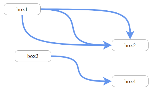
const SimpleTemplate = () => {
    const box = {id: 'box1', x: 20, y: 20};
    const box2 = {id: 'box2', x: 320, y: 120};
    const box3 = {id: 'box3', x: 50, y: 150};
    const box4 = {id: 'box4', x: 320, y: 220};
    return (
        <div style={canvasStyle} id="canvas">
            <Xwrapper>
                <DraggableBox box={box}/>
                <DraggableBox box={box2}/>
                <Xarrow start={'box1'} end={'box2'}/>
                <Xarrow start={'box1'} end={'box2'} endAnchor={'top'}/>
                <Xarrow start={'box1'} end={'box2'} startAnchor={'bottom'}/>
            </Xwrapper>
            <Xwrapper>
                <DraggableBox box={box3}/>
                <DraggableBox box={box4}/>
                <Xarrow start={'box3'} end={'box4'}/>
            </Xwrapper>
        </div>
    );
};

(will render this)

Usage

react-xarrows will smartly trigger updates on relevant elements! use Xwrapper and useXarrow hook to achieve selective rendering!

useXarrow

import {useXarrow} from "react-xarrow"

const YourComponent = ({id, ...props}) => {
    const updateXarrow = useXarrow()
    //...
    return (
        <div id={id}>
            ...
        </div>
    )

}

Xwrapper

const YourApp = () => {
    return (
        // ...
        <Xwrapper>
            <YourComponent id={'comp1'}/>
            <YourComponent id={'comp2'}/>
            <Xarrow start={'comp1'} end={'comp2'}/>
        </Xwrapper>
        // ...
    )
}

each time component calling useXarrow hook renders also the xarrows inside the wrapping Xwrapper wrapper will render. receiving updateXarrow is optional. use this function only if you want to trigger a render different phase from rendering(like click or drag event).

API

to see full typescript definition see types.ts file.

here's a summary of the all the available props:

Properties Description default value type
start ref to start element none(Required!) string/ReactRef
end ref to end element none(Required!) string/ReactRef
startAnchor from which side the arrow should start from start element 'auto' string/object/array
endAnchor at which side the arrow should end at end element 'auto' string/object/array
labels optional labels null string/array
color color of Xarrow(all parts) 'CornflowerBlue' string
lineColor color of the line null string
headColor color of the head null string
tailColor color of the tail null string
strokeWidth thickness of Xarrow(all parts) 4 number
headSize thickness of head(relative to strokeWidth) 6 number
tailSize thickness of tail(relative to strokeWidth) 6 number
path path drawing style 'smooth' string
curveness how much the line curveness when path='smooth' 0.8 number
gridBreak where the line breaks in path='grid' "50%" string
dashness should the line be dashed false boolean/object
showHead show the arrow head? true boolean
showTail show the arrow tail? false boolean
showXarrow show Xarrow? true boolean
animateDrawing animate drawing when arrow mounts? false boolean/object
headShape shape of the arrow head 'arrow1' string/object
tailShape shape of the arrow tail 'arrow1' string/object
zIndex zIndex - Overlapping elements with a larger z-index cover those with a smaller one 0 number
Advanced Props

see details

Properties Description default value type
passProps properties which will be pased to arrowBody,arrowHead,arrowTail {} object
SVGcanvasProps properties which will be passed to svgCanvas {} object
arrowBodyProps properties which will be passed to arrowBody {} object
arrowHeadProps properties which will be passed to arrowHead {} object
arrowTailProps properties which will be passed to arrowTail {} object
divContainerProps properties which will be passed to divContainer {} object
SVGcanvasStyle style properties which will be passed svgCanvas 0 object
divContainerStyle style properties which will be passed divContainer false object
_extendSVGcanvas extend svgCanas at all sides 0 number
_debug show debug elements 0 boolean
_cpx1Offset offset control point 1 x 0 number
_cpy1Offset offset control point 1 y 0 number
_cpx2Offset offset control point 2 x 0 number
_cpy2Offset offset control point 2 x 0 number
API flexibility

This API built in such way that most props can accept different types. you can keep things simple or provide more custom props for more custom behavior(see startAnchor good example).
explore typescript for detailed descriptions of what type excepts every prop.

Properties

This documentation is examples driven.
The examples sorted from the most common use case to the most custom one.

'start' and 'end'

required
can be a reference to a react ref to html element or string - an id of a DOM element.

examples:

  • start="myid" - myid is id of a dom element.
  • start={myRef} - myRef is a react ref.

'startAnchor' and 'endAnchor'

specify what anchors are allowed. can be a string/object/array.

type:

export type anchorType = anchorPositionType | anchorCustomPositionType;

simple usage:

type:

export const tAnchorEdge = ['middle', 'left', 'right', 'top', 'bottom', 'auto'] as const;
export type anchorPositionType = typeof tAnchorEdge[number];

one of "auto" | "middle" | "left" | "right" | "top" | "bottom" auto will choose automatically the path with the smallest length.

example:

  • endAnchor="middle" will set the anchor of the end of the line to the middle of the end element.
  • endAnchor="auto" choose the closest anchor.
  • endAnchor="left" connect to the left.

custom usage:

type:

export type anchorCustomPositionType = {
    position: anchorPositionType;
    offset: { x?: number; y?: number };
};

example:

  • endAnchor= { position: "auto", offset: { x: 20 } } will choose automatic anchoring for end anchor but will offset it 20 pixels to the right after normal positioning.

if list is provided - the minimal length anchors will be chosen from the list. example:

  • endAnchor= ["right", {position: "left", offset: {y: -10}}] only right and left anchors will be allowed for endAnchor, and if the left side connected then it will be offset 10 pixels up.
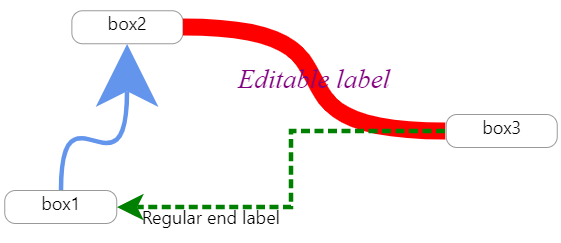
labels

you can place up to 3 labels. see examples

  • labels="middleLabel" - middle label
  • labels=<div style={{ fontSize: "1.3em", fontFamily: "fantasy", fontStyle: "italic" }}>styled middle label</div>
    • custom middle label
  • labels={{ start:"I'm start label",middle: "middleLabel",end:<div style={{ fontSize: "1.3em", fontFamily: "fantasy", fontStyle: "italic" }}>big end label</div> }} start and middle label and custom end label

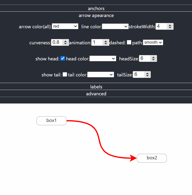
color,lineColor and headColor and tailColor

color defines color to the entire arrow. lineColor,headColor and tailColor will override color specifically for line,tail or head. examples:

  • color="red" will change the color of the arrow to red(body and head).
  • headColor="red" will change only the color of the head to red.
  • tailColor="red" will change only the color of the tail to red.
  • lineColor="red" will change only the color of the body to red.

strokeWidth and headSize and tailSize

strokeWidth defines the thickness of the entire arrow. headSize and tailSize defines how big will be the head or tail relative to the strokeWidth. examples:

  • strokeWidth={15} will make the arrow more thick(body and head).
  • headSize={15} will make the head of the arrow more thick(relative to strokeWidth as well).
  • tailSize={15} will make arrow's tail thicker.

path

path can be one of: "smooth" | "grid" | "straight", and it controls the path arrow is drawn, exactly how their name suggest. examples:

  • path={"grid"} will draw the line in sharp curves(90 degrees) like grid.

curveness

defines how much the lines curve. makes a difference only in path='smooth'. examples:

  • curveness={false} will make the line straight without curves(exactly like path='straight').
  • curveness={true} will choose default values of curveness.
  • curveness={2} will make Xarrow extra curved.

gridBreak

defines where the line will break when path='grid'.

examples:

  • gridBreak='20%' the line would break closer to start element(20% of the path instead of 50%).
  • gridBreak='50' the line would break 50 pixel from start element.
  • gridBreak='20%50' the line would break 50 pixel after 20% from start element.
  • gridBreak='100%-50' the line would break 50 pixel before end element.

dashness

can make the arrow dashed and can even animate. if true default values(for dashness) are chosen. if object is passed then default values are chosen except what passed. examples:

  • dashness={true} will make the line of the arrow to be dashed.
  • dashness={{ strokeLen: 10, nonStrokeLen: 15, animation: -2 }} will make a custom looking dashness.

showHead, showTail and showXarrow

showXarrow: show or not show Xarrow? (can be used to restart the drawing animation) showHead: show or not the arrow head? showTail: show or not the arrow tail?

  • showXarrow={false} - will hide (unmount) Xarrow and his labels.
  • showHead={false} - will hide the arrow head.

animateDrawing

can animate the drawing of the arrow using svg animation. type: boolean|number. if true animation duration is 1s. if number is passed then animation duration is number's value in seconds. examples:

  • animateDrawing will animate the drawing of the arrow in 1 second.
  • animateDrawing={5} will animate the drawing of the arrow in 5 seconds.
  • animateDrawing={0.1} will animate the drawing of the arrow in 100 milliseconds.

custom svg arrows - headShape and tailShape

you can customize the svg edges (head or tail) of the arrow. you can use predefined svg by passing string,one of "arrow1" | "circle" | "heart"

simple usage:

headShape type:string

Code Result
<xarrow headShape='circle'/>

img_1.png

<xarrow headShape='circle'
        arrowHeadProps={"fill": "transparent",
            "strokeWidth": "0.1",
            "stroke": "CornflowerBlue"}
/>

img_1.png

<xarrow headShape='heart'/>

img.png

you can import arrowShapes which is object contains all predefined svg shapes.

custom usage

you can also pass your own svg shapes:

type svgElemType = "circle" | "ellipse" | "line" | "path" | "polygon" | "polyline" | "rect"
type headShapeType<T extends svgElemType> = {
    svgElem: SVGElementTagNameMap[T];
    offsetForward?: number;
};

for example, you can pass the following object, and it will be exactly equivalent to passing 'arrow1':

const headShapeArrow1 = {svgElem: <path d="M 0 0 L 1 0.5 L 0 1 L 0.25 0.5 z"/>, offsetForward: 0.25}
// then pass it Xarrow
<Xarrow headShape={headShapeArrow1}/>

svgElem - a jsx of svg element like path or circle(can also imported svg element from file).
offsetForward - how much to offset tht line into the svg element(from 0 to 1). normally the line will connect to the start of the svgElem. for example in case of the default arrow you want the line to enter 25% into the svgElem.

here's a custom example using custom svg files.

don't forget about arrowHeadProps and arrowTailProps in case you want to use default shape but custom svg props.

in case you pass a custom svg element: currently you have to adjust the path to start from 0,0 and to be at size box 1x1 in order to make the custom shape look like the default shapes in size.

advanced customization

passing props

The xarrow is fully customizable, and you can pass props to any part of the component. if unlisted(unknown) property is passed to xarrow so by default it'll be passed down to divContainer.

passProps

you can pass properties to visible parts(body and head) of the arrow (such event handlers and much more). this supposed to be enough for most cases. examples:

  • passProps= {{onClick: () => console.log("xarrow clicked!")}} - now the arrow will console log a message when clicked.
  • passProps= {{cursor: "pointer"}} - now the cursor will change to pointer style when hovering over Xarrow.
  • passProps= {{pointerEvents: "none"}} - now the user cannot interact with Xarrow via mouse events.

advanced customization

The properties below can be used to customize the arrow even farther:

arrowBodyProps, arrowHeadProps, SVGcanvasProps, divContainerProps

image

if you wish you can pass props specific part of the component.
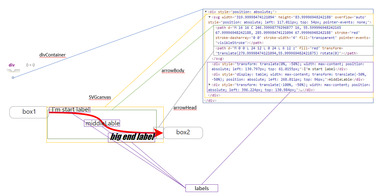
  • divContainerProps - the container which contains the SVG canvas, and the optional labels elements. It takes no place, and located where you normaly placed him in the elements tree(no offset). The SVGcanvas and the labels will be placed in a offset from this div.
  • SVGcanvasProps - the svg canvas which contains arrow head and body.
  • arrowBodyProps - the body of the arrow
  • arrowHeadProps - the arrow head.

Note that arrowBody and arrowHead receives props of svg path element, SVGcanvas receives props of svg element, and divContainerProps of a div element.

examples:

  • arrowHead = {onClick: () => console.log("head clicked!")} - now only the head will console log a message when clicked.
SVGcanvasStyle, divContainerStyle

if you wish to pass style to divContainer or SVGcanvas use SVGcanvasStyle,divContainerStyle and not SVGcanvasProps ,divContainerProps to not override existing style.

_extendSVGcanvas

will extend the svg canvas at all sides. can be useful if for some reason the arrow is cut though to small svg canvas( should be used in advanced custom arrows). example: _extendSVGcanvas = {30} - will extend svg canvas in all sides by 30 pixels.

_cpx1Offset,_cpy1Offset,_cpx2Offset,_cpy2Offset

now you can manipulate and offset the control points of the arrow. this way you can control how the line curves. check out the interactive codesandbox, set _debug to true and play with these properties.

Donation

It takes many hours to develop and maintain this library, and it is not funded by any company or commercial organization.

If you/your company are using this project, please consider donating.
Any donation will help me to devote more time to the development of this project.

paypal

Contributing

Want a feature that is not supported? found a bug?
no need to clone the repo and set up the dev environment anymore!
here's a ready to use development environment with a click of a button(patience, it takes about a minute to setup):

Open in Gitpod

this will set up environment that will clone react-xarrow master,and will link the code from the src to the examples, and will start examples,with typescript watch process that will recompile when any change is made.
this means that any code changes in src/* will immediately be reflected to the running example at port 3000! (add console.log("test") line and see!)
to reproduce this dev env on your local machine git clone and follow same commands as in gitpod.yml.

if you made an improvement that is relevant for most users, you can quickly submit a pull request.
Please always pull request from and into dev branch - here's Gitpod

Versions

See CHANGELOG.md in this repo.

<style> details { border: 1px solid #aaa; border-radius: 4px; padding: .5em .5em 0; margin: 1em 0; } </style>

react-xarrows's People

Contributors

dependabot[bot] avatar eliav2 avatar tvildo avatar

Stargazers

 avatar  avatar  avatar  avatar  avatar  avatar  avatar  avatar  avatar  avatar  avatar  avatar  avatar  avatar  avatar  avatar  avatar  avatar  avatar  avatar  avatar  avatar  avatar  avatar  avatar  avatar  avatar  avatar  avatar  avatar  avatar  avatar  avatar  avatar  avatar  avatar  avatar  avatar  avatar  avatar  avatar  avatar  avatar  avatar  avatar  avatar  avatar  avatar  avatar  avatar  avatar  avatar  avatar  avatar  avatar  avatar  avatar  avatar  avatar  avatar  avatar  avatar  avatar  avatar  avatar  avatar  avatar  avatar  avatar  avatar  avatar  avatar  avatar  avatar  avatar  avatar  avatar  avatar  avatar  avatar  avatar  avatar  avatar  avatar  avatar  avatar  avatar  avatar  avatar  avatar  avatar  avatar  avatar  avatar  avatar  avatar  avatar  avatar  avatar  avatar

Watchers

 avatar  avatar  avatar

react-xarrows's Issues

Feature request: Stepped line support

There is a use case I have where I would like the lines drawn stepped.
Currently in Xarrows:
image

I would like it to be like:
image

I can currently get this result from react-archer:
image
Which is closer to what I'm looking for, but I really would like the starting anchor point to be on the bottom instead of the right side which is not possible with their current version.

Could fix this by putting perpendicular dummy elements that act as a proxy to make the 90 degree lines, but that would add unnecessary elements to the DOM. Maybe there is a way to do this with strictly SVG?

Thank you!

updateXarrow on a grid

Describe the bug & Expected behavior
When using updateXarrow from V2 with a react-draggable component on a grid, the arrow points to the previous component position but only while dragging. I had created an issue about this before the release of V2 and it seems that the bug is still present.

To Reproduce
Simply put the react-draggable component on a grid like grid={[25, 25]}.

Screenshots
As the screenshot shows, the arrow is pointing to the previous position of the component on the right.
Bug

scaling arrows

Awesome work, this is extremely easy to use!

When allowing end users to zoom in and out by using transform: 'scale(.8)' for example, the lines cannot find the nodes properly.

Using your example on code sandbox, if you update canvas style to be this when on 'FewArrows' you can reproduce the issue.
export const canvasStyle = {
width: '100%',
height: '40vh',
background: 'white',
overflow: 'auto',
display: 'flex',
pointerEvents: 'none',
transform: 'scale(.8)',
};

image

Can't build gatsby with react-xarrows

Describe the bug & Expected behavior
I try to build my gatsby.js project and it doesn't work with this module. When I remove the code the build is working. I set a rule for webpack without any success. Can you help me ?

EDIT :

So I copied the repo in my project and the problem is with this line :

const pRefType = PT.oneOfType([PT.string, PT.exact({ current: PT.instanceOf(Element) })]);

Screenshot from 2021-07-08 01-49-34

Do you have any idea how can I fix this ?

To Reproduce
Add the module in a gatsby project and try build it.

Screenshots

Screenshot from 2021-07-08 01-24-46
Screenshot from 2021-07-08 01-25-00
Screenshot from 2021-07-08 01-25-17

style provided in SVGcanvasProps removes existing styles

I am passing SVGcanvsProps form my app as follows:

SVGcanvasProps={{ style: { zIndex: isSelectedTouchPoint ? 2 : 1 } }}

which is removing all styles and applying provided style instead. I simply want to override the styles with whatever is provided.

Following change should fix the issue. I can create a pull request if you are ok with the proposed solution:

// extract styles from svg canvas props
const { style: svgCanvasStyle, ...restSVGCanvasProps } = SVGcanvasProps; 

  return (
    <div
      style={{ position: 'absolute' }}
      {...divContainerProps}
      {...extraProps}
    >
      <svg
        ref={(selfRef as unknown) as React.LegacyRef<SVGSVGElement>}
        width={st.cw}
        height={st.ch}
        style={{
          // border: "2px yellow dashed",
          position: 'absolute',
          left: st.cx0,
          top: st.cy0,
          pointerEvents: 'none',
          // apply styles
          ...svgCanvasStyle,
          // overflow: "hidden",
        }}
        overflow="auto"
        // apply rest of the styles
        {...restSVGCanvasProps}
      >

IE11 stroke-dasharray

First of all, thanks a lot for your work.

For a specific customer I have the need of using this package within IE11, yes, 2020, IE11.

stroke-dasharray is not compatible, so there is not much we can do to actually draw dashed lines. But, even straight lines are not being displayed due to the fact that the property strokeDasharray is always created:

strokeDasharray={${dashStroke} ${dashNone}}

Maybe you could consider on setting the property to 'none' in case of dashness is false (default). This way you would support IE11

Thanks in advanced!

custom line path

Hi
Is there any plan to provide an ability to pass through API custom line path, if predefined line architecture is not enough?
Or maybe apply curvness attribute also to grid path option.
Thanks.

Path "GRID" overlaps with node when connected to parent

Hi,
Firstly, I would really appreciate creating this library. Thanks a ton!!!
I have an issue with grid type path, some of the lines are connected to line under the top rows nodes as shown below. I think this is issue with shorted path to connect the lines.
image

If we see the below screenshot, need to move some lines in between nodes
image

Please help. Thanks

Enhancement to Custom SVG

Is your feature request related to a problem? Please describe.
A clear and concise description of what the problem is. Ex. I'm always frustrated when [...]
I love the feature that was added where I can customize my arrow head/tail with a custom SVG, however I am very limited in my knowledge/ability of creating complex SVG files in code.

I have a graphics designer who creates them for me, however I am unable to use them with xarrows.

Id love the ability to pass in a "ready-made" svg as a custom one. Rather than having to create it using typescript properties.

Option for Parallel Lines

Hey!

I think it would be a great addition to have the option of having parallel lines in the case of something like:

  • Line from '#id1' to '#id2'
  • Line from '#id2' to '#id1'

Currently, if this is the case, the lines would show as overlapping each other, since they'd both be taking the shortest path when using automatic anchors.

Although basic, I had something like this in mind:

parallel lines

Drawing arrows on elements rendered via map()

Hey,

I've been using this library for a while and I've been trying to use it to draw arrows between elements that are rendered via a .map() function. I'm stumped with getting it to work properly for me. I'm getting a dataset that I map() over and render. I'm currently giving each rendered element a dynamic ID based off of a sequence provided by the dataset as well as the .map() index.

I'm getting this result (with the IDs written in black):

alt text

When I force a re-render on the component, it renders correctly:

alt text

Now I know you can use the useXarrow() hook to ask the arrows to re-render, but I don't have a child component to place the hook in since I don't have any sort of event that I want them to re-render on. I just need them to render properly every time the component displays.

Anyone have any ideas on what I could do to achieve my goal?

  const { exercises, confirmSwap } = props;

  return (
    <IonGrid>
      <div className="ion-margin-bottom ion-margin-start">
        {exercises.map((exercise, index) => {
          if (index + 1 < exercises.length) {
            return (
              <>
                <IonRow key={index}>
                  <IonCol>
                    <div id={exercise.sequence[0] + index.toString()}>
                      <WorkoutDiv
                        showSwap
                        showInfo
                        data={exercise}
                        confirmSwap={confirmSwap}
                      />
                    </div>
                  </IonCol>
                </IonRow>
                <Xwrapper>
                  <Xarrow
                    zIndex={-1}
                    key={index}
                    start={exercise.sequence[0] + index.toString()}
                    end={exercise.sequence[0] + (index + 1).toString()}
                    startAnchor="left"
                    endAnchor="left"
                    showHead={false}
                    _cpx1Offset={-15}
                    _cpx2Offset={-15}
                    path="grid"
                    strokeWidth={2}
                    lineColor="#FFA300"
                  />
                </Xwrapper>
              </>
            );
          } else {
            return (
              <IonRow key={index}>
                <IonCol>
                  <div id={exercise.sequence[0] + index.toString()}>
                    <WorkoutDiv
                      showSwap
                      showInfo
                      data={exercise}
                      confirmSwap={confirmSwap}
                    />
                  </div>
                </IonCol>
              </IonRow>
            );
          }
        })}
      </div>
    </IonGrid>
  );

Avoid drawing over specific items or ids

Is your feature request related to a problem? Please describe.
I would love if it was possible to take the boundaries of specific other components in to account when rendering the arrows between components to avoid overlap with objects available. Ideally it would be an array of refs or ids to avoid.

I know this complicates the algorithm significantly, but just passing extra props to the component in its current state seems to be not sufficient (or am I missing something?)

image

Describe the solution you'd like
The possibility for the lines to avoid touching the other elements (so the blue line from top to bottom would go around both other "appointments"

Move arrow to "back" if element overlaps arrow

If I have box A, B, C, and I have an arrow pointing from A to C, but box B is in the path of the arrow. Right now the arrow path line would display on top of box B. It would be nice if the path line can be "moved to back" so that box B covers the line.

Not a bug, but enhancement.

startBox / endBox props as start / end alternative

I want to render arrows inside the css-scaled (transform:scale(..)) parent.

If scale != 1 - arrows are rendered incorrectly.

Would be great if arrow will have extra optional scale prop (=1 by default) so it will divide all anchors x/y/width/height by this prop value before doing main calculations to compensate applied scaling

I don't use it, (I use native scrolling)
but it's also common practice to use transform: translate** to implement pan, or just use transform:matrix
to scale/translate at once.

So arrow would have also 'translateX' / 'translateY' props to substract from original values
I am not familiar with code, but I don't think it would be a great change, because all calculations will remain same, they will only be based on pre-scaled / pre-translated sizes and positions instead of original values got from html elements.

To make things consistent with css maybe it makes sense to accept scaleX scaleY also separately
for reference:
https://developer.mozilla.org/en-US/docs/Web/CSS/transform-function/matrix()

.getBoundingClientRect() of arrow

Is your feature request related to a problem? Please describe.
I'm trying to get the .getBoundingClientRect() of the <XArrow /> component so that I can get its width, height, etc...
The problem is that there is no way - that I know of - to get a ref of the Arrow.

Describe the solution you'd like
There should be a way to add a ref to the <XArrow /> component
This can be achieved by defining the <XArrow /> component with forwardRef.

Edit: If you pass a ref to SVGcanvasProps or arrowBodyProps you get an error on the console.

Describe alternatives you've considered
I tried applying the ref to a wrapping div (see code below) as a work-around, but it did not work.

const App = () => {
  const ref = useRef()
  // ...

  return (
    <div ref={ref}>
      <XArrow start={start} end={end} />
    </div>
  )
}

Gradient fill

It would be great if we can fill the line with gradient

Setting direction that arrow from an element travels and minimum distance before it turns

This is a new feature. My company would be happy to fund development time to get this included in the library. Contact me if you are interested in this.

we are using Xarrow as a key componet in a diagraming project. we need the arrow to travel OUT from the html element before it turns.

Attached is a video showing what we are after, you can see that the arrow switches to start right instead of left.\

https://www.awesomescreenshot.com/video/3823751?key=07782652924a1a857f76cf1f52e23cde

property like

TailConnectionSegmentDirection
TailConnectionSegmentLength
HeadConnectionSegmentDirection
HeadConnectionSegmentLength

would be great.

Visual glitch while dragging on grid

Describe the bug & Expected behavior
Using react-draggable with a grid, I get a visual glitch where the connection is connected to the last place where the component was. This only happens while dragging. After the component is "dropped", the connection updates to the correct place.

I assumed this is a bug with react-xarrows, but it might be with react-draggable's onDrag prop. I also assume that the bug is always present, but the gap is so small that it isn't noticed when there is no grid.

To Reproduce
Simply use react-draggable with a grid.

Here is a link to an example on CodeSandbox: https://codesandbox.io/s/react-xarrows-bug-81lx4?file=/src/App.js.
If you prefer, here is the code:

import { useState } from "react";
import Draggable from "react-draggable";
import Xarrow from "react-xarrows";
import "./styles.css";

function App() {
  const [, setRender] = useState({});
  const reRender = () => setRender({});

  return (
    <div className="App">
      <Xarrow start="1" end="2" path="grid" showHead={false} />

      <Draggable
        defaultPosition={{ x: 60, y: 60 }}
        grid={[20, 20]}
        onStop={reRender}
        onDrag={reRender}
      >
        <div id="1" className="square" />
      </Draggable>

      <Draggable
        defaultPosition={{ x: 300, y: 300 }}
        grid={[20, 20]}
        onStop={reRender}
        onDrag={reRender}
      >
        <div id="2" className="square" />
      </Draggable>
    </div>
  );
}

export default App;

Screenshots
Here is a screenshot of what happens while dragging the component.

bug

cleanMonitorDOMchanges

Hi,
I use the library to show dependencies for "items" . When I remove one or more items from the DOM, since I don't want to show them, it seems that XArrow has still events listening to them : It can be the "resize" event listener for window or the "scroll" event ... when it tries to check if update is needed it's not able to find the element and the following error is raised:

".. is not an id of element in the dom. make sure you provided current id or provide a React reference to element instead".

How is it possible to unregister these events ? Calling cleanMonitorDOMchanges ? How to access it ?

Thank you.

Z-Index

Is your feature request related to a problem? Please describe.
I tried to render the arrow behind a component by doing something like this:

<XArrow passProps={{ style: { zIndex: -1 } }} ... />

But it doesn't work. Is there any way to do it at the moment?

Describe the solution you'd like
There should be a zIndex prop that would be passed to the svg components of the arrow. Something like this:

<XArrow zIndex={-1} ... />

Describe alternatives you've considered

  • I tried changing the order they were rendered, but I need to create the start and end refs dynamically, therefore, I need to render the components before I render the connection between them (I'm using use-dynamic-refs for this).
  • I also tried setting opacity to 0.99 to see if the problem was with a Stacking Context, but it didn't work.

Additional context
I want a way for the connection to be displayed behind the little gray circles.

image

I'm using this library for a university project, so I really need a solution for this, even if it is just a hacky workaround.

Setting up an OnClick method for line

In the attached file you look into that the main problem is when we want to set icon on line and add onClick method for that icon we could not setup.
so please help me for setting up an onClick method on react-xarrow or setting up an icon on that line

offset anchors towards facing direction

Is your feature request related to a problem? Please describe.
When a straight arrow is anchored to a circular/round element, neither middle nor auto is a preferable choice.

Describe the solution you'd like
It would be nice if there were a variant of middle where you could provide a radius offset where the arrow would point towards the middle of the target element, but is radius-amount shorter.

Of course, this type of anchor would only really be useful on straight arrows.

TypeError: lineRef.current.getTotalLength is not a function

Describe the bug & Expected behavior
TypeError: lineRef.current.getTotalLength is not a function
--> getTotalLength is no longer supported

To Reproduce
Launch create-react-app, install react-xarrows and use it somewhere. Run yarn upgrade if the error doesn't show up.

Problems testing my app

Hi! i'm having this error while testing my project, it's caused by the library. I'm kinda a noob with testing so if anyone can help me to fix this that would be great.

` FAIL src/components/navbar/NavBar.test.js
● Test suite failed to run

/Users/bchavez/Documents/km-careerpath/ui/node_modules/react-xarrows/lib/index.js:12
import React, { useRef, useEffect, useState } from "react";
^^^^^^

SyntaxError: Cannot use import statement outside a module

  1 | import React, { useState } from "react";
> 2 | import Xarrow from "react-xarrows";
    | ^
  3 | import "./TreeNode.scss";
  4 |
  5 | function TreeNode(props) {

  at ScriptTransformer._transformAndBuildScript (node_modules/@jest/transform/build/ScriptTransformer.js:537:17)
  at ScriptTransformer.transform (node_modules/@jest/transform/build/ScriptTransformer.js:579:25)
  at Object.<anonymous> (src/components/tree-node/TreeNode.js:2:1)`

Ability to Pass Coordinates

It would be nice if instead of a ref/id you could pass coordinates - example would be I want to drag a arrow from a div and have the end follow my mouse.

Help Building Code from Fork

Been doing JS for a long time, but new to Typescript. I am seeing several errors in VS Code from the master branch (in my fork), and when I try to npm run build, I get 7 errors.

My environment:

➜ npm --version
7.6.3
➜ node --version
v12.8.0
➜ tsc --version
Version 3.9.7

Appreciate any help in building, I am looking to add support to animate the adding of a line, I have it all figured out in SVG animation, just can't get it to build.

The arrow overlaps over other div contents

Hey, I've been using this library for a while and it looks great. However recently one of the arrows keeps overlapping my div content and it doesn't look good. I've tried the zIndex functionality but still the same. Is there something I'm doing wrong or it's something under development?

Issue with resizing "Start" node

Hello, I have a problem when I resize one of my two endpoints for the arrow. The problem is shown below:
arrowResizeIssue
When I resize my start node, the arrows end up not adjusting correctly. This sometimes overlaps like you see in the Gif or sometimes the arrows do not stretch long enough to point to the endpoint item numbers.

I have tried monitorDomchanges={true} and that has not changed the behavior.

arrow move on scroll

Capture1
Capture2

code:-

props.connections.map((element, index) => {
                    return (
                        <Xarrow
                            key={index}
                            start={element.companyRef}
                            end={element.clientRef}
                            color={randomColor()}
                            strokeWidth={2}
                            curveness={0.5}
                            dashness={false}
                            animation={1}
                            animateDrawing={true}
                        />
                    );
                })

when i scroll arrow move with it. Is there a way to stop this

animateDrawing shows dashed line on first render

Hey there! Cool package. Unfortunately I think I may have found a bug with the animateDrawing prop. I'm using v2.0.2

When animateDrawing is set to true, I'm seeing a dashed line appear on first render instead of seeing the arrow animate cleanly. Strangely, the arrow does animate properly if the component is removed and then added again to the DOM.

This dashed effect happens even if the dashness prop is set to false.

To Reproduce
Here's a code sandbox with a reproducible example. Refresh the preview and you should see a dashed line instead of the animation.

import "./styles.css";
import Xarrow, { Xwrapper } from "react-xarrows";

export default function App() {
  return (
      <div className="container">
        <Xwrapper>
          <div
            style={{
              width: "50px",
              height: "50px",
              backgroundColor: "blue",
              alignSelf: "start"
            }}
            id={"start"}
          />
          <div
            style={{ width: "50px", height: "50px", backgroundColor: "red" }}
            id={"end"}
          />
          <Xarrow
            start={"start"}
            end="end"
            animateDrawing={true}
            dashness={false}
          />
        </Xwrapper>
      </div>
  );
}

Screenshots
Here's how the arrow appears on initial render:
example-react-xarrows-bug

v2 not as expected on react StrictMode?

Describe the bug & Expected behavior
After creating a new project and installing the newest version (2.0.0), the examples do not run, quoting an error: "Uncaught Error: 'Xwrapper' is required around element using 'useXarrow' hook! wrap your xarrows and connected elements with Xwrapper! "

To Reproduce
All I did was create a new project, install the libraries (react-xarrows and react-draggable) and copy/paste the example code.

I did this in CodeSandbox as well: CodeSandbox

Screenshots
Link to Error

How i can pass start and end iD's to React-xArrows

i have two files...
one is SideMenu.tsx
and the second is Section.tsx

inside these files im using JavaScript map method to show content dynamically..

i want to create a line between these two component... so how can i do that?

Arrows scale incorrectly after zoom change and element is dragged

Hello,

First of all this library is great! Saves me a lot of troubles! It also works great with the draggable library.
Now I'm trying to use it with a React pan zoom library.
Everything looks good when you first zoom in/out and don't drag any element. However, when an element is dragged after the window zoom has changed, the arrows don't re-render correctly anymore.
Here is a small sandbox I updated from your Example2. You can use the scrollwheel to zoom in/out, then try to drag one of the boxes. The arrow is hooked to the original scale.
https://codesandbox.io/s/zoomtest-7tug1

Arrow lose start point

Hello! I want connect my elements in Droppable containers with help arrows. As drop containers I use react-beautiful-dnd. All work great, except case when I drop start element of arrow in other drop container. In this case arrow lose start point. I don't now how solve this problem. Please, tell me how can do it?

Sandbox: https://codesandbox.io/s/arrowlosestartpoint-4jfem

Better control over arrow layout?

In the attached image, you can see that I want to show a relationship between the first line and a couple of the lines below. I want the arrows to approach from the right side of the elements. As pictured, the arrows are trampling the content of my elements. I'd like the arrows to be able to first travel far enough to the right so that they can attach to each element from the right.

image

Recommend Projects

  • React photo React

    A declarative, efficient, and flexible JavaScript library for building user interfaces.

  • Vue.js photo Vue.js

    🖖 Vue.js is a progressive, incrementally-adoptable JavaScript framework for building UI on the web.

  • Typescript photo Typescript

    TypeScript is a superset of JavaScript that compiles to clean JavaScript output.

  • TensorFlow photo TensorFlow

    An Open Source Machine Learning Framework for Everyone

  • Django photo Django

    The Web framework for perfectionists with deadlines.

  • D3 photo D3

    Bring data to life with SVG, Canvas and HTML. 📊📈🎉

Recommend Topics

  • javascript

    JavaScript (JS) is a lightweight interpreted programming language with first-class functions.

  • web

    Some thing interesting about web. New door for the world.

  • server

    A server is a program made to process requests and deliver data to clients.

  • Machine learning

    Machine learning is a way of modeling and interpreting data that allows a piece of software to respond intelligently.

  • Game

    Some thing interesting about game, make everyone happy.

Recommend Org

  • Facebook photo Facebook

    We are working to build community through open source technology. NB: members must have two-factor auth.

  • Microsoft photo Microsoft

    Open source projects and samples from Microsoft.

  • Google photo Google

    Google ❤️ Open Source for everyone.

  • D3 photo D3

    Data-Driven Documents codes.