
Design and prototype UI, interaction, navigation, transition and animation for App Store ready Apps in Interface Builder with IBAnimatable.


The app was made in Interface Builder with IBAnimatable without a single line of code. Due to the size of the GIF file on Dribbble, it only demonstrates a subset of features. We can also find the full HD version on YouTube or MP4 on Github
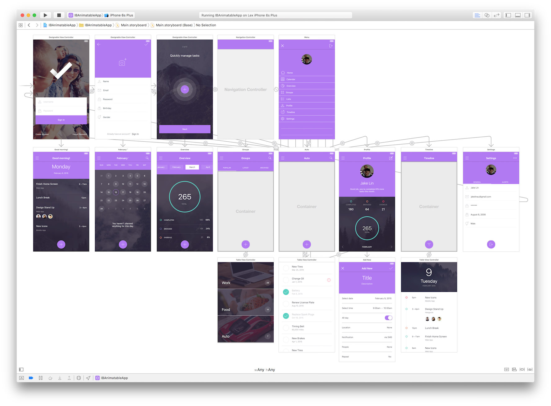
Here is the design in Interface Builder (Storyboard).
With IBAnimatable, we can design a UI in an Interface Builder like Sketch, and prototype animations in a Swift playground like Framer Studio. Also we can use the output of the design directly in the production ready App.
As a designer, we love Sketch, which is a simple but yet super powerful tool to design UI. However, Sketch can't design interaction, navigation, transition and animation, we may need another tool like Framer Studio to design some of them. Moreover, to make an App Store ready App, we need to use Xcode and Interface Builder to implement the UI and animations. To speed up the process and minimize the waste, we create IBAnimatable to make Interface Builder designable and animatable.
- From prototype to shippable App Store ready App - What you design in Interface Builder is what the App exactly looks like.
- Designer friendly - Sketch style setting panel on Attributes Inspector to lower the learning curve for using Interface Builder.
- Animation design support in Swift playground - Similar to Framer Studio, we can prototype animations in Swift playground to save time for running on simulator or actual iOS devices.
- Built-in Auto Layout support - We can use Auto Layout and Size Classes with
IBAnimatableto support orientations and multiple iOS devices. - Navigation and transition support - We can use default navigation pattern in the App and
IBAnimatablealso adds unwind segues to navigate back or dismiss scene without any code. More transitions will be added soon. - Protocol oriented programming -
IBAnimatableuses a protocol oriented programming paradigm. With Swift protocol extension, it is easy to support more designable or animatable features. We can even use these protocol extensions to create other custom UI elements instead of using the default ones fromIBAnimatable.
- Prototyping - Create interactive prototypes to validate ideas quickly.
- Redesigning in Interface Builder - Redesign UI from Sketch and animation from Framer Studio without writing any code.
- Making custom UI elements - Use
IBAnimatableprotocols to make custom UI elements. e.g. Buttons with a default color palette.
Vision, Technical Considerations and Roadmap
The easy way to learn and understand how powerful of IBAnimatableis to run the example App and play around the settings in Interface Builder. Just few steps we can run the App as below:
- Clone the repository
$ git clone https://github.com/JakeLin/IBAnimatable.git- Open the workspace in Xcode
$ cd IBAnimatable
$ open IBAnimatableApp.xcodeproj- Compile and run the app in your simulator or iOS device

To use IBAnimatable to design the UI and animations in Interface Builder, just follow few steps as below:
- Open a storyboard or Xib file.
- Drag and drop a UIKit element e.g.. UIView to a ViewController.
- In Identity Inspector, connect the UI element to
Animatablecustom UI class e.g..AnimatableView, you can find allAnimatableclasses in APIs section. - Configure the UI and animations in Attribute Inspector.

We can configure the animation settings in Attribute Inspector. However, Interface Builder doesn't support previewing Animations, but we can still prototype animations in Swift playground. There are three sample pages to demonstrate how to design animation in Swift playground. You can find them in IBAnimatable.playground.
- Open IBAnimatableApp.xcodeproj
- Select IBAnimatable Framework scheme and build it with
Command + b - Select IBAnimatable.playground, select one page in Swift playground, then click on "Assistant editor" button to split the playground. After that, select "Timeline" on the top of right-hand side to preview the animation. We can use Xcode menu "Editor" -> "Execute" to re-run the playground.
As you saw above, we can prototype an App fully in Interface Builder without single line of code, but IBAnimatable also provides APIs to let us fully control the UI and animations. IBAnimatable provides simple APIs like pop(). We can simply call them in one line.
view.pop() // pop animation for the view
view.squeezeFadeInLeft() // squeeze and fade in from left animation
You can play around with all these predefined animations in the Swift playground Page - Predefined Animations
There are some properties we can change to customize the animation. What we need to do is to set the properties and call animate() method to start the animation.
// Setup the animation
view.animationType = "SqueezeInLeft"
view.delay = 0.5
view.damping = 0.5
view.velocity = 2
view.force = 1

// Start the animation
view.animate()
You can play around with all animations with different properties in the Swift playground Page - Animation Properties
Sometimes, we need to run another animation after the previous one. With IBAnimatable, we can easily chain animations together to provide a sleek user experience.
// Simply put the next animation within `{}` closure as below. It is an example to pop the view after squeeze in from the top.
view.squeezeInDown{ view.pop() }

// Heaps of animations have been chained together, it is the source code of animated GIF in "Animate in Swift playground" section
view.squeezeInDown{ view.pop { view.shake{ view.squeeze{ view.wobble{ view.flipX { view.flash{ view.flipY { view.fadeOutDown() } } } } } } } }Copy and paste IBAnimatable folder in your Xcode project.
Add .Package(url: "https://github.com/JakeLin/IBanimatable.git", majorVersion: 1) to your Package.swift
Add pod 'IBAnimatable', '~> 1.2' to your Podfile.
Add github "JakeLin/IBAnimatable" ~> 1.2 to your Cartfile.
Add this repo as a submodule, and add the project file to your workspace. You can then link against IBAnimatable.framework for your application target.
The easiest way to use IBAnimatable is to drag and drop UIKit elements and connect with Animatable UI elements in Identity Inspector. Here are the supported Animatable UI elements to map UIKit elements.
| UIKit elements | Animatable UI elements | Remark |
|---|---|---|
| UIView | AnimatableView | |
| UIBarButtonItem | AnimatableBarButtonItem | |
| UIButton | AnimatableButton | |
| UIButton | AnimatableCheckBox | Connect UIButton as AnimatableCheckBox to make CheckBox control |
| UIImageView | AnimatableImageView | |
| UILabel | AnimatableLabel | To style the text in Label, we can use Interface Builder built-in Attributed Text |
| UIStackView | AnimatableStackView | |
| UITableView | AnimatableTableView | |
| UITableViewCell | AnimatableTableViewCell | |
| UITextField | AnimatableTextField | |
| UITextView | AnimatableTextView | |
| UINavigationBar | DesignableNavigationBar | |
| UIViewController | DesignableViewController |
IBAnimatable provides a set of Designable protocols as below. Because of the power of protocol oriented programming in Swift, we don't even have to use Animatable default UI elements e.g.. AnimatableView to unlocked the power of IBAnimatable. We can conform to IBAnimatable protocols to use the default implementation in protocol extension to create other custom UI elements.
| Property name | Data type | Remark |
|---|---|---|
| roundedImage | Optional<UIImage> | By default, Interface Builder can only support outline images for Bar Button Item. With roundedImage, we can display a rounded image. The image can not be previewed in Interface Builder. |
| Property name | Data type | Remark |
|---|---|---|
| blurEffectStyle | Optional<String> | Support three different blur effects: ExtraLight, Light and Dark, also can be found in emum BlurEffectStyle . The look of blur effect in Interface Builder is different from Simulator or device. |
| blurOpacity | CGFloat | Opacity of the blur effect specified above. Default value is CGFloat.NaN, the value is from 0.0 to 1.0. |
| Property name | Data type | Remark |
|---|---|---|
| borderColor | Optional<UIColor> | border color |
| borderWidth | CGFloat | border width. Default value is CGFloat.NaN, the value is greater than 0. |
| borderSide | Optional<String> | border side: Top, Right, Bottom or Left, also can be found in emum BorderSide. If not specified, then display four sides. |
| Property name | Data type | Remark |
|---|---|---|
| checked | Bool | Default value is false |
| checkedImage | Optional<UIImage> | The image to display when CheckBox is checked. |
| uncheckedImage | Optional<UIImage> | The image to display when CheckBox is unchecked. |
| Property name | Data type | Remark |
|---|---|---|
| cornerRadius | CGFloat | rounded corner radius. Default value is CGFloat.NaN, the value is greater than 0. |
| Property name | Data type | Remark |
|---|---|---|
| fillColor | Optional<UIColor> | fill color of the UI Element |
| opacity | CGFloat | opacity, alpha of the UI Element, Default value is CGFloat.NaN, the value is from 0.0 to 1.0. |
| predefinedColor | Optional<String> | Predefined color. All predefined colors are in enum ColorType. To find the predefined flat colors, you can use flatuicolors.com, all flat color start with Flat, e.g. PETER RIVER on the website maps to FlatPeterRiver in the enum. |
| Property name | Data type | Remark |
|---|---|---|
| startColor | Optional<UIColor> | start gradient color |
| endColor | Optional<UIColor> | end gradient color |
| predefinedGradient | Optional<String> | Predefined gradients. All predefined gradients are in enum GradientType, To find the predefined gradients, you can use uigradients.com, e.g. Juicy Orange on the website maps to JuicyOrange in the enum. |
| startPoint | Optional<String> | start direction point, can find in enum GradientStartPoint . |
| Property name | Data type | Remark |
|---|---|---|
| solidColor | Bool | whether to display solid color only. Default value is false. Need to manually unpick translucent in Interface Builder, otherwise, it will have constraint issue in IB although it is correct in run time. |
| Property name | Data type | Remark |
|---|---|---|
| maskType | Optional<String> | Supported maks type: All predefined animations are in enum MaskType |
Supported MaskType:
CirclePolygonTriangleStar: Can alse specify the points of the Star, e.g. useStar(6)to have a star with 6 points. If not specified, default is 5 points.Wave: Can use pramaters to cumstomize theWaveshape likemaskWave(waveUp: Bool, waveWidth: CGFloat, waveOffset: CGFloat).Wave(down, 20, 5)means the Wave faces down, width is 20 and offset is 5. If not specified, default value isWave(up, 40, 0).
It is used in AnimatableTextField to add padding on either or both sides.
| Property name | Data type | Remark |
|---|---|---|
| paddingLeft | CGFloat | padding on left-hand side. Default value is CGFloat.NaN. |
| paddingRight | CGFloat | padding on right-hand side. Default value is CGFloat.NaN. |
| paddingSide | CGFloat | padding on both sides. Default value is CGFloat.NaN. |
| Property name | Data type | Remark |
|---|---|---|
| placeholderColor | Optional<UIColor> | placeholder text color in AnimatableTextField. |
| Property name | Data type | Remark |
|---|---|---|
| rootWindowBackgroundColor | Optional<UIColor> | root window background color. Can be seen when we use flip transition. |
| Property name | Data type | Remark |
|---|---|---|
| rotate | CGFloat | rotation of the UI element in degrees. Default value is CGFloat.NaN, value is from -360 to 360, if the value is negative, it rotates reverse. |
Drop shadow of the UI element, it is popular in Material Design. These properties are not able to render in IB correctly, it maybe an Interface Builder's bug.
| Property name | Data type | Remark |
|---|---|---|
| shadowColor | Optional<UIColor> | shadow color |
| shadowRadius | CGFloat | shadow corner radius. Default value is CGFloat.NaN, the value is greater than 0. |
| shadowOpacity | CGFloat | shadow opacity. Default value is CGFloat.NaN, the value is from 0.0 to 1.0. |
| shadowOffset | CGPoint | x is horizontal offset and y is vertical offset. |
Display a side hint image in AnimatableTextField
| Property name | Data type | Remark |
|---|---|---|
| leftImage | Optional<UIImage> | the image to display on the left-hand side. |
| leftImageLeftPadding | CGFloat | left padding of hint image. Default value is CGFloat.NaN. |
| leftImageRightPadding | CGFloat | right padding of hint image. Default value is CGFloat.NaN. |
| leftImageTopPadding | CGFloat | top padding of hint image. Default value is CGFloat.NaN. If not specified, the image will center vertically. |
| rightImage | Optional<UIImage> | the image to display on the right-hand side. |
| rightImageLeftPadding | CGFloat | left padding of hint image. Default value is CGFloat.NaN. |
| rightImageRightPadding | CGFloat | right padding of hint image. Default value is CGFloat.NaN. |
| rightImageTopPadding | CGFloat | top padding of hint image. Default value is CGFloat.NaN. If not specified, the image will center vertically. |
| Property name | Data type | Remark |
|---|---|---|
| lightStatusBar | Bool | to display white or black text status bar. Default value is false to display black text. |
| Property name | Data type | Remark |
|---|---|---|
| removeSeparatorMargins | Bool | whether to remove separator margins in AnimatableTableViewCell. Default value is false. There maybe a bug of Interface Builder when setting "Separator Insert" to 0 doesn't work. |
Easily add color layer on top of the UI element especially AnimatableImageView.
| Property name | Data type | Remark |
|---|---|---|
| tintOpacity | CGFloat | opacity of tint color (white color). Default value is CGFloat.NaN. |
| shadeOpacity | CGFloat | opacity of shade color (black color). Default value is CGFloat.NaN. |
| toneColor | Optional<UIColor> | tone color |
| toneOpacity | CGFloat | opacity of tone color. Default value is CGFloat.NaN. |
| Property name | Data type | Remark |
|---|---|---|
| hideNavigationBar | Bool | whether to hide navigation bar. Default value is false. |
| Property name | Data type | Remark |
|---|---|---|
| animationType | Optional<String> | Supported animations. All predefined animations are in enum AnimationType |
| autoRun | Bool | Whether to automatically start the animation. Default value is true. if it is true, the animation will automatically run when the view is loaded. If want to manually start the animation should set it to false. |
| duration | CGFloat | Animation duration in seconds. Default value is 0.7. |
| delay | Double | Delay to start the animation in seconds. Default value is 0. |
| damping | CGFloat | Used in UIView Spring animation (0 ~ 1 seconds). To smoothly decelerate the animation without oscillation, use a value of 1. Employ a damping ratio closer to zero to increase oscillation. Default value is 0.7. Notice: FadeOutIn, FadeInOut, Shake, Pop, Morph, Squeeze, Flash, Wobble and Swing animations do not use damping. |
| velocity | CGFloat | used in UIView Spring animation. A value of 1 corresponds to the total animation distance traversed in one second. For example, if the total animation distance is 200 points and you want the start of the animation to match a view velocity of 100 pt/s, use a value of 0.5. Default is 0.7. Notice: FadeOutIn, FadeInOut, Shake, Pop, Morph, Squeeze, Flash, Wobble and Swing animations do not use damping. |
| force | CGFloat | used to apply force to the animation. The number is higher, the animation property has more changes. e.g.. for Pop animation, higher force causes the view popping bigger. Default value is 1. |
| repeatCount | Float | Used to specify the count to repeat the animation. Can only be used in Shake, Pop, Morph, Squeeze, Flash, Wobble, Swing, Rotate and RotateCCW (roate counterclockwise) animations. Default value is 1. |
| x | CGFloat | Used to specify the absolute x to move in MoveTo animation and x offset in MoveBy. When used in MoveBy, negative means moving left and positive means moving right. Default values is CGFloat.NaN |
| y | CGFloat | Used to specify the absolute y to move in MoveTo animation and y offset in MoveBy. When used in MoveBy, negative means moving up and positive means moving down. Default values is CGFloat.NaN |
With these methods, we can navigate back or dismiss current ViewController with any code in Interface Builder.
| Method name | Remark |
|---|---|
| func unwindToViewController(sender: UIStoryboardSegue) | Used in Interface Builder to unwind from Navigation Controller |
| func dismissCurrentViewController(sender: UIStoryboardSegue) | Used in Interface Builder to dismiss current ViewController |
All of us can contribute to this project. Fewer overheads mean less time to build quality Apps and more time to enjoy coffee ☕️.
-
If you are a designer, you can design in Interface Builder with
IBAnimatablewithout designing tool like Sketch, or implement your existing design from Sketch or Photoshop in Interface Builder rapidly. WithIBAnimatable, you should be able to doallmost of design work in Interface Builder. If you have any feature request, please create a GitHub Issue and we will put it in the backlog. If you have done any design withIBAnimatable, please let us know via creating Pull Request or GitHub Issue. We will add it to README file. -
If you are a developer, you can work on features or fix bugs, please check out Vision, Technical Considerations and Roadmap and GitHub Issues to find out the backlogs. If you have used
IBAnimatablein your App, please let us know via creating Pull Request or GitHub Issue. We will add it to README file. -
If you are good at English, please correct my English 😁. If you are good at other languages, please create a README file in those languages.
-
If you like the project, please share it with the other designers and developers, and star 🌟 the project. 🤗
Many thanks to all contributors 🤗
IBDesignableandIBInspectable- The entire project is based on that.- Sketch - Interface Builder should be as easy as Sketch to use.
- Framer Studio - Design and preview animations in one place.
- Spring by Meng To - steal a lot of animation parameters from this project.
- Invision ToDo App UI Kit, The demo App's original design is from this UI Kit and redone in Interface Builder. We also added interaction, navigation and animations.
Please see CHANGELOG.md
IBAnimatable is released under the MIT license. See LICENSE for details.


 React
React
 Typescript
 Django
 Laravel
 Facebook
 Microsoft
 Google
 Alibaba
 D3
D3
 Tencent