GithubHelp home page GithubHelp logo

gonuit / flutter-custom-refresh-indicator Goto Github PK

View Code? Open in Web Editor NEW
430.0 7.0 61.0 53.04 MB

Widget that makes it easy to implement a custom pull to refresh gesture.

License: MIT License

Kotlin 0.06% Swift 0.19% Objective-C 0.02% Dart 86.04% HTML 1.82% CMake 3.79% C++ 7.75% C 0.34%
dart flutter p2r pull-to-refresh refresh-indicator widget

flutter-custom-refresh-indicator's Introduction

Cover image

Custom Refresh Indicator

Tests

Create your own custom refresh indicator widget in the blink of an eye!

Features:


QUICK START

CustomMaterialIndicator

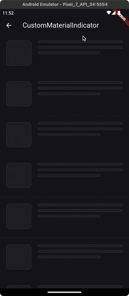
If you just want to replace the content of the material indicator, you can use CustomMaterialIndicator widget, which builds a material container. In addition to the built in RefreshIndicator it supports horizontal lists and triggering from both edges (see the trigger argument).

CustomMaterialIndicator(
  onRefresh: onRefresh, // Your refresh logic
  builder: (context, controller) {
    return Icon(
      Icons.ac_unit,
      color: Colors.blue,
      size: 30,
    );
  },
  child: scrollable,
)

Effect:

CustomRefreshIndicator

Elevate your Flutter app with a tailor-made refresh indicator using the CustomRefreshIndicator widget. Just wrap your scrollable list, and design your unique indicator. It's that easy! 😏

CustomRefreshIndicator(
  onRefresh: onRefresh, // Your refresh logic
  builder: (context, child, controller) {
    // Place your custom indicator here.
    // Need inspiration? Look at the example app!
    return MyIndicator(
      child: child,
      controller: controller,
    );
  },
  child: ListView.builder(
    itemBuilder: (_, index) => Text('Item $index'),
  ),
)

Effect: What's Possible?

Your creativity sets the boundaries! Explore our examples (just scroll a bit πŸ‘‡) to see what you can build. From subtle animations to eye-catching visuals, make the refresh action a delightful moment. πŸš€

Examples

Almost all of these examples are available in the example application.

Plane indicator [SOURCE][DEMO] Ice cream [SOURCE][DEMO] Warp [SOURCE][DEMO]
plane_indicator ice_cream_indicator warp_indicator
With complete state [SOURCE][DEMO] Pull to fetch more [SOURCE][DEMO] Envelope [SOURCE][DEMO]
indicator_with_complete_state fetch_more Envelope indicator
Programmatically controlled [SOURCE][DEMO] Your indicator Your indicator
programmatically_controlled Have you created a fancy refresh indicator? This place is for you. Open PR. Have you created a fancy refresh indicator? This place is for you. Open PR.

Documentation

Usage

Here is a quick example of how to use the CustomRefreshIndicator:

CustomRefreshIndicator(
  onRefresh: onRefresh,
  child: ListView(
    // Your ListView content here
  ),
  builder: (BuildContext context, Widget child, IndicatorController controller) {
    // Return your custom indicator widget here
  },
)

CustomRefreshIndicator Parameters

Basic

  • child (Widget): The content of the scroll view that will be pulled down to trigger the refresh.
  • builder (IndicatorBuilder): A function that returns the widget which will be used as the refresh indicator.
  • onRefresh (AsyncCallback): A callback when the refresh is initiated. Should return a Future.
  • controller (IndicatorController?): Manages the state and interaction of the refresh indicator.

Timing and Durations

  • durations (RefreshIndicatorDurations)
    • cancelDuration: Duration to hide the indicator after canceling.
    • settleDuration: Duration for the indicator to settle after release.
    • finalizeDuration: Duration to hide the indicator after refreshing.
    • completeDuration: Optional duration for the indicator to remain visible in the complete state after the onRefresh action is completed. If not specified, the indicator will skip the complete state and transition to the finalizing state without remaining in the complete state.

State Tracking

  • onStateChanged (OnStateChanged?): Callback that will be called when the state of the indicator changes.

Customization

  • notificationPredicate (ScrollNotificationPredicate): Determines which ScrollNotifications will trigger the indicator.
  • leadingScrollIndicatorVisible (bool): Visibility of the leading scroll indicator.
  • trailingScrollIndicatorVisible (bool): Visibility of the trailing scroll indicator.

Trigger Behavior

  • offsetToArmed (double?): Pixel distance to trigger the refresh.
  • containerExtentPercentageToArmed (double?): Container extent percentage to arm the indicator.
  • trigger (IndicatorTrigger): Defines the edge from which the refresh can be triggered.
  • triggerMode (IndicatorTriggerMode): Configures the condition that will trigger the refresh.

Performance

  • autoRebuild (bool): Whether to automatically rebuild the indicator on controller updates.

Indicator States

CustomRefreshIndicator manages various states to provide feedback on the refresh process. Understanding these states will help you customize the behavior and appearance of your refresh indicator.

State Value Range Description
idle 0.0 The default state when no interaction is happening. The indicator is not visible.
dragging 0.0 to 1.0 The user is pulling down, but hasn't yet reached the threshold to trigger a refresh.
armed At or above 1.0 Pull-down has passed the threshold. Releasing now will trigger the onRefresh callback.
canceling Animates back to 0.0 Pull-down stopped before the threshold; no refresh is triggered, and the indicator retracts.
loading Steady at 1.0 The onRefresh callback is active, indicating an ongoing refresh operation.
complete Steady at 1.0 Refresh is complete, and the indicator stays fully visible if completeDuration is set.
finalizing 1.0 to 0.0 The refresh operation has finished, and the indicator is animating back to its initial state.

Each state transition provides an opportunity to animate or adjust the UI accordingly, giving users a seamless and interactive experience.

Handling State Changes

To react to state changes, you might set up an onStateChanged callback like so:

CustomRefreshIndicator(
  onRefresh: onRefresh,
  // Track state changes with the onStateChanged callback.
  onStateChanged: (IndicatorStateChange change) {
    // When transitioning from dragging to armed state, do something:
    if (change.didChange(from: IndicatorState.dragging, to: IndicatorState.armed)) {
      // Handle the armed state, e.g., play a sound, start an animation, etc.
    }
    // When returning to the idle state from any other state, do something else:
    else if (change.didChange(to: IndicatorState.idle)) {
      // Reset any animations, update UI elements, etc.
    }
    // Handle other state changes as needed...
  }
  // Additional properties...
)

This setup gives you the flexibility to customize the user's experience as they interact with the refresh indicator. For instance, you could start an animation when the state changes from dragging to armed, signaling to the user that their action will trigger a refresh.

Trigger Modes

The CustomRefreshIndicator widget provides flexible trigger modes that define how and where the pull-to-refresh gesture can be initiated within a scrollable list.

trigger (IndicatorTrigger)

This property determines which edge of the list the pull-to-refresh can be initiated from. It is especially useful for lists that can be inverted using the reverse argument.

Value Description
leadingEdge The pull-to-refresh gesture can only be initiated from the leading edge of the list. This is typically the top for standard lists, but it becomes the bottom when list is reversed.
trailingEdge The pull-to-refresh can only be initiated from the trailing edge of the list. This is usually the bottom, but it switches to the top for lists that are reversed.
bothEdges The gesture can be triggered from both the leading and trailing edges of the list, allowing for pull-to-refresh functionality no matter which end the user starts dragging from.

triggerMode (IndicatorTriggerMode)

This property controls how the CustomRefreshIndicator can be activated in relation to the scrollable's position when the drag starts. It behaves similarly to the triggerMode of the built-in RefreshIndicator widget.

Value Description
anywhere The refresh can be triggered from any position within the scrollable content, not just from the edge.
onEdge The refresh will only be triggered if the scrollable content is at the edge when the dragging gesture begins.

By default, triggerMode is set to onEdge, which means that the refresh action is typically initiated when the user drags from the very top or bottom of the content, depending on the list orientation and the trigger property settings.

These modes provide developers with control over the user's interaction with the refresh mechanism, ensuring a smooth and intuitive user experience that fits the context of the app's functionality.

IndicatorController Properties

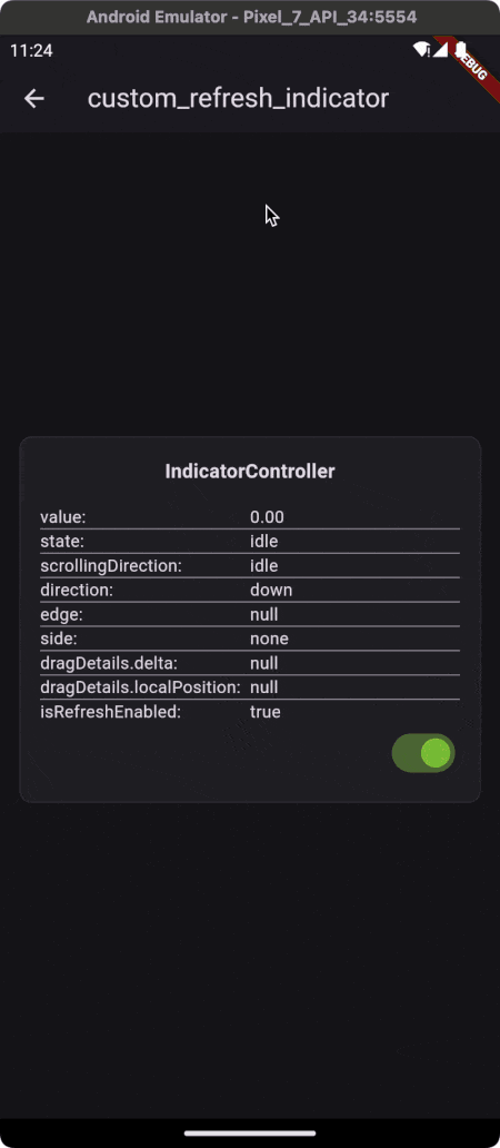
The CustomRefreshIndicator widget is equipped with a controller that gives you access to the current state and behavior of the refresh indicator. Below is an in-depth look at the controller's properties.

state (IndicatorState)

This property represents the current state of the indicator. It's a reflection of the user's interaction with the pull-to-refresh gesture, as well as the indicator's response to those interactions.

More information about the state can be found in the Indicator States section.

edge (IndicatorEdge?)

This property indicates from which end of the list the pull-to-refresh gesture was initiated.

Value Description
start The gesture started from the beginning of the list (usually the top).
end The gesture started from the end of the list (usually the bottom).

The edge property is particularly useful when the trigger is set to bothEdges, allowing the gesture to be recognized from either the start or end of the list.

side (IndicatorSide)

The side property determines on which side of the scrollable area the indicator "should" appear.

Value Description
top Places the indicator at the top of the scrollable content.
bottom Places the indicator at the bottom of the scrollable content.
left Places the indicator to the left of the scrollable content.
right Places the indicator to the right of the scrollable content.
none The indicator will not be displayed on any side.

direction (AxisDirection)

This property identifies the axis direction along which the scrollable content moves. It can be up, down, left, or right.

scrollingDirection (ScrollDirection)

This reflects the scrolling direction that the user is currently taking within the scrollable content. It helps in determining the appropriate response of the indicator to the user's scroll actions.

dragDetails (DragUpdateDetails?)

This property provides the details about the drag update event, including the position and delta of the drag.

Property Description
globalPosition The global position of the pointer when the drag update occurred.
delta The delta distance the pointer has moved since the last update event.
primaryDelta The delta distance along the primary axis (e.g., vertical for a vertically scrolling list).

The dragDetails property is invaluable when you want to implement custom behavior based on the precise movement of the user's drag, allowing for fine-tuned control over the refresh indicator's response.

IndicatorController Showcase

The CustomRefreshIndicator widget is designed to provide a flexible and responsive user experience. To better understand how the widget updates the controller's data in response to user interactions, an example is worth a thousand words.

Please visit the following live demo to see the CustomRefreshIndicator in action: Custom Refresh Indicator Live Example.

Support

If you like this package, you have learned something from it, or you just don't know what to do with your money πŸ˜… just buy me a cup of coffee β˜•οΈ and this dose of caffeine will put a smile on my face which in turn will help me improve this package. Also as a thank you, you will be mentioned in this readme as a sponsor.

Buy Me A Coffee

Have a nice day! πŸ‘‹

flutter-custom-refresh-indicator's People

Contributors

gonuit avatar kamilklyta avatar kennethj avatar lukepighetti avatar rbt22 avatar ziqq avatar

Stargazers

 avatar  avatar  avatar  avatar  avatar  avatar  avatar  avatar  avatar  avatar  avatar  avatar  avatar  avatar  avatar  avatar  avatar  avatar  avatar  avatar  avatar  avatar  avatar  avatar  avatar  avatar  avatar  avatar  avatar  avatar  avatar  avatar  avatar  avatar  avatar  avatar  avatar  avatar  avatar  avatar  avatar  avatar  avatar  avatar  avatar  avatar  avatar  avatar  avatar  avatar  avatar  avatar  avatar  avatar  avatar  avatar  avatar  avatar  avatar  avatar  avatar  avatar  avatar  avatar  avatar  avatar  avatar  avatar  avatar  avatar  avatar  avatar  avatar  avatar  avatar  avatar  avatar  avatar  avatar  avatar  avatar  avatar  avatar  avatar  avatar  avatar  avatar  avatar  avatar  avatar  avatar  avatar  avatar  avatar  avatar  avatar  avatar  avatar  avatar  avatar

Watchers

 avatar  avatar  avatar  avatar  avatar  avatar  avatar

flutter-custom-refresh-indicator's Issues

Push onRefresh out to the top as a parameter on the examples. Accepts a Future function.

Here's an example of bringing the onRefresh parameter to the top for warp-indicator.dart so that you can just replace the default refresh widget with this one and you still have access to the onRefresh from whichever widget you were set up in. Might be a good idea to do this for all the examples as then people can just swap out the indicators easily in their code and try the different ones. BRILLIANT project by the way - Thanks for this!

import 'dart:math';

import 'package:flutter/material.dart';
import 'package:custom_refresh_indicator/custom_refresh_indicator.dart';
import 'package:flutter/rendering.dart';
import 'package:flutter/scheduler.dart';

enum WarpAnimationState {
  stopped,
  playing,
}

typedef StarColorGetter = Color Function(int index);

class WarpIndicator extends StatefulWidget {
  final Widget child;
  final int starsCount;
  final Color skyColor;
  final StarColorGetter starColorGetter;
  final Future Function() onRefresh; // Step 1

  const WarpIndicator(
      {Key? key,
      required this.child,
      this.starsCount = 30,
      this.skyColor = Colors.black,
      this.starColorGetter = _defaultStarColorGetter,
      required this.onRefresh}) // Step 2
      : super(key: key);

  static Color _defaultStarColorGetter(int index) =>
      HSLColor.fromAHSL(1, Random().nextDouble() * 360, 1, 0.98).toColor();

  @override
  _WarpIndicatorState createState() => _WarpIndicatorState();
}

class _WarpIndicatorState extends State<WarpIndicator>
    with SingleTickerProviderStateMixin {
  static const _indicatorSize = 150.0;
  final _random = Random();
  final _helper = IndicatorStateHelper();
  WarpAnimationState _state = WarpAnimationState.stopped;

  List<Star> stars = [];
  final _offsetTween = Tween<Offset>(
    begin: Offset.zero,
    end: Offset.zero,
  );
  final _angleTween = Tween<double>(
    begin: 0,
    end: 0,
  );

  late AnimationController shakeController;

  static final _scaleTween = Tween(begin: 1.0, end: 0.75);
  static final _radiusTween = Tween(begin: 0.0, end: 16.0);

  @override
  void initState() {
    shakeController = AnimationController(
      vsync: this,
      duration: const Duration(milliseconds: 100),
    );
    super.initState();
  }

  Offset _getRandomOffset() => Offset(
        _random.nextInt(10) - 5,
        _random.nextInt(10) - 5,
      );

  double _getRandomAngle() {
    final degrees = ((_random.nextDouble() * 2) - 1);
    final radians = degrees == 0 ? 0.0 : degrees / 360.0;
    return radians;
  }

  void _shiftAndGenerateRandomShakeTransform() {
    _offsetTween.begin = _offsetTween.end;
    _offsetTween.end = _getRandomOffset();

    _angleTween.begin = _angleTween.end;
    _angleTween.end = _getRandomAngle();
  }

  void _startShakeAnimation() {
    _shiftAndGenerateRandomShakeTransform();
    shakeController.animateTo(1.0);
    _state = WarpAnimationState.playing;
    stars = List.generate(
      widget.starsCount,
      (index) => Star(initialColor: widget.starColorGetter(index)),
    );
  }

  void _resetShakeAnimation() {
    _shiftAndGenerateRandomShakeTransform();
    shakeController.value = 0.0;
    shakeController.animateTo(1.0);
  }

  void _stopShakeAnimation() {
    _offsetTween.end = Offset.zero;
    _angleTween.end = 0.0;
    _state = WarpAnimationState.stopped;
    _shiftAndGenerateRandomShakeTransform();
    shakeController.stop();
    shakeController.value = 0.0;
    stars = [];
  }

  @override
  Widget build(BuildContext context) {
    return CustomRefreshIndicator(
      offsetToArmed: _indicatorSize,
      leadingGlowVisible: false,
      trailingGlowVisible: false,
      onRefresh: widget.onRefresh, // Step 3
      child: widget.child,
      builder: (
        BuildContext context,
        Widget child,
        IndicatorController controller,
      ) {
        final animation = Listenable.merge([controller, shakeController]);
        return Stack(
          children: <Widget>[
            AnimatedBuilder(
                animation: shakeController,
                builder: (_, __) {
                  return LayoutBuilder(
                    builder:
                        (BuildContext context, BoxConstraints constraints) {
                      return CustomPaint(
                        painter: Sky(
                          stars: stars,
                          color: widget.skyColor,
                        ),
                        child: const SizedBox.expand(),
                      );
                    },
                  );
                }),
            AnimatedBuilder(
              animation: animation,
              builder: (context, _) {
                _helper.update(controller.state);
                if (_helper.didStateChange(
                  to: IndicatorState.loading,
                )) {
                  SchedulerBinding.instance
                      ?.addPostFrameCallback((_) => _startShakeAnimation());
                } else if (_helper.didStateChange(
                  to: IndicatorState.idle,
                )) {
                  SchedulerBinding.instance
                      ?.addPostFrameCallback((_) => _stopShakeAnimation());
                }
                return Transform.scale(
                  scale: _scaleTween.transform(controller.value),
                  child: Builder(builder: (context) {
                    if (shakeController.value == 1.0 &&
                        _state == WarpAnimationState.playing) {
                      SchedulerBinding.instance
                          ?.addPostFrameCallback((_) => _resetShakeAnimation());
                    }
                    return Transform.rotate(
                      angle: _angleTween.transform(shakeController.value),
                      child: Transform.translate(
                        offset: _offsetTween.transform(shakeController.value),
                        child: ClipRRect(
                          child: child,
                          borderRadius: BorderRadius.circular(
                            _radiusTween.transform(controller.value),
                          ),
                        ),
                      ),
                    );
                  }),
                );
              },
            ),
          ],
        );
      },
    );
  }

  @override
  void dispose() {
    shakeController.dispose();
    super.dispose();
  }
}

class Star {
  Offset? position;
  Color? color;
  double value;
  late Offset speed;
  final Color initialColor;
  late double angle;

  Star({
    required this.initialColor,
  }) : value = 0.0;

  static const _minOpacity = 0.1;
  static const _maxOpacity = 1.0;

  void _init(Rect rect) {
    position = rect.center;
    value = 0.0;
    final random = Random();
    angle = random.nextDouble() * pi * 3;
    speed = Offset(cos(angle), sin(angle));
    const minSpeedScale = 20;
    const maxSpeedScale = 35;
    final speedScale = minSpeedScale +
        random.nextInt(maxSpeedScale - minSpeedScale).toDouble();
    speed = speed.scale(
      speedScale,
      speedScale,
    );
    final t = speedScale / maxSpeedScale;
    final opacity = _minOpacity + (_maxOpacity - _minOpacity) * t;
    color = initialColor.withOpacity(opacity);
  }

  draw(Canvas canvas, Rect rect) {
    if (position == null) {
      _init(rect);
    }

    value++;
    final startPosition = Offset(position!.dx, position!.dy);
    final endPosition = position! + (speed * (value * 0.3));
    position = speed + position!;
    final paint = Paint()..color = color!;

    final startShiftAngle = angle + (pi / 2);
    final startShift = Offset(cos(startShiftAngle), sin(startShiftAngle));
    final shiftedStartPosition =
        startPosition + (startShift * (0.75 + value * 0.01));

    final endShiftAngle = angle + (pi / 2);
    final endShift = Offset(cos(endShiftAngle), sin(endShiftAngle));
    final shiftedEndPosition = endPosition + (endShift * (1.5 + value * 0.01));

    final path = Path()
      ..moveTo(startPosition.dx, startPosition.dy)
      ..lineTo(startPosition.dx, startPosition.dy)
      ..lineTo(shiftedStartPosition.dx, shiftedStartPosition.dy)
      ..lineTo(shiftedEndPosition.dx, shiftedEndPosition.dy)
      ..lineTo(endPosition.dx, endPosition.dy);

    if (!rect.contains(startPosition)) {
      _init(rect);
    }

    canvas.drawPath(path, paint);
  }
}

class Sky extends CustomPainter {
  final List<Star> stars;
  final Color color;

  Sky({
    required this.stars,
    required this.color,
  });

  @override
  void paint(Canvas canvas, Size size) {
    var rect = Offset.zero & size;

    canvas.drawRect(rect, Paint()..color = color);

    for (final star in stars) {
      star.draw(canvas, rect);
    }
  }

  @override
  SemanticsBuilderCallback get semanticsBuilder {
    return (Size size) {
      var rect = Offset.zero & size;

      return [
        CustomPainterSemantics(
          rect: rect,
          properties: const SemanticsProperties(
            label: 'Lightspeed animation.',
            textDirection: TextDirection.ltr,
          ),
        ),
      ];
    };
  }

  @override
  bool shouldRepaint(Sky oldDelegate) => true;
  @override
  bool shouldRebuildSemantics(Sky oldDelegate) => false;
}

minimum duration setting

I see that we have complete state duration which is nice, but what would be really nice is the ability to set a minimum refreshing duration. It just provides a more seamless experience while showing that actions are taking place

How to cancel pull to refresh?

How to cancel pull to refresh when user is going up:

_controller.position.userScrollDirection == ScrollDirection.forward

Bug when change scroll direction

Similar to #51
The problem is different behaviour when list has one element and 100 elements.

  1. One element
    I can scroll up and down during dragging

  2. 100 elements
    When I change scroll direction refresh will be hide

There is possibility to make it consistent?

often stop unexpectedly [PlaneIndicator + NestedScrollView]

══║ EXCEPTION CAUGHT BY FOUNDATION LIBRARYβ•žβ•β•β•β•
The following assertion was thrown while dispatching notifications for IndicatorController:
Build scheduled during frame.
While the widget tree was being built, laid out, and painted, a new frame was scheduled to rebuild
the widget tree.
This might be because setState() was called from a layout or paint callback. If a change is needed
to the widget tree, it should be applied as the tree is being built. Scheduling a change for the
subsequent frame instead results in an interface that lags behind by one frame. If this was done to
make your build dependent on a size measured at layout time, consider using a LayoutBuilder,
CustomSingleChildLayout, or CustomMultiChildLayout. If, on the other hand, the one frame delay is
the desired effect, for example because this is an animation, consider scheduling the frame in a
post-frame callback using SchedulerBinding.addPostFrameCallback or using an AnimationController to
trigger the animation.

When the exception was thrown, this was the stack:
#0      WidgetsBinding._handleBuildScheduled.<anonymous closure>
(package:flutter/src/widgets/binding.dart:747:9)
#1      WidgetsBinding._handleBuildScheduled (package:flutter/src/widgets/binding.dart:770:6)
#2      BuildOwner.scheduleBuildFor (package:flutter/src/widgets/framework.dart:2434:24)
#3      Element.markNeedsBuild (package:flutter/src/widgets/framework.dart:4280:12)
#4      State.setState (package:flutter/src/widgets/framework.dart:1108:15)
#5      _AnimatedState._handleChange (package:flutter/src/widgets/transitions.dart:128:5)
#6      ChangeNotifier.notifyListeners (package:flutter/src/foundation/change_notifier.dart:308:24)
#7      IndicatorController.setIndicatorState
(package:custom_refresh_indicator/src/controller.dart:150:5)
#8      _CustomRefreshIndicatorState._start
(package:custom_refresh_indicator/src/custom_refresh_indicator.dart:293:16)
#9      _CustomRefreshIndicatorState._handleScrollEndNotification
(package:custom_refresh_indicator/src/custom_refresh_indicator.dart:212:9)
#10     _CustomRefreshIndicatorState._handleScrollNotification
(package:custom_refresh_indicator/src/custom_refresh_indicator.dart:283:14)
#11     Element.visitAncestorElements (package:flutter/src/widgets/framework.dart:4091:39)
#12     Notification.dispatch (package:flutter/src/widgets/notification_listener.dart:83:13)
#13     ScrollActivity.dispatchScrollEndNotification
(package:flutter/src/widgets/scroll_activity.dart:104:63)
#14     ScrollPosition.didEndScroll (package:flutter/src/widgets/scroll_position.dart:907:15)
#15     ScrollPosition.beginActivity (package:flutter/src/widgets/scroll_position.dart:876:9)
#16     _NestedInnerBallisticScrollActivity.applyNewDimensions
(package:extended_nested_scroll_view/src/extended_nested_scroll_view.dart:1676:14)
#17     ScrollPosition.applyNewDimensions (package:flutter/src/widgets/scroll_position.dart:623:15)
#18     _NestedScrollPosition.applyNewDimensions
(package:extended_nested_scroll_view/src/extended_nested_scroll_view.dart:1631:11)
#19     _ExtendedNestedScrollPosition.applyNewDimensions
(package:extended_nested_scroll_view/src/extended_nested_scroll_view_part.dart:261:11)
#20     ScrollPosition.applyContentDimensions
(package:flutter/src/widgets/scroll_position.dart:553:7)
#21     _ExtendedNestedScrollPosition.applyContentDimensions
(package:extended_nested_scroll_view/src/extended_nested_scroll_view_part.dart:273:18)
#22     RenderViewport.performLayout (package:flutter/src/rendering/viewport.dart:1493:20)
#23     RenderObject.layout (package:flutter/src/rendering/object.dart:1852:7)
#24     RenderProxyBoxMixin.performLayout (package:flutter/src/rendering/proxy_box.dart:116:14)
#25     RenderObject.layout (package:flutter/src/rendering/object.dart:1852:7)
#26     RenderProxyBoxMixin.performLayout (package:flutter/src/rendering/proxy_box.dart:116:14)
#27     RenderObject.layout (package:flutter/src/rendering/object.dart:1852:7)
#28     RenderProxyBoxMixin.performLayout (package:flutter/src/rendering/proxy_box.dart:116:14)
#29     RenderObject.layout (package:flutter/src/rendering/object.dart:1852:7)
#30     RenderProxyBoxMixin.performLayout (package:flutter/src/rendering/proxy_box.dart:116:14)
#31     RenderObject.layout (package:flutter/src/rendering/object.dart:1852:7)
#32     RenderProxyBoxMixin.performLayout (package:flutter/src/rendering/proxy_box.dart:116:14)
#33     RenderObject.layout (package:flutter/src/rendering/object.dart:1852:7)
#34     RenderProxyBoxMixin.performLayout (package:flutter/src/rendering/proxy_box.dart:116:14)
#35     RenderObject.layout (package:flutter/src/rendering/object.dart:1852:7)
#36     RenderProxyBoxMixin.performLayout (package:flutter/src/rendering/proxy_box.dart:116:14)
#37     RenderObject.layout (package:flutter/src/rendering/object.dart:1852:7)
#38     RenderProxyBoxMixin.performLayout (package:flutter/src/rendering/proxy_box.dart:116:14)
#39     RenderObject.layout (package:flutter/src/rendering/object.dart:1852:7)
#40     RenderSliverFixedExtentBoxAdaptor.performLayout
(package:flutter/src/rendering/sliver_fixed_extent_list.dart:240:19)
#41     RenderObject.layout (package:flutter/src/rendering/object.dart:1852:7)
#42     RenderSliverEdgeInsetsPadding.performLayout
(package:flutter/src/rendering/sliver_padding.dart:137:12)
#43     _RenderSliverFractionalPadding.performLayout
(package:flutter/src/widgets/sliver_fill.dart:167:11)
#44     RenderObject.layout (package:flutter/src/rendering/object.dart:1852:7)
#45     RenderViewportBase.layoutChildSequence (package:flutter/src/rendering/viewport.dart:510:13)
#46     RenderViewport._attemptLayout (package:flutter/src/rendering/viewport.dart:1580:12)
#47     RenderViewport.performLayout (package:flutter/src/rendering/viewport.dart:1489:20)
#48     RenderObject.layout (package:flutter/src/rendering/object.dart:1852:7)
#49     RenderProxyBoxMixin.performLayout (package:flutter/src/rendering/proxy_box.dart:116:14)
#50     RenderObject.layout (package:flutter/src/rendering/object.dart:1852:7)
#51     RenderProxyBoxMixin.performLayout (package:flutter/src/rendering/proxy_box.dart:116:14)
#52     RenderObject.layout (package:flutter/src/rendering/object.dart:1852:7)
#53     RenderProxyBoxMixin.performLayout (package:flutter/src/rendering/proxy_box.dart:116:14)
#54     RenderObject.layout (package:flutter/src/rendering/object.dart:1852:7)
#55     RenderProxyBoxMixin.performLayout (package:flutter/src/rendering/proxy_box.dart:116:14)
#56     RenderObject.layout (package:flutter/src/rendering/object.dart:1852:7)
#57     RenderProxyBoxMixin.performLayout (package:flutter/src/rendering/proxy_box.dart:116:14)
#58     RenderObject.layout (package:flutter/src/rendering/object.dart:1852:7)
#59     RenderProxyBoxMixin.performLayout (package:flutter/src/rendering/proxy_box.dart:116:14)
#60     RenderObject.layout (package:flutter/src/rendering/object.dart:1852:7)
#61     ChildLayoutHelper.layoutChild (package:flutter/src/rendering/layout_helper.dart:56:11)
#62     RenderFlex._computeSizes (package:flutter/src/rendering/flex.dart:896:45)
#63     RenderFlex.performLayout (package:flutter/src/rendering/flex.dart:931:32)
#64     RenderObject.layout (package:flutter/src/rendering/object.dart:1852:7)
#65     RenderSliverFillRemainingWithScrollable.performLayout
(package:flutter/src/rendering/sliver_fill.dart:92:14)
#66     RenderObject.layout (package:flutter/src/rendering/object.dart:1852:7)
#67     RenderViewportBase.layoutChildSequence (package:flutter/src/rendering/viewport.dart:510:13)
#68     RenderViewport._attemptLayout (package:flutter/src/rendering/viewport.dart:1580:12)
#69     RenderViewport.performLayout (package:flutter/src/rendering/viewport.dart:1489:20)
#70     RenderObject._layoutWithoutResize (package:flutter/src/rendering/object.dart:1707:7)
#71     PipelineOwner.flushLayout (package:flutter/src/rendering/object.dart:879:18)
#72     RendererBinding.drawFrame (package:flutter/src/rendering/binding.dart:497:19)
#73     WidgetsBinding.drawFrame (package:flutter/src/widgets/binding.dart:883:13)
#74     RendererBinding._handlePersistentFrameCallback
(package:flutter/src/rendering/binding.dart:363:5)
#75     SchedulerBinding._invokeFrameCallback (package:flutter/src/scheduler/binding.dart:1145:15)
#76     SchedulerBinding.handleDrawFrame (package:flutter/src/scheduler/binding.dart:1082:9)
#77     SchedulerBinding._handleDrawFrame (package:flutter/src/scheduler/binding.dart:996:5)
#81     _invoke (dart:ui/hooks.dart:150:10)
#82     PlatformDispatcher._drawFrame (dart:ui/platform_dispatcher.dart:270:5)
#83     _drawFrame (dart:ui/hooks.dart:114:31)
(elided 3 frames from dart:async)

The IndicatorController sending notification was:
  Instance of 'IndicatorController'
════════════════════════════════════════════════

image

image

Nested ListViews trigger parent refresh indicator

When you have add vertical scrolling list view with nested horizontal scrolling, if you overflow scroll one of the nested ListViews the parent refresh indicator is triggered.

It would nice to lock the pull to an axis or direction.

controller.value is always 0.0

return CustomRefreshIndicator(
  onRefresh: onRefresh,
  builder: (context, child, controller) {
    print(controller.value); // always prints 0.0
    return Stack(
      children: [
        this,
        CupertinoActivityIndicator(),
      ],
    );
  },
  child: this,
);
return CustomRefreshIndicator(
  onRefresh: onRefresh,
  builder: MaterialIndicatorDelegate(
      builder: (BuildContext context, IndicatorController controller) {
    print(controller.value); // prints as expected from 0.0 to 1.0
    return CupertinoActivityIndicator();
  }),
  child: this,
);

Indicator always spinning

Hi,

The indicator (checkmark indicator example) is constantly spinning, even when not actively refreshing.

Intended behavior is still the case when refresh occurs.

Here's a screenshot:
Screenshot 2022-12-31 at 9 38 27 PM

Any help would be appreciated :) thanks!

Error When rebuilding child in CustomRefresher

Hi, first of all, great package.

Im getting and error when I rebuild the child in CustomRefresher. I'm using a StaggeredGridView(or a ListView) inside the child, but I attach a controller to it as I need to listen to the scroll to know when it reaches the end and add more items to the list. To create an infinite scroll.

The problem is that when I add those items this error appears:

═══════ Exception caught by foundation library ════════════════════════════════
The following assertion was thrown while dispatching notifications for IndicatorController:
Build scheduled during frame.

While the widget tree was being built, laid out, and painted, a new frame was scheduled to rebuild the widget tree.

This might be because setState() was called from a layout or paint callback. If a change is needed to the widget tree, it should be applied as the tree is being built. Scheduling a change for the subsequent frame instead results in an interface that lags behind by one frame. If this was done to make your build dependent on a size measured at layout time, consider using a LayoutBuilder, CustomSingleChildLayout, or CustomMultiChildLayout. If, on the other hand, the one frame delay is the desired effect, for example because this is an animation, consider scheduling the frame in a post-frame callback using SchedulerBinding.addPostFrameCallback or using an AnimationController to trigger the animation.

When the exception was thrown, this was the stack
#0      WidgetsBinding._handleBuildScheduled.<anonymous closure>
package:flutter/…/widgets/binding.dart:783
#1      WidgetsBinding._handleBuildScheduled
package:flutter/…/widgets/binding.dart:806
#2      BuildOwner.scheduleBuildFor
package:flutter/…/widgets/framework.dart:2587
#3      Element.markNeedsBuild
package:flutter/…/widgets/framework.dart:4311
#4      State.setState
package:flutter/…/widgets/framework.dart:1264
...
The IndicatorController sending notification was: Instance of 'IndicatorController'
════════════════════════════════════════════════════════════════════════════════

The app doesn't break, but it would be nice to solve it.

Hope you can shine some light into it. Thanks! ;)

How to create a simple CupertinoActivityIndicator based loader

This project looks super advanced, KUDOS!

The examples provided are very advanced and powerful.

But I'm wondering if there is a good example for a simple implementation, for example a standard iOS look using CupertinoActivityIndicator ? I'm having a hard time figuring out how to go about that

app build fails with version >=1.0.0 - The method 'disallowIndicator' isn't defined for the class 'OverscrollIndicatorNotification'

When building a flutter app with custom_refresh_indicator >=1.0.0, the build fails with the following message:

/C:/src/flutter_nullsafe/.pub-cache/hosted/pub.dartlang.org/custom_refresh_indicator-1.2.1/lib/src/custom_refresh_indicator.dart:199:22: Error: The method 'disallowIndicator' isn't defined for the class 'OverscrollIndicatorNotification'.
 - 'OverscrollIndicatorNotification' is from 'package:flutter/src/widgets/overscroll_indicator.dart' ('/C:/src/flutter_nullsafe/packages/flutter/lib/src/widgets/overscroll_indicator.dart').
Try correcting the name to the name of an existing method, or defining a method named 'disallowIndicator'.
        notification.disallowIndicator();
                     ^^^^^^^^^^^^^^^^^
/C:/src/flutter_nullsafe/.pub-cache/hosted/pub.dartlang.org/custom_refresh_indicator-1.2.1/lib/src/custom_refresh_indicator.dart:203:22: Error: The method 'disallowIndicator' isn't defined for the class 'OverscrollIndicatorNotification'.
 - 'OverscrollIndicatorNotification' is from 'package:flutter/src/widgets/overscroll_indicator.dart' ('/C:/src/flutter_nullsafe/packages/flutter/lib/src/widgets/overscroll_indicator.dart').
Try correcting the name to the name of an existing method, or defining a method named 'disallowIndicator'.
        notification.disallowIndicator();
                     ^^^^^^^^^^^^^^^^^

Flutter version:

Flutter 2.5.3 β€’ channel stable β€’ https://github.com/flutter/flutter.git
Framework β€’ revision 18116933e7 (9 months ago) β€’ 2021-10-15 10:46:35 -0700
Engine β€’ revision d3ea636dc5
Tools β€’ Dart 2.14.4

NestedScrollView + TabView + ListView bug.

It is used for NestedScrollView + TabView + ListView. controller.state is easy to get stuck in dragging, causing the pull-down refresh to fail to start.
I added the first line of _handleScrollStartNotification, it work.

if (controller.state == IndicatorState.dragging) {
    setIndicatorState(IndicatorState.idle);
}

// controller.state always IndicatorState.dragging, _canStart always false.
_canStart = controller.state == IndicatorState.idle &&
        (widget.reversed
            ? notification.metrics.extentAfter == 0
            : notification.metrics.extentBefore == 0);

Switching TabView quickly and sliding the ListView can easily trigger this problem.

Is it possible to somehow put CustomRefreshIndicator inside of CustomSrollView and give it SliverList child?

Is it possible to have same structure?

    Scaffold(
        body: CustomScrollView(
            controller: wm.scrollListController,
            slivers: [
                const SliverPersistentHeader(
                    delegate: AppBarWidget(),
                    pinned: true,
                ),
                CustomRefreshIndicator(
                    builder: (params ) {
                        return AnimatedBuilder(
                            builder: (params) {
                                return child; 
                            },
                            child: SliverList(
                              delegate: SliverChildBuilderDelegate()
                           )
                        )
                    }
                ),
            ]
        )
    );

I mean i need to put indicator between app bar and sliver list and not lose the scrollcontroller ( nested scroll view case)

Animate the indicator during pull

first, thanks for this package! the default RefreshIndicator gave me really hard time and didn't feel good while yours works and feels perfect.

Is it possible to make the custom refresh indicator to animate during pull? the same way the material RefreshIndicator behaves?

Thanks!

When ScrollController added to short ListView IndicatorController doesn't recive ScrollNotification events from gesture detection

When I added ScrollController to ListView and there are few elements on list (they fit on display, no scroll needed) the drag gesture is not recognized by UI and the CustomRefreshIndicator doesn't get notified about the gesture event.

I reproduced it on CheckMarkIndicatorScreen:

import 'package:example/indicators/check_mark_indicator.dart';
import 'package:example/widgets/example_app_bar.dart';
import 'package:example/widgets/example_list.dart';
import 'package:flutter/material.dart';
import 'package:flutter/widgets.dart';

class CheckMarkIndicatorScreen extends StatefulWidget {
  @override
  _CheckMarkIndicatorScreenState createState() =>
      _CheckMarkIndicatorScreenState();
}

class _CheckMarkIndicatorScreenState extends State<CheckMarkIndicatorScreen> with SingleTickerProviderStateMixin, WidgetsBindingObserver  {

  final _scrollController = ScrollController();

  @override
  dispose() {
    _scrollController.dispose();
    super.dispose();
  }

  @override
  void initState() {
    super.initState();
    _scrollController.addListener(_onScroll);
  }

  void _onScroll(){
    print("_onScroll");
  }

  @override
  Widget build(BuildContext context) {
    return Scaffold(
      backgroundColor: appBackgroundColor,
      appBar: const ExampleAppBar(),
      body: SafeArea(
        child: CheckMarkIndicator(
          child:  ExampleList(appBackgroundColor, _scrollController),
        ),
      ),
    );
  }
}

and ExampleList

import 'package:flutter/material.dart';

import 'example_app_bar.dart';

class ExampleList extends StatelessWidget {
  final Color backgroundColor;
  final ScrollController scrollController;
  const ExampleList([this.backgroundColor = appBackgroundColor, this.scrollController ]);
  @override
  Widget build(BuildContext context) {
    return DecoratedBox(
      decoration: BoxDecoration(color: appBackgroundColor, boxShadow: [
        BoxShadow(
          blurRadius: 2,
          color: Colors.white70,
          spreadRadius: 0.5,
          offset: Offset(0.0, .0),
        )
      ]),
      child: ListView.separated(
       controller: scrollController,
        itemBuilder: (BuildContext context, int index) => const Element(),
        itemCount:2,
        separatorBuilder: (BuildContext context, int index) => const Divider(
          height: 0,
          color: Color(0xFFe2d6ce),
          thickness: 1,
        ),
      ),
    );
  }
}


class Element extends StatelessWidget {
  const Element();

  @override
  Widget build(BuildContext context) {
    return Container(
      alignment: Alignment.centerLeft,
      padding: const EdgeInsets.all(20),
      child: Row(
        crossAxisAlignment: CrossAxisAlignment.start,
        children: <Widget>[
          FakeBox(height: 80, width: 80),
          const SizedBox(width: 20),
          Expanded(
            child: Column(
              mainAxisSize: MainAxisSize.min,
              mainAxisAlignment: MainAxisAlignment.start,
              crossAxisAlignment: CrossAxisAlignment.start,
              children: [
                FakeBox(height: 8, width: double.infinity),
                FakeBox(height: 8, width: double.infinity),
                FakeBox(height: 8, width: 200),
              ],
            ),
          ),
        ],
      ),
    );
  }
}

class FakeBox extends StatelessWidget {
  const FakeBox({
    Key key,
    @required this.width,
    @required this.height,
  }) : super(key: key);

  final double width;
  final double height;

  static const _boxDecoration = const BoxDecoration(
    color: const Color(0xFFE2D8D7),
    borderRadius: BorderRadius.all(
      Radius.circular(10),
    ),
  );

  @override
  Widget build(BuildContext context) {
    return Container(
      margin: const EdgeInsets.only(bottom: 10),
      width: width,
      height: height,
      decoration: _boxDecoration,
    );
  }
}

CheckMarkIdicatorExample - indicator visible without DecoratedBox behind list

Hi,
First of all, thanks for sharing with that fancy code.
When i use check mark indicator example without DecoratedBox on my ListView, the incidator is allways visible .
I saw that it can be hidden based on Indicator state, like in the plane indicator:

            return Stack(
              overflow: Overflow.clip,
              children: <Widget>[
                **if (_prevState != IndicatorState.idle)**
                  Container(

Is that the desired way to hide the CircularProgressIndicator for CheckMarkIdicator when using list without DecoratedBox?

To reproduce simply remove DecoratedBox from ExampleList

class ExampleList extends StatelessWidget {
  final Color backgroundColor;
  const ExampleList([this.backgroundColor = appBackgroundColor]);
  @override
  Widget build(BuildContext context) {
    return ListView.separated(
        itemBuilder: (BuildContext context, int index) => const Element(),
        itemCount: 4,
        separatorBuilder: (BuildContext context, int index) => const Divider(
          height: 0,
          color: Color(0xFFe2d6ce),
          thickness: 1,
        ),
      );
  }
}

didStateChange never catch IndicatorState.hiding

With current didStateChange implementaion next call controller.didStateChange(from: IndicatorState.loading, to: IndicatorState.hiding) and {controller.didStateChange(to: IndicatorState.hiding) never return true.

It seams then next bloc:

    controller._setIndicatorState(IndicatorState.hiding);
    await _animationController.animateTo(0.0,
        duration: widget.loadingToIdleDuration);

execute notifyListeners of IndicatorController twice before builder of AnimatedBuilder called.

[feature_request] Parameter to disable snapping back to 1.0 when armed

Hey, would it be possible to add a parameter to CustomRefreshIndicator to disable this line essentially ->
await _animationController.animateTo(1.0, duration: widget.armedToLoadingDuration);

For my use case, I want the Widgets dependent on the IndicatorController.value to stay the same until the onRefresh function completes.

Error with version 1.2.0 and flutter 2.10.5

On Xcode build:
: Error: Method 'addPostFrameCallback' cannot be called on 'WidgetsBinding?' because it is potentially null.
../…/src/custom_refresh_indicator.dart:209

  • 'WidgetsBinding' is from 'package:flutter/src/widgets/binding.dart' ('../../flutter/packages/flutter/lib/src/widgets/binding.dart').
    package:flutter/…/widgets/binding.dart:1
    Try calling using ?. instead.

IndicatorState may need an 'error' state.

When using onRefresh, if the future returns an exception, but the CustomRefreshIndicator only has a 'Complete' state, is there any way to display the refresh error?

[question]Is there a way to listen for the drag from bottom?

I believe we all have encountered scenario in developing a long list of data when we want to keep requesting more data from the server while user scroll at the end of the list...

I believe that's how we can scroll indefinitely on Twitter with their seemingly infinite data list.

So, this package provide us ways to pull down the list from the top to refresh the whole list, but from the api documentation, I don't see there's way to listen to the 'drag from bottom' event.

My question is, is it available to do that feature with this package?

Thanks in advance!

The listView is not displayed

CustomRefreshIndicator(
onRefresh: onRefresh,
builder: (context, child, controller) {
return Center(child: CupertinoActivityIndicator());
},
child: ListView.builder(
itemBuilder: (_, index) => Text('Item $index'),
),
)

The listView is not displayed

[Question] Default indicator

Is there an out of the box icon that makes this work as a drop in replacement for the default RefreshIndicator flutter widget?

I'm quite happy with the flutter RefreshIndicator but would quite like to make use of the trigger options to refresh from the bottom as well as the top.

Rename 'builder' Property to 'indicatorBuilder' for Clarity

Hello there! I would like to suggest a minor but potentially helpful improvement to the CustomRefreshIndicator package. Currently, the property used to build the refresh indicator is named builder. To enhance clarity and make its purpose more self-explanatory, I propose renaming it to indicatorBuilder.

Benefits:

  • Improved Clarity: Renaming to indicatorBuilder will make it instantly clear that this property is responsible for creating the custom refresh indicator.
  • Better Readability: With a more descriptive name, developers will find it easier to understand and use the widget.
  • Consistency: Aligning with similar properties in other Flutter widgets ensures a consistent and intuitive API design.

I believe this simple change could enhance the overall developer experience when using CustomRefreshIndicator. Thank you for considering this suggestion, and I'm excited to contribute to the continued improvement of the package.

Best regards.

Refresh Indicator not working with extendBodyBehindAppBar: true?

Scaffold(
          extendBodyBehindAppBar: true,
          appBar: PreferredSize(Size.fromHeight(44),
            child: AppBar(
              brightness: Brightness.light,
              backgroundColor: Colors.transparent,
              elevation: 0,
              flexibleSpace: ClipRRect(
                child: BackdropFilter(
                  filter: ImageFilter.blur(sigmaX: 16.0, sigmaY: 16.0),
                  child: Container(
                    color: Colors.transparent,
                  ),
                ),
              ),
              title: Text('hello world')
            ),
          ),
          body: Container(
            padding: EdgeInsets.symmetric(horizontal: 16),
            child: PullToRefresh(
                handleRefresh: _handleRefresh,
                child: ListView.builder(
          itemCount: 20,
          itemBuilder: (context, index) {
            return Container(
              margin: EdgeInsets.only(bottom: 50),
              height: 200,
              child: Image.network(
                  'https://gimg2.baidu.com/image_search/src=http%3A%2F%2Fgss0.baidu.com%2F-Po3dSag_xI4khGko9WTAnF6hhy%2Fzhidao%2Fpic%2Fitem%2F4034970a304e251fae75ad03a786c9177e3e534e.jpg&refer=http%3A%2F%2Fgss0.baidu.com&app=2002&size=f9999,10000&q=a80&n=0&g=0n&fmt=jpeg?sec=1630144388&t=8eb957946c6c091d7559a9a119acfd17'),
            );
          }),
            )
          ),
        ),

The indicator is always behind Appbar, what should I do to fix it?

Question about the cancelling state - indicator container immediately closes on cancel

I have issue with dragging on cancelling state.

This is example from medium post:

class ExampleScreen extends StatefulWidget {
  const ExampleScreen({super.key});

  @override
  State<ExampleScreen> createState() => _ExampleScreenState();
}

class _ExampleScreenState extends State<ExampleScreen> {
  int _itemsCount = 10;

  @override
  Widget build(BuildContext context) {
    return Scaffold(
      appBar: const ExampleAppBar(),
      body: CustomRefreshIndicator(
        onRefresh: () => Future.delayed(const Duration(seconds: 3)),
        trigger: IndicatorTrigger.leadingEdge,
        child: ExampleList(
          itemCount: _itemsCount,
          countElements: true,
        ),
        builder: (
          BuildContext context,
          Widget child,
          IndicatorController controller,
        ) {
          return Stack(
            alignment: Alignment.topCenter,
            children: <Widget>[
              if (!controller.isIdle)
                Positioned(
                  top: 35.0 * controller.value,
                  child: SizedBox(
                    height: 30,
                    width: 30,
                    child: CircularProgressIndicator(
                      value: !controller.isLoading ? controller.value.clamp(0.0, 1.0) : null,
                    ),
                  ),
                ),
              Transform.translate(
                offset: Offset(0, 100.0 * controller.value),
                child: child,
              ),
            ],
          );
        },
      ),
    );
  }
}

The problem is - that if I start slowly dragging down, and then I drag just one pixel to the top - and container closes immediately.

I wonder whether there maybe something I missed in configuration in order to address this...

CircularProgressIndicator with transparent background

How can I show a transparent background CircularProgressIndicator?

If I use the code below, the background is white.

                child: CustomMaterialIndicator(
                  indicatorBuilder: (context, controller) => Container(
                    child: const CircularProgressIndicator(),
                  ),

If I use the code below, the background is white as well.

                child: CustomMaterialIndicator(
                  indicatorBuilder: (context, controller) => Container(
                    color: Colors.transparent,
                    child: const CircularProgressIndicator(),
                  ),

How can I move the children list down along with the RefreshIndicator?

How can I move the children list down along with the RefreshIndicator as in your examples (Plane or IceCream)?

In these examples you use the offsetToArmed property, however I didn't find it in the latest version. How can I implement child ListView movement along with an indicator?

Thanks a lot in advance!

TabBar Put in TabBarView children: Not displayed!

return CustomRefreshIndicator(
      offsetToArmed: _indicatorSize,
      onRefresh: () => Future.delayed(const Duration(seconds: 2)),
      completeStateDuration: const Duration(seconds: 2),
      onStateChanged: (change) {
        if (change.didChange(to: IndicatorState.complete)) {
          setState(() {
            _loading = true;
          });

          /// set [_renderCompleteState] to false when controller.state become idle
        } else if (change.didChange(to: IndicatorState.idle)) {
          setState(() {
            _loading = false;
          });
        }
      },
      child: const Text("123123"),
      builder: (
        BuildContext context,
        Widget child,
        IndicatorController controller,
      ) {
        return Stack(
          children: [
            AnimatedBuilder(
                animation: controller,
                builder: (BuildContext context, Widget? _) {
                  if (controller.scrollingDirection == ScrollDirection.reverse &&
                      prevScrollDirection == ScrollDirection.forward) {
                    controller.stopDrag();
                  }
                  prevScrollDirection = controller.scrollingDirection;
                  final containerHeight = controller.value * _indicatorSize;
                  return Container(
                    alignment: Alignment.center,
                    height: containerHeight,
                    decoration: BoxDecoration(
                        color: _loading ? Colors.greenAccent : Colors.black,
                        shape: BoxShape.circle),
                    child: OverflowBox(
                      maxHeight: 40,
                      minHeight: 40,
                      maxWidth: 40,
                      minWidth: 40,
                      alignment: Alignment.center,
                      child: _loading
                          ? const Icon(
                              Icons.check,
                              color: Colors.white,
                            )
                          : SizedBox(
                              height: 30,
                              width: 30,
                              child: CircularProgressIndicator(
                                strokeWidth: 2,
                                valueColor: const AlwaysStoppedAnimation(Colors.white),
                                value: controller.isDragging || controller.isArmed
                                    ? controller.value.clamp(0.0, 1.0)
                                    : null,
                              ),
                            ),
                    ),
                  );
                }),
            AnimatedBuilder(
              builder: (context, _) {
                return Transform.translate(
                  offset: Offset(0.0, controller.value * _indicatorSize),
                  child: child,
                );
              },
              animation: controller,
            ),
          ],
        );
      },
    );

RefreshIndicator not shown because of nested CustomScrollView inside bodyContent()

Swiping down fails to activate CustomRefreshIndicator. Issue is with CustomScrollView inside the bodyContent(), when it's removed (return Container()) the problem goes away . Any ideas on how to get this to work?
SimpleIndicatorContent is a copy/paste from sample project.

import 'package:custom_refresh_indicator/custom_refresh_indicator.dart';
import 'package:flutter/material.dart';
import 'package:tester/indicator/simple_indicator.dart';

class Home extends StatefulWidget {
  Home({Key key, this.title}) : super(key: key);
  final String title;

  @override
  _HomeState createState() => _HomeState();
}

class _HomeState extends State<Home> {

  @override
  Widget build(BuildContext context) {
    return Scaffold(
      backgroundColor: Colors.grey[300],
      body: SafeArea(
        child: CustomRefreshIndicator(
          leadingGlowVisible: false,
          offsetToArmed: 200.0,
          trailingGlowVisible: false,
          builder: customRefreshBuilder(),
          onRefresh: () => Future.delayed(const Duration(seconds: 2)),
          child: NestedScrollView(
            headerSliverBuilder:
                (BuildContext context, bool innerBoxIsScrolled) {
              return <Widget>[
                SliverAppBar(
                  title: Text("Hello World"),
                ),
                sliverContent()
              ];
            },
            body:bodyContent()
//            body: Container(), <-- Works
//            ),
          ),
        ),
      ),
    );
  }
}

customRefreshBuilder() => (context, child, controller) {
  return Stack(
    children: <Widget>[
      child,
      PositionedIndicatorContainer(
        controller: controller,
        child: SimpleIndicatorContent(
          controller: controller,
        ),
      ),
    ],
  );
};

bodyContent() {
  final List<Widget> entries = <Widget>[
    Text('1'),
    Text('2'),
    Text('3'),

  ];

  SliverList sliverList = createSliverList(entries);
  return Tooltip(
      message: "Swipe to refresh.",
      child: CustomScrollView(
          scrollDirection: Axis.vertical,
          physics: const AlwaysScrollableScrollPhysics(
              parent: BouncingScrollPhysics()),
          slivers: <Widget>[SliverToBoxAdapter(), sliverList]));
}

createSliverList(entries) {
  List<Widget> list = List.from(entries);
  return SliverList(delegate: SliverChildListDelegate(list));
}

sliverContent() {
  return SliverAppBar(
      automaticallyImplyLeading: false,
      backgroundColor: Colors.white,
      elevation: 0.0,
      expandedHeight: 300.0,
      floating: true,
      snap: true,
      flexibleSpace: FlexibleSpaceBar(
        background: Container(
          child: Column(
            children: <Widget>[
              Column(
                mainAxisSize: MainAxisSize.min,
                mainAxisAlignment: MainAxisAlignment.center,
                children: <Widget>[
                  Row(
                    crossAxisAlignment: CrossAxisAlignment.center,
                    children: <Widget>[
                      textContainer(),
                    ],
                  )
                ],
              ),
              Expanded(
                child: Container(child: Text("Content")),
              ),
              Container(
                child: Text("Content"),
              )
            ],
          ),
        ),
      ));
}

textContainer() {
  return Expanded(
      child: Container(
          margin: EdgeInsets.only(left: 5.0),
          padding: EdgeInsets.only(left: 5.0, top: 5.0, bottom: 5.0),
          child: Text("Content")));
}

_refresh() async {}

Recommend Projects

  • React photo React

    A declarative, efficient, and flexible JavaScript library for building user interfaces.

  • Vue.js photo Vue.js

    πŸ–– Vue.js is a progressive, incrementally-adoptable JavaScript framework for building UI on the web.

  • Typescript photo Typescript

    TypeScript is a superset of JavaScript that compiles to clean JavaScript output.

  • TensorFlow photo TensorFlow

    An Open Source Machine Learning Framework for Everyone

  • Django photo Django

    The Web framework for perfectionists with deadlines.

  • D3 photo D3

    Bring data to life with SVG, Canvas and HTML. πŸ“ŠπŸ“ˆπŸŽ‰

Recommend Topics

  • javascript

    JavaScript (JS) is a lightweight interpreted programming language with first-class functions.

  • web

    Some thing interesting about web. New door for the world.

  • server

    A server is a program made to process requests and deliver data to clients.

  • Machine learning

    Machine learning is a way of modeling and interpreting data that allows a piece of software to respond intelligently.

  • Game

    Some thing interesting about game, make everyone happy.

Recommend Org

  • Facebook photo Facebook

    We are working to build community through open source technology. NB: members must have two-factor auth.

  • Microsoft photo Microsoft

    Open source projects and samples from Microsoft.

  • Google photo Google

    Google ❀️ Open Source for everyone.

  • D3 photo D3

    Data-Driven Documents codes.