See official documentation and checkout the content of settings.json
Dark color schemes for Jetbrains IDEs
Home Page: https://plugins.jetbrains.com/plugin/12118-hiberbee-theme
License: MIT License
See official documentation and checkout the content of settings.json
![dependabot[bot] avatar](https://avatars.githubusercontent.com/in/29110?v=4 "dependabot[bot]")


The default selection foreground/background properties make it hard to distinguish the selected region from the rest of the text:

In the above example the region factor is highlighted in the word refactoring
I think the foreground/background color values should be updated to provide clear indication of the selected regions:


With the recent theme update, inactive tabs are no longer receiving file colors .
To Reproduce
Steps to reproduce the behavior (in Rider 2022.1):
Expected behavior
Inactive tabs should receive file colors. It is the case in all preset themes from Jetbrains.
Screenshots
Screenshot using Hiberbee Dark:

Screenshot using Visual Studio Dark:

Desktop (please complete the following information):
Additional context
I think it might be related to recent change and this setting:
"inactiveColoredFileBackground": "editorPaneBg",
Describe the bug
The plugin doesn't change main interface color scheme of the Intellij IDEA Community Edition (leaves it as default)
To Reproduce
Steps to reproduce the behavior:
Expected behavior
See fine color scheme as in main readme page of this repo
Screenshots

Desktop (please complete the following information):
Additional context
First I've noticed the issue after update IntelliJ IDEA 2021 to IntelliJ IDEA 2021.2.4 along with the plugin. I've tried to invalidate cache with all options selected for Intellij and reinstall the plugin - didn't help. Then I downloaded the 2023 version and faced the same issue
UPD:
So far I use Hiberbee version 2022.5.16.1805, works with IntelliJ IDEA 2023.1.1 (Community Edition). Almost all newer versions cause the issue for me. Is this a redesign? If yes, then why? Like it used to be

After updating the latest hiberbee, most of my code color(declared class, method returned object, etc) becomes grey and hard to differentiate with commented style. Is it just my issue or it's caused by the update?
When I select this plugin I can see my code color changes as expected, however, after intellij did a file index scan, all color becomes grey, I tried to check from Perference->Editor->ColorScheme, but not found where the settings were for those grey out text..
I'm using your .theme.json file in a Demo for a Swing look and feel
(https://github.com/JFormDesigner/FlatLaf) and found that there is
a invalid color reference in the json file.
"CheckBoxMenuItem.disabledBackground": "darkBackground",
darkBackground does not exist.
Webstorm 2020.1
MacOS
After update the theme stop working into Color Schema Editor, but works in interface

Describe the bug
When using JetBrains IDEA 2023.2.1 on Windows 11 21H2, warning messages such as "Unsafe query: 'Delete' statement without 'where' clears all data in the table" are not displayed properly when using the Hiberbee Theme plugin version 2023.9.18.1533.
Specifically, the warning text overlaps with the IDE interface elements, making it difficult to read the message. This issue does not occur with the default IDEA themes.
To Reproduce
Steps to reproduce the behavior:
1.Install Hiberbee Theme plugin version 2023.9.18.1533 in IDEA 2023.2.1
2.Run an unsafe SQL delete query in the database tool window
3.Observe warning message display
Screenshots

Desktop :
I'm using Rider 2022.3.1 and Hiberbee 2023.01.12.0712.
When using code completion, background is yellow and font is light grey, which makes it unreadable.
I also tried New UI, but same issue.

Describe the bug
In Visual Studio Code, viewing a markdown file, the headers are still in plain white. In IntelliJ/PyCharm, the headers are given different colors based on level; i.e. H1 is light red, H2 is light blue, H3 is light green, etc.
This is true for both the hashtag format, "#, ##, ###...", and the underline format, "====, ----", in markdown files.
To Reproduce
Steps to reproduce the behavior:
Expected behavior
Each of the headers should be in a different color based on the header level.
Desktop (please complete the following information):
Additional context
Other markdown elements are colored/syntax highlighted.
Screenshot

First of all thank you very much for this beautiful theme! I like it a lot more than the shipped Darcula theme.
There's only one thing that really annoys me. Whenever I'm in debugging mode and want to evaluate an expression I click on the expression in my code and then open the "Evaluate Expression" window. The clicked expression will be filled into the Expression input and marked completely. But since I don't see that it's marked I just start typing like if my cursor was at the end of the expression and therefore it disappears and only what I typed in will remain. This is only the case in single-line mode. If I change the input to multi-line, the marking of text is visible.
I hope you can confirm this issue. Looking forward to see this fixed in a future version.
Hello, @vladyslavvolkov
In the last update, the colors of inactive opened file tabs were changed to bright grey. The color comes with a contrast to the rest of the dark theme and is highly disharmonic.
Please revert this change or significantly darken the color.
Also, the checkboxes in different menus are completely unreadable: the check mark is almost invisible. Screenshot attached.

Thanks!
Describe the bug
The latest version breaks installing on WebStorm versions pre-2022.3 with error:
Plugin "Hiberbee Theme" was not installed: Downloaded version is incompatible with the current IDE: Plugin 'Hiberbee Theme' (version '2022.11.19.0023') is not compatible with the current version of the IDE, because it requires build 223 or newer but the current build is WS-222.4345.14
To Reproduce
Steps to reproduce the behavior:
Expected behavior
The theme to install on compatible versions 191+
Screenshots

Desktop (please complete the following information):
Is your feature request related to a problem? Please describe.
Using the New UI in IntelliJ with Hiberbee leads to some problems.
Inlay Hints shows an author icon, but it's much too big

Commit Tool

Settings Icon invisible

Git Tool icon sometimes gets really big, blowing up the whole left toolbar
I think most of these issues are related to display scaling on my MacBook and occur after switching displays from "internal only" to " internal + external".
Describe the solution you'd like
Correct scaling/placement/visibility of icons, no matter if I change my dispaly layout/settings.
Additional context
Main menu of PhpStorm is flickering and disappearing in full screen mode.
To Reproduce
Expected behavior
In full screen mode, the main menu should be shown when the mouse pointer is at the top edge of the screen.
Screenshots
Current behavior:

Expected behavior:

Desktop:
Describe the bug
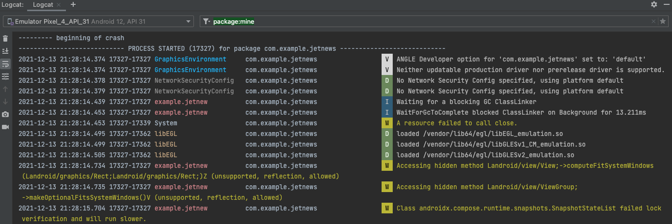
The new logcat in android studio version Dolphin has a new logcat view and the theme changes the colors of the log level messages so its harder to identify.
To Reproduce
Steps to reproduce the behavior:
Expected behavior
Support the updated look of the logcat ie. color error/warning messages in red/yellow etc. as well as the log level letter
Screenshots
Screenshot with Hiberbee on

Screenshot with default theme
Desktop (please complete the following information):

The color is displayed incorrectly in res/values/color.xml in Android Studio, and the color when selected is not obvious. Hope it can be fixed
Describe the bug
Updating to July 31, 2023 update the editor background colors appear to be broken

With this one they've introduced the 'Modern UI', I tried it (I think it looks terrible and went back), but the background colors appear to be the low contrast washed out defaults. To make sure I fully reinstalled the plugin but it persists.
To Reproduce
Upgrade to latest version. Appearance set to Hiberbee Dark as is Editor Color scheme
Expected behavior
A clear and concise description of what you expected to happen.
Screenshots
If applicable, add screenshots to help explain your problem.
Desktop (please complete the following information):
Can you support turning off bright colors? Eyes feel a little uncomfortable,Thank you very mcuh
Describe the bug
A clear and concise description of what the bug is.
To Reproduce
Steps to reproduce the behavior:
Expected behavior
It should have color convention similar to what we have in Java
Screenshots

IntelliJ IDEA 2020.2.1 (Ultimate Edition)
Build #IU-202.6948.69, built on August 25, 2020
Licensed to IntelliJ IDEA Evaluator
Expiration date: September 20, 2020
Runtime version: 11.0.8+10-b944.31 amd64
VM: OpenJDK 64-Bit Server VM by JetBrains s.r.o.
Windows 10 10.0
GC: ParNew, ConcurrentMarkSweep
Memory: 1967M
Cores: 8
Registry: ide.intellij.laf.enable.animation=true, ide.balloon.shadow.size=0
Non-Bundled Plugins: Key Promoter X, com.hiberbee.intellij.hiberbee-theme, Lombook Plugin, com.mallowigi, org.jetbrains.kotlin, org.intellij.scala
Describe the bug
Doesn't work well with native icons later1.8.4
Screenshots
If applicable, add screenshots to help explain your problem.


The parameter name is almost the same as the background color, and the parameter type is not easy to identify.
This problem has troubled me for too long, and I have to endure it because I love this theme so much.😃
Describe the bug
Selected area color bug,It is not possible to distinguish between the selected areas
Screenshots

Desktop (please complete the following information):
Is your feature request related to a problem? Please describe.
The TODO comments are not as visible as in the native Webstorm themes, they kinda blend within the template as a text, making them inconspicuous

Describe the solution you'd like
At least the "TODO" part of the comment should be more visible, to catch an eye faster.
Describe alternatives you've considered
Tried using a separate plugin, but it feels like a stretch.
Hello I am using Hiberbee dark theme in IntelliJ and this is awesome, how should I adjust any settings to display code error occurrence like a red border or red underline? Currently, it's showing a light blue underline which is really easy to ignore with the dark background...
Describe the bug
Most colors seem to change after closing the settings window. I can't locate the setting that causes this.
Before closing settings:

After closing settings:

To Reproduce
Steps to reproduce the behavior:
Can you make an official release of the theme on Visual Studio 2022 with the VSCode theme converter https://github.com/microsoft/theme-converter-for-vs for example (not sure if the result will be accurate)
Thanks for this awesome theme I love it.
Hello,
after the latest update, the colors of checkboxes don't let distinguish between checked and un-checked boxes. The mark is white on a yellow checkbox.
See the attached screenshot.

Hello,
I'm very like icon system in your screenshot, please tell me the name of plugin to do that.
Thank you.
When any part of code in PyCharm's editor is selected, the selection isn't visible because it is coloured black, while the background is dark grey.
Expected behavior
The contrast of the selection must be increased, by brightening the selection colour or changing it to a brighter one
Screenshots

Hello,
The small black point on line 10 is the breakpoint. Is this because of this theme ?

Is your feature request related to a problem? Please describe.
This is a small update to conform with the rest of the industry supporting diversity & inclusion. Changing the branch name may break automation & CI/CD processes, but the cost/benefit analysis really is worth the hassle.
Describe the solution you'd like
I would like the 'master' branch renamed to 'main' to conform with the new industry standards and to support diversity & inclusion.
Describe alternatives you've considered
Leaving the branch name as 'master' could leave some people offended. It also could appear that the theme/business is outdated and cannot move forward with current trends/issues.
Additional context
N/A
I set up plugin, rebooted but nothing changed, scheme did not apply Do I need some extra settings? Idea 2019.3
Just found this and realized it isn't compatible with 2019.3. Understandably so given that 2019.3 just released this week.
I'm not sure if there is anything needed other than updating the support versions or not.
Is there a way to make the project tree a bit more compact or have an option to do so? Similar to the screenshot below would be great.

Is your feature request related to a problem? Please describe.
It's a bit strange when I have a list of selectable items in a dropdown, and the currently selected item is the dark item.
Describe the solution you'd like
I would want the currently selected item to be light grey and the unselected items to be dark
Describe alternatives you've considered
No alternatives, just swapping the current colors for selected/non-selected
Additional context
It's not initially clear which item in the following image is currently selected

IntelliJ 2020.1 EAP just came out and this is not compatible with it anymore:
The Hiberbee theme (id=com.hiberbee.intellij.hiberbee-theme, path=...\Jetbrains\apps\IDEA-U\ch-0\201.3803.71.plugins\intellij-theme, version=1.4.2) plugin is incompatible (target build range is 191.6183 to 193.*).
rt
Тема установлена. Но ее нет не в цветовых схемах, не в выборе темы IDE. IDEA 2019.1
En: Installed this theme, but there is no options where I can choose theme. Neither in Appearance, neither in color scheme.


In XML files, especially ones where the # symbol is used regularly like the colors.xml file in android, the symbol # makes line highlighted as comments instead of regular XML highlighting.
| Actual | Expected ("#" removed to show the expected behaviour) |
|---|---|
 |
 |
I believe this theme suffers from the same issue documented below in the material theme.
ChrisRM/material-theme-jetbrains#1491
Projects with parent pom.xml files show the entire contents of the parent pom.xml as grey text. And the section in child pom.xml files that describes the parent are also grey.
I believe the fix is to add 'parent_scheme="Default"' to line 1 in \src\main\resources\colors\Dark.xml to become:
Couldn't seem to get the gradle build working for this repo. So I dug through the plugins and manually changed the file in the .jar and it seems to work fine for me now. Would be great if you could apply the fix into the repo and get a new version out.
invalid Issues
Love this theme. Thanks to all you guys' work.
After the updates on 2021.8.1, the font color turns black when a tab is chosen/active, which makes the word on the tab unclear when it is hovered, as the background color is also pretty dark when hover. (I do not remember whether this happens before the current version. )


Maybe we could use a brighter color for the chosen/active tab, so it can be seen more clearly.
Default autocomplete selection is lighter than further ones.
It's confusing when working fast:(


Describe the bug
firstly, ths for your theme, it's really cool.
since I updated, the below function has disappeared.


I like the theme a lot but this one place seems to be not working :)
A declarative, efficient, and flexible JavaScript library for building user interfaces.
🖖 Vue.js is a progressive, incrementally-adoptable JavaScript framework for building UI on the web.
TypeScript is a superset of JavaScript that compiles to clean JavaScript output.
An Open Source Machine Learning Framework for Everyone
The Web framework for perfectionists with deadlines.
A PHP framework for web artisans
Bring data to life with SVG, Canvas and HTML. 📊📈🎉
JavaScript (JS) is a lightweight interpreted programming language with first-class functions.
Some thing interesting about web. New door for the world.
A server is a program made to process requests and deliver data to clients.
Machine learning is a way of modeling and interpreting data that allows a piece of software to respond intelligently.
Some thing interesting about visualization, use data art
Some thing interesting about game, make everyone happy.
We are working to build community through open source technology. NB: members must have two-factor auth.
Open source projects and samples from Microsoft.
Google ❤️ Open Source for everyone.
Alibaba Open Source for everyone
Data-Driven Documents codes.
China tencent open source team.