GithubHelp home page GithubHelp logo

hirosystems / ui Goto Github PK

View Code? Open in Web Editor NEW
34.0 16.0 6.0 12.26 MB

The Blockstack design system implemented with react, styled-components, and styled-system.

Home Page: https://blockstack.design

JavaScript 1.59% TypeScript 98.27% HTML 0.14%
blockstack blockstack-ui react styled-components css-in-js styled-system

ui's Introduction

Stacks UI monorepo

This project is a monorepo for all of our Stacks UI related projects.

  • @stacks/ui: The react component library, built with emotion and theme-ui.
  • @stacks/ui-core: The underlying css-in-js package. This is a modification of theme-ui.
  • @stacks/ui-theme: Theme-ui spec theme for the component library.
  • @stacks/ui-utils: Utilities to help build out complex UI projects.

Running locally

This project uses Lerna, yarn workspaces, changesets, and tsdx for bundling.

  • Clone the repo
  • Install deps via yarn

ui's People

Contributors

aulneau avatar blockstack-devops avatar charliec3 avatar dependabot[bot] avatar fbwoolf avatar github-actions[bot] avatar hstove avatar kyranjamie avatar

Stargazers

 avatar  avatar  avatar  avatar  avatar  avatar  avatar  avatar  avatar  avatar  avatar  avatar  avatar  avatar  avatar  avatar  avatar  avatar  avatar  avatar  avatar  avatar  avatar  avatar  avatar  avatar  avatar  avatar  avatar  avatar  avatar  avatar  avatar  avatar

Watchers

 avatar  avatar  avatar  avatar  avatar  avatar  avatar  avatar  avatar  avatar  avatar  avatar  avatar  avatar  avatar  avatar

ui's Issues

Update buttons

I'm seeing a lot of different button styles in our product, especially the secondary type (admittedly my fault). I'd like to redesign it in a way we can all get behind and push it to our products using the UI library.

There's also the issue of the disabled state of the primary button looking similar to the secondary button.

Update color system in Figma

As discussed during the UI architecture sync we're updating the color system.

There are three layers:

Criteria:

  • Light and dark mode for the emphasis layer and semantic layer
  • Usage defined in the emphasis and semantic layers meets AA a11y standards
  • UX team agrees on the proposed names
  • List of semantic colors is complete, both for design and development. We can test this using some key screens of our three products.

@aulneau @kyranjamie @andresgalante Feel free to add ideas. I will make a draft and link it here.

Named spacing units

Named spacing units
Similarly to the Shopify design library, it'd be helpful to have named spacing units, for the most frequently occurring values.

//
// An example of names, could also go 
// for tight/loose or some other system
<Text textStyle="display" pb={['small', 'medium', 'large']}>

The benefit of this is having more natural language with which to align on and discuss layouts. Units become more relatable. small is clearly small, whereas the size of an 8 is either big or small depending on the scaling units used.
Consistency is enforced by encouraging use of these units. Number-based units only being used in the case of exceptions. Helpful errors keep things tidy, such as in the case where a number that has a corresponding alias is used.

Thoughts?

text line-height causing misalignment

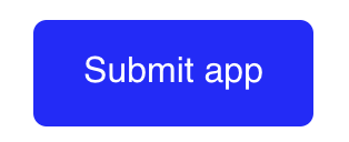
In many places on the app.co staging, line-heights of the text causes misalignment. Take for example this button:

image

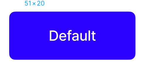
The button height is 48px. The line-height is 21.328px, which causes the text to be misaligned inside the button. If we were to use the text styles from the design system, it would be perfectly centered (48px - 20px = 14px either side):

image

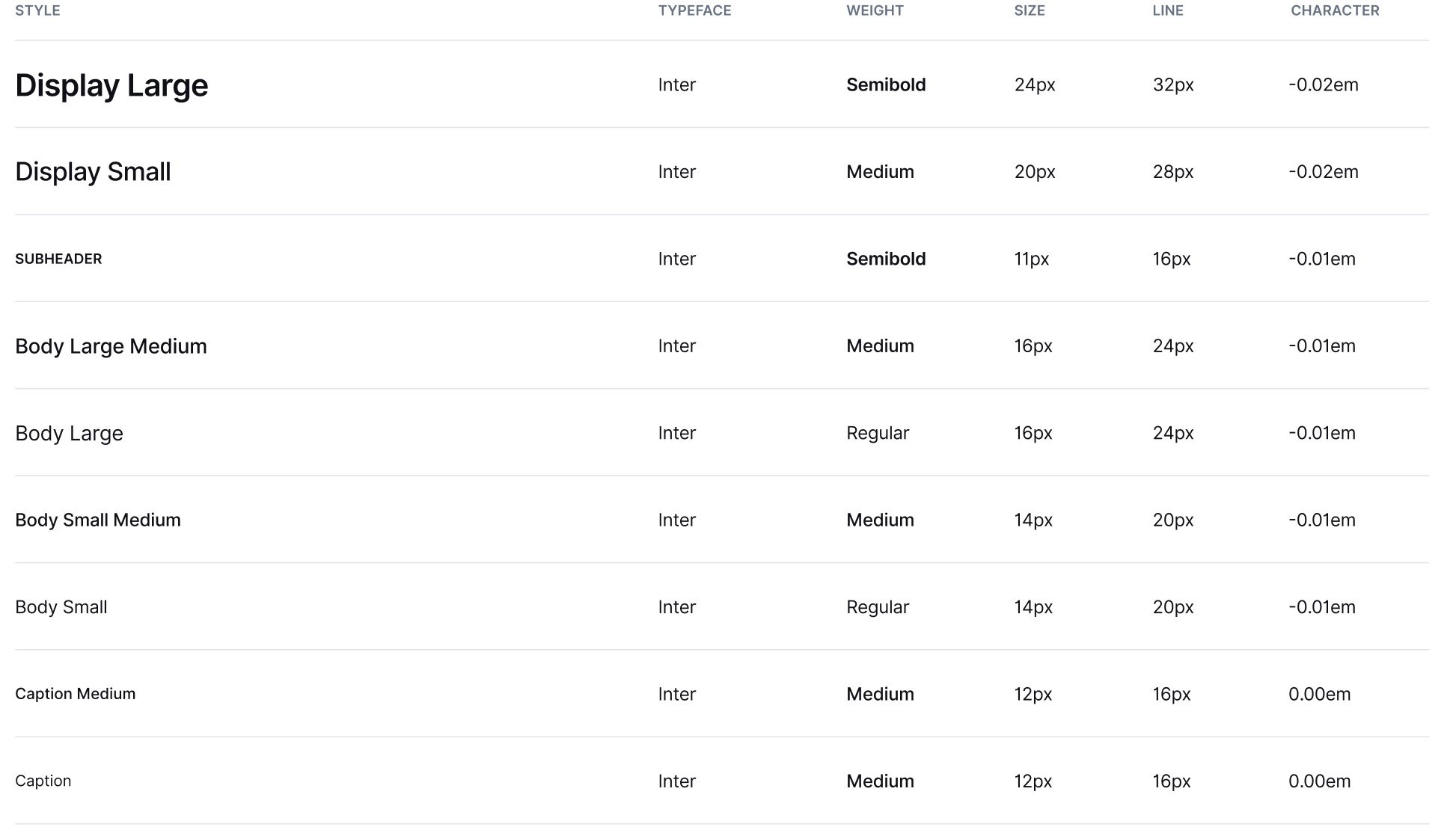
There are other places this occurs. In general, we should stick to multiples of 4px for line-height because this creates vertical rhythm and ensures everything is aligned properly. I have chosen these line-heights to be multiples of 4 and work well within paragraphs:
image

It's the line-height that counts, not a nice scale increase of the text size, which is arbitrary based on the font. We can still convert these line-heights to rem if you'd like as long as they result in the same px heights.

`mdi-react` missing dependency

On a fresh install, when importing blockstack-ui, there is an error if mdi-react is not installed. It's fixed if you just install it in your project. We should add this dependency to package.json.

Suggestion: Mandatory `as` prop for all primitives.

I've noticed working with this library thus far, there's a real temptation to not specify an as prop and just use the div or span defaults.

It's really easy to compose layouts, but I find myself totally forgetting the correct semantic HTML element, and it's evident looking at other sites there's a real over-reliance on divs rather than their semantic alternatives.

A potential solution I'd like to suggest/discuss here: making as a mandatory prop, as this'll force developers to think about what element to use, even if it is a div.

Interested in any other solutions as well that can remedy major div nesting.

Exposing ThemeProvider/theme

Currently, we expose ThemeProvider, from styled-system, and the corresponding theme used to style the library.

I'm wondering whether there's value in exposing such implementation details of the UI library. Do we want to allow consumers of the library to change theme?

We, may, in the future have a dark theme, so we need the flexibility of changing themes, but this could be be encapsulated in the library.

<BlockstackUiProvider variant="dark">

`ui` font family is invalid

In our body typography, all the font-familys are just ui. What is that supposed to mean? All those element just show up as the default browser font for me (i.e. times new roman). Also, there is no way to override these fonts, so parts of app.co are broken.

@aulneau

Generative avatar/icon design for accounts and tokens

@aulneau to chime in here on technical constraints.

For a user an avatar or icon is helpful in differentiating between accounts and tokens. Each of these will have a unique address, and we can use these addresses to generate a visual that is unique as well. We can use shapes, colors (+gradients) and type. Keep in mind that these will generally be pretty small, around 36x36 px.

I'd like to propose the following guiding principles:

  • They should be easy to differentiate
  • They should be easy to remember
  • They should be on brand

We currently use gradients for this, its colors constrained by a HSL range, with an optional letter that represents the first letter of the token.

Emotion/react dependency

I believe the package needs to be a runtime dependency (it is marked as a dev dependency right now). This is what happens when I try using this @stacks/ui package in a new project:

Screen Shot 2021-03-22 at 10 08 29 AM

After installing it locally, the issue disapepared

Icons

#30 introduces the chevron icon we're using in the design system, currently across blockstack-app and connect.

It warrants further thought as to the best way we can add these icons to our library.

  • What degree of configuration should they support?
  • Are they only included output bundle when used?
  • What naming conventions should we use?

Typing theme file

Would be great productivity win if we're able to type the theme.ts file.

Not totally sure how we'll do this, as strings are used to reference the object. Some ideas:

Typing the strings
Write a script to parse theme file and return available string literal types. Something like:

type Theme = 'red' | 'red.100' | 'red.200';
<Text color="red" /> //strongly typed as above

Function look up
Not sure if we can do this but:

<Text color={(theme: Theme) => theme.color.red} />

Reference theme directly
This seems like the most obvious to me:

<Text color={theme.color.red} />

Feature request: tooltip

In the explorer, we have a tooltip, but it could be better. For example, the only option is to display it above & centered over the element, which is problematic if the element is on the side of the page.

Improvements could be to allow more dynamic positioning, or even some magic to automatically change the display based on where the element is currently positioned on the screen.

Transition to emotion in place of styled-components

As I've been working with styled-system and building these components, I've been thinking more and more about how it might be best to move over to emotion in place of styled-components. They are very close with regards to their feature sets, however, emotion has a feature that can take a function called shouldForwardProps that I don't see styled-components will be implementing anytime in the near term. This function essentially filters out any props that might cause warnings to appear in react about passing them to the underlying DOM element.

Currently there isn't a clear or clean way to filter out the props from our styled-components and prevent them from getting to the underlying dom element. https://styled-system.com/guides/removing-props-from-html/

There is an issue here -> styled-components/styled-components#439 that has some suggestions but nothing clear cut.

If we move to emotion, we'll have to add it and replace styled-components in our various projects, which isn't too much work, but will add some more time to integrating @blockstack/ui to our projects.

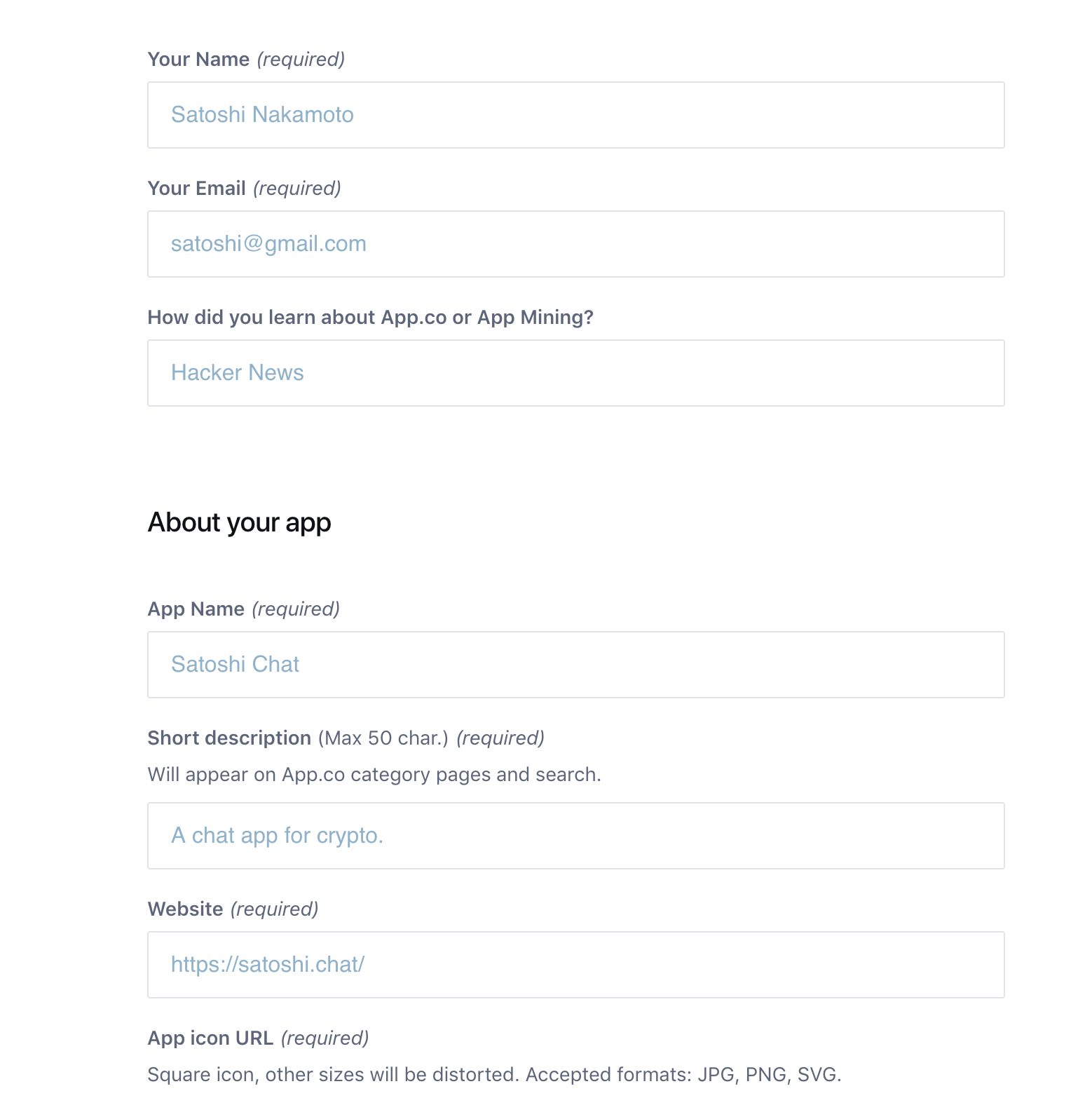
Input fields and selects

We're currently using old components for inputs and selects on app.co staging:

image

We'd like to use the new components from Waffle:

image

Using `as="h1"` results in ignored fontSize

const StackingTitle: FC = ({ children }) => (
  <Text as="h1" display="block" textStyle="display.large" fontSize="40px">
    {children}
  </Text>
);

In this example component fontSize is ignored, owing to the defaults set implicitly for a h1

<Text /> default display block

Been using the <Text /> element and found it quite frustrating the default is set to display: inline.

We should consider changing this to display: block;, so textual element behave like their defaults.

Standardize transaction component

For usage across Connect, Explorer and Wallet among other products.

  • All TX types
    • States: Default, hover, focused, active
  • Pending/rejected/confirmed
  • Has optional context for current user
  • Icon types (e.g. receipt, delivery, Stacking initiation, faucet receipt)
  • Width responsiveness
  • Special Stacking treatment?
  • Time format
    • Tooltip
  • TX ID
  • Extra options
    • View on Explorer
    • Retry?

Standardize STX balance component

For usage across Connect, Explorer and Wallet among other products.

  • Total
  • Available
  • Locked
    • Stacking
    • Legacy
  • Unlocked
  • Other tokens
  • Total sent vs received historically

Recommend Projects

  • React photo React

    A declarative, efficient, and flexible JavaScript library for building user interfaces.

  • Vue.js photo Vue.js

    ๐Ÿ–– Vue.js is a progressive, incrementally-adoptable JavaScript framework for building UI on the web.

  • Typescript photo Typescript

    TypeScript is a superset of JavaScript that compiles to clean JavaScript output.

  • TensorFlow photo TensorFlow

    An Open Source Machine Learning Framework for Everyone

  • Django photo Django

    The Web framework for perfectionists with deadlines.

  • D3 photo D3

    Bring data to life with SVG, Canvas and HTML. ๐Ÿ“Š๐Ÿ“ˆ๐ŸŽ‰

Recommend Topics

  • javascript

    JavaScript (JS) is a lightweight interpreted programming language with first-class functions.

  • web

    Some thing interesting about web. New door for the world.

  • server

    A server is a program made to process requests and deliver data to clients.

  • Machine learning

    Machine learning is a way of modeling and interpreting data that allows a piece of software to respond intelligently.

  • Game

    Some thing interesting about game, make everyone happy.

Recommend Org

  • Facebook photo Facebook

    We are working to build community through open source technology. NB: members must have two-factor auth.

  • Microsoft photo Microsoft

    Open source projects and samples from Microsoft.

  • Google photo Google

    Google โค๏ธ Open Source for everyone.

  • D3 photo D3

    Data-Driven Documents codes.