CSS | YUM-YUM (responsive web page)
Introduction
According to the provided designs, develop the HTML/CSS integration. You should start with the mobile-first approach and make your page responsive.
Submission
Upon completion, run the following commands:
$ git add .
$ git commit -m "done"
$ git push origin master
Create Pull Request so your TAs can check up your work.
Instructions
Iteration 1: Setup
Fonts
Body's type is Lato. You should include the font with Google Fonts with the following weights: normal, bold, black.
Headings type is a custom font called Intro. It is already included into the page and available through: font-family:"Intro"; with 2 font-weights : 400 and 900.
Images
For gray images, use placeholders (you can use any from https://placeholder.com).
Click here to see an example
All other images are provided into the images folder. Insert as many <img> tags as you need into the HTML. Or you could also use CSS property background to set the images in your page.
It's up to you.
Iteration 2: Designs
Mobile design
Click here to see the details

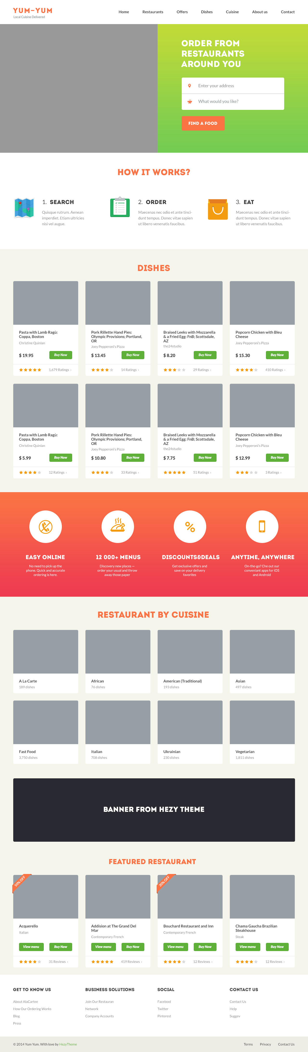
Desktop design
Click here to see the details
Happy coding!


 React
React
 Typescript
 Django
 Laravel
 Facebook
 Microsoft
 Google
 Alibaba
 D3
D3
 Tencent