<input-knob> ⟳ custom element
A rotating, touch-sensitive knob that you can use like an
<input type="range">.
Install
The dist directory contains the CommonJS module (input-knob.cjs.js), ES
module (input-knob.esm.js) and UMD (input-knob.umd.js) variants of the
element that you can use directly.
Install via npm and include via the bundler of your choice:
npm install --save input-knobInclude via unpkg:
<script src="https://unpkg.com/input-knob"></script>Usage
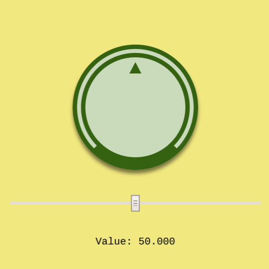
This will create a knob with a minimum value of zero, a maximum of 100, a current value of 50, and each full turn of the knob will change the value by 10.
<input-knob value="50" scale="10" min="0" max="100"></input-knob>value: Current value, this will update as the knob is turned. Optional, defaults to0.scale: The change in the value for one full turn. Optional, defaults to1.min: Minimum allowed value. Optional, defaults tonull.max: Maxium allowed value. Optional, defaults.tonull.
If both min and max are set, then the knob can be turned multiple times to
reach a different value. If only one or none of min or max is set, then a
full turn of the knob will reset the value to 0.
These are also exposed as properties on the object and can be set or observed in JavaScript:
const knob = document.querySelector('input-knob');
knob.value = 42;
Events
Three event types are dispatched for each point in an interaction:
knob-move-start: fired on initial touch or click.knob-move-change: fired repeatedly for each change in rotation.knob-move-end: fired when the touch or click is released.
Style and appearance
There are two key parts of the element that can be styled. The <input-knob>
element itself, which is the container for the inner rotator part. The
rotator is accessed using the ::part(rotator) pseudo-element. The outer
element does not rotate, so can be used for general positioning or changing the
appearance of the outer container. The inner rotator represents the part of
the knob the user interacts with and will rotate as the value changes.
Content inside the <input-knob> tag will also rotate and can be used to do
things like provide a top marker for the knob.
<style>
  input-knob {
    width: 150px;
    padding: 10px;
    border: 2px dashed green;
    background: lightgreen;
  }

  input-knob::part(rotator) {
    box-sizing: border-box;
    background: lightblue;
    border: 2px dashed blue;
    border-radius: 100%;
    width: 150px;
    height: 150px;
  }

  .mark {
    display: inline-block;
    width: 100%;
    text-align: center;
    font: bold 200% monospace;
    color: blue;
  }
</style>

<input-knob value="50" scale="10" min="0" max="100">
  <div class="mark">▲</div>
</input-knob>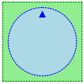
Demo
Try the demo at https://input-knob.glitch.me
Backwards compatibility
For browsers that do not support custom elements, etc. you can use the
webcomponents.js polyfills.
For browsers that do not support Shadow Parts, the element will add a fallback
class and <span> that can by styled.
input-knob {
  width: 150px;
  padding: 10px;
  border: 2px dashed green;
  background: lightgreen;
}

input-knob::part(rotator) {
  box-sizing: border-box;
  background: lightblue;
  border: 2px dashed blue;
  border-radius: 100%;
  width: 150px;
  height: 150px;
}

input-knob.fallback > span.fallback {
  display: block;
  box-sizing: border-box;
  background: lightblue;
  border: 2px dashed blue;
  border-radius: 100%;
  width: 150px;
  height: 150px;
}
Contributing
Issues and pull requests happily received. Please see CONTRIBUTING.md.

 React
React
 Typescript
 Django
 Laravel
 Facebook
 Microsoft
 Google
 Alibaba
 D3
D3
 Tencent