GithubHelp home page GithubHelp logo

jemmybutton / byrne-euclid Goto Github PK

View Code? Open in Web Editor NEW
1.2K 56.0 102.0 2.47 MB

MetaPost + ConTeXt rendition of Oliver Byrne's "The first six books of the Elements of Euclid"

License: GNU General Public License v3.0

TeX 100.00%
geometry book euclid byrne metapost tex

byrne-euclid's Introduction

MetaPost + ConTeXt rendition of Oliver Byrne's "The first six books of the Elements of Euclid"

title

This project is not intended to create the exact copy of the original, but rather is an attempt to implement all its most important features in a way that would allow easy modification and creation of similarly styled geometric proofs.

comparison

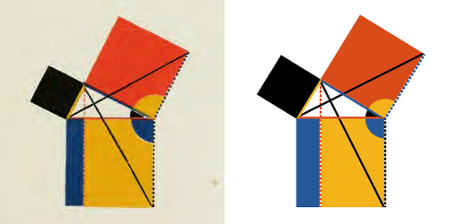
This version of the book is made in a way that makes modifications, including translation, quite possible and even not that difficult. As a proof of concept Russian translation was made. Plus, although Byrne's book looks cool as it is, it might be helpful, as Edward Tufte points out, to supplement it with conventional letter designations. So, there's also option for that (it is turned on by default in the Russian version and can be easily turned on in the English version).

labels

In addition to all the colorful byrnian stuff, this edition features generated lettrines and vignettes, so there are no two identical initials in the whole book.

lettrines

The book itself (byrne_context.tex) and Russian translation (byrne_ru_context.tex) are licensed under CC-BY-SA 4.0.

MetaPost library (byrne.mp) and lettrines generator (lettrines.mp) are licensed under GPLv3 or later.

To build the book from command line run context byrne_context.tex within the book directory. To generate lettrines run mpost lettrines.mp within \lettrines directory.

See releases for prepared .pdfs. See Actions for fresher pdfs (unless they are expired).

byrne-euclid's People

Contributors

bpiddubnyi avatar dougmencken avatar jemmybutton avatar kharus avatar sheeit avatar

Stargazers

 avatar  avatar  avatar  avatar  avatar  avatar  avatar  avatar  avatar  avatar  avatar  avatar  avatar  avatar  avatar  avatar  avatar  avatar  avatar  avatar  avatar  avatar  avatar  avatar  avatar  avatar  avatar  avatar  avatar  avatar  avatar  avatar  avatar  avatar  avatar  avatar  avatar  avatar  avatar  avatar  avatar  avatar  avatar  avatar  avatar  avatar  avatar  avatar  avatar  avatar  avatar  avatar  avatar  avatar  avatar  avatar  avatar  avatar  avatar  avatar  avatar  avatar  avatar  avatar  avatar  avatar  avatar  avatar  avatar  avatar  avatar  avatar  avatar  avatar  avatar  avatar  avatar  avatar  avatar  avatar  avatar  avatar  avatar  avatar  avatar  avatar  avatar  avatar  avatar  avatar  avatar  avatar  avatar  avatar  avatar  avatar  avatar  avatar  avatar  avatar

Watchers

 avatar  avatar  avatar  avatar  avatar  avatar  avatar  avatar  avatar  avatar  avatar  avatar  avatar  avatar  avatar  avatar  avatar  avatar  avatar  avatar  avatar  avatar  avatar  avatar  avatar  avatar  avatar  avatar  avatar  avatar  avatar  avatar  avatar  avatar  avatar  avatar  avatar  avatar  avatar  avatar  avatar  avatar  avatar  avatar  avatar  avatar  avatar  avatar  avatar  avatar  avatar  avatar  avatar  avatar  avatar  avatar

byrne-euclid's Issues

[Nit] Consider changing the shade of yellow and possibly blue

Hi Sergey. I am merely relaying a Reddit comment about the shades of yellow and blue in your book. Although I tend to agree with /u/jacobolus that the yellow might be warmer, this is a matter of taste so the ultimate call is yours.
As a side note, I checked your colours against deuteranopia, protanopia, and tritanopia with Vischeck. The good news is that all colorblind people can distinguish its colors. Here is how a deuteranope sees it:
deuteranope

Request: Line Numbers

I have been using this document in my math classes for the last year or so now, and one thing that would help would be Line Numbers added along the right side of the text--perhaps in faint grey. This would allow me to just say "Look at Line 3" rather than "Ok, see the line where it's a blue angle and a red one? See it?"

Декорировать прямые углы уголками

К сожалению, у меня недостаточно знаний, чтобы правильно на английском написать такой текст, поэтому напишу на русском.

По следам комментария на хабре.

Есть идея рисовать для прямых углов индикатор того, что они прямые. Варианты реализации:

  • Вместо дуги рисовать уголок. В тексте, чтобы уголок не воспринимался как квадрат, можно продлить стороны фигуры за границы получающегося квадрата. Проблема с этим вариантом -- может быть некрасиво выглядящее объединение нескольких углов. Кроме того, если по смыслу требуется показать, что несколько углов образуют прямой, это совсем не будет работать
  • В таком случае второй вариант: рисовать дугу, как и прежде, но внутри дуги тонкой линией нарисовать уголок, примерно так:
    CornerExample

Typos

1313: s/;/./
1351: IMHO, there should be either 0 or 2 commas in углов \drawAngle{A} или \drawAngle{D},
1351: \drawUnitLine{AB} совпадает \drawUnitLine{DE} — missing "с"
1414: probably missing comma or semicolon before "но"
1415: ditto before "часть"
1589: ditto before "проведем"
1631: missing comma at the end
1673: ditto
1674: s/пост./постр./ (how about introducing macros \construction and \hypothesis for "(постр.)" and "(гип.)"?)
1679: missing period at the end
1737: ditto
1766: probably s/$\perp$ к/$\perp$/
1769: ditto
1770: move the semicolon to the end of line
1806: probably missing comma or semicolon before "но"
1842: [optionally add a comma at the end]
1849: missing period at the end

Wishlist

Hi Sergey. I'm putting here random ideas that I can't implement on my own. Feel free to ignore them.

  1. Roman.Arabic references to propositions. They have been standard in Elements at least since Heiberg's 1883–85 edition (in the Latin pages, albeit with a comma: https://archive.org/stream/euclidisoperaomn01eucluoft#page/146/mode/2up). I know too little about ConTeXt and its wiki didn't help me in this task.
  2. Experiment with colour in the lettrines. For instance, keep the letter black and draw the fleurons in one of the basic three colours. Or even in a gradient starting in one colour and ending in another.

Suggestions

Propositions I.XXVII, I.XXVIII and I.XXIX (Russian):

  • Rename the angles so that their sides are marked with G and H rather than E and F.

Proposition I.XXXV (Russian):

  • Rename <BAC to <EAC, <EBD to <FBD, and <AFD to <BFD to match the vertices of the triangles that are proven to be equal.
  • Optional: draw EFDG byred so that <AEC is anchored.
  • Very optional: don't draw AC, which is only implicitly mentioned in the text.

Some typos in byrne_context.pdf

Page 31: add a period before "For", replace the final semicolon with a period.
Page 34: remove \therefore before "hence" (this is Byrne's typo).
Page 38: replace a comma with a period before "Then".
Page 39: replace "for" with "For", add a period at the end.
Page 40: add a period at the end.
Page 43: add a period at the end (this is Byrne's typo).
Page 44: add a period at the end of the proposition.
Page 45: add a period before "But" (this is Byrne's typo).
Page 46: replace a comma with a period before "Then".
Page 48: add a period at the end.
Page 50: add a comma and a period to the second and third lines in the brace at the end.
Page 55: add a period before "Consequently".
Page 59: replace a semicolon with a period before "Then" or replace "Then" with "then" (this is Byrne's typo).
Page 61: add a period at the end (this is Byrne's typo).
Page 63: replace a colon with a period before "Therefore" or replace "Therefore" with "therefore" (this is Byrne's typo).
Page 64: add a period before "But" (this is Byrne's typo).
I have got to go now. Hope this helps.

Bug in Proposition I.XVI

en:1905, ru:1903 — we should not be producing \drawUnitLine{AC,CF} but \drawUnitLine{BE,EC}.

\drawCurrentPictureInMargin leaves a spurious space

Hi Sergey. Please take a look at page 15 of byrne_context.pdf — the text of definition 8 starts correctly, while the text of definition 9 has a spurious space at its beginning. Same goes for all pieces of text accompanied by a picture in the margin.
All the best,
Marcin Ciura

Increase size of diagrams

I use this PDF with my students in a middle school. They have commented that they think the diagrams aren't big enough, especially compared to the pages from the orginal Byrne which I was giving them. Compare, just as an example, Book 1 Prop 13. The original is much "chunkier" (in the words of my students.) Is it possible to easily change the size of the diagrams, or would that require a complete overhaul?

Yellow side of an angle gets drawn as thin black line

See Proposition I.V: in \drawAngle{DCE,DCB} = \drawAngle{EBD,CBE}, the sides CE and BD are drawn as thin black lines while they are yellow lines on the picture. This is probably intended behavior but I found no documentation of this feature.

Enlarge narrow angles

Privet, Sergey. This is not a bug, just a suggestion how to improve your excellent edition. You might consider increasing the length of the sides in narrow acute angles. To see what I mean, please compare the yellow and blue angles on page 32 of byrne_context.pdf with their equivalents on Byrne's page 4: https://archive.org/stream/firstsixbooksofe00eucl#page/4/mode/2up

I attach an image I made with a simple formula (the formula is copied from my XeLaTeX code so the variable names probably do not match yours):

\pgfmathgreater{\angle}{60}
\pgfmathifthenelse
{\pgfmathresult}
{\sidelength}
{\sidelength * (90 - \angle) / 60}

Caveat: you will probably want to keep the non-scaled way of displaying for adjacent angles that share their sides.
Proposition 1.4

Add Lettrines to English Releases.

The lettrines would be an invaluable aide to me, as I am using this PDF as a teaching resource, but they are only on the Russian PDF. I don't have the technical know-how to set up ConText in a reasonable amount of time. Could the English PDF have letterines added?

[Nit] Consider using a canonical form of axiom I

The applications of axiom I base on various permutations of equalities, e.g. (symbolically):
(Proposition I.I) X = Y and X = Z, ∴ Y = Z;
(Proposition I.II) X = Y and Z = X = Y, ∴ Y = Z;
(Proposition I.III) X = Y and Z = X, ∴ Z = Y; etc.
It hurts my OCD so I propose to standardize them on one form, e.g. Y = X and Z = X, ∴ Y = Z.

Below is a diff of my proposal applied to the initial three propositions. If you agree with me, I can make it a PR. Even if you reject the idea, please change \inax[post:I] to \inax[ax:I] in proposition I.I (bug present only in the Russian version) and add \inax[ax:I] to proposition I.II.

-Поскольку $\drawUnitLine{AB} = \drawUnitLine{CA}$ \indef[def:XV];\\
-и $\drawUnitLine{AB} = \drawUnitLine{BC}$ \indef[def:XV];\\
-$\therefore \drawUnitLine{CA} = \drawUnitLine{BC}$ \inax[post:I];\\
+Поскольку $\drawUnitLine{CA} = \drawUnitLine{AB}$ \indef[def:XV];\\
+и $\drawUnitLine{BC} = \drawUnitLine{AB}$ \indef[def:XV];\\
+$\therefore \drawUnitLine{CA} = \drawUnitLine{BC}$ \inax[ax:I];\\

-Поскольку $\drawUnitLine{BE,BD} = \drawUnitLine{DA,AF}$ \indef[def:XV],\\
-и $\drawUnitLine{BD} = \drawUnitLine{DA}$ (постр.),\\
-$\therefore \drawUnitLine{BE} = \drawUnitLine{AF}$ \inax[post:III],\\
-но \indef[def:XV] $\drawUnitLine{BC} = \drawUnitLine{BE} = \drawUnitLine{AF}$;
+Поскольку $\drawUnitLine{DA,AF} = \drawUnitLine{BD,BE}$ \indef[def:XV],\\
+и $\drawUnitLine{DA} = \drawUnitLine{DB}$ (постр.),\\
+$\therefore \drawUnitLine{AF} = \drawUnitLine{BE}$ \inax[post:III],\\
+но $\drawUnitLine{BC} = \drawUnitLine{BE}$ \indef[def:XV];

-$\therefore \drawUnitLine{AF}$ проведенная из данной точки (\pointA) равна данной прямой \drawUnitLine{BC}.
+$\therefore \drawUnitLine{AF}$ проведенная из данной точки (\pointA) равна данной прямой \drawUnitLine{BC} \inax[ax:I].

-Поскольку $\drawUnitLine{AD} = \drawUnitLine{AB}$ \indef[def:XV],\\
+Поскольку $\drawUnitLine{AB} = \drawUnitLine{AD}$ \indef[def:XV],\\
 и $\drawUnitLine{EF} = \drawUnitLine{AD}$ (постр.);

-$\therefore \drawUnitLine{EF} = \drawUnitLine{AB}$ \inax[ax:I];
+$\therefore \drawUnitLine{AB} = \drawUnitLine{EF}$ \inax[ax:I];

Bug in proposition I.VII

As I understand it, line 1499 of the English version and line 1507 of the Russian version compare wrong pairs of segments. The body of \eqalign should say
\drawUnitLine{CA}&=\drawUnitLine{DA}\cr \drawUnitLine{BC}&=\drawUnitLine{BD}
instead of
\drawUnitLine{CA}&=\drawUnitLine{BC}\cr \drawUnitLine{DA}&=\drawUnitLine{BD}.

[Not a bug] Selectively disabling ligatures

I like the change to EB Garamond but the ubiquitous "st" ligature looks annoying in my Polish version. Since it took me a while to figure out how to disable it, I am leaving the snippet here in case anyone needs it, too.

\startluacode
  require( "selnolig" )
  function process_ligatures_wrapper(nodes,tail)
    process_ligatures(nodes,tail)
    return nodes
  end
  thirddata = thirddata or {}
  thirddata.ligatures = {}
  thirddata.ligatures.process_ligatures = process_ligatures_wrapper
  nodes.tasks.appendaction(
      "processors", "words", "thirddata.ligatures.process_ligatures" )
  suppress_liga( "st", "s|t" )
\stopluacode

[Nit] Consider un-rotating figures in the text

IMHO, all non-trivial figures in the text can be shown in the same orientation as in the accompanying picture and startGlobalRotation can be used only for trivial figures: points, lines, arcs. See the triangle in Proposition I.II, the angles in Proposition I.VIII, the rectangle in Proposition II.V, etc. The only counterargument I can think of is consistency with Byrne's book.

Bug in proposition I.IX

Lines 1572 (English) and 1566 (Russian) say D := A yscaled -1;. As triangle BCD is equilateral, they should say D := (0, -2.3094u); instead. To differentiate it visually from a mirror image of triangle ABC, I suggest also, say, A := (0, 5/3u); three lines above.

Fell types; unicode-math

I really like this project! I just have a couple of suggestions:

  1. The original book uses (some of) the “Fell Types”, which have been revived by Igino Marini, and are available for free: http://iginomarini.com/fell/the-revival-fonts/. (Note that the ornaments, in particular, match exactly.) I would recommend using these fonts (taking optical sizes into account) rather than Gentium, which looks a bit anachronistic.
  2. I would strongly recommend using the unicode-math package (assuming it works with ConTeXt), so that the letters in math mode are in the same font as in text mode.

Building instructions

Dear Team,
What a wonderful book.
May I ask how to build it? I have TexStudio which I use to build many other books, but I received 35Mb of errors while trying to build this book. I tried pdflatex, xelatex and lualatex.

Kindly let me know,

[Nit] Label horizontal lines in text left-to-right

Examples up to Proposition I.XXXV:
Propositions I.X, I.XI, I.XII: DB and CD are labelled in the opposite direction to their appearance in the diagram. BD and DC would be more natural.
Proposition I.XIV: CD should better be referred to as DC
Proposition I.XXIV: BD should better be DB

--WithName functions removal

With this e629c3e i want to eventually get rid of all the --WithName functions, replacing them with extended syntax for their ordinary counterparts: for instance you can type byAngleDefine.someAngle(A, B, C, byred, 0);instead of byAngleDefineWithName(A, B, C, byred, 0)(someAngle);
For now --WithName ones are still there, so everything should work as before. @mciura would you mind switching to the new syntax at some point?

Consider adding a table of contents

...even if Byrne's book does not have it. Two versions come to my mind:

  1. List just the Introduction and the Books.
  2. Also list the subsections of the Introduction and the individual propositions.
    The choice between 1) and 2) might be controlled by setting some macro.

Move the first word closer to the lettrine

The space between a lettrine and all the words is equal. In the original, the first word is closer. Also, Bringhurst writes in The Elements of Typographic Style (page 63):

"In English, if the initial letter is A, I or O, a question can arise: is the initial letter itself a word? The answer to this question must come in the spacing of the text in relation to the versal. If the first word of the text is Ahead, for example, excessive space between the initial A and the rest of the word is bound to cause confusion."

initial

Feature Request: ʃ, the Long s

Byrne uses ʃ, the long s, throughout his text. Do you have plans of adding it or making it an optional switch?

Having options is one way to requests for more Byrne-like features that you feel would decrease usability, for example, the roman numerals. Just a thought.

Beautiful work! It's so brilliant, I wish I had thought of it, but you did it better than I could have anyway.

Bug in proposition I.XXXV

EDIT: sorry, bug was present in pdf release, not in actual source code. Apologies.


Hi and thanks for your work.

there's a bug in I.35 second-to-last line. Should be :
trapezium minus triangle

thank you

Recommend Projects

  • React photo React

    A declarative, efficient, and flexible JavaScript library for building user interfaces.

  • Vue.js photo Vue.js

    🖖 Vue.js is a progressive, incrementally-adoptable JavaScript framework for building UI on the web.

  • Typescript photo Typescript

    TypeScript is a superset of JavaScript that compiles to clean JavaScript output.

  • TensorFlow photo TensorFlow

    An Open Source Machine Learning Framework for Everyone

  • Django photo Django

    The Web framework for perfectionists with deadlines.

  • D3 photo D3

    Bring data to life with SVG, Canvas and HTML. 📊📈🎉

Recommend Topics

  • javascript

    JavaScript (JS) is a lightweight interpreted programming language with first-class functions.

  • web

    Some thing interesting about web. New door for the world.

  • server

    A server is a program made to process requests and deliver data to clients.

  • Machine learning

    Machine learning is a way of modeling and interpreting data that allows a piece of software to respond intelligently.

  • Game

    Some thing interesting about game, make everyone happy.

Recommend Org

  • Facebook photo Facebook

    We are working to build community through open source technology. NB: members must have two-factor auth.

  • Microsoft photo Microsoft

    Open source projects and samples from Microsoft.

  • Google photo Google

    Google ❤️ Open Source for everyone.

  • D3 photo D3

    Data-Driven Documents codes.