React Native <Image> component, that rescales itselfs correctly on iOS and Android devices.
##Why?
React Native's Image size is rendered the same regardless of device size and resolution. Desired behaviour in is to have a component, that scales appropriately.
##Installation
npm install react-native-responsive-image --save
##Usage
Use the <ResponsiveImage> component and set it's initWidth and initHeight props.
These values are used as they are for iPhone6 Plus, and they are scaled down on any smaller iOS/Android device.
##Example
Three images in one full-width row:
var React = require('react-native');
var ResponsiveImage = require('react-native-responsive-image');
var {
  AppRegistry,
  StyleSheet,
  View,
} = React;

var App = React.createClass({
  render: function() {
    return (
        <View style={{flex: 1, justifyContent: 'center',}}>
            <View style={{flexDirection: 'row',}}>
  	 				<ResponsiveImage source={{uri: 'http://facebook.github.io/react/img/logo_og.png'}} initWidth="138" initHeight="138"/>
                    <ResponsiveImage source={{uri: 'http://facebook.github.io/react/img/logo_og.png'}} initWidth="138" initHeight="138"/>
                    <ResponsiveImage source={{uri: 'http://facebook.github.io/react/img/logo_og.png'}} initWidth="138" initHeight="138"/>
            </View>
         </View>
    );
  }
});

AppRegistry.registerComponent('AwesomeProject', () => App);
##One image size?
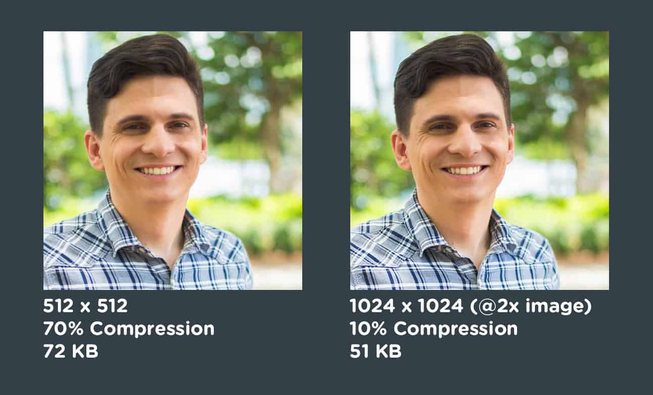
We could have added support for multiple image sources, like https://github.com/exponentjs/react-native-responsive-image has. It sounds like you would save some bytes by delivering less-resolution images to devices with lower resolution.
But solution that worked the best for me was different. Actually you need to serve just one high-resolution compressed, and it will even save more bytes. Though @2x or @3x images have more pixels, it’s surprising how much they can be compressed.


 React
React
 Typescript
 Django
 Laravel
 Facebook
 Microsoft
 Google
 Alibaba
 D3
D3
 Tencent