Different ways to create forest plots in R. In all examples the user will need to look and modify the axis limits/breaks to suit the estimates they are plotting.
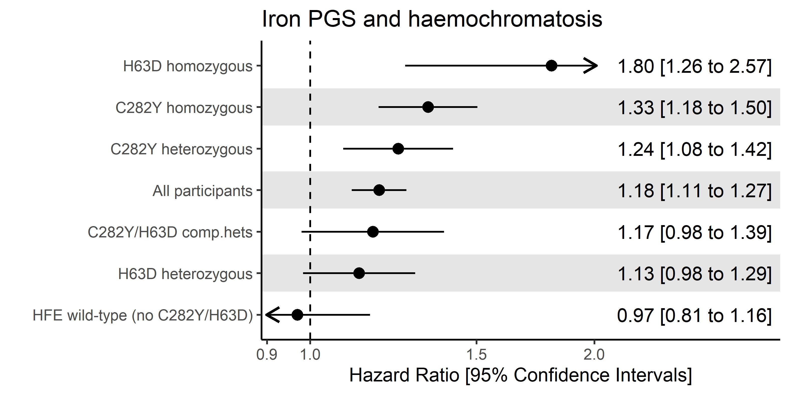
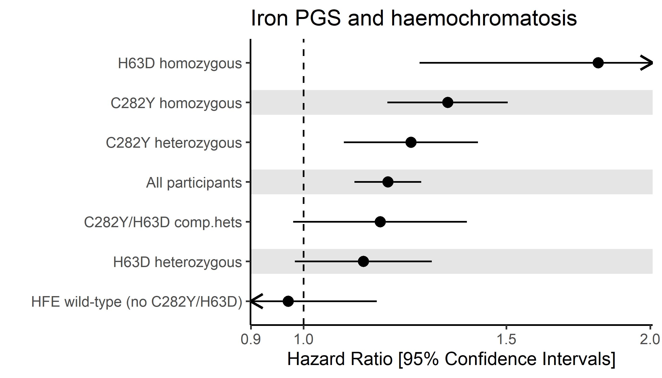
Examples using data from our 2022 paper on iron polygenic score associations with haemochromatosis outcomes
Pilling LC, Atkins JL, Melzer D (2022) Genetic modifiers of penetrance to liver endpoints in HFE hemochromatosis: associations in a large community cohort. Hepatology. https://doi.org/10.1002/hep.32575
Link to syntax. Example output:

Same as above but with 3 differences:
- Alternating coloured horizontal lines added (white and grey)
- Ordered by effect size rather than custom (as appears in file)
- Different "classic" theme to include axis lines and no reference lines
Link to syntax. Example output:

As above, with one difference:
- Axes can be limited if wide CIs are not desired. Arrows are added to show CIs go beyond limits
Link to syntax. Example output:
As above, with one difference:
- Write estimates alongisde the forest plots. Remember to modify variable
x_maximum_labelsif you can't see the estimate text properly.
Link to syntax. Example output: