GithubHelp home page GithubHelp logo

mapbox / dr-ui Goto Github PK

View Code? Open in Web Editor NEW
31.0 83.0 12.0 101.77 MB

Design system for docs.mapbox.com

Home Page: https://mapbox.github.io/dr-ui/

License: BSD 2-Clause "Simplified" License

JavaScript 98.89% HTML 0.11% CSS 0.90% Shell 0.11%
docs docs-infrastructure

dr-ui's Introduction

Note: DR-UI is no longer being maintained.

As of April 2024, docs.mapbox.com has migrated to a new infrastructure and dr-ui components have been migrated to docusaurus-packages

@mapbox/dr-ui

Build Status

Pronounced "Doctor UI". Documentation React UI components. See @mapbox/mr-ui.

UI components for Mapbox documentation projects.

This project is for internal Mapbox usage. The code is open source and we appreciate bug reports; but we will only consider feature requests and pull requests from Mapbox developers.

Installation

Requirements

  • Node 18
  • npm 9

If you're not sure if your Node and NPM versions are up to date, run nvm use before installing dependencies. If you don't have NVM installed, you can find installation instructions here.

npm install @mapbox/dr-ui

On Mapbox projects, pair these components with version 0.26.0 of Mapbox's custom Assembly build. (This is not in peerDependencies because you might use <link> and <script> tags instead of the npm package.)

The public Assembly build should work fine, with maybe one or two hiccups.

Usage

Import individual components! All components are exposed at @mapbox/dr-ui/{component-name}. For example:

import Card from '@mapbox/dr-ui/card';
import BackToTopButton from '@mapbox/dr-ui/back-to-top-button';

Only the component itself and whatever it depends on will be drawn into your bundle.

Development

See CONTRIBUTING.md.

dr-ui's People

Contributors

andrewsepic avatar azarovalex avatar chriswhong avatar colleenmcginnis avatar danswick avatar davidtheclark avatar dependabot[bot] avatar heystenson avatar katydecorah avatar kepta avatar malwoodsantoro avatar mathewantony31 avatar mikelmaron avatar rclark avatar

Stargazers

 avatar  avatar  avatar  avatar  avatar  avatar  avatar  avatar  avatar  avatar  avatar  avatar  avatar  avatar  avatar  avatar  avatar  avatar  avatar  avatar  avatar  avatar  avatar  avatar  avatar  avatar  avatar  avatar  avatar  avatar  avatar

Watchers

 avatar  avatar  avatar  avatar  avatar  avatar  avatar  avatar  avatar  avatar  avatar  avatar  avatar  avatar  avatar  avatar  avatar  avatar  avatar  avatar  avatar  avatar  avatar  avatar  avatar  avatar  avatar  avatar  avatar  avatar  avatar  avatar  avatar  avatar  avatar  avatar  avatar  avatar  avatar  avatar  avatar  avatar  avatar  avatar  avatar  avatar  avatar  avatar  avatar  avatar  avatar  avatar  avatar  avatar  avatar  avatar  avatar  avatar  avatar  avatar  avatar  avatar  avatar  avatar  avatar  avatar  avatar  avatar  avatar  avatar  avatar  avatar  avatar  avatar  avatar  avatar  avatar  avatar  avatar  avatar  avatar  avatar

dr-ui's Issues

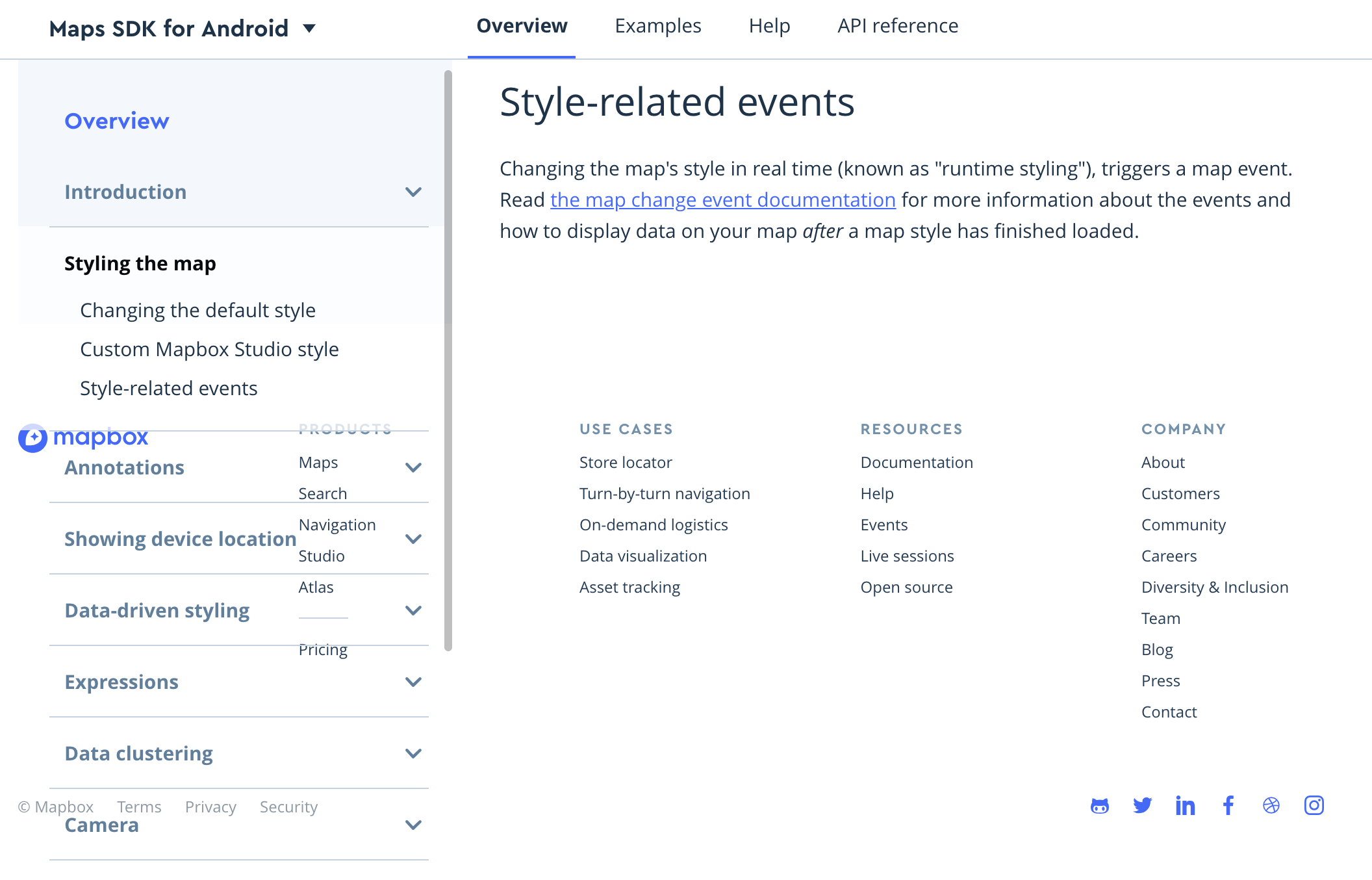
Programmatically adjust position of headings when using TopbarSticker

In docs-prose.css padding for h2 accommodates the TopbarSticker component that often appears at the top of our docs. Other heading do not include proper spacing wrt the top bar when using a hash. For example, an h3:

image

Is there a way we can programmatically adjust the position of headings on pages that use the TopbarSticker component?

cc @katydecorah

Add automated testing

This project does not currently have any automated testing, so all components must be tested manually before publishing. That's probably okay for now while our component count is so low, but will become cumbersome soon. We should add some automated testing once our initial group of components has been added.

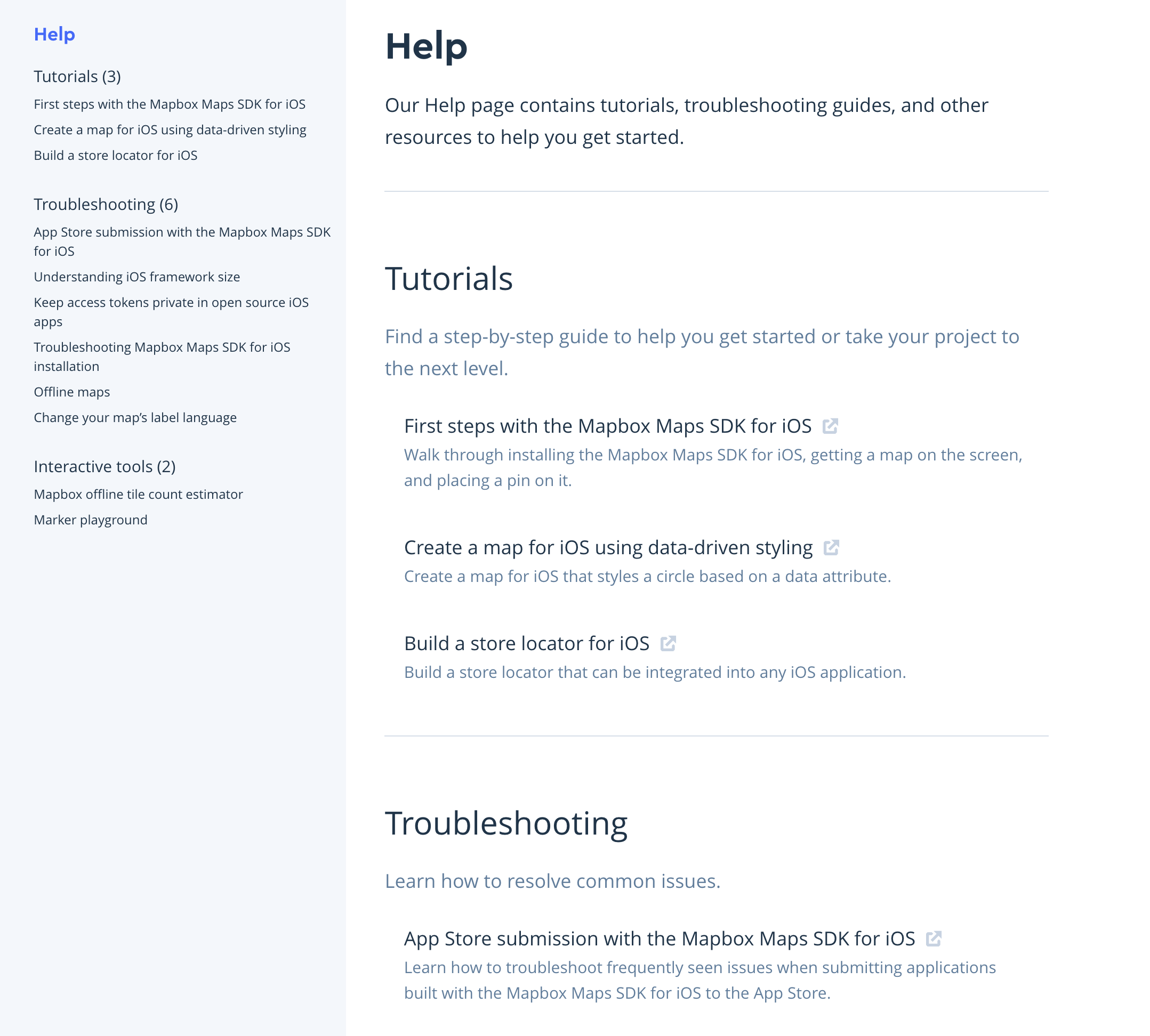
Add RelatedHelpGuides component

The RelatedHelpGuides component determines how the CardContainer and Card are placed on SDK pages that list related help pages.

Example in action

screencapture-mapbox-ios-sdk-maps-help-2018-07-16-09_01_52

Dependencies

None โ€” just arranges other components.

Props

  • frontMatter includes a title and description
  • cardContainers is an array of card containers

Things to discuss

Does it make sense to create a shared component at this level?

Starter code

Similar to the code in #19

Other potential docs components

I think we have issues open for all the components that we need to make sure that the structure of pages across repos are consistent. We could also consider adding components for:

  • Components that determine the layout of the content in the wider column in PageLayout, like:
  • Components that are used in Markdown files, like:
    • CodeLanguageToggle
    • ToggleableCodeBlock
    • SideBySideComparison

@danswick @davidtheclark do we want to work on those in this initial push? โ˜๏ธ

Add NavigationAccordion and NavigationDropdown component

Edit: TocMultiPage <--> NavigationAccordion , TocDropdown <--> NavigationDropdown

Here comes another double component issue. ๐Ÿ‘ฏโ€โ™‚๏ธ There are two types of tables of contents (so far) used in documentation. This one, TocMultiPage, lists guides on that are on multiple pages. It also relies on a TocDropdown component that appears on narrow screens.

Example in action

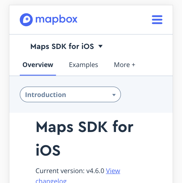
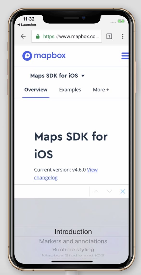
Here's an example from the Maps SDK for iOS docs:

image

Dependencies

This component relies on the Icon mapbox-react-component and a TocDropdown component that puts the first-level items into a dropdown on narrow screens.

Props

TocMultiPage:

  • currentPath comes from using withLocation in the PageShell component. It's used here to determine which item in the table of contents is active (and expanded).
  • sidebarContent is an object with all the items that should be included in the table of contents. It's very particular. There's a firstLevelToc object with the title and path for each separate guide and a secondLevelToc for the headings within the current active guide.

TocDropdown:

  • currentPath is used here to determine which item in the table of contents is active (and expanded).
  • dropdownOptions is just the firstLevelToc items.

Test cases

  • basic
  • section with no secondLevelToc items

Things to discuss

Nothing yet.

Starter code

TocMultiPage:

import React from 'react';
import PropTypes from 'prop-types';
import classnames from 'classnames';
import Icon from '@mapbox/react-icon';
import TocDropdown from './toc-dropdown';

class TocMultiPage extends React.PureComponent {
  static propTypes = {
    currentPath: PropTypes.string,
    sidebarContent: PropTypes.shape({
      firstLevelToc: PropTypes.arrayOf(
        PropTypes.shape({
          title: PropTypes.string.isRequired,
          path: PropTypes.string.isRequired
        })
      ).isRequired,
      seccondLevelToc: PropTypes.arrayOf(
        PropTypes.shape({
          level: PropTypes.number.isRequired,
          slug: PropTypes.string.isRequired,
          text: PropTypes.string.isRequired
        })
      )
    })
  };

  render() {
    const { props } = this;
    const secondLevelContent =
      props.sidebarContent.secondLevelToc &&
      props.sidebarContent.secondLevelToc.map(secondLevelTocItem => {
        return (
          <li key={secondLevelTocItem.slug} className="mt6">
            <a
              href={`#${secondLevelTocItem.slug}`}
              className="color-blue-on-hover text-decoration-none unprose"
            >
              {secondLevelTocItem.text}
            </a>
          </li>
        );
      });
    const firstLevelContent = props.sidebarContent.firstLevelToc.map(
      (page, index) => {
        const title = page.title;
        let icon = null;
        const isActive = this.props.currentPath === page.path;
        const breakLineClasses = classnames('py3 ', {
          'border-t border--gray-light': index !== 0
        });
        const textClasses = classnames('pl12 py12 txt-bold txt-m flex-child', {
          'color-black pb3': isActive
        });
        const activeSectionClasses = classnames(
          'pl24-mm px0 block-mm none pr12',
          {
            'bg-lighten75': isActive
          }
        );
        if (!isActive) {
          icon = (
            <Icon
              name="chevron-down"
              className="flex-child flex-child--no-shrink icon color-gray h24 w24"
            />
          );
        }
        return (
          <div key={index} className={activeSectionClasses}>
            <div className={breakLineClasses}>
              <a
                href={page.path}
                className="color-blue-on-hover color-gray text-decoration-none unprose flex-parent flex-parent--space-between-main flex-parent--center-cross"
              >
                <div className={textClasses}>{title}</div>
                {icon}
              </a>
              {isActive && secondLevelContent ? (
                <div className="ml24 pt0">
                  <ul className="txt-m pb12 inline-block-mm none color-blue-on-hover-anchor unprose">
                    {secondLevelContent}
                  </ul>
                </div>
              ) : (
                ''
              )}
            </div>
          </div>
        );
      }
    );
    return (
      <div>
        <div className="block-mm none">{firstLevelContent}</div>
        <div className="none-mm block bg-gray-faint shadow-darken10">
          <TocDropdown
            dropdownOptions={this.props.sidebarContent.firstLevelToc}
            currentPath={this.props.currentPath}
          />
        </div>
      </div>
    );
  }
}

export { TocMultiPage };

TocDropdown:

import React from 'react';
import PropTypes from 'prop-types';
import ControlSelect from '@mapbox/react-control-select';
import { routeToPrefixed } from '@mapbox/batfish/modules/route-to';

export default class TocDropdown extends React.Component {
  static propTypes = {
    dropdownOptions: PropTypes.arrayOf(
      PropTypes.shape({
        title: PropTypes.string.isRequired,
        path: PropTypes.string.isRequired
      })
    ).isRequired
  };

  render() {
    const optionsArray = this.props.dropdownOptions.map(option => {
      return {
        label: option.title,
        value: option.path
      };
    });
    let currentOption = optionsArray.filter(option => {
      return this.props.currentPath == option.value;
    });

    return (
      <div className="py24 px24 flex-parent flex-parent--space-between-main flex-parent--center-cross">
        <ControlSelect
          id="navigate-this-section"
          onChange={value => {
            routeToPrefixed(value);
          }}
          value={currentOption[0].value}
          options={optionsArray}
          themeControlSelect="select--stroke round-full bg-white"
          themeControlSelectContainer="flex-child flex-child--no-shrink"
        />
      </div>
    );
  }
}

Recommendations for SectionedNavgation

While examining the SectionedNavgation component I noticed a few patterns that may be confusing:

image

  1. The navbar's links have two different outcomes: the headers link within the page while the following links open a new page. I would expect that all links stay on the page or all links go to a new page.
  2. Since the navbar duplicates information within the content section, it's almost like we have two views competing on the page.
  3. In some instances the side navbar is long and requires a scrollbar. Users are potentially scrolling twice to navigate similar information.

Recommendation:

  • Only show the header links in the navbar and have them only link within the page. Similar to:

image

but with design updates to match the dr-ui theme.

@colleenmcginnis would love your opinion as this component is used by several other doc pages.

Consistent hover state in product menu trigger

aug-11-2018 09-41-38

Right now we have a pointing finger and underlined text when hovering over the text, but not when over the arrow. However, clicking on the arrow works just the same. It'd be preferable to have the entire clickable area respond in the same way to hover.

Add ToggleableCodeBlock and CodeToggle components

ToggleableCodeBlock and CodeToggle are used together when we want to show code that does the same thing, but using different languages. This can be different languages for a single platform (like Swift and Objective C for iOS examples) or languages across platforms (like API documentation examples).

A few requirements:

  • Both ToggleableCodeBlock and CodeToggle should be able to have any number of languages.
  • There should be able to be any number of ToggleableCodeBlocks per CodeToggle.
  • Preferred language should be able to be stored at the application level, so the language is pre-toggled to the last selected language when changing pages (iOS, Android, and Unity docs use the React's Context).
  • We'll want to ensure that the string that's used to identify the language is exactly the same for the code block and the code toggle.

Example in action

Here's an example in the iOS docs:

image

Here's an example of what we'll want to use these components for in /api-documentation:

image

Dependencies

  • highlight.js
  • @mapbox/react-code-snippet

Props

codeSnippet: PropTypes.arrayOf(
    PropTypes.shape({
      language: PropTypes.oneOf(['swift', 'objective-c', 'java', 'kotlin', 'javascript']),
      rawCode: PropTypes.string.isRequired,
      highlightedCode: PropTypes.string.isRequired,
      preferredLanguage: PropTypes.bool.isRequired
    })
).isRequired
onChange: PropTypes.func.isRequired,
options: PropTypes.arrayOf(
    PropTypes.shape({
      language: PropTypes.oneOf(['swift', 'objective-c', 'java', 'kotlin', 'javascript']).isRequired,
      preferredLanguage: PropTypes.bool.isRequired
    })
).isRequired

Things to discuss

There are a lot of things I'm unsure about re: these components, but I think it might be easier to get a PR up first and get some feedback there.

Add TocSinglePage component

@davidtheclark @danswick plz feel free to come up with a better name.

This is a different kind of table of contents that lists all the items on a single page.

Example in action

Here it is in the Maps SDK for iOS Examples page:

image

Dependencies

The current TocSinglePage component used in the Android, iOS, and Unity has a lot of dependencies (mostly data to go into the lists), but I think this should be cleaned up significantly and the data should be passed to this component as props instead.

Props

  • firstLevelItems
  • secondLevelItems
  • currentPath if we want to be able to show this table of contents on individual example pages, we probably also want to be able to determine which example is currently being displayed and apply some kind of active classes to it (txt-bold?)

Starter code

The current TocSinglePage component used in the Android, iOS, and Unity docs is kind of a mess -- is a lot of logic in there to get only of the examples for the product for that specific page and push the Getting started section to the top of the list. It might be better to start fresh, but here's the Android docs version in case we want to grab classes that determine the style of things.

Add PageLayout component

The PageLayout component creates a page with two columns โ€” a narrower one for a table of contents and a wider one for any kind of content. In the current docs, the kind of table of contents that is plugged into the layout is determined by page path โ€” it might make more sense to specify in the front matter of each .js or .md page file?

Example in action

Here's the PageLayout with a TocMultiPage table of contents in the iOS docs:

image

Dependencies

This component currently relies on an external component (https://github.com/yahoo/react-stickynode) to stick the container where the table of contents plugs in. It also includes the BackToTopButton that appears on narrow screens.

Props

  • sectionTitle is just a string that will be at the top of the narrow column (table of contents).
  • tocContent is a component that will render the table of contents that makes sense for each page and plug it into the narrow column.
  • any children will go into the wider column (main content).

Things to discuss

Does it make sense to determine which table of contents should be used in the parent component (in most cases PageShell) instead of here? Should we include the BackToTopButton as a part of this component or add it as a child of this component?

Starter code

import React from 'react';
import PropTypes from 'prop-types';
import BackToTopButton from './back-to-top-button';
import Sticky from 'react-stickynode';
import _ from 'lodash';

class PageLayout extends React.Component {
  static propTypes = {
    tocContent: PropTypes.node,
    sectionTitle: PropTypes.string
  };

  constructor(props) {
    super(props);
    this.state = {
      height: 0
    };
  }

  componentDidMount() {
    this.throttledHandleWindowResize();
    window.addEventListener('resize', this.throttledHandleWindowResize);
  }

  componentWillUnmount() {
    window.addEventListener('resize', this.throttledHandleWindowResize);
  }

  throttledHandleWindowResize = _.throttle(() => {
    const height = document.body.clientHeight;
    this.setState({
      bottomBoundaryValue: height - 450
    });
  }, 200);

  render() {
    
    return (
      <div className="grid grid--gut36 mr-neg36 mr0-mm">
        <div className="col col--4-mm col--12 bg-gray-faint px0 mt0-mm mt60">
          <Sticky
            enabled={true}
            bottomBoundary={this.state.bottomBoundaryValue}
            innerZ={1}
            top={50}
            activeClass="bg-gray-faint shadow-darken-10"
          >
            <div className="txt-ms pt24-mm pt0 viewport-almost-mm scroll-auto mt-neg60 mt0-mm">
              <div className="txt-l color-blue txt-fancy ml36 mb12 block-mm none">
                {this.props.sectionTitle}
              </div>
              {this.props.tocContent}
            </div>
          </Sticky>
        </div>
        <div
          id="docs-content"
          className="col col--8-mm col--12 mt24 mb60 pr0-mm pr36 prose"
        >
          {this.props.children}
          <BackToTopButton />
        </div>
      </div>
    );
  }
}

export { PageLayout };

Unstick sidebar content when going to a hash

When going directly to a hash very far down on a page (for example) the sidebar content in the PageLayout component should not stick, but it does.

image

@davidtheclark I'm wondering if it's a matter of the order in which things are happening because as soon as I scroll on the page the Sticky component snaps up to where it should be. Is there something I could do in componentDidMount if there is a hash in the URL? Or maybe it's more of an issue with the Sticky component we're using? Let me know if you have any thoughts that I could further ๐Ÿ•ต๏ธโ€โ™€๏ธ .

componentDidMount() {
this.debounceHandleWindowResize();
window.addEventListener('resize', this.debounceHandleWindowResize);
}

cc @samfader

Add TopNavTabs component

The TopNavTabs component is used inside the StickyTopNav and allows users to navigate between the subfolders in each product folders (src/pages/maps/ <-- for example, all the sub folders in there).

Example in action

image

Dependencies

There is a generic TabList component in progress in /mapbox-react-components that should be finished before working on this docs-specific component (cc @davidtheclark). This component will also sometimes rely on an ApiReferenceDropdown component when there are multiple API references relevant to the docs site (example) or when we want to show multiple reference for multiple versions (example).

Props

This component has two props:

  • activeTab to determine which tab should be styled as active.
  • options, which is passed to this component from the PageShell using dataSelector to find all the subfolders in each product folder. The "API reference" tab is appended to the dataSelector results since there is no api folder in the product folders. There is some custom code between iOS, Unity, and Android docs right now to account for what should happen with the API reference tab (so we'll have to find a solution that allows that flexibility).

Things to discuss

๐Ÿคทโ€โ™€๏ธ TBD

Starter code

This will be significantly different than the version in the current live docs when the TabList mapbox-react-component ships, but here's what it currently looks like for in the Android docs.

Update bottomBoundaryValue when new docs-page-shell lands

Just want to note that we'll want to adjust the bottomBoundaryValue in the PageLayout component when the new docs-page-shell lands. This value determines when the table of contents in the sidebar should unstick at the bottom of the page. That 450 value is specific to the bigger footer that we are currently using in the page shell. The new docs-page-shell will have a much smaller footer so we'll want to adjust.

bottomBoundaryValue: height - 450

cc @katydecorah

bring up-to-date with mr-ui

While working on #80 I found that it uses deprecated mr-ui components, which makes testing a little tricky. I also found a few other props/components in this repo have since been deprecated. Not urgent, but something to tackle in the new year.

Create a Note component

Notes like this one are used in both /help and /studio-manual. We should create a shared component.

image

Add a changelog

We should add a changelog and maybe add instructions for writing changelog entries in the README.

cc @danswick

fix #docs-content css

An id attribute should be unique to a page. To use these styles:

#docs-content.prose h1 {
margin-top: 6px;
margin-bottom: 30px;
font-size: 36px;
}
#docs-content.prose h2 {
font-weight: normal !important;
cursor: pointer;
font-size: 30px;
border-top: 1px solid !important;
border-color: #d6dee8 !important;
padding-top: 60px;
margin: 36px 0px 18px;
}
#docs-content.prose h3 {
font-weight: normal;
cursor: pointer;
font-size: 24px;
padding-top: 40px;
}

you must have the id docs-content and class prose on the same element. Since #docs-content is added to the page here:

<div
id="docs-content"
className="col col--8-mm col--12 mt24-mm mb60 pr0-mm px12 px36-mm"

we must add a second #doc-content element to a page to be able to use those classes

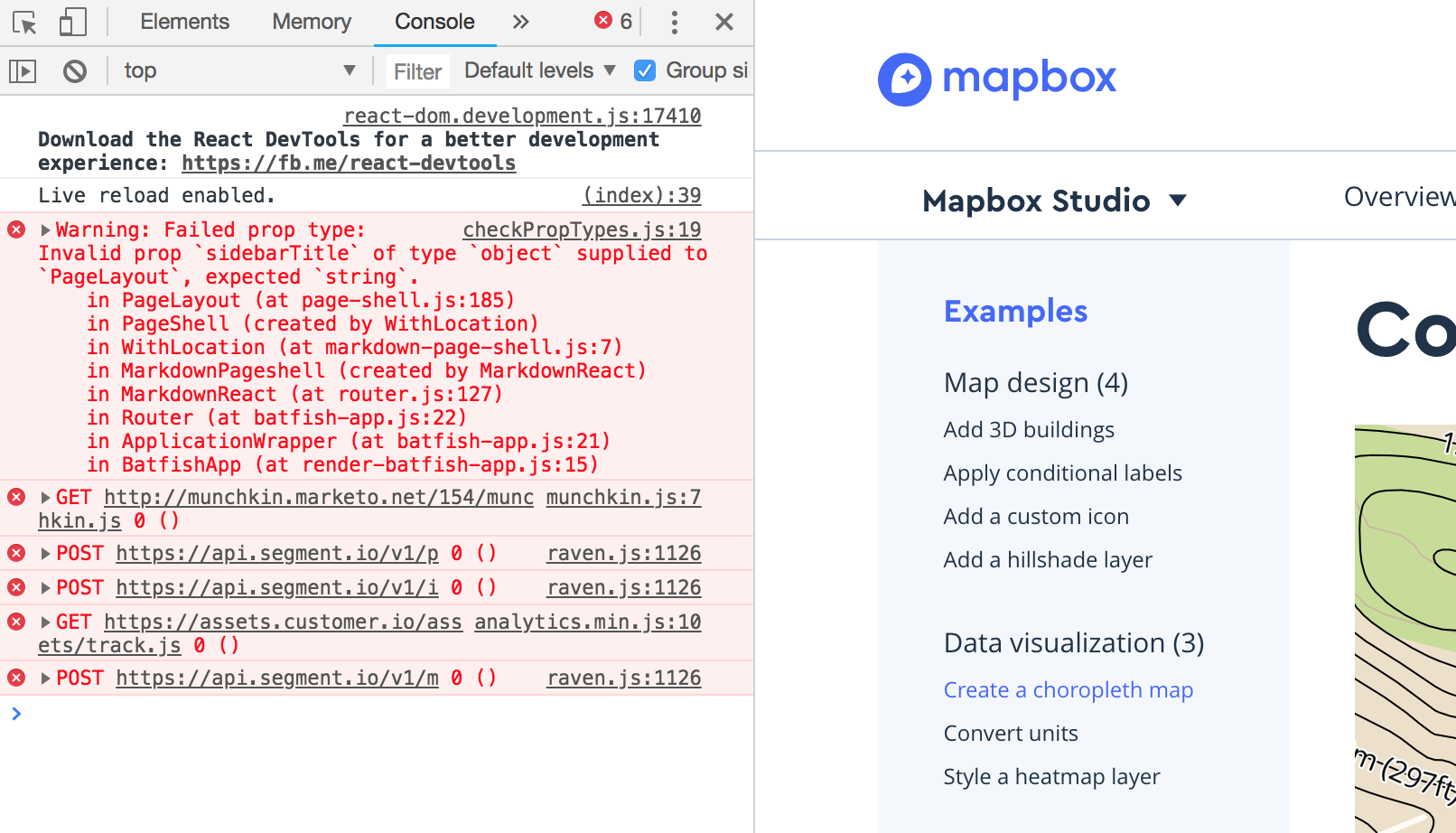
Change sidebarTitle prop type

In PageLayout, change sidebarTitle prop type to node (or string?). We need to add margin/padding to position the title.

image

Add prism.css

We load prism.css into many sites, we should add it here as well so we can also make sure the styling is consistent.

add `round` class to `Note`

I think we should add the round class to the Note component. We often round edges on elements with backgrounds. To me, the unrounded corners of a note look very obvious when near another element with rounded corners. Example:

image

Update Mapbox Studio URL

Update URL for Mapbox Studio in the src/data/product-menu-items.js file so Mapbox Studio is highlighted with links containing /studio-manual/.

image

Add ProductMenu and ProductMenuDropdown component

This is a double component issue. ๐Ÿ‘ฏ The ProductMenu is essentially a stylized version of the PopoverTrigger mapbox-react component. The ProductMenuComponent is rendered and added as the content prop in the ProductMenu component.

Example in action

Here it is in the Android docs:

image

Dependencies

The ProductMenu component uses:

  • The mapbox-react-component @mapbox/react-popover-trigger.
  • A data file called src/data/product-nav-items.js. This is probably the most important thing to share between repos. The items in the dropdown should be identical in every repo. I'm not sure what the best approach is for storing this so that it can be updated when new docs sites are added.
  • The ProductMenuDropdown is rendered and passed to PopoverTrigger as the value for the content prop (not sure if that's the best approach).
    • The mapbox-react-component @mapbox/react-icon.
    • It is passed that product-nav-items.js data file from above โ˜๏ธ .

Props

ProductMenu:

  • platform, which it gets from the PageShell in the current docs)
  • product, which it also gets from the PageShell in the current docs)

ProductMenuDropdown:

  • categories that come from the product-nav-items.js data file

Things to discuss

What's the best way to factor in the product-nav-items.js data file? Should these be two components or should they be combined?

Starter code

ProductMenu (Android docs version):

import React from 'react';
import PropTypes from 'prop-types';
import PopoverTrigger from '@mapbox/react-popover-trigger';
import Icon from '@mapbox/react-icon';
import { ProductMenuDropdown } from './product-menu-dropdown';
import { ProductNavItems } from '../data/product-nav-items.js';

const popoverProps = {
  placement: 'bottom',
  themePopover: 'round shadow-darken25 h480 scroll-auto'
};

class ProductMenu extends React.PureComponent {
  static propTypes = {
    platform: PropTypes.string.isRequired,
    product: PropTypes.string.isRequired
  };

  renderMenu() {
    return <ProductMenuDropdown categories={ProductNavItems} />;
  }

  onPopoverOpen = () => {
    this.setState({ open: true });
  };

  onPopoverClose = () => {
    this.setState({ open: false });
  };

  render() {
    return (
      <PopoverTrigger
        content={this.renderMenu}
        popoverProps={popoverProps}
        onPopoverOpen={this.onPopoverOpen}
        onPopoverClose={this.onPopoverClose}
      >
        <div className="fl wmax240-ml wmax180-mm flex-parent flex-parent--space-between-main flex-parent--center-cross">
          <div className="flex-child inline-block txt-fancy txt-l cursor-pointer border-b border-b--2 border--white border--blue-on-hover txt-truncate">
            {this.props.product} SDK for {this.props.platform}
          </div>
          <Icon
            name="caret-down"
            inline={true}
            className="flex-child fr icon h30 w30"
          />
        </div>
      </PopoverTrigger>
    );
  }
}

export { ProductMenu };

ProductMenuDropdown (Android docs version):

import React from 'react';
import PropTypes from 'prop-types';
import classnames from 'classnames';
import Icon from '@mapbox/react-icon';

class ProductMenuDropdown extends React.PureComponent {
  static propTypes = {
    categories: PropTypes.arrayOf(
      PropTypes.shape({
        productCategory: PropTypes.string.isRequired,
        icon: PropTypes.string.isRequired,
        products: PropTypes.arrayOf(
          PropTypes.shape({
            name: PropTypes.string,
            url: PropTypes.string,
            items: PropTypes.arrayOf(
              PropTypes.shape({
                text: PropTypes.string.isRequired,
                url: PropTypes.string.isRequired
              })
            )
          })
        ).isRequired
      })
    ).isRequired
  };

  render() {
    const categoryLength = this.props.categories.length;
    const activeDotStyle = {
      content: '',
      width: '6px',
      height: '6px',
      borderRadius: '3px',
      background: '#4264fb',
      position: 'absolute',
      margin: '10px 0 0 -12px',
      display: 'none'
    };
    const allCategories = this.props.categories.map((category, index) => {
      const allProducts = category.products.map((product, index) => {
        const liClasses = classnames('mt6 relative ', {
          'txt-bold': product.url && location.pathname.indexOf(product.url) > -1
        });
        const dotClasses = classnames({
          'inline-block': location.pathname.indexOf(product.url) > -1,
          none: location.pathname.indexOf(product.url) < 0
        });
        return (
          <li className={liClasses} key={index}>
            <div style={activeDotStyle} className={dotClasses} />
            <a href={product.url} className="color-blue-on-hover">
              {product.name}
            </a>
          </li>
        );
      });
      const categoryClasses = classnames('wmin240 py24', {
        'border-b border--gray-light': index < categoryLength - 1
      });
      return (
        <div className={categoryClasses} key={index}>
          <div className="txt-bold color-gray">
            <Icon
              name={category.icon}
              inline={true}
              className="icon mb-neg6 mr6 h20 w20 color-gray inline"
            />
            {category.productCategory}
          </div>
          <ul className="ml24">{allProducts}</ul>
        </div>
      );
    });
    return (
      <div>
        <div className="px24 pb24">{allCategories}</div>
        <div className="bg-gray-faint">
          <div className="py24 px24 txt-bold">
            <a href="/help/">Help page</a>
          </div>
        </div>
      </div>
    );
  }
}

export { ProductMenuDropdown };

Adjust existing components

After trying out most of the components we currently have in this repo in the context of a new docs site ๐ŸŽ‰ , there are a few minor adjustments we should make:

  1. Remove left margin from NavigationAccordion.

image

  1. Introduce the top prop for the Sticky component as a prop in its parent component PageLayout so we can stick it to the top on narrow screens.

top-react-sticky-node

  1. Remove the title from ExamplesPage.
  2. Consider renaming Mapbox Studio manual to Mapbox Studio for consistency and moving to the Maps section.

cc @danswick

Name change

Always gotta rename things at least once!

I realize now that frontend-documentation is potentially pretty confusing, since this isn't documentation about frontend.

How about @mapbox/documentation-uikit โ€” which would still leave the door open to non-react things? Or, if @colleenmcginnis feels confident it can be focused on React components, @mapbox/documentation-components?

[proposal] create a `CodePen` component for interactive code snippets

CodePen offers prefill embeds: https://blog.codepen.io/documentation/prefill-embeds/

CodePen Prefill Embeds are designed to render that code for you in a safe and isolated environment to help your users see, understand, and play with it more easily.

I think it would be fun to explore a component that would allow us to transform a code example into an interactive embed. I think this would be great for user adoption, especially on example pages, since the user will essentially be able to fork the code and play around with it.

Sticky sidebar nav vertical overflow problem

If the sticky sidebar nav has enough content that it vertically overflows the viewport, there is no way to see the lower content without scrolling to the bottom of the page itself:

2018-07-27 at 9 47 am

This is a tricky stickiness bug.

Add `CardContainer` component

The CardContainer component organizes cards (examples, tutorials, etc.) into topics/sections and adds a title to the grouping of cards.

Example in action

image

Dependencies

Should it include the ExampleCard (or TutorialCard or DocCard) or should an array of cards be passed as a prop?

Props

  • category object with a title and path
  • cards an array of all the cards for this category

Things to discuss

n/a

Starter code

Here's the Example

import React from 'react';
import PropTypes from 'prop-types';
import { ExampleCard } from './example-card';

class ExampleSection extends React.PureComponent {
  static propTypes = {
    category: PropTypes.shape({
      title: PropTypes.string.isRequired,
      path: PropTypes.string.isRequired
    }).isRequired,
    examples: PropTypes.array.isRequired
  };

  render() {
    const categoryID = this.props.category.path.split('#')[1];
    const allExampleCards = this.props.examples.map((example, index) => {
      return (
        <ExampleCard
          key={index}
          exampleTitle={example.title}
          exampleUrl={example.path}
          exampleDescription={example.description}
          exampleThumbnail={example.thumbnail}
        />
      );
    });
    return (
      <div>
        <a
          href={`${this.props.category.path}`}
          className="unprose mb12 block color-blue-on-hover"
        >
          <h2 className="pt60 txt-l txt-capitalize-first" id={categoryID}>
            {this.props.category.title} ({this.props.examples.length})
          </h2>
        </a>
        <div className="grid grid--gut12 card-container">{allExampleCards}</div>
      </div>
    );
  }
}

export { ExampleSection };

[Card] apply different styling when no image

If a Card has no image, the text-based layout produces quite a bit of spacing. I'm thinking we could switch the style a little bit to adjust the spacing and add a border divider, something like this:

image

Add ExamplesPage component

The ExamplesPage component determines how the CardContainer and DocCard are placed on SDK examples pages.

Example in action

image

Dependencies

None โ€” just arranges other components.

Props

  • frontMatter includes a title and description
  • cardContainers is an array of card containers

Things to discuss

Does it make sense to create a shared component at this level?

Starter code

import React from 'react';
import PropTypes from 'prop-types';

class ExamplesPage extends React.PureComponent {
  render() {
    const { props } = this;
    const renderedContainers = props.cardContainers.map((container, index) => {
      return <div key={index} className="pt60">{container}</div>;
    });
    return (
      <div>
        <h1 className='txt-h1 txt-fancy mb24'>{props.frontMatter.title}</h1>
        {renderedContainers}
      </div>
    );
  }
}

ExamplesPage.propTypes = {
  frontMatter: PropTypes.shape({
    title: PropTypes.string.isRequired,
    description: PropTypes.string.isRequired
  }).isRequired,
  cardContainers: PropTypes.arrayOf(PropTypes.node).isRequired
};

export { ExamplesPage };

Add StickyTopNav component

The StickyTopNav (open to better names) and the components that end up inside it are the ๐Ÿšจ highest priority ๐Ÿšจ since it is most important that these are visually and functionally consistent as users navigate between docs sites.

Example in action

Here's what it looks like in the iOS docs:

image

Dependencies

This component currently relies on an external component (https://github.com/yahoo/react-stickynode) to stick it to the top of the window. This external Sticky component wraps around a div and children go inside.

Props

Realizing that there are no specific props needed now that ProductMenu and TopNavTabs are added as children of this component in PageShell rather than being added in this component.

Things to discuss

Would this be better as a generic mapbox-react-component? If it was, then we could make a DocTopNav instead that uses the generic StickyTopNav, but also asserts what should go in it and where (ProductMenu and TopNavTabs like is done here in the Android docs).

Starter code

(After cleaning up unnecessary things from the Android docs version)

import React from 'react';
import PropTypes from 'prop-types';
import Sticky from 'react-stickynode';
import _ from 'lodash';

class StickyTopNav extends React.PureComponent {
  constructor(props) {
    super(props);
    this.state = {
      isStuck: false,
      bottomBoundaryValue: 0
    };
  }

  componentDidMount() {
    this.throttledHandleWindowResize();
    window.addEventListener('resize', this.throttledHandleWindowResize);
  }

  componentWillUnmount() {
    window.addEventListener('resize', this.throttledHandleWindowResize);
  }

  throttledHandleWindowResize = _.throttle(() => {
    const width = document.body.clientWidth;
    const height = document.body.clientHeight;
    this.setState({
      isStuck: width > 640,
      bottomBoundaryValue: height - 400
    });
  }, 200);

  render() {
    return (
      <Sticky
        enabled={this.state.isStuck}
        top={0}
        bottomBoundary={this.state.bottomBoundaryValue}
        innerZ={2}
      >
        <div
          className="border-t border-b border--gray-light pt12 bg-white w-full"
        >
          {this.props.children}
        </div>
      </Sticky>
    );
  }
}

export { StickyTopNav };

Recommend Projects

  • React photo React

    A declarative, efficient, and flexible JavaScript library for building user interfaces.

  • Vue.js photo Vue.js

    ๐Ÿ–– Vue.js is a progressive, incrementally-adoptable JavaScript framework for building UI on the web.

  • Typescript photo Typescript

    TypeScript is a superset of JavaScript that compiles to clean JavaScript output.

  • TensorFlow photo TensorFlow

    An Open Source Machine Learning Framework for Everyone

  • Django photo Django

    The Web framework for perfectionists with deadlines.

  • D3 photo D3

    Bring data to life with SVG, Canvas and HTML. ๐Ÿ“Š๐Ÿ“ˆ๐ŸŽ‰

Recommend Topics

  • javascript

    JavaScript (JS) is a lightweight interpreted programming language with first-class functions.

  • web

    Some thing interesting about web. New door for the world.

  • server

    A server is a program made to process requests and deliver data to clients.

  • Machine learning

    Machine learning is a way of modeling and interpreting data that allows a piece of software to respond intelligently.

  • Game

    Some thing interesting about game, make everyone happy.

Recommend Org

  • Facebook photo Facebook

    We are working to build community through open source technology. NB: members must have two-factor auth.

  • Microsoft photo Microsoft

    Open source projects and samples from Microsoft.

  • Google photo Google

    Google โค๏ธ Open Source for everyone.

  • D3 photo D3

    Data-Driven Documents codes.