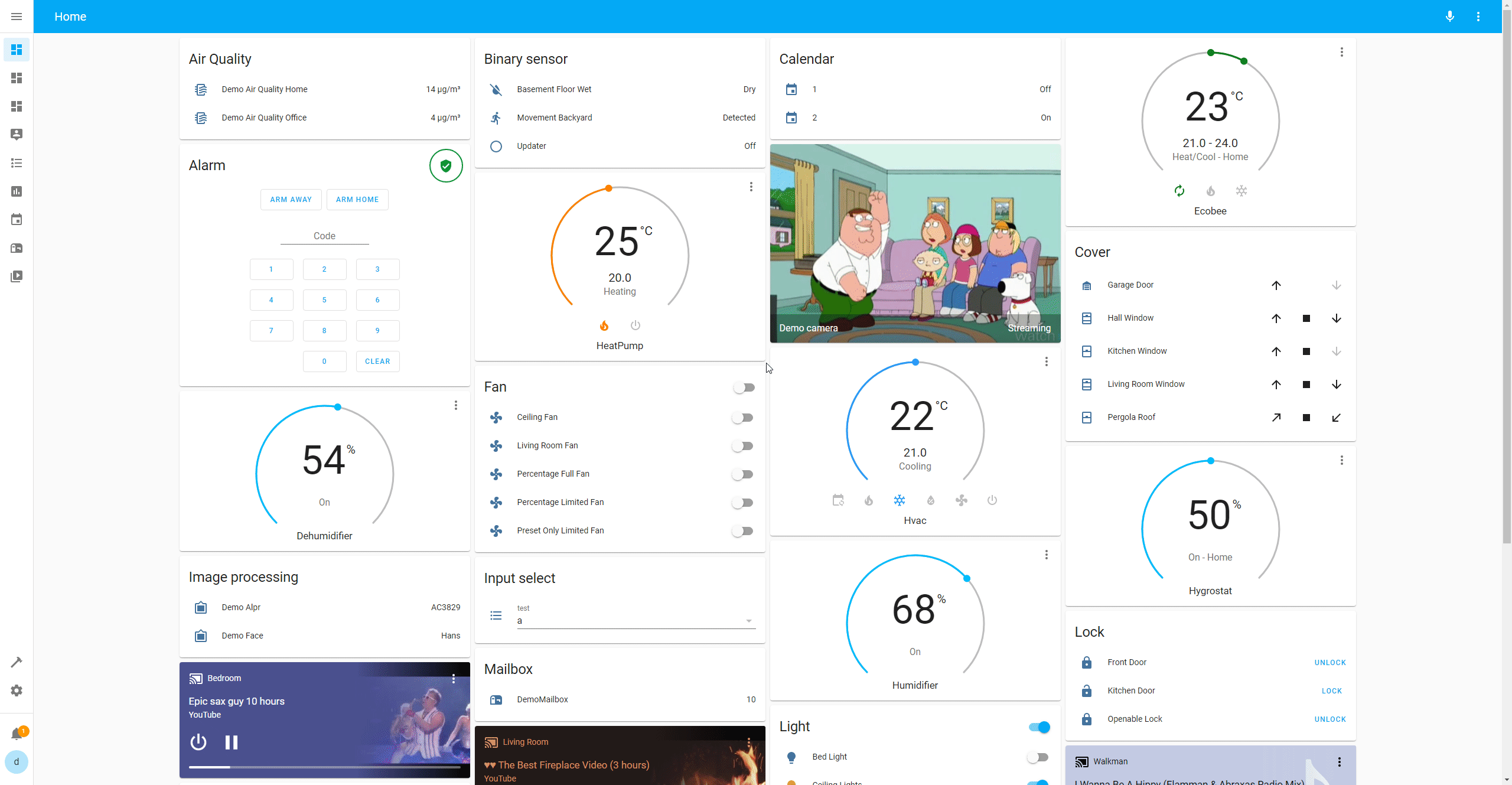
Get more control over the placement of lovelace cards
For installation instructions see this guide.
- Go to one of your lovelace views and select "Edit Dashboard"
- Click the pencil symbol next to the view name to open up the view properties
- Select "Masonry (layout-card)" from the "View type" dropdown list
- Click "Save"
Hopefully, you should see no difference at all now.
- Enter the following in the "Layout Options" box:
width: 300
max_cols: 10
- Click Save
You should now have more, narrower, collumns of cards in your view.
Please note that the "LAYOUT" tab in the animation below is now incorporated in the "SETTINGS" tab instead.
Layout-card adds four new view layout to lovelace.
- Masonry (
custom:masonry-layout) - Horizontal (
custom:horizontal-layout) - Vertical (
custom:vertical-layout) - Grid (
custom:grid-layout)
The difference between the types of layout is described below.
Those can be selected either via the GUI as in the Quick Start above, or in the lovelace configuration by setting type (and optionally layout):
views:
  - title: Home
    type: custom:masonry-layout
    layout:
      width: 300
      max_cols: 10
cards: ...If needed, any layout can also be used inside a lovelace-card by using layout-card:
type: custom:layout-card
layout_type: custom:masonry-layout
layout:
  width: 300
  max_cols: 10
cards: ...
Layout-card will take its cards and place them within itself according to the specified layout.
layout: takes the same options as is the view configuration for a layout.
NOTE: Please be aware that
layout-cardis itself a CARD, and cannot be wider than any other cards in the same view.
All cards you specify within it must fit inside this same width.
Thuslayout-cardis of limited use except in panel mode.
NOTE 2: The "default" layout option for layout-card (which you'll see if you're using the GUI lovelace editor) uses the default layout engine of lovelace. It's basically the same as the Horizontal layout, but without any options, without being able to hide cards and with the number of columns based on the width of the window rather than the layout-card.
I don't recommend using it, but it's there.
For some layout types, special options can be attached to each card. This is done in the view_layout parameter, e.g:
type: entities
entities:
  - light.bed_light
view_layout:
column: 2Layout card adds a special card called layout-break which can be used to change how some layouts work.
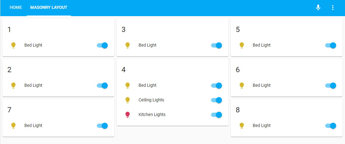
type: custom:layout-breakLayout-card introduces four layouts.
- Masonry
- Horizontal
- Vertical
- Grid
The first three are column based and work similarly:
- A number of evenly sized columns is prepared based on available space, the
widthoption and themax_colsoption. - The cards are placed into the columns one at a time in a method depending on the current layout.
- Any empty columns are removed.
- The remaining columns are placed centered on screen.
All column based layouts accept the following layout options:
| Option | Values | Description | Default |
|---|---|---|---|
width |
number | Size in pixels of each column | 300 |
max_width |
number | Maximum width of a card | 1.5 * width if specified otherwise 500 |
max_cols |
number | Maximum number of columns to show | 4 if sidebar is hidden 3 if sidebar is shown |
rtl |
true/false |
Place columns in right-to-left order | false |
column_widths |
special | A grid-template-columns specification of column widths |
none |
margin |
string | A CSS margin applied to the layout itself | 4px 4px 0px 4px |
padding |
string | A CSS padding applied to the layout itself | 0px |
height |
string | A CSS height applied to the layout itself | auto |
card_margin |
string | CSS margin applied to each card in the layout | var(--masonry-view-card-margin, 4px 4px 8px) |
reflow |
true/false |
If true the layout will get reorganized when cards are hidden (e.g. with conditional or entity-filter cards). May cause performance issues. |
false |
NOTE: Even if
column_widthsis specified, the number of columns displayed will only depend on the available space,widthandmax_cols. If you get weird results, consider the Grid Layout.
NOTE 2: If you're migrating from layout-card "1.0" (v16 - sorry about the version number confusion), this is significantly fewer options than you are used to.
The reason for this is twofold.
First: Maintainability. As Home Assistant and Lovelace evolves, it grows increasingly more difficult to keep up the more options you want to keep alive.
Second: Usability. I want to focus on fewer options and doing the right thing out of the box instead. And the three remaining options actually have much more impact than you'd think.If you want more fine-grained controll (e.g. variable sized columns), please take a look at the Grid layout.
In general, I recommend starting over with a grid view, rather than trying to convert an old layout-card based setup. You'll likely have better results.
The masonry layout immitates the default layout of lovelace.
- Each card is assigned a height based on their contents. One height unit corresponds to roughly 50 pixels, but this may vary.
- When a card is placed in the layout, it is put in the first column which has a total height of less than
min_heightunits.
Otherwise it is put it the shortest column.
The masonry layout accepts the following layout options (besides the ones mentioned above):
| Option | Values | Description | Default |
|---|---|---|---|
min_height |
number | Minimum number of card height units in a column before the next one is considered | 5 |
The horizontal layout will add each card to the next column, looping back to the first one when necessary:
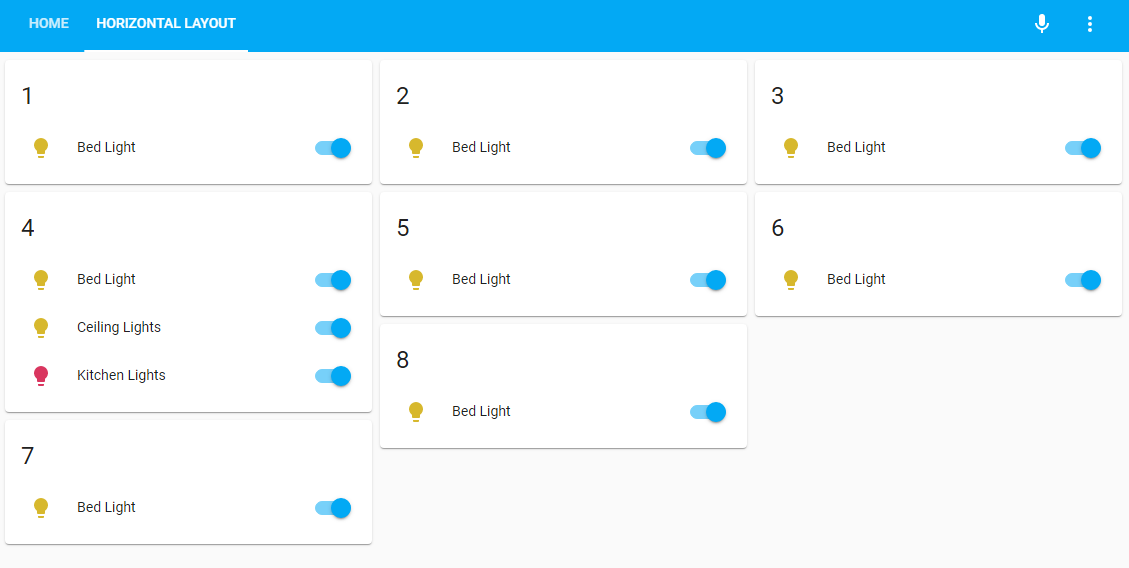
A layout-break card will cause the next card to be placed in the first column.
The horizontal layout accepts the following card view_layout options:
| Option | Values | Description | Default |
|---|---|---|---|
column |
number | Which column to place the card in. Following cards will be placed in the next column. |
The vertical layout will add each card to the same column as the previous one.
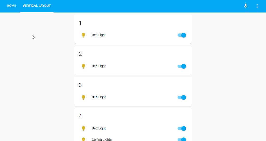
A layout-break card will cause the next card to be placed in the next column.
The vertical layout accepts the following card view_layout options:
| Option | Values | Description | Default |
|---|---|---|---|
column |
number | Which column to place the card in. Following cards will be placed in the same column. |
The grid layout will give you full controll of your cards by leveraging CSS Grid.
The grid layout accepts any option starting with grid- that works for a Grid Container as well as grid, place-items and place-content.
The layout options margin, padding and height also apply as for column based layouts.
Furthermore, the special option mediaquery can be used to set grid options depending on currently matched @media rules. This helps immensely in creating fully responsive layouts.
Please see the example code accompanying the screen recording below.
Note that only the first matching rule will be applied.
For the card view_layout options. the grid layout accepts any css grid property starting with grid- that works for a Grid Item as well as place-self.
There's no point in me trying to list all grid- options here. Instead see the excellent guide linked above.
Yaml code
Configuration for view:
title: Grid layout
type: custom:grid-layout
layout:
grid-template-columns: auto 30px 25%
grid-template-rows: auto
grid-template-areas: |
"header header header"
"main . sidebar"
"footer footer footer"
mediaquery:
"(max-width: 600px)":
grid-template-columns: 100%
grid-template-areas: |
"header"
"sidebar"
"main"
"footer"
"(max-width: 800px)":
grid-template-columns: 50% 50%
grid-template-areas: |
"header sidebar"
"main main"
"footer footer"
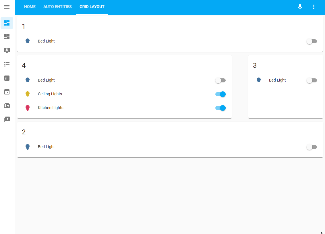
cards:
- type: entities
entities:
- entity: light.bed_light
title: "1"
show_header_toggle: false
view_layout:
grid-area: header
- type: entities
entities:
- entity: light.bed_light
title: "2"
show_header_toggle: false
view_layout:
grid-area: footer
- type: entities
entities:
- entity: light.bed_light
title: "3"
show_header_toggle: false
view_layout:
grid-area: sidebar
- type: entities
entities:
- light.bed_light
- light.ceiling_lights
- light.kitchen_lights
title: "4"
show_header_toggle: false
view_layout:
grid-area: mainIndividual cards can be displayed or hidden with the view_layout option show, e.g:
- type: entities
  title: Always show
  ...
  view_layout:
    show: always
- type: entities
  title: Never show
  ...
  view_layout:
    show: never
The options show: always and show: never are honestly quite pointless... but there's a cooler option:
type: entities
title: Never show
---
view_layout:
  show:
    mediaquery: <mediaquery>
This card will only be displayed if the @media rule <mediaquery> is a match.
Example:
- type: markdown
  content: |
    This is only shown on screens more than 800 px wide
  view_layout:
    show:
      mediaquery: "(min-width: 800px)"
- type: markdown
  content: |
    This is only shown on screens less than 400 px wide
  view_layout:
    show:
      mediaquery: "(max-width: 400px)"
- type: markdown
  content: |
    This is only shown on touch screen devices
  view_layout:
    show:
      mediaquery: "(pointer: coarse)"
Another option is this:
- type: entities
  title: Show only when sidebar is hidden
  view_layout:
    show:
      sidebar: hidden
- type: entities
  title: Show only when sidebar is visible
  view_layout:
    show:
sidebar: shownLayout card includes gap-card which can be used to insert empty space in any layout:
type: custom:gap-card
height: <height (optional)>
size: <size (optional)>
height is the height of the gap in pixels (default: 50)
size is the height of the card the layout engine will see in height units (default: pixel height / 50)
Layout card can be used with cards that populate an entities: list, like Entity Filter or auto-entities.
If no card type is explicitly specified for the entries, the Entity card will be used.
Example:
- type: 'custom:auto-entities'
        filter:
          include:
            - domain: light
              options:
                type: light
            - domain: sensor
          exclude: []
        card:
          type: 'custom:layout-card'
          cards: []
          layout_type: masonry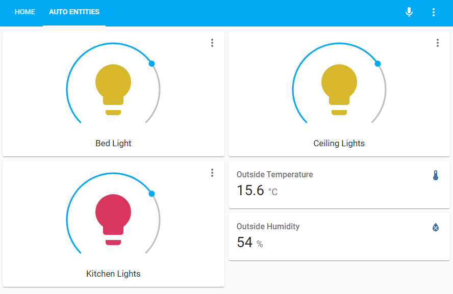


 React
React
 Typescript
 Django
 Laravel
 Facebook
 Microsoft
 Google
 Alibaba
 D3
D3
 Tencent