Puzzle Tokens is a Sketch plugin to specify and apply design tokens (in LESS or SCSS format) to Sketch layers (with shared styles) with auto styles preview generation.
Check this article to get a detailed overview with examples and join Discussions for live talk
- Download zip file
- Unarchive and install
- Download and install Node.js
- Instal less or sass using the following Terminal commands:
sudo -s
npm i less -g
npm i sass -g
- Now you're good to go!
- Download Example 1.
- Open Library.sketch file in Sketch.app
- Run Plugins > Puzzle Tokens > Apply Design Tokens menu command
- Specify LESS file according to screenshot
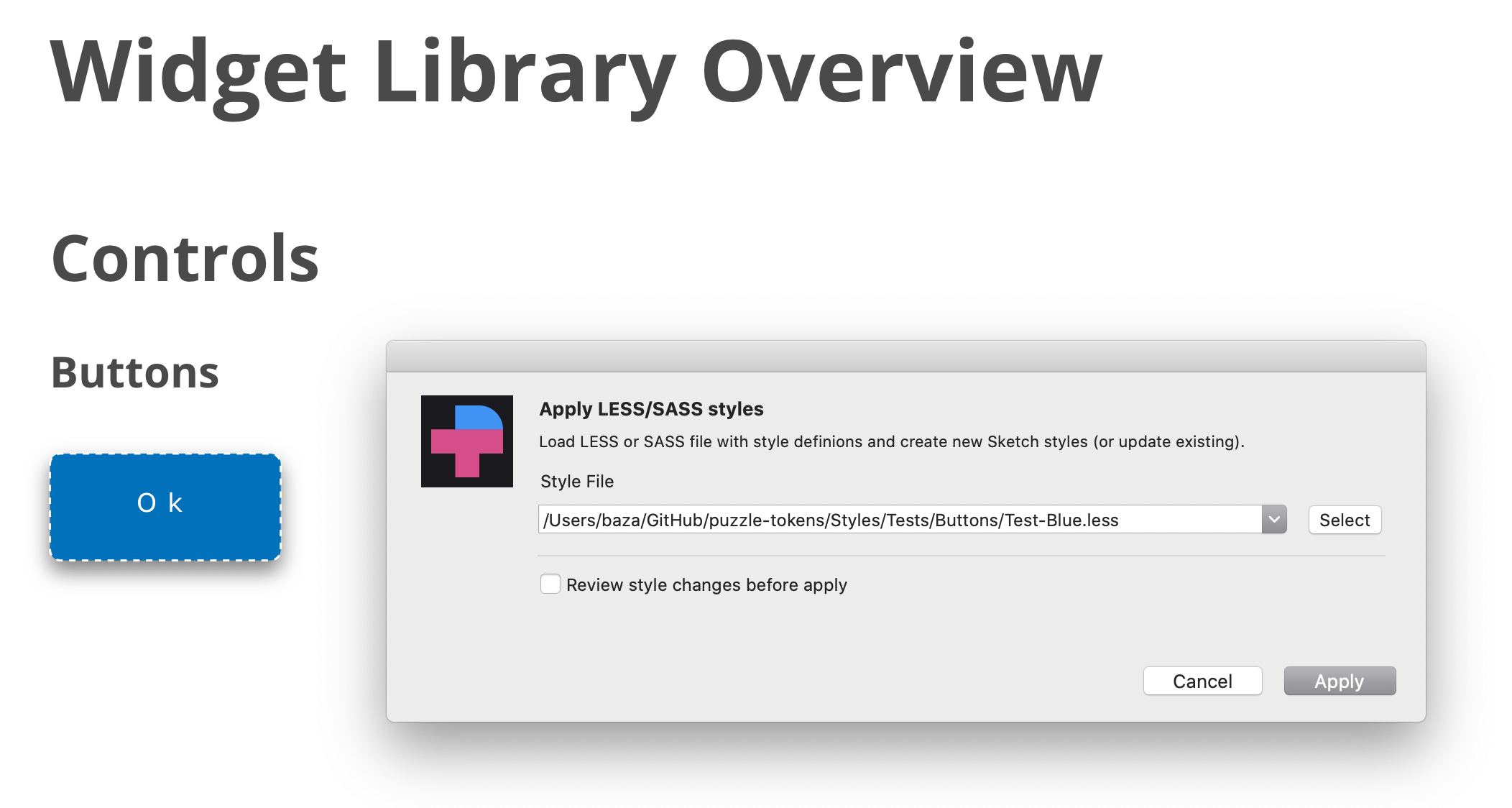
- Repeat the same operation, but select "tokens-blue.less" file. See how styles and widgets look now.
The following CSS styles are supporting.
// Text Layers

.TextStyle {
    // Sketch only styles
    pt-paragraph-spacing:  23.33;
    pt-text:               "New text content";
    -pt-text-size-behaviour: fixed-size;    // or "auto-height" or  "auto-width"

    // CSS native styles
    font-size:             12px;
    font-family:           "Open Sans";     // or "Open Sans","Times New Roman"
    font-weight:           bold;            // or extra-light, light, regular, medium, semibold, bold OR fa-solid (special trick to define FontAwesome solid icon)
    font-style:            italic;          // or normal
    line-height:           1.0;             // or 1.2 or 1.5 or any other mulitplier for font-size OR 10px
    color:                 #FFFFFF;         // HEX value OR any other CSS-compatible color values, such as red or black OR color variable name in double quotes
    opacity:               63%;             // supported "63%" or "0.42"
    text-transform:        uppercase;       // "uppercase", "lowercase", "none"
    text-decoration:       underline;       // "underline", "line-through"
    text-align:            left;            // "left", center", "right", "justify"
    vertical-align:        top;             // "top", "middle", "bottom"
    letter-spacing:        10px;            // <value>px OR "normal"
}

// Shape layers

.ShapeStyle {
    // SKETCH only properties
    border-position:       center;    // center OR inside OR outside
    border-line-end:            butt;      // butt / round / projecting
    border-line-join:           miter;     // miter / round / bevel
    border-start-arrowhead:     openarrow; // none / openarrow / filledarrow / opencircle / filledcircle / opensquare / filledsquare
    border-end-arrowhead:       openarrow; // none / openarrow / filledarrow / opencircle / filledcircle / opensquare / filledsquare
    -pt-border-update:          true;  // Use it if you want to replace an existing border, instead of adding a new one.
    -pt-fill-update:            true;  // Use it if you want to replace an existing fill, instead of adding a new one.

    /// CSS native properties
    background-color:      #B0AFB1;
    background-color:      linear-gradient(45deg, #000000,#B0AFB4);
    background-color:      linear-gradient(134deg, #004B3A 0%, #2D8B61 51%, #9BD77E 100%);
    background-color:      "mycolors/color01"; // assign color variable
    opacity:               63%;       // "63%" or "0.42"
    border-color:          #000000;
    border-color:          linear-gradient(45deg, #000000,#B0AFB4);
    border-color:          linear-gradient(134deg, #004B3A 0%, #2D8B61 51%, #9BD77E 100%);
    border-color:          "mycolors/color01"; // assign color variable
    border-width:          2px;
    border-style:          dotted;    // dotted OR dashed

    box-shadow:            none; // Clear any existing shadows from the layer style.
    box-shadow:            0 10px 20px 2 #FF00FF;
    box-shadow:            inset 0 10px 20px 2 rgba(0,0,0,0.1);
    box-shadow:            0 10px 20px 2 rgba(0,0,0,0.1), inset 0 10px 20px 2 rgba(0,0,0,0.1);
    -pt-shadow-update:          true;  // Use it if you want to replace any previous shadows, instead of adding a new one.

    mix-blend-mode:         normal; // normal / darken / multiply / color-burn / lighten / screen / color-dodge / overlay / difference
                                    // exclusion / hue / saturation / color / luminosity

    // !!ATTENTION!!
    // Shared styles don't include radius property,
    // still you can set the radius-border for a style.
    // Border radius will be reapplied to layers
    // through style assigned to it. You can also
    // apply it to the layers or symbols directly.

    border-radius:         5px;
    border-radius:         5px 5px 0 0;
}

// Text & Shape Layer Common Properties
.Style{
    // Sketch only styles
    -pt-layer-type:          text; // "layer" or "text" // Usefull to help PT to understnand the type of the layer
    -pt-pin-left:            true; // "true" or "false
    -pt-pin-right:           true; // "true" or "false
    -pt-pin-top:             true; // "true" or "false
    -pt-pin-bottom:          true; // "true" or "false
    -pt-fix-size-height:     true; // "true" or "false
    -pt-fix-size-width:      true; // "true" or "false
    -pt-skip-missed:         true: // "true" or "false // Usefull to skip style if no layer
                                                       // found without an error
    -pt-resize-symbol:      true:  //  resize layer owner (symbol master) to a layer size

    // The following properties are not a part of shared styles.
    // Bu you can set these properties for a shared style.
    // These properties will be reapplied to layers
    // through style assigned to it. You can also
    // apply it to the layers or symbols directly.

    width:                  100px;
    height:                 100px;

    margin-top:             10px;
    margin-left:            20px;
    margin-right:           20px;
    margin-bottom:          10px;

    // By default, margin is set relative to the layer's containing artboard or page.
    // (Specifically, the layer is moved so that it is positioned inside the artboard/
    // page at the specified margin. In the example above, the top-left corner of the
    // layer is set to x:10 and y:20 of the containing artboard.)
    //
    // If you prefer to set the margin  relative to another layer (for example, to set
    // the text layer of a button within the boundaries of the button's background
    // layer style), use the "-pt-margin-relative-to" property shown below.

    -pt-margin-relative-to: "layer name"; // set margin values relative to the specified
                                          // layer. The specified layer must be a sibling
                                          // (at the same level in a group, artboard, or
                                          // symbol) of the layer to which you are
                                          // applying the margin styles. If not specified,
                                          // margin will be set relative to the artboard
                                          // or page
    -pt-margin-resize:      true;         // if true, resize the "margin-relative-to"
                                          // layer to "fit" the size of the current layer,
                                          // plus the specified margin. This will make
                                          // the "margin-relative-to" layer surround
                                          // the current layer at exactly the requested
                                          // margin.


    -pt-valign:                     middle; // middle / top / bottom : align vertically inside a parent
}

// Group & SymbolMaster Properties
#Group{
    -pt-smartlayout:         LeftToRight; // LeftToRight OR HorizontallyCenter OR RightToLeft OR TopToBottom
                                          // OR VerticallyCenter OR BottomToTop OR None
}

// Group, SymbolMaster and Artboard Properties
#Symbol{
    -pt-fit-content:        true;        // Resize to fit content
}

// SymbolMaster properties
#Symbol{
    -pt-resize-instances:   true;        // Resize all instances of a symbol; the same as
                                         // clicking Sketch's "Shrink instance to fit
                                         // content" button in the Overrides section of
                                         // the instance. (This reapplies SmartLayout,
                                         // useful when you change the size of a symbol.)
}

// Symbol Instance Properties
#Card .IconButton {                      // Path to a symbol-instance layer

    // You can change the symbol source for a symbol override (for example, to switch
    // the icon displayed in a symbol instance). Usage is:
    // -pt-override-symbol: ('AffectedLayerName', '#Path #To #New #Symbol');
    //
    // In the example shown here, the Card symbol has a symbol instance in a layer named
    // IconButton. If that IconButton instance has a symbol override in layer RightIcon,
    // you can set the icon to a new icon by sharing its Puzzle Tokens path like so:

    -pt-override-symbol:    ('RightIcon ', '#Icons #Arrows #RightArrow');

    // Set the path to 'none' to disable the symbol override and show nothing at all.
}

#Image{
    // Required Properties
    image:                 ~"images/new-logo.jpg";  // OR transparent
    // Optional Properties
    border-color:          white;
    border-width:          3px;
    box-shadow:            0 10px 20px 2 #FF00FF;
    width:                 100px;  // OR 50 %
    height:                100px;  // OR 50 %
    top:                   11px;
    bottom:                22px;
    left:                  2px;
    right:                 33px;
}
You can look into more examples to get familiar with the plugin.
You can update the following Sketch objects.
// Update shared style
.MyStyles .Group .Style1{
    color: #FFFFFF;
}

// Update symbol child style properties
#MySymbols #Buttons #Submit{
    .Text{
        color: #FFFFFF;
    }
}

// Update artboard child style properties
#MyArtboard #Group1{
    .Rectangle{
        color: #FFFFFF;
    }
}

// Assign shared style to artboard/symbol child
#MySymbols #Buttons #Submit{
    .Text{
        sktext-style: "MyStyle/Group/Style1";
    }
    .Back{
        sklayer-style: "MyStyle/Group/Back";
    }
}

// Update color variables  !!!!!!!! DONT USE GRADIENTS FOR COLOR VARIABLES. SKETCH WILL CRASH !!!!!
.--COLORS-{
    .primary{
        color:                                      black;
    }
    .secondary{
        color:                                      grey;
    }
}- To start a style or symbol name from a number just add --PT- prefix. So, "--PT-1 Style" will be transformed to "1 Style".
- To start a style or symbol name from a dot just use -DOT- special keyword. So, "-DOT-Style" will be transformed to ".Style"
- To use a space inside a style or symbol name you can uses a space (but formally it will not be a CSS compartible notation) or replace space by __ .So "My__First__Style" wil be transformed to "My First Style
To apply text style you need to defined at least one of the following properites:
- color
- font-family
- font-size
- font-weight
- text-transform
- text-align
- vertical-align
- pt-paragraph-spacing
For layer style:
- background-color
- border-color
- box-shadow
- border-radius
- opacity
To create _image:
- image
To assign shared style to layer:
- sklayer-style
- sktext-style
Some styles, such as text font/transformation/etc require Sketch 53 or later. You're safe using the latest stable Sketch version to get the plugin working.
https://www.dropbox.com/s/f25cfsm26vgeu62/Recording1.mov?dl=0
#!/bin/bash
context="{\"file\":\"${HOME}/GitHub/puzzle-tokens/Styles/material-palettes/palettes.sketch\""
# The following line is optional
context="${context},\"saveAs\":\"${HOME}/GitHub/puzzle-tokens/Styles/material-palettes/palettes_new.sketch\""
context="${context},\"styles\":\"${HOME}/GitHub/puzzle-tokens/Styles/material-palettes/scss/palettes.scss\""
context="${context},\"commands\":\"apply,save,close\"}"
echo $context
/Applications/Sketch.app/Contents/Resources/sketchtool/bin/sketchtool --without-activating=YES --new-instance=No run ~/Library/Application\ Support/com.bohemiancoding.sketch3/Plugins/PuzzleTokens.sketchplugin "cmdRun" --context=$context
Compact variant:
/Applications/Sketch.app/Contents/Resources/sketchtool/bin/sketchtool --without-activating=YES --new-instance=No run ~/Library/Application\ Support/com.bohemiancoding.sketch3/Plugins/PuzzleTokens.sketchplugin "cmdRun" --context="{\"file\":\"${HOME}/GitHub/puzzle-tokens/Styles/material-palettes/palettes.sketch\",\"styles\":\"${HOME}/GitHub/puzzle-tokens/Styles/material-palettes/scss/palettes.scss\",\"commands\":\"apply,save,close\"}"


 React
React
 Typescript
 Django
 Laravel
 Facebook
 Microsoft
 Google
 Alibaba
 D3
D3
 Tencent