This card is available in HACS (Home Assistant Community Store).
Just search for Slider Button Card in Frontend tab.
Manual
Download slider-button-card.js file from the latest-release.
Put slider-button-card.js file into your config/www folder.
Go to Configuration → Lovelace Dashboards → Resources → Click Plus button → Set Url as /local/slider-button-card.js → Set Resource type as JavaScript Module.
Add custom:slider-button-card to Lovelace UI as any other card (using either editor or YAML configuration).
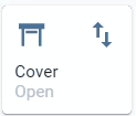
Invert calculation of state and percentage, useful for cover entities
false true for cover
Attributes
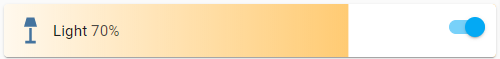
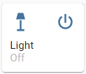
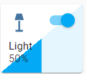
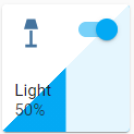
Light:
brightness_pctdefault
brightness
color_temp
hue
saturation
Warning options other than brightness_pct and brightness may give strange results
For example when color_temp is selected as attribute and the current color_mode of the light is notcolor_temp there is no value available for the slider, so the min value will be displayed. Same for hue and saturation, slider will only show correct value when the color_mode is hs.
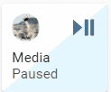
Default behavior: slider is used for volume control, when there is an entity picture it will be used instead of the icon.
In this example the action button is used to toggle play/pause.
Is your feature request related to a problem? Please describe.
When using the "Slider Button Card" together with the "Swipe Nav" it happens quite often that when I want to turn to the next page I accidentally interrupt the light buttons by swiping and turning them on or off.
Describe the solution you'd like
It would be great to integrate the function of locking the button and having to press first and then interact with the slider button.
Finally, I would like to thank you for the work you are doing, which I love. And excuse me if the text is not totally well written as I use the translator.
Is your feature request related to a problem? Please describe.
First of all congratulate you for this I think it is very useful and I plan to use it a lot the question is that I found something important that I should have for the type of functionality that gives for example the control of lights.
First and foremost in my case is the possibility that there should be able to use groups in my case in the ceiling I have 4 bulbs and do not care much to have to control individually but as a group, I think it is a major flaw that you can not perform this control.
Describe the solution you'd like
Integration of groups within the interface to be able to control several and not just one.
Browser and Operating System: Safari / MacOS & iOS
Description of problem: Slider (any type like solid, gradient, striped etc.) does not show at all on Safari on MacOS and iOS (including Home Assistant companion app for iOS). Tested with many different themes. Same config (shown below) renders correctly (slider is visible) on Chrome. Additionally on iOS there is visible bar that is the handle of slider (also visible in visual edit mode on Safari on MacOS).
Issue: You cannot scroll scroll vertically on a Lovelace dashboard if you try to start over a slider button card. The card will always interpret the action as a slide and try to set the light brightness instead of scrolling on the page.
This is happening on mobile. Tested on Android with slider-button-card v1.5.1
Is your feature request related to a problem? Please describe.
I just started using the button slider for my climate device, and noticed that I cant step the values in .5 intervals, only whole integers.
Describe the solution you'd like
Enable sliding/incrementing the values with "0.5" steps.
Describe alternatives you've considered
None
Additional context
Search through documentation, and cant find any slider option that enables this feature.
I have the slider buttons set up to control light group entities. The underlying hardware is Lightwave smart switches.
Sliding up and down works perfectly in every respect. However I find that if I increase the brightness to 100% nothing happens - the lights stay the same brightness as before.
If I give the button a tap (anywhere on the slider), then the 100% gets actioned. Not solved by using any particular slider settings, having been through them all. Only an issue with 100%. Slide up and down to 50% or 95% is works fine.
First of all thank you for this wonderful Frontend!
I noticed that it was not possible to put two / three "action_button". I find that a bit of a shame especially for the cover mode because for the moment we can only put one toggle button and I would have liked to be able to add an up button, a down button and a pause button.
I don't know if it's possible to do it or if it's done on purpose but I find that it adds a little more possibility ; )
Hello,
I use the slider button card mostly to manually control lights from my mobile phone via the Mobile App using a Grid card or Horizontal card with either 2 or 3 columns. I would like to see the behavior of the slider be as follows:
If the light is off, moving the slider leaves the light off but allows you to pre-change the brightness level. Then when you tap the "power" button, the light then turns onto the brightness that you pre-selected.
If the light is on, moving the slider changes the brightness immediately. (as it does now)
What happens to me now is that any tap on slider, (intentional or inadvertent) turns on the light immediately. (I admit, I have fat fingers! :-)
I use Home Assistant in darkmode (Google Dark Theme or the Caule dark themes) which works fine normally. But with the Google Dark Theme, the Buttons don't change at all and it looks pretty horrible when I apply one of the Caule dark themes.
I don't know why dark themes aren't working with the card, obviously some css stuff which I unfortunately don't know much about. Would be great to see those themes supported in the future.
A temporary solution is editing the styles with the card-mod integration. This solution has some problems though. First: I had to change multiple variables/classes to make it look at least similar and Second: I had to hardcode color codes because the variables where the wrong color most of the time.
Dashboard with the "Caule Dark Blue" theme applied
Dashboard with the "Google Dark Theme" theme applied
I love this card, awesome job! Replaced all my light controls with this one.
Have one feature request, maybe you could consider implementing.
I have power sensors of all my lights and other appliances.
It would be nice to display the current consumption (Watt) in the slider-button-card.
Introducing two options to control this: power_entity and maybe display_power.
Release with the issue:
1.7.0 Last working release (if known):
N/A Browser and Operating System:
Windows/Firefox/Chrome, Android/HA Companion App
Description of problem:
When invert: false is set sliding is not working correctly and state is always render as "Closed"
So let's start from good news: when sliding within 1%-99% range everything is working and rendering correctly.
Case 1. Cover is opened (Position: 0)
Issue 1. On the card cover state is misreported as "Closed". Additional information: State icon is rendered correctly ("Open"). Striped pattern is not rendered on the card (I presume this is also correct, cover is in fact open after all)
Case 2. I'm sliding (in my case from top to bottom) to close cover (from position: 0 to position: 100)
Issue 2. Upon sliding down across the button stripped pattern is render correctly, but final state is render as "Open". Once closing animation is over there's no stripped pattern on the button. Additional information: Cover is physically closed, state icon is rendered correctly (as "Closed), state is reported as "Closed".
Case 3. I'm sliding (from bottom to top) to open cover (from position: 100 to position: 0)
Issue 3. Upon sliding up across the button stripped pattern is render correctly, but final state is render as "Closed". After releasing nothing happens (no physical opening of the cover), no opening animation on the card either. The card is in state as described in Case 2.
Case 4. I'm sliding (from top to bottom) on closed cover (Position: 100) (The card is still in state as described in Case 2)
Issue 4. Stripped pattern is rendered as you would expect (closing from top to bottom) but final state is render as "Open" and nothing happens. Button states in this pose, still no physical movement of the cover. Additional information: Sliding to top does not change much except stripped pattern is removed from card, and state is reported back as "Closed". Cover actually stays closed.
To recover Case 4 I need to slide up to 1%. Cover will be opened.
Javascript errors shown in the web inspector (if applicable):
**Browser and Operating System: Version 91.0.4472.114 (Official Build) (64-bit) / W10
**Description of problem: I had to re-classify my Velux shutters as shutters in customize.yaml because they were classified as windows by defaults. Slider-button-card doesn't respect the re-classification and continue to display the window icon and the states of the window icons for open/close status.
The below screenshot shows the difference between default HS entity card with correct state icons and the slider-button-card with incorrect state icons.
It also look like that the state color is the opposite compared to the HA default, or am I miss something here?
Javascript errors shown in the web inspector (if applicable):
The cards have a blue background instead of transparent like other default hass cards. Can background be made same as default cards? Javascript errors shown in the web inspector (if applicable):
I've seen previous reported issue's about this problem, but none about a Awning device class yet.
So therefore another report for this class. Cover device classes explained
When I set slider to open 20%, the Awning goes to 80% !
Also Icon color, Power button, and Slider state and Percentage are all reversed.
The only thing correct is the Status text Open/Closed.
Hope to see a extra "reverse: true/false" manual option soon.
**Browser and Operating System: Browser and Operating System: Version 91.0.4472.114 (Official Build) (64-bit) / W10
**Description of problem: Following the support of device classes, the state icons works perfectly, many thanks again.
However, please see on the below screenshot that the state color is the opposite to HA default.
I use icon.use_state_color set to true.
Javascript errors shown in the web inspector (if applicable):
Release with the issue:
all I've tested (current v1.5.3 and some older eg. v1.5.2)
Last working release (if known):
none
Browser and Operating System:
Firefox current 89.0.2 and older 89.0.1, Windows x64, but looks like browser independent (Chrome also tested)
Slider to switch always set lights to 100% instead just switch on.
I'm using some lights stronger then it is needed for normal everyday use (but eg. full power useable when I change my desk in a lab :P), so they are normally switched on with brightess 60% or 72%, but when using "slider to switch" mode, it always sets brighness to 100%.
Action button works properly - it acts as toggle, but "slider to switch" also should work as toggle.
I just installed the lashes version (1.9.0), clear the browser (Safari) cache and restarted HA.
Unfortunately I can't use any climate entity! See below.
Maybe a feature for the future: the possibility to select the value the slider is affecting. In my case for example: change the color temperature from my ceiling lights. Not sure if it's possible but it would make the card even more useful.
I'm not a professional programmer, but let me know if there is anything I can do.
Thanks again.
Thank you for this great UI extension.
However I have covers that are providing reversed percentage for state (100% means cover is (fully) closed, 0% means (fully) open).
So currently all my covers are basically "inverted" on your buttons (-:
Is it possible to add "invert_percentage", "invert_open_close" or similar sounding option in the foreseeable future?
First of all thank you for this wonderful Frontend!
I noticed that with cover mode, when we take the cursor and pull it down, it opens the shutter. I was wondering if it was possible to add a reverse option. Put the cursor up to raise the shutter and put the cursor down to lower the shutter?
I'm really liking the style of this component far more than a lot of similar ones.
I'm wondering if you could add support for climate elements with a min and max value. For example I could have my wall-mounted dashboard have a min and max control of 14-21C
Browser and Operating System:
Chrome and Windows 10
Description of problem:
Switches work great, as do fans and smart lightbulbs. I do however have a slight problem with simple on/off lights mapped from switches.
As you probably know, in Home Assistant you can define switches which you want to be treated as lights (which is great for all my smart switches controlling actual lights).
With your awesome card, I can easily use something like 'switch.office_lamp' in the card to control the switch and thereby the light, but I would prefer to use 'light.office_lamp' instead.
I tried setting the 'toggle_on_click' flag, and it does work as expected to switch the light on, but not to switch it off. The only way it switches off is using the 'action button'.
All in all, it is a fantastic custom card, and I want to use it for all my buttons, but it also shows some strange and unpredictable behavior which I'm sure you will like to look into. Here are some examples:
The light is on - and shown as on by the action button, but shown as off by the card color, icon color, and state caption.
Sometimes you need to click twice to get the card to change background color. First click changes the action button state (and switches on the light), then the second click changes the card itself (to show that the light is on).
Light is on, card is colored, all looks good. A few minutes later, the card, icon and state all revert to display 'off', while the action button and actual light are 'on'.
Javascript errors shown in the web inspector (if applicable):
Additional information:
If needed, I can try and come up with a more detailed list and some images to help you debug.
I would very much appreciate if there was a "none" option for the slider setting, and tapping the card on the "slider" area would simply act as a toggle. As things are, entities with only an on/off state are quite frustrating to use.
This would also allow for switching between toggle and slider states with other cards, without losing out on the look or the need to replicate the look through a different card.
Safari is not working at all (there is a issue report)
In chrome the button is working, but when you select a color then the background is used the same color. When you switch to color temperature there is nothing changes.. It still keep the color selected
Not sure if this is a bug, or intentional. But when I use a cover slider, it shows for a short while until the card just blanks out again. Is it possible to keep the slider state showing?
Intent behind this is easier state views of things like garage doors and blinds.
This may only be happening for binary options, as I do not have any covers that allow for partial closure.
Is it possible to have the slider appear transparent when the entity is turned off?
Currently on MacBook (safari), iOS app using kibibit theme all cards are transparent apart from this when the entity / light is turned off, when the entity / light is turned on the slider returns to transparent.
Let me know if there's anything I can help test etc..
Thanks for a beautiful card!
I have found this little bug appearing suddenly.
When moving the slider the text"MOVE" appears. After slideing the text "PRE MOVE 2" appears.
see attached image.
Chrome Version 91.0.4472.77
Mac OS Catalina 10.15.7


![dependabot[bot] avatar](https://avatars.githubusercontent.com/in/29110?v=4 "dependabot[bot]")


 React
React
 Typescript
 Django
 Laravel
 Facebook
 Microsoft
 Google
 Alibaba
 D3
D3
 Tencent