microsoft / microsoft-ui-xaml Goto Github PK
View Code? Open in Web Editor NEWWindows UI Library: the latest Windows 10 native controls and Fluent styles for your applications
License: MIT License
Windows UI Library: the latest Windows 10 native controls and Fluent styles for your applications
License: MIT License
Ideally all of our tests would be 100% reliable, but due to the nature of interactive UI testing, we sometimes end up with spurious test failures. This can reduce confidence in the accuracy of the test reports and could cause a legitimate issue to be initially ignored.
TAEF does not support re-running failed tests. But since we have a step between TAEF running and the results being reported, we have an opportunity to re-run any failed tests. That way we can report a test failure only if it fails again on retry.
Describe the bug
When a WinUI NavigationView is inside a Splitview.Pane, removing and re-adding it in runtime stops it's navigation behavior.
Steps to reproduce the bug
Simplest steps to reproduce the behavior:
<Application
    x:Class="Test2.App"
    xmlns="http://schemas.microsoft.com/winfx/2006/xaml/presentation"
    xmlns:x="http://schemas.microsoft.com/winfx/2006/xaml"
    xmlns:local="using:Test2">

    <Application.Resources>
        <XamlControlsResources xmlns="using:Microsoft.UI.Xaml.Controls"/>
    </Application.Resources>

</Application>
MainPage.xaml:
<Page
    x:Class="Test2.MainPage"
    xmlns="http://schemas.microsoft.com/winfx/2006/xaml/presentation"
    xmlns:x="http://schemas.microsoft.com/winfx/2006/xaml"
    xmlns:local="using:Test2"
    xmlns:d="http://schemas.microsoft.com/expression/blend/2008"
    xmlns:mc="http://schemas.openxmlformats.org/markup-compatibility/2006"
    xmlns:WinUI="using:Microsoft.UI.Xaml.Controls"
    mc:Ignorable="d"
    Background="{ThemeResource ApplicationPageBackgroundThemeBrush}">

    <Grid>
        <SplitView x:Name="Split" DisplayMode="Inline" IsPaneOpen="True">
            <SplitView.Pane>
                <WinUI:NavigationView x:Name="NavView" IsSettingsVisible="False" IsBackButtonVisible="Collapsed" PaneDisplayMode="Top">
                    <WinUI:NavigationView.MenuItems>
                        <WinUI:NavigationViewItem Content="item 1"/>
                        <WinUI:NavigationViewItem Content="item 2"/>
                    </WinUI:NavigationView.MenuItems>
                </WinUI:NavigationView>
            </SplitView.Pane>

            <Button Content="Add/Remove NavigationView" Click="Button_Click"/>

        </SplitView>
    </Grid>
</Page>
MainPage.xaml.cs:
using Windows.UI.Xaml;
using Windows.UI.Xaml.Controls;

namespace Test2
{
    public sealed partial class MainPage : Page
    {
        public MainPage()
        {
            this.InitializeComponent();
        }

        private void Button_Click(object sender, RoutedEventArgs e)
        {
            if (Split.Pane is null)
                Split.Pane = NavView;
            else Split.Pane = null;
        }
    }
}
Expected behavior
Normal navigation behavior.
Version Info
NuGet package version:
Microsoft.UI.Xaml 2.0.181018003
Windows 10 version:
Device form factor:
Describe the bug
Updating my UWP app to use the latest package (2.0.181018003) causes app crashes in all versions of Windows below 1809. Upon further inspection, the 2.0.181018003 package apparently requires 1809 or higher.
Steps to reproduce the bug
Steps to reproduce the behavior:
Expected behavior
I thought that the packages were backwards compatible? So I was expecting that updating to 2.0.181018003 will not cause crashes in 1803 or lower. I could be wrong, so please correct me if I am!
Screenshots

Version Info
NuGet package version:
Microsoft.UI.Xaml 2.0.181018003
Windows 10 version:
Device form factor:
Additional context
Have a way to enable the older approach Reveal effect on ListViews.
Recently I noticed that ListView has no approach reveal anymore, meanwhile GridView and NavigationViewList still have that, after some discussion on theme editor repo here I discovered this was a change made in the sdk and as well as winui, and the reason for that are some design problems including 2px border and parallel listview items ( as discussed in the linked issue ).
So that is why I thought it would be nice that we can have this option customize-able as needed by the developer because approach reveal is very nice to have feature for controls like ListView, so there should be a way to keep it.
| Capability | Priority |
|---|---|
| Provide a ListView style that enables the Reveal approach effect | Must |
Describe the bug
I just updated Microsoft.UI.Xaml to latest version and now I cannot install/side-load my application running the Powershell script created by Visual Studio. I get the following error:
Deployment of package Microsoft.UI.Xaml.2.0_2.1810.18003.0_x64__8wekyb3d8bbwe was blocked because the provided package has the same identity as an already-installed package but the contents are different. Increment the version number of the package to be installed, or remove the old package for every user on the system before installing this package.
When I list installed packages it is definitely installed but I can't remove it because it is used by other windows applications. Is there a problem with the versioning of this package?
Windows cannot remove framework Microsoft.UI.Xaml.2.0_2.1810.18003.0_x64__8wekyb3d8bbwe because package(s)
Microsoft.XAMLControlsGallery Microsoft.WindowsCalculator Microsoft.WindowsAlarms currently depends on the framework
Steps to reproduce the bug
Expected behavior
App should be installed and handle the fact that a referenced package is already installed.
Screenshots
Version Info
Microsoft.UI.Xaml.2.0_2.1810.18003.0_x64__8wekyb3d8bbwe
Windows 10 version:
Device form factor:
Additional context
Describe the bug
Running automated tests using input injection via Microsoft.Windows.Apps.Test does not click/tap on the correct coordinates when display scale is set to a value other than 100%.
Steps to reproduce the bug
Expected behavior
Result: Test passes.
Actual: Test fails.
Version Info
NuGet package version: Microsoft.UI.Xaml 2.0.181018003
Windows 10 version:
Device form factor:
Currently all UI elements in WinUI are not color-managed, which means that they cannot support HDR/WCG on modern displays.
Currently HDR and WCG monitors are getting more popular, however the default UI controls (and many first-party applications, like Photo Viewer or Edge) are always assuming that the monitor is sRGB, which breaks the experience of the users that having them. Also this is a long-lasting complain about Windows that it does not manage colors as well as Mac
(This FR does not introduce new controls, but changes the display of existing controls.)
Grouping items in ComboBox is currently not supported. It was in WPF, and worked great. It's a gap we can bridge and to make it easier to port over WPF LOB apps to UWP.

Support for item grouping would make it easier to port over WPF LOB apps to UWP.
| # | Feature | Priority |
|---|---|---|
| 1 | ComboBox items can be grouped together in labeled categories. | Must |
| 2 | Optional setting allows groups to be collapsed. | Could |
| 3 | Multi-level groups. | Won't |
We're working on a Behavior that allows to customize the NavViews Header from the selected page, using a DataTemplate. It's working fine in MVVM Basic, Mvvmlight, Caliburn.Micro and Prism, but
we're facing an issue in the NavViewHeaderBehaviour with CodeBehind.
X:Bind is not working in the DataTemplate when the HeaderContext is set to a Page.
We've prepared a repro solution: App1.zip, with the following projects:
ContentPresenter with Content bound to a page does not resolve bindings in ContentTemplate correctly, a ContentPresenter with content bound to another class does.Tracking issue on our side is microsoft/TemplateStudio#2711
Describe the bug
Creating a new barebone uwp app yields the error
Steps to reproduce the bug
Steps to reproduce the behavior:
In visual studio 2017
Expected behavior
It should build
Screenshots
Version Info
NuGet package version:
Microsoft.UI.Xaml 2.0.181018003
Windows 10 version:
Device form factor:
Additional context
a few problems with the new NavigationView control on winui library :
Add a reveal style for the DropDownButton control.
There are currently reveal styles for many controls of the platform. However, there is one missing for the DropDownButton control. It would be nice if such a style could be added to WinUI.
The style should have a similar design to the current ButtonRevealStyle/AppBarButtonRevealStyle styles.
I'm interested in creating the equivalent RelativePanel control for WPF. I got an implementation close to it, but the layout cycle isn't completely in sync with the UWP one. It would be really helpful if RelativePanel was part of the open sourced controls, so that we can create consistent implementations across the XAML platforms.
We report test results from Helix into Azure Pipelines. If a test fails it should show up in the build test report and the build will show as failed.
However, if something goes wrong and something prevents the results from being reported, we might not notice that some results are missing from the build.
It would be nice if we have some extra step in the Pipeline that did something like "If less than 700 test results were reported then fail the build with an error". This would convert "absence of evidence" to "evidence of absence".
I don't think there is any existing feature that we can use for this, but we might be able to create something via the REST api: https://docs.microsoft.com/en-us/rest/api/azure/devops/test/results/list?view=azure-devops-rest-5.0
My page xaml
<Page x:Class="WinUITestApp.MainPage" xmlns="http://schemas.microsoft.com/winfx/2006/xaml/presentation" xmlns:x="http://schemas.microsoft.com/winfx/2006/xaml" xmlns:controls="using:Microsoft.UI.Xaml.Controls"> <controls:NavigationView AlwaysShowHeader="True" Header="Header" IsBackButtonVisible="Visible" /> </Page>
My code for title bar
var coreTitleBar = CoreApplication.GetCurrentView().TitleBar; coreTitleBar.ExtendViewIntoTitleBar = true;

Change NavigationView to Windows.UI...

We found an issue using the EventTriggerBehavior on the ItemInvoked event of Navigationview from WinUI. It works fine in Debug Mode, but doesn't work when compiled in Release.
Using the EventTriggerBehavior on the Loaded event works fine in debug and release though.
Could you have a look to see what is causing this?
Repro project:
BehaviorReleaseBug.zip
(X-Ref Issue on our side microsoft/TemplateStudio#2774)
Searching within an app is very common, especially if your app is more than a few pages deep. Today, you can build a search experience through either modifying a TextBox control or building on top of AutoSuggestBox. It's important that we make sure the most common searching scenarios seen across the industry can be enabled in XAML as well with relative ease.
Although our controls provide a lot of the necessary base components to creating a search experience, there are still a lot of scenarios to searching within a UWP app that are difficult to create using the properties and capabilities currently available.
The scope of this proposal is to ensure that a UWP developer can easily and efficiently build many of the most common experiences that are seen across the industry today in regards to searching with a search input box/control. In addition to that, the developer should also be confident that the type of experience that they are getting when using our search box control is coherent within the Windows ecosystem when it comes to controls with similar behavior.
| # | Feature | Priority |
|---|---|---|
| 1 | Have a versatile, but simple default search box experience and setup process | Must |
| 2 | Provide documentation guidance around how to set up and create a basic and common search experience | Must |
| 3 | Make it easy to create explicit and implicit search experiences, with a search box control behavior that reflects the type of search that is enabled | Must |
| 4 | Intuitive keyboard support for navigation within the suggestions dropdown - for both implicit and explicit searches | Must |
| 5 | Suggestion predictions (or "ghost") text within the input field | Must |
| 6 | Support a compact mode to enable high-density or limited app real estate scenarios | Must |
| 7 | Allow certain items in the suggestions dropdown to be query events, and some to not | Should |
| 8 | Enable the query icon to be displayed at the beginning of the text string as an icon | Should |
| 9 | Have a custom content region within the input field | Could |
The following are a set of scenarios attempting to cover the most common searching experiences.

| User Experience |
|---|
|
<SearchField Width="250" QuerySubmitted="mySearchField_QuerySubmitted"/>private void mySearchField_QuerySubmitted(SearchField sender,
SearchFieldQuerySubmittedEventArgs args)
{
string search_term = mySearchField.Text;
var results = GetItemsResult(myDatabase);
//Populate a ListView or page with sorted results...
}
| User Experience |
|---|
The query icon is never interact-able |
<SearchField Width="250" SearchMode="Implicit" TextChanged="mySearchField_TextChanged/> private void mySearchField_TextChanged(SearchField sender, SearchFieldTextChangedEventArgs args)
{
string search_term = mySearchField.Text;
var results = GetItemsResult(myDatabase);
//Update a Listview or page with sorted results...
}
| User Experience (explicit search) | User Experience (implicit search) |
|---|---|
|
|
If at any point the user clicks away or the search box loses focus, the suggestions list will close and the user's search string will remain in the box.
If focus is returned to the search box, in explicit searching the user must press enter to show the suggestion results list again, but in implicit searching the list will re-hydrate when the control received focus again.
On either TextChanged or QuerySubmitted, populate the suggestions ItemSource attached to the search control:
string search_term = mySearchField.Text;
var results = GetItemsResult(myDatabase);

mySearchField.SuggestionItemsSource = results;
private void mySearchField_SuggestionChosen(SearchField sender,
SearchFieldSuggestionChosenEventArgs args)
{
Frame.Navigate(resultsPage);
}Supplying the search control’s suggestions list with a list of items to be displayed will trigger the suggestions dropdown to show. Specifying no source to the suggestions will never display a popup dropdown attached to the control.

| User Experience |
|---|
|
private void mySearchField_SelectionChanged(object sender, SelectionChangedEventArgs e)
{
    mySearchField.PredictionText = selectedItem.Text;
}
| User Experience |
|---|
|
<SearchField Width="250" IsCompact="True"/>
| User Experience |
|---|
No Results |
On a OnFocus event or after a search is completed, the developer can specify which elements in the suggetions list are non-selectable.
A disabled suggestion item will not fire a QuerySubmitted, SuggestionChosen or SelectionChanged.
mySearchField.SuggestionItems[0].SelectionState = SuggestionItemsSelectionState.Disabled;
| User Experience (explicit search) | User Experience (implicit search) |
|---|---|
|
|
<SearchField QueryIconPlacement="Left" Width="250"/>
This could be a variety of scenarios:
Most of these scenarioss visual affordances are telling the user what's going on with their search, or layout efficiency.
<SearchField Width="250">
    <SearchField.SecondaryContent>
        <TextBlock Text="0 of 5" />
    </SearchField.SecondaryContent>
</SearchField>Currently working on aligning with other internal teams on how text predictions should operate with keyboard and mouse behavior. Once an agreement is reached this feature request will be updated. At the moment however, the defined text prediction behavior in this document is tentative.
I bind the MenuItemsSource property to an ICollectionView in the ViewModel. When I select an item by clicking on it or by code (changing the ICollectionViewModel.SelectedItem property) both the ICollectionView and the NavigationView updates the selected item when the PaneDisplayMode property is not set to "Top". In that case the NavigationView does not updates its selected item when I change it in the ViewModel and the ViewModel does not update when I select an item in the NavigationView.
when PaneDisplayMode is set to "Top"
This is the version info for my environment:
Describe the bug
XamlControlsGallery crashes at launch when using latest WinUI nupkg
Steps to reproduce the bug
Clone XamlControlsGallery repo and update Microsoft.UI.Xaml nupkg to latest from master.
Expected behavior
Result: Crashes
Expected: Doesn't crash. :)
Version Info
Microsoft.UI.Xaml 3.0.181204???
Windows 10 version:
Device form factor:
Spec for this feature is available for review here.
Today, NavigationView's menu is a flat list of destinations. Adding hierarchy to the navigation menu would enable showing top-level categories and child sub-categories in the same place, which would help clarify for users the overall structure of the app.
It’s common for complex apps to want to show multiple levels of navigation items. Although it’s possible to achieve hierarchy in the navigation pane today by placing the TreeView control into NavigationView’s PaneCustomContent area, there are multiple drawbacks to this approach. From the UI perspective, TreeView behaves poorly in NavigationView’s LeftCompact mode, and is not feasible in Top mode. For the developer, switching from NavigationView’s MenuItems list to a TreeView requires significant rewrites of the underlying data model. By providing a hierarchical solution directly within NavigationView we can eliminate implementation cliffs, significantly improve the user experience, and provide consistency across the app ecosystem.
| # | Feature | Priority |
|---|---|---|
| 1 | NavigationViewItem supports any number of child items in both Left and Top NavigationView modes | Must |
| 2 | Child items can be declared in markup | Must |
| 3 | NavigationView continues to support data binding for all its MenuItems | Must |
| 4 | Child items can be added or removed dynamically | Must |
| 5 | Selecting an item with children will show/hide the child items | Must |
| 6 | When the NavigationView Pane is closed, an item will appear selected if either itself or one of its child items is selected | Must |
| 7 | Hierarchical items' keyboard behavior matches TreeView's (with some adjustments for Top vs Left NavigationView) | Must |
| 8 | Items with children draw a chevron as a visual indicator that they can be expanded/collapsed | Must |
| 9 | The chevron changes orientation based on whether the item is open or closed | Should |
| 10 | Hierarchical items' open/close animations feel like they’re part of the same system as TreeView and MenuFlyoutSubItem animations | Should |
| 11 | Support for "accordion" behavior which makes it easy for apps to show at most one expanded parent item at a time | Should |
Create a hierarchical NavigationView in markup. This sample has two top-level categories, Home and Collections. The Collections item can be expanded to show its child sub-categories, Bookshelf and Mail.
<muxc:NavigationView>
    <muxc:NavigationView.MenuItems>
        <muxc:NavigationViewItem Content="Home" Icon="Home" ToolTipService.ToolTip="Home"/>
        <muxc:NavigationViewItem Content="Collections"
                               Icon="Keyboard" ToolTipService.ToolTip="Collections">
            <muxc:NavigationViewItem.MenuItems>
                <muxc:NavigationViewItem Content="Bookshelf"
                                    Icon="Library" ToolTipService.ToolTip="Bookshelf"/>
                <muxc:NavigationViewItem Content="Mail"
                                    Icon="Mail" ToolTipService.ToolTip="Mail"/>
            </muxc:NavigationViewItem.MenuItems>
        </muxc:NavigationViewItem>
    </muxc:NavigationView.MenuItems>
</muxc:NavigationView>These comps are not finalized and are shown here to illustrate the visual direction we're proposing.


Additions to existing NavigationViewItem class
public class NavigationViewItem : NavigationViewItemBase
{
    bool HasUnrealizedChildren { get; set; }
    bool IsChildSelected { get; set; }
    bool IsExpanded { get; set; }

    IList<Object> MenuItems { get; }
    Object MenuItemsSource { get; set; }
}
Additions to existing NavigationView class
public class NavigationView : ContentControl
{
    TypedEventHandler<NavigationView, NavigationViewExpandingEventArgs> Expanding;
    TypedEventHandler<NavigationView, NavigationViewCollapsedEventArgs> Collapsed;

    public void Expand(NavigationViewItem item);
    public void Collapse(NavigationViewItem item);

    bool AllowMultipleExpandedItems { get; set; }
}
public sealed class NavigationViewExpandingEventArgs
{
NavigationViewItemBase Item { get; }
}
public sealed class NavigationViewCollapsedEventArgs
{
NavigationViewItemBase Item { get; }
}When NavigationView is in LeftCompact or Top modes, should items with children expand on mouse hover or mouse click?
Discussion of Pros and Cons:
Ensure Gamepad experience is defined.
Now that CI builds are set up we should add the badge to the readme.
Describe the bug
If I'm building my app in debug mode it takes up to 20s to start.
In release mode this is reduced to only 2-3s
Steps to reproduce the bug
Expected behavior
Better startup performance in debug mode.
Version Info
NuGet package version:
Microsoft.UI.Xaml 2.0.181018003
Windows 10 version:
Device form factor:
TAEF has support for capturing the screen when an error occurs. This can be very useful for debugging tests, especially the UI-based tests that we rely on.
The challenge is getting the screenshots off the Helix machine and stored somewhere appropriate so that then can be referenced by someone investigating a test failure.
If we move away from using TAEF for our test execution, we would probably want to create equivalent screenshot functionality in the test code. In either case we would like to be able to correlate screenshots with test failures.
When a test failure occurs, we report the results back to Azure Pipelines. The 'Tests' tab of the Pipeline shows the failing tests and an error message for each.
Currently, the error including 'Warnings' and 'Errors' from the test log. Often this is hard to interpret since it is missing so much context. See this test run for an example: https://microsoft.visualstudio.com/WinUI/_build/results?buildId=13356842&view=ms.vss-test-web.test-result-details
I tried including the full test log output, but the Error Message string gets truncated.
It is possible to get to the full test logs on Mission Control, but this requires a bunch of clicking through various links and it also gives you the complete log for the entire run (i.e. every test in the test class).
The best approach would probably be to report the Error Message to Azure Pipeline as the error log output pre-pended with the last few lines of standard output just before the error. This should be fairly easy to add to ConvertWttLogToXUnit.ps1 and would make interpreting the test reports a lot easier.
We should enable our tests to run in Helix as part of the PR validation Checks.
Example:
XAML:
<ct:NavigationView x:Name="NavMain" ItemInvoked="NavMain_ItemInvoked">
    <ct:NavigationView.MenuItems>
        <ct:NavigationViewItem Content="Home"/>
    </ct:NavigationView.MenuItems>
</ct:NavigationView>
C#:
private void RenderMenu()
{
    NavMain.MenuItems.Add(new NavigationViewItemSeparator());

    foreach (TarotSuit suit in deck.Suits)
    {
        // make a nav menu item for the suit
        NavigationViewItem newMenu = new NavigationViewItem();
        newMenu.Content = suit.Suit;
        newMenu.Icon = new SymbolIcon(Symbol.OutlineStar);

        NavMain.MenuItems.Add("menu");
    }
}
The resulting UI and live tree:

It looks like NavigationView.MenuItems.Add(object) is setting the value passed as the Content property of a generated NavigationViewItem, resulting in an added NavigationViewItem set as the Content property of a container NavigationViewItem.
Rendering really goes sideways on this:

If I pass a string to NavigationView.MenuItems.Add(object), the result is a single NavigationViewItem with the Content property set to the string. Not only that, but if I return all the items after they've been created, the returned list doesn't contain these extra, auto-generated NavigationViewItem controls, so I think this is happening when the control is rendered, rather than how the XAML controls are created before rendering.
This widget would provide a customizable pager UI, generic states, and generic events that can be configured to navigate pages for several view controls.
The absence of a standard UI pager control, last seen as DataPager in Silverlight, has been a pain point in both WPF and UWP that has forced a variety of unfavorable workarounds for developers. Inclusion of this control in UWP would resolve an ecosystem gap and enable developers to efficiently deliver UI paging experiences in their applications. Through XAML Islands, it may also provide an opportunity to benefit WPF developers working with DataGrid or ListView. The scope of this proposal is not provide a data paging solution at this time but to start with UI paging as a foundation on top of which data paging may be later integrated.
| # | Feature | Priority |
|---|---|---|
| 1 | Can support the option to have multiple display modes as the core navigation component (NumberBox, ComboBox, Button panel). | Must |
| 2 | Can have optional text and/or glyphic bookend navigation controls (First/Last, Next/Back, none). | Must |
| 2 | Can be used to page GridView, ListView, DataGrid, and ItemsRepeater. | Must |
| 4 | Support for non-data binding/indeterminate page count solutions. | Must |
| 5 | Designed to support later possible integrated data paging component. | Must |
Here are how the three configurations could look:
ComboBox configuration

NumberBox configuration:

Button panel configuration:


<UserControl x:Class="DataPagerSample.MainPage">
   <Grid x:Name="LayoutRoot" RowDefinitions="*,Auto">
        <GridView x:Name="gridView1" ... />
	<muxc:UIPager x:Name="uiPager1"
            Source="{Binding}"
	    LastButton="AlwaysVisible"
            FirstButton="AlwaysVisible"
            NumberOfIndicesShowing="7"
	    EllipsisMaxBefore="5"
	    EllipsisMaxAfter="1"
            EllipsisShowBounds="True" />
    </Grid>
</UserControl>
<UserControl x:Class="DataPagerSample.MainPage">
    <Grid x:Name="LayoutRoot" RowDefinitions="*,Auto">
        <GridView x:Name="gridView1" ... />
	<muxc:UIPager x:Name="uiPager1"
	    Source="{Binding}"
	    DisplayMode="EditableComboBox"
	    NextButtonText="Prev"
	    PreviousButtonText="Next"
	    PrefixText="Page"
	    TotalNumberOfPages="10" />
    </Grid>
</UserControl>| Component | Notes |
|---|---|
| DisplayMode | * Used to set either a button panel (default) or an editable ComboBox as the indexing component. * When set to be a button panel, the number of visible indices can be specified.   |
| LastButton | * Button displaying text and/or glyph indicating that the user may navigate to the last index. * Automatically disabled when at last index. * Can be set to not be visible when at the last index.  |
| FirstButton | * Button displaying text and/or glyph indicating that the user may navigate to the first index. * Automatically disabled when at first index. * Can be set to not be visible when at the first index.  |
| NextButton | * Button displaying text and/or glyph indicating that the user may navigate to the next index. * Automatically disabled when at last index. * Can be set to not be visible when at the last index.  |
| PreviousButton | * Button displaying text and/or glyph indicating that the user may navigate to the previous index. * Automatically disabled when at first index. * Can be set to not be visible when at the first index.  |
| Ellipsis | * Button, often reading "...", used between indexes and before or after the first/last index to indicate an accessible but omitted range of indexes. * MaxBefore and MaxAfter properties can be used to set how many indices appear between the current page and the ellipsis before/after it. * Visibility of the first/last index can be disabled. * Only visible when using button panel as the display mode.  |
| PrefixText | * Text displayed before the editable ComboBox indexing component.  |
| NumberOfPages | * When a total number of indices (N) is given, this suffix string will appear after the editable ComboBox indexing component and read "of N". Localization will put "N" where it should be in a given language.  |
| State | Action | Narrator |
|---|---|---|
| UI pager is first focused on by tabbing | Focus defaults to the next page button if available (current page otherwise) after announcing accessible name of UI pager. | “Page selector. Next page is N." |
| UI pager is tabbed through | Tab Button: Will go through all actionable items in order without regard to groups. Arrow keys: Will be able to explore groups in the specified directions. Pressing the down arrow key at the bottom of the ComboBox will wrap the user to the top. Escape: Will escape UI pager. Enter and Spacebar: Will select the component focused on. Home: Will move focus to "go back" elements. In the ComboBox, it will jump the user to the first index. End: Will move focus to "go forward" elements. In the ComboBox, it will jump the user to the last index. |
Narrator will announce an accessible name of the visual component. Ex: “first page button” “previous page button” “1st page” “current page” "page selection drop down menu: current page is 1” |
<PagerControl
    DisplayMode = { Auto | ComboBox | NumberBox | ButtonPanel }
    NumberOfIndicesShowing = { int }
    LastButton = { Auto | AlwaysVisible | HiddenOnLast | None }
    LastButtonGlyph = { string }
    LastButtonText = { string }
    LastButtonStyle = { string }
    FirstButton = { Auto | AlwaysVisible | HiddenOnFirst | None }
    FirstButtonGlyph = { string }
    FirstButtonText = { string }
    FirstButtonStyle = { string }
    NextButton = { Auto | AlwaysVisible | HiddenOnLast | None }
    NextButtonGlyph = { string }
    NextButtonText = { string }
    NextButtonStyle = { string }
    PreviousButton = { Auto | AlwaysVisible | HiddenOnFirst | None }
    PreviousButtonGlyph = { string }
    PreviousButtonText = { string }
    PreviousButtonStyle = { string }
    EllipsisEnabled = { True | False }
    EllipsisMaxBefore = { int }
    EllipsisMaxAfter = { int }
    EllipsisShowBounds = { True | False }
    PrefixText = { string }
    NumberOfPages = { int } >
</PagerControl>After updating the WinUI library to the version mentioned in the title, the following markup:
<CommandBar DefaultLabelPosition="Collapsed">
	<CommandBar.PrimaryCommands>
		<AppBarButton Icon="Add" Label="Add"/>
	</CommandBar.PrimaryCommands>
</CommandBar>
leads to the reveal border only partially covering the button:

with the previous WinUI version it looked like this:

This happens on Windows version 1809 (17763.55) and corresponding SDK. Please note that this styling issue also seems to appear without the WinUI library added to the project (it was fine on Windows version 1803 without WinUI) and that the older WinUI version was apparently able to fix it.
Describe the bug
Running a single test works, but the debug option does not.
Steps to reproduce the bug
See this error:
---------------------------
Microsoft Visual Studio
---------------------------
A fatal error has occurred and debugging needs to be terminated. For more details, please see the Microsoft Help and Support web site. HRESULT=0x8000ffff. ErrorCode=0x0.
---------------------------
OK
---------------------------
The app window never renders. Closing it does not seem to exit the VS debugging state. Interjecting with a manual Stop Debugging does, although with a warning dialog. And afterwards Test Explorer seems to be in a bad state and in my experience doesn't recover without restarting Visual Studio.
Expected behavior
Test executes with the debugger breaking in.
Version Info
NuGet package version:
Commit 68a573b
Windows 10 version:
Device form factor:
We want to have the NavigationView all the way to the top with ExtendViewIntoTitleBar false.
Here is a screenshot of what I want:

I looked at the code for this and found that to achieve this I can put a small margin on my NavigationView and it works. I should not have to do this kind of hack to achieve a simple customization like this.
The logic can be found in microsoft-ui-xaml/dev/NavigationView/NavigationView.cpp at NeedTopPaddingForRS5OrHigher
A property on the NavigationView called something like "EnableAutomaticPadding"
The default of the property would be true, so to turn it off I could just set it to false.
With Windows 10 19H1 introducing the idea of System UI using a different theme to the Apps - It may be necessary to include the notion of providing UI to match the system, such as dialogs, or integrated XAML views outside of the app.
Providing the ability for an app's controls to adopt the OS colours may be needed for things like Sets where the window's colours may come from the OS setting, rather than the app's. If controls like the NavigationView, Menu, top toolbars, etc start to blend into the Window Frame - the controls will need to handle fallback, so mapping resources and RequestedTheme options applied to templates, will need to map to compatible resource dictionaries.
May require work in 19H1 to allow calling on resources provided by system settings for the OS theme and the App Theme options.
I fully accept this may be me jumping several steps ahead with my thinking, considering the ability to have separate themes for System UI and for Apps has just been added, and it may be more of a request for all user's colour preferences to be exposed by the framework, and the intention may be not to provide that for any number of reasons.
Describe the bug
Currently new Pull Requests open up with no Reviewers assigned. One way to address that is by creating a CODEOWNERS as described here. If that's more specific than just the code review group then it could provide a helpful place to @ mention area owners.
Note that only an admin or owner can add a CODEOWNERS file.
Steps to reproduce the bug
Expected behavior
Reviewers is unassigned (should have microsoft-ui-xaml-codereviews)
For Enable WinUI tests in Helix, we create a hard-coded list of Helix Work Items to create for running tests. Each test class has an entry in RunTestsInHelix.proj that needs to be maintained (e.g. add a new entry when a new test class is created).
Instead we could parse the output of "te.exe /list" to discover the full set of tests and then dynamically create the work items as needed. This would mean that we would not need to manually maintain the list and it would also mean that we could get better parallelization, by having each Helix work item run an equal number of test methods - right now the break down is by test class even though not every test class has the same number of tests (and we needed to special case NavigationViewTests due to it having a significantly longer runtime).
Maybe these UI projects should have a Gitter chat? Even if all 3 are included in one channel to start with.
https://github.com/Microsoft/microsoft-ui-xaml
https://github.com/dotnet/wpf
https://github.com/dotnet/winforms
We left the framework package generation out of the yaml definitions for expediency, but we need to add them back.
Describe the bug
If you add a ColorPicker to a ContentDialog and publish the app to a Windows Mobile device, it's broken visually like shown in the image below.
The red dot represents where you tap which results in the circle having some wired offset.
If you place one on a normal page it works like expected.
Steps to reproduce the bug
<ContentDialog x:Class="AcvMemTest.ColorPickerDialog"
               xmlns="http://schemas.microsoft.com/winfx/2006/xaml/presentation"
               xmlns:x="http://schemas.microsoft.com/winfx/2006/xaml"
               xmlns:controlsComp="using:Microsoft.UI.Xaml.Controls"
               xmlns:d="http://schemas.microsoft.com/expression/blend/2008"
               xmlns:mc="http://schemas.openxmlformats.org/markup-compatibility/2006"
               Title="TITLE"
               PrimaryButtonClick="ContentDialog_PrimaryButtonClick"
               PrimaryButtonText="Button1"
               SecondaryButtonClick="ContentDialog_SecondaryButtonClick"
               SecondaryButtonText="Button2"
               mc:Ignorable="d">

    <Grid>
        <Grid.RowDefinitions>
            <RowDefinition Height="Auto"/>
        </Grid.RowDefinitions>

        <controlsComp:ColorPicker x:Name="color_cp"
                                  Grid.Row="0"
                                  ColorSpectrumShape="Ring"
                                  IsAlphaEnabled="False"
                                  IsColorPreviewVisible="True"/>
    </Grid>
</ContentDialog>
Expected behavior
The ColorPicker should work in Windows Mobile ContentDialogs.
Screenshots
Version Info
NuGet package version:
Microsoft.UI.Xaml 2.1.181025003-prerelease
Windows 10 version:
Device form factor:
Additional context
Test device: Lumia 950XL
Target version: 17763
Min version: 15063
Beginning with WinUI NuGet package version 2.0.181011001, right clicking a control and selecting Edit Template -> Edit a Copy isn't enabled.
Make a version of Grid that is easier to use and manipulate with capabilities that are on par with the CSS Grid.
XAML's Grid is the most widely used Panel and is very versatile. However, it's also one of the more complicated panels and can be cumbersome. It doesn't lend itself well to easily positioning elements or simple adjustments (e.g. inserting a new row/column). Enhancing the Grid in a few simple ways will go a long way towards easing a developer's job.
| # | Feature | Priority |
|---|---|---|
| 1 | Able to refer to rows / columns by either number or a name | Must |
| 2 | Able to define spans as relative numbers or using names | Must |
| 3 | Able to assign a friendly name to a region of the grid and associate child element's with that region by name versus the row(span)/col(span) #'s | Could |
| 4 | Able to more succinctly define rows / columns, with options to be more explicit | Should |
| 5 | Support auto flow where some items may be explicitly assigned and the rest implicitly fill in by tree order (with control over how it auto fills) | Should |
| 6 | Support for defining auto-generated rows/columns that are implicitly created to position items with otherwise out-of-bounds grid indices | Should |
| 7 | Support alignment options for a general policy that applies to all the Grid's children (individual elements can override) | Could |
| 8 | Support a ShowGridLines property to aid in visual debugging the layout | Could |
Named Row / Column
<Grid>
  <Grid.RowDefinitions>
    <RowDefinition Height="Auto"/>
    <RowDefinition Height="1*"/>
    <RowDefinition Name="bottomrow" Height="Auto"/>
  </Grid.RowDefinitions>
  <Grid.ColumnDefinitions>
    <ColumnDefinition Width="Auto"/>
    <ColumnDefinition Width="1*"/>
    <ColumnDefinition Name="rightcol" Width="Auto"/>
  </Grid.ColumnDefinitions>

  <Button Grid.Row="bottomrow" Grid.Column="rightcol"/>

</Grid>
A More Succinct Syntax
<Grid RowDefinitions="Auto, 1*, {Name=bottomrow Width=Auto}"
      ColumnDefinitions="Auto, 1*, {Name=rightcol Width=Auto}">

  <Button Grid.Row="bottomrow" Grid.Column="rightcol"/>

</Grid>
Defining Named Areas
Specify a single Row (or Column) using just the name or the index. You can optionally provide a span by name or relative count with the comma syntax "fromRow,toRow" or "fromRow,#".
<Grid ColumnDefinitions="{Name=leftcol Width=Auto}, 1*, {Name=rightcol Width=Auto}"
      RowDefinitions="{Name=toprow Width=Auto}, {Name=body Width=1*}, {Name=bottomrow Width=Auto}">
      <Grid.AreaDefinitions>
        <AreaDefinition Name="imageArea" Row="toprow,bottomrow" Column="0"/>
        <AreaDefinition Name="header" Row="toprow" Column="leftcol,rightcol"/>
        <AreaDefinition Name="footer" Row="bottomrow" Column="leftcol,rightcol"/>
      <Grid.AreaDefinitions>

      <Image Grid.Area="imageArea"/>

      <TextBlock Grid.Area="Header"/>

      <Button Grid.Row="bottomrow" Grid.Column="rightcol"/>
</Grid>
More Succinctly Defined Areas
<Grid ColumnDefinitions="{Name=leftcol Width=Auto}, 1*, {Name=rightcol Width=Auto}"
      RowDefinitions="{Name=toprow Width=Auto}, {Name=body Width=1*}, {Name=bottomrow Width=Auto}"
      AreaDefinitions="{Name=imageArea Row=toprow,bottomrow Column=0},
             {Name=header Row=toprow Column=leftcol,rightcol},
             {Name=footer Row=bottomrow Column=leftcol,rightcol}">

      <Image Grid.Area="imageArea"/>

      <TextBlock Grid.Area="Header"/>

      <Button Grid.Row="bottomrow" Grid.Column="rightcol"/>
</Grid>
Auto-flow Layout w/ Auto-generated Rows (or Columns)
<Grid ColumnDefinitions="240, 1*"
      ColumnSpacing="18"
      AutoFlow="Row"
      AutoRowDefinitions="{MinHeight=80 Height=Auto}">
  <Grid.Resources>
      <Style TargetType="TextBlock">
          <Setter Property="HorizontalAlignment" Value="Right"/>
      </Style>
  </Grid.Resources>

  <TextBlock Text="Id"/>
  <TextBox x:Name="IdField"/>

  <TextBlock Text="Name"/>
  <TextBox x:Name="NameField"/>

  <TextBlock Text="Address"/>
  <TextBox x:Name="AddressField"/>

  <!-- Inserting a new label + field or re-ordering them doesn't require
       updating all the Column/Row assignments -->

</Grid>
The AutoFlow property determines how elements that aren't explicitly assigned to an area / row / column will be placed. The default is 'None'. A value of 'Row' causes the layout to attempt to sequentially fill the columns of a row before moving to the next row. It can leave gaps by not considering if elements seen later could have fit on earlier rows.
A value of 'RowDense', however, would attempt to fill in the earlier gaps with elements seen later. RowDense can affect the visual ordering and could adversely impact accessibility. Similar behavior applies to values of Column and ColumnDense.
Would a Grid with these capabilities (i.e. named areas and autoflow + autogenerated rows/columns) simplify the way that you currently use Grid? For what scenario?
Which of the proposed enhancements would you find most useful?
Describe the bug
Steps to reproduce the bug
Steps to reproduce the behavior:
Code:
<MenuFlyout> <MenuFlyoutItem Text="This is a text label"> <MenuFlyoutItem.Icon> <FontIcon Glyph="" /> </MenuFlyoutItem.Icon> </MenuFlyoutItem> </MenuFlyout>
Expected behavior
The icon should be greyed out when disabled, just like the text label.
Screenshots
Version Info
NuGet package version:
Windows 10 version:
Device form factor:
Additional context
Describe the bug
ItemsRepeater ItemsSource="{Binding MyItems}" causes the app to crash because the ItemTemplate is null by default.
Expected behavior
Should not crash. if no ItemTemplate is provided, we should use a default which just shows a TextBlock bound to the data.
Hi,
The ColorSlider of a ColorPicker is working strange and makes the control useless.
Describe the bug
I have tried to use the the Microsoft.UI.Xaml ColorPicker (and also the UWP one) with the ColorSpectrumComponents value set to "SaturationValue".
<ColorPicker ColorSpectrumShape="Box"
             Color="Red"
             Width="312"
             IsColorChannelTextInputVisible="False"
             IsColorSliderVisible="True"
             IsAlphaEnabled="False"
             IsHexInputVisible="False"
             RenderTransformOrigin="0.5,0.5"
             ColorSpectrumComponents="SaturationValue" />
The Xaml above renders this output which really looks great. You can use the slider to pick another color.

The problem starts when you set the Color to Black or White.
<ColorPicker ColorSpectrumShape="Box"
             Color="Black"
             Width="312"
             IsColorChannelTextInputVisible="False"
             IsColorSliderVisible="True"
             IsAlphaEnabled="False"
             IsHexInputVisible="False"
             RenderTransformOrigin="0.5,0.5"
             ColorSpectrumComponents="SaturationValue" />
The color slider becomes completely Black and with White it ‘disappears’. I expected the rainbow color which I had when the color was set to Red. Is this a bug?

Maybe I shouldn't use the ColorSpectrumComponents, so I set it back to the default (HueSaturation) and set the Color to Black.
<ColorPicker ColorSpectrumShape="Box"
             Color="Black"
             Width="312"
             IsColorChannelTextInputVisible="False"
             IsColorSliderVisible="True"
             IsAlphaEnabled="False"
             IsHexInputVisible="False"
             RenderTransformOrigin="0.5,0.5"
             ColorSpectrumComponents="HueSaturation" />
Does this look like a ColorPicker? I don’t think so. Is this a bug?

For me the Color Picker with a Color Slider is useless. Or am I stupid and doing something wrong?
Expected behavior
The ColorPicker in the Paint 3D app is doing what I want. Does anybody know if the ColorPicker which is in the Paint 3D app is available as a component?

Version Info
Windows 10 Desktop, 1809, 17763, WinUI NuGet 2.0.181018003
NuGet package version:
Microsoft.UI.Xaml 2.0.181018003
Windows 10 version:
Device form factor:
Additional context
Many controls currently have default icons. It would be nice if they had custom icons.
2.0.181011001
Describe the bug
When selecting the Debug_test x86 configurations from the project the build fails.
| Severity | Code | Description | Project | File | Line | Suppression State |
|---|---|---|---|---|---|---|
| Error | The "CreatePriFilesForPortableLibraries" task was not given a value for the required parameter "IntermediateExtension". | MUXControlsTestApp (test\MUXControlsTestApp\MUXControlsTestApp) | C:\Program Files (x86)\Microsoft Visual Studio\2017\Enterprise\MSBuild\Microsoft\VisualStudio\v15.0\AppxPackage\Microsoft.AppXPackage.Targets | 1275 |
Steps to reproduce the bug
Debugx86Expected behavior
It builds? Also, it's probably no clear what "Debug_test" is needed for.
A reference to the following issue posted in the WPF repository: dotnet/wpf#84
For convenience, here is the original suggestion by @thomaslevesque:
Currently, when you want to set the value of a setter to a complex object (e.g. control template), you have to specify the <Setter.Value> element:
<Style TargetType="Button">
    <Setter Property="Template">
        <Setter.Value>
            <ControlTemplate TargetType="Button">
                ...
            </ControlTemplate>
        </Setter.Value>
    </Setter>
</Style>
But this element brings no value at all, it just adds noise. Making Value the ContentProperty for Setter would make the code a bit less verbose:
<Style TargetType="Button">
    <Setter Property="Template">
        <ControlTemplate TargetType="Button">
            ...
        </ControlTemplate>
    </Setter>
</Style>
Certainly, in my opinion, one of those small changes which will make XAML programming more convenient.

Back Button size is greater than Hamburger Menu button it not suitable for view
This is captured on mobile 640XL using Windows Template Studio
and I also studied something About Showing Alt + Left Tool tip when hover anywhere on the app.
To avoid that Windows Template Studio Created this Line of Code at Shell page
private void OnLoaded(object sender, RoutedEventArgs e)
{
// Keyboard accelerators are added here to avoid showing 'Alt + left' tooltip on the page.
// More info on tracking issue #8
KeyboardAccelerators.Add(_altLeftKeyboardAccelerator);
KeyboardAccelerators.Add(_backKeyboardAccelerator);
}
but this code Throw an error for Mobile Application.
Please Review this Also
We're having an issue with WinUI NavView and the Alt + Left KeyboardAccelerator.
Initially we added the KeyboardAccelerator in the page constructor (following guidance from
https://docs.microsoft.com/en-us/windows/uwp/design/basics/navigation-history-and-backwards-navigation), but doing this the "Alt + Left" Tooltip is showing all over the app.
We saw in your samples (https://docs.microsoft.com/en-us/windows/uwp/design/controls-and-patterns/navigationview#code-example) that you are adding the accelerator in the NavView Loaded event handler. Moving the code here results in not showing the tooltip.
Is NavView_Loaded or Page_Loaded the correct place to add KeyboardAccelerators?
Working on this we also noticed that the NavView BackButton does not have a tooltip. Should this tooltip de provided out of the box (like the Hamburger Button does) or are we missing something?
I'll attach a generated app so you can see what we are generating.
NavViewTooltip.zip
Tracking issue on our side is microsoft/TemplateStudio#2650
The Form control enables layout, alignment, and grouping of form elements. Form elements are different control types associated with data input.
Creating a form is a very common scenario for Enterprise and LOB applications. Easily creating a form that is evenly spaced, appropriately sized, semantically grouped, accessible, and contains the needed actions is a manual process using Grid (or other layout controls). While this is not difficult, it can be time consuming and cumbersome.
When creating a form using any of the layout panels provided today, Narrator support is only provided at the control level. No context is provided to user. Example: if the field is required, how many, which section, etc. by creating a Form layout control this can be provided to user for free and allow developers to focus on functionality and not layout.
Note: Data/Input validation will be tracked in a separate issue.
| # | Feature | Priority |
|---|---|---|
| 1 | Able to create sections with headers | Must |
| 2 | Able to support multiple columns | Must |
| 3 | Able to define actions (Submit, Cancel, etc) | Must |
| 4 | Able to group controls on one line | Must |
| 5 | Able to override padding and margin per section or overall form | Must |
| 6 | Support Compact density spacing rules | Must |
| 7 | Support expand/collapse behavior for Form Sections | Should |
| 8 | Wrap sections based on window size | Should |
| 9 | Use inline actions or command bar actions | Should |
| 10 | Able to add items to form dynamical | Should |
| 11 | Support for data binding | Should |
| 12 | Draw a line under each section | Should |
| 13 | Dedicated area for grouped validation errors | Could |
| 14 | Support inline actions next to input fields | Could |
At default the control will create a single column form respecting spacing rules with actions at the bottom.

By providing a few properties the Form control can easily adapt to more complex data input scenarios. Without the need to define row and column definitions. The spacing rules are built into the Form control.


The Form control contains a three different components.
The Forms control will provide default spacing rules but these can be overwritten in markup.

The example below used FormSection and FormGroup to build a Form for a new patient.
         <Form Name="NewPatient">
            <FormSection Header="Name" Columns="2">
                <TextBox Header="First name"/>

                <TextBox Header="Last name"/>

                <FormGroup Columns="Auto, *">
                    <TextBox Header="M.I." Width="40"/>

                    <ComboBox Header="Suffix" PlaceholderText="Select" HorizontalAlignment="Stretch"/>
                </FormGroup>

                <TextBox Header="Last name"/>
            </FormSection>

            <FormSection Header="Basic info" Columns="2">
                <TextBox Header="Pharmacy ID"/>

                <ComboBox Header="Emergency priorty level" PlaceholderText="Select" HorizontalAlignment="Stretch"/>

                <FormGroup>
                    <CalendarDatePicker Header="Date of birth" HorizontalAlignment="Stretch"/>

                    <TextBox Header="SSN"/>
                </FormGroup>

                <TextBox Header="Citizenship"/>

                <TextBox Header="Place of birth"/>

                <ComboBox Header="Birth state (US only)" PlaceholderText="Select" HorizontalAlignment="Stretch"/>

                <FormGroup>
                    <ComboBox Header="Gender" PlaceholderText="Select" HorizontalAlignment="Stretch"/>

                    <ComboBox Header="Ethnicity" PlaceholderText="Select" HorizontalAlignment="Stretch"/>
                </FormGroup>

                <FormGroup>
                    <ComboBox Header="Martial Status" PlaceholderText="Select" HorizontalAlignment="Stretch"/>

                    <ComboBox Header="Religion" PlaceholderText="Select" HorizontalAlignment="Stretch"/>
                </FormGroup>

                <ComboBox Header="Primary language" PlaceholderText="Select" HorizontalAlignment="Stretch"/>

                <ComboBox Header="Secondary language" PlaceholderText="Select" HorizontalAlignment="Stretch"/>
            </FormSection>

            <FormSection Header="Contact" Columns="2">
                <TextBox Header="Address 1"/>

                <TextBox Header="Address 2"/>

                <TextBox Header="City"/>

                <FormGroup>
                    <ComboBox Header="State" PlaceholderText="Select" HorizontalAlignment="Stretch"/>

                    <FormGroup Columns="*,Auto">
                        <TextBox Header="Zip"/>

                        <Button Margin="0,28,0,0" Content="..."/>
                    </FormGroup>
                </FormGroup>

                <FormGroup Columns="*,Auto">
                    <TextBox Header="Facility"/>

                    <Button Margin="0,28,0,0" Content="..."/>
                </FormGroup>

                <FormGroup>
                    <TextBox Header="Room"/>

                    <TextBox Header="Community"/>
                </FormGroup>

                <FormGroup>
                    <ComboBox Header="Aware Dx" PlaceholderText="Select" HorizontalAlignment="Stretch"/>

                    <ComboBox Header="Aware Px" PlaceholderText="Select" HorizontalAlignment="Stretch"/>
                </FormGroup>

                <TextBox Header="Mapsco #"/>

                <TextBox Header="Primary phone" PlaceholderText="123-456-7890"/>

                <TextBox Header="Email"/>
            </FormSection>
        </Form>
| State | Action | Narrator |
|---|---|---|
| User has tabbed to the first field in the form | Focus is set on the first field | Form 'name' section 'headervalue', section 1 of n textbox, field 1 of n, narrator begins to read the control as it does today |
| Form is tabbed through | Tab Button: will advance to next control. Up/Down Arrow: scroll the page up and down |
standard control behavior |
| User tabbed to the first control in the following section | Focus is set on the first field of the control | Form 'name' section 'headervalue' section 2 of n, field 1 of n, narrator begins to read the control as it does today |
| Focus is set on action button | Button is focused | Form 'name' action 1 of n, narrator reads the control as it does today |
Describe the bug
The problem is that ItemsRepeater does not set its background property and does not expose a background property as well. So none of the events like dragover/drop etc are raised on repeater. We should expose the background property like all other panels do.
Steps to reproduce the bug
Try listening to drag/drop events on ItemsRepeater. Note that these do not get raised when interacting within the ItemsRepeater's bounds.
Expected behavior
ItemsRepeater should expose a background property. Setting that will cause the drag/drop events to be raised similar to existing panels like StackPanel etc.
The XAML TeachingTip Control provides a way for your app to guide and inform users in your application with a non-invasive and content rich notification. TeachingTip can be used for bringing focus to a new or important feature, teaching users how to perform a task, or enhancing the user workflow by providing contextually relevant information to their task at hand.
Even the most intuitive app might want to spotlight important updates or available features that have not yet been explored by the user. Focusing on these new updates and previously ignored features will help users use the app more effectively, leading to improved user engagement and retention in an accessible and focused way that does not invade the flow of the user or the application. These tips are already widely used among first and third-party customers but are often disjoint implementations. Teaching tips are also frequently used by other platforms and in many products, but they often offer no official control to implement these tips. Providing a XAML TeachingTip control would help standardize how these tips are delivered across all apps using the Fluent Design System and ease the job of developers so they can focus on implementing other important features.
| # | Feature | Priority |
|---|---|---|
| 1 | Able to target UI elements and be used without UI targets. | Must |
| 2 | Able to include a variety of media including videos, images, icons, and gifs, and other XAML content. | Must |
| 3 | Able be able to be closed manually. | Must |
| 4 | Has a light-dismiss option. | Must |
| 5 | Able to have an action button. | Must |
| 7 | Able to specify size of tip. | Must |
| 8 | Able to specify the location of tips. | Must |
| 9 | Accessible to narrator and keyboard navigation. | Must |
| 10 | Has a timed auto-dismiss option. | Should |
| 11 | Able to be dismissed by swiping. | Could |
| 12 | Able to follow moving UI elements. | Could |
| 13 | Cortana command integration. | Could |
Here's the XAML for a targeted teaching tip control that demonstrates the default look of the TeachingTip with a title and subtitle.
Note that the teaching tip can appear anywhere in the element tree or code behind. In this example below, it's located in a ResourceDictionary.
XAML
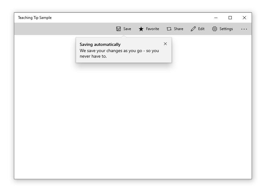
<Button x:Name="SaveButton" Content="Save">
    <Button.Resources>
        <controls:TeachingTip x:Name="AutoSaveTip"
            Target="{x:Bind SaveButton}"
            Title="Save automatically"
            Subtitle="When you save your file to OneDrive, we save your changes as you go - so you never have to.">
        </controls:TeachingTip>
    </Button.Resources>
</Button>
C#
public MainPage()
{
    this.InitializeComponent();

    if(!HaveExplainedAutoSave())
    {
        AutoSaveTip.IsOpen = true;
        SetHaveExplainedAutoSave();
    }
}
Here's the result when the Page containing the button and teaching tip is shown:
Not all tips relate to an element onscreen. For these scenarios, do not set the Target property and the teaching tip will instead display relative to the edges of the xaml root. However, a teaching tip can have the tail removed while retaining placement relative to a UI element by setting the TailVisibility property to "Collapsed". The following example is of a non-targeted teaching tip.
XAML
<Button x:Name="SaveButton" Content="Save" />

<controls:TeachingTip x:Name="AutoSaveTip"
    Title="Saving automatically"
    Subtitle="We save your changes as you go - so you never have to.">
</controls:TeachingTip>
Note that in this example the TeachingTip is in the element tree rather than in a ResourceDictionary or in code behind. This has no effect on behavior; the TeachingTip only displays when opened, and takes up no layout space.

| Component | Notes |
|---|---|
| Container | * The container is the body of the tip and encapsulates all the tip components. * Nonmodal. * If content height exceeds max height or width, vertical scrolling will be enabled. See Scroll. * For visibility concerns, the container has a border around the outer edge, which adheres to the tail if present. See Tail. * For visibility concerns, the top edge of the container has a 1px highlight which also adheres to the tail if present. See Tail.  |
| Title | * Semi-bolded. * Text wraps at Close (X) Button and Container border.  |
| Subtitle | * Text wraps at Close (X) Button and Container border.  |
| Content | * Can be customized to include text, images, videos, animation, checkboxes, hyperlinks, and any other XAML content. * Will scroll if there is more content to show than tip height allows. See Scroll Bar. * Placed below Subtitle and above Close/Action Button.  |
| Close Button | * Will appear as an X Button in the top right corner by default and in the top left corner automatically for RTL languages. The close button may also be set to appear in the bottom right corner of the tip as a traditional button or be set to not show at all so that a custom close option may be implemented in the Content Area. * If a tip is set to light-dismiss, no close button will appear at all.   |
| Action Button | * Allows the user to invoke a custom event. * This is the only non-Close button provided out of the box. Other buttons may be implemented in the Content Area.  |
| Pointer | * Triangular extension of the tip body that can be used to indicate that the tip is referring to on-screen UI element. * When PointerMode is set to auto, the pointer will automatically appear on tips that are attached to a target and off for tips that are not attached to a target. * Prefers to center on target. * Maintains a 12px margin from edges of the tip. * Not animated. * Will not have a shadow as shadows cannot yet be added to nonrectangular surfaces.  |
| Icon | * Added to the left of the Title and Subtitle by default and automatically moved to the right for RTL languages.  |
| Bleeding Content | * Bleeding Content is media that stretches to the edges of a tip. * Can be placed at the top or bottom of a tip.  |
| Scroll Bar | * If the tip's contents are large enough to require scrolling, a scrollbar which will not intersect the Close (X) Button will be added to the content area.  |
| Property | Notes |
|---|---|
| Opening | * A tip is shown by setting its IsOpen property to true. * Tips will animate on opening. * When a tip does not have enough available window space to fully show in any location [see Placement], it will not open and will instead overwrite IsOpen to false. |
| Closing | * There are three ways to close a tip: set the IsOpen property to false, the user invokes a close button, or the tip is closed via light dismiss. These will return the method used in TeachingTipCloseReason. * Closing can be deferred by taking a handle to the deferral object in the closing event args. |
| Placement | * Placement modes for targeted tips will follow the precedent of Flyout. Full placement mode will be replaced by Center which positions Tail at the center of the element. * Placement modes for untargeted tips will include each side, corner, and center of the application window. * The following properties are not preferred in tip placement: * There is not enough space for the tip to show without clipping. * The target is not large enough to maintain the tip's alignment and the Tail's 12px margin from the edge of the tip. * The target element is too large to maintain edge alignment while keeping the Tail centered on the target. |
| Light-dismiss | * Allows a tip to be dismissed when the user scrolls or clicks elsewhere within the application. * TODO: Work with Accessibility and Design to create a timed fade-out that would allow users to recover a dismissing tip via click or cursor hover. |
| Persistent Tip Location | * Once a tip is open, it will not move even if its target does. The exception to this is when the window is resized. |
| Motion | * Tips have built in open and close animations that can be customizable using Storyboards. |
| Tail/Bleeding Content Avoidance | * To avoid the visual oddity of the Tail emerging from Bleeding Content, the Tail and Bleeding Content will attempt to avoid intersecting using the following rules: * Move the bleeding content to Top or Bottom (Disabled when BleedingContentPlacement is not auto). * Shift the beak along the edge of the tip (Disabled when the placement of the tip is edge aligned). * Change the placement of the tip (Disabled when the tip placement is not auto). |
| Out of Window Bounds | * Tips can escape window bounds on newer OS versions via the ShouldConstrainToRootBounds property. When this property is set to false, the tip uses screen boundaries instead of window boundaries during its placement algorithm. |
| State | Action | Narrator |
|---|---|---|
| Tip first appears and is not in focus | No action is needed invoke the tip. | “New tip. It says …." |
| Tip is first focused on by tabbing through to the tip | Targeted Tip: Tip is injected to tab stop right after its target element. User tabs to reach tip and put it into focus. Untargeted Tip: Tip is injected to tab stop as the last item to be created. User tabs to reach tip and put it into focus. Light-dismiss: Automatically take focus. |
Default Tab Stop, Title, and Subtitle. Ex: “X Button, Tip Title, Tip Subtitle.” |
| Tip is tabbed through | Tab Button: Will go through all actionable items regardless of group in order. Arrow keys: Will be able to explore groups in the specified directions. Enter and Escape: Will result in closing the tip. Spacebar: Will select the component focused on. Home and End: Do not have use unless within a XAML component that supports their functionality |
Name of XAML or visual component. Ex: “X Button” “Save Button” “Learn More Hyperlink” |
| Tip is dismissed | 1. X Button is pressed. 2. Close Button is pressed. 3. Action Button is pressed. Tab focus goes back to where it should be, the predecessor. |
Nothing |
If you have a ListView in a UWP app and run it on Windows Mobile it crashes with the following UnhandledException:
Windows.UI.Xaml.Markup.XamlParseException
Cannot deserialize XBF metadata type list as 'RevealListViewItemPresenter' was not found in namespace 'Microsoft.UI.Xaml.Controls'. [Line: 0 Position: 0]
MainPage.xaml
<Page x:Class="App3.MainPage" xmlns="http://schemas.microsoft.com/winfx/2006/xaml/presentation" xmlns:x="http://schemas.microsoft.com/winfx/2006/xaml" xmlns:d="http://schemas.microsoft.com/expression/blend/2008" xmlns:local="using:App3" xmlns:mc="http://schemas.openxmlformats.org/markup-compatibility/2006" Background="{ThemeResource ApplicationPageBackgroundThemeBrush}" mc:Ignorable="d"> <Grid> <ListView> <ListViewItem Content="aaa" /> <ListViewItem Content="bbb" /> <ListViewItem Content="ccc" /> <ListViewItem Content="ddd" /> </ListView> </Grid> </Page>
App.xaml
<Application x:Class="App3.App" xmlns="http://schemas.microsoft.com/winfx/2006/xaml/presentation" xmlns:x="http://schemas.microsoft.com/winfx/2006/xaml" xmlns:local="using:App3"> <Application.Resources> <XamlControlsResources xmlns="using:Microsoft.UI.Xaml.Controls" /> </Application.Resources> </Application>
Steps to reproduce the bug
Steps to reproduce the behavior:
Create an UWP app. Add WinUI using NuGet. Add a XamlControlsResources to the App.xaml as described in the readme.txt. Add a ListView with some ListViewItems to the Grid of the MainPage.xaml. Run the app on Windows Mobile (I used the Mobile Emulator 10.0.15254.0 1080p).
Expected behavior
An app running on Windows Mobile, no crash
Screenshots
Version Info
TargetPlatformVersion 10.0.17763.0
TargetPlatformMinVersion 10.0.15063.0
NuGet package version:
Microsoft.UI.Xaml 2.0.181018003
Windows 10 version:
1809 - 17763.55
Device form factor:
Additional context
 React
React
A declarative, efficient, and flexible JavaScript library for building user interfaces.
🖖 Vue.js is a progressive, incrementally-adoptable JavaScript framework for building UI on the web.
 Typescript
TypeScript is a superset of JavaScript that compiles to clean JavaScript output.
An Open Source Machine Learning Framework for Everyone
 Django
The Web framework for perfectionists with deadlines.
 Laravel
A PHP framework for web artisans
Bring data to life with SVG, Canvas and HTML. 📊📈🎉
JavaScript (JS) is a lightweight interpreted programming language with first-class functions.
Some thing interesting about web. New door for the world.
A server is a program made to process requests and deliver data to clients.
Machine learning is a way of modeling and interpreting data that allows a piece of software to respond intelligently.
Some thing interesting about visualization, use data art
Some thing interesting about game, make everyone happy.
 Facebook
We are working to build community through open source technology. NB: members must have two-factor auth.
 Microsoft
Open source projects and samples from Microsoft.
 Google
Google ❤️ Open Source for everyone.
 Alibaba
Alibaba Open Source for everyone
 D3
D3
Data-Driven Documents codes.
 Tencent
China tencent open source team.

