Layout is it's own beast: When it comes to styling, the thought process around approaching layout is a different one from adding stylistic elements like colors, font, animations, etc. Having a set a primitives around this can allow this thought process to do it's thing.
Constraints ftw: react-ditto has contraints (like spacing values) built into it that help enforce design consistency. Instead of eyeball guessing how much padding is in a design and littering the codebase with differing px and em values, trust the constraints to do the work in order to free your brain and ensure visual consistency.
Never leave the render method: one reason css-in-js is great because you don't have to context switch between your component file and stylesheet. But aren't we still context switching as we scroll between styles and the render method even if it's in the same file? react-ditto enables the reader to know what the component looks like and the writer to make changes without leaving the render method.
import { Row } from 'react-ditto'

// align psyducks in a row
const Psyducks = () =>
  <Row>
    <Psyduck /> <Psyduck /> <Psyduck /> <Psyduck />
  </Row>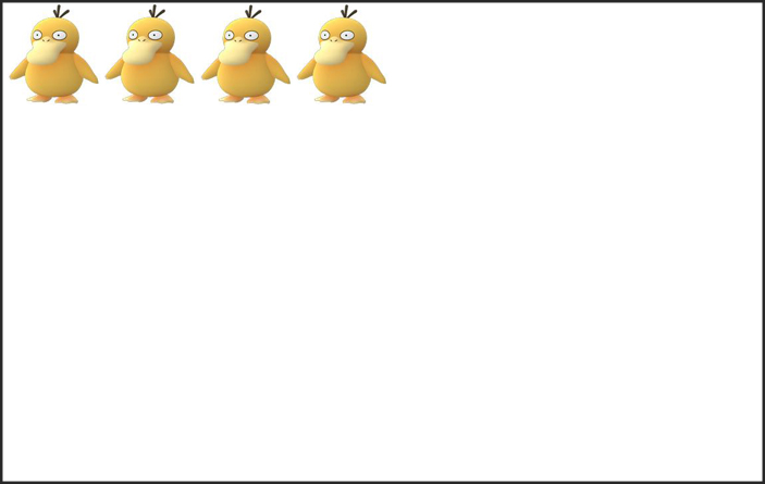
import { Row } from 'react-ditto'

// center the row of psyducks along the x axis
const Psyducks = () =>
  <Row x>
   <Psyduck /> <Psyduck /> <Psyduck /> <Psyduck />
  </Row>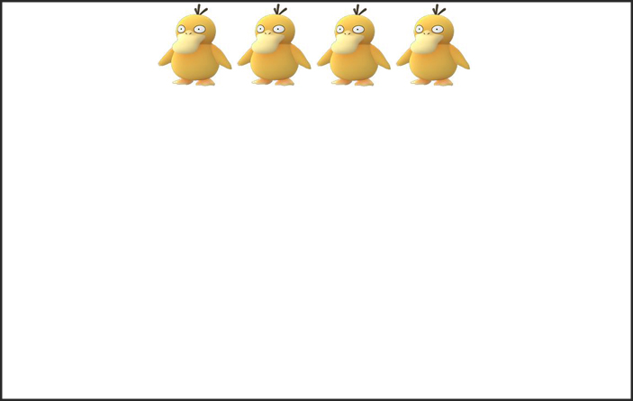
import { Row } from 'react-ditto'

// absolutely center the row of psyducks along both x & y axis
const Psyducks = () =>
  <Row x y>
   <Psyduck /> <Psyduck /> <Psyduck /> <Psyduck />
  </Row>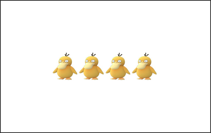
import { Row } from 'react-ditto'

// center along y axis while placing space _between_ row of psyducks
const Psyducks = () =>
  <Row y space='between'>
   <Psyduck /> <Psyduck /> <Psyduck /> <Psyduck />
  </Row>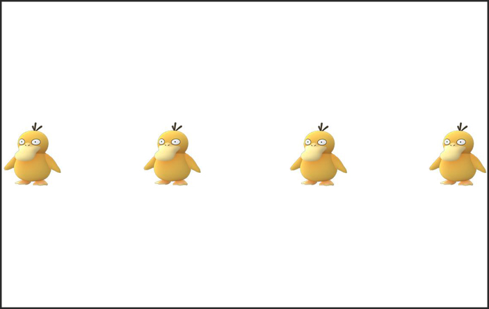
import { Row } from 'react-ditto'

// center along y axis while placing space _around_ row of psyducks
const Psyducks = () =>
  <Row y space='around'>
   <Psyduck /> <Psyduck /> <Psyduck /> <Psyduck />
  </Row>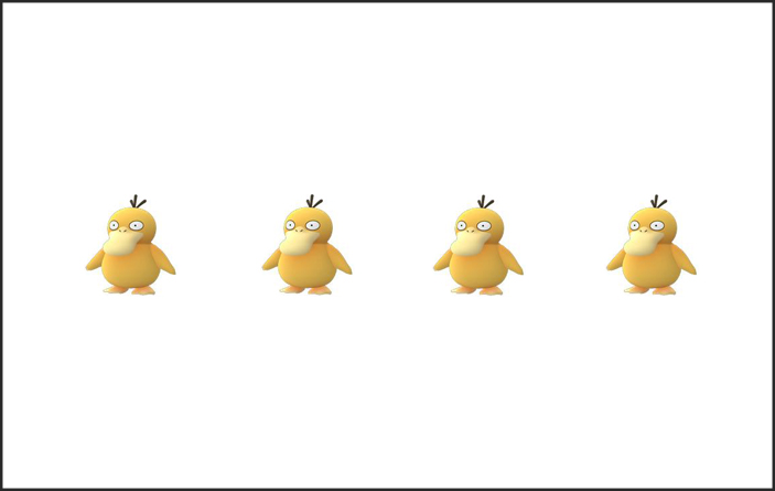
import { Col } from 'react-ditto'

// render psyducks as a column (with space _around_) and center along the x axis
const Psyducks = () =>
  <Col x space='around'>
   <Psyduck /> <Psyduck /> <Psyduck /> <Psyduck />
  </Col>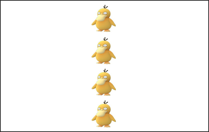
import { Col } from 'react-ditto'

// render psyducks in a column (with space _around_) and wrap as room requires
const Psyducks = () =>
  <Col space='around' wrap>
   <Psyduck /> <Psyduck /> <Psyduck /> <Psyduck />
  </Col>

First, let's get as far away from Haunter as we can by applying large left margin margin
import { Box } from 'react-ditto'

// apply size level giant (++) margin to the left
const SnorlaxAndCandy = () =>
  <Box ml='++'>
   <Snorlax />
   <Candy />
  </Box>
Now we'll give Snorlax some breathing room from Zapdos and Sandslash by applying top and bottom padding
import { Box } from 'react-ditto'

// apply size level 3 (scale from 0-5) amount of padding to top (pt) and bottom (pb)
const SnorlaxAndCandy = () =>
  <Box x pt='+' pb='+'>
   <Snorlax />
   <Candy />
  </Box>
Finally, ever use the padding shorthand to apply it only vertically or horizonally (e.g. padding: 10px 0)? You can do similarly here. Let's apply this snorlax's vertical padding via shorthand:
import { Row } from 'react-ditto'

// apply padding along the 'y' axis
const SnorlaxAndCandy = () =>
  <Row py='+'>
   <Snorlax />
   <Candy />
  </Row>
This shorthand works for both margin and padding.
Let's say we want to render our pokemon go team:
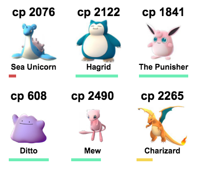
import React from 'react'
import { render } from 'react-dom'
import { Box, Row, Col } from 'react-ditto'
import { pokemon } from './examples/data'

const HealthBar = ({percentHealth}) =>
  <Box width='100%' height='6px'>
    <Box width={`${percentHealth}%`} height='100%'
      css={{backgroundColor: percentHealth < 25
        ? '#d34f4f' // red
        : percentHealth < 50
        ? '#f4d554' // yellow
        : '#6deeb6' // green
      }} />
  </Box>

const PokemonList = ({pokemon}) =>
  <Row wrap space='between' px tag='ul' maxWidth='380px'>
    {pokemon.map(p =>
      <Col x px='-' my tag='li' >
        <h2>cp { p.cp }</h2>
        <img src={ p.img } height='90px' />
        <Box tag='h4' mb1>{ p.name }</Box>
        <HealthBar percentHealth={ (p.health / p.maxHealth) * 100 } />
      </Col>
    )}
  </Row>

render(<PokemonList pokemon={pokemon} />, document.getElementById('root'))react-ditto is now built on top of glamorous to use its jsxstyle inspired api.
So in addition to react-ditto's layout shorthand... you can use glamorous goodness
import { Row } from 'react-ditto'

const DittoAndGlamorous = () =>
  <Box x y pt height='50em' color='blue' css={{':hover': { color: 'green' }}>
    I am absolutely centered with top padding. Green when hovered over, and blue when not.
  </Box>
const api = {
// layout api
x: axisPropTypes,
y: axisPropTypes,
space: PropTypes.oneOf([
'between', // |x x x|
'around' // | x x x |
]),
start: PropTypes.oneOf([
'end' // | X|
]),
wrap: ProptTypes.oneOf([
false, // squish all chilrdren to fit space
true, // overflow children underneath
'reverse' // overflow children above
]),
reverse: PropTypes.onOf({
true,
false
})
// spacing api
p: spacingPropTypes, // padding
pt: spacingPropTypes, // padding top
pr: spacingPropTypes, // padding right
pb: spacingPropTypes, // padding bottom
pl: spacingPropTypes, // padding left
px: spacingPropTypes, // horizontal padding
py: spacingPropTypes, // vertical padding
m: spacingPropTypes, // margin
mt: spacingPropTypes, // margin top
mr: spacingPropTypes, // margin right
mb: spacingPropTypes, // margin bottom
ml: spacingPropTypes, // margin left
mx: spacingPropTypes, // horizontal margin
my: spacingPropTypes, // vertical margin
// sizing api
size: sizingPropTypes,
height: sizingPropTypes,
maxHeight: sizingPropTypes,
minHeight: sizingPropTypes,
width: sizingPropTypes,
maxWidth: sizingPropTypes,
minWidth sizingPropTypes,
}
const spacingPropTypes = PropTypes.oneOf([
0, '0', // none
'--', // tiny
'-', // small
true, // standard
'+', // big
'++' // giant
])
const axisPropTypes = PropTypes.oneOf([
false, // (Default) place at "start" of given axis (far left [x] or top [y])
true, // center across given axis
'end' // place at "end" of given axis (far right [x] or bottom [y])
])
const sizingPropTypes = PropTypes.string
By default react-ditto has a base space value of 6px and the scale is based on fibonacci resulting in:
{
  '--': '6px',
  '-': '12px',
  '': '18px',
  '+': '30px',
  '++': '48px'
}
You can configure your own thusly:
// Layout.js

import { cloneNewDitto } from 'react-ditto'

const Layout = cloneNewDitto({
  baseSpace: 8
})

export const Box = Layout.Box
export const Row = Layout.Row
export const Col = Layout.Col
resulting in the following spacing values:
{
  '--': '8px',
  '-': '16px',
  '': '24px',
  '+': '40px',
  '++': '64px'
}
If you're looking for further configuration (ex: don't like the -, --, +, ++ api for spacing?), open an issue and we'll see about getting you taken care of.


 React
React
 Typescript
 Django
 Laravel
 Facebook
 Microsoft
 Google
 Alibaba
 D3
D3
 Tencent