


💥💥💥 React Library for SCREEN RECORDER . Tiny and Efficient. Check it Out 💥💥💥
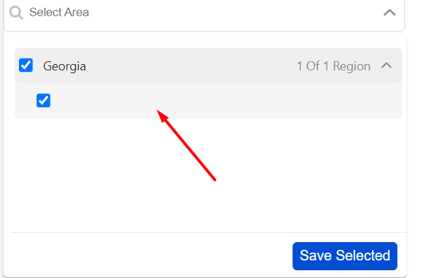
A React component which provides multi select functionality for nested option list of continent -> country -> state with various features like selection limit, CSS customization, checkbox, search option, disable preselected values, control nested level keyboard navigation for accessibility, chip select, delete selected, limit chip count, leading and trailing icon for search box, placeholder context and grouping features. Also it has feature to behave like normal dropdown(means single select dropdown).


✨ Easy to use
🍃 Light weight
🚀 Typescript
npm install multi-nested-select

yarn add multi-nested-select
React-multi-nested-select-dropdown
import NestedSelect from "multi-nested-select";;


callbackFunction(selectedItem) {
    ...
}

onChange(e_selected) {
    ...
}

<NestedSelect
    buttonContent="Done" // For custom text for button
    enableButton={true}  // To show or hide the button
    state={true}         // show the nested level state
    continent={true}     // show and hide the continent
    chip={true}          // show and hide the chip
    onChange={(val) => onChange(val)}  // while adding/removing this onchange will call
    callback={(val) => callbackFunction(val)}  //on submit or save button callback()
/>
| Prop | Type | Default | Description |
|---|---|---|---|
callback |
function |
(val) => {} |
Callback function will invoked on click of save button |
onSearch |
function |
(val) => {} |
Callback function will invoked on change of input feild event (similar to onChange). Params are searchValue |
onChange |
function |
(val) => {} |
Callback function will invoked on selection or removal of options. Params are selectedList. |
onViewmore |
function |
(val) => {} |
Callback function will invoked on click on view more (only when chip is true). |
onChipDelete |
function |
(val) => {} |
Callback function will invoked on deletion of chip. (only when chip is true). |
disabled |
boolean |
false |
Make it true to disable the select input feild. |
selectedValue |
array |
[] |
Default value to persist in dropdown |
showCustomList |
array |
[] |
Dropdown array list according to showCustomList. |
error |
bool |
false |
To display error on input field. |
helperText |
string |
"" |
To display the helper text for input. |
expandChip |
bool |
true |
To display chip expand and collapse option |
showCheckbox |
bool |
true |
To display checkbox option in the dropdown |
omitSelected |
bool |
false |
To unselect the selected when clicked outside of dropdown. |
selectLimit |
number |
-1 |
You can limit the number of items that can be selected in a dropdown |
placeholder |
string |
Select Area |
Placeholder text |
buttonContent |
string |
Save Selected |
To display the button text content` |
disable |
bool |
false |
to disaled / enabled the button |
selectAllOption |
bool |
false |
to enable "All regions" select option to select in one go |
width |
number |
360 |
width of the component. |
height |
number |
260 |
height of the dropdown. |
chip |
bool |
false |
view selected option as chip. |
chipCount |
number |
5 |
chip count displayed on input. |
placeholderCtx |
bool |
true |
enabale/ disable placeholderctx after option select. |
enableButton |
bool |
true |
Make it false to hide the button. |
trailing |
bool |
true |
Make it false to hide the trailing message ex- 0 of 24 selected'. |
leading |
bool |
true |
Make it false to hide the leading icon in search box'. |
trailingIcon |
bool |
true |
Make it false to hide the trailing icon in search box'. |
state |
bool |
true |
Option to show or hide the state option list .make it false to hide state list. |
continent |
bool |
true |
Option to show or hide the continent option list .make it false to hide continent list. |
id |
string |
'' |
Id for the search container / input field.. |
buttonClass |
string |
'' |
styling for the save button(this is className). |
dropDownClass |
string |
'' |
styling for the dropdown(this is className). |
inputClass |
string |
'' |
styling for the input field wrapper with trailing icon or leading icons(this is className). |
style |
object |
{} |
CSS Customization for multi-nested-select input fields. |
...props |
attribute |
'' |
pass any attribute other than above listed, it will default assigned to input feild as their own attributes. |
For customization of CSS we have provide className based support

* For input box --
Pass props as inputClass= " ... your class name... "
<SelectCountry
  inputClass="myCustom_text"
/>


* For drop-Down box --
Pass props as dropDownClass= "... your class name... "
<SelectCountry
  dropDownClass="myCustom_dropbox"
/>

* For drop-Down box --
Pass props as dropDownClass= "... your class name... "
<SelectCountry
  buttonClass="myCustom_button"
/>

Now create your own .css or .scss file to define that class style according to your need.

Ex -

Create `custom.css` file in your repo


.myCustom_dropbox{
    height: 200px;
    z-index: 1000;
}MIT
This package is build with typescript, react js and webpack .
Contributions are welcome, please open an issue and preferrably file a pull request.
Opening Issue Please share sample code using codesandbox.com or stackblitz.com to help me re-produce the issue.
https://codesandbox.io/s/multi-select-nested-options-5eyyu4?file=/src/App.js


 React
React
 Typescript
 Django
 Laravel
 Facebook
 Microsoft
 Google
 Alibaba
 D3
D3
 Tencent