nmalkin / kpi-dashboard Goto Github PK
View Code? Open in Web Editor NEWdashboard for visualizing key performance indicators for Mozilla Persona
dashboard for visualizing key performance indicators for Mozilla Persona


For example: there are lots of different browsers, so trying to display all of them in a report would render it incomprehensible. To deal with this, only the biggest buckets are displayed (e.g., only the top 5 browsers). The rest are grouped into an Other bucket.
This is a problem because it is the more obscure browsers and operating systems that are likely to have issues. We should consider having a way to break apart the Other category and display its constituents (in a way that actually provides insight).
In light of #16, should data displayed cumulatively (with no segmentation) be displayed, by default, as a line, not an area?
Can users log in/sign up?
In light of the changes to the format of the data stored in the KPI backend, the KPI number_sites_logged_in will be replaced with KPI number_sites_signed_in.
For reference, see:
Are users able to successfully add a second email address to their account?
Funnel analysis showing % breakdown of
Now that we're more certain that the current visualizations are staying, there can be more of an effort to make their state persist on page reload/reappearance.
For example, if the page is reloaded, we can preserve the last selected date range, remember the chosen segments, etc.
The big question is: is this necessary? The metric dashboard doesn't do that, for example.
Should get input from Crystal/Dan: to what extent do they want it to persist (always? never? only when loaded from permalinks?)
In server/lib/aggregate.js, aggregateData and aggregateMultiple are redundant. The latter could supercede the former with minor modifications.
KPI Dashboard's first Key Performance Indicator report will be:
Median # of sites a user logs into w Persona
Description: How well are we doing on Persona ID uptake? On average, how many sites does our user interact with over the day? This value should climb over time and stabilize at a healthy value.
A report should have the following common features:
Common features will show up in other KPI reports
Currently, the labels for the steps in the visualization of user flow (e.g., #2) appear only on mouse over. They should always be visible.
Report #1 presents the average number of sites a user logs into with Persona (as of #29, it is the mean, not the median). The value is computed as the mean of all values of the number_sites_signed_in KPI across all data points on a given day.
Consider this sequence of operations by a single user:
To compute the mean value, we will take the sum of all values for number_sites_signed_in (0+0+0+1+2+3=6) and divide by the total number of data points (6) to get a mean value of 1, while the correct value is, of course, 4.
In general, the problem is that multiple interactions by a single user are treated as equivalent to a single interaction by multiple users.
One way to account for this would be to try to aggregate the data points by user (i.e., figure out which data points came from the same person) and use only the maximum value. However, this is costly and has undesirable privacy implications.
Another way to handle it would be to weight higher values of number_sites_signed_in (e.g., 2=2×1, ...). This is equivalent to saying, "oh, I just saw a 2. That means I also saw a 1, but that 1 shouldn't count." This a more sensible approach, but note that it wouldn't fully correct the bias in the example above; nor (for the same reason) can it account for repeated sign-ins to the same site.
One more possibility is to do nothing, since we keep saying that this is not a very meaningful metric and we only care about its derivative. This is obviously the easiest, though we would probably have to stop calling it "average number of sites logged in."
Right now, each new request to the backend results in data retrieval and report re-calculation. There is a lot of potential for caching here.
Right now, the new user flow report has both a slider and a date picker available to select the date range, but the sites logged in report (and sign-in attempts) has only the slider. For ease of selection, and consistency, these reports should have date pickers as well.
As per mozilla/persona#2198, data points with empty event streams are the results of errors and should therefore be ignored for any calculations.
@jedp pointed out the benefits of having a more internally consistent color scheme for the user flow over time report (#18). For example, a commonly recognized gradient (green=good, red=bad). (Right now it just uses some default color.)
As requested in mozilla/persona#2281 and implemented in mozilla/persona#2373
Number of new users in the last X days
Would reduce the number of requests to the server, make for better interaction, match users' intent.
Are users able to successfully reset their password?
When there are holes in the data (i.e., there is not a data point for every single day), the new user flow over time report (#18) breaks (problem parsing SVG with D3, no data written or rendered).
To reproduce:
Data will reappear, but not the axes and hover details.
The problem
Rickshaw falls apart when no data is displayed. 181851c introduced a fix for this that catches the exception when the graph is being updated and redraws it (from scratch). However, the axes and hover details are not being recreated.
The solution
will be to recreate the appropriate axes based on the report.
Or figure out why Rickshaw's breaking on empty series. But, you know, probably the former.
Like #13, but for other reports
If the user requests data for a particular date range, and we already have that data (e.g., user wants to see June, and we're displaying May through July right now), there's no reason to issue a new request to the server and re-download that data.
Thus, some successful completions are reported as failures.
You can already link to individual reports, but it would be helpful if you could link to a particular version of the report (e.g., with a certain date range, or segmentation, selected).
It's a mess, right now, of shared functions, objects, function pointers. A more object-oriented approach (a report class, for instance), or maybe models, might make it cleaner.
Report requirement for #1 requests "buckets by screen size (mobile/tablet/desktop)".
Clarifying questions:
Report #1 is the median number of sites a user logs into with Persona.
As part of migrating to CouchDB as the backend (#27), finding the median of the data series becomes a significantly harder technical challenge. (To do it in a map/reduce framework requires a quick-select algorithm, which there doesn't seem to be a good way to do in CouchDB.)
Alternately, the median value for each day could be precalculated when data arrives and then stored in the database. However, this would require either a new database (cumbersome) or a change to the data format and code of the current one (very undesirable).
Calculating the mean of the dataset, however, is much easier.
While the median is a more sensible value to look at (it is less sensitive to outliers), it has been agreed, before, that this entire report is not hugely meaningful. The median value itself doesn't really say anything. The only way we'd use it is to watch the number and hope it trends up. In that case, however, the mean is just about as good: we can look at it and watch its trend.
Therefore, with @jedp, we have resolved to use the mean, instead of the median, for this report.
If anyone cares, we can discuss it here, and revisit this when there's more time.
When visualizing a KPI over time, important milestones (e.g., release dates) should be marked or visually highlighted in some way.
Right now, these just use built-in colors, but they are not consistent: they change every time (even for the same segments, ordered in the same way).
Per specification of #1 and input from Crystal, we want buckets by number of emails (i.e., how many emails are associated with this person's Persona account?)
Note that this is not meaningful for all reports. For example, all people in the report showing new user flow will presumably have no emails.
Rather than displaying one of the reports, the landing screen should provide an at-a-glance overview of the entire dashboard. This means, at a minimum, links with explanations, to all the screens, or, better, actual KPI values (or visualizations?).
(Per Austin's suggestion,) interviews with Crystal and Dan about their workflows should give a better picture of what would be helpful.
In addition to just showing the value on the given date, there should be a second line representing the average of that value over the preceding 7 days.
For clarity (so that it's actually useful), this should only appear when the data is shown cumulatively (no segmentation), as a line.
(for Dan)
For background, and what we're trying to accomplish, please see #27.
Counting the number of step completions in a given date range�
To get this data, we set up a view in CouchDB:
{
    map: function(doc) {
        // doc.newUserSteps is the array of steps completed by the user
        if(doc.newUserSteps.length > 0) { // Only count new users
            doc.newUserSteps.forEach(function(step) {
                // Save the completed step, with the date when it was completed as the key
                emit(doc.date, step);
            });
        }
    },

    reduce: function(keys, values, rereduce) {
        if(rereduce) {
            // omitted
        } else {
            // Count the number of times each step was completed
            var steps = {};
            values.forEach(function(step) {
                if(! (step in steps)) {
                    steps[step] = 0;
                }

                steps[step]++;
            });

            return steps;
        }
    }
}
Then, for example, if we wanted a report for June, we could query the view with startkey=2012-06-01&endkey=2012-16-30&group=false. Easy enough.
Same task, but now we want to see the data segmented by operating system. So we set up a view.
{
    map: function(doc) {
        if(doc.newUserSteps.length > 0) {
            doc.newUserSteps.forEach(function(step) {
                // Instead of saving just the step, like last time,
                // now we save both the step and the OS.
                emit(doc.date, {
                    step: step,
                    os: doc.os
                });
            });
        }
    },

    reduce: function(keys, values, rereduce) {
        if(rereduce) {
            // omitted
        } else {
            var systems = {};
            values.forEach(function(value) {
                if(! (value.os in systems)) {
                    systems[value.os] = {};
                }

                if(! (value.step in systems[value.os])) {
                    systems[value.os][value.step] = 0;
                }

                systems[value.os][value.step]++;
            });

            return systems;
        }
    }
}
A little bit more complicated, but overall pretty similar. Quite manageable.
Okay, that worked, but now we want to segment by browser.
That's very similar. The only difference is that, instead of using the doc.os field, we'd need to use the doc.browser field.
Here's the problem: because views in CouchDB can't take arbitrary parameters, we'd have to create a completely separate view with nearly identical code.
And then again, when we want to segment by screen size. And for locale, and so on.
For each segmentation (there will be at least 5 of them), a new view will have to be created, and it will be nearly identical to the other ones.
Furthermore, since most reports will have segmentations, the views will be duplicated across reports.
How can we avoid this?
To fully address #2, in addition to the visualization of user drop-off introduced in b748117, there should be some way of visualizing the flow of users over time. (The existing report allows the selection of a date range, but doesn't make it easy to track the changes over time.)
A sketch of what this visualization should look like:
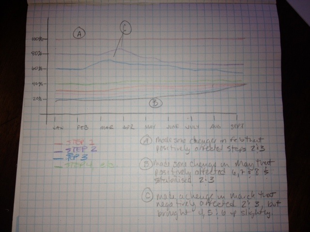
(Thanks to Annie Elliott for the idea!)
A declarative, efficient, and flexible JavaScript library for building user interfaces.
🖖 Vue.js is a progressive, incrementally-adoptable JavaScript framework for building UI on the web.
TypeScript is a superset of JavaScript that compiles to clean JavaScript output.
An Open Source Machine Learning Framework for Everyone
The Web framework for perfectionists with deadlines.
A PHP framework for web artisans
Bring data to life with SVG, Canvas and HTML. 📊📈🎉
JavaScript (JS) is a lightweight interpreted programming language with first-class functions.
Some thing interesting about web. New door for the world.
A server is a program made to process requests and deliver data to clients.
Machine learning is a way of modeling and interpreting data that allows a piece of software to respond intelligently.
Some thing interesting about visualization, use data art
Some thing interesting about game, make everyone happy.
We are working to build community through open source technology. NB: members must have two-factor auth.
Open source projects and samples from Microsoft.
Google ❤️ Open Source for everyone.
Alibaba Open Source for everyone
Data-Driven Documents codes.
China tencent open source team.