GithubHelp home page GithubHelp logo

phase2 / outline Goto Github PK

View Code? Open in Web Editor NEW
123.0 32.0 26.0 72.44 MB

Tooling infrastructure for modern web component development.

Home Page: https://outline.phase2tech.com

License: MIT License

JavaScript 19.25% CSS 25.53% TypeScript 31.37% Shell 2.08% MDX 20.01% HTML 1.76%
typescript storybook tailwindcss web-components lit hacktoberfest outline design-system javascript components

outline's Introduction

OutlineJS

Version GitPod License

Storybook Hosting

Netlify GitHub Pages Chromatic

Outline is a both a growing Web Component library as well as a toolkit for building out bespoke design systems for a wide variety of client and personal usages. Outline is based on the latest technologies and tools to help your component authoring experience and facilitate adoption in your organization.

More than a Design System

Outline is much more than just you run of the mill design system. Outline provides an added benefit on top of multiple similar libraries available.

  • Outline is a set of components
  • Outline is a set of tooling and technology to scaffold design systems for a multitude of projects
  • Outline is a set of rules for defining components
  • Outline is a set of rules for integrating components
  • Outline provides well curated documentation on many complex topics
  • Outline grows with internal lessons learned project after project here @phase2.

Outline and Outline design systems are built with many of the following notable tools:

  • Turborepo
  • Lit
  • TypeScript
  • CSS Custom Properties
  • Storybook
  • Postcss
  • TailwindCSS

Scaffolding a new Outline project

Outline is organized as a mono-repo and is available to use via NPM Packages and our CLI. The outline-cli simplifies the setup process using pre-defined templates available in the outline-templates package as guides on basic scaffolding of new Outline based projects.

Using NPX (recommended)

This method will load the latest version of the Outline CLI to cache, and prompt you when an update is available. This makes it easier than managing a local version to simply run outline init instead.

npx @phase2/outline-cli init

Global Installation

This method will require manually updating from time to time for the latest updates on your system. If you are using NVM appropriately, any version of node would need this installed. If you are using yarn, you can just install it once globally.

With NPM

npm install -g @phase2/outline-cli
outline init

With Yarn

yarn global add @phase2/outline-cli
outline init

Contributing to Outline

Detailed information regarding how to contribute to Outline development, can be found in CONTRIBUTING.md. Expect this information to be refined soon.

Please see Component Development Guide for information about developing for Outline.

Deploys by Netlify

outline's People

Contributors

biggiep2 avatar damontgomery avatar danmuzyka avatar glitchgirl avatar grshane avatar himerus avatar imgoodrich avatar jardix22 avatar jwaxo avatar mabry1985 avatar madhaze avatar peterschuelke avatar sarahp avatar shaal avatar tekante avatar tomsshow avatar

Stargazers

 avatar  avatar  avatar  avatar  avatar  avatar  avatar  avatar  avatar  avatar  avatar  avatar  avatar  avatar  avatar  avatar  avatar  avatar  avatar  avatar  avatar  avatar  avatar  avatar  avatar  avatar  avatar  avatar  avatar  avatar  avatar  avatar  avatar  avatar  avatar  avatar  avatar  avatar  avatar  avatar  avatar  avatar  avatar  avatar  avatar  avatar  avatar  avatar  avatar  avatar  avatar  avatar  avatar  avatar  avatar  avatar  avatar  avatar  avatar  avatar  avatar  avatar  avatar  avatar  avatar  avatar  avatar  avatar  avatar  avatar  avatar  avatar  avatar  avatar  avatar  avatar  avatar  avatar  avatar  avatar  avatar  avatar  avatar  avatar  avatar  avatar  avatar  avatar  avatar  avatar  avatar  avatar  avatar  avatar  avatar  avatar  avatar  avatar  avatar  avatar

Watchers

 avatar  avatar  avatar  avatar  avatar  avatar  avatar  avatar  avatar  avatar  avatar  avatar  avatar  avatar  avatar  avatar  avatar  avatar  avatar  avatar  avatar  avatar  avatar  avatar  avatar  avatar  avatar  avatar  avatar  avatar  avatar  avatar

outline's Issues

Alert Component

Requirements

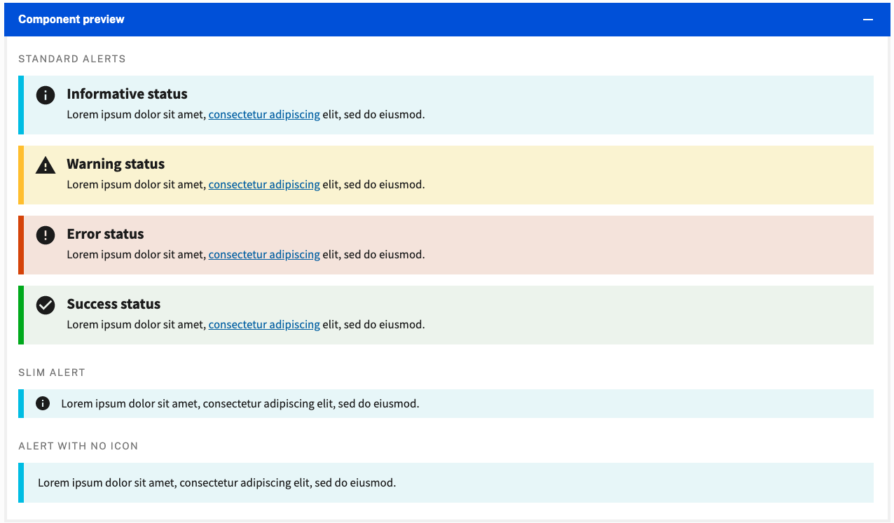
Create an alert component that:

  • Has large and small size options.
  • Has an optional icon (can be hard coded for now until icon component is created/refined).
  • Optional: Has basic style options like 'Warning", "Error" "Success" "Basic" (see below).

Example

Alert___U_S__Web_Design_System__USWDS_

Accessibility Guidelines

W3.org

Slider Component

We need a slider.
An accessible slider.
Maybe more than one slider?
Inspiration links pending.

Better the documentation on outline-link

Outline-link is one of our more flexible components, and we need better sample code blocks that are better than:

<outline-link
  linkHref="{{ linkHref }}"
  linkRel="{{ linkRel }}"
  linkTarget="{{ linkTarget }}"
>
  {{ defaultSlot }}
</outline-link>

Reduce duplication of the list of character replacements

Would we be able to reduce duplication of the list of character replacements if we ran camelize all the time without checking for a list of characters?

Or, could the logic be grouped together, for example, putting the list of characters and conditional checks inside camelize?

Right now, updates require changes in the camelize function as well as the nameDelimiter array. These two are defined quite far apart in the code and then used in a third place: lines 15, 51, and 78.

Originally posted by @damontgomery in #140 (comment)

Accordion Component

Requirement

  • Create an accordion component that is accessible called outline-accordion.
  • Accordion should have optional flag to have only one open, or many open.

Optional features

  • I can set the header to use h1, h2, etc using the outline-header component
  • I can set link to an accordion using an Anchor link
    • I can copy the link using the browser

Example(s)

https://designsystem.digital.gov/components/accordion/
Cursor_and_Accordion___U_S__Web_Design_System__USWDS_

Accessibility Guidelines

W3.org
A11y Style Guide

Update static media assets to have a greater variety of shapes/sizes

Currently there are many P2 oriented stock images but they are all the same aspect ratio. This means that if you want a square or wide landscape image you need to upload new ones.

It would be great if there were a variety of image aspect ratios and the file names were clear on what that was (ie square_400-400_headphones.jpg)

View (VRT) Visual Regression Test report while reviewing PRs

As a developer / maintainer, I want to view visual regression tool test reports when reviewing PRs on Github, so that I can tell what has changed.

  • I don't want the tools to block PRs

Implementation notes

Can we add both Chromatic / Applitools using the free-for-open-source license so we can try these out as a team and eventually choose one?

These should be pretty easy to add / remove and very quickly useful, so the risk to add / remove should be low.

Discussed on a regular meeting.

Package from Rollup is missing some of the components.

As-is, if we get to a certain size (I added outline-alert and outline-modal), Rollup wants to start chunking stuff and it seems to just toss away some random parts of the code or give an error.

I could test this by searching through the dist/outline.js file and couldn't find strings like outline-alert, but could find outline-link.

I think it has something to do with plugin-multi-entry. https://www.npmjs.com/package/@rollup/plugin-multi-entry

The closest I got was something like,

input: {
    include: [
      'src/components/**/*.ts',
    ],
    exclude: [
      'src/components/**/*.stories.ts',
      'src/components/**/*.css.lit.ts',
    ],
  },
  output: [
    {
      // Modern bundle.
      dir: 'dist',
      format: 'esm',
      entryFileName: 'outline.js',
    },
  ],
  manualChunks: () => 'outline.js',

You can run this with yarn rollup.watch.

But this uses the default name of multi-entry.js even though I've tried setting entryFileName according to the documentation in multiple places.

I'm out of ideas for today, but may be able to try again next week.

`outline-video-youtube` component should use the `lite-youtube` technique

An embedded YouTube video adds on average 2.5MB and slows down page load time.

Instead of loading YouTube iframe, you could display just the YouTube-preview-image + the YouTube-play-icon when the page loads. As soon as the user clicks on it, it switches to the YouTube embed and plays the video.

An existing webcomponent library that already does this is - https://github.com/justinribeiro/lite-youtube

We should implement a similar solution in Outline, to replace the current <outline-video-youtube>

Code Splitting / Lazy Loading

To avoid large bundle sizes, we need to enable the ability to enable code splitting/lazy loading.
Stencil did this with Rollup under the hood so we should be able to accomplish the same.

Button Group

Requirements

Create a basic button group component that:

  • Takes pre-rendered instances of outline-button passed into a slot.
  • Has basic 'Horizontal', 'Vertical' styling options.
  • Meets accessibility standards.

Example

https://designsystem.digital.gov/components/button-group/
Button_group___U_S__Web_Design_System__USWDS_

Accessibility Guidelines

a11y Style Guide (also look at Tabs info?)
Digital A11Y group role

Notes/Questions

Not sure if we need to have some kind of state/change logic built into this component.
This should be actually simple to just pass in any number of buttons into a slot, and then based on a single property of horizontal/vertical alignment, you can swap CSS.

Outline Icons

Incorporate inline icons and generate icon script into Outline

Update list components default styles

I want to update some of this CSS to use @apply where appropriate/possible. This one would simply be @apply flex flex-col;.

I would do this throughout this CSS file, including using some of the demo color palette for the colors.

Originally posted by @himerus in #94 (comment)

Make `_conditionalSlotTemplate` work with default slots

protected _conditionalSlotTemplate({
elementName,
slotNameStub,
wrapperElementType = 'div',
ariaLabel = null,
}: {
elementName: string;
slotNameStub: string;
wrapperElementType?: string;
ariaLabel?: string | null;
}): TemplateResult | null {
const namespacedSlotName = `${elementName}--${slotNameStub}`;
return this.querySelector(`[slot="${namespacedSlotName}"]`) !== null
? html`<${unsafeStatic(
wrapperElementType
)} id="${slotNameStub}" aria-label="${ifDefined(ariaLabel)}">
<slot
name="${namespacedSlotName}"
@slotchange="${() => this.requestUpdate()}"
></slot>
</${unsafeStatic(wrapperElementType)}>`
: null;

While this feature is great for a component with a lot of named slots, our "default" behavior should be on an item with a single slot to leave that slot unnamed, so that the consumer doesn't need to add any wrapper markup with slot="my-named--slot".

I'd like to see this work on unnamed slots.

Refactor outline-tab-group for mobile/accordion switch

As can be seen at https://github.com/phase2/outline/blob/next/src/components/base/outline-tabs/outline-tab-group/outline-tab-group.stories.ts#L85-L97, the mobile version of the tab group becomes an outline-accordion.

Currently this is demonstrated via the consumer, Storybook rather than being a PART of the outline-tab-group itself.
We should assume the tab group relies on the accordion, and we swap them ourselves via the design system, and not rely on the consumer to slot an additional component, that if missing nullifies the current content in the tab panel.

Enhancement: Alert

Enhancements for #41.

  • Add icons when available
  • Add the ability to close alerts.
    • If these might be used to display an alert dynamically after page load we should look into supporting aria-live polite

Pull request references

#60

Conflicting namespaces: ALL_HORIZONTAL_ALIGNMENT

(!) Conflicting namespaces: "virtual:multi-entry.js" re-exports "ALL_HORIZONTAL_ALIGNMENT" from both "src/components/base/outline-container/config.ts" and "src/components/base/outline-element/utils/types.ts" (will be ignored)

The instance in src/components/base/outline-container/config.ts should be removed and instead reference the shared one in outline-element.

Documentation: Using Outline in an existing application

What files do you need to import into your application after you run a build of the Outline Design System?

  1. dist/outline.js
  2. outline.theme.css

I'm not sure where the other dist files come into play but after including the aforementioned files in an existing application (React) I was able to successfully use the base Outline components in my React components

Recommend Projects

  • React photo React

    A declarative, efficient, and flexible JavaScript library for building user interfaces.

  • Vue.js photo Vue.js

    ๐Ÿ–– Vue.js is a progressive, incrementally-adoptable JavaScript framework for building UI on the web.

  • Typescript photo Typescript

    TypeScript is a superset of JavaScript that compiles to clean JavaScript output.

  • TensorFlow photo TensorFlow

    An Open Source Machine Learning Framework for Everyone

  • Django photo Django

    The Web framework for perfectionists with deadlines.

  • D3 photo D3

    Bring data to life with SVG, Canvas and HTML. ๐Ÿ“Š๐Ÿ“ˆ๐ŸŽ‰

Recommend Topics

  • javascript

    JavaScript (JS) is a lightweight interpreted programming language with first-class functions.

  • web

    Some thing interesting about web. New door for the world.

  • server

    A server is a program made to process requests and deliver data to clients.

  • Machine learning

    Machine learning is a way of modeling and interpreting data that allows a piece of software to respond intelligently.

  • Game

    Some thing interesting about game, make everyone happy.

Recommend Org

  • Facebook photo Facebook

    We are working to build community through open source technology. NB: members must have two-factor auth.

  • Microsoft photo Microsoft

    Open source projects and samples from Microsoft.

  • Google photo Google

    Google โค๏ธ Open Source for everyone.

  • D3 photo D3

    Data-Driven Documents codes.