This repository is a community-curated list of flexbox issues and cross-browser workarounds for them. The goal is that if you're building a website using flexbox and something isn't working as you'd expect, you can find the solution here.
As the spec continues to evolve and vendors nail down their implementations, this repo will be updated with newly discovered issues and remove old issues as they're fixed or become obsolete. If you discover a bug that's not listed here, please report it so everyone else can benefit.
- Minimum content sizing of flex items not honored
- Column flex items set to
align-items: centeroverflow their container min-heighton a flex container won't apply to its flex itemsflexshorthand declarations with unitlessflex-basisvalues are ignored- Column flex items don't always preserve intrinsic aspect ratios
- The default
flexvalue has changed flex-basisdoesn't account forbox-sizing: border-boxflex-basisdoesn't supportcalc()- Some HTML elements can't be flex containers
align-items: baselinedoesn't work with nested flex containers- Min and max size declarations are ignored when wrapping flex items
- Inline elements are not treated as flex-items
- Importance is ignored on flex-basis when using flex shorthand
- Shrink-to-fit containers with
flex-flow: column wrapdo not contain their items - Column flex items ignore
margin: autoon the cross axis flex-basiscannot be animated- Flex items are not correctly justified when
max-widthis used
Minimum content sizing of flex items not honored
| Demos | Browsers affected | Tracking bugs |
|---|---|---|
|
1.1.a – bug 1.1.b – workaround 1.2.a – bug 1.2.b – workaround |
Chrome (fixed in 72) Opera (fixed in 60) Safari (fixed in 10) |
Chrome #426898 (fixed) Chrome #596743 (fixed) Safari #146020 (fixed) |
When flex items are too big to fit inside their container, those items are instructed (by the flex layout algorithm) to shrink, proportionally, according to their flex-shrink property. But contrary to what most browsers allow, they're not supposed to shrink indefinitely. They must always be at least as big as their minimum height or width properties declare, and if no minimum height or width properties are set, their minimum size should be the default minimum size of their content.
According to the current flexbox specification:
By default, flex items won’t shrink below their minimum content size (the length of the longest word or fixed-size element). To change this, set the min-width or min-height property.
The flexbox spec defines an initial flex-shrink value of 1 but says items should not shrink below their default minimum content size. You can usually get this same behavior by setting a flex-shrink value of 0 (instead of the default 1) and a flex-basis value of auto. That will cause the flex item to be at least as big as its width or height (if declared) or its default content size.
Column flex items set to align-items: center overflow their container
| Demos | Browsers affected |
|---|---|
|
2.1.a – bug 2.1.b – workaround |
Internet Explorer 10-11 (fixed in Edge) |
When using align-items: center on a flex container in the column direction, the contents of flex item, if too big, will overflow their container in IE 10-11.
Most of the time, this can be fixed by simply setting max-width: 100% on the flex item. If the flex item has a padding or border set, you'll also need to make sure to use box-sizing: border-box to account for that space. If the flex item has a margin, using box-sizing alone will not work, so you may need to use a container element with padding instead.
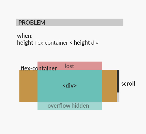
min-height on a flex container won't apply to its flex items
| Demos | Browsers affected | Tracking bugs |
|---|---|---|
|
3.1.a – bug 3.1.b – workaround 3.2.a – bug 3.2.b – workaround |
Internet Explorer 10-11 (fixed in Edge) | IE #802625 (archived) |
In order for flex items to size and position themselves, they need to know how big their containers are. For example, if a flex item is supposed to be vertically centered, it needs to know how tall its parent is. The same is true when flex items are told to grow to fill the remaining empty space.
In IE 10-11, min-height declarations on flex containers work to size the containers themselves, but their flex item children do not seem to know the size of their parents. They act as if no height has been set at all.
By far the most common element to apply min-height to is the body element, and usually you're setting it to 100% (or 100vh). Since the body element will never have any content below it, and since having a vertical scroll bar appear when there's a lot of content on the page is usually the desired behavior, substituting height for min-height will almost always work as shown in demo 3.1.b.
For cases where min-height is required, the workaround is to add a wrapper element around the flex container that is itself a flex container in the column direction. For some reason nested flex containers are not affected by this bug. Demo 3.2.a shows a visual design where min-height is required, and demo 3.2.b shows how this bug can be avoided with a wrapper element.
flex shorthand declarations with unitless flex-basis values are ignored
| Demos | Browsers affected |
|---|---|
|
4.1.a – bug 4.1.b – workaround |
Internet Explorer 10-11 (fixed in Edge) |
Prior to the release of IE 10, the flexbox spec at the time stated that a flexbox item's preferred size required a unit when using the flex shorthand:
If the <preferred-size> is ‘0’, it must be specified with a unit (like ‘0px’) to avoid ambiguity; unitless zero will either be interpreted as as one of the flexibilities, or is a syntax error.
This is no longer true in the spec, but IE 10-11 still treat it as true. If you use the declaration flex: 1 0 0 in one of these browsers, it will be an error and the entire rule (including all the flexibility properties) will be ignored.
When using the flex shorthand, always include a unit in the flex-basis portion. For example: 1 0 0%.
Important: using a flex value of something like 1 0 0px can still be a problem because many CSS minifiers will convert 0px to 0. To avoid this, make sure to use 0% instead of 0px since most minifiers won't touch percentage values for other reasons.
Column flex items don't always preserve intrinsic aspect ratios
| Demos | Browsers affected |
|---|---|
|
5.1.a – bug 5.1.b – workaround |
Internet Explorer 10-11 (fixed in Edge) |
The March 2014 spec has the following to say about how size determinations are made for flex items:
On a flex item whose overflow is not visible, this [auto] keyword specifies as the minimum size the smaller of: (a) the min-content size, or (b) the computed width/height, if that value is definite.
Demo 5.1.a contains an image whose height is 200 pixels and whose width is 500 pixels. Its container, however, is only 300 pixels wide, so after the image is scaled to fit into that space, its computed height should only be 120 pixels. The text quoted above does not make it clear as to whether the flex item's min-content size should be based the image's actual height or scaled height.
The most recent spec has resolved this ambiguity in favor of using sizes that will preserve an element's intrinsic aspect ratio.
You can avoid this problem by adding a container element to house the element with the intrinsic aspect ratio. Since doing this causes the element with the intrinsic aspect ratio to no longer be a flex item, it will be sized normally.
The default flex value has changed
| Demos | Browsers affected |
|---|---|
|
6.1.a – bug 6.1.b – workaround 6.2.a – bug 6.2.b – workaround |
Internet Explorer 10 (fixed in 11) |
When IE 10 was being developed, the March 2012 spec said the initial value for the flex property was none, which translates to 0 0 auto. The most recent spec sets the initial flex value to the initial values of the individual flexibility properties, which corresponds to initial or 0 1 auto. Notice that this means IE 10 uses a different initial flex-shrink value (technically it was called neg-flex in the spec at the time) from every other browser. Other browsers (including IE 11) use an initial value of 1 rather than 0.
This bug can manifest itself in two ways: when not setting any flex values or when using one of the flex shorthands. In both cases, flex items in IE 10 will behave differently from all other browsers. The following table illustrates the difference:
| Declaration | What it should mean | What it means in IE 10 |
|---|---|---|
| (no flex declaration) | flex: 0 1 auto |
flex: 0 0 auto |
flex: 1 |
flex: 1 1 0% |
flex: 1 0 0px |
flex: auto |
flex: 1 1 auto |
flex: 1 0 auto |
flex: initial |
flex: 0 1 auto |
flex: 0 0 auto |
If you have to support IE 10, the best solution is to always set an explicit flex-shrink value on all of your flex items, or to always use the longhand form (rather than the shorthand) in flex declarations to avoid the gotchas shown in the table above. Demo 6.1.a shows how not setting any flexibility properties causes an error, and demo 6.2.a shows how using flex: 1 can have the same problem.
flex-basis doesn't account for box-sizing: border-box
| Demos | Browsers affected |
|---|---|
|
7.1.a – bug 7.1.b – workaround 7.1.c – workaround |
Internet Explorer 10-11 (fixed in Edge) |
An explicit flex-basis value (i.e., any value other than auto) is supposed to act just like width or height. It determines the initial size of a flex item and then the other flexibility properties allow it to grow or shrink accordingly.
IE 10-11 always assume a content box model when using flex-basis to determine a flex item's size, even if that item is set to box-sizing: border-box. Demo 7.1.a shows that an item with a flex-basis value of 100% will overflow its container by the amount of its border plus its padding.
There are two ways to work around this bug. The first requires no additional markup, but the second is slightly more flexible:
- Instead of setting an explicit
flex-basisvalue, useauto, and then set an explicit width or height. Demo 7.1.b shows this. - Use a wrapper element that contains no border or padding so it works with the content box model. Demo 7.1.c show this.
flex-basis doesn't support calc()
| Demos | Browsers affected |
|---|---|
|
8.1.a – bug 8.1.b – workaround |
Internet Explorer 10-11 (fixed in Edge) |
|
8.2.a – bug 8.2.b – workaround |
Internet Explorer 10 (fixed in 11) |
IE 10-11 ignore calc() functions used in flex shorthand declarations. Demo 8.1.a shows flex: 0 0 calc(100%/3) not working in IE.
In IE 10, calc() functions don't even work in longhand flex-basis declarations (though this does work in IE 11). Demo 8.2.a shows flex-basis: calc(100%/3) not working in IE 10.
Since this bug only affects the flex shorthand declaration in IE 11, an easy workaround (if you only need to support IE 11) is to always specify each flexibility property individually. Demo 8.1.b offers an example of this.
If you need to support IE 10 as well, then you'll need to fall back to setting width or height (depending on the container's flex-direction property). You can do this by setting a flex-basis value of auto, which will instruct the browser to use the element's main size property (i.e., its width or height). Demo 8.2.b offers an example of this.
Some HTML elements can't be flex containers
| Demos | Browsers affected | Tracking bugs |
|---|---|---|
|
9.1.a – bug 9.1.b – workaround 9.2.a – bug 9.2.b – workaround 9.3.a – bug |
Chrome Edge Firefox (fixed in 63) Opera Safari (fixed in 11) |
Chrome #375693 (fixed) Chrome #700029 (fixed) Edge #4511145 (obsolete) Firefox #984869 (fixed) Firefox #1230207 (fixed) Firefox #1397768 (fixed) Safari #169082 (fixed) Safari #169700 (fixed) Safari #190065 (fixed) |
Certain HTML elements, like <summary>, <fieldset> and <button>, do not work as flex containers. The browser's default rendering of those element's UI conflicts with the display: flex declaration.
Demo 9.1.a shows how <button> elements didn't work in Firefox, and demo 9.2.a shows that <fieldset> elements don't work in most browsers. Demo 9.3.a shows that <summary> elements dont work in Safari.
The simple solution to this problem is to use a wrapper element that can be a flex container (like a <div>) directly inside of the element that can't. Demos 9.1.b and 9.2.b show workaround for the <button> and <fieldset> elements, respectively.
align-items: baseline doesn't work with nested flex containers
| Demos | Browsers affected | Tracking bugs |
|---|---|---|
|
10.1.a – bug 10.1.b – workaround |
Firefox (fixed in 52) | Firefox #1146442 (fixed) |
In Firefox, nested flex containers don't contribute to the baseline that other flex items should align themselves to. Demo 10.1.a shows the line on the left incorrectly aligning itself to the second line of text on the right. It should be aligned to the first line of text, which is the inner flex container.
This bug only affects nested containers set to display: flex. If you set the nested container to display: inline-flex it works as expected. Note that when using inline-flex you will probably also need to set the width to 100%.
Min and max size declarations are ignored when wrapping flex items
| Demos | Browsers affected | Tracking bugs |
|---|---|---|
|
11.1.a – bug 11.1.b – workaround |
Safari (fixed in 10.1) | Safari #136041 (fixed) |
Safari uses min/max width/height declarations for actually rendering the size of flex items, but it ignores those values when calculating how many items should be on a single line of a multi-line flex container. Instead, it simply uses the item's flex-basis value, or its width if the flex basis is set to auto.
This is problematic when using the flex: 1 shorthand because that sets the flex basis to 0%, and an infinite number of flex items could fit on a single line if the browser thinks their widths are all zero. Demo 11.1.a show an example of this happening.
This is also problematic when creating fluid layouts where you want your flex items to be no bigger than X but no smaller than Y. Since Safari ignores those values when determining how many items fit on a line, that strategy won't work.
The only way to avoid this issue is to make sure to set the flex basis to a value that is always going to be between (inclusively) the min and max size declarations. If using either a min or a max size declaration, set the flex basis to whatever that value is, if you're using both a min and a max size declaration, set the flex basis to a value that is somewhere in that range. This sometimes requires using percentage values or media queries to cover all possible scenarios. Demo 11.1.b shows an example of setting the flex basis to the same value as the min width to workaround this bug in Safari.
Inline elements are not treated as flex-items
| Demos | Browsers affected |
|---|---|
|
12.1.a – bug 12.1.b – workaround |
Internet Explorer 10-11 (fixed in Edge) |
Inline elements, including ::before and ::after pseudo-elements, are not treated as flex items in IE 10. IE 11 fixed this bug with regular inline element, but it still affects the ::before and ::after pseudo-elements.
This issue can be avoided by adding a non-inline display value to the items, e.g. block, inline-block, flex, etc. Demo 12.1.b shows an example of this working in IE 10-11.
Importance is ignored on flex-basis when using flex shorthand
| Demos | Browsers affected |
|---|---|
|
13.1.a – bug 13.1.b – workaround |
Internet Explorer 10 (fixed in 11) |
When applying !important to a flex shorthand declaration, IE 10 applies !important to the flex-grow and flex-shrink parts but not to the flex-basis part. Demo 13.1.a shows an example of a declaration with !important not overriding another declaration in IE 10.
If you need the flex-basis part of your flex declaration to be !important and you have to support IE 10, make sure to include a flex-basis declaration separately. Demo 13.1.b shows an example of this working in IE 10.
Shrink-to-fit containers with flex-flow: column wrap do not contain their items
| Demos | Browsers affected | Tracking Bugs |
|---|---|---|
|
14.1.a – bug 14.1.b – workaround 14.1.c – workaround |
Chrome (fixed in 118) Firefox Safari Opera |
Chrome #507397 (fixed) Firefox #995020 Safari #157648 |
If you float a flex container, use inline-flex, or absolutely position it, the size of the container becomes determined by its content (a.k.a shrink-to-fit).
When using flex-flow: column wrap, some browsers do not properly size the container based on its content, and there is unwanted overflow. Demo 14.1.a shows an example of this.
If your container has a fixed height (usually the case when you enable wrapping), you avoid this bug by using flex-flow: row wrap (note row instead of column) and fake the column behavior by updating the container's writing mode (and reseting it on the items). Demo 14.1.b shows an example of this working in all modern browsers.
Note: To use this workaround in Safari 10 you may need to set explicit dimensions on the flex items. Demo 14.1.c shows an example of how this can be needed in Safari 10.
Column flex items ignore margin: auto on the cross axis
| Demos | Browsers affected | Tracking Bugs |
|---|---|---|
|
15.1.a – bug 15.1.b – workaround |
Internet Explorer 10-11 (fixed in Edge) | IE #14593426 |
margin: auto can be used to fill all the available space between flex items (and is useful for centering), but in IE 10-11 this doesn't work in the cross axis for flex items within a column container.
Instead of filling the available space, items render according to their align-self property, which defaults to stretch. Demo 15.1.a shows an example of this.
If you're using margin: auto to center items, you can achieve the same effect by setting align-self: center on each item with margin: auto (or align-items: center on the container). Demo 15.1.b shows this working in IE 10-11.
flex-basis cannot be animated
| Demos | Browsers affected | Tracking Bugs |
|---|---|---|
|
16.1.a – bug 16.1.b – workaround |
Internet Explorer 10-11 Safari |
Safari #180435 (fixed) |
In some browsers, CSS animations involving the flex-basis property are ignored. Demo 16.1.a shows an example of this.
Since the flex-basis property is effectively just a substitute for the container's size property along the main axis (width for rows and height for columns), you can achieve the effect of animating flex-basis by using a flex-basis value of auto and instead animating either the width or height instead. Demo 16.1.b shows how you can achieve the same effect from demo 16.1.a by animating width instead of flex-basis.
Flex items are not correctly justified when max-width is used
| Demos | Browsers affected |
|---|---|
|
17.1.a – bug 17.1.b – workaround |
Internet Explorer 11 |
In IE 11 the free space between or around flex items (as per their container's justify-content property) is not correctly calculated if a max-size property is used (max-width in the row direction, max-height in the column direction). Demo 17.1.a shows an example of this.
In most cases where a max-size property is used on a flex item, the desired result is to have that item's initial size start at the value of the flex-basis property and grow to no larger than its max-size value.
In such cases, the same effect can be achieved by initially specifying the desired max-size as the item's flex-basis and then letting it shrink by setting the min-size property (min-width in the row direction, min-height in the column direction) to whatever flex-basis was previously set to.
In other words, the following two declarations will both render an item with a final size between 0% and 25% depending on the available free space:
.using-a-grow-strategy {
  flex: 1 0 0%;
  max-width: 25%;
}

.using-a-shrink-strategy {
  flex: 0 1 25%;
  min-width: 0%;
}
Demo 17.1.b shows this working in IE 11.
Flexbugs was created as a follow-up to the article Normalizing Cross-Browser Flexbox Bugs. It is maintained by @philwalton, @gregwhitworth and @akaustav. If you have any questions or would like to get involved, please feel free to reach out to one of us on Twitter.
If you've discovered a flexbox bug and would like to submit a workaround for it, please open an issue or submit a pull request. Make sure to submit relevant test cases or screenshots and indicate which browsers are affected.
Please only submit bugs if they have a viable workaround and the workaround applies to most use cases. If you do not know of a workaround, but you're reasonably confident one exists, please indicate that in the issue and the community can help investigate.
Note: Do not submit bugs here in lieu of reporting them to browser vendors. Reporting bugs to browser vendors is the best and fastest way to get bugs fixed.


 React
React
 Typescript
 Django
 Laravel
 Facebook
 Microsoft
 Google
 Alibaba
 D3
D3
 Tencent