GithubHelp home page GithubHelp logo

piitaya / lovelace-mushroom Goto Github PK

View Code? Open in Web Editor NEW
3.1K 30.0 299.0 3.1 MB

Build a beautiful Home Assistant dashboard easily

License: Apache License 2.0

JavaScript 0.42% TypeScript 99.58%
card home-assistant lovelace mushroom hacs hacktoberfest

lovelace-mushroom's Introduction

πŸ„ Mushroom

hacs release downloads build

Buy Me A Coffee

Overview

What is mushroom ?

Mushroom is a collection of cards for Home Assistant Dashboard UI.

Mushroom mission is to propose easy to use components to build your Home Assistant dashboard.

Features

  • πŸ›  Editor for all cards and and all options (no need to edit yaml)
  • 😍 Icon picker
  • πŸ–Œ Color picker
  • πŸš€ 0 dependencies : no need to install another card.
  • 🌈 Based on Material UI colors
  • πŸŒ“ Light and dark theme support
  • 🎨 Optional theme customization
  • 🌎 Internationalization

The goal of Mushroom is not to provide custom card for deep customization. You can use the excellent UI Lovelace Minimalist and Button card plugins for this.

Installation

HACS

Mushroom is available in HACS (Home Assistant Community Store).

  1. Install HACS if you don't have it already
  2. Open HACS in Home Assistant
  3. Go to "Frontend" section
  4. Click button with "+" icon
  5. Search for "Mushroom"

Manual

  1. Download mushroom.js file from the latest release.
  2. Put mushroom.js file into your config/www folder.
  3. Add reference to mushroom.js in Dashboard. There's two way to do that:
    • Using UI: Settings β†’ Dashboards β†’ More Options icon β†’ Resources β†’ Add Resource β†’ Set Url as /local/mushroom.js β†’ Set Resource type as JavaScript Module. Note: If you do not see the Resources menu, you will need to enable Advanced Mode in your User Profile
    • Using YAML: Add following code to lovelace section.
      resources:
          - url: /local/mushroom.js
            type: module

Usage

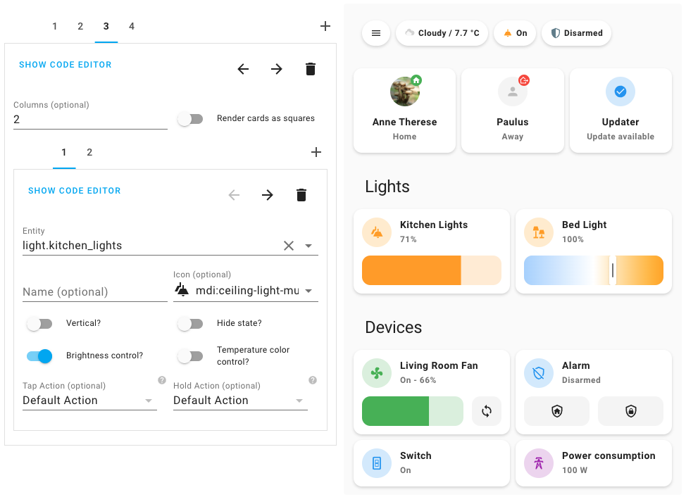
All the Mushroom cards can be configured using Dashboard UI editor.

  1. In Dashboard UI, click 3 dots in top right corner.
  2. Click Edit Dashboard.
  3. Click Plus button to add a new card.
  4. Find one of the Custom: Mushroom card in the list.

Cards

Different cards are available for differents entities :

Theme customization

Mushroom works without theme but you can add a theme for better experience by installing the Mushroom Themes. If you want more information about themes, check out the official Home Assistant documentation about themes.

Development server

Home assistant demo

You can run a demo instance of Home Assistant with docker by running:

npm run start:hass

Once it's done, go to Home Assistant instance http://localhost:8123 and start configuration.

Windows Users

If you are on Windows, either run the above command in Powershell, or use the below if using Command Prompt:

npm run start:hass-cmd

Development

In another terminal, install dependencies and run development server:

npm install
npm start

Server will start on port 4000.

Build

You can build the mushroom.js file in dist folder by running the build command.

npm run build

Maintainer steps to add a new language

  1. To be compatible with Home Assistant, language tags have to follow BCP 47. A list of most language tags can be found here: IANA subtag registry. Examples: fr, fr-CA, zh-Hans.
  2. Create a new file {language_code}.json with your language code in the translation folder. Examples: fr.json.
  3. Import your file into the localize.ts file and add your language in the languages record.
  4. Don't forget to test locally with the development server by choosing the language with the Home Assistant UI in your profile.

Troubleshooting

I don't see the last changes

  1. Check that your Home Assistant version is the latest. Some new Mushroom features can only be visible for the latest Home Assistant version.
  2. Check that you have the latest Mushroom version
  3. Clear your cache :

My card mod configuration doesn't work.

Help about card mod configuration is not provided in this repository. More info in the state of card mod support.

Credits

The design is inspired by 7ahang’s work on Behance and Ui Lovelace Minimalist.

lovelace-mushroom's People

Contributors

acesyde avatar alessandroias avatar arnyminerz avatar atomikwiwa avatar bemble avatar bingooo avatar dependabot[bot] avatar doryx3d avatar dsimop avatar durgnomis-drol avatar frenck avatar giacomocarrozzo avatar gnol86 avatar golles avatar greghesp avatar istvnurbn avatar laurenshoogendijk avatar ldvc86 avatar mariusthvdb avatar menelao147 avatar misa1515 avatar piitaya avatar planecore avatar redphx avatar rhuba8324 avatar smekac95 avatar steffenrapp avatar tiwu avatar tomaszdom avatar ulic75 avatar

Stargazers

 avatar  avatar  avatar  avatar  avatar  avatar  avatar  avatar  avatar  avatar  avatar  avatar  avatar  avatar  avatar  avatar  avatar  avatar  avatar  avatar  avatar  avatar  avatar  avatar  avatar  avatar  avatar  avatar  avatar  avatar  avatar  avatar  avatar  avatar  avatar  avatar  avatar  avatar  avatar  avatar  avatar  avatar  avatar  avatar  avatar  avatar  avatar  avatar  avatar  avatar  avatar  avatar  avatar  avatar  avatar  avatar  avatar  avatar  avatar  avatar  avatar  avatar  avatar  avatar  avatar  avatar  avatar  avatar  avatar  avatar  avatar  avatar  avatar  avatar  avatar  avatar  avatar  avatar  avatar  avatar  avatar  avatar  avatar  avatar  avatar  avatar  avatar  avatar  avatar  avatar  avatar  avatar  avatar  avatar  avatar  avatar  avatar  avatar  avatar  avatar

Watchers

 avatar  avatar  avatar  avatar  avatar  avatar  avatar  avatar  avatar  avatar  avatar  avatar  avatar  avatar  avatar  avatar  avatar  avatar  avatar  avatar  avatar  avatar  avatar  avatar  avatar  avatar  avatar  avatar  avatar  avatar

lovelace-mushroom's Issues

Room summary card

What do you think about a card like this one
unknown-2
unknown-3
unknown-4

The bottom button turn on / off all light of room, same for plug and cover
The icon are hide if no windows open, door open, water sensor off....

[Feature Request] Possibility to wrap text overflow in template card.

Love all these cards. The design and the simplicity is awesome!

I have a sensor that returns the pollen forecast as its state. This is a rather long text (200 characters)( I also believe that the max. character possible for a sensor in HA is 255). I would love if it was possible to wrap the text in the template card, either by default or as an option.

Cards do not display properly via Google Cast

Some lovelace-mushroom cards work partially when Cast to a display - my use case is I Cast to a Google Home display. I love these cards and would love to use them on my touch display!

This issue occurs with either a HACS-based or regular install.

Cards:
Chips-card: Works partially - reports icon states, responds to colours, but label titles do not change (e.g., content_info: name will still display the state of the entity).
Light-card: Works partially - reports icon states, controls brightness, but label colours do not change and colour / temperature selection buttons are not shown.
Entity-card: As above
Title-card: Does not display - shows 'Custom component doesn't exist' error.

I have not tested the other cards.

To Reproduce

  1. Create a lovelace config with mushroom-cards
  2. Use https://cast.home-assistant.io/ or this template
  3. Compare lovelace view on desktop / mobile to cast view - cast will not display consistently

Additional context
Cast feature introduction: Home Assistant Cast

http:
  cors_allowed_origins:
    - https://cast.home-assistant.io

Is included in my configuration.yaml.

[Request] Hide Icon

Can we have an option to hide the icons for all cards? Thanks, I'm loving these cards!

RGB color ramp ?

Thanks for sharing your great work.
Would be great if you could add an RGB color ramp in addition to temperature and brightness in your future update.

Add popup action

It could be nice to have possibility to set pop-up action or press and long press with these popup right?
Screenshot_20220205-000626

Chips Icon Color

This is more a feature request. I'd like to be able to change icon color based on state on Chips card:
chips:

  • type: entity
    entity: group.teste11
    icon: mdi:lightbulb-group
    tap_action:
    action: toggle
    icon_color: |
    if (state === 'off') return 'rgb(0, 255, 0');

Feature Request Color Template

Hey, would it be possible to get the color not static? I'd love to see a color template so I could set the color in combination with an entities state.
My use case would be the color of garbage bins I need to get in front of the house

Card title for chips

I think it would be fine to give the possibility to define a title for a card Chips.
Thanks for this good job.

Alarm chip icon color not honored

Describe the bug

Setting the icon color does nothing for the alarm chip icon

To Reproduce

  1. Add an alarm chip
  2. Set the icon color to any color from the icon color dropdown
  3. Click save

Expected behavior

Expect to see the color set on the icon

Screenshots

image

Idea: Allow colored icons/sliders corresponding to theme color

Im not sure if this is even possible, but would be awesome if the colors could take their value from the themes defined color scheme.
i.e.: Currently the Fan Card is Green, while the Light Card is Orange.

Possibly the primary-color?

Example from Google light theme:

  # Main Interface Colors
  primary-color: rgb(26, 115, 232)

Display status different icons

Can add a change of icons and color for different statuses? For example,

  • the door is open (icon mdi:door-open; red color)
  • the door is closed (icon mdi:door; green color)

Remove alarm panel group

Alarm group should be handled using alarm template. To handle when panels have different state and display it in the card, we should handle partial states: partially_armed, partially_disarmed etc.

Button Card Request

Requesting if you could include a button card. I have alot of switches connected to lights and fans which dont show up in either light or fan cards.

I am new to github, couldnt find the button to request feature. Love the cards. Thanks for sharing.

Header at the bottom

Is your feature request related to a problem? Please describe.
The problem is that chips card + tab header make a big header not ergonomic

Describe the solution you'd like
May be chips card can automaticaly and some code to do like this : UI-Lovelace-Minimalist/UI#346

Icon is on for locked and unlocked and unarmed states

When the entity card is used for a lock or alarm system, the state icon is always on for all states.

Expected behaviour is for the icon to turn off in unlocked or disarmed state, just like a turned off switch or input_boolean
Screenshot 2022-02-06 at 14 19 39
.

[Idea] Light brightness slider in one row

Hi, Mushroom is incredibly nice! I'd love an option to have the light brightness slider in the name row, so the entire control only takes one row instead of two. Thanks!

Binary Sensor Icon in Chip Cards

Currently, when a motion sensor entity is added to a chip card, it defaults to a checkbox-marked-circle icon. The out of box icon for a motion sensor depends on its state, using either motion-detector or motion-sensor-off. It would be great if this was also the default behavior in Mushroom

SVG Icons

The possibility to also use SVG icons, especially animated SVG icons could improve the design feeling.

Fan card, only show space for fan speed when on

Is your feature request related to a problem? Please describe.
For a fan that allows fan speed the card adds blank space for the fan speed controller UI even when the device is off.

Describe the solution you'd like
When the device is off the area for the fan speed controller is collapsed. When it is turned on the area then expands showing the speed controller.

Suggestion: Use zone icon for person card

Currently person card uses either "home" icon when at home and "away" icon for all other states and zones.
It would be nice to show specific zone icon, when person is in that zone.
Would that be possible?

Enhance documentation

Create a dedicated website with demo/gif etc instead of readme.
If we can provide a minimum HASS environment with demo component to see it live instead of video etc, would be better.

Entities card

Is it possible to create /change a card thats allowing more than one entity?
For example to work together with auto-entities card.

In that way you can create a card filled with entities at a specific state.

This is how it looks when using a entity-filter card
image

This is how it should look like
image

Button Card

Requesting if you could include a button card. I have alot of switches connected to lights and fans which dont show up in either light or fan cards.

Love the cards. Thanks for sharing.

Add option to color light chip cards based on state

Setting a chip card for a light to "Name" for disambiguation unfortunately makes it impossible to know the state. If the icon was colored the same way it is in the light card chips can be colored that would be quickly visual way to indicate state.

Animate Fan Icon for Devices That Do Not Return Speed

Is your feature request related to a problem? Please describe.
Currently, the animate icon option for the Fan card only works on Fans that return a speed.

Describe the solution you'd like
There should be a default spin speed for devices that do not return speed, or only function in an on/off state.

Describe alternatives you've considered

Additional context

(Request) card size

You could add the ability to change the card size, height and width. Thank you for the great work and easy setup.

Active color on Chip

Hello

Active color on chip don't work for me... Something special to do to activate it?

Thanks for all

A climate card

Is there any plan for a climate card?
Love the mushroom cards and a climate/thermostat card would be a great addition to the current cards.
As the official HA is really huge and very different looking on the dashboard.

Thanks!

Allow badge customization

On some cards I want to display a badge on the icon. For example, I have multiple alarm panels, sometimes they have a different state and I want to see it on the alarm panel card:
Capture d’écran 2022-02-09 aΜ€ 18 10 06

The idea is to add these card configuration:

  • badge_sensor: the sensor used to know whether the badge should be displayed or not
  • badge_color: the badge color
  • badge_icon: the icon displayed in the badge

Problem raised: the editor will have a lot of information, it would be great to create foldable sections or tabs.

Home Assistant Android app error

Home Assistant 2022.2.6 - server
HA for Android v2022.1.1-full

I added Custom Mushroom Light Card to Lovelace.
When I opened Home Assistant on my Android phone I see this error message only.

Screenshot_20220212_130831_io homeassistant companion android

Failed to change light temperature

Hello, incredible work for us who know little about design and programming.

I have the following problem and it is when I make a temperature change in the lights that the error appears that I show you in the screenshot that I leave you.

image

Add area Icon in person card

Add the option to hide area name in the person card and put the area icon in tu upper left corner of picture (like suitcase for work area for my home)
With my previous issue we could have only picture and 2 icons

Hide entire Chip on specific state

It would be nice to have an option to hide/show entire chips depending on an entity state.

Example:
I'm using a Chip for the dishwasher, when idle the icon is grey and there is no text, when washing the icon is blue and there is a text showing the progress percentage.
It would be useful to hide the Chip when idle and only show up when washing.

This way Chips will become more of a status bar showing current active parts of your system.

The config could be like:
"show/hide" when "trigger-entity" state "is/isnot" equal to "condition-state"

Make sliders less sensitive

Hi,

I redid my dashboard using the light cards and they look really good, I love the brightness and temperature sliders.
However on mobile when I'm scrolling I (very often) turn random lights on by touching the slider, it seems like if my finger happens to start the scroll on a slider it'll register as a touch as well, turning the light on.

I don't know if it can be made less sensitive but if so, it would be great.
Alternatively maybe an option to hide the slider and only show them when a button is pressed, or even just a lock might do it.

I turned on the main light in the nursery three times last night while the baby was sleeping when trying to scroll past it :(

Thanks

Ability to hide title

Is your feature request related to a problem? Please describe.
Sometime cards are too big, and some of them can be more compact

Describe the solution you'd like
image
Add ability of compact view. No title. Main action (if needed) near sub actions.
Here you have cover and light

Entity card show attribute

Hi!
I just discovered your card and it's pretty impressive! However, i'd like to ask if it's possible to add attribute selection in entity card, so we could choose either to show state (default) or rather certain attribute of the entity? It would be a nice addition...

Recommend Projects

  • React photo React

    A declarative, efficient, and flexible JavaScript library for building user interfaces.

  • Vue.js photo Vue.js

    πŸ–– Vue.js is a progressive, incrementally-adoptable JavaScript framework for building UI on the web.

  • Typescript photo Typescript

    TypeScript is a superset of JavaScript that compiles to clean JavaScript output.

  • TensorFlow photo TensorFlow

    An Open Source Machine Learning Framework for Everyone

  • Django photo Django

    The Web framework for perfectionists with deadlines.

  • D3 photo D3

    Bring data to life with SVG, Canvas and HTML. πŸ“ŠπŸ“ˆπŸŽ‰

Recommend Topics

  • javascript

    JavaScript (JS) is a lightweight interpreted programming language with first-class functions.

  • web

    Some thing interesting about web. New door for the world.

  • server

    A server is a program made to process requests and deliver data to clients.

  • Machine learning

    Machine learning is a way of modeling and interpreting data that allows a piece of software to respond intelligently.

  • Game

    Some thing interesting about game, make everyone happy.

Recommend Org

  • Facebook photo Facebook

    We are working to build community through open source technology. NB: members must have two-factor auth.

  • Microsoft photo Microsoft

    Open source projects and samples from Microsoft.

  • Google photo Google

    Google ❀️ Open Source for everyone.

  • D3 photo D3

    Data-Driven Documents codes.