rachelandrew / multicol-wip Goto Github PK
View Code? Open in Web Editor NEWSomewhere to store stuff relating to my work on Multi-column layout
License: MIT License
Somewhere to store stuff relating to my work on Multi-column layout
License: MIT License


Since we’re using columns extensively for ebooks, and I’m documenting needs for different languages and their typography, I may come across use cases for the multicol/overflow spec.
Please feel free to use this issue to add use cases to this collection. I believe it will be a collective effort to document those use cases and do some triage.
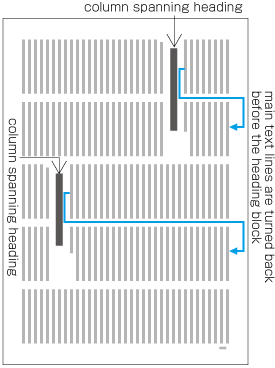
I’ll start with the processing of column spanning headings in japanese. There are Requirements for Japanese Text Layout with a lot of illustrations. The most interesting is the note though:
In multi-column books, the top level heading for the start page usually spans all columns designed in the kihon-hanmen. In common magazines, the title of the start page of an article usually spans all columns designed in the kihon-hanmen.
Top level heading can be considered <h1> on a web page kihon-hanmen, the text area in the viewport. In other words, if you have a column-count of 2 and columns overflow, there is currently no way to have a column-span of 2 as well.
There are also examples where <h2>, <h3>, <h4>, etc. span a specific number of columns.
Although not discussed explicitly, there are other examples of column-span in Hangul (see illustrations at the end of this section) and Chinese (see the last note of section 4.1.1).
There are of course examples in latin languages but my main focus being CJK at the moment, I guess it’s worth mentioning that in Japanese, this is quite a clear requirement.
Disclaimer: I’m primarily doing ebooks, which means columns are used at the :root level to paginate contents. Since there is nothing else to manage paged media in ebooks apps, I guess this is one of the major use cases for CSS3 multicol at the moment (and authors don’t have any choice). However, the following bugs happen in multicol anyway (they’re not scoped to ebooks, they apply to the web as well).
From experience, modern layout specs (flexbox + grid) have quite a significant number of rendering issues in multi-columns. I’ve started searching for grid issues but am very likely to follow up with flexbox issues in the next weeks. At first sight, a lot of those issues are related to fragmentation.
This is what happens when you’re using something like
element {
  display: grid;
  grid-template-columns: repeat(auto-fit, minmax(20em, 1fr));
}
Chrome (reference)

This is the expected result.
Now in Firefox…

Surprisingly, it looks like the element is pushed to the next column (while it could fit in the current one).
And finally Safari…

As you can see, text overflows and is clipped. If you reverse the order and apply a border to the text’s container (a figcaption there), it is however computed as expected:

But for some reason, text doesn’t wrap.
More generally, using flex or grid in columns is the surest way to have contents cut-off in multicol. Unfortunately, It seems implementers pay very little attention to the multicol context when implementing the new layout specs. :-(
This is quite an obvious one and I guess there’s no need for screenshots/samples.
Support for avoid has been, by very far, the most popular request from EPUB authors for the last 7 years.
From experience, they just don’t understand why that doesn’t work in columns yet since widowed headings are an absolute no-no in typography (and forcing a break-before might simply break the flow for sub-headings).
Workarounds include wrapping the heading and the following paragraph in a div with page-break-inside: avoid but that can lead to column-fill issues when this div has to be fragmented because it is too long.
I have no idea if this is by design or what, but columns seem to hide overflow. Like, if you had an absolutely positioned item within a box in a column that was wider than the column.
https://codepen.io/chriscoyier/pen/boxyMJ

You can't overflow or z-index or whatever your way out of this.
Real world example:

Forced to make sure columns are wide enough so that submenu doesn't get overlapped by another column.
First and foremost, I am really sorry to report this EPUB-related case.
The issue is the following: there is a common misconception amongst EPUB authors that pagination = paged media, although they are not using CSS paged media to lay out contents – don‘t ask me why, my best assumption is that page-break-* works in Adobe’s ePub 2 Reader Mobile Software Development Kit and the UIWebView setPagination API on which iBooks is relying.
This can have nasty consequences, the worst one probably being extensive reliance upon page-break-* properties.
As far as I can tell, CSS break is a strange beast and browsers don’t alias it the same for columns. If authors want maximum compatibility, they should consequently use the following:
element {
  -webkit-column-break-inside: avoid;
  page-break-inside: avoid;
  break-inside: avoid;
}
Problem is what you’ll find in 99.9% of cases is…
element {
  page-break-inside: avoid;
}
This, once again (sorry), far outscopes CSS Multicol. But I can see “Page Break Aliases” are discussed in the CSS Fragmentation Module Level 3. So the question is, do you want to go all the way back to column-break and take the EPUB case into account for the mapping as well?
In the EPUB context, page-break-inside would probably be itself an alias for column-break (which has practical implementations, albeit prefixed). Excluding print, the most extensive use of page-break-* is quite possibly ebooks, so I thought it was worth reporting this.
I’m taking the liberty to cc @frivoal since we’re in contact for the project I’m currently leading.
To sum things up, we have quite some issue in EPUB-land: forcing the column axis for pagination when the writing-mode is vertical. It would indeed be kind of weird if “pages” (achieved through the use of CSS3 multicol) were laid out on top of each other (spread view).
In other words, the following is not really the result we’re trying to get.

That is probably what is expected by authors when using columns in their stylesheet but I’m really not so sure about that by the way. After reading a lot of articles on vertical writing, it seems some authors might resolve to horizontal writing because pseudo-pagination with vertical scroll feels super unnatural, apparently. See for example “7. Stick with horizontal” in this article.
The result we’d like to get is this one:

Unfortunately, there’s no way to force the column axis. Or so I thought…
It turns out there’s a proprietary way to do it. So for the sake of compatibility – and I hope level 2 –, I’ll try to document two webkit-specific properties:
-webkit-column-axis;-webkit-column-progression.Those properties first appeared in Safari 7.0, it seems to facilitate the creation of a setPagination API – Apple having interests in the ebook market, it’s not so surprising they wanted to extend columns a little bit to deal with this problem.
I took a quick look at all the CSS3 multicol drafts and didn’t find anything related to axis and progression, which is why “extend columns a little bit” in the previous paragraph. I may be wrong about that so please feel free to correct me if that is the case.
Three years ago, Chromium removed them because they had no use for it. It is however unclear if they tried to collect feedback from authors. Also, the following:
and it's assumed that these properties serve no purpose on their own. (source)
is debatable. More on that later.
Those properties were created to:
axis);progression).When using columns with vertical writing, you’ll get something like this.

To clarify, overflow on the y-axis as columns are laid out on top of one another.
But when using -webkit-column-axis, this will have some significant effect in Safari.

You now have overflow on the x-axis as columns are laid out next to one another.
Then -webkit-column-progression can be reversed so that, for instance, bottom to top vertical text can be managed “naturally”: first column at the bottom, last column at the top.
Values can be auto, vertical, or horizontal.
Values can be normal, or reversed.
It looks like impact on column-width and column-count is pretty huge. It looks like the column-width will simply use the value of the computed width or height of the container, depending on the axis – for instance, if you want two vertical columns in this demo, you must change :root’s height. As for column-count, it is entirely ignored – as a matter of fact, you can even get rid of your columns declaration and it will work as expected.
Consequently, if you want two visible columns with -webkit-column-axis: horizontal, you need to constraint the width of the container in vertical-rl, and columns will then overflow.
Then if you also set -webkit-column-progression: reverse, then columns will overflow in the opposite direction of the writing-mode. So, for vertical-rl for instance, they will overflow left to right instead of right to left.

Hope this can help as we (ebooks) have a use case for this. I really can’t tell if web authors would like to have those properties standardized but do feel like it could be worth checking with them, especially after researching Japanese typography a little bit.
After all, having such properties for columns would be consistent with flex-direction for instance.
[Edit] Added link to horizontal mode with vertical-axis demo as impact on other properties is quite significant. It’s like switching from columns to pages, where the element’s width or height is overriding the columns property.
I made a demo to show off the bugs I could find:
http://labs.jensimmons.com/2016/examples/multicolumn-3-bug-demo.html
Here's what I know is broken:
In Safari and Chrome, the drop shadows from boxes end up breaking away from their box, and showing up on the bottom of the previous columns, or the top of the next column. The bug is not the same in both — the problem with the shadow appearing at the top only seems to happen in Safari. I have not seen this problem in Firefox. I have not tested in other browsers.
Chrome: https://monosnap.com/file/VWENRmvXFOSPGeLIuVNOzaW7c9MpXf.png
Safari: https://monosnap.com/file/1o4x8WsAXPnKHEYAj3iRCIu28wpjt6.png
If you put a top margin on content, the margin does not collapse in the first column, but it does collapse in all the other columns. This inconsistency is bad.
For example: https://monosnap.com/file/ZG6plPyzC8C4aPw2IJJic2QjCe2CEU.png (same in Chrome, Safari, Firefox) It would be better if the margin always collapses, or if it never collapses. The only practical work around is to never ever put top margins on any content that's in columns. Which is a dumb workaround.
break in FirefoxFirefox needs to add support for break-*. Meanwhile, some needs can be covered with substituting other properties (which is what Autoprefixer will do) — for example, page-break-inside: avoid. In other cases, there is no way to get support, like for break-before: column; . I don't have a comprehensive understanding of what is and is not possible (for my demos, I use break-inside: avoid a lot, and not much of the rest of it). Jen Robbins @jenville was just going through some of this for her book and may have deeper research.
 React
React
A declarative, efficient, and flexible JavaScript library for building user interfaces.
🖖 Vue.js is a progressive, incrementally-adoptable JavaScript framework for building UI on the web.
 Typescript
TypeScript is a superset of JavaScript that compiles to clean JavaScript output.
An Open Source Machine Learning Framework for Everyone
 Django
The Web framework for perfectionists with deadlines.
 Laravel
A PHP framework for web artisans
Bring data to life with SVG, Canvas and HTML. 📊📈🎉
JavaScript (JS) is a lightweight interpreted programming language with first-class functions.
Some thing interesting about web. New door for the world.
A server is a program made to process requests and deliver data to clients.
Machine learning is a way of modeling and interpreting data that allows a piece of software to respond intelligently.
Some thing interesting about visualization, use data art
Some thing interesting about game, make everyone happy.
 Facebook
We are working to build community through open source technology. NB: members must have two-factor auth.
 Microsoft
Open source projects and samples from Microsoft.
 Google
Google ❤️ Open Source for everyone.
 Alibaba
Alibaba Open Source for everyone
 D3
D3
Data-Driven Documents codes.
 Tencent
China tencent open source team.