GithubHelp home page GithubHelp logo

react-native-progress-bar-animated's Introduction

react-native-progress-bar-animated

npm version

๐Ÿ“Š Simple, customizable and animated progress bar for React Native

Features

  • Flexible style
  • Plain simple and flexible API
  • Listeners for actions

Demo

You can try on expo: https://expo.io/@rafaelmotta021/react-native-progress-bar-animated-demo

Setup

yarn add react-native-progress-bar-animated

or

npm install --save react-native-progress-bar-animated

Usage

import React from 'react';
import {
  View,
  StyleSheet,
  Dimensions,
  Button,
  Alert,
  Text,
} from 'react-native';

import ProgressBarAnimated from 'react-native-progress-bar-animated';

export default class App extends React.Component {

  state = {
    progress: 20,
    progressWithOnComplete: 0,
    progressCustomized: 0,
  }

  increase = (key, value) => {
    this.setState({
      [key]: this.state[key] + value,
    });
  }

  render() {
    const barWidth = Dimensions.get('screen').width - 30;
    const progressCustomStyles = {
      backgroundColor: 'red', 
      borderRadius: 0,
      borderColor: 'orange',
    };

    return (
      <View style={styles.container}>
        <View>
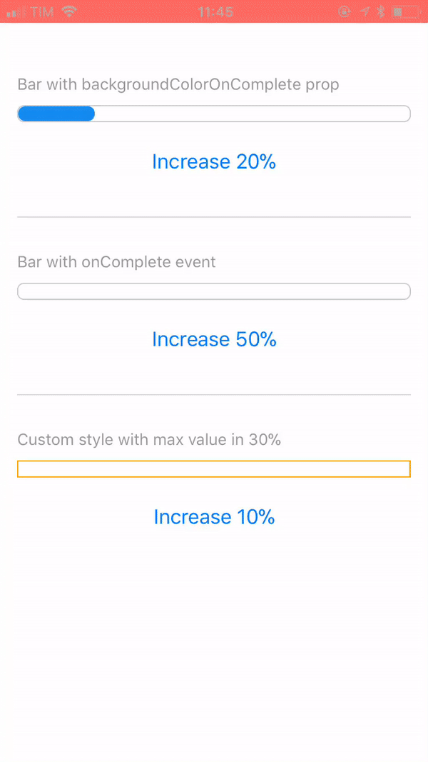
          <Text style={styles.label}>Bar with backgroundColorOnComplete prop</Text>
          <ProgressBarAnimated
            width={barWidth}
            value={this.state.progress}
            backgroundColorOnComplete="#6CC644"
          />
          <View style={styles.buttonContainer}>
            <View style={styles.buttonInner}>
              <Button
                title="Increase 20%"
                onPress={this.increase.bind(this, 'progress', 20)}
              />
            </View>
          </View>
        </View>
        <View style={styles.separator} />
        <View>
          <Text style={styles.label}>Bar with onComplete event</Text>
          <ProgressBarAnimated
            width={barWidth}
            value={this.state.progressWithOnComplete}
            onComplete={() => {
              Alert.alert('Hey!', 'onComplete event fired!');
            }}
          />
          <View style={styles.buttonContainer}>
            <View style={styles.buttonInner}>
              <Button
                title="Increase 50%"
                onPress={this.increase.bind(this, 'progressWithOnComplete', 50)}
              />
            </View>
          </View>
        </View>
        <View style={styles.separator} />
        <View>
          <Text style={styles.label}>Custom style with max value in 30%</Text>
          <ProgressBarAnimated
            {...progressCustomStyles}
            width={barWidth}
            maxValue={30}
            value={this.state.progressCustomized}
          />
          <View style={styles.buttonContainer}>
            <View style={styles.buttonInner}>
              <Button
                title="Increase 10%"
                onPress={this.increase.bind(this, 'progressCustomized', 10)}
              />
            </View>
          </View>
        </View>
      </View>
    );
  }
}

const styles = StyleSheet.create({
  container: {
    flex: 1,
    backgroundColor: '#FFF',
    marginTop: 50,
    padding: 15,
  },
  buttonContainer: {
    marginTop: 15,
  },
  separator: {
    marginVertical: 30,
    borderWidth: 0.5,
    borderColor: '#DCDCDC',
  },
  label: {
    color: '#999',
    fontSize: 14,
    fontWeight: '500',
    marginBottom: 10,
  },
});

Available props

Name Type Default Description
value number 0 Progress value
maxValue number 500 Max percentage bar can have
barEasing string 'linear' Easing animation type(bounce, cubic, ease, sin, linear, quad)
barAnimationDuration number [] Duration in ms of bar width animation
backgroundAnimationDuration number null Duration in ms of bar background color change
width number REQUIRED Width of bar
height number 15 Height of bar
backgroundColor string '#148cF0' Color that will complete the bar
underlyingColor string '#148cF0' Color that underlies the bar
backgroundColorOnComplete string null Optional color that will overwrite background color when reach the max value prop
borderWidth number 1 Style prop
borderColor string '#148cF0' Style prop
borderRadius number 6 Style prop
onComplete function null Callback after bar reach the max value prop

react-native-progress-bar-animated's People

Contributors

rafaelmotta avatar zhouanbo avatar

Stargazers

 avatar  avatar  avatar  avatar  avatar  avatar  avatar  avatar  avatar  avatar  avatar  avatar  avatar  avatar  avatar  avatar  avatar  avatar  avatar  avatar  avatar  avatar  avatar  avatar  avatar  avatar  avatar  avatar  avatar  avatar  avatar  avatar  avatar  avatar  avatar  avatar  avatar  avatar  avatar  avatar  avatar  avatar  avatar  avatar  avatar  avatar  avatar  avatar  avatar  avatar  avatar  avatar

Watchers

 avatar  avatar

react-native-progress-bar-animated's Issues

backgroundColorOnComplete prop doesn't works

backgroundColorOnComplete not working

`  <ProgressBarAnimated
                    width={WINDOW_WIDTH/1.5}
                    value={100}
                    maxValue={100}
                    barAnimationDuration={3000}
                    backgroundColorOnComplete="#000000"
                    backgroundAnimationDuration={1000}
                    backgroundColor="#FFA366"
/>`

Warning: componentWillReceiveProps has been renamed, and is not recommended for use.

Warning: componentWillReceiveProps has been renamed, and is not recommended for use. See https://fb.me/react-async-component-lifecycle-hooks for details.

  • Move data fetching code or side effects to componentDidUpdate.
  • If you're updating state whenever props change, refactor your code to use memoization techniques or move it to static getDerivedStateFromProps. Learn more at: https://fb.me/react-derived-state
  • Rename componentWillReceiveProps to UNSAFE_componentWillReceiveProps to suppress this warning in non-strict mode. In React 17.x, only the UNSAFE_ name will work. To rename all deprecated lifecycles to their new names, you can run npx react-codemod rename-unsafe-lifecycles in your project source folder.

Please update the following components: ProgressBar

Lose state props when width calculation is modified

Version: "react-native-progress-bar-animated": "^1.0.6"
RN: "react-native": "^0.55.3"
Expected behavior: blue progress bar shows in the view
Actual behavior: blue progress bar fails to show in the view

Use case: I need to set the progress bar width to a percentage value of its parent container, not on the whole window. When I replaced barWidth with a different calculation method, this.state.progress (blue bar) no longer shows its value in the bar. I'm using the OnLayout package to grab the width. I then use that derived value for the widthas follows:

  state = {
    progress: 20,
    progressWithOnComplete: 0,
    progressCustomized: 0,
    viewWidth: 0
  };
      <OnLayout>
        {({ width }) => (
          <ProgressBarAnimated
            width={width * 0.6}
            value={this.state.progress}
            backgroundColorOnComplete="#6CC644"
            style={{ alignSelf: 'center' }}
          />
        )}
      </OnLayout>

screen shot 2018-05-30 at 8 52 25 pm

I tried to manually manipulate the width through the `onLayout` method with the same results.

Publish latest version on npm

Can you please publish latest version on npm, because there is no underlayingColor prop when I install the package with npm?

Thank you.

custom div inside the bar

Is it possible to put a custom inside the progress bar in order to have the progress be just the fillable background color of the view?

Width "100%" string

@rafaelmotta :
Hi, congratulations for the module, set the width to a numerical value from some problems it would be possible to set the value of with as a percentage.

backgroundColorOnComplete only works the first time

Like I said the bar's colour is only changed the very first time the animation is completed, after that it has no effect.

am I missing something?

even with multiple progressbars on one page, only the first one ever changes colour

Linear gradient

Hi! ๐Ÿ‘‹

Firstly, thanks for your work on this project! ๐Ÿ™‚

Today I used patch-package to patch [email protected] for the project I'm working on.

For my project i needed your exact progress bar except i needed it to be a gradient so i added that myself, since all the gradient variants i could find where circular. Hope i can help anyone else looking for this.

Here is the diff that solved my problem:

diff --git a/node_modules/react-native-progress-bar-animated/src/.AnimatedProgressBar.js.swp b/node_modules/react-native-progress-bar-animated/src/.AnimatedProgressBar.js.swp
new file mode 100644
index 0000000..54c096d
Binary files /dev/null and b/node_modules/react-native-progress-bar-animated/src/.AnimatedProgressBar.js.swp differ
diff --git a/node_modules/react-native-progress-bar-animated/src/AnimatedProgressBar.js b/node_modules/react-native-progress-bar-animated/src/AnimatedProgressBar.js
index 29a0f82..221f065 100644
--- a/node_modules/react-native-progress-bar-animated/src/AnimatedProgressBar.js
+++ b/node_modules/react-native-progress-bar-animated/src/AnimatedProgressBar.js
@@ -1,5 +1,7 @@
 import React from 'react';
 import PropTypes from 'prop-types';
+import { LinearGradient } from 'expo-linear-gradient';
+import { StyleSheet } from 'react-native';
 
 import {
   View,
@@ -13,6 +15,7 @@ class ProgressBar extends React.Component {
 
     this.state = {
       progress: props.value,
+      colorGradientArray : props.colorGradientArray
     };
     
     this.widthAnimation = new Animated.Value(0);
@@ -61,6 +64,7 @@ class ProgressBar extends React.Component {
       easing: Easing[this.props.barEasing],
       toValue: toValue > 0 ? toValue : 0,
       duration: this.props.barAnimationDuration,
+      useNativeDriver: false
     }).start();
   }
 
@@ -68,6 +72,7 @@ class ProgressBar extends React.Component {
     Animated.timing(this.backgroundAnimation, {
       toValue: 1,
       duration: this.props.backgroundAnimationDuration,
+      useNativeDriver: false
     }).start();
   }
 
@@ -92,9 +97,16 @@ class ProgressBar extends React.Component {
           height: this.props.height - (this.props.borderWidth * 2),
           width: this.widthAnimation,
           backgroundColor: this.backgroundInterpolationValue || this.props.backgroundColor,
-          borderRadius: this.props.borderRadius,
+          useNativeDriver: false
         }}
-        />
+        >
+        <LinearGradient
+        colors={this.props.colorGradientArray}
+        start={[0, 1]} 
+        end={[1, 0]}
+        style={[styles.background, {height: this.props.height}]}
+      />
+        </Animated.View>
       </View>
     );
   }
@@ -159,4 +171,14 @@ ProgressBar.defaultProps = {
   onComplete: null,
 };
 
+const styles = StyleSheet.create({
+  background: {
+    position: 'absolute',
+    left: 0,
+    right: 0,
+    top: 0,
+  }
+});
+
 export default ProgressBar;
+

This issue body was partially generated by patch-package.

Recommend Projects

  • React photo React

    A declarative, efficient, and flexible JavaScript library for building user interfaces.

  • Vue.js photo Vue.js

    ๐Ÿ–– Vue.js is a progressive, incrementally-adoptable JavaScript framework for building UI on the web.

  • Typescript photo Typescript

    TypeScript is a superset of JavaScript that compiles to clean JavaScript output.

  • TensorFlow photo TensorFlow

    An Open Source Machine Learning Framework for Everyone

  • Django photo Django

    The Web framework for perfectionists with deadlines.

  • D3 photo D3

    Bring data to life with SVG, Canvas and HTML. ๐Ÿ“Š๐Ÿ“ˆ๐ŸŽ‰

Recommend Topics

  • javascript

    JavaScript (JS) is a lightweight interpreted programming language with first-class functions.

  • web

    Some thing interesting about web. New door for the world.

  • server

    A server is a program made to process requests and deliver data to clients.

  • Machine learning

    Machine learning is a way of modeling and interpreting data that allows a piece of software to respond intelligently.

  • Game

    Some thing interesting about game, make everyone happy.

Recommend Org

  • Facebook photo Facebook

    We are working to build community through open source technology. NB: members must have two-factor auth.

  • Microsoft photo Microsoft

    Open source projects and samples from Microsoft.

  • Google photo Google

    Google โค๏ธ Open Source for everyone.

  • D3 photo D3

    Data-Driven Documents codes.