GithubHelp home page GithubHelp logo

rcaferati / react-awesome-slider Goto Github PK

View Code? Open in Web Editor NEW
2.9K 33.0 286.0 60.9 MB

React content transition slider. Awesome Slider is a 60fps, light weight, performant component that renders an animated set of production ready UI general purpose sliders with fullpage transition support for NextJS and GatsbyJS. 🖥️ 📱

Home Page: https://fullpage.caferati.me

License: MIT License

JavaScript 74.69% CSS 25.31%
image-slider media-slider media-gallery gallery-component carousel carousel-component gallery react-carousel react-gallery react-slider

react-awesome-slider's Introduction

React Awesome Slider v3 [NEW fullpage navigation HOC]

Travis NPM

react-awesome-slider is a 60fps, extendable, highly customizable, production ready React Component that renders a media (image/video) gallery slider/carousel.

FULLPAGE navigation HOC

For using the full-screen navigation HOCs please checkout the GatsbyJS and NextJS examples on the ras fullpage strategies repository.

You can access the demo for the FULLPAGE navigation here: fullpage.caferati.me

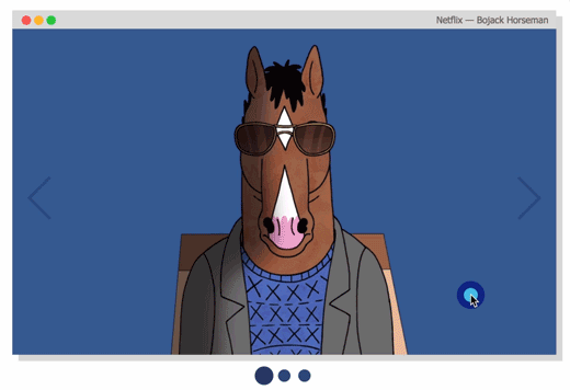
react-awesome-slider demo

Basic usage

react-awesome-slider demo react-awesome-slider demo

Basic usage with pure CSS

import AwesomeSlider from 'react-awesome-slider';
import 'react-awesome-slider/dist/styles.css';

const slider = (
  <AwesomeSlider>
    <div>1</div>
    <div>2</div>
    <div>3</div>
    <div>4</div>
  </AwesomeSlider>
);

Animation recipes: scale-out, fold-out, cube, open and fall.

For analysing how the animations are built, please check out to this folder. Collaborations with new creative ones are welcome, just open a PR.

react-awesome-slider demo react-awesome-slider demo react-awesome-slider demo react-awesome-slider demo

Cube animation recipe

Checkout more recipes on the styled folder. For more animation recipes check out the styled folder.

import AwesomeSlider from 'react-awesome-slider';
import 'react-awesome-slider/dist/custom-animations/cube-animation.css';

const slider = (
  <AwesomeSlider animation="cubeAnimation">
    <div data-src="/path/to/image-0.png" />
    <div data-src="/path/to/image-1.png" />
    <div data-src="/path/to/image-2.jpg" />
  </AwesomeSlider>
);

Touch enabled

react-awesome-slider demo

Live demo

Checkout the CSS customizer at my portfolio

Figma File

Import the component directly into your Figma project.

Installing

npm install --save react-awesome-slider

or

yarn add react-awesome-slider

More Examples

Basic usage with Media object

import AwesomeSlider from 'react-awesome-slider';
import 'react-awesome-slider/dist/styles.css';

const slider = (
  <AwesomeSlider
    media={[
      {
        source: '/path/to/image-0.png',
      },
      {
        source: '/path/to/image-1.png',
      },
      {
        source: '/path/to/image-2.png',
      },
    ]}
  />
);

Basic usage with CSS Modules

import AwesomeSlider from 'react-awesome-slider';
import AwesomeSliderStyles from 'react-awesome-slider/src/styles';

const slider = (
  <AwesomeSlider cssModule={AwesomeSliderStyles}>
    <div data-src="/path/to/image-0.png" />
    <div data-src="/path/to/image-1.png" />
    <div data-src="/path/to/image-2.jpg" />
  </AwesomeSlider>
);

Fold-out animation recipe with CSS Modules

Checkout more recipes on the styled folder. For more animation recipes check out the styled folder.

Note that on v3 there's an adition of the animation prop. The animation name is the cammel-cased version of the animation css file.

import AwesomeSlider from 'react-awesome-slider';
import CoreStyles from 'react-awesome-slider/src/core/styles.scss';
import AnimationStyles from 'react-awesome-slider/src/styled/fold-out-animation/fold-out-animation.scss';

const slider = (
  <AwesomeSlider
    animation="foldOutAnimation"
    cssModule={[coreStyles, animationStyles]}
  >
    <div data-src="/path/to/image-0.png" />
    <div data-src="/path/to/image-1.png" />
    <div data-src="/path/to/image-2.jpg" />
  </AwesomeSlider>
);

Using the Autoplay HOC with plain CSS

import AwesomeSlider from 'react-awesome-slider';
import withAutoplay from 'react-awesome-slider/dist/autoplay';
import 'react-awesome-slider/dist/styles.css';

const AutoplaySlider = withAutoplay(AwesomeSlider);

const slider = (
  <AutoplaySlider
    play={true}
    cancelOnInteraction={false} // should stop playing on user interaction
    interval={6000}
  >
    <div data-src="/path/to/image-0.png" />
    <div data-src="/path/to/image-1.png" />
    <div data-src="/path/to/image-2.jpg" />
  </AutoplaySlider>
);

Using the Captioned HOC with plain CSS

import AwesomeSlider from 'react-awesome-slider';
import withCaption from 'react-awesome-slider/dist/captioned';
import 'react-awesome-slider/dist/styles.css';
import 'react-awesome-slider/dist/captioned.css';

const CaptionedSlider = withCaption(AwesomeSlider);

const component = (
  <CaptionedSlider
    startupScreen={StartupScreen}
    cssModule={CaptionedStyles}
    screens={[
      {
        backgroundColor: '#4a9c8c',
        media: '/images/series/ricknmorty-3.png',
        caption: 'I want to see what you got.',
      },
      {
        backgroundColor: '#4a9c8c',
        media: '/images/series/ricknmorty-3.png',
        caption: "The answer is -- Don't think about it.",
      },
    ]}
  />
);

Key Features

  • Look and feel customisable and extendable via SASS and CSS Variables (custom-properties) (scss main file)
  • Media pre-loader
  • Touch enabled
  • 60fps animations
  • Animated transition recipes
  • Extendable via custom plugin HOC components
  • FullScreen achieved through the fillParent prop

Main Props

Attributes Type Default Description
className string null Add a className to the component container
cssModule object null CSS Module object if you choose to use this styling approach
name string awesome-slider Unique name of the rendered slider. Useful if you're navigating between multiple pages that contains a slider component.
selected number 0 Sets the current active/selected screen
bullets boolean true When set to true show the bullet controls underneath the slider
organicArrows boolean true When set to true show the organic arrow next and prev controls
fillParent boolean false When set to true the slider will fill the dimensions of the parent element. Usefull for using it in full-screen mode.
infinite boolean true When set to true the slider will behave on an infinite fashion returing to the first slide after the last one.
startupScreen node null Set's the startup screen component to be shown before the first screen is loaded. It works like a pre-loading screen.
startup boolean true Used together with startupScreen controls whether or not the startupScreen should auto-start.
transitionDelay number 0 Sets a delay in ms between the slide transitions. Useful if you're waiting for an exit animation to finish in the current slide.
mobileTouch boolean true When set to true activates a swipe touch effect to navigate on mobile devices.
buttons boolean true Should render the default left and right navigation buttons.
buttonContentRight node null Add content as children of the right button.
buttonContentLeft node null Add content as children of the left button.
customContent node null Render extra content at the same level of the default buttons. Useful if you want to add an extra slider navigation layer or a fixed overlay element
onFirstMount function null Called on componentDidMount passing the slider reference as an argument
onTransitionEnd function null Called on at the slider transition end event passing the slider reference as an argument
onTransitionStart function null Called on slider transition start passing the slider reference as an argument
onTransitionRequest function null Called when a user interacts with the slider navigation (arrows or bullets)

Contribute

If you have an idea for a missing feature or animation just craft your own hoc feature or animation style and send it up via PR to the src/components folder.

Author

Rafael Caferati

License

MIT. Copyright (c) 2018 Rafael Caferati.

react-awesome-slider's People

Contributors

abdellani avatar dependabot[bot] avatar lexscher avatar libbymiller09 avatar mozky avatar ngyukman avatar rcaferati avatar

Stargazers

 avatar  avatar  avatar  avatar  avatar  avatar  avatar  avatar  avatar  avatar  avatar  avatar  avatar  avatar  avatar  avatar  avatar  avatar  avatar  avatar  avatar  avatar  avatar  avatar  avatar  avatar  avatar  avatar  avatar  avatar  avatar  avatar  avatar  avatar  avatar  avatar  avatar  avatar  avatar  avatar  avatar  avatar  avatar  avatar  avatar  avatar  avatar  avatar  avatar  avatar  avatar  avatar  avatar  avatar  avatar  avatar  avatar  avatar  avatar  avatar  avatar  avatar  avatar  avatar  avatar  avatar  avatar  avatar  avatar  avatar  avatar  avatar  avatar  avatar  avatar  avatar  avatar  avatar  avatar  avatar  avatar  avatar  avatar  avatar  avatar  avatar  avatar  avatar  avatar  avatar  avatar  avatar  avatar  avatar  avatar  avatar  avatar  avatar  avatar  avatar

Watchers

 avatar  avatar  avatar  avatar  avatar  avatar  avatar  avatar  avatar  avatar  avatar  avatar  avatar  avatar  avatar  avatar  avatar  avatar  avatar  avatar  avatar  avatar  avatar  avatar  avatar  avatar  avatar  avatar  avatar  avatar  avatar  avatar  avatar

react-awesome-slider's Issues

Super expression must either be null or a function, not undefined

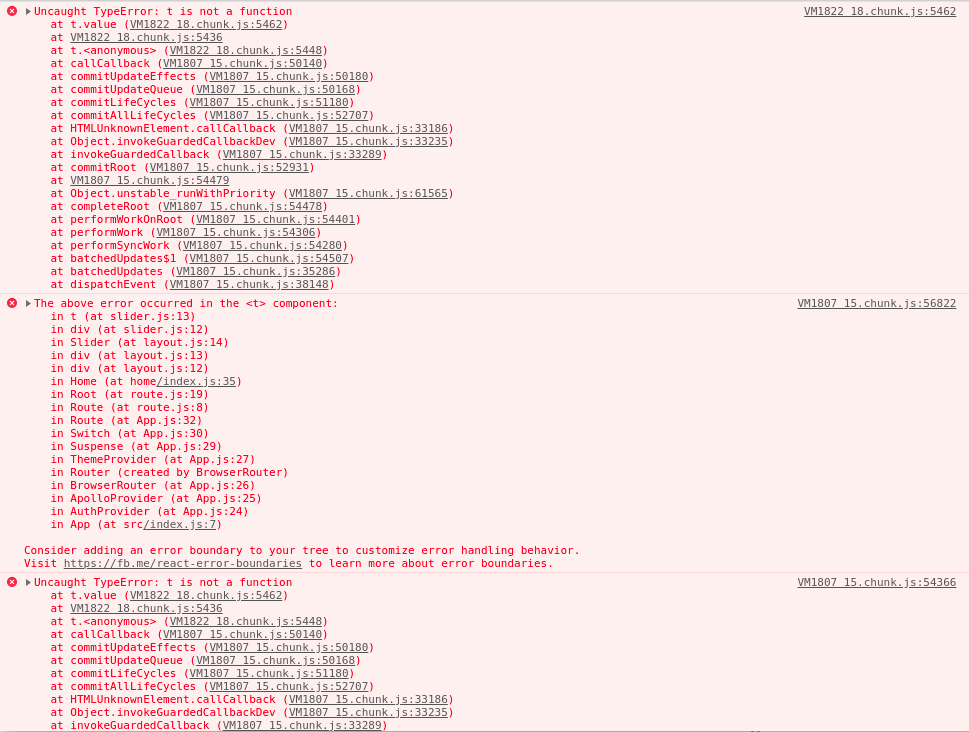
After running a build and deploying into my prodution environment, I receive the following error:

TypeError: Super expression must either be null or a function, not undefined

Everything works fine in my dev environment. It seems to be stemming from the code shown in the screenshot located in dist\index.js and/or dist\autoplay.js.

Any idea how I can get around this? Thanks.
error
ConsoleError

Prop for set hidden arrow when at first or last page.

Hi bro,

I using this library and I looking for a props to set hidden arrow button like your portfolio page. Can you shown me which is props or we need add this to your library, tell me you suggestion and we will go through on that.

Thanks

Not working at all

Even following the most basic example, it's still not functioning at all. The arrows are missing, the bullets won't transition to the other slides, etc. The only thing that this is doing is showing the first picture I have and nothing else.

import AwesomeSlider from 'react-awesome-slider';
import 'react-awesome-slider/dist/styles.css';

const slider = (
      <AwesomeSlider
        fillParent={true}
      >
        <div data-src="https://images.befunky.com/wp/wp-2014-08-milky-way-1023340_1280.jpg?auto=format&fm=jpg&q=75&w=1776&ixlib=js-1.4.1" />
        <div data-src="https://images.befunky.com/wp/wp-2015-11-hellofall4.jpg?auto=format&fm=jpg&q=75&w=1248&ixlib=js-1.4.1"/>
      </AwesomeSlider>
    );

Strange behaviour and error when navigating

Hi..
I´m trying to use the slider passing a simple div array:

  render () {
    const offersList = this.state.offers.map((item, index) => {
      return <div data-src={item.image} key={`slider-${index}`}>
        <p>{item.name}</p>
      </div>
    })

    return (
      <div className='slider-content'>
        <AwesomeSlider>
          {offersList}
        </AwesomeSlider>
      </div>
    )
  }

I get the offers in an ajax call on the ComponentDidMount lifecycle and store it in a state.

For some reason the component is very slow ( freezing my Chrome for a bit ), doesn´t show the first slider and when I try to click to navigate it gives me an error:
index.js:1 Uncaught (in promise) TypeError: Cannot read property 'classList' of null

Am I doing something wrong?

Thanks

Amazon S3 Images not loading

I have a data coming from API and showing them like this

      <AwesomeSlider>
        {items.map(x => ( 
          <SlideItem key={x.url} {...x} /> 
        ))}
      </AwesomeSlider>

Nothing is shown

If I click Back Arrow I get the Image but then it crashes in the console

index.js:478 Uncaught (in promise) TypeError: Cannot read property 'classList' of null
    at eval (index.js:478)

Do you know what's happening here?

Autoplay option is not working

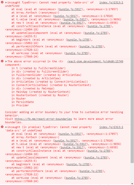
hello! ive tried using the autoplay option according to the docs(https://caferati.me/demo/react-awesome-slider/autoplay), and im getting this error while trying to render:
Inked66958717-77990b00-f071-11e9-8f0e-4f11462a12f5_LI

ive tried looking at the example page code as well but there all the logic is outside of the actual package, so im wondering if the autoplay option exist?

in the 1.x version ive used the autoplay suggested here but it sometimes crash on mobile when moving across images fast.

thank you.

slide in components not getting rendered

So, i don't know if its a bug, or i am missing something.

I have the following code:

<AwesomeSlider
						cssModule={AwsSliderStyles}
						bullets={false}
						infinite={false}
						fillParent
					>
						{
							slides.map(currentSlide => (
								<Slide slide={currentSlide} />
							))
						}</AwesomeSlider>

and the Slide component looks the following:

const Slide = (props) => {
	const { slide } = props
	return (
		<div style={{ backgroundImage: `url(${slide.bgImage})`, backgroundSize: 'contain', backgroundRepeat: 'no-repeat', backgroundPosition: '50% 50%' }} />
	)
}

pretty simple, but it's not working.

However, if i copy that single div from the Slide component, and place it directly in the map, it works.

Do you have any idea what might the problem be?

[Request?] --startup class on container element

I'm trying to conditionally style the controls on the startup slide and the _startUp is only applied on the slide content element.

If the container had a class like aws-sld--startup we could do something similar to the --first and --last classes where the left or right control isn't visible.

My current workaround was using the className prop on AwesomeSlider to make it work since I'm always using a startup slide.

question about slider

I was curious if there is a way to use your sliders for entire page transitions rather then just pictures, as I understand from the looks of the setup that data-src plays a big role in the pre configuration. Thanks!

Syntax Error: Unexpected token import - Using with NextJS

When trying to have a fold-out/cube or any other another animation that requires CSS modules, the server throws up an error:

(function (exports, require, module, __filename, __dirname) { import Styles from './fold-out-animation.scss';
SyntaxError: Unexpected token import
    at new Script (vm.js:51:7)
    at createScript (vm.js:136:10)
    at Object.runInThisContext (vm.js:197:10)
    at Module._compile (internal/modules/cjs/loader.js:618:28)
    at Object.Module._extensions..js (internal/modules/cjs/loader.js:665:10)
    at Module.load (internal/modules/cjs/loader.js:566:32)
    at tryModuleLoad (internal/modules/cjs/loader.js:506:12)
    at Function.Module._load (internal/modules/cjs/loader.js:498:3)
    at Module.require (internal/modules/cjs/loader.js:598:17)
    at require (internal/modules/cjs/helpers.js:11:18)
    at Object.react-awesome-slider/src/styled/fold-out-animation/index

The code that gave the error is:

import AwesomeSlider from 'react-awesome-slider';
import AwesomeSliderStyles from  'react-awesome-slider/src/styled/fold-out-animation/index';
import 'react-awesome-slider/dist/styles.css';

const Home = () => {
  return (
    <div>
      <Head>
         <title>Home</title>
      </Head>

      <AwesomeSlider>
        <div>1</div>
        <div>2</div>
        <div>3</div>
        <div>4</div>
      </AwesomeSlider>
    </div>
  );
}

export default Home

This is my next.config.js file:

const withPlugins = require('next-compose-plugins');
const withCSS = require('@zeit/next-css');
const withSass = require('@zeit/next-sass');
module.exports = withPlugins([
    [withCSS, {
        cssModules: true
    }], 
    [withSass, {
        cssModules: true
    }]
]);

Don't know why its causing this issue.
Also, is there a way to have those other animations without the use of CSS modules?

Rendering vertical pictures / portraits?

I'm rendering vertical pictures and can't seem to find an option for them? The container keeps being wider and horizontal. Is there some documentation for applying custom css styles?

On click modal

Hello I am trying to get a different modal element to go off OnClick for each image.

<AwesomeSlider onClick={this.openModal} >
<div data-src={serene} />
<div data-src={bw1} />
<div data-src={fexivus} />
<div data-src={mount} />
<div data-src={orbfall} />
</AwesomeSlider>

OR

<AwesomeSlider >
 <div onClick={this.openModal} data-src={serene} />
<div data-src={bw1} />
<div data-src={fexivus} />
<div data-src={mount} />
<div data-src={orbfall} />
</AwesomeSlider>

Does not work.

How do I attach event handling to each image in the slider.

Great app BTW <3

Sorry if this is an ignorant question.

Change image before slider animation

Sorry, this is more of a question than an issue, but I'm wondering if there is a way to change the image on button click and have the image change before the slider animation happens? I've tried the following:

...
const [image, setImage] = useState(0);
...
<AwesomeSlider
        animation="cubeAnimation"
        cssModule={AwesomeSliderStyles}
        id="awesome"
        onTransitionRequest={() => setImage(newImage)}
        onTransitionStart={() => setImage(newImage)}
        onTransitionEnd={() => setImage(newImage)}
        transitionDelay={2000}
      >
       <div>
          <img src={image} alt="" />
        </div>
        <div>stuff</div>
      </AwesomeSlider>

The image successfully changes after the animation occurs, but I'd like it to change before the slider animation. I realize you may not have had this kind of thing in mind when you built this, so I understand if it's not possible given the current implementation.

Support for the experimental syntax 'classProperties' isn't currently enabled

hey there,
I'm trying to use react-awesome-sloder with create-react-app
on the first try after installation i get the following error:

Support for the experimental syntax 'classProperties' isn't currently enabled

i dont want to eject so i was wondering if there is anything you may do on your end

thank in advance!

Thanks

Thanks for react-awesome-slider

Cant show images

image

import AwesomeSlider from 'react-awesome-slider';
import AwesomeSliderStyles from 'react-awesome-slider/src/styled/fold-out-animation';

result empty. Dunnow why?

Autoplay hoc won't work

The autoplay hoc seems not work properly.
Just stucked on the first image

import AwesomeSlider from  'react-awesome-slider';
import withAutoplay from 'react-awesome-slider/dist/autoplay';
const AutoPlayer = withAutoplay(AwesomeSlider);

export default AwesomeComponent extends Component{
 render = () => {
        return (
            <>
                {this.state.data ?
                    <AutoPlayer play={true}
                    cancelOnInteraction={false} // should stop playing on user interaction
                    interval={1000}>
                        {this.state.data.map((item) => {
                                    return(
                                        <div className="template-container">
                                            <div className="template-img-container">
                                                    <div className="template-img">
                                                        <img src={item.img}></img>
                                                    </div>
                                            </div>
                                            <div className="descr-container">       
                                                        <div className='descr-box'>
                                                            <p className="descr-text">{item.caption}</p>
                                                        </div>
                                            </div>
                                        </div>)
                        })}
                    </AutoPlayer>
                    : <></>
                }
            </>
        );
    }

Infinite Sliding Issue

Hi @rcaferati
Not able to reuse the prop to stop the infinite sliding functionality. I need to stop any further right-swiping from the last page, and same with any further left-swiping from the first page.
Tried utilizing the infinite prop, but unable to make it behave as expected.

Cannot build

Works perfectly in dev. When I try to build, it can't minify. I think it's because dist/index.js is already minified, but not sure. I tried using src/index.js, but can't parse, "... may need an appropriate loader...".

I have a dozen other modules working. Only react-awesome-slider causes issue. I can run in dev with our without react-awesome-slider. When I try to build, get error. Can build and run in production WITHOUT react-awesome-slider.

Am I trying to import incorrectly? Any other ideas?

Thanks!
Ben

Fatal error when is served in production

Hello guys,

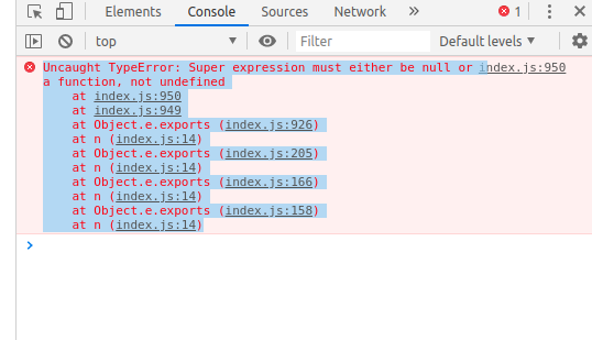
I started using react-awesome-slider just a few days ago, easy to use and worked great in my local env, after all my tests I compiled (npm run build) to deploy it in production and boom nothing works. After all my debugging I realized that only importing your library my component never loads... The error:

Uncaught TypeError: Super expression must either be null or a function, not undefined
at index.js:950
at index.js:949
at Object.e.exports (index.js:926)
at n (index.js:14)
at Object.e.exports (index.js:205)
at n (index.js:14)
at Object.e.exports (index.js:166)
at n (index.js:14)
at Object.e.exports (index.js:158)
at n (index.js:14)

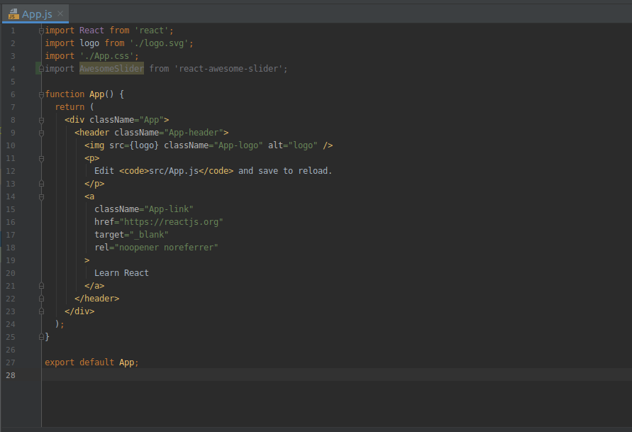
I even tried with a clean (new) project and the result is always the same

The error:
image

My clean project with the import:
image

render <picture> tag

Hi, how would I be able to get tag working? I want to show webp images but with a fallback to jpg for browsers that don't support webp

Local blob image not rendering

Can we change this line so that it's the default behaviour?
i.e if (media.url.match(/mp4/)) ... else { background = <img... }

I have an input that accepts images, I then use those files to URL.createObjectUrl(file) and pass it to the AwesomeSlider.

back and next "buttons" missing aria label

According to all page tests and accessibility tests, all Buttons must have discernible text.
meaning, adding
aria-label="back"
and
aria-label="next"
to the arrow buttons will help across all devices and give a better score for search crawlers.
Just my two cents. thanks for the package! amazing work.

Selected prop not updating position in the bullets

I am initializing my AwesomeSlider with an specific position...But the bullets below does not show that position, so when I start navigating is always at the first...
Example:
<AwesomeSlider
selected=3 //To show the 4th media from the list at creation..
infinite={false} >
{mediaItems} //this are my media items source list..

In the bullets of navigation it does not show the correct index, the one passed in the selected prop.

Problems with touch in the responsive version.

The library works well when it is in desktop version, but when I switch to mobile version and change the image with the touch I skip the error that I will show you next.
Selección_071
Selección_072

Any suggestions on what to do to fix this?

I can't get my images

Hi, I'm having some problem with the path to my images. In my src folder I have a folder for images and other folder for components, I'm trying to get my images from a component like this:
<div data-src="../assets/imgs/slider/img-0.png"/> but it's not working, Am I doing anything wrong?

[Feature Request] Enable touch/ drag on desktop?

Hi! I would like to make so my desktop users are able to change the slide with the mouse. Is that possible with this package? I tried to do so with the examples you provide, but mouse has no effect. Thank you! :)

override arrow component

Can we override organic arrow component via the props?

This is very useful if we want custom arrows.

autoplay hoc has wrong import and

Using the AutoPlay hoc example from your website, I get the following error:
Code_MghdlojmDQ

apparently the dir is wrong, so ive added '/src' to that line. now it finds the file but i get a different error:
Code_Hfw2preLae
Ive used the old version with no problems so i think i dont misuse it now.

the old way someone posted here for auto-play crashes on mobile when users move too many pictures fast so ive decided to move to your new version! hopefully it will work soon thank you for this package!

custom css

Olá estou tentando seguir o tutorial, gerando um css personalizado no site de demo:

.aws-btn {
  --slider-height-percentage: 25%;
  --slider-transition-duration: 200ms;
  --organic-arrow-thickness: 2px;
  --organic-arrow-border-radius: 0px;
  --organic-arrow-height: 22px;
  --organic-arrow-color: #00ff24;
  --control-button-width: 40%;
  --control-button-height: 25%;
  --control-button-background: transparent;
  --control-bullet-color: #a3b9d0;
  --control-bullet-active-color: #8b9db1;
  --loader-bar-color: #851515;
  --loader-bar-height: 6px;
  } 

meu carrousel:

const Slider = () =>(
    <AwesomeSlider cssModule={AwesomeSliderStyles}>
    <div data-src="http://s2.glbimg.com/4Ek8CnZSuYyyvaNQEPPiX_d-faA=/e.glbimg.com/og/ed/f/original/2017/11/24/gali1.jpg" />
    <div data-src="https://img.estadao.com.br/thumbs/640/resources/jpg/0/4/1512053836140.jpg" />
  </AwesomeSlider>   
)

export default Slider;

css:

@import './styles.scss';

.#{$root-element} {
  --scale-out-scale: 0.85;

  &--exit {
    &.#{$root-element}--moveRight,
    &.#{$root-element}--moveLeft {
      animation: scaleOut var(--slider-transition-duration) both
        var(--transition-bezier);
    }
  }
}
.aws-btn {
  --slider-height-percentage: 25%;
  --slider-transition-duration: 200ms;
  --organic-arrow-thickness: 2px;
  --organic-arrow-border-radius: 0px;
  --organic-arrow-height: 22px;
  --organic-arrow-color: #00ff24;
  --control-button-width: 40%;
  --control-button-height: 25%;
  --control-button-background: transparent;
  --control-bullet-color: #a3b9d0;
  --control-bullet-active-color: #8b9db1;
  --loader-bar-color: #851515;
  --loader-bar-height: 6px;
  } 

@keyframes scaleOut {
  to {
    transform: scale(var(--scale-out-scale));
  }
}

como eu deveria colocar essa customização?

Image fullscreen on click

What about including functionality that when clicking the image, it shows it fullscreen, click again and return to normal state?

Video and Images

Its possible add video to slider and pause while autoplay video?

How can I get this to work without a background?

I'm trying to use this for a text slider that goes over the background of a different div. However, if I remove the default background, you can see the previous element. Is there some workaround for this?

(I know it's probably not possible, but I wanted to ask nonetheless)

in production TypeError: Super expression must either be null or a function, not undefined

Hi, nice slider, good job

There is a problem, in dev environment:

ƒ t(e){!function(e,t){if(!(e instanceof t))throw new TypeError("Cannot call a class as a function")}(this,t);var n=function(e,t){if(!e)throw new ReferenceError("this hasn't been initialised - super() h…

but slider work, and in the production environment:

TypeError: Super expression must either be null or a function, not undefined

and slider not work
i use next.js, i tried ssr: false, dynamic import when componentDidMount...

Recommend Projects

  • React photo React

    A declarative, efficient, and flexible JavaScript library for building user interfaces.

  • Vue.js photo Vue.js

    🖖 Vue.js is a progressive, incrementally-adoptable JavaScript framework for building UI on the web.

  • Typescript photo Typescript

    TypeScript is a superset of JavaScript that compiles to clean JavaScript output.

  • TensorFlow photo TensorFlow

    An Open Source Machine Learning Framework for Everyone

  • Django photo Django

    The Web framework for perfectionists with deadlines.

  • D3 photo D3

    Bring data to life with SVG, Canvas and HTML. 📊📈🎉

Recommend Topics

  • javascript

    JavaScript (JS) is a lightweight interpreted programming language with first-class functions.

  • web

    Some thing interesting about web. New door for the world.

  • server

    A server is a program made to process requests and deliver data to clients.

  • Machine learning

    Machine learning is a way of modeling and interpreting data that allows a piece of software to respond intelligently.

  • Game

    Some thing interesting about game, make everyone happy.

Recommend Org

  • Facebook photo Facebook

    We are working to build community through open source technology. NB: members must have two-factor auth.

  • Microsoft photo Microsoft

    Open source projects and samples from Microsoft.

  • Google photo Google

    Google ❤️ Open Source for everyone.

  • D3 photo D3

    Data-Driven Documents codes.