


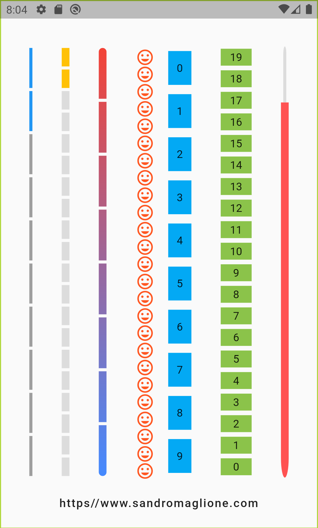
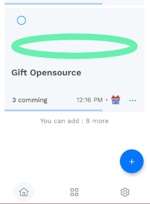
Open source Flutter package, bar indicator made of a series of selected and unselected steps.
Made by Sandro Maglione, check out his personal official website sandromaglione.com
Check out the full step_progress_indicator tutorial
See the full example here
Check out the official dartdoc for the package here
Install and import the package. Then just customize its parameters.
dependencies:
  flutter:
    sdk: flutter
  step_progress_indicator: ^1.0.2
The last no null-safe version of the package was v0.2.5+8
| Horizontal | Vertical |
|---|---|
 |
 |
| Circular1 | Circular2 |
|---|---|
 |
 |
 |
 |
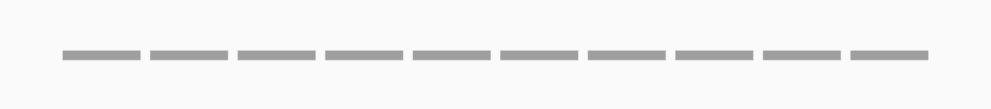
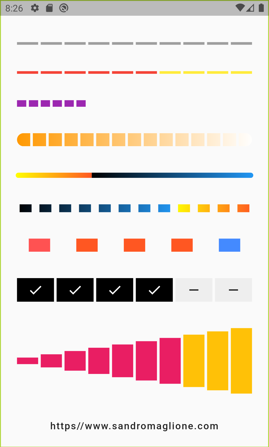
StepProgressIndicator(
    totalSteps: 10,
)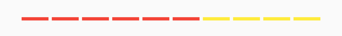
StepProgressIndicator(
    totalSteps: 10,
    currentStep: 6,
    selectedColor: Colors.red,
    unselectedColor: Colors.yellow,
)
StepProgressIndicator(
    totalSteps: 20,
    currentStep: 6,
    size: 10,
    selectedColor: Colors.purple,
    unselectedColor: Colors.transparent,
)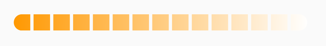
StepProgressIndicator(
    totalSteps: 15,
    currentStep: 12,
    size: 20,
    selectedColor: Colors.amber,
    unselectedColor: Colors.black,
    roundedEdges: Radius.circular(10),
    gradientColor: LinearGradient(
        begin: Alignment.topLeft,
        end: Alignment.bottomRight,
        colors: [Colors.orange, Colors.white],
    ),
),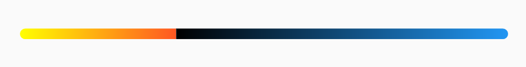
StepProgressIndicator(
    totalSteps: 100,
    currentStep: 32,
    size: 8,
    padding: 0,
    selectedColor: Colors.yellow,
    unselectedColor: Colors.cyan,
    roundedEdges: Radius.circular(10),
    selectedGradientColor: LinearGradient(
        begin: Alignment.topLeft,
        end: Alignment.bottomRight,
        colors: [Colors.yellowAccent, Colors.deepOrange],
    ),
    unselectedGradientColor: LinearGradient(
        begin: Alignment.topLeft,
        end: Alignment.bottomRight,
        colors: [Colors.black, Colors.blue],
    ),
),
StepProgressIndicator(
    totalSteps: 12,
    currentStep: 4,
    padding: 6.0,
    size: 12,
    progressDirection: TextDirection.rtl,
    selectedColor: Colors.green,
    unselectedColor: Colors.black12,
    selectedGradientColor: LinearGradient(
        begin: Alignment.topLeft,
        end: Alignment.bottomRight,
        colors: [Colors.yellowAccent, Colors.deepOrange],
    ),
    unselectedGradientColor: LinearGradient(
        begin: Alignment.topLeft,
        end: Alignment.bottomRight,
        colors: [Colors.black, Colors.blue],
    ),
)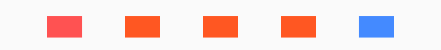
StepProgressIndicator(
    totalSteps: 5,
    padding: 20.0,
    size: 20,
    customColor: (index) => index == 0
        ? Colors.redAccent
        : index == 4 ? Colors.blueAccent : Colors.deepOrange,
)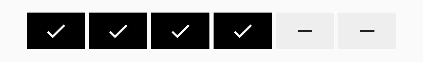
StepProgressIndicator(
    totalSteps: 6,
    currentStep: 4,
    size: 36,
    selectedColor: Colors.black,
    unselectedColor: Colors.grey[200],
    customStep: (index, color, _) => color == Colors.black
        ? Container(
            color: color,
            child: Icon(
            Icons.check,
            color: Colors.white,
            ),
        )
        : Container(
            color: color,
            child: Icon(
            Icons.remove,
            ),
        ),
)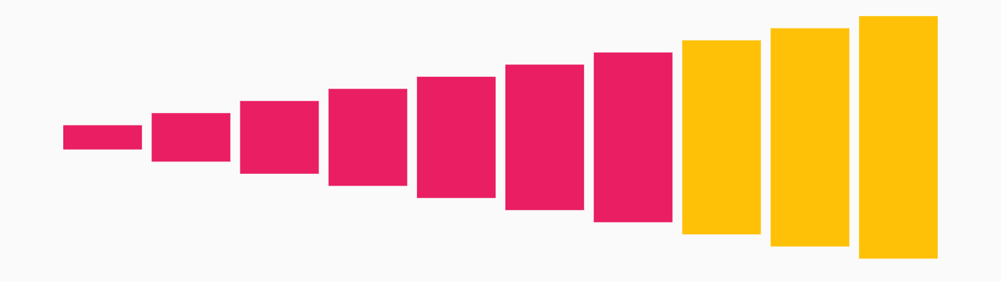
StepProgressIndicator(
    totalSteps: 10,
    currentStep: 7,
    selectedColor: Colors.pink,
    unselectedColor: Colors.amber,
    customSize: (index) => (index + 1) * 10.0,
)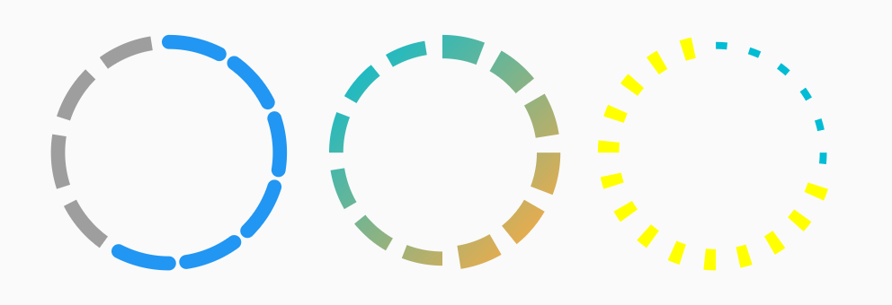
Row(
mainAxisAlignment: MainAxisAlignment.spaceEvenly,
children: <Widget>[
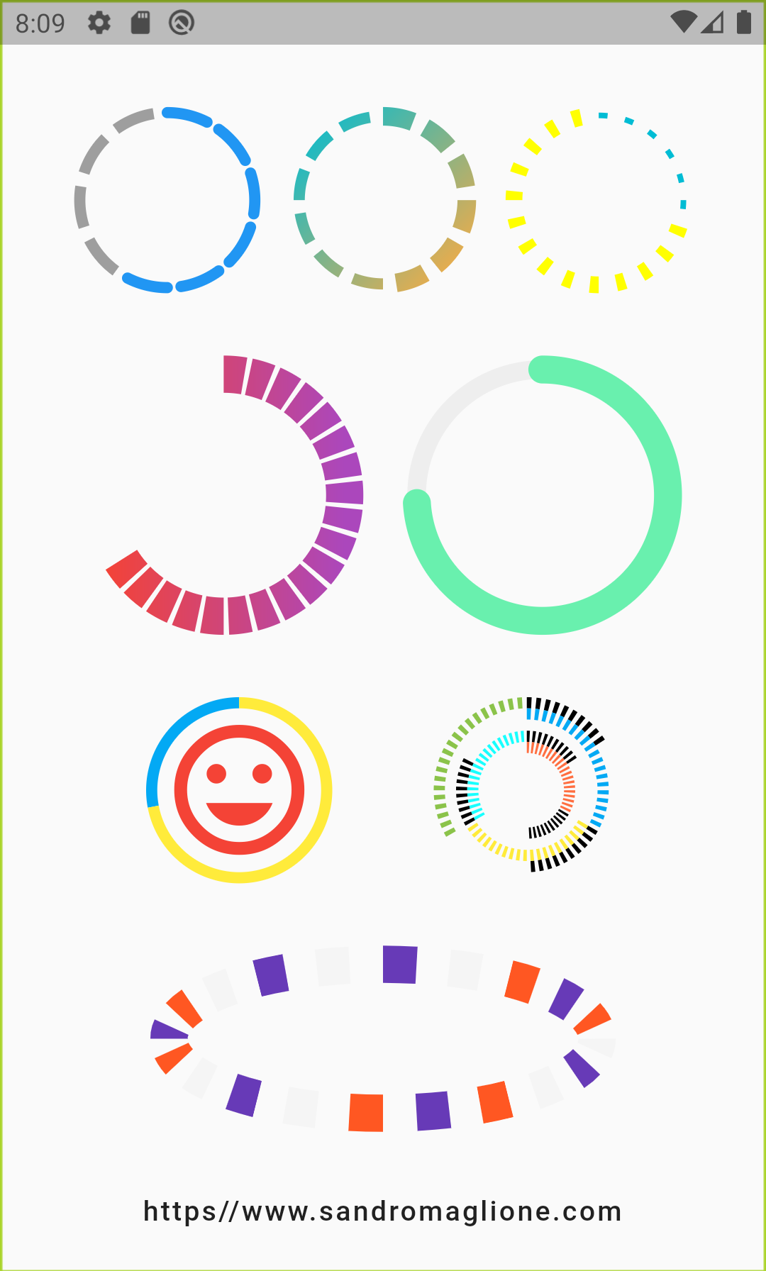
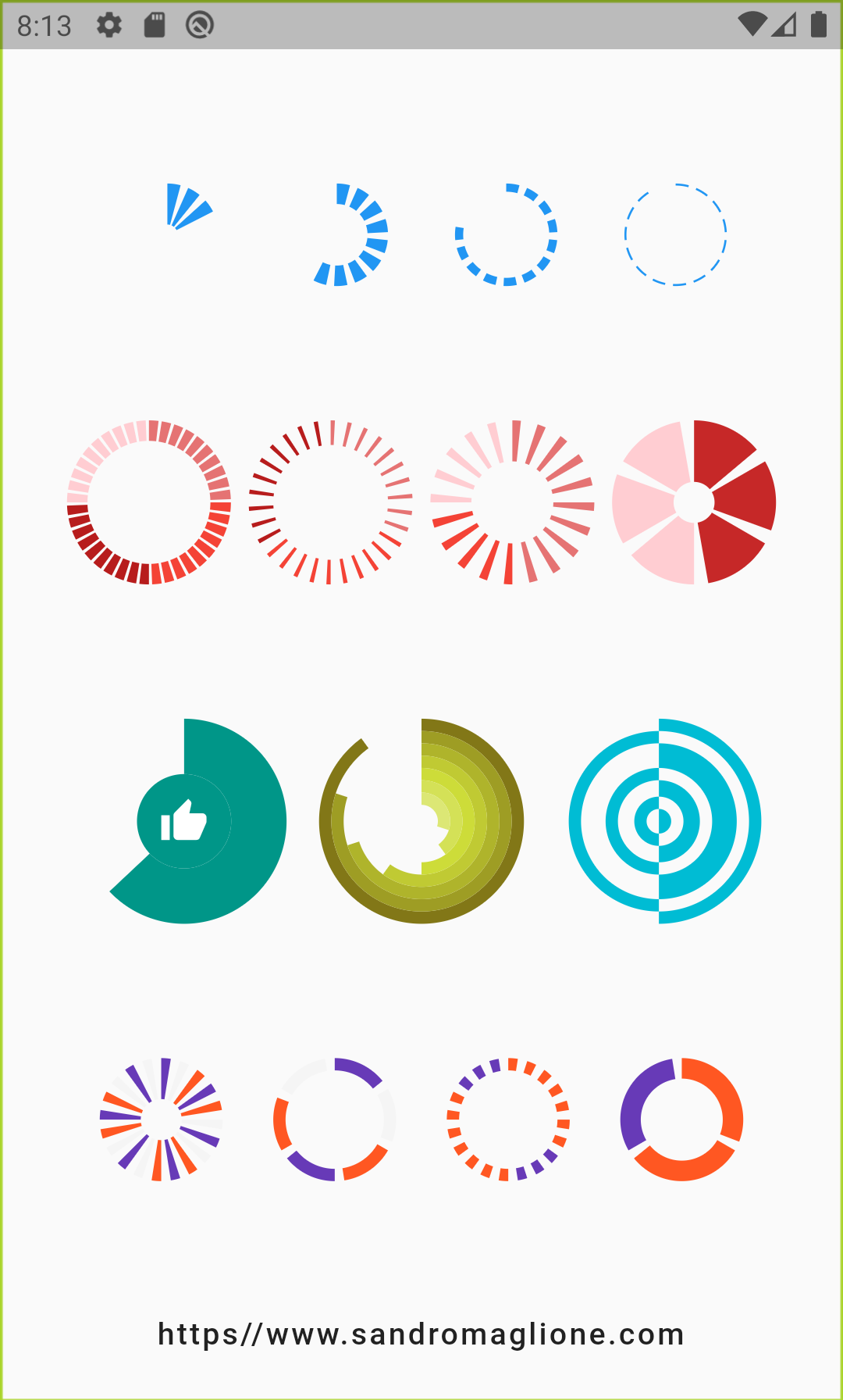
CircularStepProgressIndicator(
totalSteps: 10,
currentStep: 6,
width: 100,
roundedCap: (_, isSelected) => isSelected,
),
CircularStepProgressIndicator(
totalSteps: 12,
currentStep: 6,
selectedColor: Colors.redAccent,
unselectedColor: Colors.grey[200],
selectedStepSize: 10.0,
width: 100,
gradientColor: LinearGradient(
begin: Alignment.topLeft,
end: Alignment.bottomRight,
colors: [Colors.cyan, Colors.orangeAccent],
),
),
CircularStepProgressIndicator(
totalSteps: 20,
currentStep: 6,
padding: math.pi / 15,
selectedColor: Colors.cyan,
unselectedColor: Colors.yellowAccent,
selectedStepSize: 3.0,
unselectedStepSize: 9.0,
width: 100,
),
],
)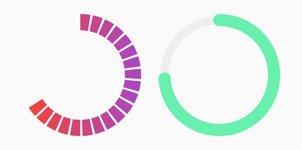
Row(
    mainAxisAlignment: MainAxisAlignment.spaceEvenly,
    children: <Widget>[
    CircularStepProgressIndicator(
        totalSteps: 20,
        currentStep: 12,
        stepSize: 20,
        selectedColor: Colors.red,
        unselectedColor: Colors.purple[400],
        padding: math.pi / 80,
        width: 150,
        height: 150,
        startingAngle: -math.pi * 2 / 3,
        arcSize: math.pi * 2 / 3 * 2,
        gradientColor: LinearGradient(
            colors: [Colors.red, Colors.purple[400]],
        ),
    ),
    CircularStepProgressIndicator(
        totalSteps: 100,
        currentStep: 74,
        stepSize: 10,
        selectedColor: Colors.greenAccent,
        unselectedColor: Colors.grey[200],
        padding: 0,
        width: 150,
        height: 150,
        selectedStepSize: 15,
        roundedCap: (_, __) => true,
    ),
    ],
),
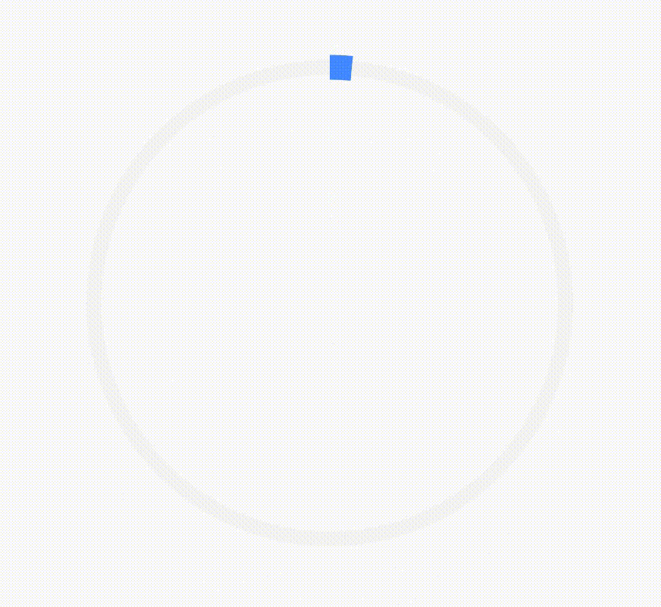
CircularStepProgressIndicator(
    totalSteps: 100,
    currentStep: 72,
    selectedColor: Colors.yellow,
    unselectedColor: Colors.lightBlue,
    padding: 0,
    width: 100,
    child: Icon(
        Icons.tag_faces,
        color: Colors.red,
        size: 84,
    ),
)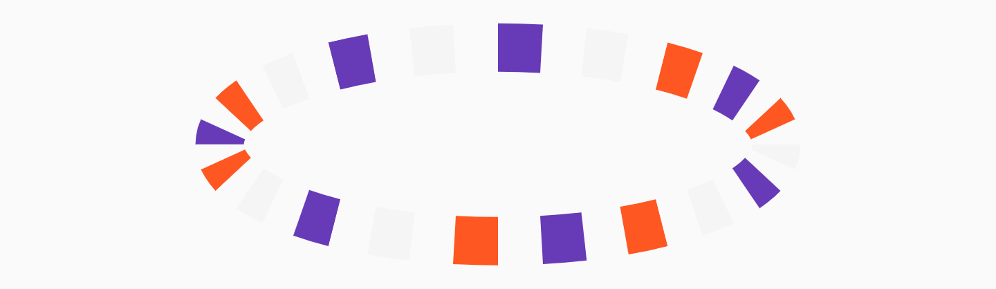
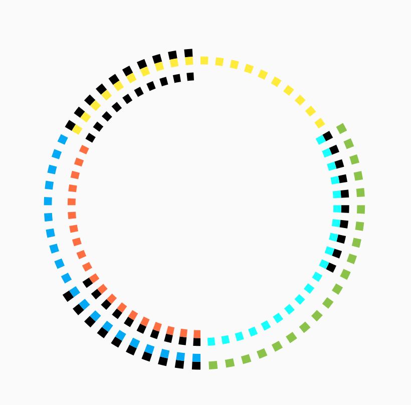
CircularStepProgressIndicator(
    totalSteps: 20,
    stepSize: 20,
    customColor: (index) => index % 3 == 0
        ? Colors.deepPurple
        : index % 2 == 0
            ? Colors.deepOrange
            : Colors.grey[100],
    width: 250,
)| Parameter | Type | Description | Default |
|---|---|---|---|
| totalSteps | int |
Total number of step of the complete indicator. | @required |
| currentStep | int |
Number of steps to underline, all the steps with index <= currentStep will have Color equal to selectedColor. |
0 |
customStep(int, Color, double) |
Widget |
Defines a custom Widget to display at each step, given the current step index, the Color, which could be defined with selectedColor and unselectedColor or using customColor, and its size, which could be defined using size, selectedSize, unselectedSize, or customSize. |
- |
onTap(int) |
void Function() |
Defines onTap function given index of the pressed step. | - |
customColor(int) |
Color |
Assign a custom Color for each step. | - |
customSize(int) |
double |
Assign a custom size for each step. | - |
| selectedColor | Color |
Color of the selected steps. | Colors.blue |
| unselectedColor | Color |
Color of the unselected steps. | Colors.grey |
| gradientColor | Gradient |
Apply gradient color to the indicator. | - |
| selectedGradientColor | Gradient |
Apply gradient color to the selected steps of the indicator. | - |
| unselectedGradientColor | Gradient |
Apply gradient color to the unselected steps of the indicator. | - |
| blendMode | BlendMode |
Apply BlendMode to ShaderMask when gradientColor, selectedGradientColor, or unselectedGradientColor defined. |
- |
| direction | Axis |
Defines if indicator is horizontal or vertical. | Axis.horizontal |
| progressDirection | TextDirection |
Defines if steps grow from left-to-right / top-to-bottom TextDirection.ltr or right-to-left / bottom-to-top TextDirection.rtl. |
TextDirection.ltr |
| size | double |
Size of the indicator (height if direction is Axis.horizontal, width if Axis.vertical). |
4.0 |
| padding | double |
Spacing, left-right if horizontal, top-bottom if vertical, of each step. | 2.0 |
| fallbackLength | double |
Length of the progress indicator in case the main axis (based on direction attribute) has no size limit i.e. double.infinity. |
100.0 |
| selectedSize | double |
Specify a custom size for selected steps. | - |
| unselectedSize | double |
Specify a custom size for unselected steps. | - |
| roundedEdges | Radius |
Add rounded edge corners to first and last step. | - |
| mainAxisAlignment | MainAxisAlignment |
Assign alignment MainAxisAlignment for indicator's container. |
MainAxisAlignment.center |
| crossAxisAlignment | CrossAxisAlignment |
Assign alignment CrossAxisAlignment for indicator's container. |
CrossAxisAlignment.center |
| stepMainAxisAlignment | MainAxisAlignment |
Assign alignment MainAxisAlignment for a single step. |
MainAxisAlignment.center |
| stepCrossAxisAlignment | CrossAxisAlignment |
Assign alignment CrossAxisAlignment for a single step. |
CrossAxisAlignment.center |
| Parameter | Type | Description | Default |
|---|---|---|---|
| totalSteps | int |
Total number of step of the complete indicator. | @required |
| currentStep | int |
Number of steps to underline, all the steps with index <= currentStep will have Color equal to selectedColor. |
0 |
| child | Widget |
Widget child contained inside the indicator. | - |
| selectedColor | Color |
Color of the selected steps. | Colors.blue |
| unselectedColor | Color |
Color of the unselected steps. | Colors.grey |
customColor(int) |
Color |
Assign a custom Color for each step. | - |
| gradientColor | Gradient |
Apply a gradient color to the indicator. | - |
customStepSize(int, bool) |
double |
Assign a custom size for each step. | - |
| selectedStepSize | double |
Specify a custom size for selected steps. | - |
| unselectedStepSize | double |
Specify a custom size for unselected steps. | - |
| circularDirection | CircularDirection |
Defines if steps grow clockwise (CircularDirection.clockwise) or counterclockwise (CircularDirection.counterclockwise) |
CircularDirection.clockwise |
| stepSize | double |
Size of the each step of the indicator. | 6.0 |
| height | double |
Height of the indicator's container. | - |
| width | double |
Width of the indicator's container. | - |
| padding | double |
Spacing between each step. | math.pi / 20 |
| startingAngle | double |
Angle in which is placed the starting point of the indicator. | 0 |
roundedCap(int, bool) |
bool |
Adds rounded edges at the beginning and at the end of the circular indicator given int index of each step and a bool telling if the step is selected. |
(_, __) => false |
| removeRoundedCapExtraAngle | bool |
Removes extra angle caused by StrokeCap.butt when roundedCap is applied #20. |
false |
| arcSize | double |
Angle in radiants which represents the size of the arc used to display the indicator. | math.pi * 2 |
| fallbackHeight | double |
Height of the indicator's container in case the parent height has no size limit i.e. double.infinity. |
100.0 |
| fallbackWidth | double |
Width of the indicator's container in case the parent width has no size limit i.e. double.infinity. |
100.0 |
I am always open for suggestions and ideas for possible improvements or fixes.
Feel free to open a Pull Request if you would like to contribute to the project.
If you would like to have a new feature implemented, just write a new issue.
- v1.0.2 - 2 January 2022
- v1.0.1 - 16 June 2021
- v1.0.0 - 10 May 2021
- v0.2.5+8 - 01 December 2020
- v0.2.4+7 - 25 August 2020
- v0.2.3+6 - 20 May 2020
- v0.2.2+5 - 26 April 2020
- v0.2.1+4 - 25 February 2020
- v0.2.0+3 - 24 February 2020
- v0.1.1+2 - 24 January 2020
- v0.1.0+1 - 23 January 2020
If you would like to support my work, why don't you buy me a coffee?
MIT License, see the LICENSE.md file for details.


 React
React
 Typescript
 Django
 Laravel
 Facebook
 Microsoft
 Google
 Alibaba
 D3
D3
 Tencent